

This case involved an Amazon seller in the US marketplace whose mini curling iron Listing was under competitive pressure. The initial concern centered on how the product was presented: whether the title used the right keywords, whether the main images communicated the product clearly, and whether the page looked strong enough to compete in a crowded haircare category.
The first instinct was to treat the problem as a collection of isolated content issues—more keywords in the title, more product views in the image sequence, and more attractive lifestyle visuals. DeepBI’s diagnosis pointed to a deeper constraint: the Amazon product page was not building a complete reason to trust and buy. It showed the product, but did not sufficiently explain its travel readiness, temperature suitability, safety features, or hair-protection logic.
That changed the optimization order. Instead of treating Amazon ads as the first place to keep adjusting, the later direction focused on repairing the Listing’s conversion capacity: clarifying the title, rebuilding the bullet-point selling logic, making travel and safety proof visible, and restructuring A+ content around the buyer’s unanswered concerns. The case is a useful reminder for Amazon sellers that traffic is not automatically valuable when the page is still asking shoppers to resolve basic doubts on their own.
The Listing Was Not Empty. It Was Under-Explained.
At first glance, the product page had the basic components expected from an Amazon Listing:
- A product title with core keywords
- A main image sequence
- Product feature images
- Lifestyle and styling visuals
- A+ content
- Customer reviews
But the presence of these modules did not mean they were working together as a sales argument.
The product was positioned around several potentially meaningful use cases:
- Travel and international use
- Compact styling for short hair
- Dual-voltage operation
- Fast heating
- Temperature adjustment
- Automatic shut-off
- Hair protection
- Portability
The problem was that these points were not organized into a clear path from search result to purchase decision.
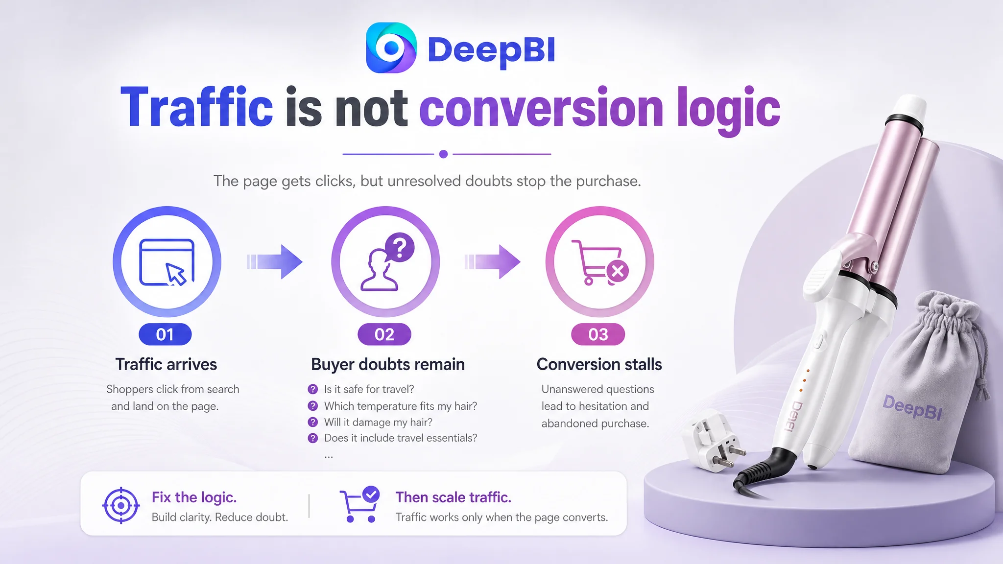
A shopper interested in a travel curling iron could still be left asking:
- Does it include the accessories needed for travel?
- Can it work safely in different countries?
- Which temperature is suitable for fine, normal, or thick hair?
- How does it reduce concerns about heat damage?
- What happens if the user forgets to turn it off?
- Is the compact size genuinely useful, or is it simply smaller?
- Can it create lasting results on different hair lengths?
The page did not consistently answer these questions at the moment they became important.
The core issue was not a lack of product information. It was a lack of decision logic.
The Competitive Gap Was Larger Than the Team First Assumed
DeepBI’s Listing comparison gave the page a total score of 60 out of 100, compared with 86 out of 100 for a closely matched high-performing competitor.
The 26-point gap was not concentrated in one minor visual detail.
- Title: Target Listing: 10/20, Comparable high-performing Listing: 17/20, Gap: -7
- Main image: Target Listing: 24/30, Comparable high-performing Listing: 26/30, Gap: -2
- Bullet points: Target Listing: 2/10, Comparable high-performing Listing: 9/10, Gap: -7
- A+ content: Target Listing: 17/25, Comparable high-performing Listing: 24/25, Gap: -7
- Reviews: Target Listing: 7/15, Comparable high-performing Listing: 10/15, Gap: -3
- Total: Target Listing: 60/100, Comparable high-performing Listing: 86/100, Gap: -26
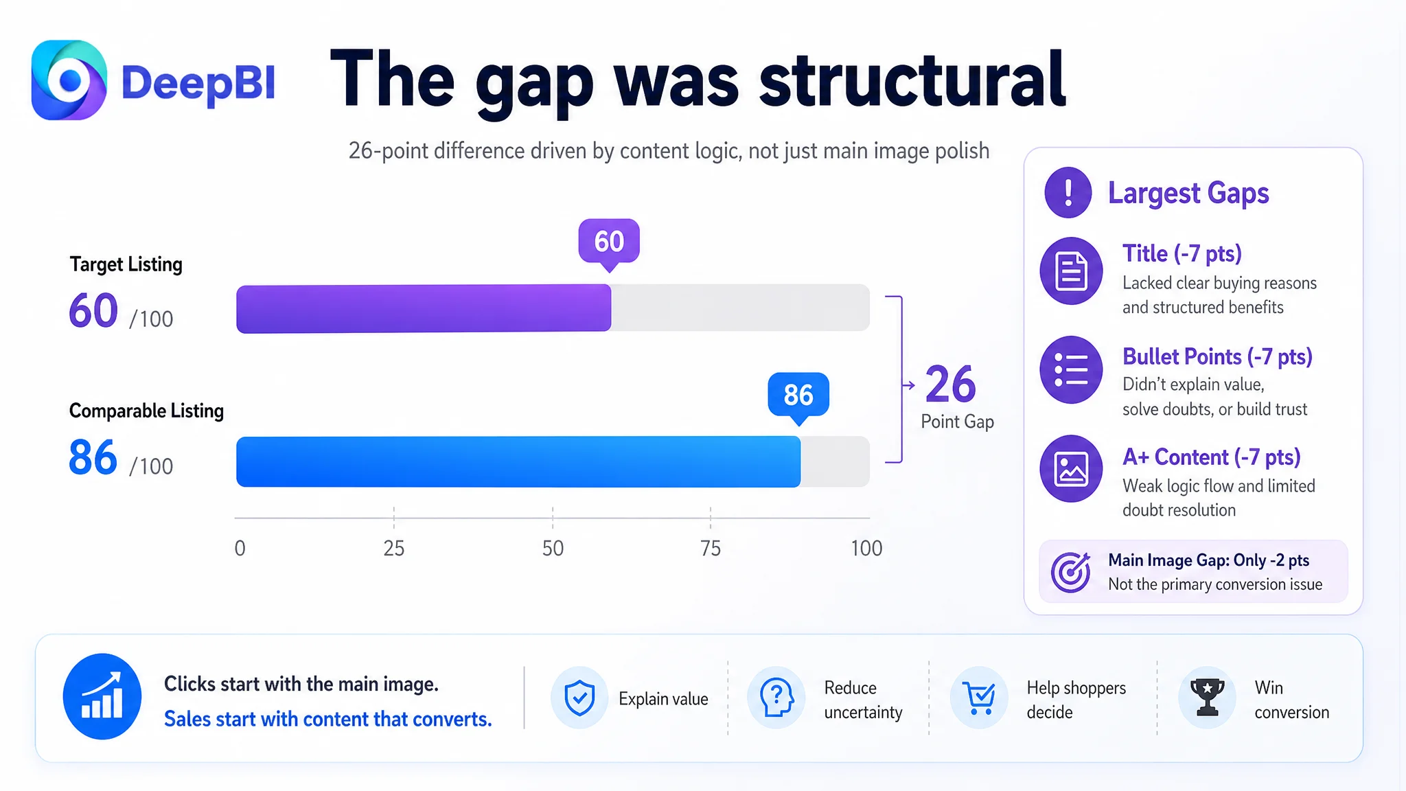
The score made one fact difficult to ignore: the page was not primarily losing because of a small difference in image polish.
The largest gaps were in the title, bullet points, and A+ content—the areas responsible for explaining value, reducing uncertainty, and helping shoppers decide whether the product fit their situation.
The main image score was also lower, but only by two points. That mattered for click strength, yet it did not explain the full conversion problem by itself.
This distinction changed the diagnosis from “the creative needs to look better” to “the Listing needs to carry more of the buyer’s decision.”
The Original Framing Focused on Keywords and Product Display
The initial optimization direction was understandable. The title contained important search terms, and the product images showed the curling iron in different views. A team working under Amazon competition pressure might reasonably assume that the next step is to refine keyword placement, make the product more visually appealing, or add more attractive styling scenes.
That approach treats each Listing element as an independent asset:
- Improve the title for search visibility
- Add or replace images
- Show the product from more angles
- Add a few lifestyle scenes
- Mention additional features
But this page did not need isolated additions as much as it needed a stronger relationship between the modules.
The title needed to make the travel proposition credible. The bullet points needed to explain why the listed functions mattered. The image sequence needed to resolve the same concerns visually. The A+ content needed to deepen trust rather than repeat product views.
Without that connection, improving one module at a time would leave the page structurally weak.
This is also why continued Amazon ads optimization would have been a risky first move. If paid traffic reaches a page that does not quickly establish suitability and trust, higher traffic can expose the conversion leak more clearly without solving it.
The Title Had Search Terms, but Not Enough Buying Reasons
The title score was 10/20, seven points behind the comparable high-performing Listing.
The target title placed core keywords early, but its structure was fragmented. It read more like a sequence of product descriptors than a clear buying proposition.
The stronger title pattern in the category connected:
- Product type
- Travel use
- Dual-voltage capability
- Safety features
- Temperature control
- Target audience or hair type
The target page did not communicate these points with the same clarity. In particular, it lacked sufficient emphasis on:
- Travel use
- Dual voltage
- Automatic shut-off
- Temperature settings
- Suitability for short hair
- Concrete functional benefits
The recommended direction was not to add every possible keyword. It was to reduce repetition and make the title easier to understand while retaining the most commercially relevant terms.
A stronger title structure for this product category would prioritize:
Brand or product identifier + core product type + travel use + dual voltage + temperature control + safety feature + audience or use case
The objective was not keyword density for its own sake. It was to make the search result more informative before the shopper even entered the product page.
The Main Image Was Not Weak Because It Was Unattractive
The main image score was 24/30, only two points below the comparable Listing. That result is important because it prevents an easy but incomplete conclusion.
The image sequence was not failing simply because the product looked poor.
Its larger weakness was that it did not communicate enough information early in the browsing path.
The comparable Listing used its early images to establish multiple signals at once:
- The complete travel kit
- A clear product form
- Visible accessories
- Temperature suitability
- Dual-voltage use
- Safety features
- Hair-protection technology
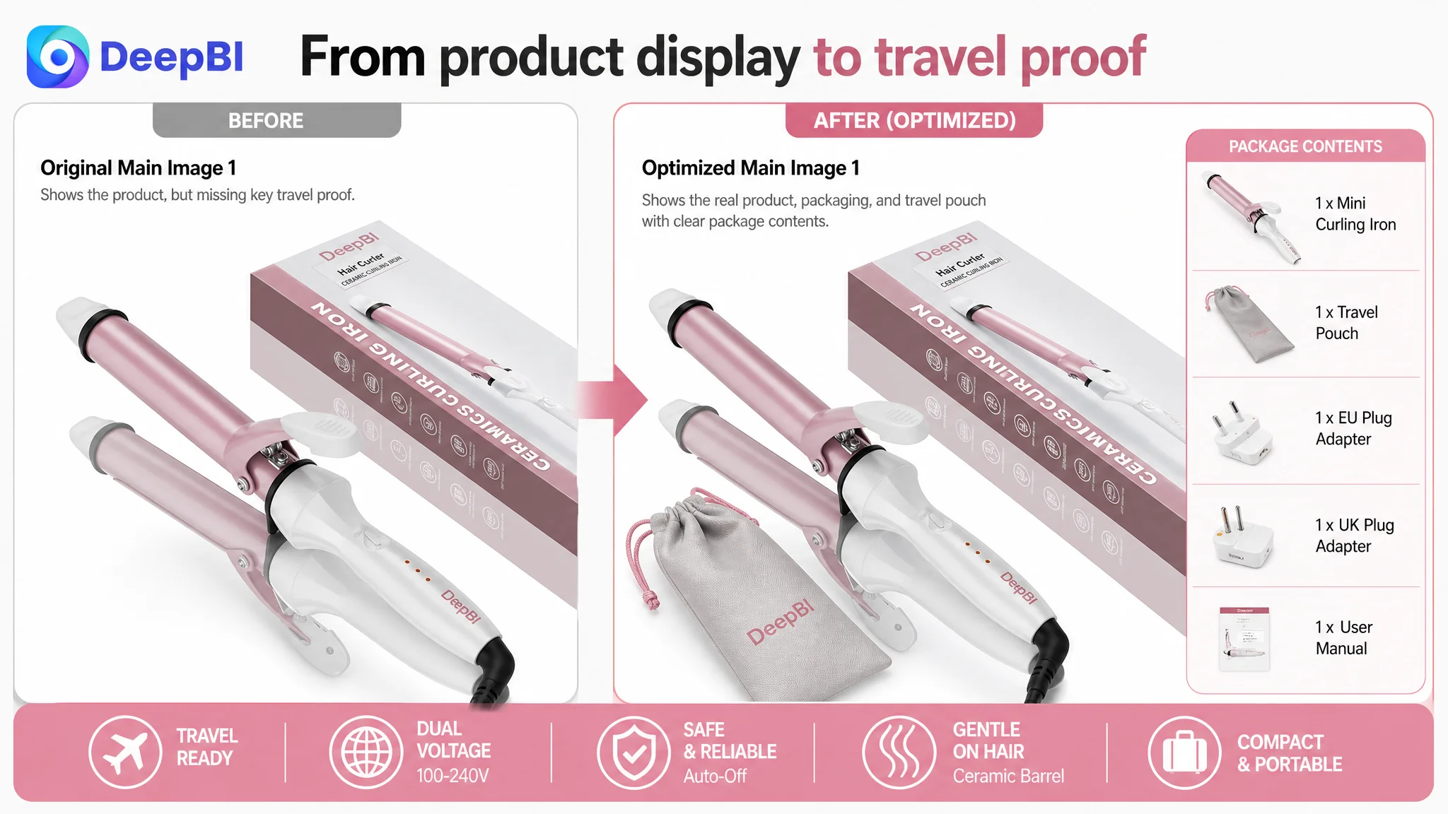
The target Listing required shoppers to inspect the images more actively. The first view emphasized the product and packaging, but did not immediately confirm what was included for travel. Another image reinforced the compact size without showing which hair types or conditions the temperature settings were intended for. A fast-heating chart communicated speed, but did not provide the same level of visual validation for international use.
One image was also largely repetitive. It used space in the image sequence without adding a new answer to a buyer concern.
The first image needed to confirm travel readiness
For a travel curling iron, the pouch and any supported travel accessories are not decorative details. They are evidence that the product is designed for the stated use case.
The recommended direction was to show the travel pouch and the complete package where those items were genuinely included. If an adapter was not included, the page needed to state that limitation clearly rather than imply otherwise.
The image sequence needed to connect temperature with suitability
The product information supported temperature settings, but the page did not make their practical meaning sufficiently clear.
A shopper should not have to infer whether the available settings are appropriate for fine, normal, or thicker hair. The visual sequence could use the confirmed temperature range and actual product capabilities to show suitability without inventing unsupported specifications.
Safety and hair protection needed visible proof
The page already had evidence of a 60-minute automatic shut-off feature and referenced protective coating technology. However, these points were not given enough visual priority.
For a high-heat styling tool, safety and hair health are not secondary details. They directly affect whether a shopper feels comfortable buying a product for use in unfamiliar environments such as hotels or international travel.
The Five Bullet Points Were the Largest Content Failure
The bullet-point score was only 2/10, compared with 9/10 for the comparable Listing.
This was not a subtle copywriting difference. The target bullet points were effectively missing as a conversion layer and functioned more like page controls than customer-facing product explanations.
That left the title and images carrying too much of the commercial argument.
The stronger Listing used a clear progression:
1. Fast heating and quick styling
2. Dual voltage, portability, and automatic shut-off
3. Travel adapters and international use
4. Temperature customization for different hair needs
5. Protective coating, ergonomic handling, and gifting value
The important point was not the number of bullets. It was the structure behind them.
Each bullet connected a customer concern with a product response and a practical outcome.
Fast heating needed to be framed as a time benefit
“30-second heating” is more useful when connected to a real situation: styling before work, preparing quickly while traveling, or creating a curl without a long wait.
Dual voltage needed to be connected to travel confidence
“Dual voltage” is a specification. Its value is that it reduces uncertainty when the customer uses the curling iron in different countries.
Automatic shut-off needed to be treated as risk reduction
A 60-minute automatic shut-off feature addresses a specific anxiety: leaving a heated tool on or using it in an unfamiliar environment.
Temperature settings needed to explain control
The page needed to clarify how the confirmed temperature settings support different hair types, textures, or desired results. Simply listing settings does not tell shoppers whether the tool will suit them.
Protective coating needed to address heat-damage concerns
The product’s ceramic or protective-coating claims should be presented as part of a hair-care argument, provided they accurately reflect the physical product and its verified specifications.
The bullet points did not need more adjectives. They needed a more complete reasoning chain:
Customer concern → product feature → practical benefit → use context
The A+ Content Showed the Product, but Did Not Lead the Shopper
The A+ content score was 17/25, seven points below the comparable Listing.
The target page included core selling materials, scene images, structural details, and styling results. However, the content remained relatively product-centered. It presented features without guiding the customer through the order in which doubts typically arise.
The comparable Listing followed a fuller journey:
1. The shopper’s problem
2. The product as a solution
3. Technical proof
4. Travel and safety suitability
5. How to use the product
6. Expected styling results
7. Emotional or gifting value
The target A+ content moved too quickly toward product presentation and final styling scenes while leaving important questions unresolved.
A+ content should not only make the product look more complete. It should make the buying decision feel less risky.
The early modules needed to establish technical confidence
The first A+ module should act as a concise overview of confirmed specifications, including relevant features such as:
- One-inch barrel
- Dual voltage
- Quick heat-up
- PTC heating
- 360-degree swivel cord
The purpose is to help a shopper quickly verify whether the product fits the intended use.
Suitability should come before generic lifestyle imagery
The existing short-hair and styling modules were useful, but they appeared before the page had fully addressed broader concerns about travel, temperature, and safety.
A better order would introduce suitability and technical reassurance first, then show styling outcomes as confirmation.
Temperature settings needed contextual explanation
The page mentioned three temperature settings of 400°F, 450°F, and 500°F in the product analysis. These should not be presented as bare numbers. The content should explain how the settings relate to different hair textures or styling needs, without claiming capabilities not supported by the product.
Travel claims needed physical evidence
If the product included a travel pouch or adapters, the A+ page should show them directly. If an accessory was not included, the content should not imply that it was.
The same principle applied to portability claims. Concrete, verified details such as dimensions or weight are more credible than a general statement that the curling iron is “travel-friendly.”
Safety needed its own place in the persuasion sequence
Automatic shut-off and other confirmed safety elements should not be buried in a general feature collage. They deserved a dedicated visual explanation because safety concerns become more important when the product is used away from home.
A comparison module could support rational trust
A carefully framed comparison table against generic alternatives could help clarify the product’s confirmed advantages, such as:
- Titanium barrel construction, if supported by the product information
- Quick heat-up
- PTC heater
- Temperature settings
- Dual voltage
- 360-degree swivel cord
The comparison should remain factual and avoid unsupported superiority claims.
Reviews Added a Separate Layer of Conversion Risk
The review dimension scored 7/15, compared with 10/15 for the comparable Listing.
The target Listing had:
- 3.8 stars
- 82 total reviews
- 8 reviews visible on the first page
The comparable Listing had:
- 4.4 stars
- 630 total reviews
The difference in review volume created a significant trust gap. More importantly, the target Listing’s lower rating was not merely a matter of review count. The available negative feedback included concerns about functional failures such as the product not heating or not gripping hair properly.
Those issues cannot be solved through title or image optimization alone.
This created two parallel responsibilities:
- The Listing needed to explain its legitimate strengths more clearly.
- The customer team needed to address product-quality and customer-service concerns that could continue to suppress conversion.
A stronger page may reduce uncertainty, but it cannot compensate indefinitely for unresolved product performance problems.
Why DeepBI Did Not Recommend Tuning Ads First
The central business judgment was about sequencing.
The case did not provide post-optimization advertising results, so it would be inaccurate to claim that ACOS declined or CVR increased. However, the Listing evidence was strong enough to show why continued ad tuning should not be treated as the first solution.
The page had a weak conversion foundation in three high-impact areas:
- The title did not clearly communicate the strongest buying reasons.
- The bullet points did not explain the product’s value.
- The A+ content did not resolve major suitability, travel, and safety concerns.
In that situation, changing bids or campaign structure would risk optimizing the cost of sending traffic to a page that still could not convert enough of it.
This is the practical distinction between a traffic problem and a traffic-absorption problem.
Advertising can amplify visibility, but it can also amplify the consequences of an unclear product page.
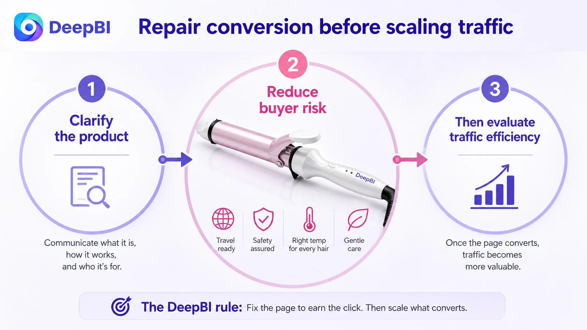
The correct order was therefore:
1. Clarify what the product is and who it is for.
2. Make confirmed travel, safety, temperature, and hair-protection benefits visible.
3. Rebuild the bullet points around customer concerns.
4. Restructure A+ content so that objections are answered before styling results are presented.
5. Only then use advertising data to judge whether the improved page can absorb more traffic efficiently.
This does not mean ads were irrelevant. It means advertising performance needed to be interpreted together with Listing conversion capacity.
The Optimization Was a Rebuild of Sales Logic, Not a Cosmetic Refresh
The later direction focused on four connected changes.
1. Make the travel proposition believable
The page needed to show the complete travel proposition through verified evidence:
- Dual-voltage capability
- Supported plug adapters, if included
- Travel pouch, if included
- Compact dimensions
- Practical portability
- International-use context
The aim was to move “travel curling iron” from a keyword claim to a credible product identity.
2. Make the title readable and commercially specific
The title needed fewer repeated terms and more useful signals:
- Travel
- Dual voltage
- Temperature settings
- Anti-scald protection
- Automatic shut-off
- Target user or hair-use context
A readable title supports both search discovery and the customer’s first judgment of relevance.
3. Turn bullets into a decision sequence
The bullet points needed to explain why each feature mattered rather than simply naming the feature.
Fast heating, temperature control, travel compatibility, safety, and protective coating each needed a clear role in the customer’s decision.
4. Reorder A+ content around doubt resolution
The revised content logic should move from:
Technical confirmation → suitability → travel proof → safety reassurance → usage guidance → styling results
This “resolve concerns first, show outcomes second” structure is more appropriate for a product with heat, hair-damage, and travel-use concerns.
What This Case Changes About Amazon Store Diagnosis
No post-optimization performance data was included in the case material, so the outcome should not be overstated as a confirmed increase in CVR, lower ACOS, or stronger organic ranking.
The documented change was a change in operating judgment.
The customer team could now see that:
- The page had a 26-point competitive gap, not a single isolated image issue.
- The weakest areas were title structure, bullet-point logic, and A+ persuasion.
- Main images needed to communicate functional proof, not only product appearance.
- Reviews created a trust and product-quality risk that creative work alone could not remove.
- Travel claims required physical evidence and precise wording.
- Advertising should not be scaled blindly before the product page can convert the traffic it receives.
For other Amazon sellers, the broader lesson is straightforward:
Before asking whether ads need more optimization, ask whether the Listing gives shoppers enough reasons to believe the product is right for them.
In this case, the product did not first need more traffic logic. It needed clearer conversion logic. Once the page can explain the product, reduce risk, and connect features to real use situations, Amazon ads have a more credible foundation to work with.