

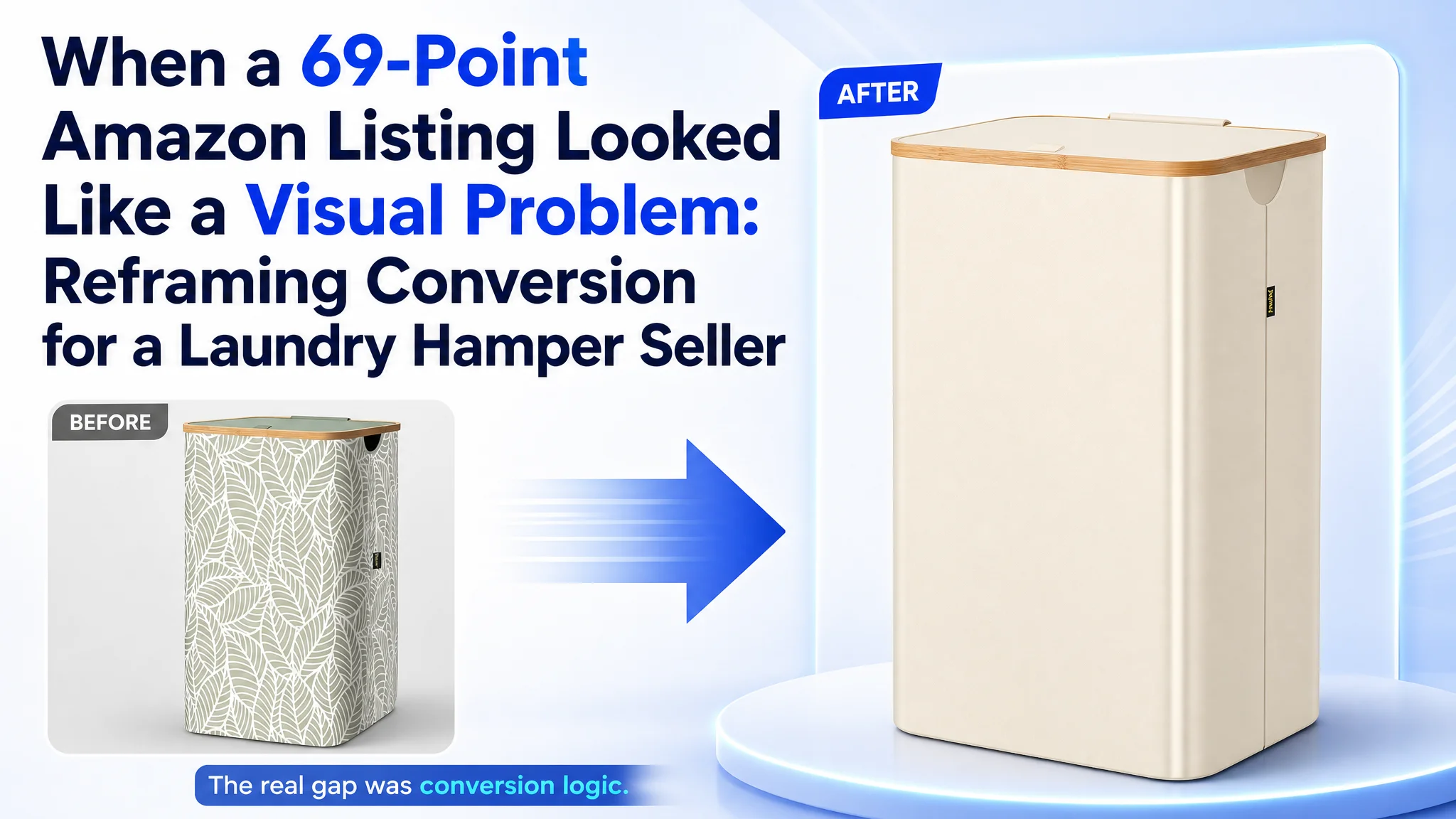
The customer was an Amazon seller with a laundry hamper Listing that had already received substantial content work: lifestyle photography, material details, size information, foldability messaging, and multiple home-use scenarios. Yet the Listing remained weaker than a comparable high-performing Amazon product page, with a total score of 69 versus 84.
The initial diagnosis leaned toward presentation: improve the premium look, refine the images, and explain the product more clearly. DeepBI found a more fundamental issue. The page contained information, but it did not lead shoppers through the decisions that mattered most: Will the hamper stay upright? Can it handle daily laundry? Will it contain clutter and odors? Is it easy to carry, assemble, and store?
That changed the optimization direction. Instead of treating the Amazon Listing as a collection of attractive assets, the team reframed it as a conversion sequence: surface the household problem, prove structural stability, demonstrate daily handling, then support the final choice with size, style, and material details. The case offers a useful lesson for Amazon sellers: when a product page has traffic or content but still struggles to convert, the problem may be the order and logic of persuasion rather than the amount of information.
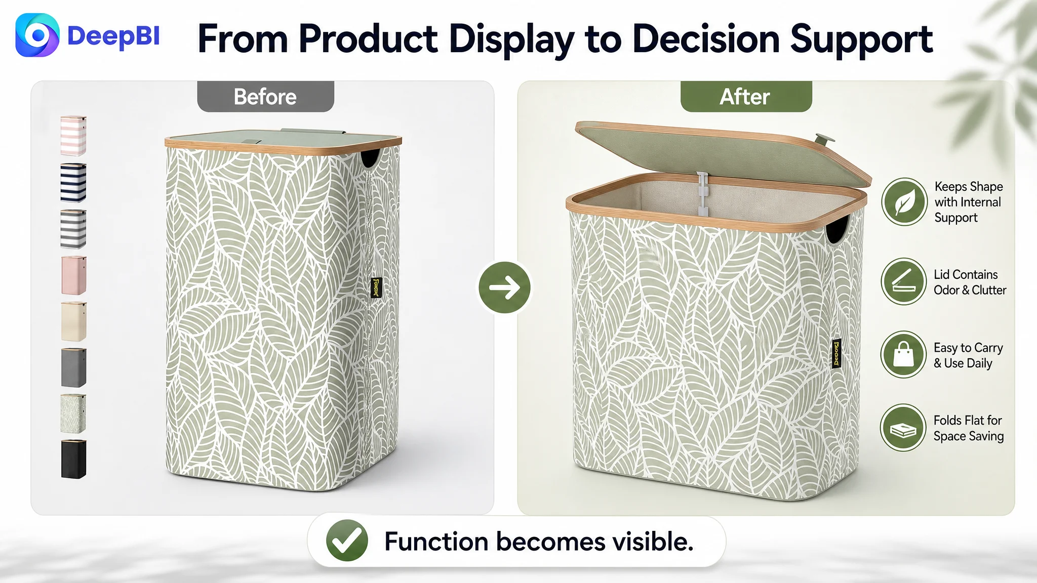
The Amazon Listing Had Content. It Did Not Yet Have Enough Decision Power.
The customer’s Amazon Listing was for a tall, foldable laundry hamper with a bamboo lid and handles, internal support, and an Antique Foliage finish. The 18-gallon/70-liter variation was presented for bedrooms, bathrooms, dorms, and laundry rooms, with additional size and color options available.
On the surface, the page was not empty or careless.
It included:
- A designed main image sequence
- Material and structure details
- Size and capacity comparisons
- Foldable storage information
- Multiple lifestyle settings
- A+ content built around bedroom, bathroom, nursery, and laundry-room scenes
- A title that covered product type, capacity, support structure, foldability, and usage locations
The problem was that these elements were not making equal contributions to conversion.
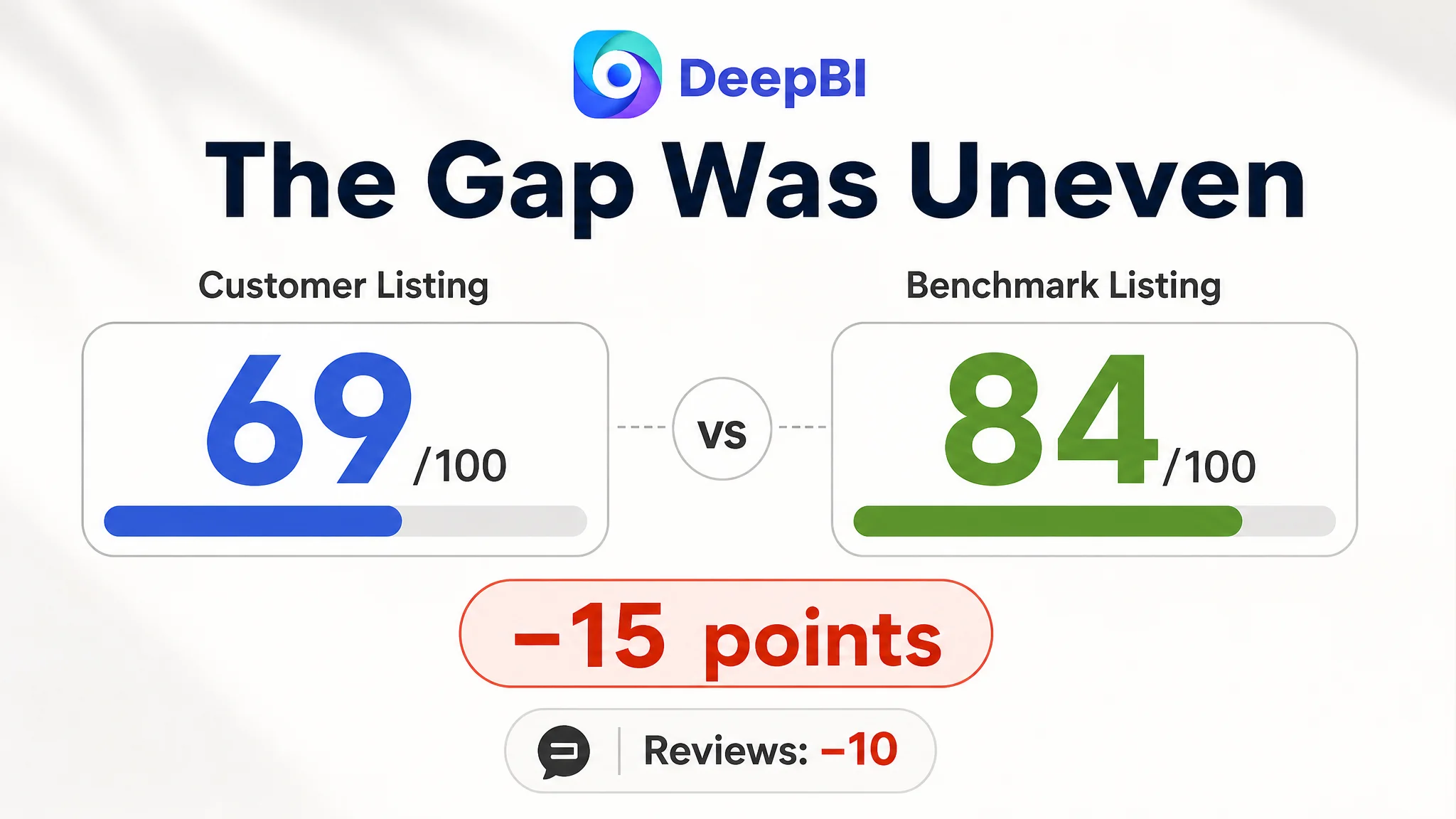
DeepBI’s comparison produced a total score of 69/100, compared with 84/100 for a closely matched benchmark Listing.
The gap was not evenly distributed:
- Title: Customer Listing: 15/20, Benchmark Listing: 17/20, Gap: -2
- Main images: Customer Listing: 24/30, Benchmark Listing: 25/30, Gap: -1
- Bullet points: Customer Listing: 5/10, Benchmark Listing: 8/10, Gap: -3
- A+ content: Customer Listing: 21/25, Benchmark Listing: 20/25, Gap: +1
- Reviews: Customer Listing: 4/15, Benchmark Listing: 14/15, Gap: -10
- Total: Customer Listing: 69/100, Benchmark Listing: 84/100, Gap: -15
The first important judgment was that the Listing did not have one isolated “bad image.” It had a conversion-logic imbalance.
The customer’s A+ content was already stronger than the benchmark in several respects. It used polished full-width lifestyle images, clear size information, liter-to-gallon conversions, and room-specific applications. But the title, bullet points, main-image order, and review profile were not helping shoppers reach confidence quickly enough.
The page did not lack information. It lacked a clear path from household frustration to purchase confidence.
The Initial Direction Focused on Quality and Appearance
The customer had emphasized several legitimate strengths:
- Elegant bamboo detailing
- Sustainable materials
- A refined home-decor appearance
- Fabric texture
- Multiple sizes and colors
- Foldability
- Internal support
Those strengths mattered, especially for a home-storage product that needs to remain visible in a bedroom or bathroom. But the early presentation treated them mainly as product attributes.
That created a subtle misdiagnosis.
The Listing was being optimized as if the main issue were:
- The product needed to look more premium
- The material story needed more emphasis
- The page needed more complete specifications
- The visual style needed greater consistency
DeepBI did not reject those improvements. It changed their priority.
For this category, shoppers are not only buying a decorative container. They are trying to solve a recurring set of practical problems:
- Dirty clothes accumulating in visible piles
- Odors spreading through a room
- A hamper becoming misshapen when empty
- Heavy laundry being difficult to move
- Assembly taking too much effort
- Limited storage space when the hamper is not in use
The benchmark Listing addressed those concerns directly. The customer Listing often described the product from the inside out: material, appearance, capacity, environmental positioning, and room placement.
That difference explains why a visually polished page can still underperform.
The Largest Gap Was Not Aesthetics. It Was Trust.
The review dimension was the clearest commercial weakness.
The customer Listing showed:
- 3.7 stars
- 70 total reviews
- No useful review content visible on the first page
The benchmark Listing showed:
- 4.4 stars
- 7,585 total reviews
- Richer written feedback, images, and videos
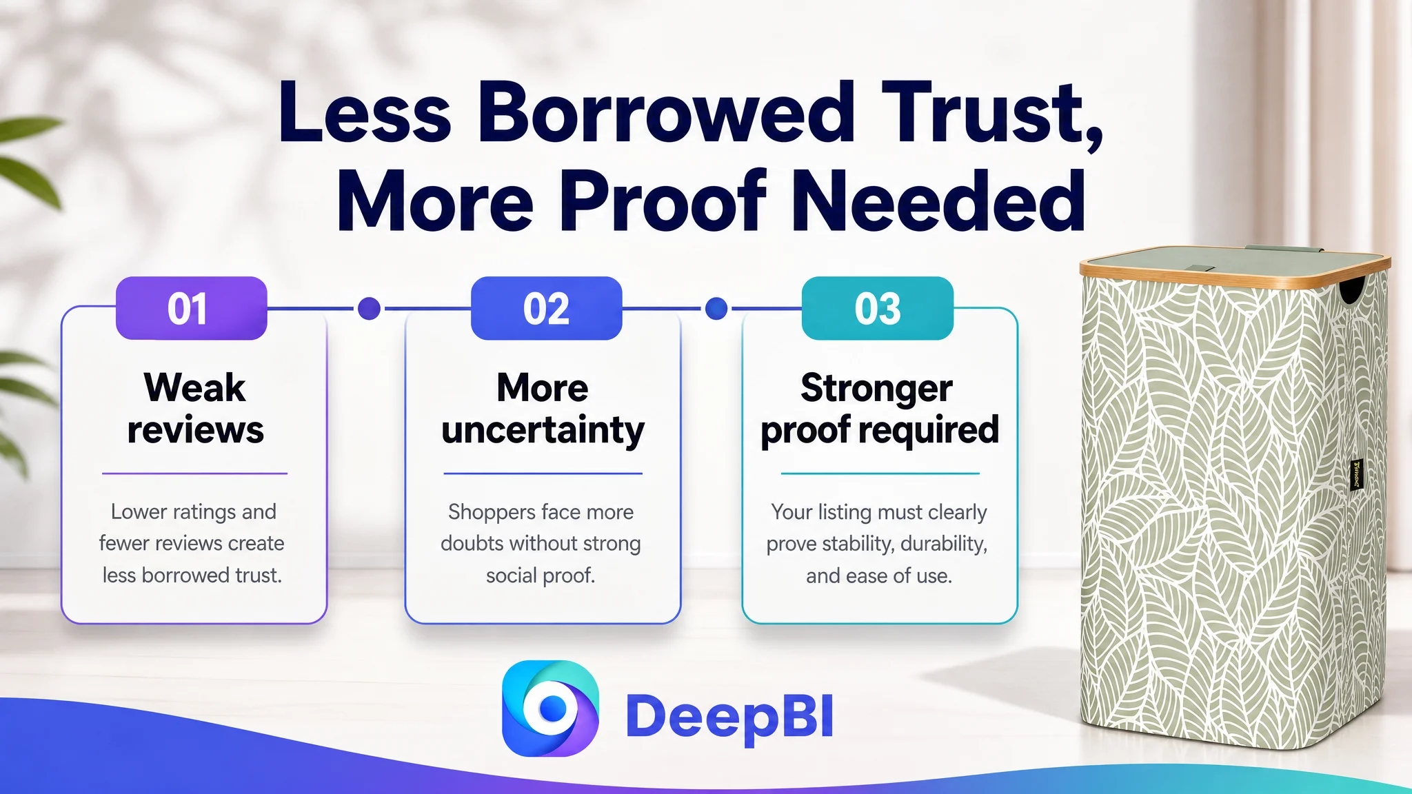
This created a large trust disadvantage for a product that shoppers may evaluate through durability and daily usability. A customer deciding between two laundry hampers is likely to ask whether the structure holds its shape, whether the handles feel reliable, whether the lid is convenient, and whether the product works as shown.
The Listing could not quickly borrow enough confidence from social proof.
That made the product page’s own content more important. When review equity is weak, the title, main images, bullet points, and A+ content must work together to reduce uncertainty. They cannot manufacture customer feedback, but they can make the product’s logic easier to understand and its functional claims easier to verify.
This is where the review gap and the content gap became connected.
The review weakness was not the only problem, but it increased the cost of unclear messaging. A well-established benchmark could rely on years of social proof to absorb some ambiguity. The customer Listing had less room for ambiguity.
The Title Was Spending Valuable Space on the Wrong Priority
The title score was 15/20, only two points behind the benchmark. That might appear minor, but the issue was structural rather than purely numerical.
The benchmark title led with a clear capacity signal and then moved into high-intent features such as:
- Large capacity
- Foldable design
- A removable bag
- Lid
- Bamboo handles
- Bedroom, bathroom, dorm, and laundry-room use
The customer title used a more complex capacity expression, 18 Gal/70L, without placing the most important capacity cue early enough. It also used “Internal Support,” which described a construction feature but did not immediately express the customer outcome: the hamper stays upright and resists collapsing.
The title also gave valuable space to “Antique Foliage,” a color descriptor with less search and decision value than capacity, foldability, or use-case keywords.
The suggested title direction therefore moved toward:
- Laundry hamper as the primary product phrase
- Bamboo lid and handles near the front
- 70L capacity stated clearly
- Foldable structure retained
- Bedroom, bathroom, dorm, and laundry-room scenarios added
- Internal support preserved as a differentiating structural feature
This was not keyword stuffing. It was a reordering of the customer’s decision priorities.
The title needed to tell shoppers what the product is, where it fits, and why its structure matters before it described the finish.
The Main Images Explained Features but Did Not Escalate the Buying Argument
The main-image score was relatively strong at 24/30. The problem was not that the images were unusable. It was that the sequence did not maximize the information available during rapid Amazon browsing.
The first image showed the product, but not enough of its function
The opening image established the style and Antique Foliage pattern, along with the natural bamboo rim. That supported visual positioning, but the hamper was shown closed.
A slightly open or removed lid could communicate two important ideas immediately:
- The product is easy to access
- The interior has meaningful capacity for clothes, towels, and other household items
The change would preserve the product’s actual design while making its usefulness more visible at the discovery stage.
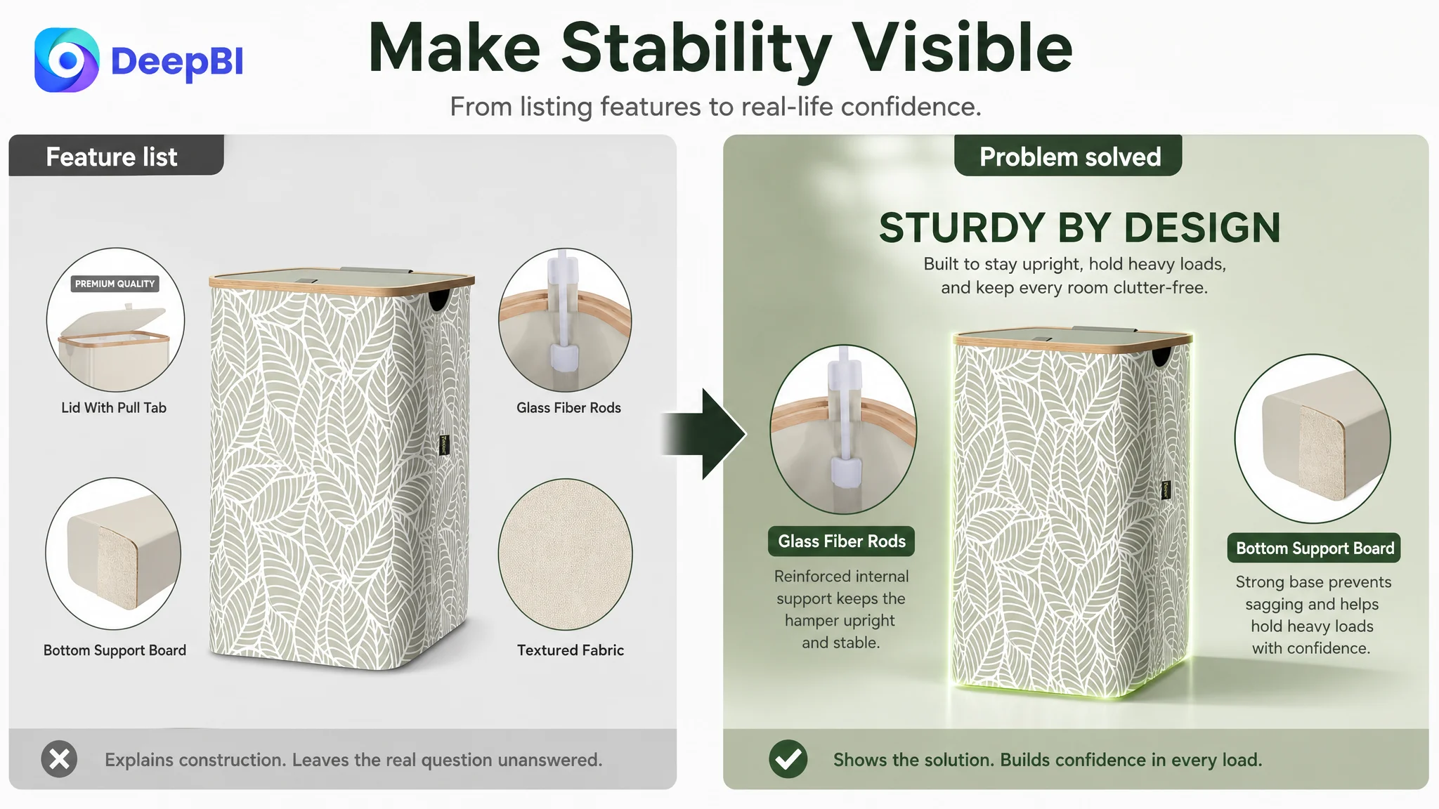
The second image needed to answer the collapse concern
The customer’s structural image focused on premium quality, glass fiber rods, the bottom support board, and construction details. Those facts were valid, but the presentation remained passive.
For a foldable fabric hamper, one of the likely concerns is whether it will remain upright when empty or loaded. The stronger image direction was therefore to turn the construction details into a solution:
- Show the internal support structure as the reason the hamper maintains its shape
- Make the glass fiber rods and bottom support board visually legible
- Contrast stable shape maintenance with the common fear of a collapsed fabric basket
- Present the structure as a practical benefit, not merely a premium-material claim
This is an important distinction in Amazon image strategy.
A technical detail becomes more persuasive when the buyer understands what problem it prevents.
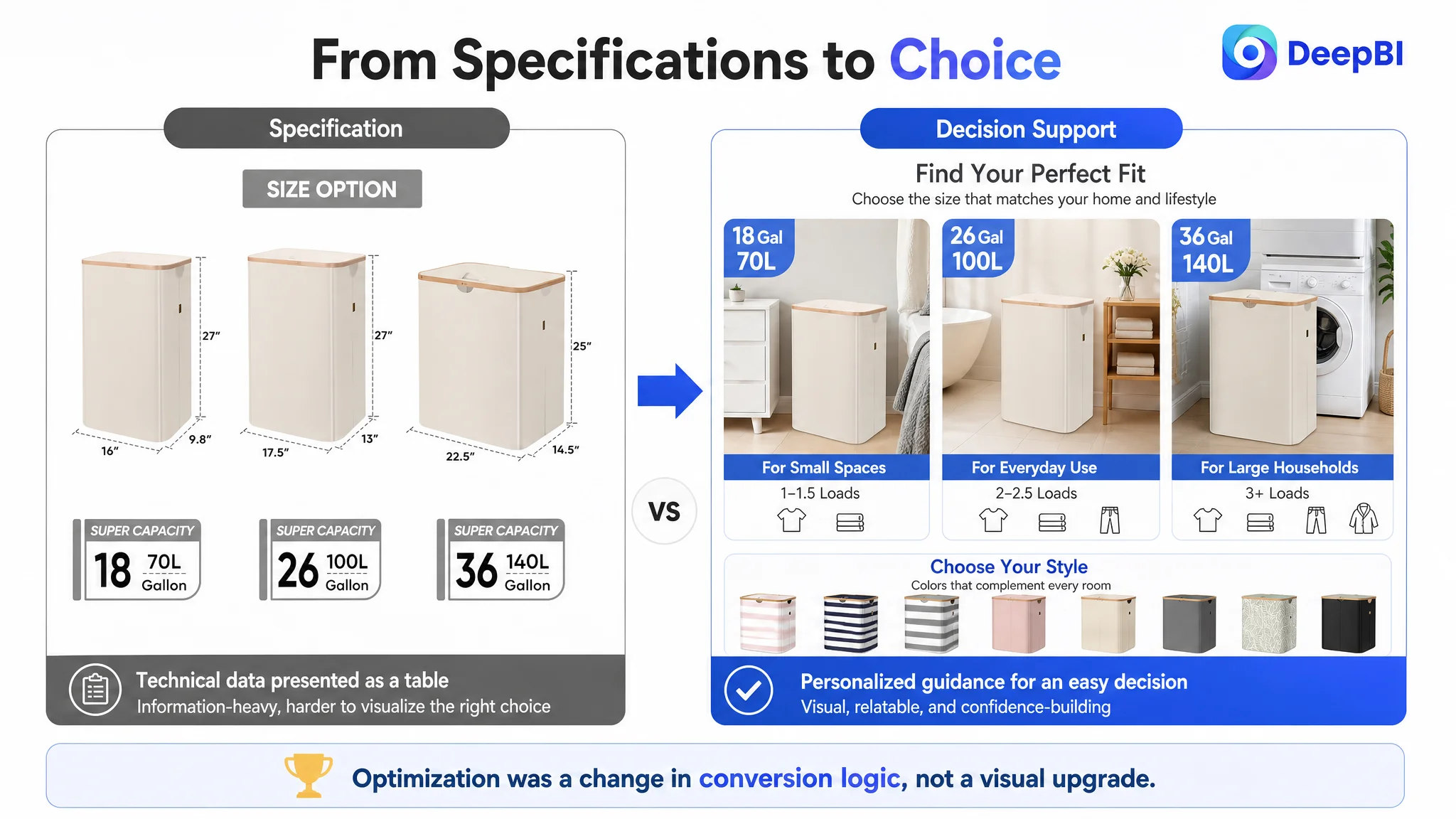
Size information should follow functional reassurance
The size image was useful and included dimensions, capacity conversions, and size options. DeepBI did not recommend removing it. It recommended moving it after the stability message.
The preferred sequence was:
1. Discover the product and its access
2. Understand why it stays upright
3. Choose the right capacity
4. See how it fits into daily use
5. Understand assembly and compact storage
That order follows the shopper’s logic more naturally than presenting specifications before the product’s core usability has been established.
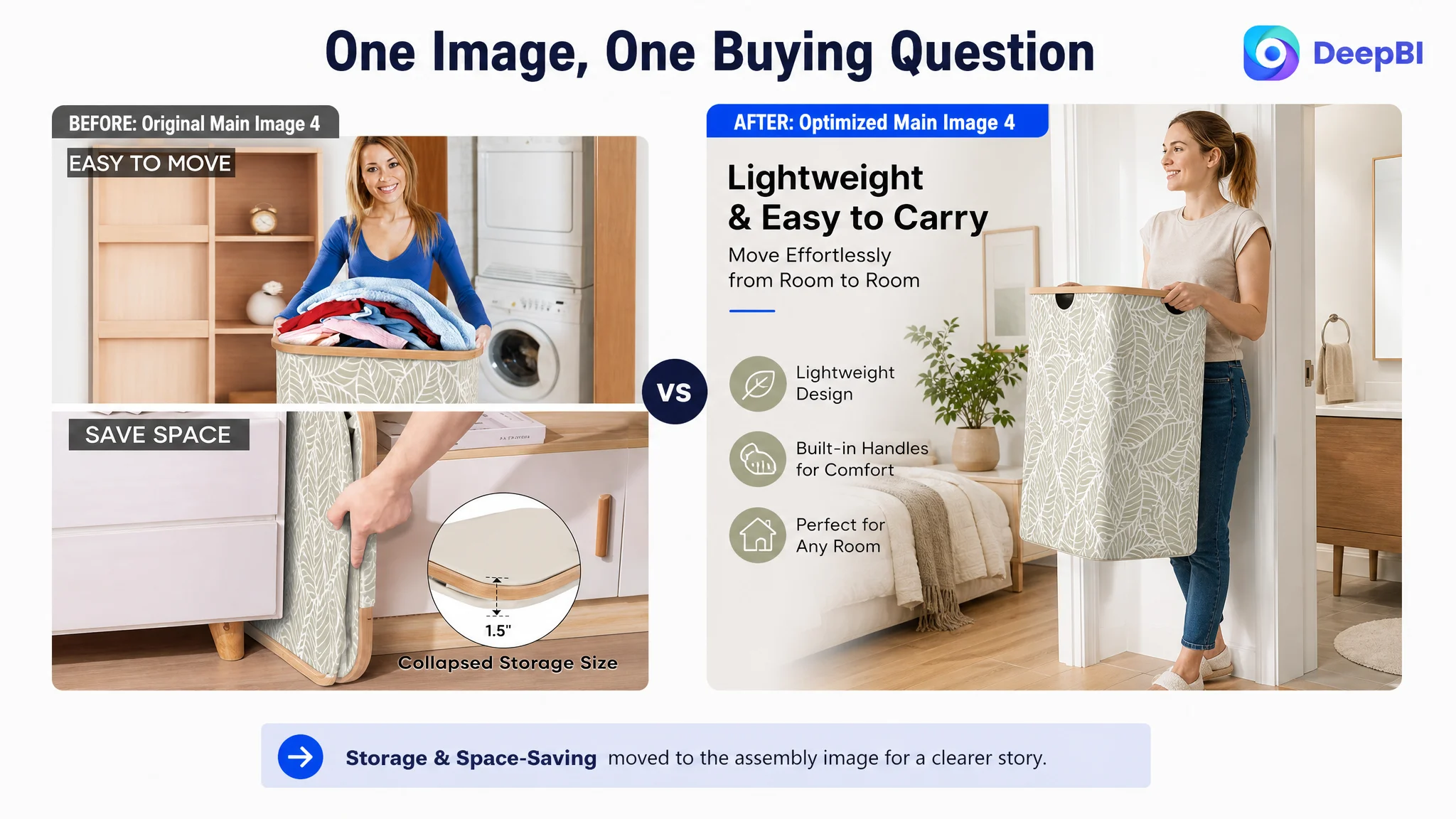
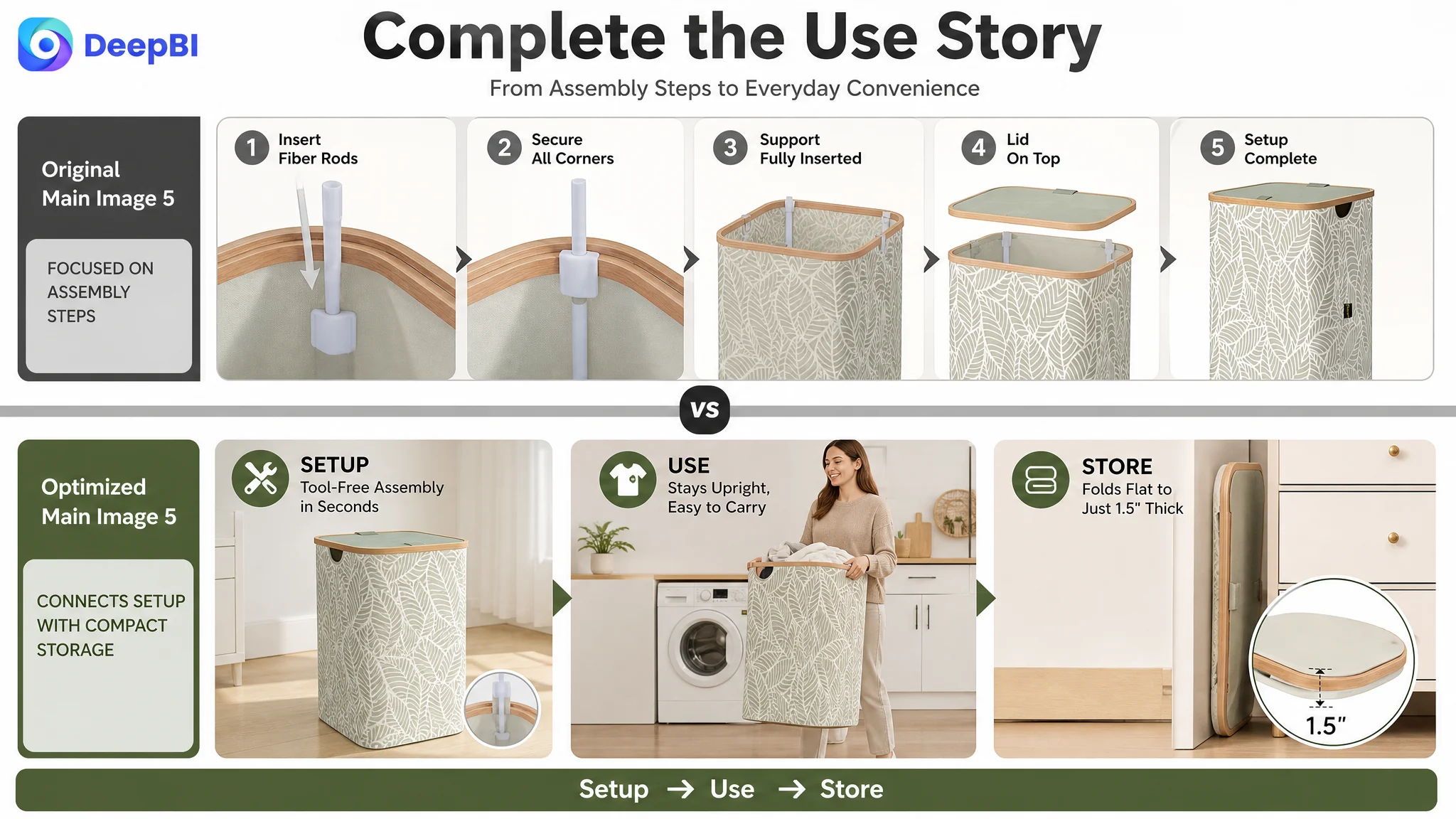
Portability and assembly needed clearer separation
The existing portability and storage image combined several ideas, including room-to-room use and collapsed storage. That diluted both.
The revised logic separated them:
- One image focused on lightweight movement through bedrooms, bathrooms, and dorms
- Another focused on tool-free setup and compact storage
- The assembly sequence showed the support rods being inserted
- The takedown sequence connected directly to the collapsed storage size, including the stated 1.5-inch profile
This created a more coherent “unbox, assemble, use, store” story.
Advertising or visual traffic cannot fix a page that asks shoppers to assemble the product’s value for themselves.
The Bullet Points Were Written as Features, Not Answers
The five-point section scored only 5/10, with a three-point gap against the benchmark.
The customer’s bullets contained relevant information, but the structure leaned toward:
- Appearance and material
- Capacity and dimensions
- Environmental positioning
- Usage scenarios
- Brand support
The benchmark Listing led with the customer’s practical concerns:
- Storing dirty clothes and household items
- Containing odors
- Carrying laundry
- Folding and storing the hamper
- Demonstrating capacity and load support
DeepBI’s recommended rewrite did not require inventing a new product. It reorganized confirmed characteristics into a clearer problem-solution structure.
The first bullet should connect style to placement
The bamboo rim and neutral styling were legitimate strengths. But instead of presenting appearance as a standalone benefit, the bullet should explain how the design works in a bedroom, bathroom, or dorm while the internal support helps the hamper maintain its shape.
That gives the aesthetic claim a practical context.
The second bullet should make capacity usable
“70L” is more useful when shoppers can relate it to a household task. The suggested direction connected the capacity with approximately two to three loads of clothes, towels, or bedding, while also explaining that the lid conceals clutter and helps prevent odors from spreading.
The important principle is not the number alone. It is the number attached to an expected use.
The third bullet should turn structure into reliability
The customer’s sustainable-material message was not discarded. It was combined with the internal support structure to answer a more immediate question: will the hamper remain upright under normal use?
The bullet therefore connected bamboo, high-strength fabric, and internal support to durability and shape maintenance.
The fourth bullet should remove assembly uncertainty
Foldability is more compelling when the shopper understands how it works. The suggested copy clarified that the support rods can be inserted without tools and removed when the hamper needs to be stored flat.
This matters because “foldable” can otherwise sound like a vague attribute rather than a practical advantage.
The fifth bullet should explain movement
The bamboo handles and lightweight construction were positioned around moving the hamper from room to room. That is more concrete than describing the material alone.
The result is a five-point sequence that answers:
1. Where does it fit?
2. How much can it hold?
3. Will it stay stable?
4. How is it assembled and stored?
5. How is it moved?
That sequence is more commercially useful than a list of product qualities.
The A+ Page Was Stronger Than the Benchmark, but It Entered the Story Too Late
The A+ score was 21/25, one point higher than the benchmark. This is a critical nuance.
The customer did not need a wholesale replacement of the A+ content. It already had advantages:
- High-quality lifestyle scenes
- A consistent visual atmosphere
- Specific dimensions and capacity conversions
- Multiple real-home applications
- A stronger premium-home positioning
The issue was the order of persuasion.
The existing A+ content moved quickly toward style, space, and visual integration. The benchmark used stronger early emotional hooks around messy clothes, bad odors, and household clutter.
DeepBI’s recommendation was to shift the A+ sequence from:
Product introduction → material details → specifications → lifestyle scenes
toward:
Household frustration → handling and transport → structural proof → daily access → material confidence → size and style choice → final home integration
Begin with the problem shoppers already feel
The first A+ module should make the product’s purpose immediately recognizable:
- Messy clothes
- Odor concerns
- General household clutter
- The need to keep bedrooms, bathrooms, and dorms organized
This does not mean using exaggerated emotional language. It means acknowledging the actual context in which the product is evaluated.
Show how the product is handled
The next module should demonstrate the bamboo pull handles and the process of moving the hamper. The focus should remain on the confirmed frame handles and should not imply an unverified removable bag function.
The buyer should be able to understand how the product is lifted and transported without guessing from a lifestyle image.
Prove the internal structure
The structural module should show how the support system is assembled and why it helps the hamper maintain its shape. This is the missing bridge between the product’s foldable nature and the buyer’s expectation of stability.
A simple assembly demonstration can do more for trust than another generic material close-up.
Verify the lid in daily use
The lightweight lid deserved its own functional moment. The A+ page should show:
- Easy lifting
- Quick access
- Closing after use
- The lid’s role in concealing clutter and helping contain odors
This turns a visual design element into a reason to choose the product.
Move material messaging toward the decision point
The fabric texture and bamboo rim were attractive, but a texture swatch alone did not advance the buying decision. The improved module should connect:
- Durable fabric
- Natural bamboo
- Sustainable positioning
- Long-term visual appeal
- Fit with a well-kept home
The material story becomes more credible when it follows functional proof.
Let size and color support personal fit
The size-and-color module should not operate as a cold specification table. It should help shoppers match the product to their space and style:
- 18-gallon, 26-gallon, and 36-gallon options
- The 18-gallon Antique Foliage variation as the featured choice
- Other color options shown clearly
- Capacity and room fit presented together
The final lifestyle module can then reassure the buyer that the selected variation belongs in a modern bedroom or bathroom, rather than looking like a temporary utility item.
Why DeepBI Did Not Treat More Advertising as the First Answer
The available case material does not include post-optimization advertising results such as CVR, ACOS, TACOS, or organic-order changes. It would therefore be misleading to claim that this Listing rewrite already reduced advertising costs or increased orders.
The decision logic is still clear.
When a product page has a 15-point competitive gap, weak bullet-point logic, a substantially weaker review profile, and a page sequence that delays functional proof, sending more paid traffic to the same page carries a risk: the advertising may amplify a low-conversion experience.
That does not mean Amazon ads are irrelevant. It means ads should not be used to compensate for a page that has not yet answered the buyer’s central questions.
The current priority was therefore to repair the Listing’s conversion capacity first:
- Clarify the search and product promise in the title
- Make stability visible in the main images
- Rebuild the bullets around household problems and solutions
- Reorder A+ content around emotional entry, functional proof, and final reassurance
- Use the product page to compensate, as far as possible, for limited social proof
Only after that foundation is in place can advertising data provide a cleaner read on traffic quality and page performance.
The Reframed Business Problem
The customer did not have a product with no strengths.
The Listing already had:
- A differentiated foliage design
- Natural bamboo elements
- Multiple sizes and colors
- Useful specifications
- Strong lifestyle photography
- A+ content with clear home-setting value
The constraint was that these strengths were not arranged around the buyer’s highest-risk questions.
The customer was presenting a laundry hamper as a tasteful home accessory with useful functions. DeepBI reframed it as a solution to a sequence of daily frustrations:
1. Laundry becomes visible and disorganized.
2. Odors and clutter need to be contained.
3. The hamper must remain upright and dependable.
4. The load must be easy to move.
5. The product must be simple to assemble and store.
6. The final size and style must fit the home.
That is the difference between adding more content and improving conversion logic.
The strongest optimization was not “make the page look better.” It was “make each page element answer the next question in the buying decision.”
What Amazon Sellers Can Take From This Case
This case does not support a claim of completed performance improvement because no post-change metrics were provided. It does support a clearer operating model for Amazon Listing diagnosis.
A strong Listing is not automatically a strong conversion asset. Even when the A+ page looks polished and the product has credible features, the page can underperform if:
- The title delays the most important product and capacity cues
- The main images explain construction without showing the problem solved
- The bullet points list attributes without connecting them to use
- The A+ content starts with aesthetics before establishing urgency
- Weak reviews leave the page without enough borrowed trust
- Advertising is asked to scale before the page is ready to convert
The customer’s revised direction was therefore not a collection of isolated copy and image edits. It was a change in business judgment.
The page needed to prove stability before emphasizing premium materials, explain use before displaying specifications, and connect style to practical household value. Once those priorities were clear, the title, main images, bullets, and A+ modules could work as one Amazon product-page system rather than as separate content blocks.
That is the deeper lesson for Amazon sellers: before increasing traffic, decide whether the Listing has earned the right to receive more of it.