


This case involved an Amazon seller whose women’s halter crop top Listing was competing for traffic without giving shoppers enough reasons to click, trust, or buy. The customer initially viewed the problem as an advertising and keyword issue, assuming that better targeting or more traffic would improve performance.
DeepBI’s diagnosis pointed somewhere else. The Listing scored only 36 out of 100 against a comparable high-performing Amazon Listing at 84, with the largest gap concentrated in the product detail experience. The page had limited visual proof, no meaningful review foundation, and weak connections between product features and customer benefits.
The later optimization therefore focused first on the Amazon product page: restructuring the title, turning bullet points into a buying argument, replacing repetitive images with proof-oriented visuals, adding lifestyle and sizing content, and building a more complete A+ experience. The lesson for other Amazon sellers is direct: before increasing ad pressure, confirm that the Listing can convert the traffic it already receives.
The seller saw an advertising problem
The product was a women’s halter crop top with a sleeveless, backless design, tie detail, cropped fit, and multiple creative patterns. It was positioned for summer outfits, dates, vacations, parties, streetwear, and other going-out occasions.
On Amazon, this type of product competes in a highly visual decision environment. Shoppers often make an initial judgment from the search result, then use the image stack, title, bullet points, reviews, and A+ content to decide whether the product is worth the risk.
The customer’s initial concern was understandable: if traffic was not producing enough orders, the instinct was to look at advertising structure, keyword selection, bids, and targeting. In that diagnosis, the Listing was treated as a traffic destination that only needed more qualified visitors.
But the deeper question was different:
Was the Amazon product page giving paid traffic enough evidence to convert?
That question changed the direction of the case.
The first diagnosis was incomplete
The customer’s Listing had a serious visibility problem. The title began with irrelevant and confusing wording, including “Chef Hat Cooking Tools,” even though the product belonged to the women’s tops category.
This created two immediate risks:
- Search relevance could be weakened by unrelated terms.
- Shoppers could struggle to understand what the product was before deciding whether to click.
The title also lacked important style and occasion language. It did not clearly communicate terms such as halter, corset style, Y2K, summer, or going-out wear in a structured way. Instead, the core product information was scattered and the design attributes were not arranged around a clear buying intent.
That could easily be interpreted as a keyword problem.
However, fixing the title alone would not solve the full conversion issue. Even a more relevant title would still lead shoppers to a page with weak visual proof, no review foundation, and almost no A+ storytelling.
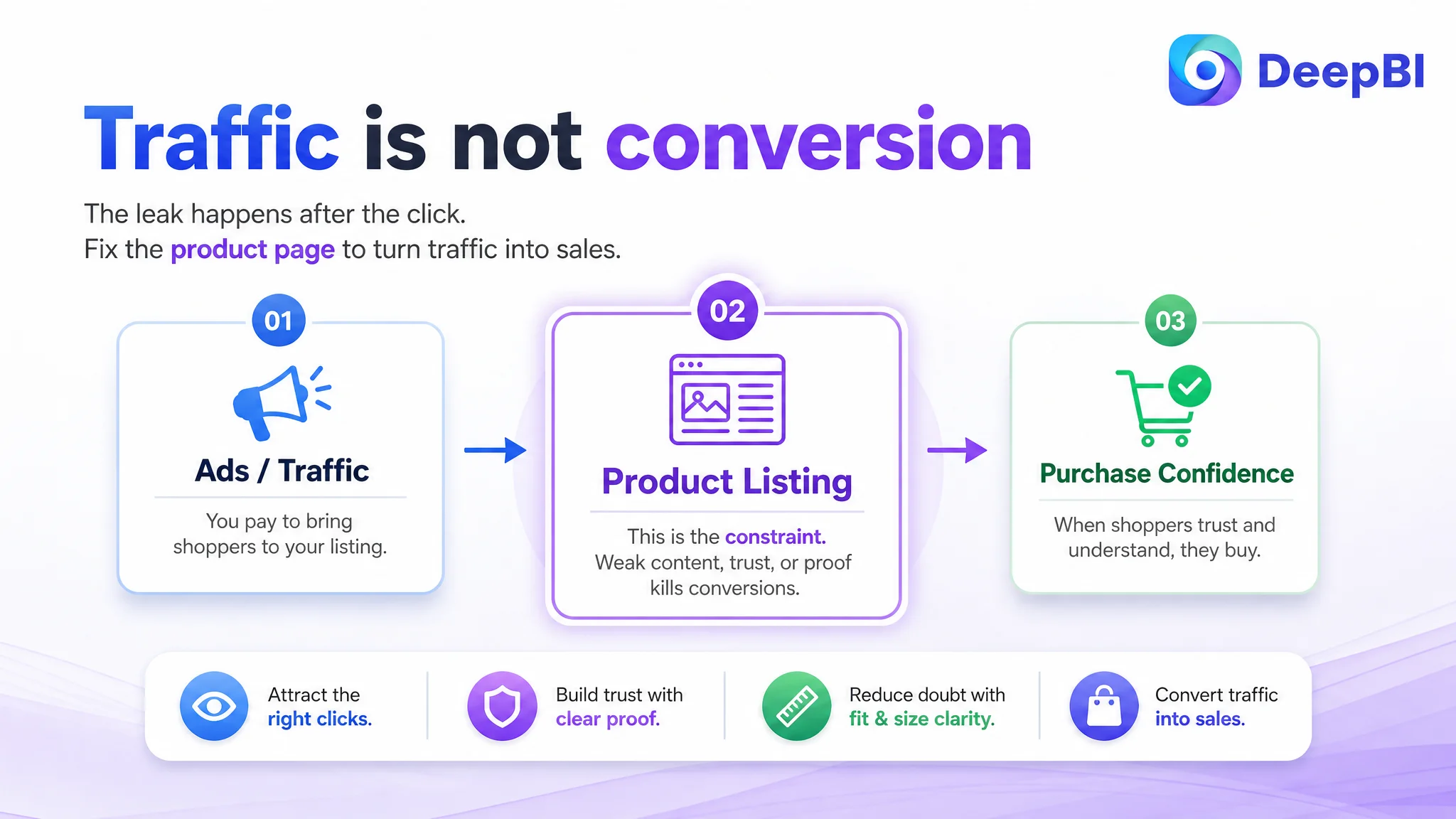
The seller was looking at the traffic entrance. DeepBI found that the larger constraint was what happened after the click.
The score gap showed where the Listing was losing trust
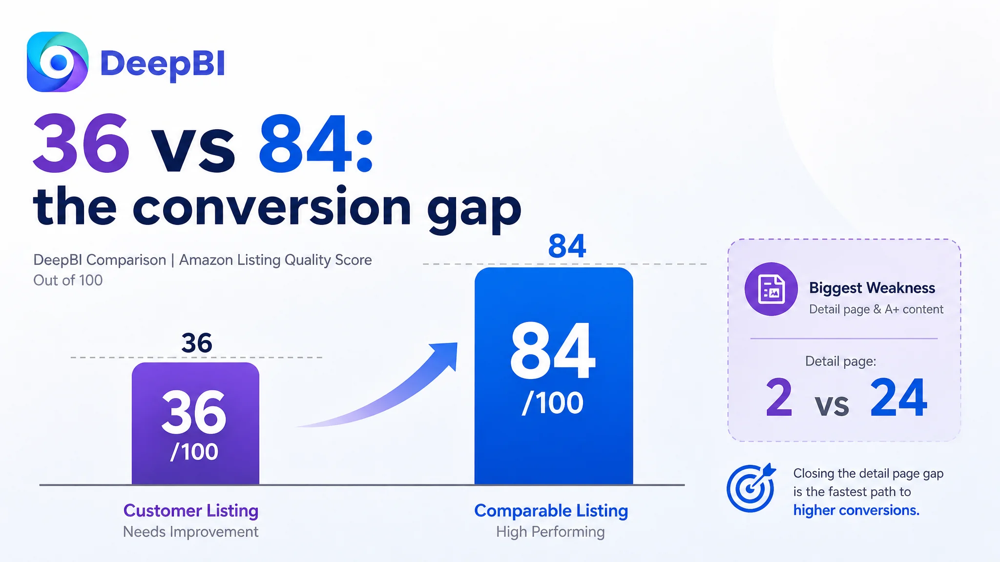
DeepBI’s comparison produced a total score of 36 out of 100 for the customer’s Listing, compared with 84 out of 100 for a comparable high-performing Listing.
- Title: Customer Listing: 11/20, Comparable Listing: 17/20, Gap: -6
- Main images: Customer Listing: 16/30, Comparable Listing: 25/30, Gap: -9
- Bullet points: Customer Listing: 5/10, Comparable Listing: 7/10, Gap: -2
- Detail page and A+ content: Customer Listing: 2/25, Comparable Listing: 24/25, Gap: -22
- Reviews: Customer Listing: 2/15, Comparable Listing: 11/15, Gap: -9
- Total: Customer Listing: 36/100, Comparable Listing: 84/100, Gap: -48
The most important signal was not that every dimension was weaker. It was that the gaps were concentrated in areas that influence shopper confidence.
The detail-page gap alone was 22 points. The customer’s A+ content relied on basic text and did not provide a visual explanation of how the product looked, fit, or worked in real situations. The comparable Listing used lifestyle imagery, buyer-style content, feature close-ups, a size chart, outfit guidance, and a brand-oriented visual structure.
The review gap added another layer of risk. The customer Listing had no rating history and no review count, while the comparable Listing had a 4.5-star rating and 78 reviews. This did not prove that reviews were the only reason for the performance difference, but it did show that the customer’s page lacked a basic trust signal already available to shoppers elsewhere in the category.
The diagnosis was therefore not “the ads need more tuning.”
It was:
The Amazon Listing had insufficient conversion capacity. Advertising would bring people to a page that had not yet established enough relevance, product understanding, fit confidence, or trust.
The main image was not only a design problem
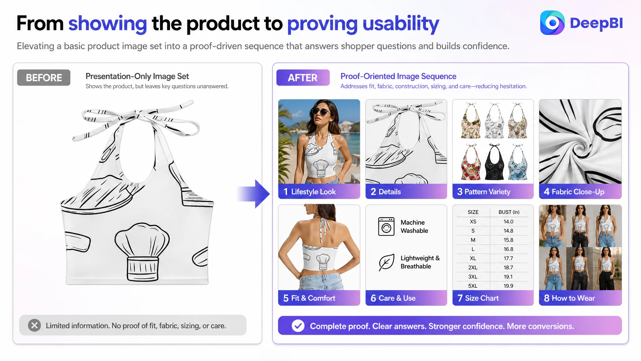
The customer’s image set showed the product, but several images repeated the same basic function: displaying the garment from different angles or presenting it in a general setting.
That created information waste.
For a fashion product with a halter neckline, backless construction, cropped length, and tie detail, shoppers still need answers to practical questions:
- How does the back tie adjust?
- Does the garment appear supportive or flimsy?
- What does the fabric look like at close range?
- How does the product fit on a real body?
- Is the silhouette clear from the front and back?
- What size information is available?
- Can the shopper imagine wearing it outside a beach setting?
The comparable Listing used its image sequence to answer more of these questions. It combined model views, construction details, styling context, and visual explanations of the product’s design.
The customer’s images, by contrast, leaned more heavily on general presentation. The issue was not that the images were unusable. The issue was that they did not assign each image a distinct role in the buying decision.
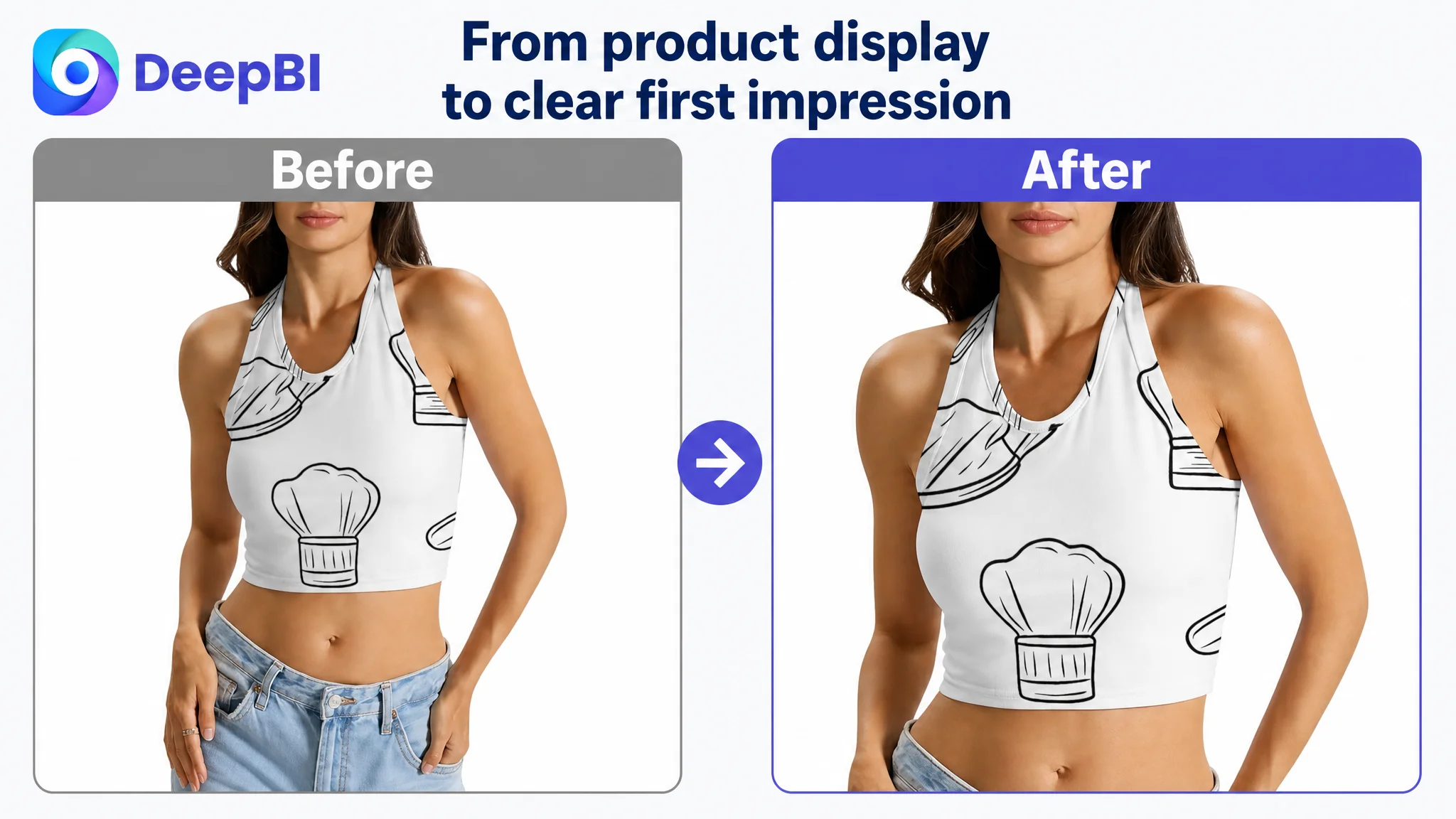
The first image needed to earn the click
The first image’s role was to establish style, fit, pattern, and the halter design. That foundation should be retained.
But the product also needed to look substantial and intentionally constructed. The optimization direction was not to invent a new material or claim an unverified structural feature. It was to improve the way the existing garment was presented so that shoppers could better judge its shape, fabric, and quality.
For Amazon search results, visual appeal is not separate from product communication. A shopper needs to recognize the category quickly and understand the intended style without having to decode the image.
The second image needed to prove something new
The customer’s second image added a street setting but did not resolve a specific purchase concern. A stronger role for this position would be to show a physical detail such as the tie construction, stitching, fabric texture, or another verifiable element already present in the product.
This is where DeepBI’s reasoning mattered. The instruction was not simply to “make the image more premium.” It was to connect the image to a specific uncertainty.
The back view needed to demonstrate adjustability
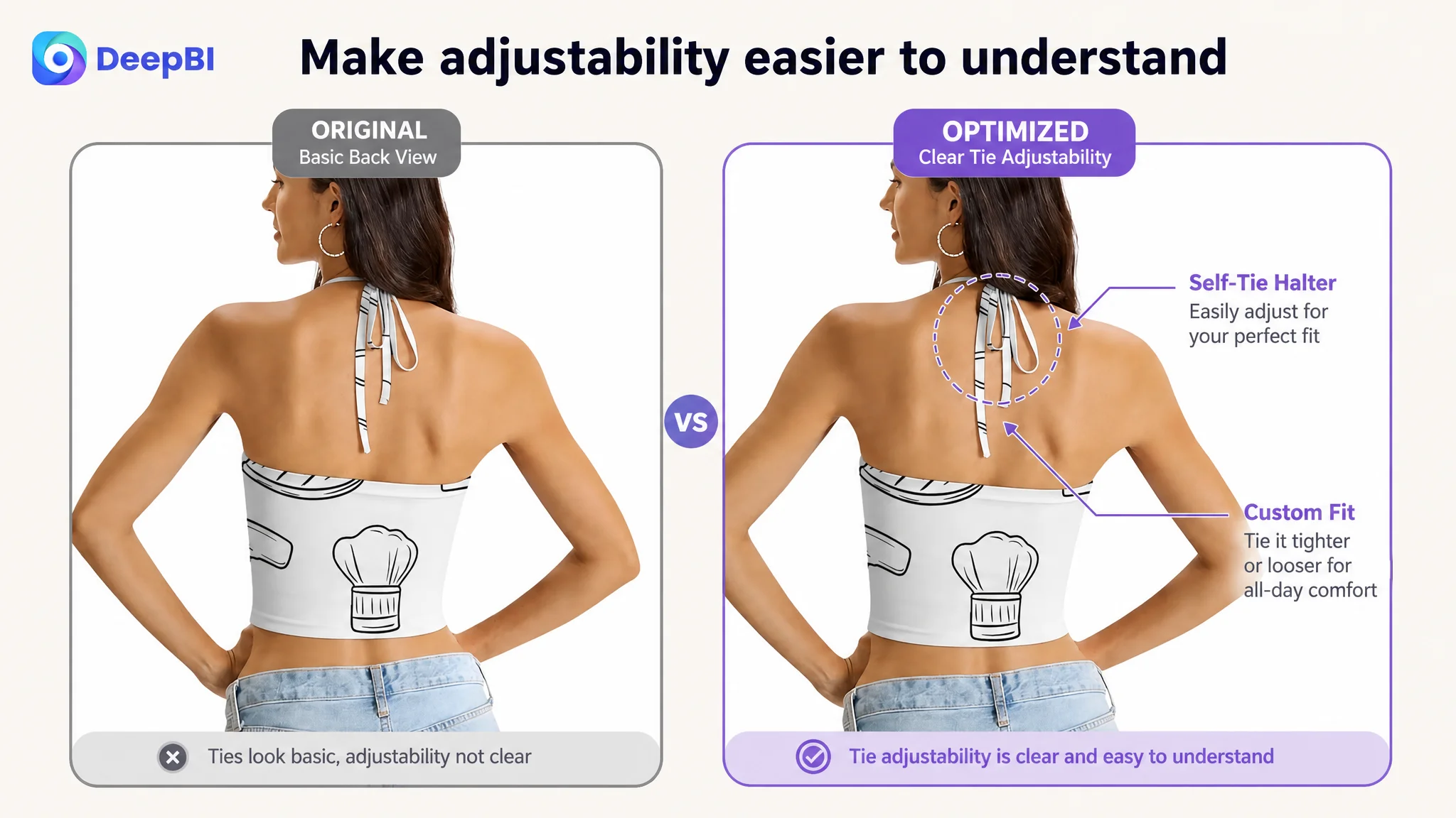
The back view confirmed the backless design and halter construction, but it did not clearly show how the tie could be handled or adjusted.
For a product where fit is a meaningful concern, showing the tie detail more clearly could help reduce uncertainty. The purpose was not to promise a fit beyond the product’s actual capabilities. It was to make the existing adjustment logic easier to understand.
Repetition had to become evidence
The flat-lay images also presented the product, but they did not sufficiently establish construction or care-related confidence. A more useful sequence would distinguish between:
- Style and silhouette
- Back and tie functionality
- Fabric appearance
- Stitching or construction details that can be verified
- Sizing and fit guidance
The principle was simple: each image should answer a different question.
The bullet points had information, but not enough buying logic
The original bullet-point structure focused mainly on material, design, pattern, sizing, and occasions. Those topics were necessary, but the wording stayed close to product description.
The stronger competitor structure translated details into shopper outcomes. It connected fabric with comfort, design with adjustability, and the product with specific ways to wear it.
That distinction matters on an Amazon product page.
A bullet point that says a top has a halter neck provides information. A bullet point that explains how the tie detail supports a more customizable fit gives the shopper a reason to care.
The recommended structure moved through five buying questions:
1. What will it feel like to wear?
The material description was reframed around lightweight feel, breathability, softness, durability, and machine-washable care, where supported by the product information.
2. How does the product fit and adjust?
The halter, sleeveless, backless, cropped, and tie-back design were presented as a connected fit story rather than as isolated labels.
3. What style does it express?
The variety of floral, camouflage, tie-dye, retro, and graphic patterns was positioned as a choice of aesthetic rather than a long inventory of prints.
4. Will it fit different shoppers?
The XS-to-5XL range was brought forward as an important sizing message, while precise bust measurements were reserved for a clear size chart.
5. What can the shopper wear it with?
The bullet points added practical styling direction, such as pairing the top with high-waisted jeans for a street look or a mini skirt for dates, parties, and festivals.
This was not a matter of adding more adjectives. It was a change from feature listing to decision support.
A product page converts more effectively when the shopper can connect a product detail to a personal outcome.
The missing A+ content created the largest conversion leak
The biggest weakness was the detail page.
The customer’s A+ area was largely text-based and lacked the visual modules needed to build product confidence. For a fashion item, this meant shoppers had limited opportunity to understand the garment beyond the basic image stack.
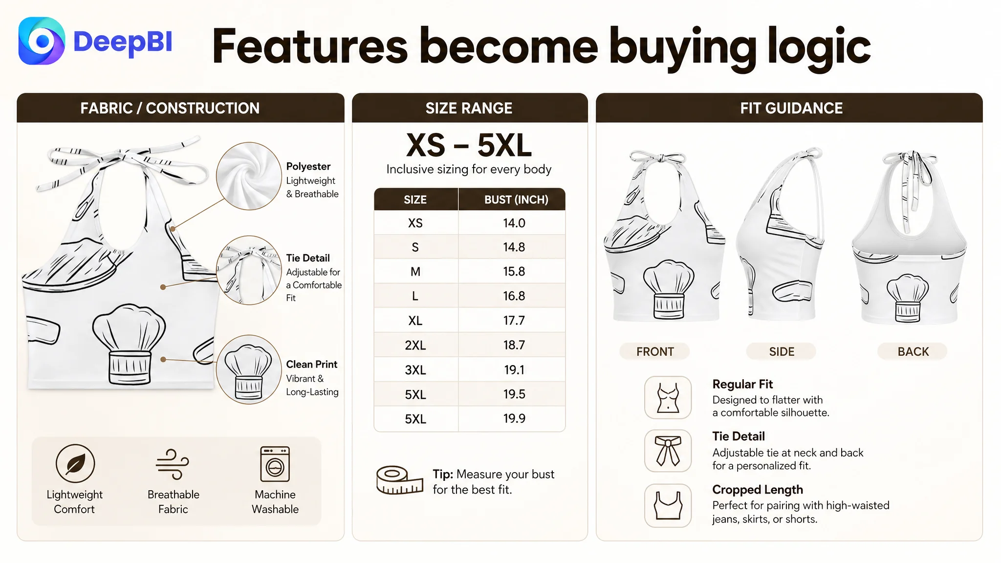
A stronger A+ structure would begin with the intended look and occasions. Lifestyle images could show the top in everyday casual wear, travel, vacations, themed parties, and date settings. This would help the shopper see the product as something usable rather than as an isolated garment.
The next modules would address fit and wearability:
- Backless construction
- Halter neckline
- Tie adjustment
- Lightweight and breathable fabric
- Regular-fit interpretation
- Machine-washable care
- Size range and bust measurements
Pattern variety could then become a visual style module, helping shoppers identify the aesthetic that best fits them.
The final section would provide a detailed size chart covering the available range from XS to 5XL. This matters because apparel conversion is often limited by uncertainty about fit. A broad size range has less value if shoppers cannot confidently select the correct size.
The proposed A+ direction also avoided claims that were not verified in the customer’s product information. The comparable Listing used specific construction language such as support bones and hook-and-eye closures, but the customer’s Listing did not have confirmed evidence for those features.
DeepBI therefore did not recommend copying those claims.
That restraint was part of the diagnosis. Better conversion cannot be built by adding unsupported specifications that may create returns, negative reviews, or a mismatch between the image and the delivered product.
Why DeepBI did not keep tuning the ads first
At this stage, further ad adjustments risked amplifying the Listing’s existing weaknesses.
If the title was unclear, the traffic could be less relevant.
If the main images failed to create enough interest, impressions might not turn into clicks.
If the page did not explain fit, fabric, styling, and care, clicks could fail to become orders.
If the Listing had no review foundation and almost no A+ content, paid traffic would face a heavier trust burden than traffic sent to a more complete competitor page.
This is why the order of operations mattered.
DeepBI’s decision was not that Amazon ads were unimportant. Ads remained useful for generating traffic and testing demand. But the Listing needed to become a more capable destination before additional traffic could be evaluated fairly.
The practical sequence was:
1. Remove irrelevant title language and restore category clarity.
2. Rebuild the title around the actual product, key attributes, and use occasions.
3. Convert bullet points into a feature-to-benefit buying path.
4. Reassign image roles so each image resolves a different concern.
5. Build A+ content around style, fit, fabric, care, pattern variety, and sizing.
6. Avoid unsupported technical claims.
7. Only then judge whether further advertising changes were producing useful traffic.
This reduced the risk of confusing a page-level conversion problem with an ad-targeting problem.
The optimization focused on restoring page-level sales logic
The proposed title was structured around the actual product:
Women's Halter Crop Top Lace Up Tank Top Sleeveless Backless V Neck Corset Style Y2k Summer Going Out Tops
Its purpose was not to imitate another Listing. It was to correct the original mismatch by placing the core category first and organizing relevant design and occasion terms into a readable structure.
The same logic applied to the creative work. DeepBI treated the comparable Listing as a reference for decision structure, not as a template to copy. The customer’s product had to remain physically accurate, while its presentation became more complete and commercially useful.
That distinction is important for AI-assisted image work as well. Visual enhancement can improve composition, lighting, framing, scene context, and information hierarchy. It should not change the garment’s actual structure, add unverified components, or create a promise the product cannot keep.
For this case, the most valuable image improvements were therefore grounded in the product’s confirmed attributes:
- Halter construction
- Sleeveless and backless design
- Tie detail
- Cropped silhouette
- Available pattern variety
- Polyester fabric
- Lightweight and breathable positioning
- Machine-washable care
- XS-to-5XL sizing information
The objective was not to make the product look like a different product. It was to make the existing product easier to understand and safer to evaluate.
The expected business change was better control, not an invented result
The case material does not include verified post-optimization figures for CVR, ACOS, TACOS, organic orders, or keyword ranking. Those outcomes should not be invented.
What can be established is the intended operating change.
Before the Listing work, the seller was at risk of using advertising to compensate for weak page fundamentals. After the Listing work, the page would have a clearer opportunity to:
- Attract more relevant clicks through better category and style communication
- Convert paid traffic with stronger visual and informational support
- Reduce fit uncertainty through clearer sizing
- Build more confidence through lifestyle and detail content
- Make the product’s use occasions easier to imagine
- Give future ad data a cleaner environment for evaluation
- Reduce the chance that ads continue amplifying page-level defects
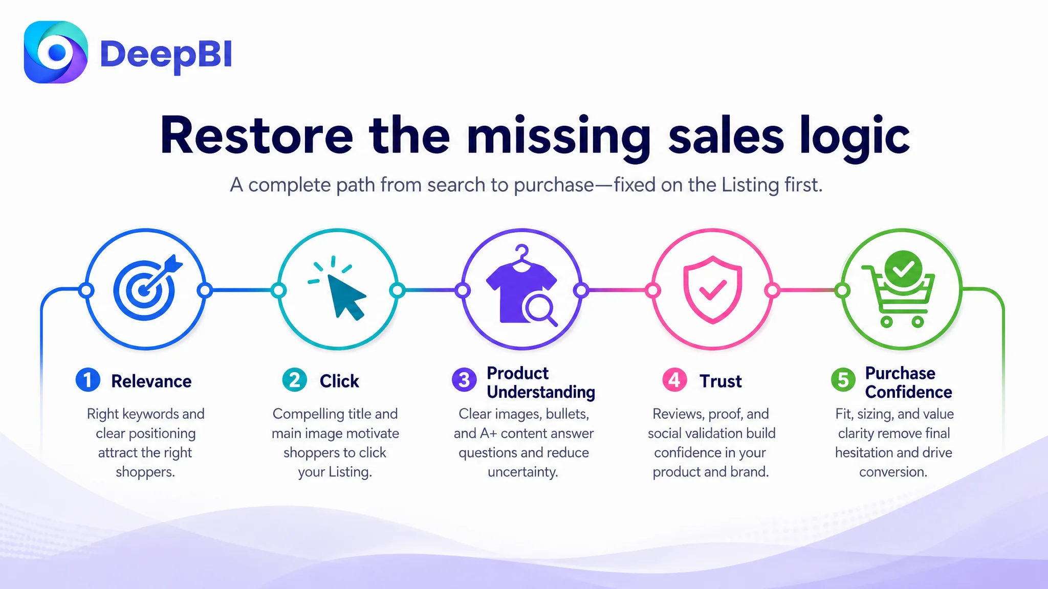
The broader goal was not to declare that a title or image could solve the whole business. It was to restore the missing chain between search relevance, click motivation, product understanding, trust, and purchase confidence.
The operating lesson for Amazon sellers
This case began with a familiar concern: traffic was not producing enough business value, so advertising appeared to be the problem.
The deeper diagnosis showed a different constraint. The customer’s Amazon Listing was significantly behind a comparable page in title structure, image roles, A+ content, review foundation, and shopper-facing proof. The largest weakness was not a single bad keyword or one unattractive image. It was the absence of a complete product-page argument.
The seller did not need to keep pushing traffic into the same page first.
The page needed to answer the questions shoppers were already asking:
- What exactly is this product?
- Why is this style relevant to me?
- How does it fit?
- How can I wear it?
- What does the fabric and construction look like?
- How do I care for it?
- Which size should I choose?
- Why should I trust this Listing without an established review history?
That is the judgment DeepBI brought to the case.
Amazon ads can create attention, but Listing quality determines whether that attention becomes a business result.