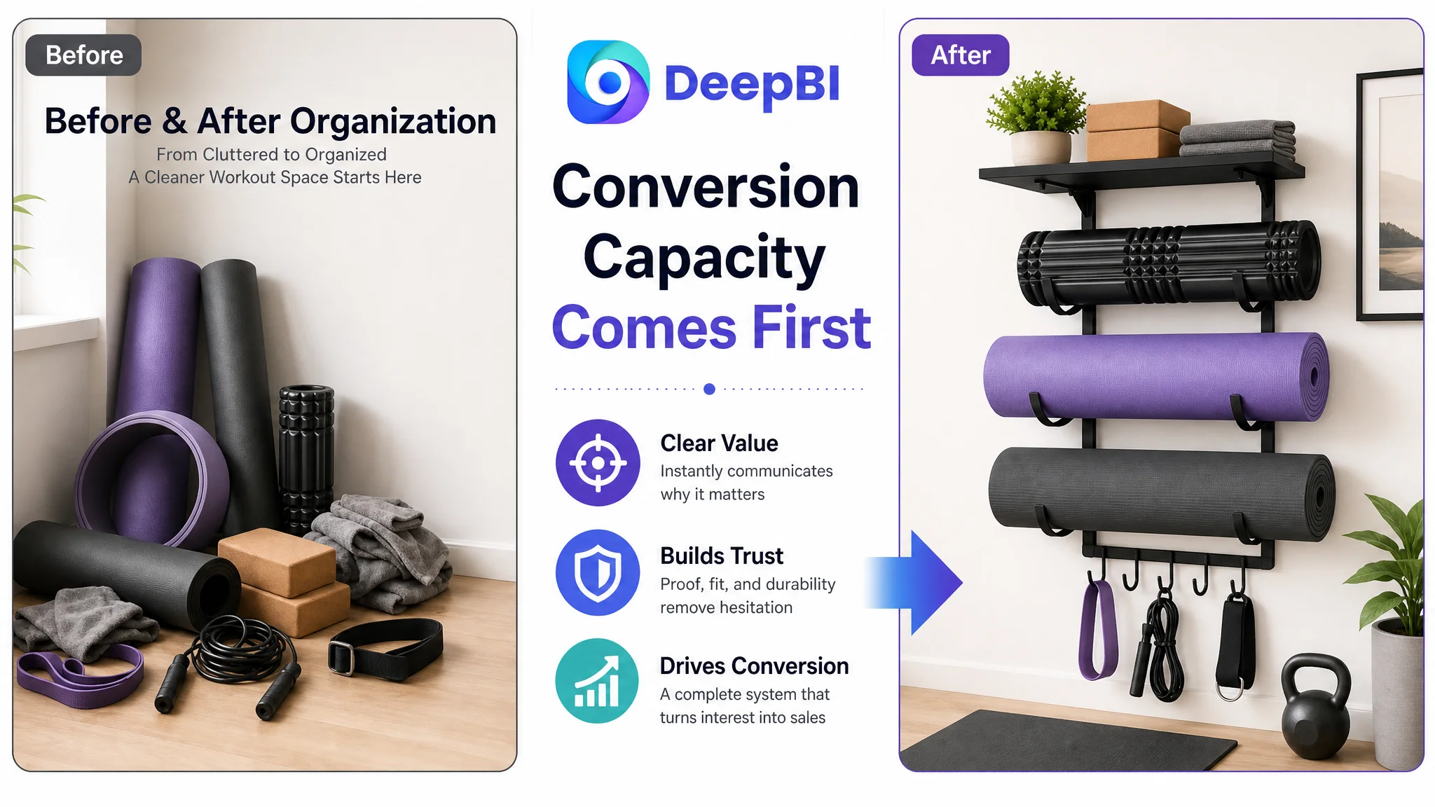
The customer was an Amazon seller in the home fitness accessories category, offering a wall-mounted yoga mat storage rack for the US marketplace. The Listing had a recognizable product, relevant keywords, and detailed feature claims, yet its overall competitive position remained weak. The initial instinct was to keep refining the title, technical specifications, and individual selling points.
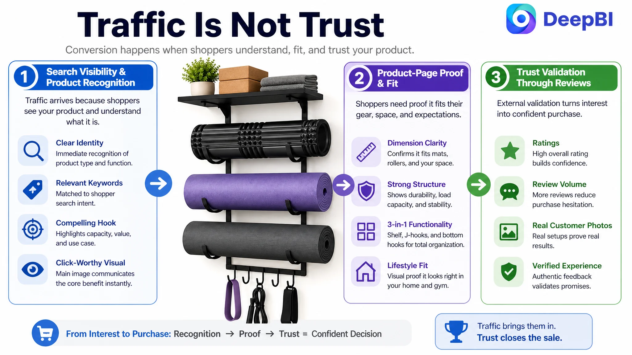
DeepBI found that this was not primarily a matter of adding more keywords or emphasizing isolated product details. The Listing was losing at the level of decision logic: the main image did not establish the full space-saving value quickly enough, the A+ content did not resolve key fit and durability concerns, and the page had no review foundation to support trust.
The later optimization therefore focused on rebuilding the Amazon product page as a complete conversion path—from immediate 3-in-1 capacity visualization, to floor-space recovery, structural proof, accessory compatibility, dimensions, lifestyle fit, and finally color selection. For other Amazon sellers, the lesson is direct: before scaling or repeatedly adjusting traffic, first determine whether the Listing can explain, prove, and validate the purchase decision.
The Listing Was Not Missing Information. It Was Missing a Stronger Order of Persuasion.
The product is designed to organize yoga mats, foam rollers, blocks, towels, resistance bands, jump ropes, and other home gym accessories through a wall-mounted system. Its underlying offer is relatively clear:
- A three-tier J-hook structure
- A wide top shelf
- Five lower hooks
- Heavy-duty iron construction
- A minimalist black finish
- A way to reclaim floor space
The difficulty was that these advantages were not arranged in the order Amazon shoppers needed to understand them.
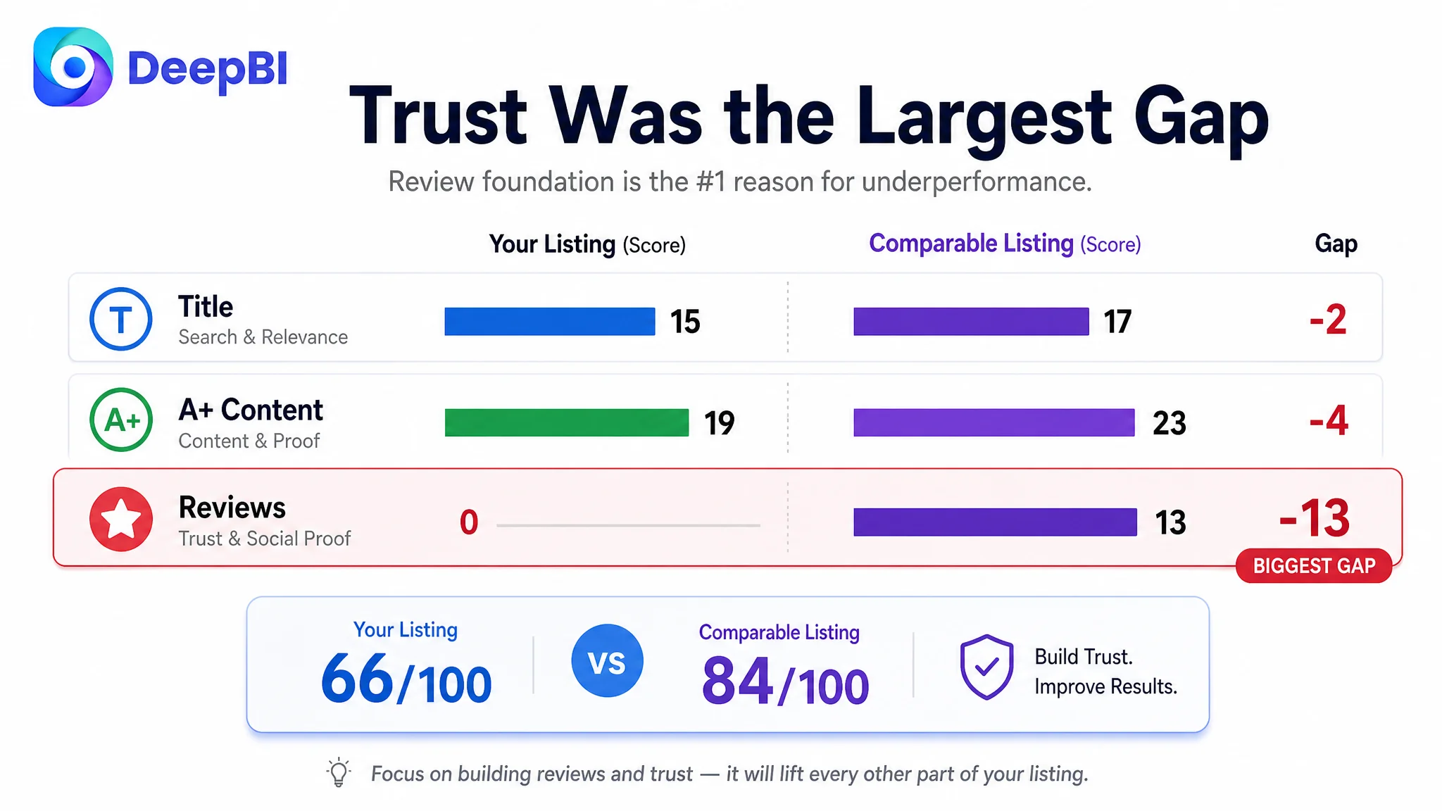
The customer’s Listing had an overall score of 66 out of 100, compared with 84 out of 100 for a comparable high-performing Listing in the same category. The 18-point gap was not concentrated in one small copy error. It reflected a broader issue across the product page.
- Title: Customer Listing: 15/20, Comparable Listing: 17/20, Gap: -2
- Main image: Customer Listing: 24/30, Comparable Listing: 25/30, Gap: -1
- Bullet points: Customer Listing: 8/10, Comparable Listing: 6/10, Gap: +2
- A+ content: Customer Listing: 19/25, Comparable Listing: 23/25, Gap: -4
- Reviews: Customer Listing: 0/15, Comparable Listing: 13/15, Gap: -13
- Total: Customer Listing: 66/100, Comparable Listing: 84/100, Gap: -18
The result created an important distinction:
The Listing did not lack product features. It lacked enough evidence, sequence, and trust to make those features commercially persuasive.
The Initial Diagnosis Focused on Keywords and Details
The first optimization direction was understandable. The title needed stronger keyword structure, and the page contained several technical claims that could be made more visible.
The customer’s title began with a phrase equivalent to “Wall Mount Yoga Mat Storage Rack.” It covered the core product type, but the structure did not immediately communicate the strongest combination of product identity, capacity, and use case.
The comparable Listing opened with a clear quantity and product type, then added material, color, hooks, and home gym usage. That structure made the product easier to identify and gave shoppers more reasons to click within the first part of the title.
The customer’s product already had useful details such as:
- Three tiers
- Five hooks
- Heavy-duty iron
- Increased thickness
- A wide top shelf
- Compatibility with yoga and fitness accessories
The problem was not that these details were absent. They were distributed without a sufficiently strong hierarchy.
This can lead teams into a familiar cycle: revise the keyword order, add another specification, emphasize a material upgrade, or make one image more attractive. Each change may be reasonable on its own, but none addresses the larger question:
Why should a shopper trust this wall-mounted organizer to solve their storage problem better than the alternatives?
DeepBI reframed the task from isolated content improvement to full Listing conversion diagnosis.
The Largest Gap Was Not in the Title or Main Image
The score comparison showed that the title and main image were behind, but only modestly:
- Title: 2 points behind
- Main image: 1 point behind
- A+ content: 4 points behind
- Reviews: 13 points behind
The review gap changed the priority of the entire case.
The customer Listing had no rating data, no review count, and no customer comments visible on the homepage. The comparable Listing had a 4.6-star rating, 1,441 reviews, and ten reviews visible on the first page, including image- and video-supported feedback.
That difference was not simply a social proof issue. It affected how every other claim on the page was interpreted.
A statement such as “heavy-duty construction” is easier to accept when shoppers can see customers using the product. A claim about organizing several types of equipment becomes more credible when real installations show the result. Even a well-designed A+ page has a harder job when there is no customer evidence to validate the product experience.
The customer’s Listing could describe stability, capacity, and appearance. It could not yet demonstrate that the market had accepted those promises.
This is why DeepBI did not treat the page as a simple creative refresh. The diagnostic logic connected five dimensions—title, main image, bullet points, A+ content, and reviews—to identify where conversion confidence was being lost.
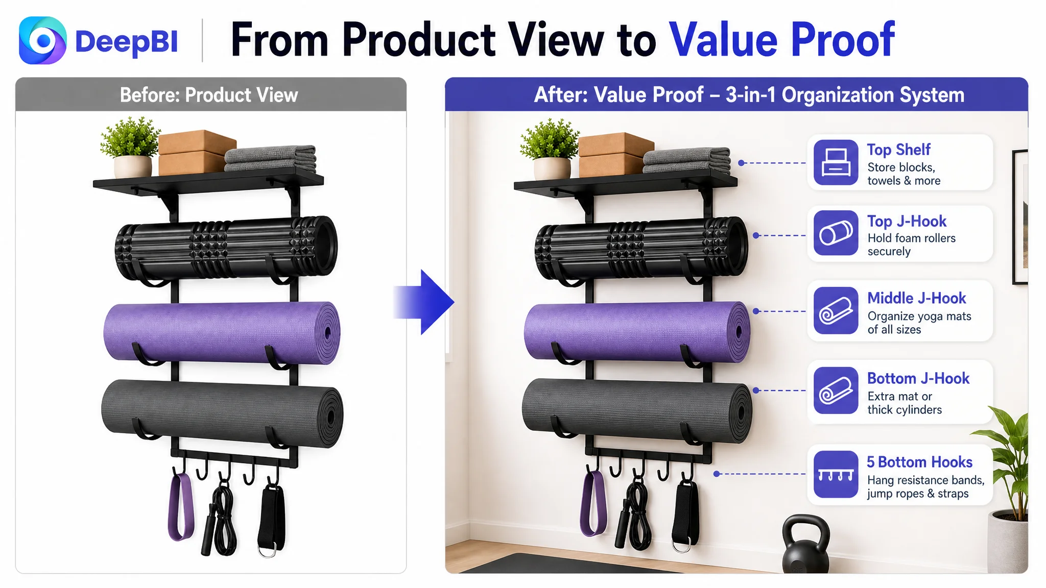
The Main Image Showed the Product, but Not the Reason to Buy It
The product images communicated the physical rack and some of its components. However, the early visual sequence did not establish the complete value of the storage system quickly enough.
The first image mainly showed mats and general accessories. It did not make the full diversity of storage immediately obvious. A shopper could understand what the product was, but might not yet understand how much clutter it could remove.
The second image moved too quickly into feature comparison. It provided useful detail, but before a shopper had fully understood the larger benefit of reclaiming floor space.
The third image repeated a narrow feature-validation role around hooks. That created another technical explanation without adding a new layer of trust.
DeepBI’s judgment was that the images needed to perform different jobs in sequence:
First, establish full capacity
The opening visual should show the three-in-one organization concept at a glance:
- Multiple yoga mats and foam rollers
- Items placed on the wide upper shelf
- Accessories hanging from the lower hooks
The point is not to make the image more crowded. It is to make the system’s usefulness immediately legible.
Next, show the recovered space
A lifestyle scene should communicate the result of wall-mounted storage: a cleaner corner, less floor clutter, and a more orderly home gym or yoga space.
This is more persuasive than showing the rack alone because it connects the product to an outcome the shopper already wants.
Then, prove stability
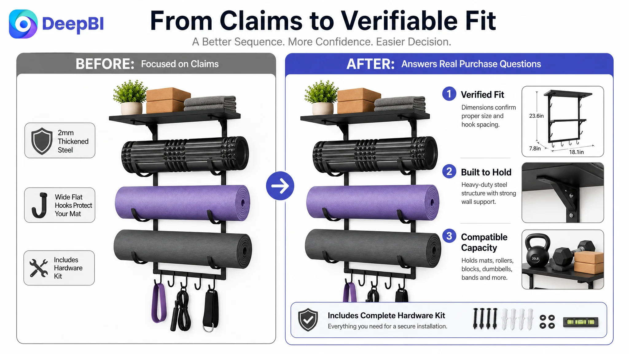
The product’s 2mm iron thickness and anti-rust finish are relevant, but technical claims become stronger when connected to visible structure. The page should show how the support design contributes to stability instead of leaving the shopper to infer the relationship between material thickness and load-bearing performance.
Finally, resolve fit and installation
Dimensions, hook spacing, compatible equipment, and the included hardware kit should appear after the main value has been established. They answer practical purchase questions without forcing the shopper to decode the entire product before understanding why it matters.
A product image should not only show what the item is. It should help the shopper understand what decision the item makes easier.
The Bullet Points Were a Relative Strength, Not the Main Bottleneck
Interestingly, the customer’s bullet points scored 8 out of 10, two points higher than the comparable Listing.
The customer’s copy had several strong qualities:
- It opened with the problem of cluttered space.
- It used the 1mm-to-2mm thickness improvement as a concrete detail.
- It connected the product to a minimalist aesthetic.
- It presented the functions in a logical sequence.
- It included installation and accessory information.
The comparable Listing, despite its stronger overall score, was less structured in the bullet section and repeated some storage claims.
This matters because the customer team was not starting from a weak copy foundation. The bullets already demonstrated useful problem-solution logic.
The opportunity was to make the copy align more closely with the visual and page-level strategy:
- Lead with space recovery and organization.
- Connect heavy-duty construction to stability over time.
- Explain the three-in-one storage system through real accessory use.
- Position the rack as both functional storage and a clean display element.
- Reduce installation uncertainty through clear hardware and support information.
The improvement was therefore not “write more features.” It was to ensure the title, images, bullets, and A+ content all supported the same buying argument.
The A+ Content Was Where the Decision Path Broke
The A+ content score was 19 out of 25, four points behind the comparable Listing.
The customer’s existing A+ modules included:
- A lifestyle hero image
- Before-and-after space comparison
- Material close-ups
- Use-case scenes
- Feature comparisons
These were useful building blocks, but their order did not fully match the shopper’s decision process.
The first module introduced the product, its aesthetics, and multiple color choices at the same time. That divided attention too early. Before choosing a color, shoppers needed to be convinced that the product could organize their equipment and fit their space.
The comparable Listing built a more complete “problem, solution, proof” sequence:
- Floor clutter and difficult assembly
- The product’s storage structure
- Compatibility with different equipment
- Dimensions and space requirements
- Multiple room settings
- Color options
- Real user feedback
The difference was not simply that the competitor had more modules. The difference was that each module removed a different form of hesitation.
The first question: What can this product organize?
The opening A+ section should present the full storage system immediately:
- Three-tier J-hooks for mats and foam rollers
- A wide shelf for blocks, dumbbells, towels, or water cups
- Five hooks for bands, jump ropes, straps, and bags
The goal is to establish capability before introducing variants.
The second question: Will it actually reduce clutter?
The existing before-and-after logic was worth keeping. It directly addressed the floor-space problem and helped translate a wall-mounted rack into a visible room improvement.
It needed to be strengthened with capacity evidence, so the “after” state showed not only a cleaner space but also the amount and variety of equipment being organized.
The third question: Can the structure support regular use?
The existing material module emphasized the increase from 1mm to 2mm and the anti-rust coating. That information should be connected to structural proof: reinforced brackets, support geometry, and clear examples of how the product remains stable without bending or sagging.
The objective is not to invent a new technical claim. It is to make the existing claim easier to believe.
The fourth question: Will my equipment fit?
This was a missing decision node.
The page needed clearer dimensional information and compatibility visuals for:
- Extra-thick yoga mats
- Foam rollers
- Yoga blocks
- Dumbbells
- Towels
- Resistance bands
- Jump ropes
- Yoga straps
The flat-hook comparison could remain as a useful product advantage, but it should come after the basic fit question has been answered.
The fifth question: Will it look appropriate in my home?
The existing scenes focused mainly on home gyms and yoga studios. That left an unaddressed concern: whether the minimalist rack would work in a living room, bedroom, or other shared space.
A lifestyle module showing those settings would connect the product’s functional purpose with its aesthetic promise. The rack is not only a utility item for a dedicated gym; it is also intended to help create a cleaner, more orderly room.
The final question: Which version should I choose?
Black, gold, and white options should appear near the end of the persuasion path. By that point, the shopper has already understood the capacity, fit, structure, and lifestyle value. Color becomes a final choice rather than an early distraction.
Why DeepBI Did Not Recommend More Ad Adjustments First
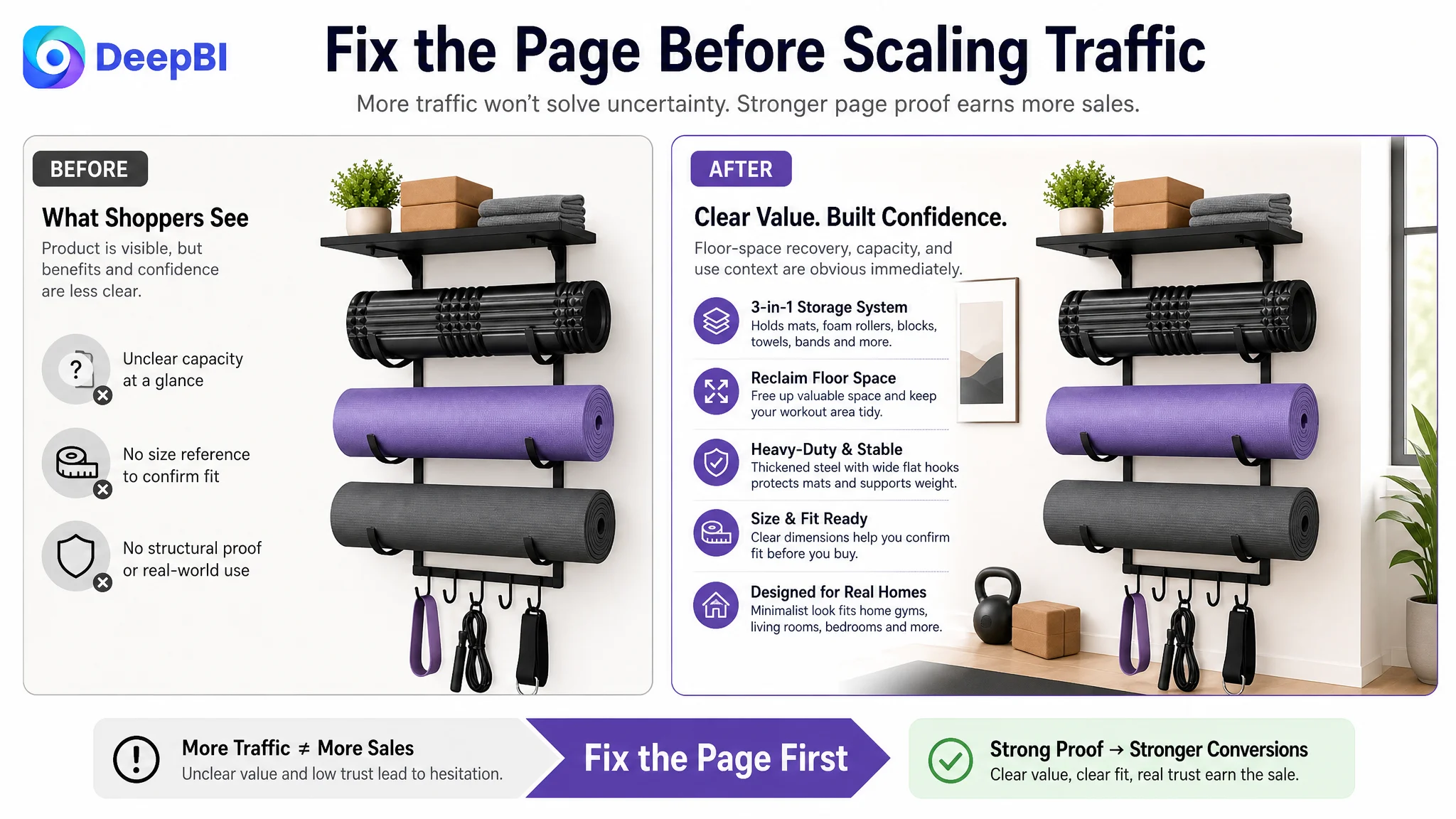
The case did not support a conclusion that the seller’s advertising campaigns were the primary problem. What it did show was that sending more traffic to the existing page would not automatically resolve the Listing’s conversion weaknesses.
For an Amazon seller, this distinction is commercially important.
Advertising can bring a shopper to the product page. It cannot, by itself:
- Create review history
- Explain whether multiple accessories will fit
- Prove that a structure is stable
- Show how much floor space the product can recover
- Make a product look appropriate in a living room
- Turn scattered features into a coherent purchase decision
If the page does not perform those jobs, additional traffic may only expose the same conversion gaps to more shoppers.
Advertising does not only amplify a Listing’s strengths. It can also amplify the page’s existing uncertainty.
DeepBI therefore prioritized the page-level constraint first. The immediate business risk was not simply low visibility. It was investing more effort in traffic before the Listing had enough conversion capacity to make that traffic useful.
The Optimization Direction Became More Specific
The recommended direction was not a generic instruction to “improve the images” or “make the A+ more premium.” Each change was tied to a specific decision problem.
Title
The title strategy was to:
- Keep the core product type near the front.
- Include relevant terms such as yoga mat holder and home gym organizer.
- Add J-hooks, heavy-duty iron, and wide top shelf where useful.
- Clarify compatible accessories such as foam rollers, blocks, and resistance bands.
- Reduce scattered or repetitive phrasing.
This created a clearer relationship between search visibility and shopper understanding.
Main image sequence
The image sequence was redefined around business roles:
1. Immediate capacity visualization
2. Floor-space recovery and lifestyle value
3. Structural and durability credibility
4. Dimensions and equipment compatibility
5. Installation assurance and hardware completeness
Each image would answer a different question instead of repeating the same product description.
A+ content
The A+ path was reorganized to move from:
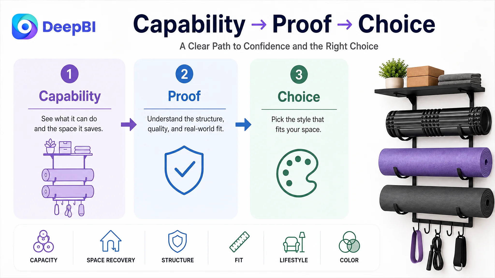
Capability → space recovery → structural proof → compatibility → dimensions → lifestyle fit → final color choice
This sequence protects decision energy. It asks shoppers to consider variants only after the product’s value and fit have been established.
Review foundation
The review score could not be solved through design alone. The customer needed a compliant review-building process, including appropriate use of Amazon review programs and post-purchase follow-up.
This was a separate operational requirement, but it remained central to the Listing diagnosis because the review gap was the largest measurable trust deficit in the comparison.
What Changed in the Business Understanding
The case did not provide verified post-optimization CVR, ACOS, TACOS, or organic-order results, so no numerical outcome should be claimed. The meaningful change at this stage was the decision framework.
The customer no longer needed to treat every performance concern as a keyword, image, or campaign adjustment in isolation. The Listing could be evaluated as a connected conversion system:
- The title earns recognition and search relevance.
- The main image creates a reason to click.
- The bullet points organize the product’s selling logic.
- The A+ content removes fit, stability, and lifestyle concerns.
- Reviews provide external validation.
- Advertising then has a stronger page to send traffic toward.
This reframing also clarified the order of operations. The seller could continue improving traffic quality, but should not assume that more traffic would compensate for missing trust and incomplete product-page proof.
The Real Bottleneck Was Listing Conversion Capacity
The customer’s Amazon Listing was not failing because the product had no differentiated features. It was underperforming because the page did not make those features easy to understand, verify, and trust.
The 66-point score, the four-point A+ gap, and especially the 13-point review gap showed that the problem extended beyond title wording or isolated creative quality. The page needed a stronger commercial narrative:
- Organize more equipment.
- Recover floor space.
- Trust the structure.
- Confirm the fit.
- Visualize the product in the home.
- Choose the finish only after confidence is established.
That is the central lesson for Amazon sellers:
Before asking whether ads can bring more traffic, ask whether the Listing has earned the right to receive it.
DeepBI’s role in this case was not to produce a longer list of edits. It was to identify which weakness mattered most, explain why previous optimization logic was incomplete, and set a decision order that connected Amazon search, product-page conversion, visual proof, and customer trust.