

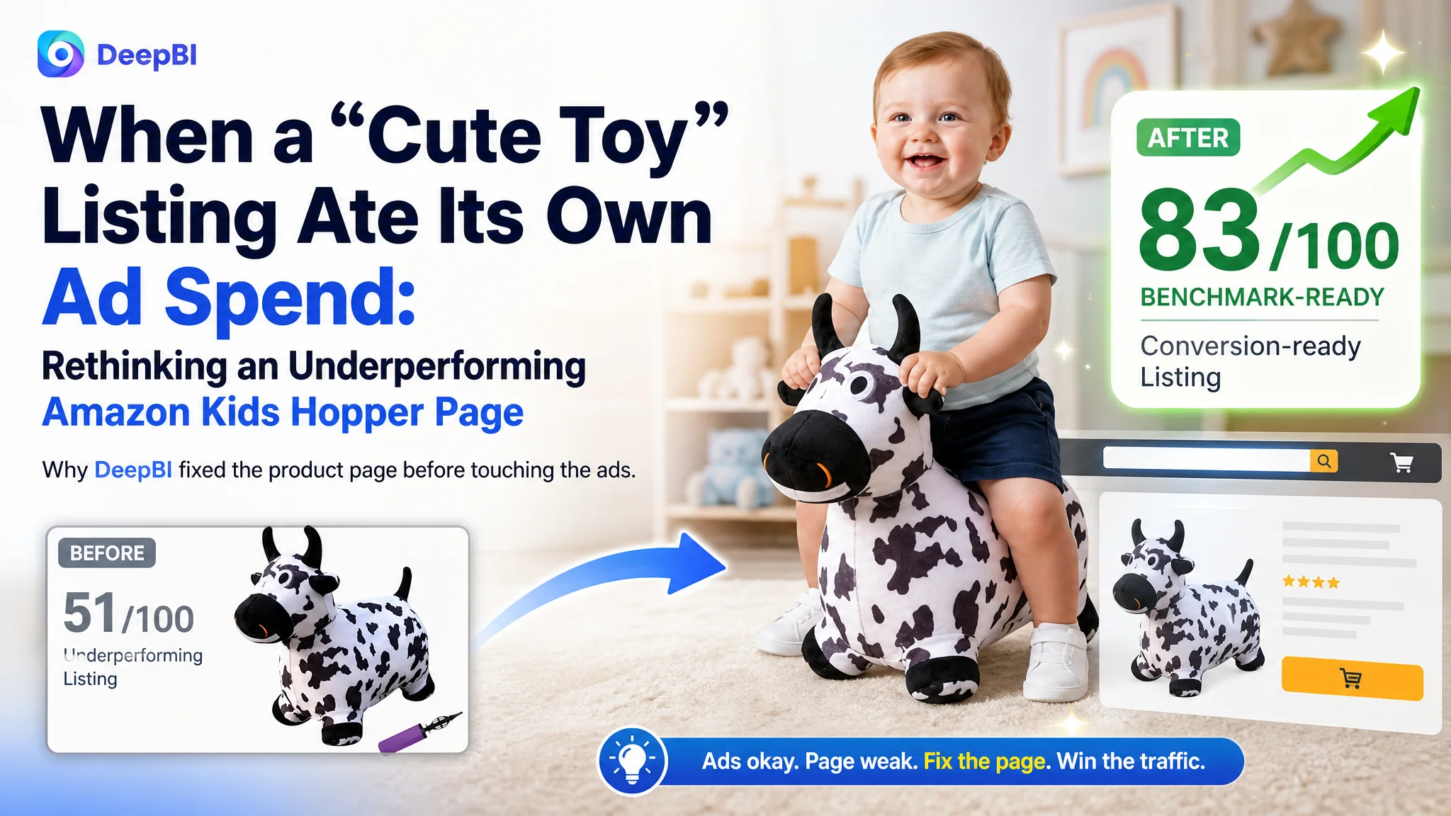
An Amazon seller in the kids’ toy category came to DeepBI with a familiar headache: ads were running, traffic was coming in, but the toddler hopper toy just would not scale. The team’s first reaction was to blame bids, keywords, and maybe “weak creatives” in Amazon ads. They kept tuning campaigns, but ACOS stayed stubborn and orders lagged behind impressions.
Once we put their Amazon Listing side by side with a category-leading competitor, the pattern was clear: this was not an advertising problem. The real leak sat in the product page itself. The main image was passable, but the title, bullets, A+ content, and review structure could not carry parents from click to confident purchase. Ads were simply pumping traffic into a page that lacked a buying story, trust proof, and a clear user focus.
DeepBI reframed the work order: instead of “optimize ads harder,” we treated ads as temporarily “good enough” and made the Listing conversion capacity the first-class problem. That meant rebuilding the Amazon title around toddlers and gift intent, reorganizing bullets around parent decision logic, and designing a full A+ flow with use scenes and safety visualization. The outcome was not just a nicer-looking page; the Listing regained the ability to convert traffic so that ad spend finally had somewhere productive to land.
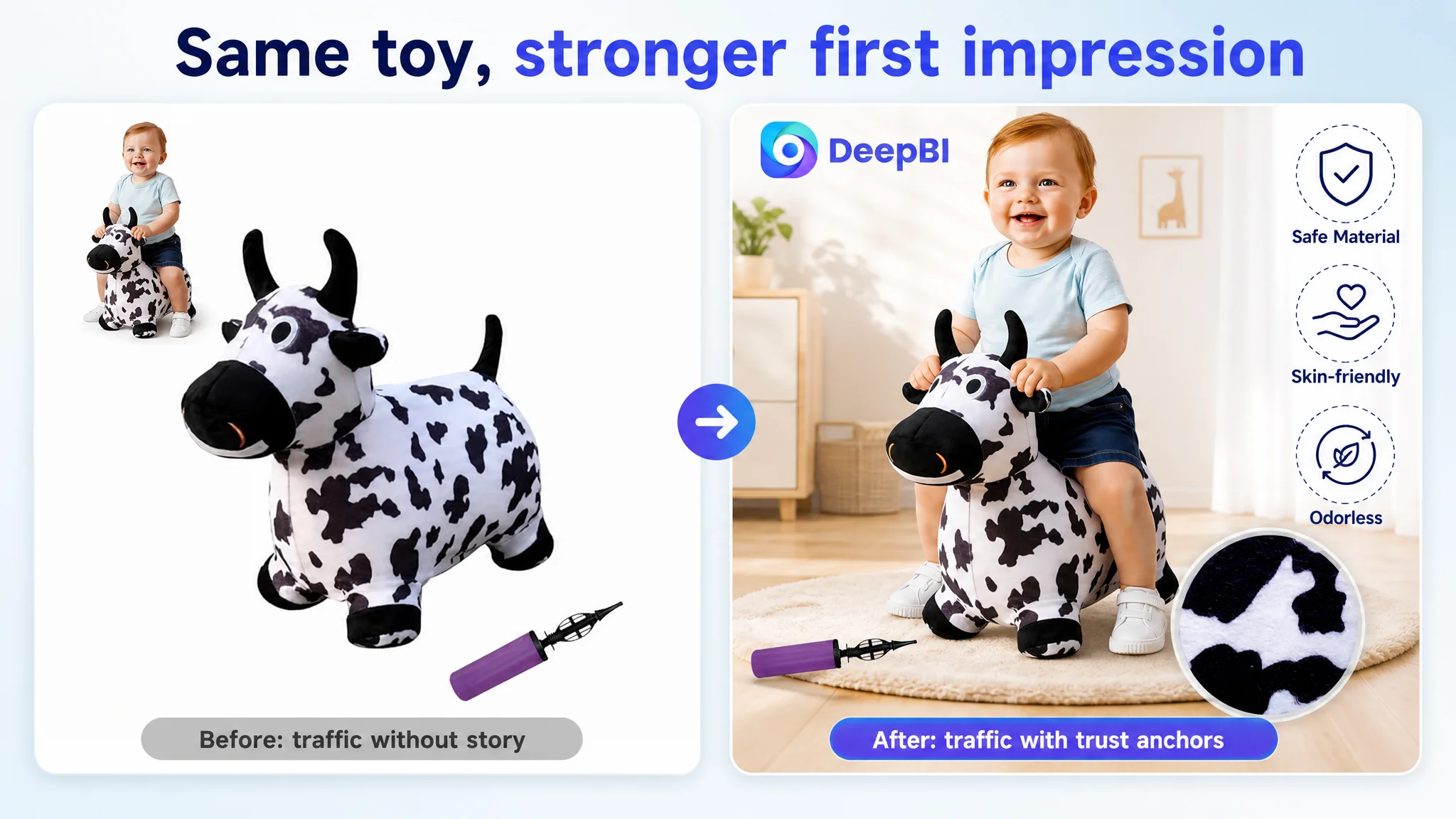
For Amazon sellers, this case is a reminder: when a product in a competitive category underperforms, it is easy to over-focus on ad levers or main-image cosmetics. Often, the real constraint is a weak product-page story that cannot justify the click. Until that is fixed, more traffic simply magnifies the gap between you and the benchmark Listing.
The Core Conflict: A Listing That Could Not Carry Its Own Traffic
DeepBI’s scoring put numbers on what the seller had been “feeling” but not diagnosing:
- Their Listing total score: 51/100
- Benchmark competitor: 83/100
- Gap: -32 points
Broken down by Amazon Listing dimensions:
- Title: 11 vs. 15 (20 max)
- Main image block: 25 vs. 24 (30 max)
- Bullet points: 6 vs. 8 (10 max)
- Detail/A+ content: 1 vs. 22 (25 max)
- Reviews: 8 vs. 14 (15 max)
One line stands out:
Detail/A+ content: 1 vs. 22 — this product page was almost a blank screen below the fold.
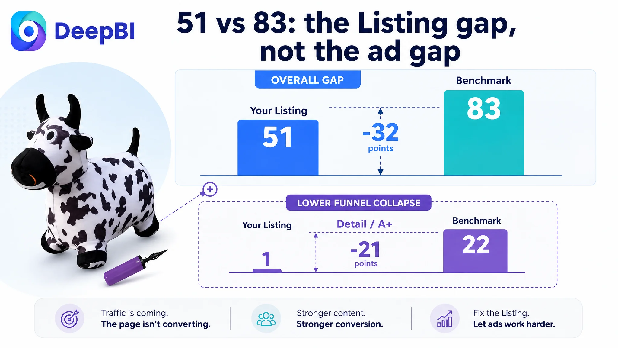
From a business perspective, that meant:
- Ads could still buy traffic.
- The search thumbnail (main image) was not tragic.
- But once parents arrived, the page had almost no structured argument for why they should trust this particular hopper with their toddler.
The true core conflict was not “ad inefficiency,” it was weak Listing conversion, especially in mid- and lower-funnel content.
What the Seller Originally Misdiagnosed
From the seller’s side, the logic looked reasonable:
- The hopper is cute, with a plush cover and included pump.
- Main images show the product and a child using it.
- Ads bring impressions, but orders underperform category norms.
- Ergo: the problem must be in advertising—CPCs, keyword mix, maybe insufficient budgets.
This drove a traditional optimization pattern:
- Repeated bid changes across main keywords.
- Experimenting with different ad groups and match types.
- Trying to “brute-force” more traffic to compensate for weak performance.
But none of these moves changed the core reality: parents who did land on the page did not see enough reason to buy.
There was also a subtler misdiagnosis:
- The seller believed “we already highlight plush cover and decoration use; the rest is just design preference.”
- They underestimated how aggressively leading Amazon Listings in toys now weaponize A+ content, safety proof, and gift framing.
So while they debated whether the main image “felt premium enough,” DeepBI’s competitive scores showed that their real exposure was brutal: no A+ content at all, vague bullets, and very weak social proof.
Amazon Ads Were Not Failing. The Page Was Consuming the Traffic.
Once we compared the Listing against a benchmark in the same Amazon US toy subcategory, the contrast was sharp.
On paper:
- Similar product concept: animal-shaped bouncing hopper for toddlers.
- Similar age range and use scenario: indoor/outdoor active play, giftable.
- But radically different Listing strength.
In numbers:
- Detail/A+ score: 1 vs. 22
- Review strength:
- The seller: 4.0 stars, 11 total reviews, with a visible 1-star review on the first page (18% of visible reviews were negative).
- Competitor: 4.6 stars, 3,656 reviews, first-page reviews all 4–5 stars.
“The real problem was not that ads failed to bring traffic. It was that the page could not convert the traffic.”
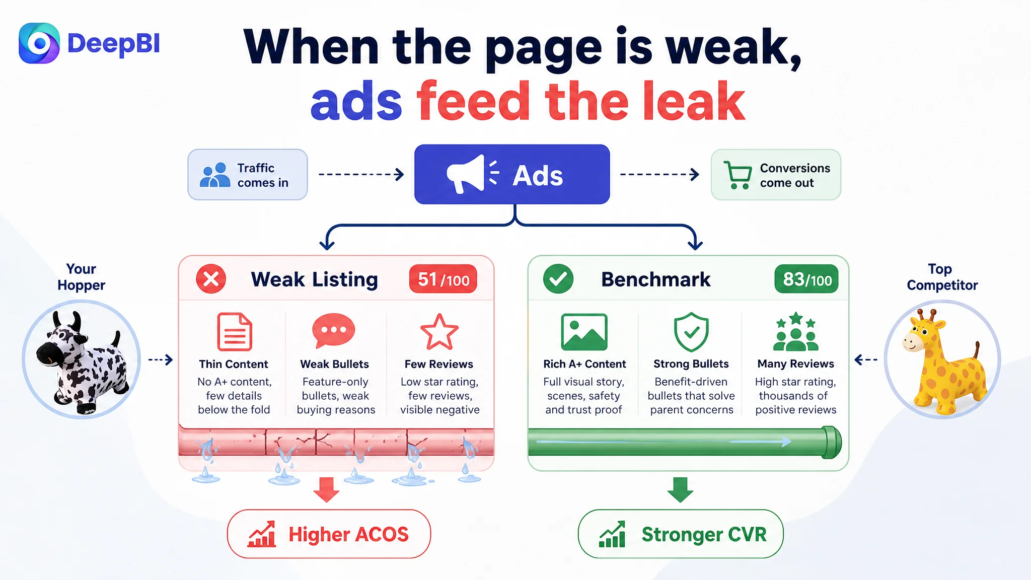
From an ad-efficiency standpoint, this matters because:
- Every paid click lands on a page with no visual trust layer, no safety visualization, and minimal explanation of benefits.
- Parents inevitably compare this to competitor pages overflowing with imagery of happy kids, safety badges, and gift-ready positioning.
- Even with similar CPCs, the seller’s ACOS will skew higher because CVR is structurally weaker.
Under these conditions, “optimizing ads” is largely re-arranging how you lose money.
How the Listing Scored So Low: Where the Page Broke the Buying Logic
1. Title: Functional Description Without a Buyer Anchor
The original title leaned heavily on function and scenes, but:
- No clear brand signal at the front — weaker trust compared to competitor titles that open with brand.
- No explicit user and age range — the competitor leads with “Toddlers” and a full “18 Months 2 3 4 5 6 Years Old” range, which:
- Tells parents “this is exactly for your child.”
- Locks into high-intent age/occasion search queries.
- Weak gift framing — the competitor includes “Gifts for Boys Girls,” which is highly conversion-oriented, especially in Q4 and around birthdays.
- Keyword density focused on functionality only — the competitor repeats “Jumping Horse,” “Ride on Bouncer,” etc., to strengthen relevance around proven search terms.
Net effect: the seller’s title described an object; the competitor’s title defined a solution for a specific buyer, age, and use case (gift).
DeepBI’s recommendation for a new title:
“Hoppity Cow Inflatable Hopper with Pump, Plush-Covered Bouncy Animal Ride on Bouncer for Toddlers & Kids, Jumping Cow Hopping Toy Birthday Gift for Boys Girls 18 Months to 6 Years Old”
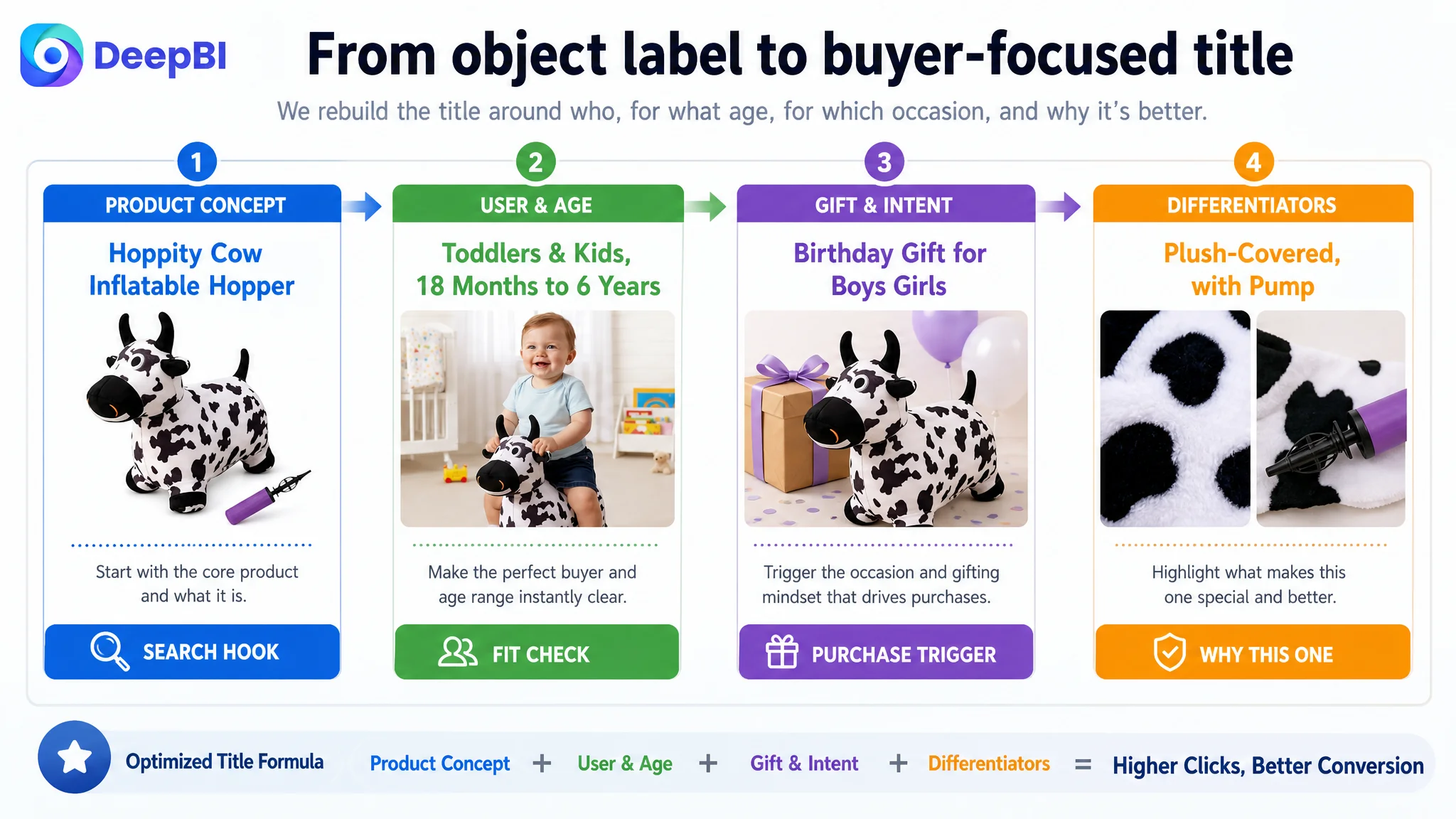
Key shifts in logic:
- Put the recognizable product concept (“Hoppity Cow”) and form (“Inflatable Hopper”) early.
- Explicitly anchor user (“Toddlers & Kids”) and age range (“18 Months to 6 Years”).
- Bring in gift and play intent (“Jumping Cow Hopping Toy Birthday Gift for Boys Girls”).
- Keep differentiated attributes (“Plush-Covered”, “with Pump”) visible but not overwhelming.
This turns the title into a search-entry and decision frame, not just a label.
2. Main Image Block: Not Terrible, but Not Building a Reason to Click
DeepBI’s scoring actually showed the seller was roughly on par with the competitor on main image block (25 vs. 24/30). This meant:
- The main image was not the fatal weakness.
- But inside the image set, there were conversion leaks.
Key issues DeepBI flagged:
- Flat, somewhat cluttered visuals:
- The primary image had child + product, but the environment felt flat and generic; it did not amplify “warm, modern home” or “premium toy.”
- Several supporting images repeated similar content (e.g., overlapping function shots) instead of building an information gradient.
- Lack of clear safety and quality visualization:
- For 18M+ toys, most parents scan for clear safety cues.
- The competitor uses visualized certificates (e.g., safety report screenshots with “Pass”) directly in the gallery.
- The seller only mentioned “safe material” in text.
DeepBI’s optimization direction was not “make it prettier,” but:
- Clarify each slot’s job:
- Image 1: hook and click driver.
- Image 2: size, load-bearing, durability.
- Image 3: inflation steps (how easy?).
- Image 4: real-life use scene with child in a warm, aspirational home.
- Image 5: safety & material icons (BPA-free, skin-friendly, odorless).
- Image 6: cleaning/washability or multi-use scenes.
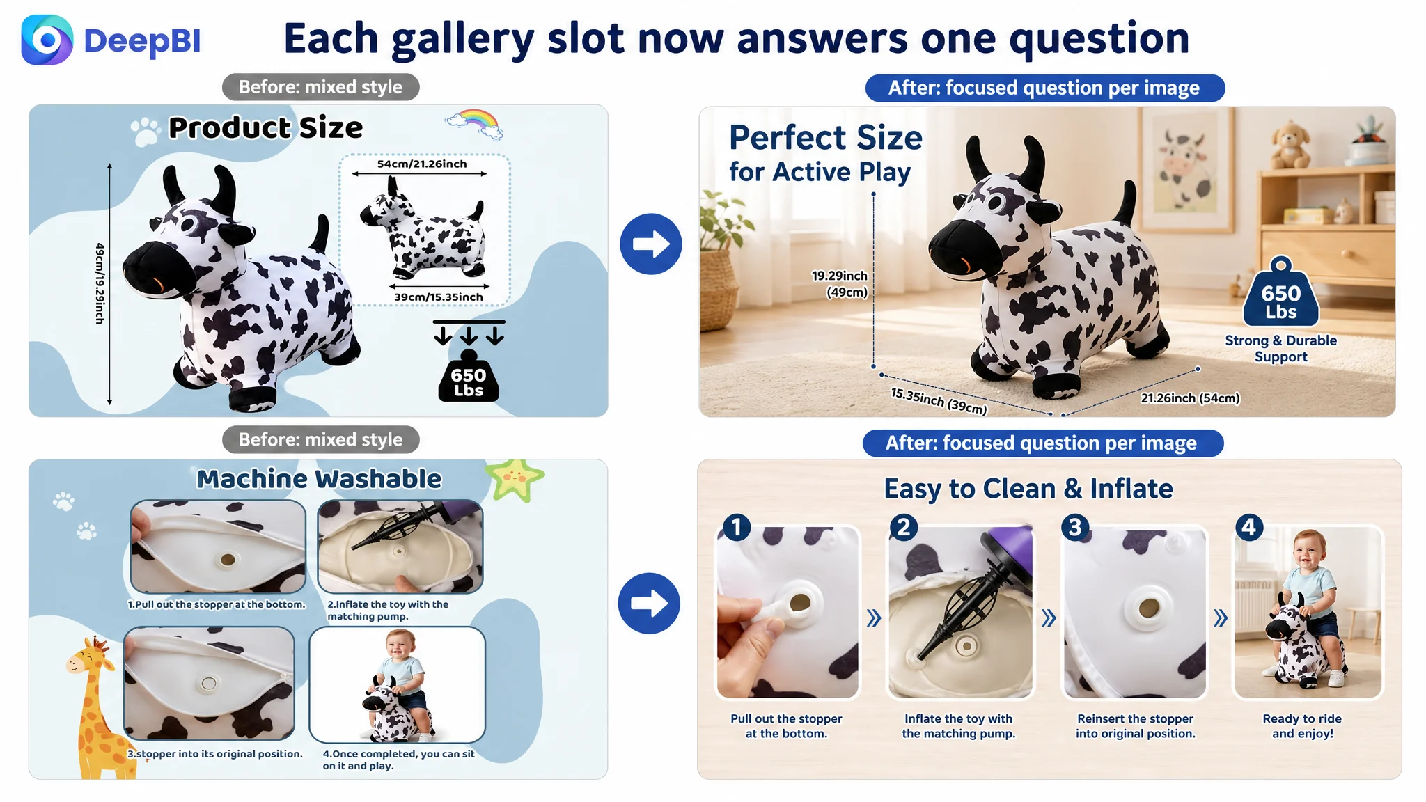
The AI-guided visual instructions were built at this level:
- “Product centered at 70% of frame, 30° angle, professional three-point lighting, pure white background, pump clearly placed at lower right, inset circle in top-left showing a real child riding the toy.”
- “Flat, front-view product with clean soft light, light blue gradient background, fine lines labeling length/width/height, weight capacity symbol at lower right.”
In other words, each image becomes a specific business asset: one explains size, one demonstrates ease of use, one builds trust, one sells emotion.
3. Bullet Points: Information Without a Persuasion Path
The seller’s bullets focused on:
- Decoration.
- Inflation steps.
- Structural stability.
- Detachable cover.
- Portability/storage.
All valid. But DeepBI’s comparison with the benchmark showed three missing layers:
1. User-centric framing
The competitor writes bullets from the parent and child’s perspective: fun, physical development, safety, and gift excitement. The seller wrote from the product’s perspective: what it is, how to use it, some features.
2. Emotion + rational mix
Benchmark bullets combine:
- Emotional triggers (“enjoy pretend-play,” “it’s so cool to bring to a kids’ party”).
- Rational benefits (“develop physical stamina,” “ASTM F963-11 Toy Safety Standards”).
The seller mostly had neutral, descriptive language, with little call to the parent’s desire to see their child happy, active, and safe.
3. Decision-logic coverage
Parent questions that must be answered:
- Is it fun enough to keep my child interested?
- Will it help them be active, not just stare at screens?
- Is it safe (materials, stability, standards)?
- Is it easy to clean and inflate?
- Is it a good gift?
The competitor systematically addresses these; the seller’s bullets partially touch on them but never close the loop.
DeepBI’s bullet rewrites intentionally followed a “pain point → benefit → feature” triad:
- BP #1: Adorable design + role play + decor
Positions the cow shape and plush cover as a character and companion, not just an object.
- BP #2: Balance & coordination
Directly claims “develop physical stamina, improve agility, maintain balance,” framing the toy as a growth tool, not just entertainment.
- BP #3: Stability across indoor/outdoor
Ties the four-point base to safe use “anytime and anywhere,” answering the unspoken worry about tipping.
- BP #4: Safe, washable materials
Combines “BPA-free” with “removable, machine-washable plush cover,” addressing both safety and hygiene.
- BP #5: Gift & portability
Explicitly labels it a gift for birthdays, Children’s Day, Christmas, and mentions pump included + easy deflation for storage or transport.
“The bullet points had information, but not a buying logic.”
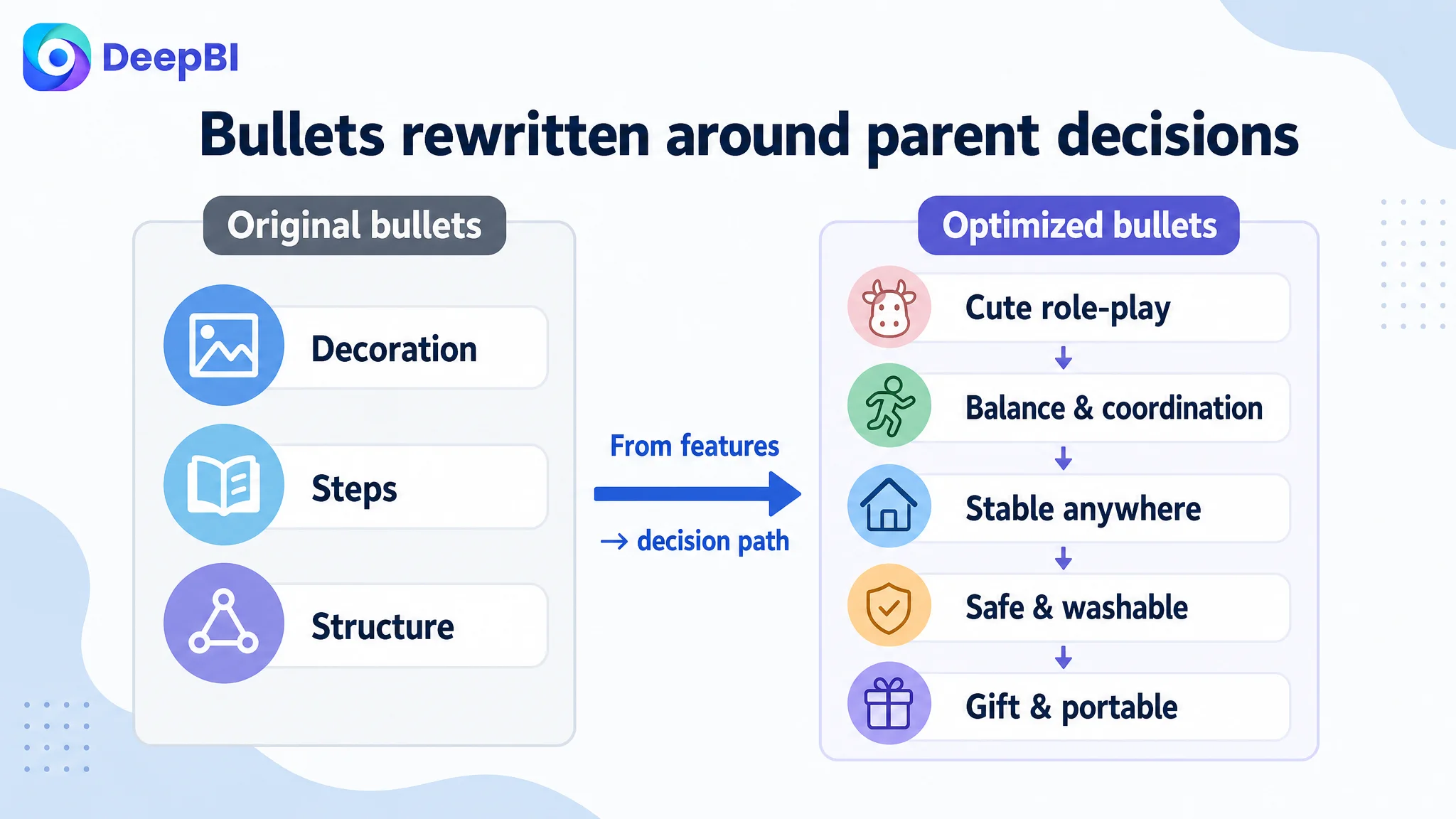
By restructuring them, the page starts to talk to parents’ decision path, not just list attributes.
4. Detail/A+ Content: A Near-Empty Lower Funnel
Here is where the Listing was truly broken:
- The seller: no A+ content module at all.
- Benchmark: a full A+ stack with:
- A hero lifestyle scene.
- Core benefit panels (fun + physical development).
- Visual safety badges and test report snippet.
- Cleaning/inflation how-to visuals.
- Multi-color and multi-child imagery for inclusivity and gifting.
From a conversion standpoint, this means:
- After the bullets, parents had no further reassurance.
- No rich lifestyle context: the hopper never appears in a cozy living room with a happy child.
- No visible safety proof: no icons, no reports, no clear “Pass” highlight.
- No maintenance clarity: how to clean the cover? Is inflation easy?
- No gift-specific framing: no multi-color “gift matrix,” no “best toy gift” banner.
DeepBI’s prescribed A+ architecture:
1. Lifestyle hero
- A 3–5-year-old riding the toy in a modern, sunlit living room.
- Warm, Nordic-style interior (light wood, white curtains).
- Headline text like “Keep Fun Active” – connecting fun + movement.
2. Safety & material proof
- Left: three round icons (BPA-free, safety standard, high elasticity).
- Right: overlapping test reports with a magnifying glass zooming on “Pass.”
- Soft yellow-white gradient background.
3. Daily care & ease of use
- Two-circle layout:
- One shows wiping the toy surface.
- One shows the pump inflating the toy.
- Simple, bold captions: easy to clean, easy to inflate.
4. Multi-color & gifting matrix
- Four parallel scenes, each showing a different color toy (green, yellow, pink, blue) with kids playing.
- A handwritten-style “The Best Toy Gift” callout.
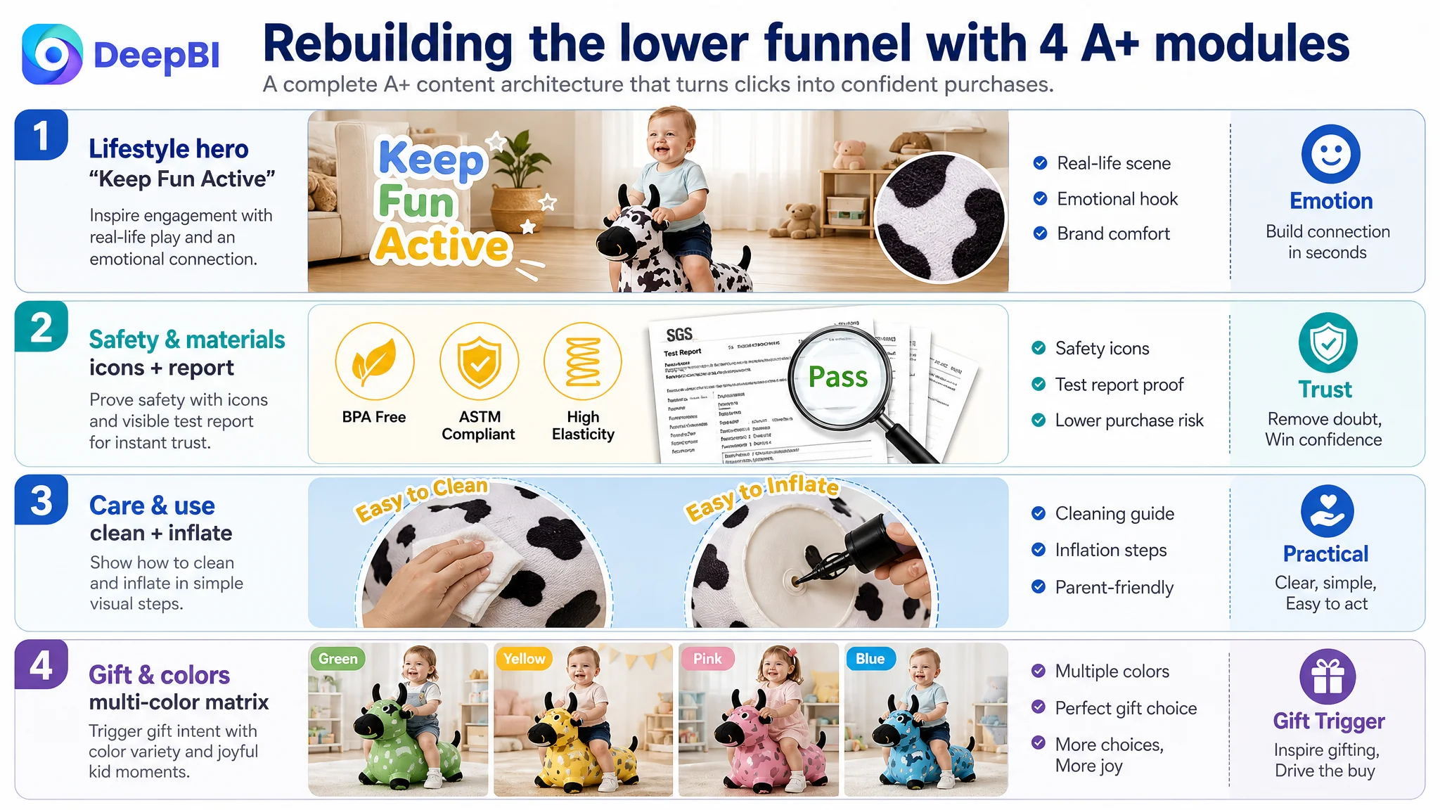
This is not “design for design’s sake.” It rebuilds the decision narrative: fun → movement benefits → safety proof → practical use → gift excitement.
Without this, every click carries full acquisition cost but lands on a page that feels incomplete—exactly what was happening.
5. Review Structure: Weak Social Proof and Visible Negativity
Review metrics:
- The seller:
- 4.0 stars.
- 11 total reviews.
- 7 visible on the first page, including at least one 1-star.
- Benchmark:
- 4.6 stars.
- 3,656 total reviews.
- First page: 100% 4–5 stars.
For a parent, this translates to:
- The competitor feels well-proven and widely used.
- The seller feels untested and somewhat risky, especially with a visible 1-star in so few reviews.
DeepBI’s judgment here was not “you need more reviews” in the abstract, but:
- With such a small review base, one 1-star review dramatically drags perceived risk.
- Without strong A+ and safety visuals to counterbalance, that single review can dominate the buyer’s mental picture.
So the Listing had:
- Weak trust baseline (few reviews).
- Explicit negative outlier (1-star in the first screen).
- Zero trust amplification (no A+ imagery, no certificates).
Ads could not overcome this. They only increased the number of people who hit that fragile trust structure.
Why DeepBI Refused to “Optimize Ads First”
From DeepBI’s perspective, the business risk was clear:
- If the team increased budgets or chased more aggressive keywords without fixing conversion, they would:
- Inflate spend.
- Push more traffic into a page that structurally underperforms vs. the benchmark.
- Potentially erode margins without building any durable organic positioning.
“Advertising does not only amplify advantages. It can also amplify a page’s existing defects.”
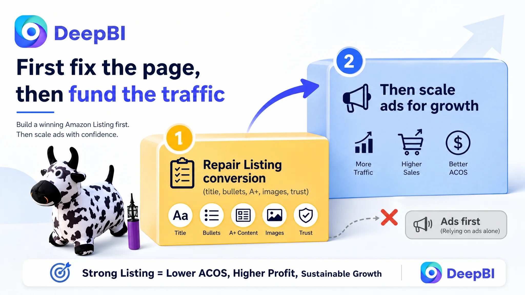
So we prioritized:
1. Repairing the Listing’s basic persuasion capacity
- Title: clarify user, age, gift intent, and core product type.
- Bullets: reframe around parent decision logic.
- A+: build a full visual story for fun, movement, safety, care, and gifting.
- Images: structure the gallery so each slot answers a different question.
2. Stabilizing trust signals before scaling traffic
- Give early traffic a more robust page so any positive review growth compounds.
- Reduce the gap between what parents expect (after seeing the refined main images) and what the rest of the page delivers.
3. Avoiding ads as a band-aid
- With a 51/100 Listing score vs. 83/100 for the benchmark, more ad spend would likely mean:
- Higher ACOS.
- No improvement in organic ranking (because CVR would underperform category norms).
- Only after conversion improved would it make sense to re-accelerate ads.
In short: before ads could work again, the page had to convert.
How the Page’s Sales Logic Started to Recover
Once the decision was made to treat Listing conversion as the primary constraint, the path forward became structured:
1. Clearer Search Entry via the Title
The optimized title repositioned the product as:
- A specific type of toy (inflatable hopper, hopping toy).
- For a specific audience and age (toddlers, 18 months to 6 years).
- With a clear use case (birthday gift, boys and girls).
- Highlighting differentiators (plush cover, pump included).
This impacts:
- CTR on Amazon search results (more relevant to high-intent queries).
- Conversion for parents scanning the title as a quick check for suitability.
2. Bullet Points That Walk Parents Through a Decision
The revised bullets:
- Start with cute design and pretend play (child’s interest).
- Move into balance and coordination (parent’s desire for developmental benefit).
- Reassure on stability and versatile use (safety + practicality).
- Address safety and hygiene explicitly.
- Close with gift positioning and portability (how it fits into real-life scenarios).
Now, the bullet stack essentially answers:
- “Will my child love it?”
- “Is it good for them?”
- “Is it safe and easy to handle?”
- “Is it a good gift and practical to own?”
3. A+ Content That Turns a Toy into a Growth Partner
By introducing the four A+ modules, the page moves from “toy photo gallery” to structured decision support:
- Lifestyle: parents can see their own living room in the images.
- Safety: they visually register “BPA free”, “standards”, “Pass.”
- Maintenance: they understand the cleaning and inflation workflow in seconds.
- Gifting: they see multiple colors, multiple kids, and a “best gift” frame.
4. Re-Framed Visuals That Support Click and Conversion
The main image set is redesigned so that:
- Each image has a clearly defined commercial role.
- Core anxieties are answered visually:
- “How big is it and how much weight can it take?”
- “How do I inflate it?”
- “Will it fit my home style?”
- “Is it safe and skin-friendly?”
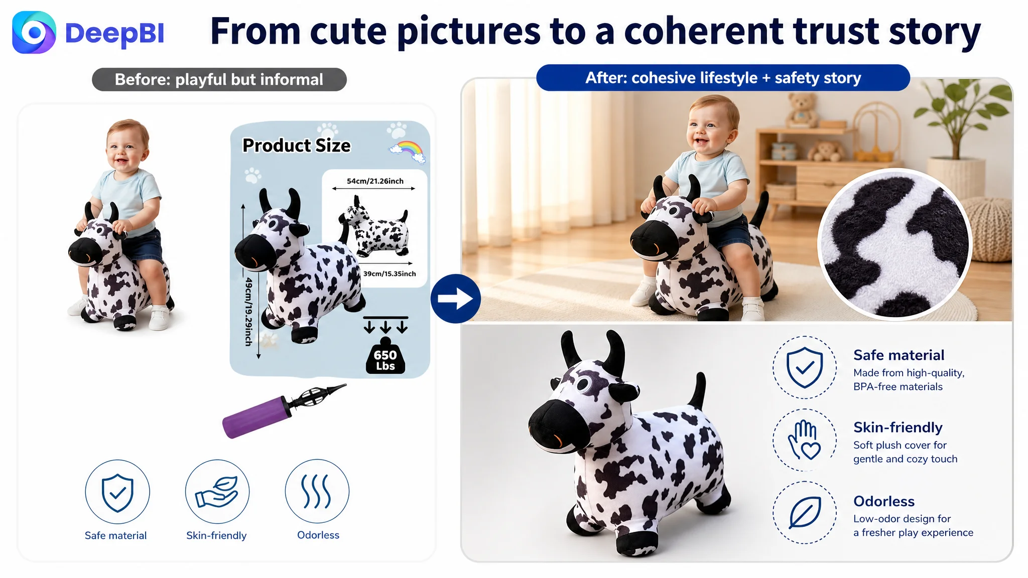
The result is not only about aesthetics. It is about reducing cognitive load and compressing the time from curiosity to conviction.
What Changed for the Business (Even Without Invented Numbers)
The case material does not contain post-optimization KPIs, so we will stay on the level of operating state and risk.
By repairing the Listing first, the seller:
- Reduced the structural gap vs. the benchmark (particularly the catastrophic 1 vs. 22 in detail/A+).
- Gave paid traffic a credible chance to convert rather than dropping visitors into a near-empty page.
- Decreased dependence on “perfect ads” to compensate for a weak page.
- Positioned the product to:
- Accumulate reviews on a stronger trust foundation.
- Eventually improve organic rankings because CVR no longer lags badly behind category norms.
On the risk side:
- The seller moved away from the dangerous pattern of “spend more to test more” on ads while the page was fundamentally underpowered.
- They now have a repeatable Listing logic they can reuse for similar child/parent products:
user-defined title → parent-centric bullets → full A+ trust narrative → structured images.
On the understanding side:
- The team saw that Amazon ads and Amazon Listing conversion are not separate tracks.
They are a single system, in which:
- Listing quality sets the ceiling for ad efficiency.
- Ads only amplify what already exists on the product page.
Takeaways for Other Amazon Sellers
For any Amazon seller, especially in children’s products and other trust-sensitive categories, this case offers a few practical judgments:
1. If ads feel “expensive,” look at the page first.
Before assuming a bidding or targeting problem, ask:
- Is my Listing anywhere near the benchmark’s level in title clarity, bullet logic, A+, and reviews?
2. A high gap in A+ and review strength makes every click costlier.
A page with no A+ and weak review structure cannot justify the same CPC as a competitor with a full trust stack.
3. Main images are necessary, but not sufficient.
Even a solid main image will not save a page that has:
- Generic title.
- Feature-only bullets.
- Missing safety visualization.
- Zero A+.
4. Ads are multipliers, not magicians.
When the Listing score is 51 vs. a competitor’s 83, more traffic mostly multiplies your conversion deficit.
5. Listing conversion capacity is a strategic asset.
Once the page can convincingly talk to your target buyer, every future dollar of ad spend and every organic impression has a materially higher chance of turning into profit.
This kids’ hopper toy did not fail because the product was wrong. It struggled because the Amazon Listing was not doing the work required in today’s competitive toy category. DeepBI’s role was not to tweak knobs in the ad console, but to surface—and then fix—the underlying constraint: a product page that could not yet carry its own traffic.