

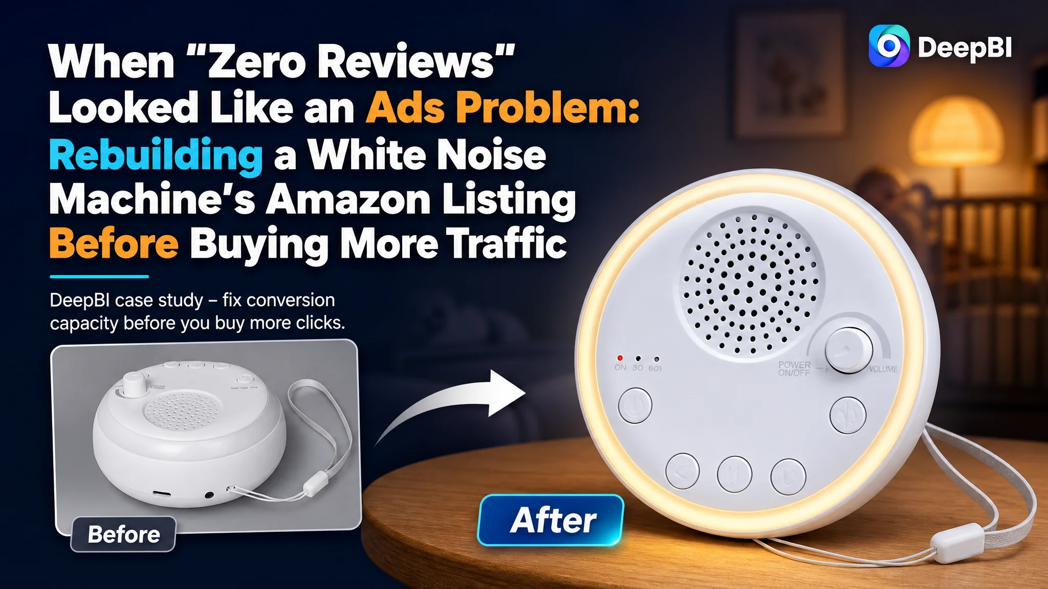
This case comes from an Amazon seller in the baby‑care and home‑sleep category. The team launched a portable white noise machine with night light on Amazon, planned to push it with Amazon ads, and quickly ran into a wall: the benchmark competitor was converting well with strong ratings and rich A+ content, while their own new ASIN had no reviews, weaker visuals, and a much lower overall Listing score.
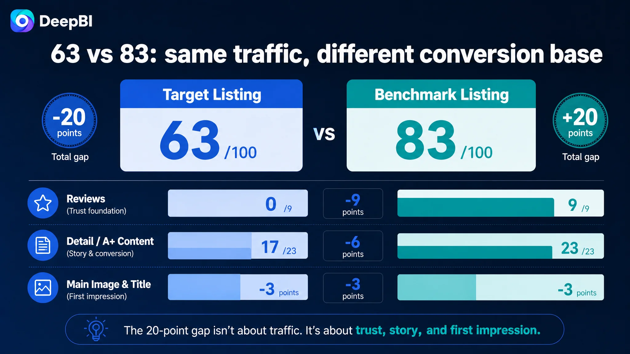
At first, the seller framed the situation as a traffic and bidding problem—“we just need to buy more exposure and wait for reviews.” DeepBI’s diagnosis pointed in a different direction. Against a leading competing Listing in the same category, the target Listing scored 63/100 versus 83/100, with the biggest gaps not in keywords but in trust and story: missing review foundation (0 vs 9 points), thinner A+ content (‑6 points), and main image/title that did not fully earn the click.
DeepBI recommended holding back on aggressive ad scaling and instead rebuilding the Amazon product page so that any paid traffic would have a real chance to convert. The optimization focused on: restructuring the title around Amazon search logic, upgrading main images from “cheap ecommerce asset” to “credible baby‑care device”, and turning the A+ area into a clear “problem → solution” narrative for sleep, nursery use, and travel. For other Amazon sellers, this case is a reminder: when ACOS feels unstable or new launches stall, the real constraint is often Listing conversion capacity, not the ads dashboard.
What the Seller Saw: A New Listing That “Just Needed Traffic”
The product is a portable white noise machine with 16 sounds, a night light, timer, memory function, and USB‑C rechargeable battery—positioned for babies and adults, at home and on the go.
From the seller’s perspective:
- The product specs were competitive.
- The five bullet points already told a seemingly complete story.
- Ads could be turned on at any time to bring traffic.
The pressure came from a clearly stronger benchmark ASIN in the same Amazon category:
- High review volume and rating: 708 reviews at 4.5 stars, with rich photo/video reviews.
- Stronger total Listing score: 83/100 vs the target Listing’s 63/100.
- More complete A+ structure and trust modules.
Because the seller had no rating history on the new Listing (0 reviews, no stars), the team’s initial internal narrative was: “We just haven’t pushed enough traffic yet. Let’s focus on ads, bids, and search terms.”
In other words, they were treating a conversion‑foundation problem as a traffic‑volume problem.
“The real problem was not that ads failed to bring traffic. It was that the page could not yet convert the traffic in a credible way.”
The Core Constraint Was Not Traffic. It Was Conversion Capacity.
From DeepBI’s diagnostic view, there was only one bottleneck that mattered at this stage:
The Listing did not yet have the conversion and trust capacity to justify scaling Amazon ads.
The data and structural gaps made that visible:
- Total Listing score gap: 63 vs 83 (‑20 points).
- Detail/A+ content gap: 17 vs 23 (‑6 points).
- Review/trust gap: 0 vs 9 (no rating vs a mature review base).
- Visual hierarchy gap on main image and title: both lagged the benchmark by 3 points each.
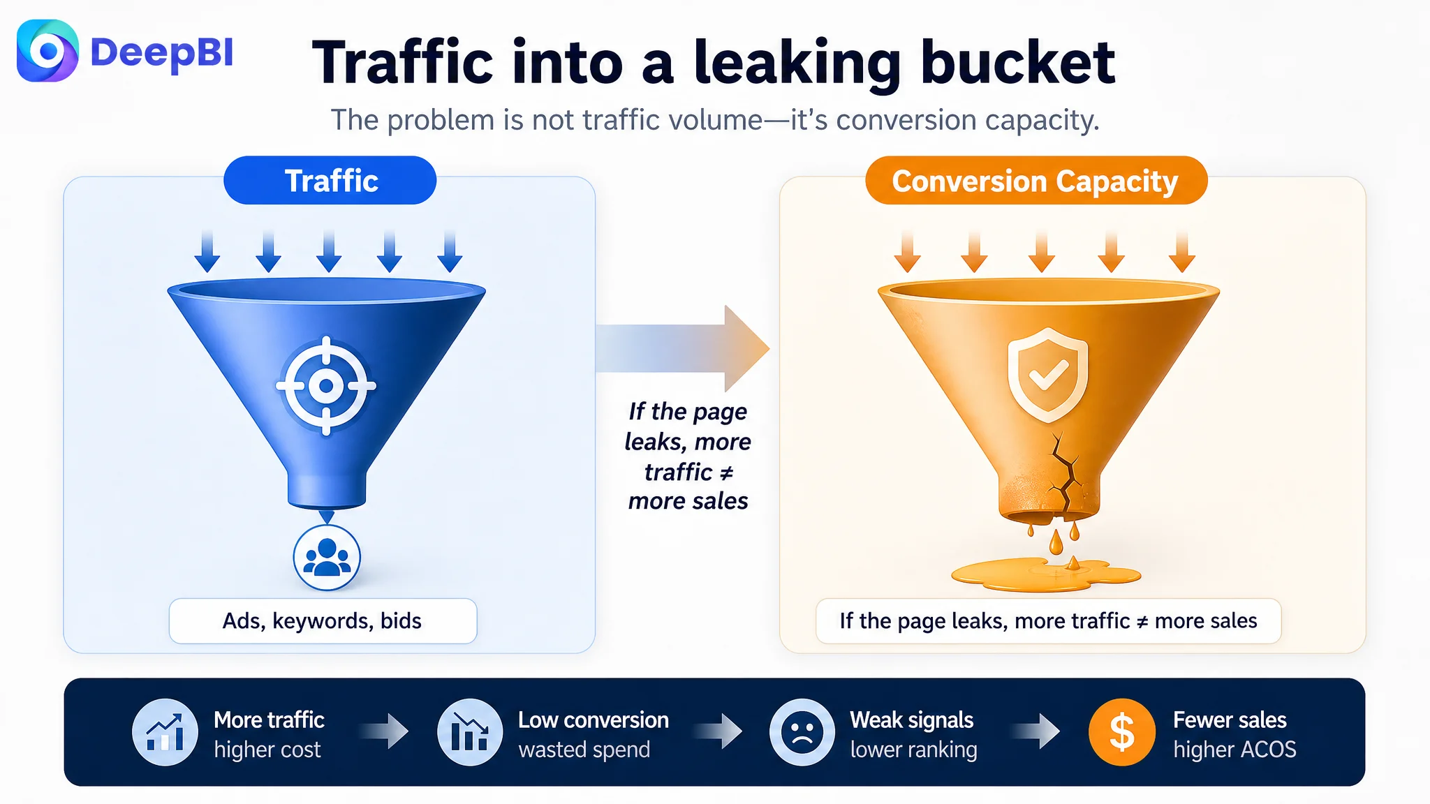
If the seller pushed aggressive traffic into this state, three risks would immediately appear:
1. ACOS volatility: Paid clicks would be relatively expensive, but the page’s ability to close orders was limited, especially with zero reviews.
2. Negative algorithm feedback: Weak early CVR would make Amazon’s system less willing to reward the Listing with organic exposure.
3. Wasted “review acquisition” attempts: Even if some initial orders came in, the page did not yet provide a compelling, low‑friction buying journey to support steady, organic review growth.
Without fixing the page first, ad optimization would be like pouring water into a leaking bucket.
Why Traditional Ad Tuning Would Have Failed Here
If the team had stayed on the original path and focused on Amazon ads first, these are the levers they would likely have pulled:
- Adjusting bids, match types, and search terms around “white noise machine”, “sound machine”, “baby sleep aid”.
- Testing different daily budgets to try to “buy” their way to initial sales velocity.
- Possibly tweaking ad creatives without touching the underlying product page structure.
In a mature Listing with strong conversion, that kind of incremental tuning can work.
In this case, DeepBI’s scoring and competitor comparison showed a different picture:
- Title was structurally sub‑optimal. The core phrase “White Noise Machine” appeared later in the string; the competitor’s title followed a “brand + core product” pattern, then layered in differentiated features and concrete scenes (“Touch Warm Light”, “Ideal Travel Companion & Nursery Must‑Have”).
- Main image set lacked emotional and trust depth. It felt like low‑cost ecommerce material: information was dense and technical, but without the warmth and realism common in mother‑and‑baby devices.
- A+ content lacked a clear “problem → solution” narrative. The seller had scenes and icons, but not the same level of guided storytelling or visible validation that the benchmark Listing used.
- No ratings at all, versus a competitor with hundreds of reviews, including imagery and multiple languages.
With these gaps, traditional ad tweaks would only amplify defects:
“Advertising does not only amplify advantages. It can also amplify a page’s existing defects.”
What the Listing Data Actually Showed
1. Title: Keywords Present, But Decision Logic Weak
The original title did include “White Noise Machine” and sleep‑related terms, but it had three conversion issues:
- Primary keyword placement: “White Noise Machine” sat later in the sequence, while the benchmark placed brand + core product at the front, maximizing both search weight and instant recognition.
- Sell‑point syntax: The seller used parallel listing of features (“16 Sounds, 3‑Stage Timer”) with commas. The benchmark connected sounds and light through “&” and used verbs like “Touch Warm Light” that evoke an interaction and scene.
- Scene and emotional entry: The title repeated generic “Sleep Aid” language, whereas the benchmark explicitly named scenes and emotional payoffs (“Ideal Travel Companion & Nursery Must‑Have”), directly mapping how and where the buyer would use it.
DeepBI’s recommended title direction reframed the line around Amazon’s search and decision logic:
White Noise Machine for Baby & Adults, Portable Sound Machine with 16 Soothing Sounds, Night Light, Sleep Timer & Memory Function, USB Rechargeable Sleep Aid for Home, Travel and Nursery
Key shifts in logic:
- Lead with the core query: “White Noise Machine for Baby & Adults” at the very front.
- Clarify user coverage: Babies and adults in one breath, reducing perceived narrowness.
- Structured feature blocks: Group sounds, night light, timer, and memory into clearly legible clusters.
- Scene tags at the end: “Home, Travel and Nursery” to echo benchmark behavior without copying.
This was not about stuffing more words; it was about making the title do two jobs simultaneously: win search relevance and preview a credible use story.
2. Main Images: From “Cheap Asset” to “High‑Trust Baby Device”
When DeepBI compared the target Listing’s main images to the benchmark set, the gap was not in sheer number of photos but in what those images actually did for the conversion funnel.
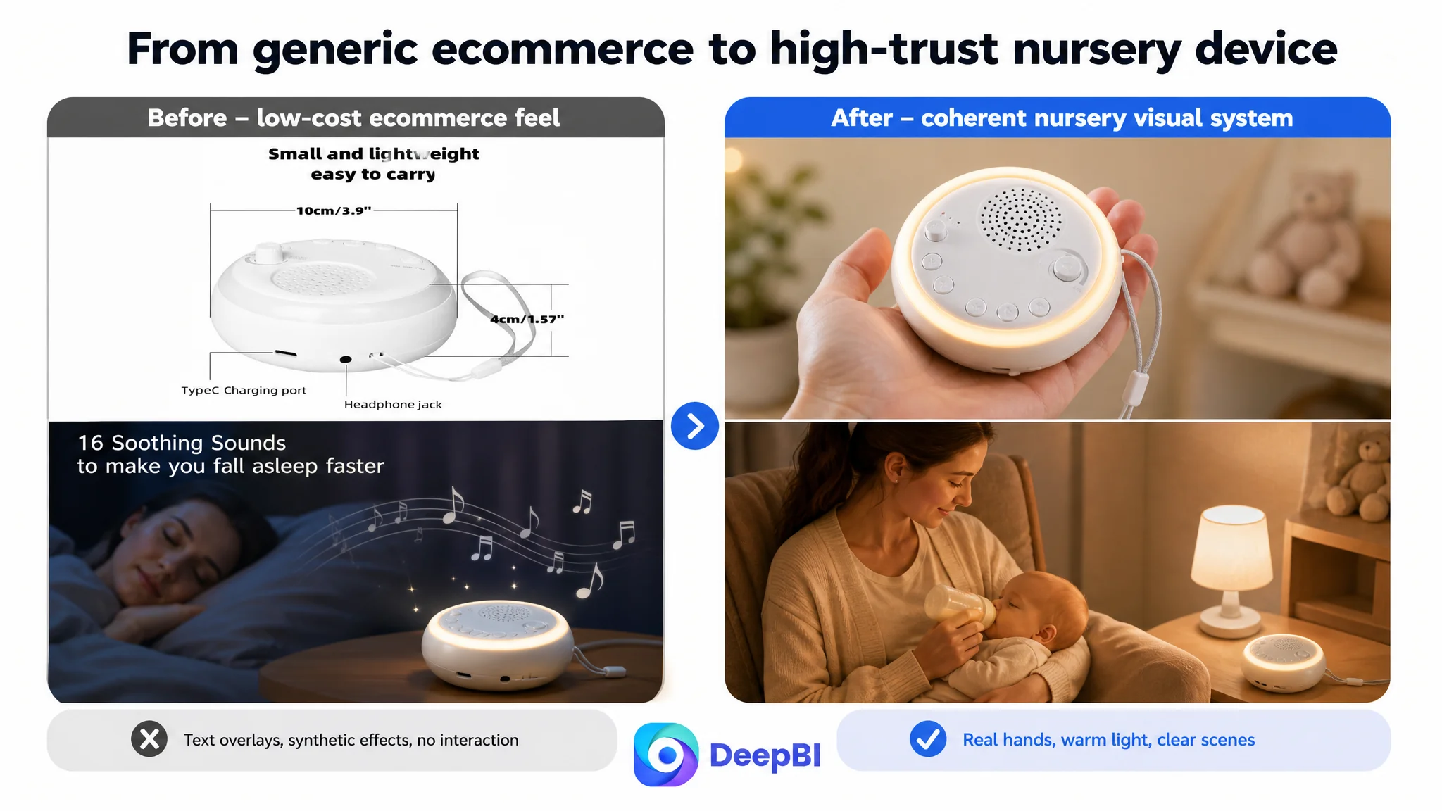
The problems on the current Amazon Listing:
- Overloaded first image: Too many visual elements and labels made it hard to grasp the core benefit (e.g., sound count) within three seconds on the search results page.
- Weak emotional resonance: For a mother‑and‑baby sleep aid, the images did not transmit calm, warmth, or safety strongly enough.
- Lack of behavioral proof: There were few cues showing actual interaction—tapping the top, adjusting brightness—so “ease of use” stayed abstract.
DeepBI’s optimization logic was:
- Move from “low‑cost ecommerce style” to a coherent home‑and‑nursery visual language with warm tones and soft lighting.
- Use angle, light, and context to turn each image into a specific piece of the buying argument.
Some of the key proposed image roles:
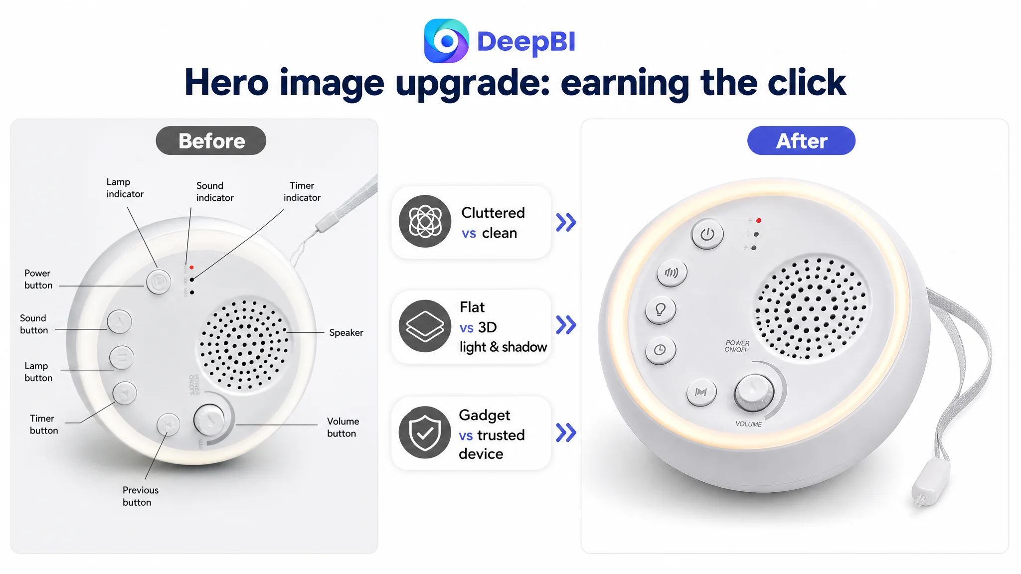
1. Clean hero: Product centered, ~75% of frame, 45° top‑down angle, soft light and real shadow, white background, glowing light ring, cord hanging naturally. Goal: instantly read as a high‑quality, modern device in thumbnail form.
2. Scale and portability: Device resting in an adult hand, 45° angle, blurred bedroom background, simple overlay like “Weight: 0.5 lb” plus USB‑C icon. Goal: eliminate size/weight anxiety at a glance.
3. Sound variety visualization: Product at bottom center, 2×2 icon grid above showing four sound categories (“Nature”, “Fan”, “White Noise”, “Lullabies”) with counts. Goal: make “16 sounds” look rich and organized, not abstract.
4. Night operation trust: Device on a wooden bedside table in low light, a hand tapping the top, warm glow illuminating a blurred baby crib. Goal: prove that it truly works as a nursery night light and is easy to operate half‑asleep.
5. High‑frequency baby scene: Device in a warm, homey setting with a parent feeding a baby in the background, light halo visible. Goal: position the product as part of an intimate caregiving routine, not just a gadget.
The key is that each main image is assigned a clear conversion task: click attraction, scale understanding, sound richness, usability, or emotional trust. This moves the Listing from “pictures of product” to “pictures that reduce purchase risk and effort step by step.”
3. Bullet Points: Structure Was Good, but Content Needed Re‑Weighting
Interestingly, on pure structure, the target Listing’s bullet points were not weaker than the benchmark—in fact, they scored slightly higher (7 vs 6) in DeepBI’s model:
- They centered on the core pain point of quiet sleep and extended to adult use (work, meditation).
- They followed a clear, layered logic: from sound, to night light, to control, to portability, to battery and eco‑benefits.
- They emphasized outcome and user benefit (“ensure restful sleep”, “create a focused workspace”).
The issue was not structure; it was how concretely those bullets matched what buyers actually worry about, and how they leveraged competitor insight.
DeepBI’s optimization path:
- Bullet 1 – Sound diversity and outcomes. Specify types (white, pink, brown noise, lullabies, rain, ocean), and explicitly connect them to noise masking and infant soothing. This turns “16 sounds” into a decision‑useful promise.
16 high‑fidelity sounds, including white/pink/brown noise, lullabies, and nature soundscapes; masks disruptive noises, soothes infants, and helps adults fall asleep faster.
- Bullet 2 – Night light in real nursery scenes. Anchor the light in late‑night feeding and diaper‑change moments; mention eye‑friendliness and non‑stimulation of baby.
Adjustable warm glow for late‑night feedings, diaper changes, and check‑ins without fully waking the baby.
- Bullet 3 – Timer and memory as convenience, not just specs. Emphasize automatic shutoff and “no need to re‑set every night.”
3‑stage timer (15/30/60 min) and memory function that restores your last settings automatically.
- Bullet 4 – Multi‑scenario adult usage. Bring in office privacy, yoga, meditation, not just babies and travel.
From hotel rooms to offices and yoga mats—positioned as an all‑day, all‑place relaxation and privacy tool.
- Bullet 5 – Battery life and USB‑C as economic and eco‑logical. Make “no disposable batteries” and long runtime explicit.
Built‑in rechargeable battery with USB‑C, long runtime per charge, and no ongoing battery waste.
Here, DeepBI did not change the seller’s original logical framework; it re‑weighted and sharpened each bullet so that every line resolved a concrete, recognizable scenario or fear.
4. A+ / Detail Page: From Generic Scenes to a Persuasive Buying Journey
The A+ comparison was the clearest gap:
- The seller used: main scene + function annotations + sound demo GIF + plain product shots + multi‑scene collage.
- The benchmark used: brand main visual, sound category overview, internal structure/tech visualization, interaction diagrams, simplified operation infographics, battery life visuals, timer module, charging accessories, and multi‑scene panels.
Most importantly, the benchmark page:
- Followed a “problem → solution” narrative (“Sleep soundly with scheduled shutdown”, etc.).
- Included visible trust signals, such as awards/shortlists in mother‑and‑baby segments.
- Used structured multi‑scene layouts with labels and icons (yoga, meditation, work, sleep).
DeepBI’s judgment:
- The seller’s A+ had information, but too much of it sat as unstructured, unlabeled visuals. Buyers had to “work” to parse the message.
- No trust module meant the product relied only on bare product shots at the exact moment when the review base was zero.
- There was no single, strong opening frame that instantly told a sleep‑and‑safety story for babies.
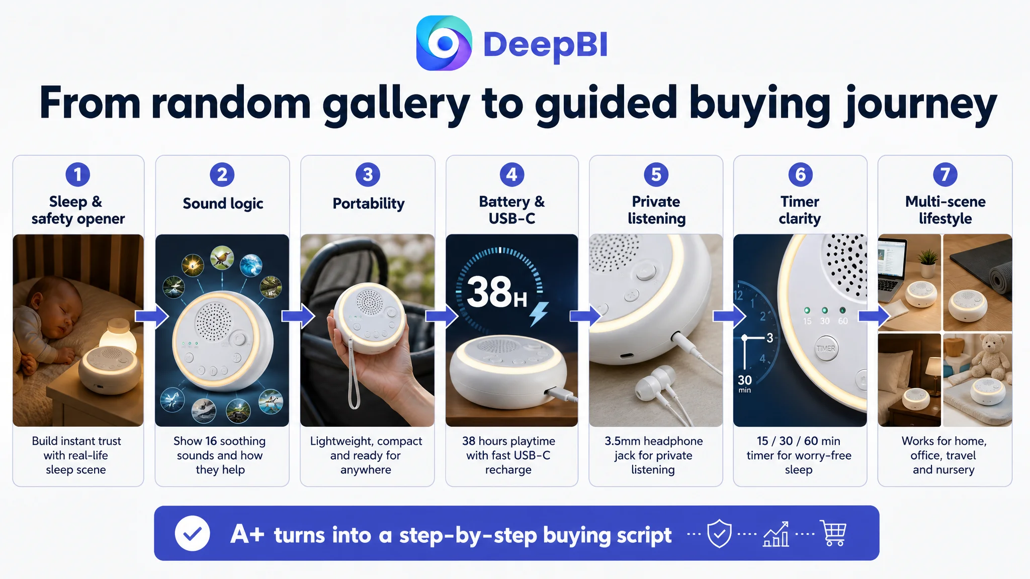
The proposed A+ re‑architecture was therefore very intentional:
1. Opening brand scene: Warm night nursery, baby sleeping, product at bottom‑right emitting a soft 2700K glow. Clear headline: “16 Soothing Sounds for Better Sleep.”
- Purpose: Immediately align with mother‑and‑baby sleep expectations and reduce anxiety about harsh light or noise.
2. Sound logic visualization: Top‑down view of the device, surrounded by 16 icons in a radial layout (fire, ocean, rain, fan, birds, etc.), divided into clear categories and labeled “16 High‑Fidelity Soothing Sounds – Nature, White Noise, & Lullabies.”
- Purpose: Turn abstract “16 sounds” into a perceived, organized richness.
3. Portability in real use: Close‑up of the device hanging from a stroller handle in a park, with “Travel Ready & Stroller Friendly” and “Compact 3.5‑inch Design.”
- Purpose: Prove real‑world portability and hook stroller‑use scenes that parents actually care about.
4. Battery life and USB‑C clarity: Side view with USB‑C cable inserted, big “38H Continuous Playback” typography, cool tech background.
- Purpose: Eliminate battery‑life anxiety and highlight modern USB‑C universality.
5. Private listening differentiation: Macro shot of the 3.5mm headphone jack with an earbud plug approaching, captioned “Private Listening Mode – 3.5mm Headphone Jack.”
- Purpose: Surface a true differentiator vs many plain white noise machines and link it to office/travel privacy.
6. Timer comprehension: Overhead shot focusing on the timer button and three LEDs (15/30/60), with a semi‑transparent clock overlay.
- Purpose: Make timer logic instantly understandable without reading long text.
7. Multi‑scene trust mosaic: Four equal panels: next to a laptop (office noise masking), beside a yoga mat (meditation), on a hotel nightstand (travel sleep), beside a changing table (nursery). Central badge: “Your All‑Day Relaxation Companion.”
- Purpose: Expand perceived user base beyond babies, justify price/value, and make the product feel like a lifestyle tool, not a niche gadget.
This is where DeepBI’s philosophy shows up most clearly: A+ was not treated as a gallery, but as a conversion script broken into visual chapters.
Why DeepBI Prioritized Fixing the Listing Before Pushing Ads
From a pure cash‑flow standpoint, the seller’s initial impulse—to start ads quickly and “accelerate reviews”—is understandable. The question DeepBI had to answer was:
In what state will every additional ad dollar produce the least wasted spend and the most durable impact?
Given:
- A 20‑point total score gap vs the benchmark,
- A 9‑point gap on reviews and a 6‑point gap on A+,
- A Listing that already had reasonable bullet structure but weaker title/main image trust signals,
DeepBI’s judgment was:
1. Without conversion repair, ads would mostly teach the algorithm that this page doesn’t convert as well as peers. That would suppress both paid and organic opportunities.
2. Any early buyers would face a more tentative, less polished decision journey. Lower conversion at the start risks a slower accumulation of organic reviews and more pressure to keep ads on just to sustain sales.
3. Competitor weaknesses (1‑star review rate of ~33% on first page) were an opportunity—but only if the Listing could present a clearly better alternative. The target Listing needed to show, at a glance, that it avoided the same pitfalls and matched or exceeded benefits.
So DeepBI recommended:
- First, rebuild the Listing—title, main image, A+, and bullet content—so that the page could stand credibly next to the benchmark even with fewer reviews.
- Then, bring in traffic deliberately and watch CVR, not just clicks.
This sequencing reflects a simple principle:
Before scaling Amazon ads, you must decide whether the page actually deserves more traffic.
How the Page’s Sales Logic Started to Recover
Once the optimization plan was clarified, the expected changes in operating state were:
- Stronger click logic from search results:
- Title now front‑loaded with “White Noise Machine for Baby & Adults” and clear use scenes.
- Main image stack visually closer to category leaders, with higher perceived quality and clearer value in the first 3 seconds.
- Buyers scanning results would see the device as a modern, credible alternative to the award‑bearing competitor, not a generic low‑cost clone.
- More coherent persuasion once on the page:
- Bullets mapping precisely to sleep, nursery, office privacy, yoga, and travel scenarios.
- A+ modules answering most typical pre‑purchase questions visually: How many sounds? How does it hang? How long does the battery last? How do I use the timer? Can I use headphones?
- Improved initial trust without relying on review count:
- Although no artificial badges were invented, the overall visual narrative and parameter transparency (e.g., 38‑hour playback, USB‑C, private listening) raised perceived professionalism.
- This mitigated part of the “zero‑review anxiety” that usually depresses conversion for new ASINs.
With this foundation, each paid click had a higher probability of becoming an order and, therefore, a review opportunity. The Listing began to have its own conversion competence instead of leaning entirely on ad mechanics.
How Ad Traffic Became Useful Again
After the Listing logic was rebuilt, the role of Amazon ads changed in three important ways:
1. From buying exposure to feeding a capable page. Traffic was no longer sent to a weak page; it was sent to a Listing that could reasonably compete for the same buyers as the benchmark, even without hundreds of reviews.
2. From chasing clicks to testing messaging. Because the title and images now carried distinct, testable messages (e.g., “16 Soothing Sounds”, “38H Continuous Playback”, “Private Listening Mode”), ad groups and search terms could be aligned to those hooks and their performance read more cleanly.
3. From pure ACOS focus to CVR‑first discipline. With the Listing tightened, the seller could watch conversion rate movement when ads ramped up. If ACOS was still unstable, the diagnosis would point to market fit or pricing—not to missing basics in images or A+.
In practical terms, this reduced the risk that ad spend would be written off as “test losses” without a clear learning.
What Changed in the Seller’s Understanding
The most important outcome of the case was not a single metric; it was a shift in how the team thought about Amazon growth:
- Ads were re‑framed as an amplifier, not a repair tool. The seller saw that Amazon ads cannot fix a page that does not yet build trust, especially in categories where competitors already have deep review moats.
- Listing quality became the foundation of advertising efficiency. Title, main image, bullet points, and A+ were understood as a single conversion system, not separate, cosmetic elements.
- The team began to treat review‑less launches differently. Instead of “turn on ads and wait”, the new default became “ensure the page can stand next to the benchmark first, then use ads to prove and scale it.”
- Competitor weaknesses became actionable only after internal basics were solid. Seeing that the benchmark had a significant 1‑star share on the first page stopped being just “good news”; it became a reason to clarify and highlight exactly how this product avoided those pain points.
For other Amazon sellers, this case is a concrete reminder:
- High or unstable ACOS on a new or weak Listing is often a page‑conversion issue disguised as an ads problem.
- If your Amazon product page scores significantly below a realistic benchmark in main image quality, A+ depth, and trust elements, fix that first before expecting bid changes to solve your economics.
- Advertising is most powerful when it amplifies a Listing that already understands and answers the buyer’s decision logic end to end.