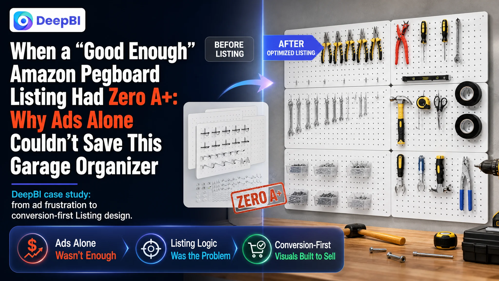
This case comes from an Amazon seller in the metal pegboard / garage tool storage category. On paper, their product configuration looked very competitive: more panels, more hooks, higher load capacity. The team believed they mainly needed to “push ads harder and refine keywords” to win more orders. But even with traffic, the Listing simply could not convert at the level they expected.
Once we put their Listing into DeepBI and benchmarked it against a leading Amazon competitor, the problem surfaced very clearly: this was not an advertising or “minor text tweak” issue. The real bottleneck was a half‑finished product page – especially a completely missing A+ section – that was consuming every click the ads managed to bring in. The ads were doing their job; the Listing was not.
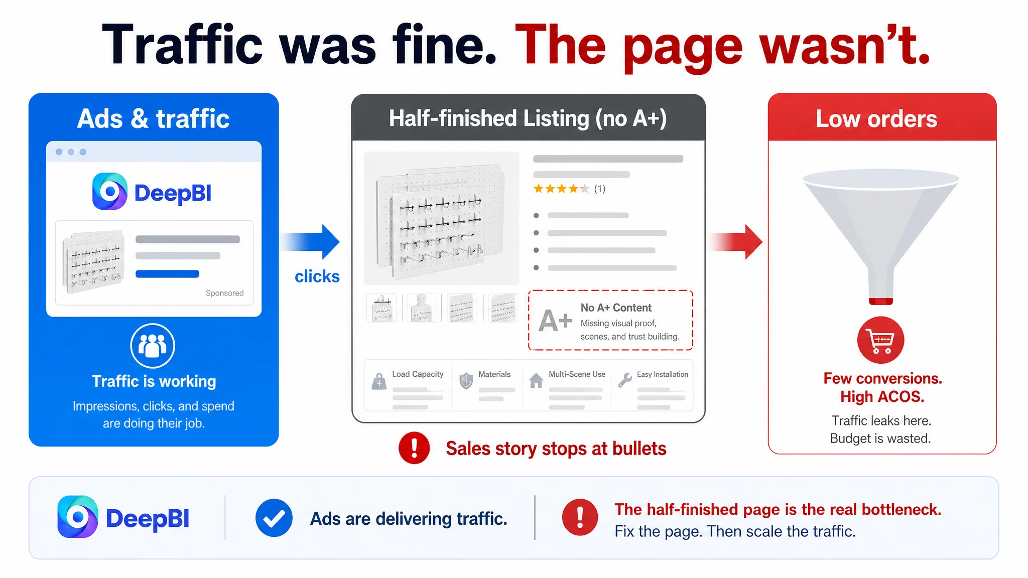
The later optimization work therefore did not start with campaign structure, bids, or more keywords. It started with rebuilding the Amazon product page’s sales logic: refocusing the title on core search terms, restructuring bullet points around outcome and proof, and, most critically, designing a full A+ story with visual proof of load‑bearing strength, completeness of the kit, and multi‑scene usage. Only after the page could convincingly carry the traffic did ad efficiency have a chance to recover.
For other Amazon sellers, the pattern here is familiar: high ACOS is easy to blame on ads, but when your Listing scores 47/100 against a benchmark at 83/100 and has zero A+ content, the true constraint is not the ad console. It is the product page’s ability to convert both paid and organic traffic.
The Seller’s Perspective: “Our Set Is Stronger and Bigger, Why Isn’t It Selling?”
This Amazon seller offers a metal pegboard wall organizer: white steel panels, hooks, bins, and mounting hardware for garage, kitchen, and office organization.
From the team’s point of view:
- The product spec felt superior to market leaders: more panels, more hooks, higher claimed load capacity.
- Title and bullets already contained a lot of information: dimensions, accessories, usage scenarios.
- They had begun to invest in Amazon ads and believed poor results mainly meant:
- Keywords were not fully optimized.
- Bids and budgets needed more tuning.
- Maybe the main images were “not pretty enough.”
In other words, they saw a traffic and ads problem, not a page-conversion problem.
But when we ran the Listing through DeepBI’s scoring and benchmarked it against a leading competitor in the same Amazon category, the picture was very different.
What the Data Actually Showed: A 47/100 Listing Facing an 83/100 Benchmark
DeepBI’s Listing scoring put the customer’s Amazon product page at 47/100, while the benchmark competitor sat at 83/100. The gap wasn’t scattered; it clustered around a single, critical area.
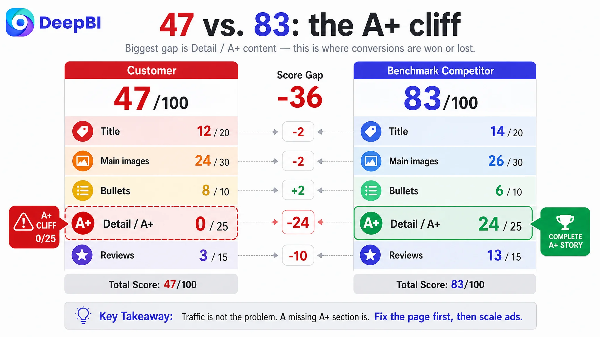
Score comparison by dimension:
- Title: 12 vs. 14 (out of 20) – only slightly behind
- Main images: 24 vs. 26 (out of 30) – also only slightly behind
- Bullet points: 8 vs. 6 (out of 10) – actually a bit stronger on paper
- Detail / A+: 0 vs. 24 (out of 25) – this is the cliff
- Reviews: 3 vs. 13 (out of 15) – early-stage social proof vs. a matured trust base
Two things are worth underlining:
The competitor’s advantage did not come from a fundamentally better product spec. It came from a far more complete and persuasive Amazon product page.
And even more stark:
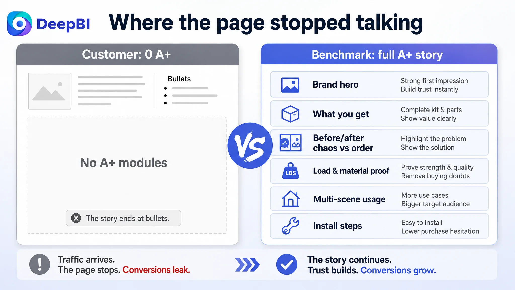
The customer’s A+ score was literally 0. No A+ at all, in a category where the benchmark had a fully built narrative and visual proof chain.
Once you see this, continuing to pour budget into ads while keeping the page in this state is not “aggressive scaling”; it’s subsidizing a leak.
Where the Misdiagnosis Started: Overweighting Specs, Underweighting Page Structure
From the seller’s side, several beliefs kept them optimizing in the wrong direction:
1. “More specs and more accessories = more persuasive”
- The original title led with total accessories and detailed part lists.
- Bullets were dense with counts, sizes, and configuration details.
- The thinking: if we show how much you get, the value is obvious.
2. “Our bullets are already very detailed, so copy is not the issue”
- They saw their bullets as a strength: solution + benefit, concrete data, and scene description.
- Compared to the competitor, they felt they were already telling a richer story.
3. “Images are okay; ads will drive more eyes”
- Main images were seen as “good enough” standard e‑commerce visuals.
- They did not see a missing A+ section as an urgent blocker; it was more like “we’ll do it later.”
4. “High ACOS means ads need more work”
- When campaigns didn’t deliver ROI, they looked first at:
- Keyword coverage
- Match types, bids, and budgets
- Maybe launching new campaigns
- The assumption: ad tuning precedes page rebuilding.
In short, they tried to solve a conversion problem with traffic tools.
The Real Constraint: A Page That Could Not Carry Paid Traffic
DeepBI’s scoring made the bottleneck unambiguous: Listing conversion capacity, not traffic, was the constraint.
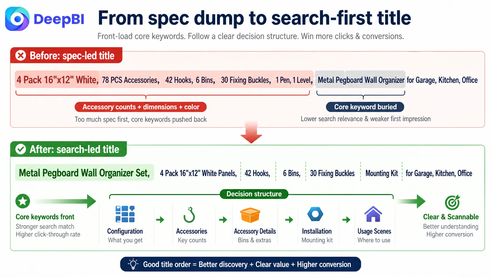
1. Title: Core search terms buried by an overlong spec list
Compared with the benchmark, the customer’s title had two issues:
- Core keywords were not front-loaded.
The competitor leads with “Pegboard, Metal Peg Board, 24x12 inch…”, aligning with how users actually search (“pegboard”, “metal peg board”). The customer’s original title opened with total accessories, dimensions, and color, pushing “Metal Pegboard” and “Wall Organizer” to the back.
- Information overload without decision structure.
Listing every minor part (“30 Hook Fixing Buckle, 1 Pen, 1 Level”) made the title long and harder to scan on mobile search results. Shoppers see a block of text rather than:
- What it is
- Size
- Capacity / strength
- Where to use it
The suggested title refocuses this:
Metal Pegboard Wall Organizer Set, 4 Pack 16x12 Inch White Peg Board Panels with 42 Hooks, 6 Bins, 30 Fixing Buckles and Mounting Kit for Garage Tool Storage, Kitchen, Office
Core terms like “Metal Pegboard” and “Wall Organizer” are moved into the front third. The structure becomes recognizably Amazon‑friendly: product type + configuration + key accessories + main usage scenes.
2. Main images: No clear visual reason to click
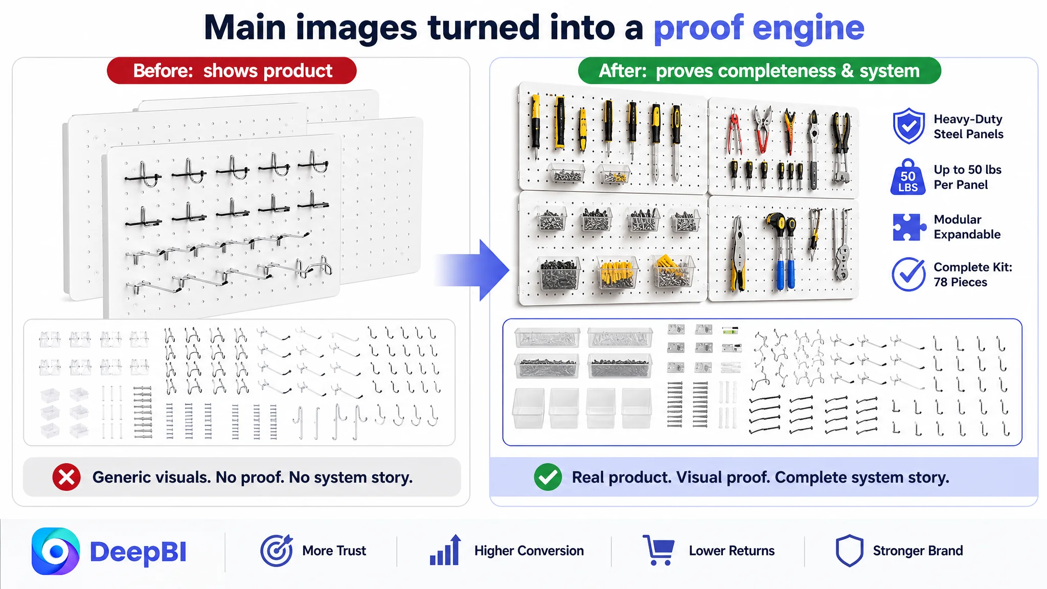
The main-image score gap vs. the competitor was only -2 points, but the qualitative differences mattered:
- One image slot was effectively “dead” (a non‑useful image), reducing information density and harming completeness in Amazon’s eyes.
- Technical strength was not visualized.
In this category, shoppers care deeply about “will it bend?” and “will it hold real tools?”. The competitor’s image 3 visualized a 30 lbs load very clearly. The customer’s images largely showed the product instead of proving its capability.
- Scenes lacked emotional pull and action guidance.
Where the competitor made “organized garage life” feel tangible, the customer’s scenes were more generic and informational.
DeepBI’s image-level recommendations all point to one thing: turn each image into a specific proof point, not just a prettier photo.
Examples of the proposed changes:
- Hero packshot:
Product centered, ~70% of frame, 30° top‑down angle to show layered completeness of the kit; strong side light to create shadows and “industrial weight”; scattered hooks in the foreground; clear textual tag like “78‑Piece Complete Set”.
- Accessories overview:
Left side: installed pegboard on a white brick wall. Right side: grid layout of all 78 accessories with small labels underneath each. This converts “a lot of stuff” into clean, quantified richness.
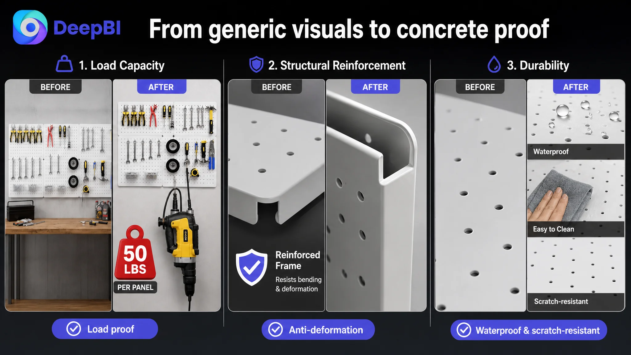
- Load-bearing proof:
Panel at 80% of frame, straight-on angle, with a heavy power tool hanging from hooks, plus a strong, simple graphic mark (e.g., a red badge “High Load Capacity”). This addresses the core fear: “Will this hold my drill?”
- Anti-deformation detail:
Macro shot of the reinforced frame and folded edges, lit with hard side light on a dark background, with overlay text explaining “reinforced four-sided frame” – turning a structural feature into a visible reason to trust.
- Durability demonstration:
Triptych showing water beading, scrubbing with a sponge, and a clean, intact surface, with a simple claim like “Waterproof & Scratch Resistant”. This turns vague “durable” into observable behavior.
The problem was not that the page lacked images. It was that the images did not function as a conversion engine.
3. Bullet points: Strong data, but missing explicit decision structure
Ironically, the customer’s bullet points scored higher than the competitor’s. On paper they had:
- Solution + benefit framing
- Detailed counts and dimensions
- Specific scenes (transparent bins, no extra tools needed, etc.)
But against shopper logic and the benchmark’s structure, some gaps appeared:
- The competitor’s bullets follow “feature → function → result” consistently.
- The customer’s bullets mix solution, benefits, and specs, but not always in a predictable progression.
DeepBI’s optimized bullets refocus each point into a clear headline + proof + outcome structure:
- BP1 – Heavy-Duty Steel Construction
Explicitly leverage the claimed 50 lbs per 16"x12" panel, positioning it as superior to the competitor’s 30 lbs. Add “bend-free storage” and environment details like rust and humidity resistance to make “heavy duty” tangible.
- BP2 – Comprehensive Accessory Kit with Protection
Quantify hooks, highlight silicone caps as a tool protection advantage, not just an accessory detail. This turns a small design choice into a quality signal.
- BP3 – Efficient Bin Storage System
Elevate the clear bins from “extra parts” to a workflow benefit: quick visibility, faster picking, better classification.
- BP4 – Modular Layout & Universal Compatibility
Emphasize standard 1/4" hole spacing to remove compatibility anxiety and highlight the layout flexibility: horizontal, vertical, compact station to full wall.
- BP5 – Secure & Easy Installation
Merge convenience and safety: complete mounting kit, 30 peg locks to keep hooks from popping out, multi-wall compatibility (drywall, wood, brick). This answers “Will I install it wrong or unsafely?” directly.
The point is not more words; it is more intentional logic: each bullet closes a specific objection.
4. Detail page / A+ content: Completely missing in a category that depends on it
Here is the real breaking point.
The competitor uses A+ to build a full decision journey:
- Brand visual & lifestyle positioning – e.g., “The Art of Organized Living” with full-width scenes.
- Specifications and set breakdown – a clean “What You Get” module, with panels and accessories clearly separated and labeled.
- Before/after chaos vs. order – visualizing the pain (“chaos”) and the solution (organized pegboard grid).
- Core performance proof – panels carrying tools with quantified load (“30 lbs”, “10x stronger”) and structural details (reinforced edges).
- Multi-scene validation – bedroom, kitchen, garage: this is not just a workshop tool, it’s a home organizer.
- Installation guidance – step-by-step images that reduce post-purchase anxiety.
The customer had no A+ modules at all. On Amazon, especially for a heavier, more technical product like a metal pegboard, that is essentially:
Running Amazon ads into a product detail page that stops talking after the bullets.
DeepBI’s A+ recommendations are not cosmetic; they are about reconstructing the entire conversion path:
- First-screen hero module
Wide shot of a clean, modern garage workbench. Centered black metal pegboard holding yellow power tools. Side daylight, brand‑colored title text on the left. This immediately says: “professional, organized, stable.”
- Specs & kit breakdown module
Isometric 45° view of two panels on the left; accessories flat‑lay on the right. Overlays for panel dimensions, hole size (1/4"), hole spacing (1"). A neutral block beneath summarizing “4 panels, 42 hooks, 6 bins, 30 locks, screws and anchors.”
- Load & material module
Three panels installed on a textured wall with heavy tools hanging. A simple 3D kettlebell icon and headline showing load capacity, supported by short text about steel thickness and anti-bending design.
- Multi-scene module
Three vertical slices: gaming/desk setup, kitchen wall, garage. Different color tones per scene, each with a small label. This lifts the product from “garage-only hardware” into a multi-room organization system, broadening search relevance and appeal.
The insight here:
In this category, A+ is not a “nice to have”. It is the space where shoppers learn to trust the load, visualize their own wall, and believe they can install it.
Without it, every click is asking the shopper to make a decision on insufficient evidence.
Why DeepBI Did Not Recommend “More Ads” First
Looking at the score breakdown and page structure, the decision sequence became obvious.
1. Listing conversion was fundamentally underdeveloped.
A 0/25 A+ score against a competitor at 24/25 is not a marginal difference. It is the difference between “has a sales story” and “does not.”
2. Main images were not fully weaponized.
They showed product and accessories, but did not clearly:
- Prove load capacity
- Highlight structural reinforcement
- Demonstrate durability
- De-risk installation
3. Reviews were in early stage.
1 review at 5.0 stars is not a trust system; it is a pilot. The competitor’s 38 reviews at 4.8 stars provide stable social proof that helps A+ and visuals land.
In that state, increasing Amazon ad spend does two negative things:
- Magnifies wasted spend: more paid clicks landing on an incomplete page.
- Pollutes your perception of ads: ACOS stays high, and the team wrongly concludes “ads don’t work for this product,” when in reality the page cannot yet convert.
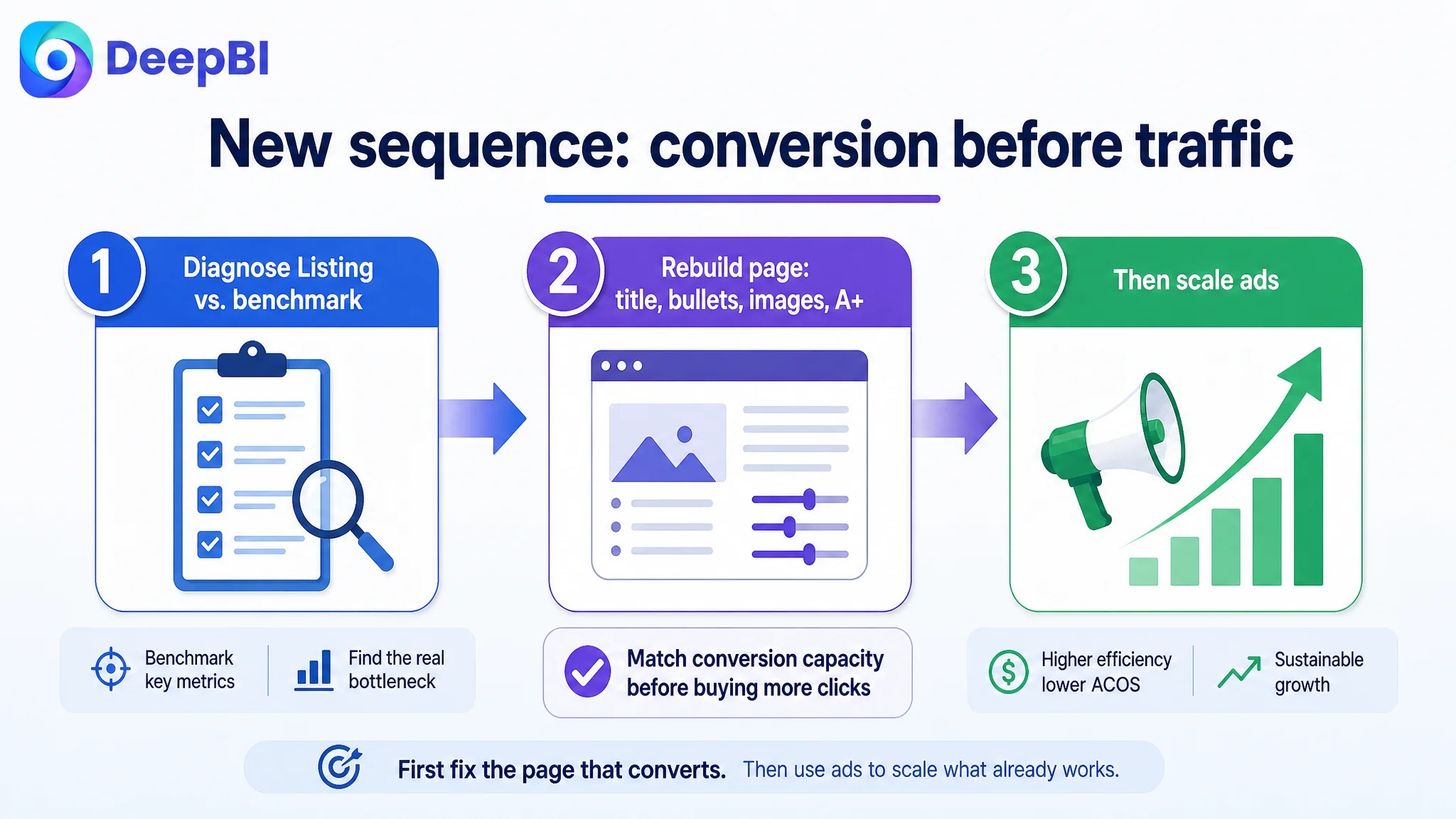
The priority had to be:
1. Rebuild page logic (title, bullets, main images, A+) to match or exceed the benchmark’s conversion capacity.
2. Then use ads to test and scale once the Listing can actually monetize each incremental click.
Advertising does not only amplify advantages. It can just as efficiently amplify a Listing’s defects.
How the Page Started to Recover Its Sales Logic
After aligning around Listing conversion as the root constraint, the optimization path was clear.
1. Title refocused around winning search terms and outcome clarity
- Brought “Metal Pegboard” and “Wall Organizer” forward to align with dominant search behavior.
- Cleaned up punctuation and flow so that:
- Product type
- Configuration (4 panels, 16x12)
- Key accessories (42 hooks, 6 bins, 30 fixing buckles)
- Main scenes (garage, kitchen, office)
appear in an immediately readable sequence.
On mobile search results, shoppers see the what, how much, and for where within the first glance.
2. Bullet points reorganized into a predictable objection-handling path
The optimized bullets collectively answer, in order:
1. “Will it bend or rust?” → Heavy-duty steel, 50 lbs load, powder coating, garage conditions.
2. “Are the hooks safe for my tools?” → Silicone-capped, anti-slip, anti-scratch.
3. “Where do my small parts go?” → Transparent bins, quick identification.
4. “Can I extend and mix with what I already own?” → Standard 1/4" hole spacing, universal compatibility.
5. “Will installation be painful or unsafe?” → All hardware included, peg locks, works on plaster, wood, brick.
This is no longer “five blocks of product info”; it is a sequence that guides the buyer through their hidden questions.
3. Main-image set reconceived as a structured proof system
Each image acquires a job:
- Image 1 – Hero completeness & set value
Strong industrial aesthetic, clear “complete set” messaging.
- Image 2 – All accessories at a glance
Grid layout + labels to visualize “78-piece kit” professionally.
- Image 3 – Load capacity proof
Heavy tool hanging, visual emphasis on “high load capacity”.
- Image 4 – Structural reinforcement
Close-up on folded edges and frame reinforcement.
- Image 5 – Durability and surface properties
Water, abrasion, then clean surface – demonstrating long-term resilience.
- Image 6+ – Multi-scene usage and hidden advantages (like concealed screws)
Bringing lifestyle and aesthetic advantages forward.
The result: when a shopper scrolls through images, they unconsciously walk through reason after reason to trust and choose this Listing.
4. A+ introduction to close the decision loop
Rebuilding from zero A+ to a full module sequence changes the psychological weight of the page:
- The shopper can now:
- See the future state of their own wall.
- Understand exactly what they’re getting.
- Believe in the load and material story.
- Learn how and where else they could use it.
- Feel that installation is guided and achievable.
For Amazon’s algorithm, a richer, more complete page also tends to correlate with better conversion signals, which support both organic ranking and ad efficiency longer term.
What Changed for the Seller: From “Ad Frustration” to Conversion Awareness
Because this case is about structural diagnosis rather than a long-run growth story, we don’t rely on invented numbers. But several concrete shifts happened on the business side:
- The team stopped blaming Amazon ads as the primary problem.
They began to see ACOS as a reflection of Listing readiness, not just campaign structure.
- Conversion became the first checkpoint before scaling traffic.
Before raising bids or budgets, the question changed to: “Does this page deserve more traffic yet?”
- The Listing regained the ability to potentially convert both paid and organic traffic.
With a more competitive title, functional main images, and a real A+ story, every new visitor has a higher chance of turning into an order.
- Risk on traffic spend decreased.
Ads were no longer being pushed into a page that stopped talking after the bullets. The relationship between:
- main image CTR
- detail-page CVR
- ACOS / TACOS
became more stable and interpretable.
Most importantly, the seller’s mental model shifted:
Amazon ads are not a universal fix. They are an amplifier, and what they amplify is the current state of your Listing.
Takeaways for Other Amazon Sellers in Similar Categories
For any Amazon seller working with functional, hardware-like products (garage organization, storage systems, tools, etc.), this case surfaces several practical judgments:
1. A missing or empty A+ section is not a cosmetic defect. It is a conversion handicap.
Especially when your benchmark competitor has a complete, visually driven A+ story.
2. High ACOS can be a Listing problem, not an ad problem.
When your Listing score trails the benchmark by 30+ points and your A+ is at 0, tuning keywords is secondary.
3. Over-detailed titles and bullets are not automatically persuasive.
Without a clean structure (what it is → capacity → where to use → why it’s better), information density turns into friction.
4. Main images must prove, not just show.
In heavy-duty, high-load categories, visualizing capacity, reinforcement, and durability is non-negotiable.
5. Before scaling ads, ask: “Would I buy from this page at this price if I came here organically?”
If the honest answer is “not yet,” traffic is not your bottleneck.
What DeepBI added in this case was not a new feature; it was a different sequence of thinking: diagnose the Listing’s conversion capacity first, then decide whether ads are being under‑ or over‑used.
For many Amazon sellers, that shift in judgment is where wasted ad spend finally stops, and real, controllable growth begins.