

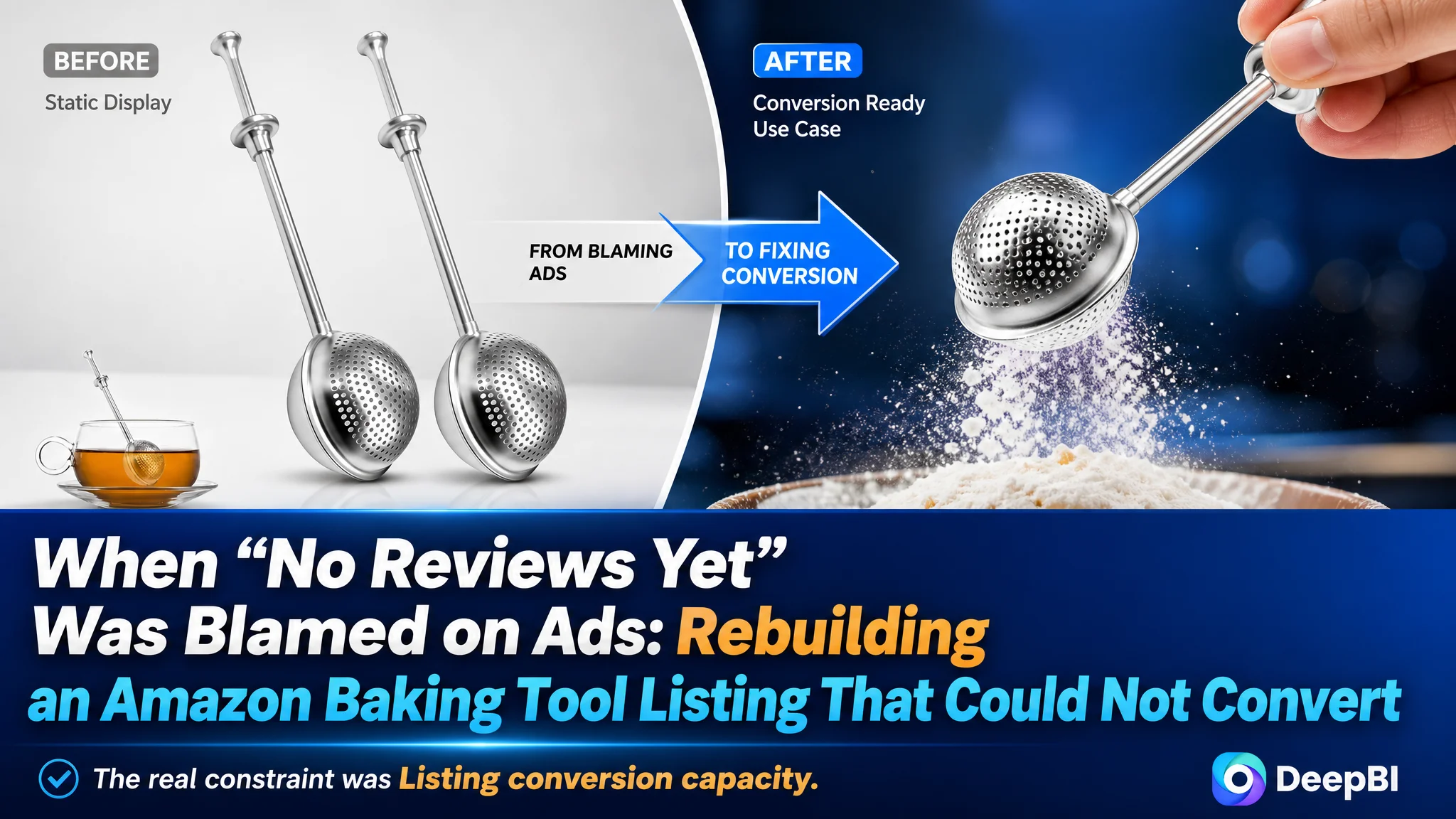
This case comes from an Amazon seller in the baking tools category who thought their problem was mainly “not enough traffic and no reviews yet.” They were preparing to push more Amazon ads behind a new 2‑pack flour duster wand, expecting ad spend to compensate for weak early conversion. But once we put their Amazon Listing side‑by‑side with a category‑leading competitor, it became clear: the real constraint wasn’t exposure, it was that the product page itself had almost no ability to convert traffic.
The customer’s initial plan was straightforward: keep the current Listing, open up the bids, and wait for reviews to come in so conversion would “naturally” improve. DeepBI’s diagnosis showed a different picture. The page scored only 43/100 against a benchmark at 83/100, and the gap did not come from keywords or images alone; it came from a missing A+ story, zero review trust, and a set of visuals and bullets that never really answered why someone should buy this specific Amazon product.
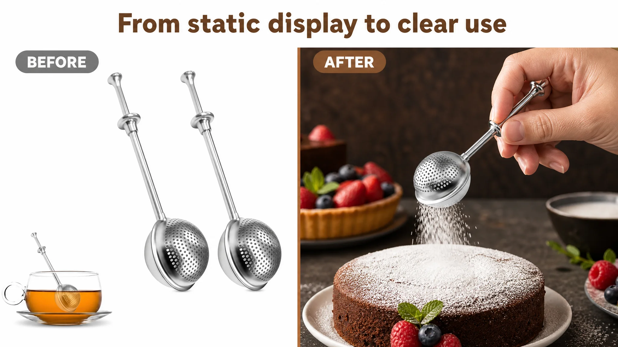
We reframed the priority: before scaling Amazon ads, this seller needed a product page that could actually carry both paid and organic traffic. The later optimization therefore focused on four levers: tightening the title around a clear baking use‑case, turning the main image set from static props into dynamic dusting scenes, rebuilding bullet points around “waste control + ease of use” instead of bare functions, and designing an A+ structure that could replace the total vacuum below the fold. For other Amazon sellers, the core lesson is blunt: high ACOS on a cold ASIN is often not an ad‑tuning issue—it is a Listing‑conversion issue that ads are only making more expensive.
What the Seller Saw: A Normal “New ASIN” Struggle
This Amazon seller was launching a 2‑pack stainless‑steel flour duster wand for baking on the US marketplace.
From their perspective, the situation looked like a textbook new‑product problem:
- No reviews, no star rating
- Limited sales history
- Pressure to kickstart velocity with Amazon ads
Internally, the team believed:
- “The product is fine; the page already has all basic elements (title, images, bullets).”
- “The main bottleneck is zero reviews and low exposure.”
- “Once we push ads and accumulate social proof, things will normalize.”
So they were preparing to increase bids and budgets to “force” more traffic into the Listing.
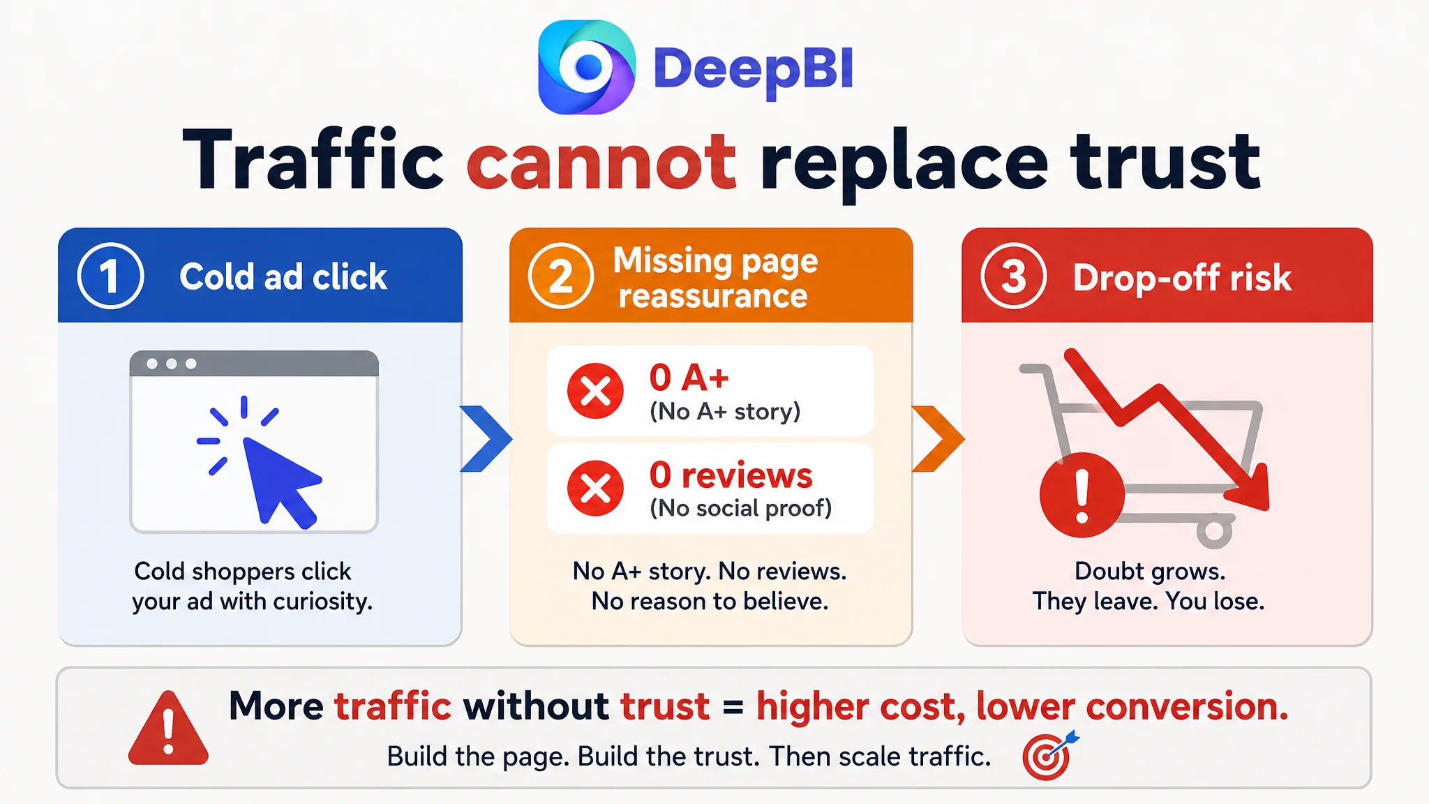
But this plan assumed one thing that was never validated: that the current page was already good enough to convert additional traffic at an acceptable cost.
“The real problem was not that ads failed to bring traffic. It was that the page could not convert the traffic.”
The Core Constraint Was Listing Conversion Capacity, Not Traffic
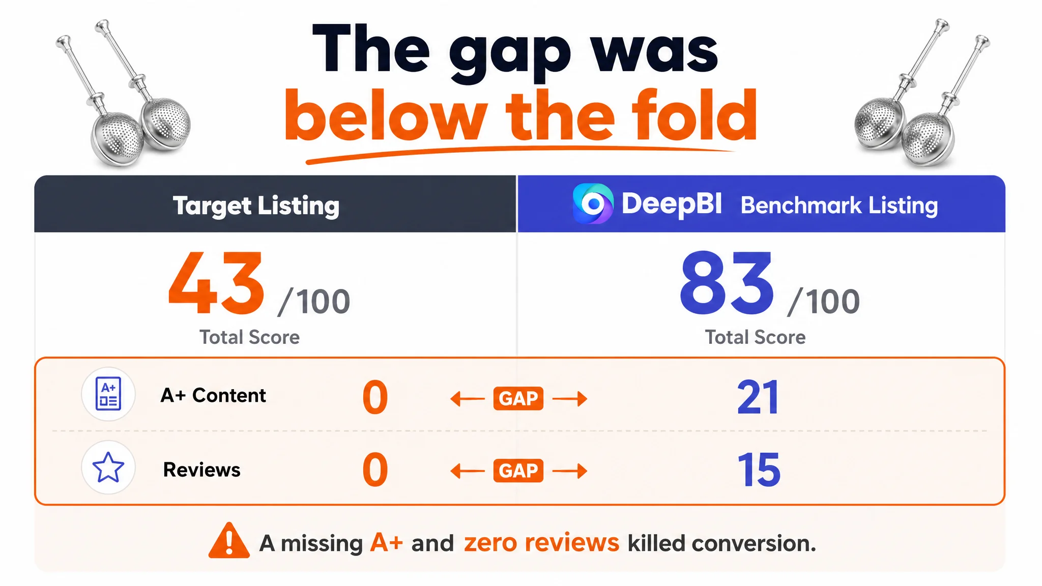
When we ran a full Listing score and benchmark comparison against a category‑leading Amazon competitor, the numerical gap was unambiguous:
- Target Listing total score: 43/100
- Benchmark Listing total score: 83/100
- Gap: –40 points
At first glance, title, main images, and bullets were not catastrophically bad:
- Title: 12 vs. 14 (out of 20)
- Main images: 24 vs. 25 (out of 30)
- Bullet points: 7 vs. 8 (out of 10)
The fatal gap came from two places that directly determine conversion capacity:
- Detail page (A+): 0 vs. 21 (out of 25)
- Reviews: 0 vs. 15 (out of 15)
In other words:
- Above the fold, the Listing looked “basically okay.”
- Below the fold, it had no A+ story at all, and no review trust.
The benchmark, in contrast, combined:
- A structured, visually rich A+ layout (brand banner, multi‑scene usage, action shots, parameter modules, professional chef imagery), and
- 4.8 stars with 4,817+ reviews and high‑quality first‑page feedback.
Sending more ad traffic into this asymmetry would only enlarge the difference in outcome: the benchmark would monetize its clicks with strong page trust; our seller would pay for clicks that hit a narrative vacuum.
How the Misdiagnosis Formed: “We Just Need Ads and Reviews”
Operationally, the customer’s thinking path was common:
1. See low sales and no reviews.
2. Assume exposure is low.
3. Decide to push Amazon ads to raise traffic and review count.
From a distance, this logic is not “wrong”—for many new ASINs, paid traffic is necessary to start the flywheel.
What was missing here was any quantitative check of:
- How competitive the Listing itself was versus successful peers.
- Whether the page had enough “sales logic” to justify heavy paid traffic.
- Whether the first real cold visitors would find enough information and trust signals to buy without reviews.
Because that check was not done, the seller:
- Overestimated what the existing images and bullets could do.
- Underestimated how much a missing A+ and missing social proof would drag down conversion.
- Treated Amazon ads as a cure‑all, instead of a force multiplier that can also multiply defects.
“Advertising does not only amplify advantages. It can also amplify a page’s existing defects.”
What DeepBI Saw in the Data and the Page
The Listing score breakdown gave us a structured way to pinpoint where the real risk lay.
1. Title: Technically Loaded, Strategically Unclear
On the surface, the title had many relevant terms:
- “2‑Pack”
- “Flour Duster”
- “Powdered Sugar Shaker”
- “Dusting Sifter”
- “304 Stainless Steel”
But the arrangement created several issues:
- Keyword clutter: Multiple near‑synonyms (“Flour Duster”, “Powdered Sugar Shaker”, “Dusting Sifter”) sat side‑by‑side, making the title feel bloated and less readable.
- Weak lead: It opened with “2‑Pack” and “304 Stainless Steel”—clear attributes, but not the core intent term nor an outcome.
- Functional, not experiential: “One‑Hand Spring Handle” is accurate, but it speaks like a feature spec, not a usage result.
The benchmark title, by contrast:
- Led with the brand and core category keyword (“Flour Duster”), aligning strongly with Amazon search logic.
- Used “One‑Handed Operation” and “Pick Up and Dust”—phrases that immediately evoke usage scenes and ease, not engineering.
- Added “Gift Package”, expanding scenarios into gifting and lifestyle, not just utilitarian baking.
The gap was not that our seller lacked keywords; it was that the title never clearly framed a buying outcome that could pull the eye in a crowded search result.
2. Main Images: Static Props vs. Dynamic Use‑Cases
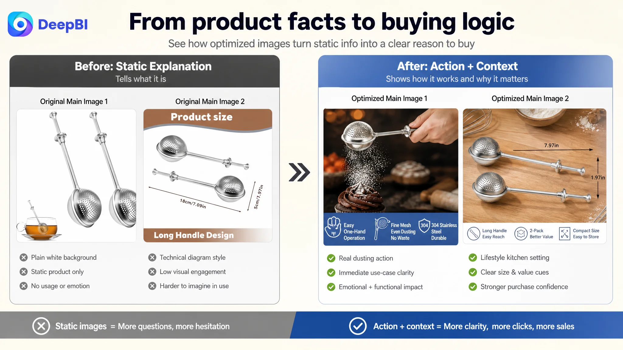
Numerically, the main image dimension was close (24 vs. 25), but visually, the benchmark created far more click and conversion leverage.
Key contrasts:
- First image
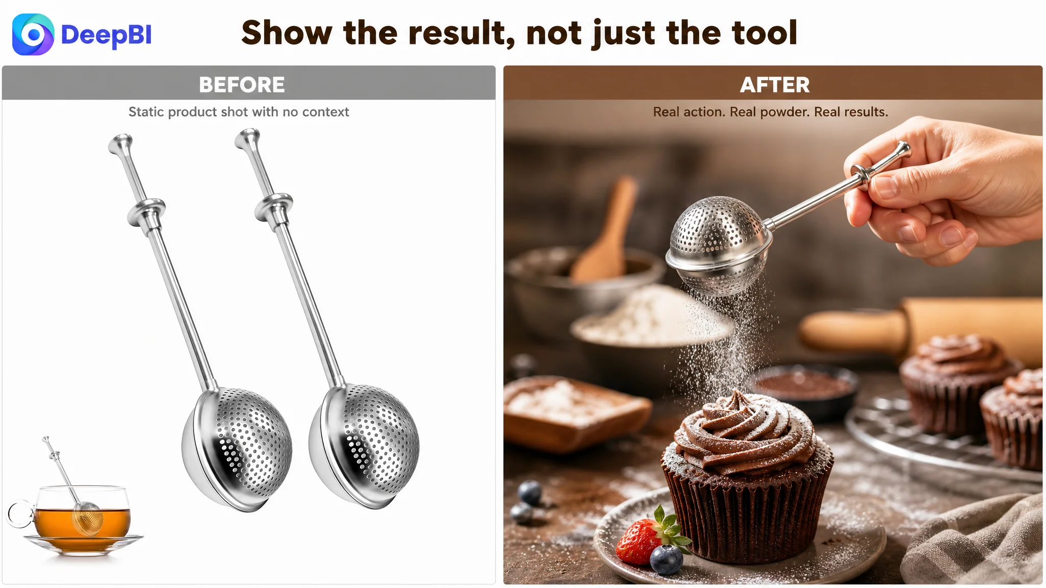
- Benchmark: Product in a hand, dusting flour or sugar over a dessert, with a warm baking background. This immediately answers: “What does this tool do for me?”
- Target: Static product display with a lot of empty, low‑energy background. Easy to scroll past.
- Functional illustration
- Benchmark: Clear visual of flour falling, with arrows showing the spring action—function is instantly understood.
- Target: Numbered static diagram that requires reading and interpretation. Higher cognitive load.
- Scene richness & trust
- Benchmark: Packaging, real use in home/pro baking settings, desserts and drinks, gifting cues.
- Target: No meaningful lifestyle or gifting context, no packaging emphasis, no emotional hook.
In a baking tool category that is not strictly a must‑buy, this matters a lot. A big share of buyers—especially older female home bakers and gift shoppers—are not just buying a “piece of steel.” They are buying:
- Control over flour and sugar
- Clean, professional‑looking results
- A slightly upgraded home‑baking experience
- Something nice enough to give as a gift
The current image set did not show that story at all.
3. Bullet Points: Features Listed, Not Problems Solved
The target Listing’s bullet points had information, but their logic was product‑centric:
- Explain core function and scenarios
- Mention operation convenience
- Mention material and durability
- Add multi‑use expansion
- Detail specs and storage
The benchmark did something more conversion‑oriented:
- Started from pain points: waste, control, mess.
- Used colloquial, experiential language: “never comes apart,” “such good control.”
- Wove in user identities directly: “professional and family bakers.”
Effectively, the competitor’s bullets answered:
- “What exact annoyance disappears if I buy this?”
- “Who is this for, and am I in that group?”
Our seller’s bullets mostly answered:
- “What is this object made of, and what can it technically do?”
That difference is small on paper, but large in how quickly a busy shopper can connect the Listing to their own kitchen.
The Real Hole: A Missing A+ Story and Zero Social Proof
Where the Listing lost the most points—and the most trust—was below the fold.
No A+ Content at All
The target ASIN had:
- No A+ module, no brand section, no scene banners, no structured explanation.
The benchmark had:
- A brand banner with clear product name and usage tags (sugar, cocoa, tea).
- Multi‑scene application images (baking, beverages, tea).
- Results showcase: beautiful desserts evenly dusted.
- Core selling point modules explaining single‑hand operation and material.
- Action shots of flour powder “fog” falling—solving the “even dusting vs clumps” concern.
- Professional chef imagery as authority and trust reinforcement.
- Icons/modules for: 304 stainless steel, dishwasher safe, compact size, multi‑use, etc.
Without any A+ content, our seller’s page:
- Gave buyers nothing new after the standard bullets.
- Left all questions about evenness, convenience, durability, and professionalism open.
- Built zero sense of brand, quality, or lifestyle fit.
This is exactly where conversion tends to break: shoppers scroll, do not find compelling reassurance, and quietly leave.
Review Dimension: 0 vs. 4,817+
On the trust side:
- Target Listing:
- No star rating
- 0 total reviews
- Benchmark Listing:
- 4.8 stars—well above typical baseline
- 4,817 total reviews
- Top reviews are long, detailed, and strongly positive
The result:
- The benchmark Listing can convert cold traffic simply by stacking social proof on top of a strong A+ story.
- Our seller’s Listing depends entirely on page content quality to make up for the absence of reviews.
That is the reality of a new ASIN. If your A+ and visual story are thin, and you also have no reviews, paid traffic will not “fill the gap.” It will just hit a wall more quickly.
Why DeepBI Did Not Recommend “Optimize Ads First”
From a business‑risk perspective, the priority was clear.
At this stage:
- The Listing had weak narrative and zero trust.
- The benchmark had strong narrative and massive trust.
- Any serious push in Amazon ads would likely deliver poor CVR and high ACOS.
Continuing to tune bids, keywords, and campaign structures under these conditions would have:
- Consumed budget without revealing true demand (because the page could not properly convert).
- Biased internal judgment against the product (“maybe people just don’t want this”), when in fact the page was under‑selling it.
- Delayed the necessary structural work on the Listing.
So DeepBI’s judgment was:
- Listing conversion capacity had to be repaired first.
- Amazon ads should be treated as the second step, after the product page could demonstrate basic ability to convert cold pageviews.
How the Optimization Direction Changed
Once the core constraint was identified, the optimization path shifted from “more traffic and wait for reviews” to “rebuild the sales logic of the page.”
1. Reframing the Title Around Intent and Value
Proposed optimized title:
2‑Pack Flour Duster Wand for Baking, 304 Stainless Steel Powdered Sugar Shaker, One‑Handed Spring Handle Sifter for Icing Sugar, Cocoa, Cinnamon, Spices and Flour
Key logic shifts:
- Lead with “2‑Pack” + core intent (“Flour Duster … for Baking”)
- Shows value (two pieces) immediately in search results.
- Aligns head term with how buyers actually search.
- Compress redundant keywords
- Merge similar sugar terms to free characters.
- Add the high‑performing phrase “for Baking” for relevance.
- Clarify operation benefit
- Use “One‑Handed Spring Handle Sifter” to bridge feature and experience.
Title stops being just a cluster of functions and becomes a concise, high‑intent phrase that fits Amazon search mechanics and buyer scanning behavior.
2. Turning Main Images into a Visual Decision Path
The optimization concept for images was not “make them prettier,” but “make them do specific jobs in the decision funnel.”
Examples:
- Primary image
- 45° view, product in a hand, sugar visibly falling against a dark background.
- Metal edges highlighted, motion frozen, “Easy One‑Hand Operation” text cue.
- Goal: win the click by instantly signaling function and quality.
- Dimension image
- Product on a wood kitchen surface, with clean dimension annotations.
- Goal: remove any size uncertainty in a realistic environment.
- Packaging and quality image
- Product with gift‑ready packaging, cool‑tone minimalist background, “Food Grade 304” icon.
- Goal: anchor perceived quality and gift potential.
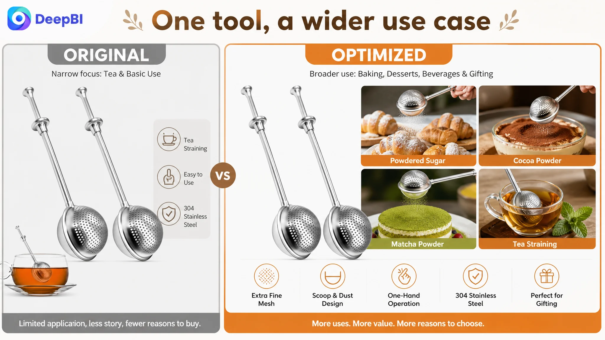
- Multi‑scene collage
- Five‑cell layout showing donuts, tiramisu, matcha latte, tea infusion.
- Goal: expand perceived use‑cases, address “Is it really versatile?” without extra reading.
- Operation close‑up
- Macro shot of fingers pressing the spring handle, warm kitchen background.
- Goal: translate an abstract “spring design” into an immediately felt ease‑of‑use image.
This turns the image set into a coherent narrative from click motivation to functional understanding to lifestyle fit.
3. Rewriting Bullets from Features to Outcomes
The bullet recommendations systematically reoriented copy toward user benefit:
- BP #1 – From generic function to precision + zero waste
- “Fine mesh ensures even distribution with zero waste, helping you get just the right amount every time for a professional finish.”
- BP #2 – Highlight “scoop and dust” duality
- Emphasize that one side is perforated, the other solid, so the tool doubles as a scoop straight from the jar.
- This directly addresses handling and convenience, not just sifting.
- BP #3 – Remove stability doubts in use
- “Reliable construction ensures the wand stays together during use, supporting quick dusting while rolling dough or decorating pastries.”
- BP #4 – Material + audience positioning
- “Essential tool for both professional pastry chefs and family home bakers.”
- This helps readers self‑identify.
- BP #5 – 2‑piece set + compact storage
- Combine high value (2 wands) with minimal drawer footprint and clear dry‑powder use range.
Each bullet becomes a small “pain point → solution → usage scene” loop instead of a mere specification list.
4. Designing an A+ Layout That Actually Sells
Given the original page had no A+ at all, the goal was to:
- Build a modular A+ structure that reflects how buyers think:
1) What is this? 2) Can it solve my problem? 3) Is it reliable? 4) Is it right for how I bake?
- Use visual modules that mirror what already works in the benchmark, without copying structure or IP.
Planned modules included:
1. Opening banner
- Product at a 45° angle, tags like “Sugar / Cocoa / Leaf Tea / Herbal Tea.”
- Purpose: Set multi‑use positioning in one glance.
2. Core benefit action shot
- Hand squeezing the handle; sugar mist falling evenly on dough.
- Purpose: Prove even dusting and single‑hand control visually.
3. Trust module
- Professional chef figure, desserts perfectly dusted.
- Purpose: Borrow authority; associate tool with professional results.
4. Feature icon panel
- “One‑Handed Operation”, “Compact Size”, “Dishwasher Safe”, “304 Stainless Steel” in icon format.
- Purpose: Condense key rational points into a scannable block.
5. Scenario module
- Image of scooping flour from a bowl, plus “Baking & Tea Infusing” heading.
- Purpose: Show both baking and tea usage, proving versatility.
6. Detail macro
- Close‑up of spring joint and mesh.
- Purpose: Reduce structural‑quality concerns.
7. Tea infuser use‑case image
- Product on a glass tea cup with loose‑leaf inside.
- Purpose: Expand into a secondary need state (tea lovers) without changing the product.
This A+ blueprint transforms the lower half of the product page from an empty scroll into a layered persuasion journey.
How This Changed the Role of Ads and the Seller’s Understanding
Once these Listing changes are in place, several things become possible—even before review volume catches up:
- Higher baseline CVR on cold visits
The page gives buyers enough information and trust cues to make a decision without relying purely on social proof.
- More meaningful ad tests
When you send Amazon ad traffic now, you are actually testing demand and pricing, not testing “How tolerant are visitors of a half‑empty page?”
- Reduced ACOS risk over time
As conversion improves and early reviews begin to accumulate, each ad click has a better chance of turning into both an order and a review, instead of just a bounce.
On the understanding side, the seller moved from:
- “Our biggest issue is no reviews and not enough traffic”
to:
- “Our page did not deserve more traffic yet; it could not tell a convincing baking story or build trust.”
and from:
- “We need to tune ads harder”
to:
- “We need to raise our Amazon product page conversion capacity first, then let ads scale what is already working.”
Takeaways for Other Amazon Sellers
Several patterns in this case are widely shared across Amazon:
1. A new ASIN without reviews must lean on page content.
If you have no A+ and weak storytelling, you are asking ads to carry a job they cannot do.
2. Small score gaps in title/images can hide a huge gap in narrative depth.
Here, title/main images/bullets looked “close” numerically, but the absence of any A+ content and social proof left a –36 point hole.
3. Ads are multipliers, not repair tools.
When your product page underperforms, additional ad spend mostly multiplies your cost, not your orders.
4. Title, main images, bullets, and A+ must form one buying logic.
- Title: anchor search intent and make a clear promise.
- Images: show the promise in action.
- Bullets: structure benefits and remove doubts.
- A+: deepen understanding and trust.
5. Before scaling ads, ask: “Does this page deserve more traffic?”
If the honest answer is “not yet,” then the first optimization budget belongs to the Listing—not the campaigns.
In this baking‑tools case, DeepBI’s value was not in suggesting “nicer pictures” or “better wording” in the abstract, but in identifying that the true bottleneck was a Listing with almost no conversion infrastructure. Once that constraint is clear, the decision order—fix the page first, scale ads second—becomes much easier to execute with confidence.