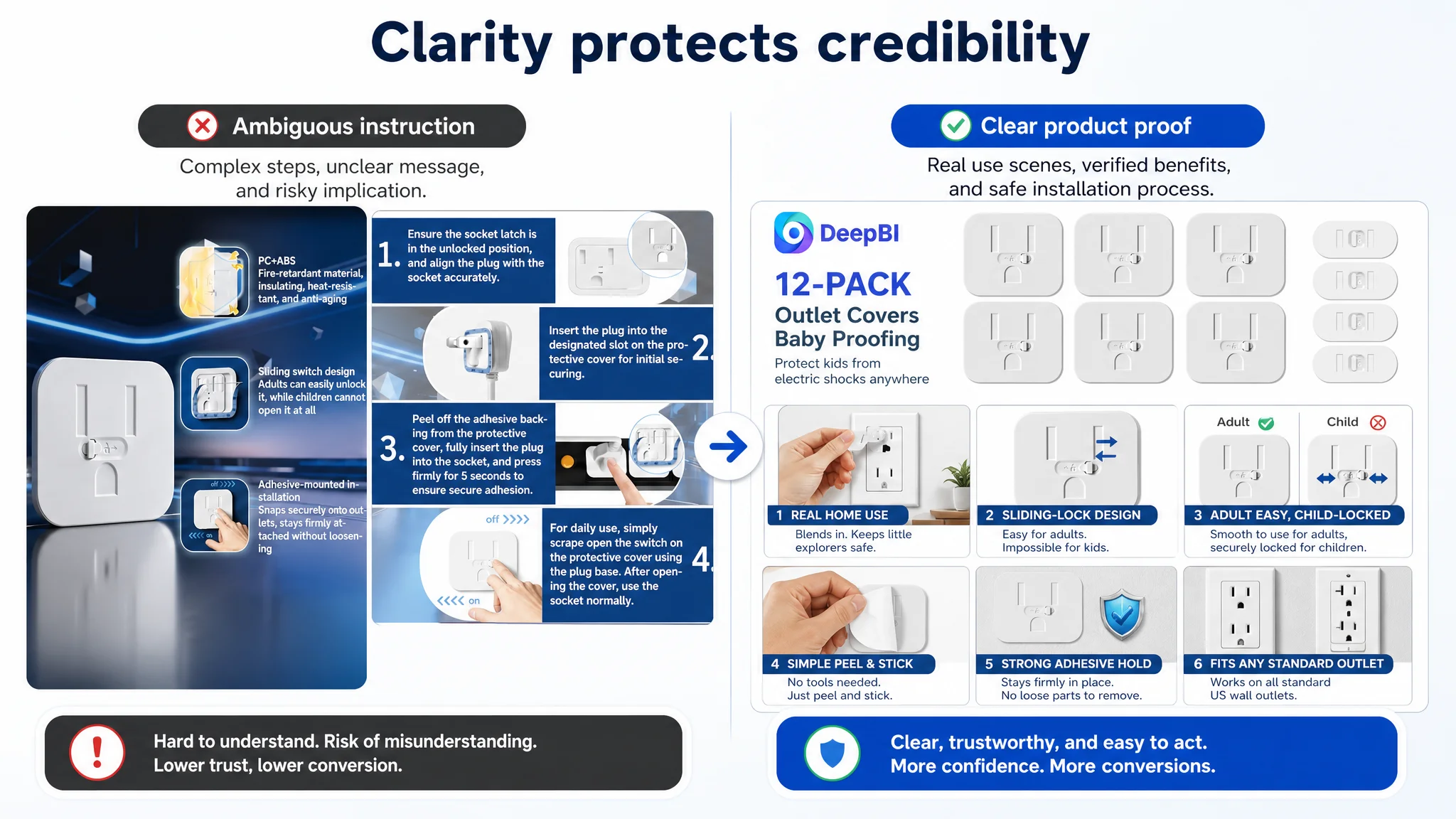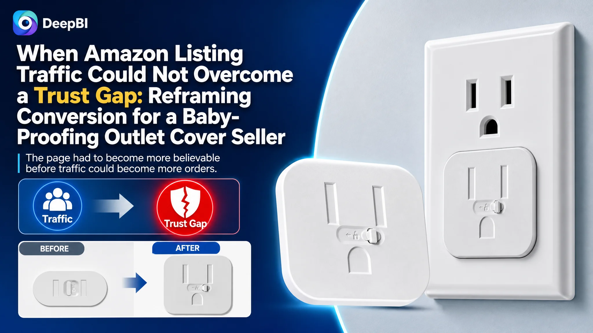
This case concerns an Amazon seller in the baby-proofing category whose product page was not competitive enough to convert shoppers with confidence. The initial optimization direction naturally leaned toward visible elements: moving keywords forward in the title, clarifying the 12-pack quantity, improving the main images, and explaining the sliding-lock mechanism.
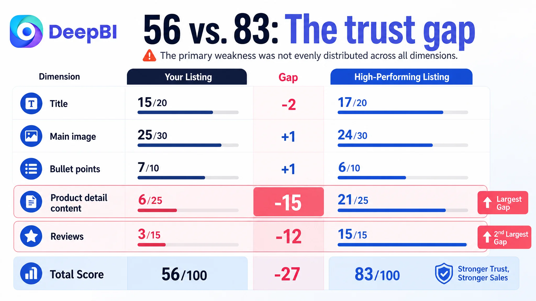
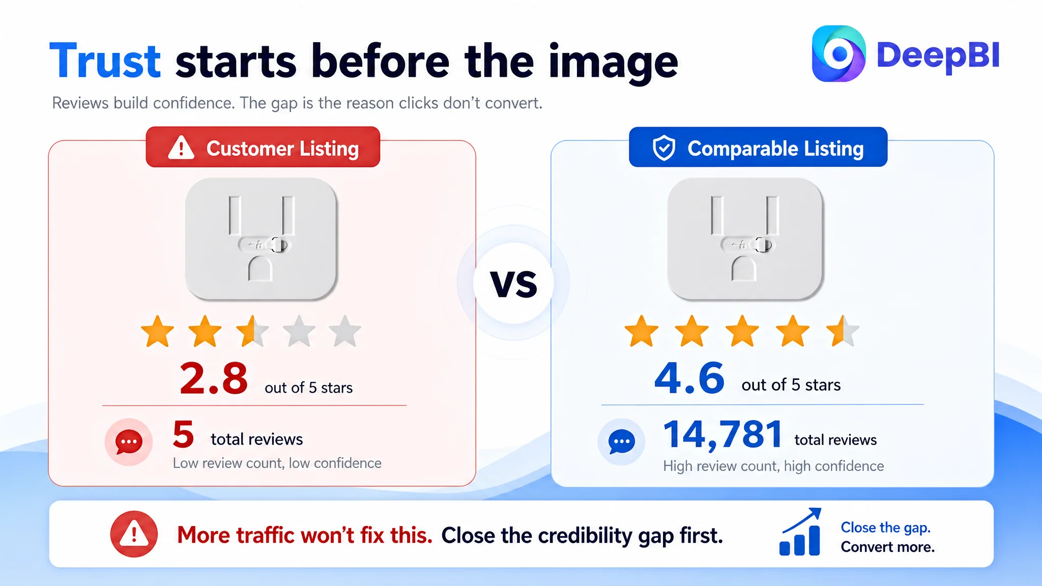
Those changes mattered, but they did not explain the full business problem. DeepBI’s comparison found that the Amazon Listing scored 56 out of 100 against 83 for a comparable high-performing listing. The largest gaps were not in the main image or title. They were in the product detail experience and customer trust: the page had no visual A+ structure, while the product had only five reviews and a 2.8-star rating.
The real task was therefore not to make the product page look more polished. It was to rebuild the sales logic from the first impression to the final purchase decision: confirm what the 12-piece set does, show how the sliding lock works, resolve installation and adhesive concerns, and give parents enough evidence to trust the product. Other Amazon sellers can learn from the case that more traffic cannot compensate for a page that leaves core safety questions unanswered.
The Amazon Listing Was Not Losing on Every Dimension
At first glance, the product page appeared to have several areas that could be improved.
The title was less complete than the comparable listing. The main image set lacked some of the competitor’s visual clarity. The bullet points described functions but did not always lead with the customer’s concern. The product detail section contained no meaningful visual modules.
That list could easily lead an Amazon team toward a broad creative refresh: rewrite the title, redesign the images, adjust the bullets, and add more persuasive wording.
But the score comparison showed that the weaknesses were not evenly distributed.
- Title: Customer Listing: 15/20, Comparable high-performing Listing: 17/20
- Main image: Customer Listing: 25/30, Comparable high-performing Listing: 24/30
- Bullet points: Customer Listing: 7/10, Comparable high-performing Listing: 6/10
- Product detail content: Customer Listing: 6/25, Comparable high-performing Listing: 21/25
- Reviews: Customer Listing: 3/15, Comparable high-performing Listing: 15/15
- Total: Customer Listing: 56/100, Comparable high-performing Listing: 83/100
The main image was not the largest problem. Its score was slightly higher than the comparable listing. The bullet points were also not dramatically behind.
The major losses were concentrated in two areas:
- Product detail content: a 15-point gap
- Reviews: a 12-point gap
That changed the diagnosis.
The Listing did not primarily lack information. It lacked enough evidence for a safety-conscious shopper to believe the information.
The Original Optimization Direction Was Too Close to the Surface
The initial working assumption was understandable. If the title did not communicate the product clearly enough, improve the keyword structure. If the images did not explain the product, replace them. If shoppers might not understand the sliding-lock mechanism, add more product demonstrations.
The proposed title reflected that direction:
Adhesive Sliding-Lock Outlet Covers Baby Proofing, 12-Pack Child Proof Electrical Socket Protector, Safety Baby Plug Covers for Home and Kitchen
It brought several useful elements closer to the front of the Amazon search result:
- Adhesive installation
- Sliding-lock design
- 12-pack quantity
- Child-proof outlet protection
- Home and kitchen use
The bullet-point recommendations also followed a stronger customer sequence: safety protection, discreet design, tool-free installation, multi-room coverage, and peace of mind.
These were sensible changes. However, they addressed the page as a collection of components. They did not yet address how a parent decides whether a safety product is reliable enough to purchase.
The product category creates a high trust threshold. A shopper is not only asking:
- What is included?
- How many pieces are in the pack?
- Does it fit a standard US outlet?
- Is installation easy?
They are also asking:
- Can a child really access the outlet?
- Can an adult remove or use it without frustration?
- Will the adhesive hold?
- Is the installation guidance safe and credible?
- Does this product look like a serious home-safety solution?
- Why should I trust this page when the review history is so limited?
A title or isolated product close-up cannot answer all of those questions.
The Real Constraint Was Listing Conversion Capacity
The customer Listing had a total score of 56, but the total alone did not explain the business risk. The dimension gaps did.
The page had a relatively solid foundation in the main image and bullet-point areas. The problem was that the deeper decision layer was almost absent.
The comparable listing used a fuller visual structure that included:
- Product quantity and purpose
- Product close-ups
- Structural explanations
- Comparison modules
- Real home-use scenes
- Home decor integration
- Broader household safety applications
The customer Listing relied mainly on repeated text descriptions and product presentation. That meant a shopper could understand what the product was, but might still lack the confidence to use it for a child-safety decision.
This is where DeepBI’s diagnosis moved beyond aesthetic comparison. It connected each content gap to a specific point in the buying decision.
The product detail page had no proof sequence
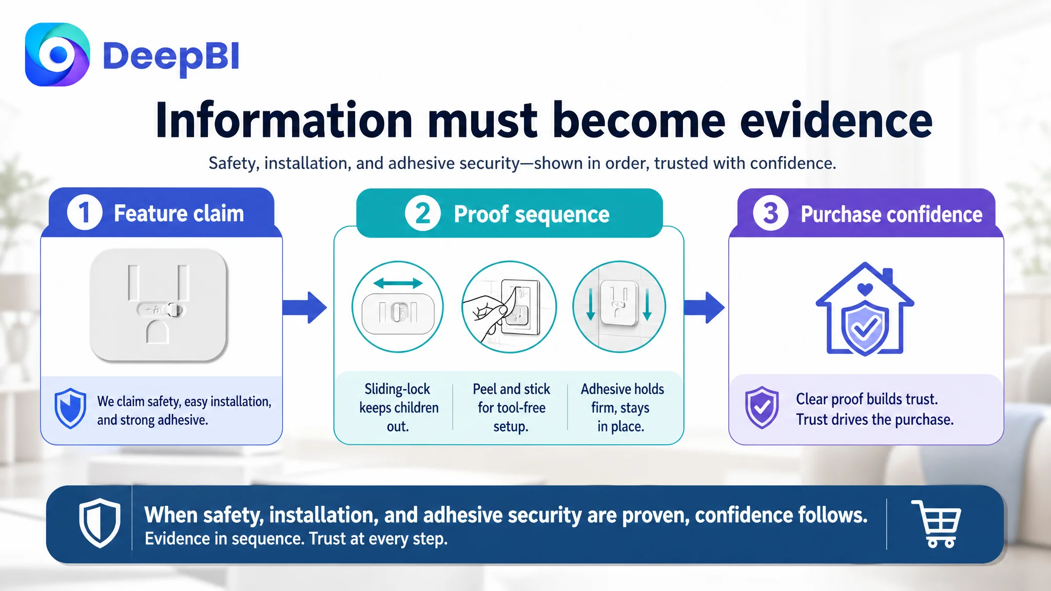
The missing A+ content was not simply a missing design asset. It removed the opportunity to establish a clear sequence:
1. What the product protects
2. How the sliding-lock mechanism works
3. Why a child cannot easily open it
4. Why an adult can still operate it
5. How installation works without tools
6. Why the adhesive helps keep it in place
7. Where the product can be used
Without that sequence, the page asked shoppers to assemble the argument themselves from short text and isolated images.
For a safety product, that is a costly burden.
The review profile weakened every other claim
The product had five total reviews, a 2.8-star rating, and two negative reviews on the first page that questioned adhesive performance. The comparable listing had 14,781 reviews and a 4.6-star rating.
This was not a small credibility gap. It affected the interpretation of the entire Listing.
A claim such as “strong adhesive” carries less weight when the first-page review experience raises concerns about the product coming loose. A claim such as “peace of mind” also sounds less convincing when the page has not yet accumulated enough independent evidence to support it.
The review gap could not be solved through image design alone. But it had to be included in the diagnosis because it changed the level of proof required from every other page element.
Why DeepBI Did Not Keep Tuning the Main Image First
The main image still needed refinement, but not because it was visually inferior in every respect.
The deeper issue was that the image set did not consistently communicate the product’s central decision logic: an adult can operate the cover, while a child should not be able to access the outlet easily.
Several specific problems made that logic less clear:
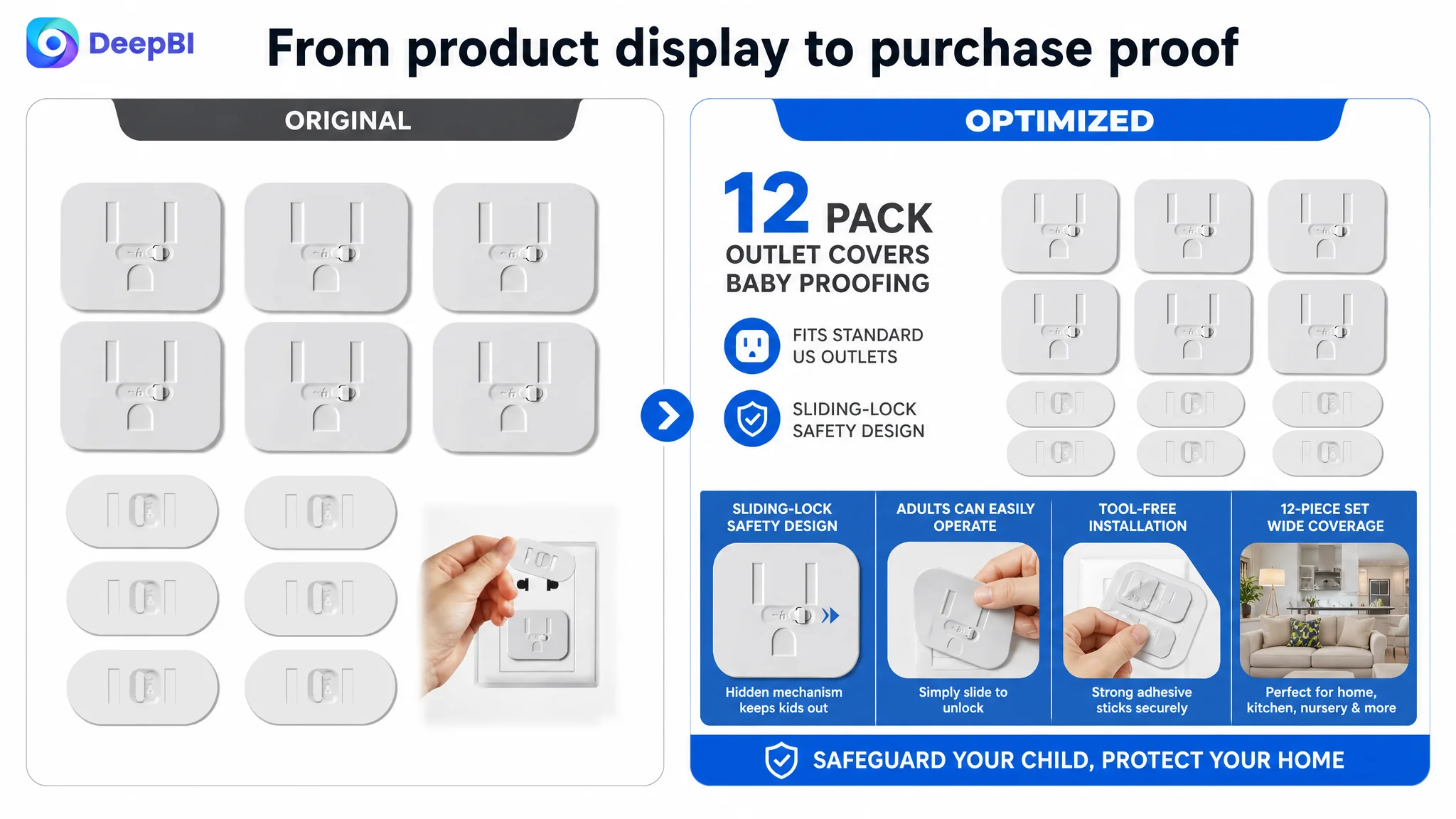
- The first image did not sufficiently confirm standard US outlet compatibility.
- The product quantity and adult removal method were not obvious at first glance.
- Some information graphics required shoppers to decode the layout.
- The visual narrative moved between child safety and unrelated imagery, including a cat scene.
- One installation image used a non-US power strip and implied an unsafe plug-scraping behavior.
- Several images presented the product without fully explaining how it solves the risk.
DeepBI therefore did not treat the solution as “make the images prettier.” It reframed the image set around proof.
The first visual should establish the product type, quantity, and standard US outlet context. The next should make the sliding-lock mechanism understandable. Another should address the adhesive and multi-outlet coverage. The usage image should show a correct, safe installation process. The final trust image should connect the product to a specific household risk rather than relying on generic safety stock photography.
The priority was not to imitate the comparable listing. It was to identify which customer questions that listing answered more effectively, then rebuild those answers around the actual product’s verified attributes.
The Title Needed More Than Keywords
The title gap was modest: 15 out of 20 compared with 17 out of 20. That was important because it showed that title optimization was not the primary repair.
Still, the title was not working as a single buying message.
The existing structure emphasized keywords and functions, including “Outlet Covers Baby Proofing,” but the selling logic was dispersed. The proposed structure placed the product’s differentiating mechanism earlier:
- Adhesive
- Sliding lock
- Outlet covers
- Baby proofing
- 12-pack quantity
- Child-proof protection
- Home and kitchen use
This created a clearer relationship between feature and use case.
The title was not expected to solve the trust problem. Its role was narrower: help the right Amazon shopper understand the product quickly and enter the product page with the right expectation.
That distinction mattered. If the Listing team treated the title as the main conversion fix, it would be asking a search-result field to do the work of the entire product page.
The Bullet Points Needed a Buying Logic
The customer’s bullet points were functional and relatively clear. They described features such as adhesive strength, the sliding lock, tool-free installation, and multi-scene use.
The problem was ordering and emphasis.
The original structure leaned toward:
- Pack quantity and coverage
- Adhesive strength
- Sliding-lock design
- Tool-free installation
- Multiple use scenarios
The stronger structure began with the shopper’s concern:
- Protection from electrical access
- A discreet design that blends into the home
- Immediate installation without tools
- Coverage across rooms and locations
- A final reassurance around family safety
This was not a matter of adding emotional language for its own sake. In this category, the page needed to connect each feature to a specific parental concern.
The sliding lock needed to answer the trade-off
Parents want two things that can appear contradictory:
- A child should not be able to open the cover easily.
- An adult should not struggle to use the outlet.
The bullet points and visual modules needed to make that trade-off explicit. “Sliding-lock design” is only a feature label. The conversion argument is that the mechanism is intended to make the outlet difficult for a child to access while remaining manageable for an adult.
The adhesive needed to answer the removal concern
“Strong adhesive” was also not enough by itself. The page needed to show where the adhesive sits, how the cover stays in place, and how that relates to the concern that a curious child might pull it away.
Because the review section already contained concerns about adhesive performance, this explanation became especially important. It did not erase the reviews, but it prevented the page from leaving the concern unaddressed.
The 12-piece set needed to feel useful, not merely larger
The 12-pack quantity was a meaningful point of comparison, but quantity alone does not create value.
The page needed to connect the set to practical locations:
- Nursery
- Kitchen
- Living room
- Office
- Grandparents’ home
- Vacation rental
That helped shoppers understand how the product could fit into a broader child-proofing plan rather than appearing as an arbitrary pack size.
The A+ Page Had to Carry the Missing Trust Layer
The largest content gap was the absence of a meaningful A+ experience.
The comparable listing used approximately 12 visual modules, while the customer page relied on plain text without an equivalent visual persuasion structure. That difference affected more than page appearance. It changed how quickly shoppers could verify the product’s usefulness.
DeepBI’s recommended A+ direction followed a deliberate order.
Start with scale and purpose
The first module should immediately show the 12-piece set and establish its baby-proofing purpose. This reduces uncertainty about what the shopper is buying and why the quantity matters.
Explain the mechanism
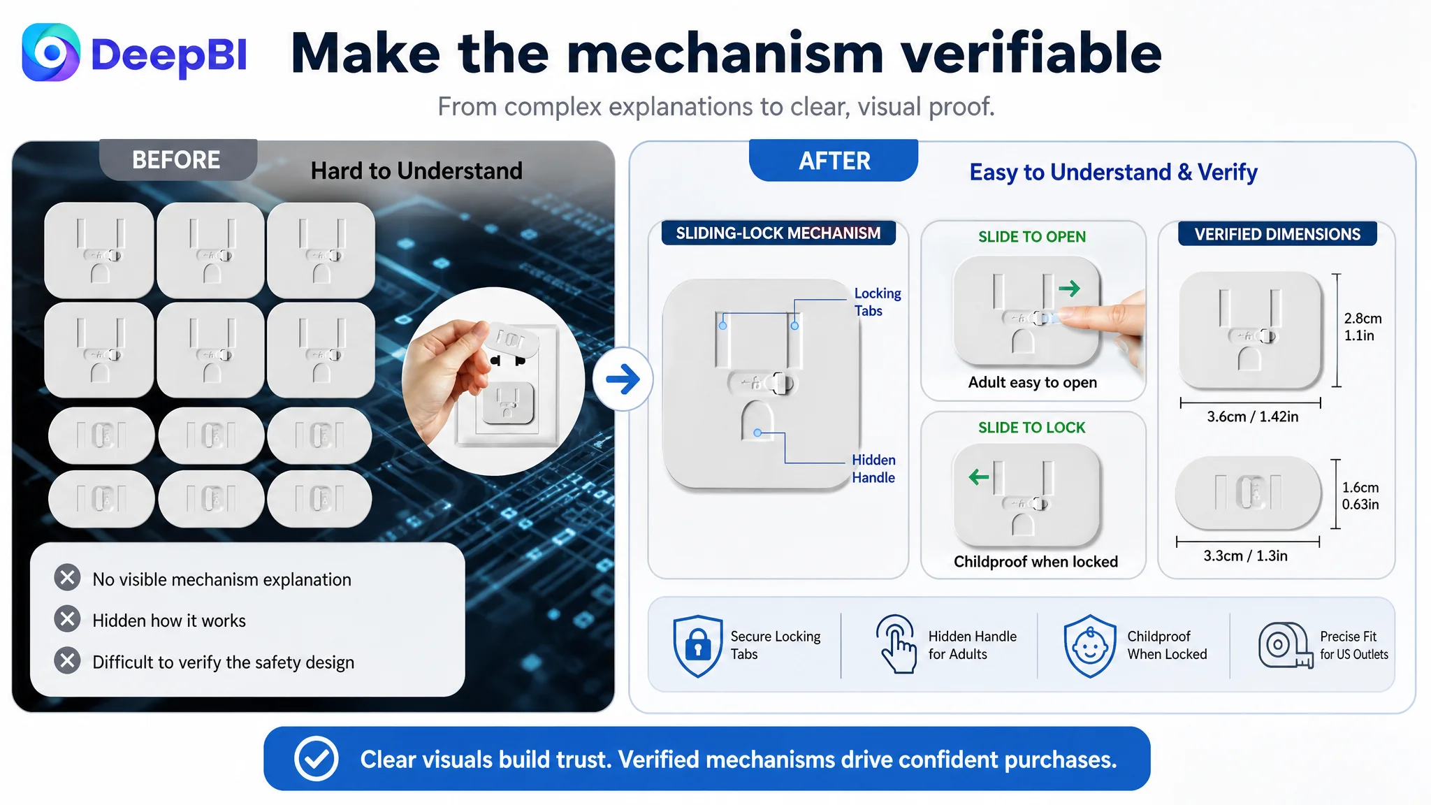
The next module should show the sliding-lock design as a working safety mechanism, not just as a product feature. The shopper should understand how the cover blocks access and why the design differs from a simple loose plug.
Prove the usability balance
A direct visual comparison should address the most important decision node: the child-access problem versus adult usability.
The product page should show the intended interaction clearly and safely, without implying that a plug or another unsafe object should be used to pry the cover open.
Remove installation doubt
The installation module should demonstrate the actual “peel and stick” process, confirm that tools are not required, and avoid misleading outlet examples. Standard US outlet compatibility should be visually clear.
Address persistent security
The adhesive module should explain that the sticky backing is intended to keep the cover firmly in place and that there are no loose parts for a curious child to remove.
Expand the use context
A home, kitchen, nursery, and office context gives the product more practical relevance. It also helps the shopper understand where the 12-piece set can be used.
Close with risk reduction
The final module should bring the story back to the core purpose: helping protect children from electrical access across the home.
This is the difference between adding A+ content and using A+ content as a conversion system.
The page did not need more modules for the sake of completeness. It needed each module to remove one reason for hesitation.
The Review Problem Changed the Order of Operations
The 2.8-star rating and five-review history could not be treated as a secondary detail.
It created a risk that the Listing team might respond by increasing Amazon ads before the page had repaired its trust structure. More paid traffic would expose more shoppers to the same unresolved questions. If the page did not convert them, the store could spend more while producing more evidence that the Listing was underperforming.
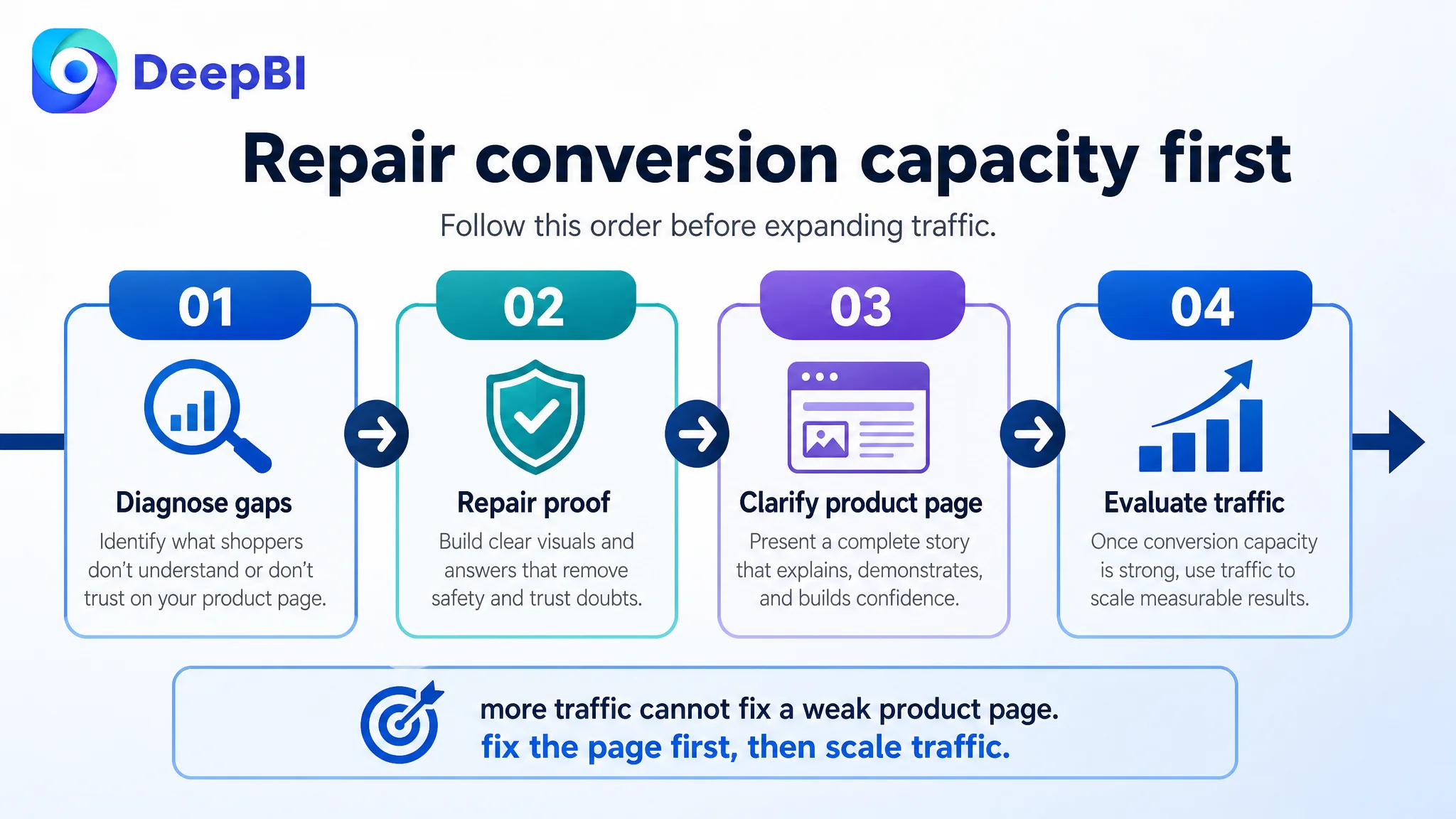
That is why DeepBI prioritized the page’s conversion capacity before treating traffic expansion as the main answer.
The decision path was:
- First, identify the largest conversion and trust gaps.
- Then, correct misleading or incomplete visual explanations.
- Next, build a clear product-page argument around safety, usability, installation, adhesive security, and coverage.
- Only after the page can better receive traffic should the team judge whether further ad or keyword adjustments are working.
This does not mean Amazon ads are unimportant. It means ads should not be used to compensate for an unresolved product-page problem.
A More Reliable Visual Strategy for the Amazon Product Page
The visual recommendations were grounded in the product’s verified features rather than invented specifications or altered product properties.
The revised direction emphasized:
- The 12-piece set
- Standard US outlet compatibility
- The sliding-lock design
- Adult removal and child-access prevention
- Strong adhesive
- Tool-free installation
- Multiple home environments
- Clear risk reduction
It also removed elements that could damage trust:
- Non-US outlet examples
- Unclear installation sequences
- Unsafe plug-scraping behavior
- Generic stock imagery disconnected from the product
- Distracting futuristic backgrounds
- Visual narratives that shifted away from child electrical safety
This is where DeepBI’s role was not simply to suggest a new image. The important judgment was deciding what the image had to prove, what it must not imply, and which product attributes could safely be emphasized without changing the product itself.
The Business Change Was a Better Order of Decisions
The case material does not provide confirmed post-optimization figures for CVR, ACOS, organic orders, or keyword ranking. Those outcomes should not be invented.
The measurable change at this stage was the operating diagnosis.
The Listing team could now see that:
- The main image was not the only or largest issue.
- The title and bullet points needed refinement, but they were not the central bottleneck.
- The absence of A+ content created a major trust and explanation gap.
- The low review rating and limited review volume weakened every conversion claim.
- The product page needed to prove the safety mechanism, not merely name it.
- Ads should not be scaled aggressively while the page remained unable to answer fundamental purchase questions.
That changed the risk profile of the account. Instead of continuing with scattered creative edits or relying on traffic to reveal the answer, the team had a clearer sequence for repairing the Amazon Listing.
The intended operating state was also more controllable: a page with a coherent sales argument, more accurate product demonstrations, clearer safety communication, and a visual structure capable of receiving both organic and paid traffic.
What Amazon Sellers Should Take From This Case
The most important lesson is not that A+ content matters, or that titles should include pack size. Those are useful observations, but they are not the main judgment.
The deeper lesson is that an Amazon Listing can appear to have a creative problem when it actually has a proof problem.
For this baby-proofing outlet cover seller, the page did not fail because every component was weak. It failed because the strongest parts of the page were not connected into a convincing decision path, while the most important trust layer was missing.
A practical diagnosis should therefore ask:
- Is the page losing clicks, or losing confidence after the click?
- Is the main image genuinely weak, or is the deeper product story missing?
- Are reviews creating a trust barrier that copy cannot hide?
- Does each image answer a real customer question?
- Does A+ content explain the mechanism and use case in sequence?
- Are ads bringing more opportunity to the page, or simply amplifying its existing defects?
In this case, the correct direction was not to keep treating Amazon ads or individual creative elements as isolated problems. It was to rebuild the Listing’s ability to explain, demonstrate, and support trust.
Before more traffic could become more orders, the Amazon product page had to become more believable.