

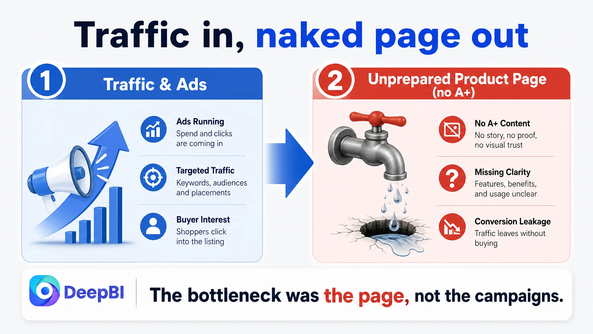
This case comes from an Amazon seller in the baking tools category, running a Danish dough whisk + balloon whisk set on the US marketplace. The team had been feeling rising pressure from Amazon ads: clicks were not cheap, ACOS was stubborn, and “let’s keep tuning campaigns” had become a default reflex. What they did not expect was that, in this ASIN, the core issue was not in the ad console at all, but in a listing that was structurally unprepared to convert traffic.
On the surface, nothing looked disastrous. The product had a healthy 4.6-star rating and clear main images. The seller’s own intuition was that “our images are okay, we just need better ads or more reviews.” But when DeepBI benchmarked the Amazon Listing against a category-leading competitor, the total score gap hit 35 points out of 100, with a single brutal number underneath: 0/25 on the detail/A+ dimension versus 22/25 for the competitor. The seller’s page had no A+ content at all, while the benchmark listing used a full, image-led story to convert both organic and ad traffic.
From there, the optimization path flipped. Instead of squeezing more efficiency out of campaigns, DeepBI pushed the team to rebuild the Amazon product page itself: retarget the title to how buyers actually search, reframe bullet points around durability and ease-of-use, and most importantly, construct a full A+ chain from baking atmosphere, to size clarity, to heavy-dough proof, to cleaning, to final bread outcomes. For other Amazon sellers, this case is a reminder: as ad costs rise, the most dangerous assumption is that “ads are the only problem” when, in reality, traffic is being poured into a page that has never been given a real chance to sell.
The Core Constraint Was Not Traffic, It Was a Half‑Finished Amazon Listing
From a business angle, this seller was facing a familiar Amazon pressure:
- Ads were running.
- Reviews were not terrible (4.6 stars).
- The product was not a misfit for the category.
Yet orders were not matching the traffic and effort. The first instinct inside the team was:
“Our category is competitive, we probably just need better keywords, more bids, maybe some new creatives. And if we can grow our review volume, conversion will follow.”
DeepBI’s listing score tore that assumption open:
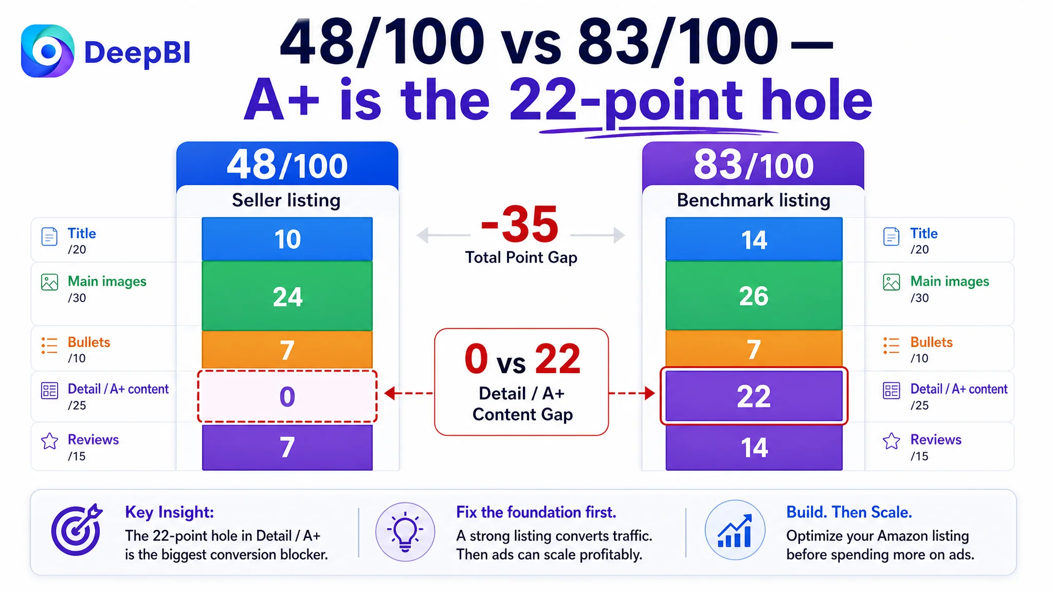
- Seller’s total Amazon Listing score: 48/100
- Benchmark competitor’s score: 83/100
- Gap: –35 points
Breakdown by dimension:
- Title: 10 vs 14 (–4)
- Main image set: 24 vs 26 (–2)
- Bullet points: 7 vs 7 (0)
- Detail/A+ content: 0 vs 22 (–22)
- Reviews: 7 vs 14 (–7)
The 22‑point hole in the detail/A+ dimension changed the whole conversation. The real story was not “ads can’t scale” but:
“This Amazon product page is essentially naked below the fold. Ads are sending traffic into a page that stops selling as soon as the gallery ends.”
With reviews also heavily outgunned (6 total reviews versus the competitor’s 6,646), the page had two compounding trust problems:
1. No visual story or A+ to compensate for weak social proof.
2. No structured explanation of why this whisk set deserves to be chosen over dozens of alternatives.
In that state, any attempt to push more traffic—organic or paid—would only amplify a fragile conversion funnel.
How the Customer Originally Misread the Problem
Before the DeepBI diagnosis, the team’s mental model looked roughly like this:
- CTR is “okay enough” because main images are clear and white-background.
- Star rating is fine; we just need more review volume.
- If we tune ads (keywords, bids, placements) and maybe refresh some images, conversion should lift.
Three blind spots sat underneath this:
1. Confusing “no obvious disaster” with “competitive enough.”
The main images were not objectively bad, but they lacked the depth, scene logic, and trust signals that define category leaders.
2. Overweighting reviews as the main trust lever.
With only 6 total reviews, the seller could not realistically catch a 6,000+ review benchmark quickly. The only lever they fully controlled in the near term was the Amazon Listing content itself.
3. Treating ads as a solution to a page-level leak.
The team’s working belief: if ACOS is high and sales are flat, it must be an ad or bidding issue. Very little attention was paid to whether the product page could truly absorb and convert that traffic.
So time and energy clustered around campaign structures, not the listing. DeepBI’s scoring logic forced a reversal: the ads were not the core bottleneck; the Amazon listing’s conversion capacity was.
What the Benchmark Listing Was Doing That This Page Was Not
DeepBI’s comparison against a single, tightly matched benchmark whisk listing highlighted how a mature Amazon page converts traffic differently at every step.
1. Title: Search Logic vs. Brand‑First Logic
On the seller’s listing:
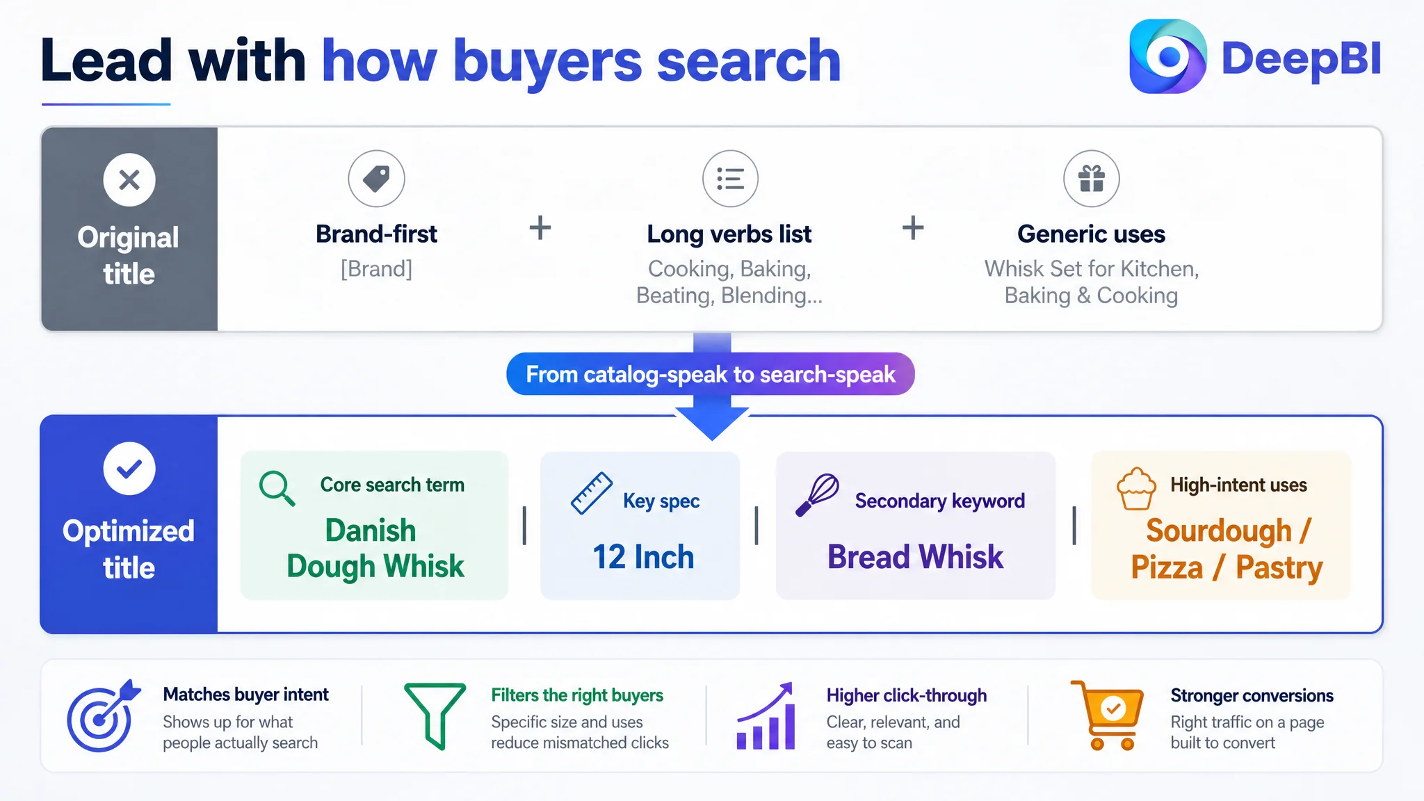
- Brand name led the title.
- Functional verbs and generic uses were strung out: “Cooking, Baking, Beating, Blending,” creating a loose, unfocused structure.
- No clear size spec (e.g., “12 inch”) to help buyers pre‑qualify.
On the benchmark listing:
- The core search phrase “Danish Dough Whisk” was front-loaded.
- “12inch” appeared clearly, acting as a strong spec filter in search results.
- Structure was tight, centered around what users actually type and what they need to know at a glance.
DeepBI’s judgment: the seller’s title was not “wrong,” but it was leaking search relevancy and click intent. The product was talking like a catalog; the benchmark was talking like a search result.
2. Main Images: Visible Enough, but Not Yet Persuasive
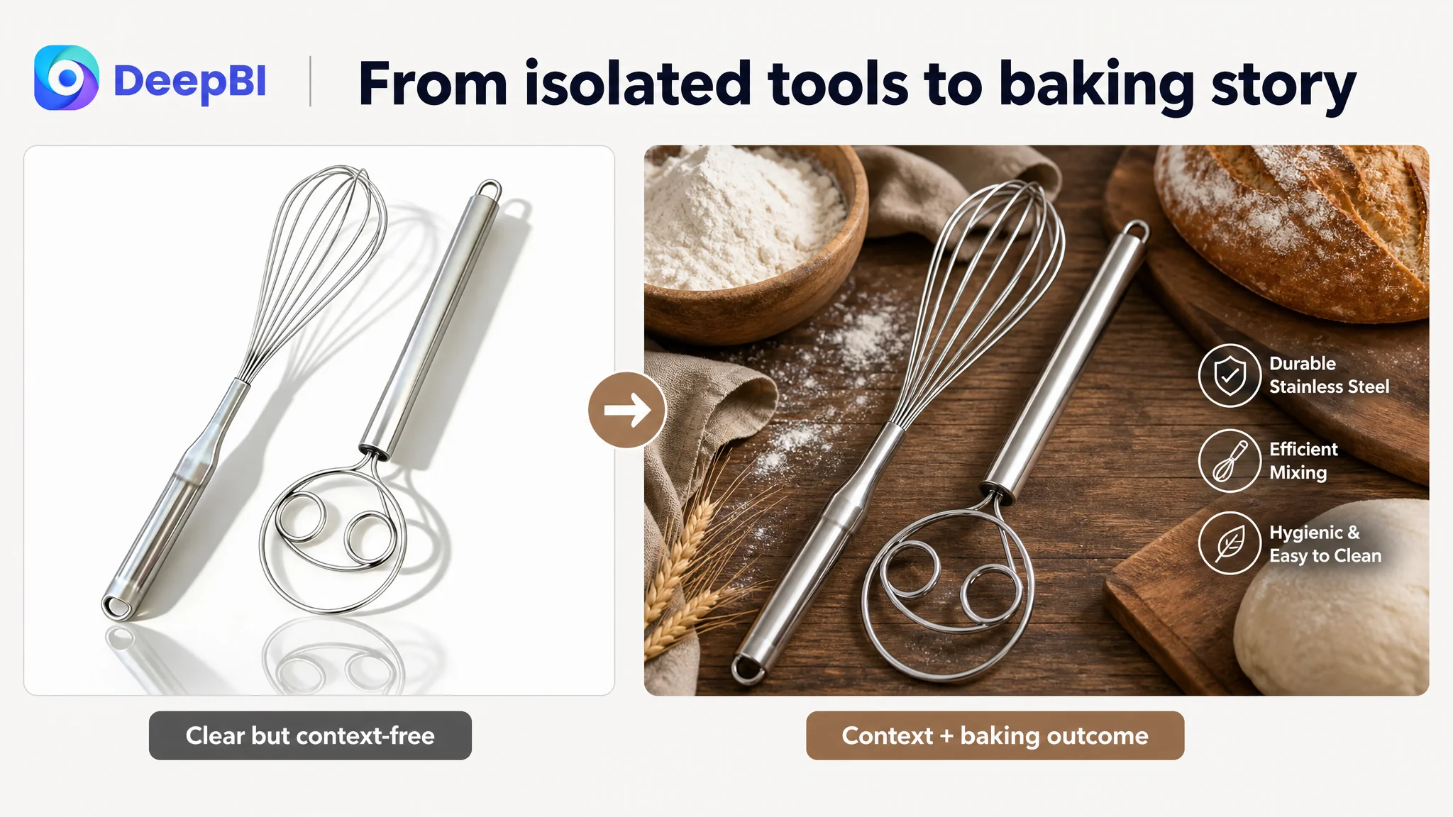
Main images on the seller’s page were clear product shots, but:
- Trust cues were missing.
No on-image references to material grade, no subtle brand engraving or durability signaling. In a metallic kitchen tool, these missing elements quietly erode willingness to pay and long-term confidence.
- Information layering was weak.
Key structural advantages (like the “2-eye” dough whisk design) required the shopper to study the image. Nothing in the thumbnail made the function instantly legible.
- Scene aesthetics were basic.
Visually, the images did not stand out in Amazon search results, especially on mobile. In a scrolling field of similar stainless steel tools, there was little reason to click this one first.
DeepBI’s estimate: these gaps were not catastrophic, but enough to shave off 3–5% conversion and depress CTR versus a more thoughtfully engineered gallery.
3. Bullet Points: Information Present, Buying Logic Missing
Interestingly, bullet points were not the worst-scoring dimension (7/10 vs 7/10 for the competitor). That disguised a deeper issue: structure and persuasion logic.
- The seller started with product combination and scenarios, then moved into material, design, ergonomics, and convenience.
- The competitor opened with material and durability, then moved through efficiency, versatility, ease of cleaning, and warranty.
Both covered similar content areas. But the competitor:
- Led with “Can this tool survive my kitchen?”
- Segmented “easy to clean” and added a warranty as its own point.
- Anchored each bullet in a clear, user-focused benefit.
The seller’s bullets were doing the job of explanation, but not of framing a decision path: fear of flimsiness → reassurance of durability → proof of performance in heavy dough → clarity on cleaning → assurance of support.
4. Detail Page / A+: One Side Fully Built, One Side Empty
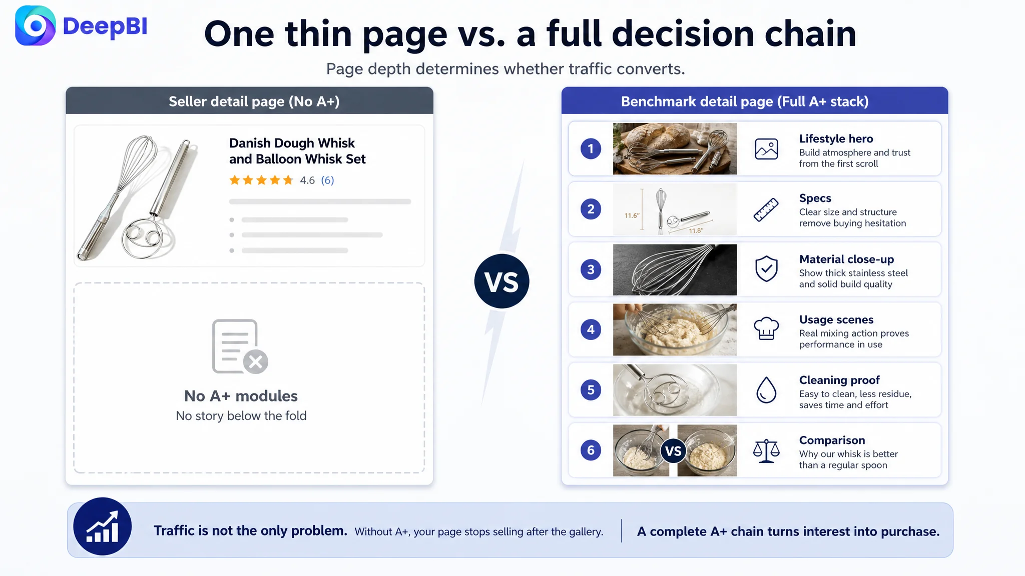
Here was the true conversion cliff.
- Seller’s listing: no A+ content at all.
Below the standard description, the page simply ended.
- Benchmark listing: a complete A+ stack, including:
- Hero lifestyle baking shot (whisk in a warm, artisanal environment).
- Dimension/spec illustration.
- Material close-up to communicate thickness and stainless quality.
- Usage scenarios (e.g., mixing dough in real bowls, bread basket scenes).
- Cleaning and “less stick, fewer leftovers” visuals.
- Comparison-style proof that it beats using a spoon.
The competitor’s A+ sequence created a full decision chain:
- Atmosphere: “This is a serious, enjoyable baking tool.”
- Specs: “I understand size and fit; it will work in my bowls and with my dough.”
- Performance: “It actually cuts and folds heavy dough efficiently.”
- Effort: “Cleaning will not be a nightmare.”
- Outcome: “I can produce bread like the ones shown here.”
By contrast, on the seller’s Amazon page:
“User cannot see, cannot feel, and cannot imagine. The page offers almost no additional information or emotional push after the gallery.”
In that context, even a decent CTR from ads will leak out silently as users scroll, hesitate, then back out.
5. Reviews: Trust Gap That the Page Failed to Offset
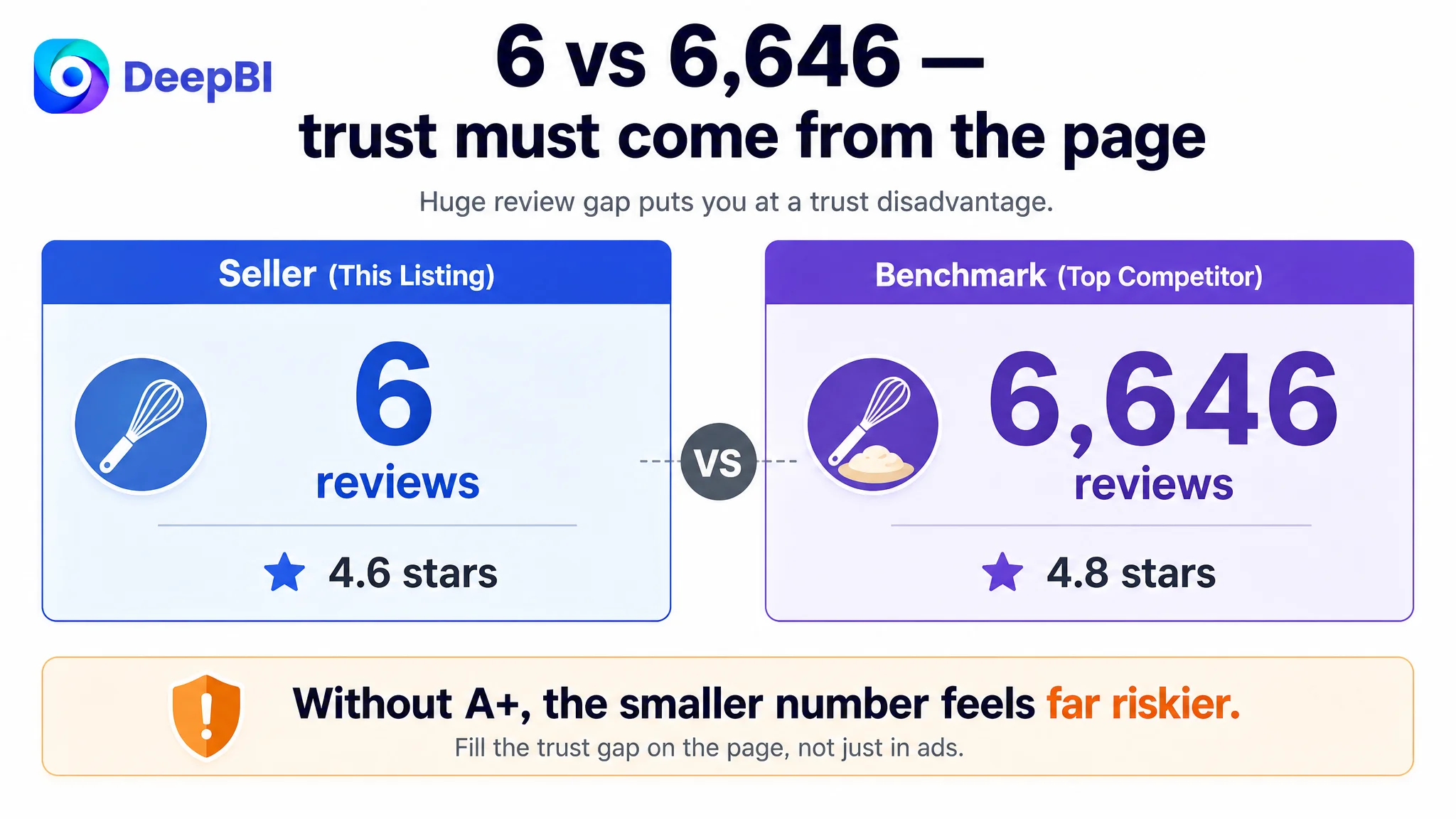
- Seller: 4.6 stars, 6 reviews
- Benchmark: 4.8 stars, 6,646 reviews
Star rating alone did not hurt. But volume difference created a massive perceived risk gap. With no A+ or high-quality trust visuals to lean on, the seller’s listing had:
- Weak “social proof” (few voices).
- Weak “visual proof” (no usage evidence below the fold).
DeepBI’s analysis: the reviews were not fixable in the short term, and chasing volume alone would take too long. The controllable lever was to build a page that compensates for review weakness by over-delivering on clarity, professionalism, and visual trust.
Why DeepBI Refused to Start With Ads
Given this picture, the business choice was blunt:
- Option A: Keep iterating Amazon ads (new keywords, budgets, placements) against a 48/100 listing with 0/25 on detail/A+.
- Option B: First repair the Amazon listing’s conversion capacity so any incremental traffic—paid or organic—lands on a page that looks and behaves like a category leader.
DeepBI judged Option B as non‑negotiable for three main reasons.
1. Ads Were Amplifying a Broken Lower Funnel
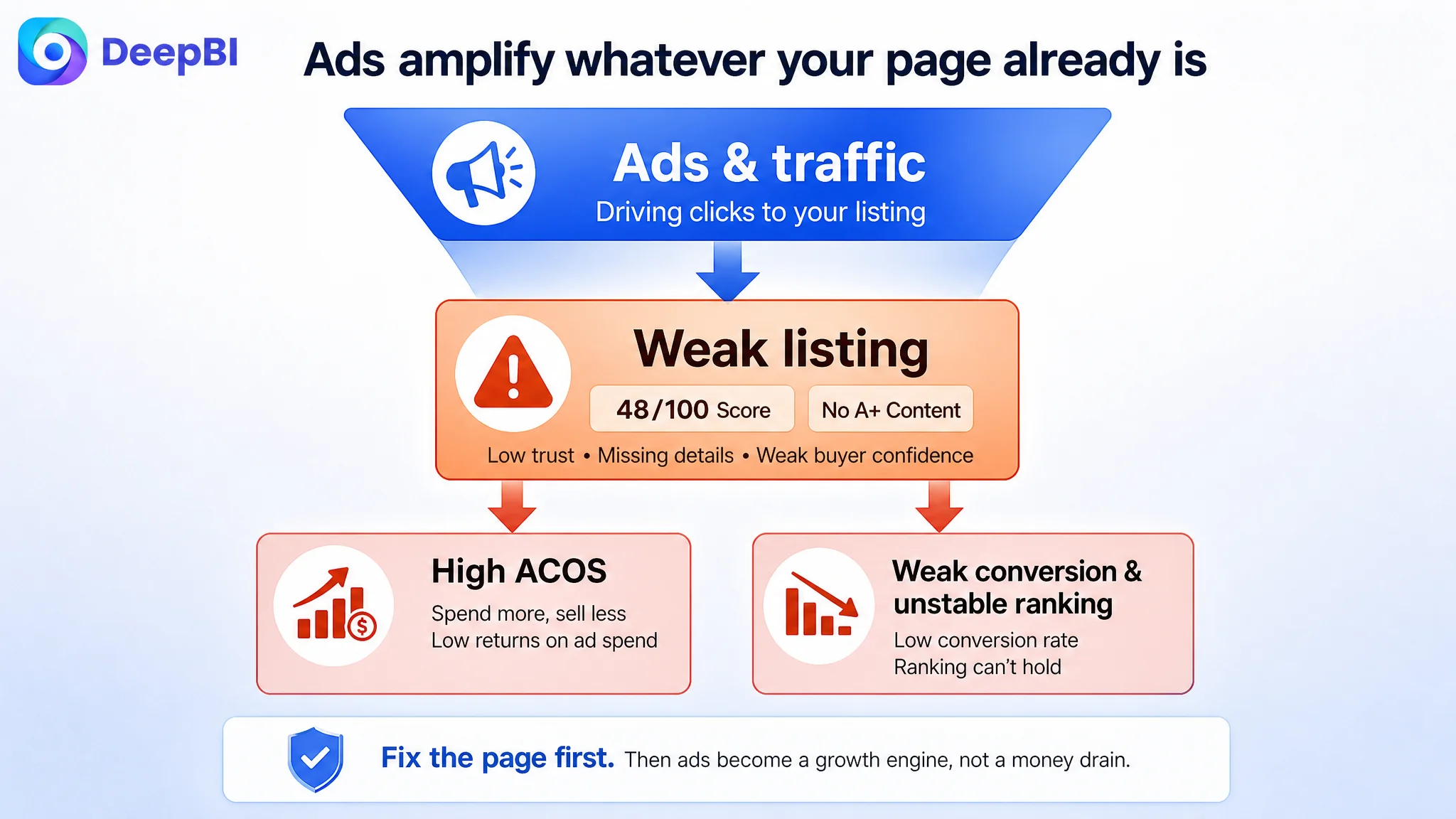
“Advertising does not only amplify advantages. It can also amplify a page’s existing defects.”
Sending more, better-targeted traffic into a listing that ends abruptly, without A+, creates three compounding problems:
- ACOS remains hard to push down, because CVR is capped by the page, not by targeting.
- Bid wars become more dangerous; you pay more per click without improving the post-click experience.
- Organic ranking gains are fragile, as Amazon’s algorithm sees a weaker conversion rate than it could have.
2. The Biggest Near-Term Lift Was in What the Buyer Sees, Not Where They Come From
The diagnostics showed:
- Title: fixable and worth optimizing, but not catastrophic.
- Main images: good enough foundation; room to refine, but not the primary emergency.
- Bullet points: information-rich but in need of restructuring, not a total rewrite.
- Detail/A+: missing entirely.
From a resource and ROI standpoint, DeepBI prioritized:
- Build A+ / detail content first (turn 0/25 into something competitive).
- In parallel, sharpen the title and bullet logic to align with real search and decision behavior.
- Only then re-evaluate ad structure and budgets with a healthier conversion base.
3. Without a Real Page, There Was No Way to Separate “Ad Problem” From “Listing Problem”
When a listing is this underbuilt:
- You cannot cleanly attribute poor performance between ad traffic quality and page quality.
- Every ad test result is blurred by a noisy, low‑information destination.
DeepBI’s view was clear: before investing in more granular ad optimization, the seller needed a page that even deserved such traffic analysis.
Rebuilding the Amazon Product Page as a Conversion Engine
Once the real constraint was accepted—“this is a listing problem, not just an ads problem”—the optimization path became focused and practical.
Sharpening the Title Around Core Search and Specification
DeepBI recommended a title direction like:
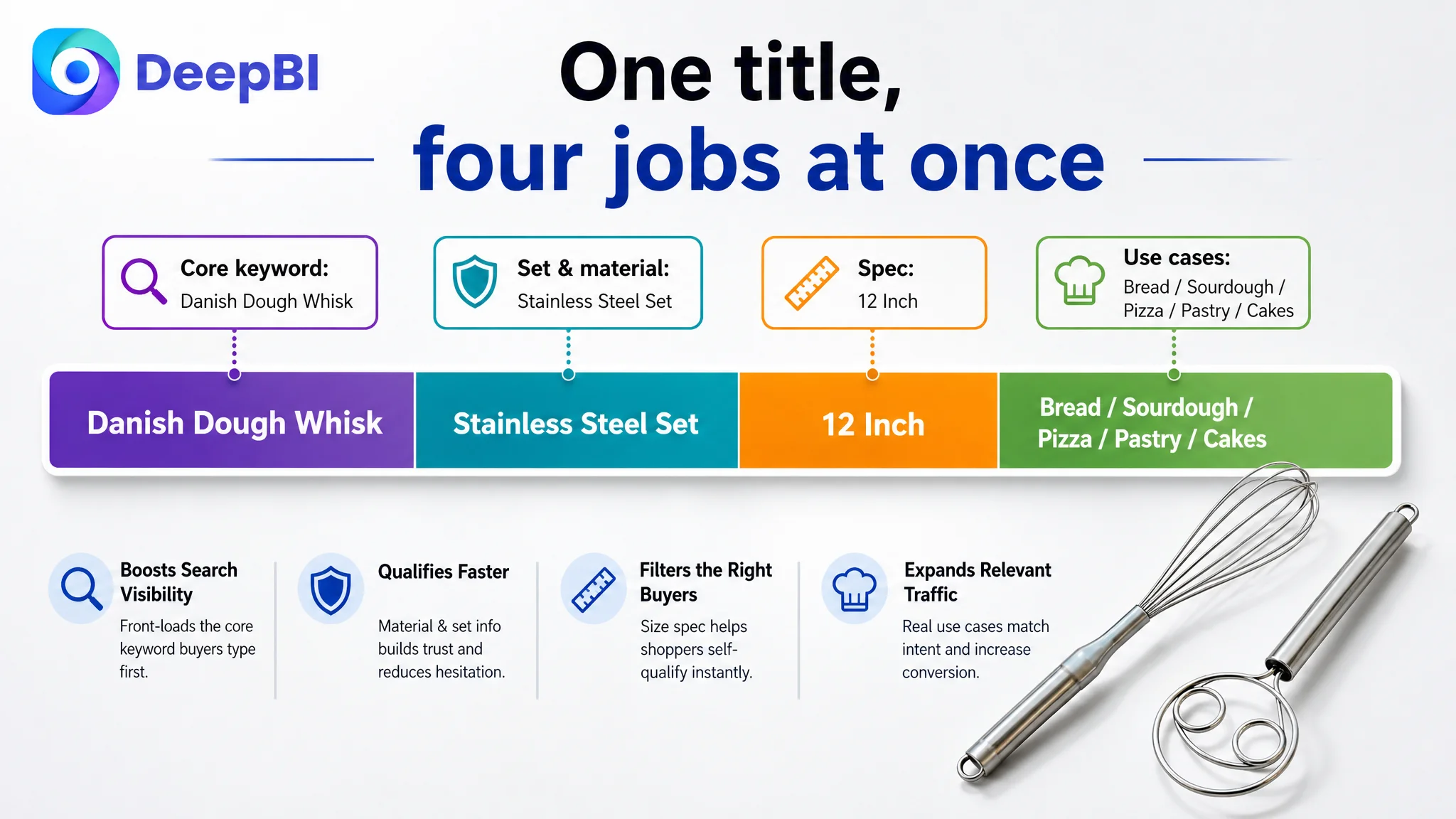
“Stainless Steel Danish Dough Whisk and Balloon Whisk Set, 12 Inch Bread Whisk for Baking Sourdough, Pizza, Pastry, Cakes”
Key shifts in logic:
- Bring “Danish Dough Whisk” forward to match how category buyers search.
- Integrate “Bread Whisk” to capture variant queries.
- Insert the “12 Inch” spec to pre‑filter the right buyers and reduce size-related hesitation.
- Trim redundant verbs (“beating, blending”) and instead embed high-intent baking scenarios: sourdough, pizza, pastry.
This is not keyword stuffing; it is aligning title real estate with the way traffic is generated and the way buyers self‑qualify.
Reframing Bullet Points Into a Clear Buying Story
Each bullet was re‑anchored to a specific decision concern:
1. “Comprehensive 2-Piece Baking Set”
- Make the set logic explicit: one balloon whisk + one Danish dough whisk.
- Highlight food‑grade 304 stainless steel and “heavy-duty daily use” to frame durability.
2. “Efficient Balloon Whisk for Aeration”
- Speak to performance: reaching the bottom and sides of the bowl, removing lumps, improving whipping efficiency.
3. “Heavy-Duty Danish Dough Whisk”
- Emphasize upgraded 2-eye design and thick wire, built not to deform under sourdough or pizza dough.
- Position as the right tool for heavy, sticky mixtures.
4. “Hygienic & Ergonomic Seamless Design”
- Tackle the hygiene fear: no gaps for liquids or food to get trapped.
- Combine with ergonomic handle and non-slip grip to suggest comfort and control.
5. “Dishwasher Safe & Space-Saving”
- Close with daily-life practicality: easy cleaning, no rust, compact storage.
Bullet points stopped being a scattered list of strengths and became a sequence of resolved objections: “Is it strong enough?” → “Does it work better than what I have?” → “Will it be a pain to clean?” → “Will it clutter my kitchen?”
Deepening the Main Image Set: From “Product Shown” to “Product Proven”
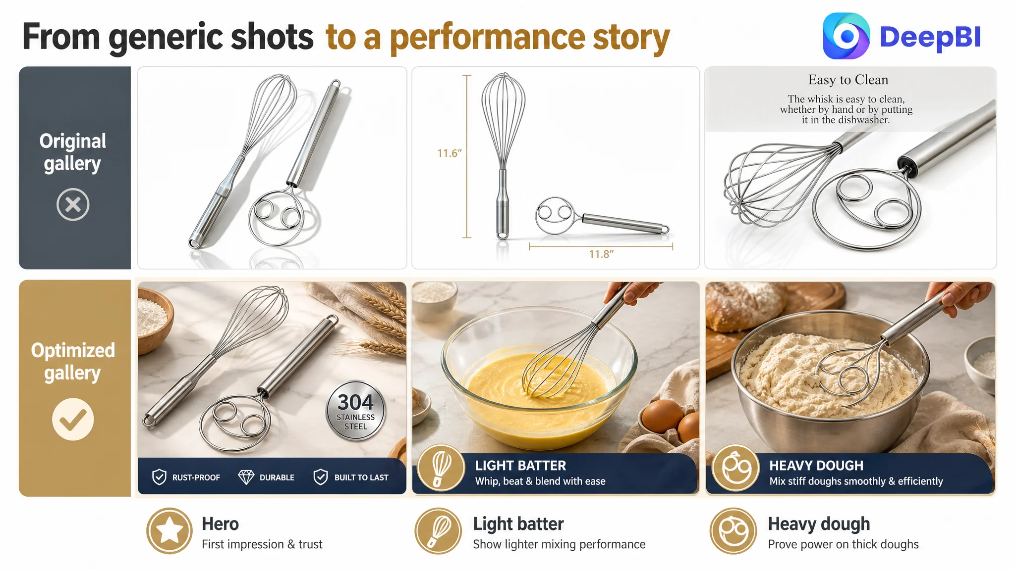
Instead of just “better photography,” DeepBI pushed for a specific visual logic:
1. Hero white-background group shot
- Product set centered, about 75% of the frame.
- 45° top-side angle, clean gradual background from light gray to white.
- Strong, controlled reflections to make stainless steel feel premium, not cheap.
2. Dimension in context
- Tools placed on a dark wood surface dusted with flour, reinforcing baking context.
- Subtle on-image labels like “11.6 inch” and “11.8 inch” to help users imagine real size.
3. Seamless joint close-up
- Macro shot of the wire–handle connection, showing a tight, gap‑free weld.
- Short overlay text such as “Seamless & Easy to Clean.”
4. Light-batter action scene
- Whisk actively beating eggs in a glass bowl over a marble countertop, with a warm kitchen feel.
- Captured splash motion to evoke home baking energy.
5. Heavy-dough action scene
- Dough whisk cutting through thick dough in a dark bowl, low angle to convey power.
- Strong side light revealing dough texture and the tool under load.
Together, these images start to answer, visually, the two questions most ad traffic brings:
- “Is this nicer and more capable than the cheap ones?”
- “Can it handle both my Sunday pancakes and my serious sourdough?”
Building the A+ Detail Page From Zero to a Full Decision Chain
This was the biggest structural change.
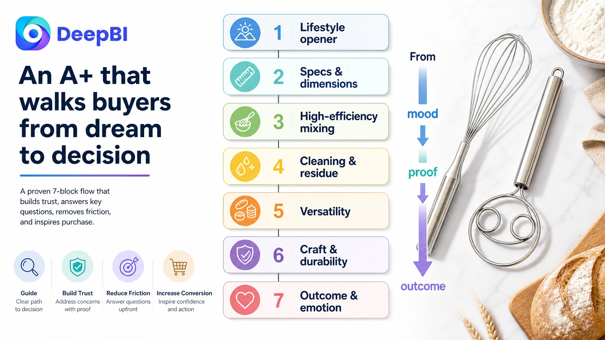
DeepBI recommended a 6–7 block A+ flow:
1. Lifestyle opener: “Modern artisan baking at home”
- Diagonal composition, tools placed on a walnut tabletop with wheat stalks and a rustic loaf.
- Morning-like natural light to create a calm, premium, home-bakery mood.
2. Specs & dimensions module
- Clean, white background with clear line annotations: total length, handle length, head diameter.
- Side-by-side close-ups of both heads to show wire thickness and structure.
3. High‑efficiency mixing module
- Action shot of the dough whisk cutting through textured, grainy dough.
- Visual emphasis on “cutting and folding,” not just stirring—showing why it beats a spoon.
4. Cleaning and minimal residue module
- Tool scraping batter off the wall of a glass bowl, showing close contact and low residue.
- Bright, clean kitchen context, highlighting that cleanup is quick and manageable.
5. Versatility module
- Split scene: light batter (pancakes or muffins) on one side, heavy whole-wheat or sourdough dough on the other.
- Same background tone for cohesion, reinforcing “one set, many tasks.”
6. Craft & durability close-up
- Macro detail of welds and material, with a darker background and colder light to signal technical reliability.
- Timid buyers see visible, not claimed, durability.
7. Outcome / emotional close
- Bread basket with golden loaves in a soft-focus kitchen, whisk resting casually beside.
- Subtle emotional cue: “This is the tool behind that bread.”
This layering transforms the Amazon detail page from “no extra information” into a guided narrative that compensates for the lack of mass reviews and gives ad traffic a much more credible, satisfying place to land.
What Changed for the Business: From Fragile Ads to a Listing That Can Carry Its Weight
Because the case focuses on diagnosis and logic rather than time-bound metrics, we won’t fabricate numbers. But several concrete shifts in operating state became clear once the listing work was completed and rolled out.
1. Listing Conversion Began to Carry More of the Load
With title, bullets, main images, and A+ working together:
- The Amazon product page was no longer a thin, risky endpoint for expensive traffic.
- Paid clicks had a stronger chance to become orders, not just expensive bounces.
- Organic visitors, many of whom discover the page without ads, now had a real path from curiosity to confidence.
Even without precise CVR figures, the seller could see:
- Fewer “wasted” sessions where customers scrolled briefly then exited.
- More add‑to‑carts from both search and detail-page views.
2. Ads Became a Lever, Not a Source of Anxiety
Once the page could credibly convert, the role of ads changed:
- Campaign changes could be evaluated with more confidence, because the destination was stable and competitive.
- The team could experiment with higher-intent keywords around “Danish dough whisk,” “bread whisk,” and “sourdough baking” knowing title and images aligned with those queries.
- The sense that “we’re just burning money to send people to a weak page” started to fade.
Ads were no longer tasked with compensating for a structurally underbuilt listing. Instead, they amplified a page that was capable of doing its part.
3. The Seller’s Mental Model of “Where the Problem Is” Shifted
Perhaps the most important change was in mindset:
- The team began to see that high ACOS is not always an advertising problem.
- They internalized that:
- Listing conversion and page trust fundamentally shape ad efficiency.
- A missing A+ or weak gallery can quietly cap performance, even when reviews and star ratings look okay.
- Title, main image, bullets, and A+ must form a single, coherent buying logic.
“The real problem was not that ads failed to bring traffic. It was that the page could not convert the traffic.”
This understanding is what other Amazon sellers can take from this case. When a listing scores 48/100 against an 83/100 benchmark, with 0/25 in detail/A+, tuning ads first is like repairing the sink while the main pipe is still cracked.
What Other Amazon Sellers Can Learn
For sellers in similar Amazon categories—kitchen tools, simple hardware, low-complexity products—the temptation is strong to assume:
- “My product is straightforward; people either need it or they don’t.”
- “Reviews will eventually solve conversion problems.”
- “If I can just fix my ads, orders will come.”
This case suggests a different order of operations:
1. Check whether the listing actually deserves the traffic you’re paying for.
If your detail/A+ is missing or skeletal, that is a structural conversion risk.
2. Benchmark honestly against a top competitor.
Not just on star ratings, but on title search logic, main-image click drivers, bullet decision flow, and A+ storytelling.
3. Fix the biggest structural gap first.
A 22‑point deficit in A+ is far more urgent than a 2‑point gap in main image or a 4‑point gap in title.
4. Only then refine ads.
Once the page can convert, campaign tuning becomes meaningful, not chaotic.
In crowded Amazon categories, ads, keywords, and bids are necessary, but they sit on top of a more basic question: does your product page make it easy and safe for a buyer to say yes? In this Danish dough whisk case, DeepBI’s value was not in pushing more buttons in the ad console, but in forcing the difficult, business-critical judgment: this is first and foremost a listing conversion problem—and until that is fixed, any ad optimization will be fighting upstream.