

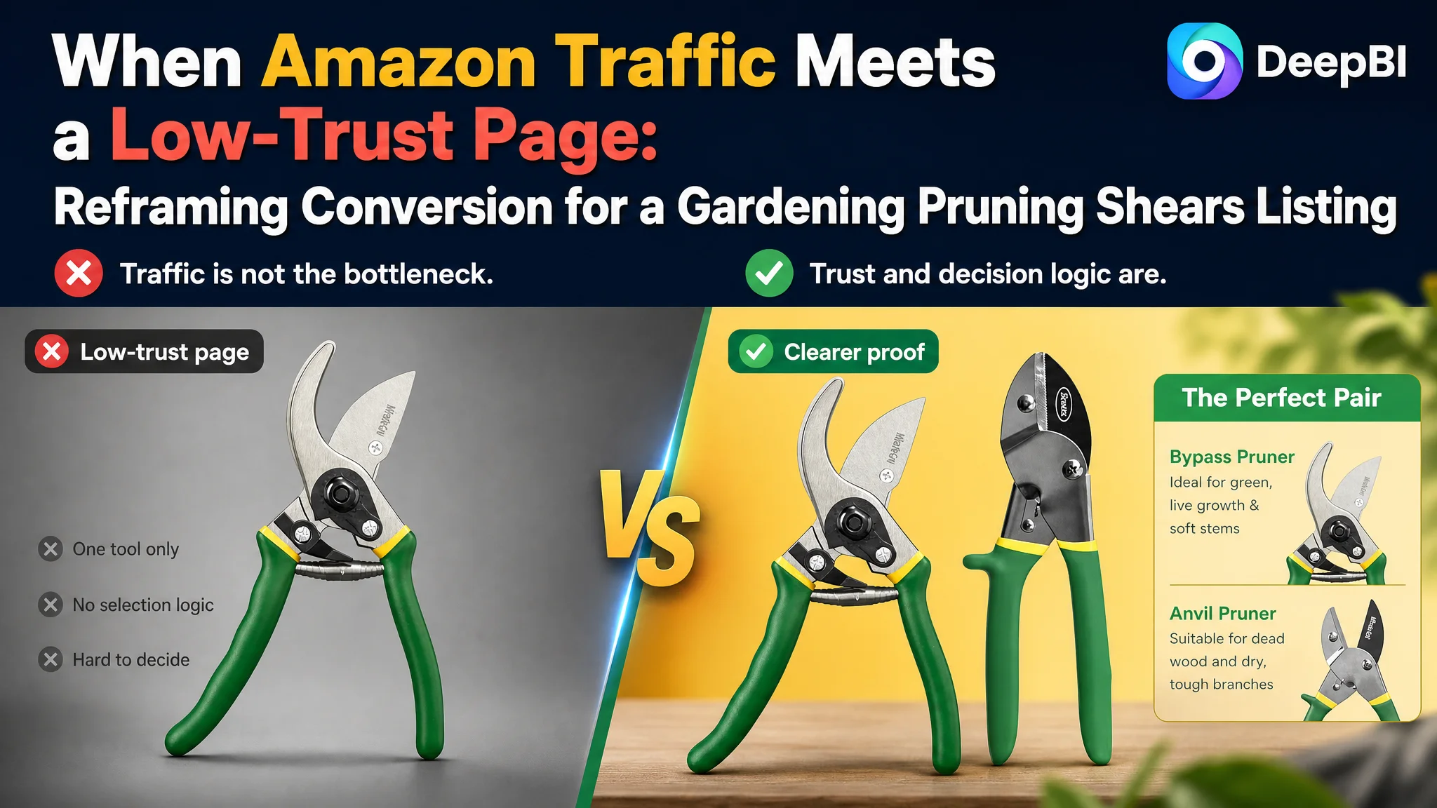
An Amazon seller in the gardening tools category was not facing a simple keyword or copywriting problem. Its two-piece pruning shears Listing had a recognizable product format, clear basic functions, and a title that was already close to a comparable high-performing listing. Yet the overall Listing score was only 54 out of 100, compared with 83 for the benchmark product.
The initial optimization direction centered on making the product benefits clearer: refine the title, explain the difference between bypass and anvil pruners, and add more gardening-use scenarios. Those changes were useful, but they did not explain the largest conversion gap. DeepBI found that the real weakness was deeper in the Amazon product page: the Listing provided too little visual proof, too little decision guidance, and too little trust reinforcement from its content and reviews.
The later direction therefore shifted from general description to performance evidence. The focus moved to measurable cutting capacity, carbon steel construction, Teflon coating, comfort and safety details, structured A+ content, and clearer use-case logic for live growth versus dead wood. The case offers an important lesson for Amazon sellers: before sending more traffic to a Listing, determine whether the page gives shoppers enough reason to trust and choose the product.
The Listing did not lack product information. It lacked a persuasive order for that information.
The Product Was Understandable. The Buying Decision Was Not
The target Listing sold a two-piece set of eight-inch pruning shears:
- One bypass pruner for live plants and soft stems
- One anvil pruner for dry stems, dead wood, and tougher branches
- Carbon steel blades
- Teflon coating
- Comfort-grip handles
- A safety-lock mechanism
On paper, the product had several useful selling points. The problem was that these points were not arranged around the questions an Amazon shopper needs to answer quickly:
- Which pruner should I use?
- Can it handle the branches I need to cut?
- Will it remain sharp and resist sap or rust?
- Can I use it for a long gardening session without excessive hand fatigue?
- Is the product safe to store?
- Does the two-piece set offer meaningful value?
The Listing mostly described the product. The benchmark Listing helped shoppers make a decision.
That distinction explains why a page can appear complete while still losing conversion. Shoppers are not only checking whether a feature exists. They are judging whether the product is suitable, credible, and worth the risk of purchase.
The First Diagnosis Focused on Visible Gaps, but Missed the Largest One
The customer’s Listing did have areas that needed refinement.
The title was long and repeated the eight-inch specification. The core keyword, “Pruning Shears,” was not placed as prominently as it was in the benchmark title. The wording also ended with a broad gardening-use phrase rather than a sharper description of the product’s use cases.
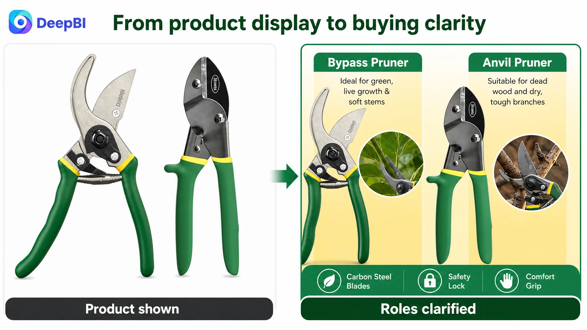
The main image set confirmed that the product was a two-piece set, but it did not immediately communicate premium construction or measurable performance. The visuals relied more on descriptive impressions such as sharpness than on visible proof of blade material, construction, or cutting capacity.
The bullet points also leaned toward feature listing. They mentioned materials, product types, use scenarios, coating, and safety, but did not consistently connect each feature to a specific user concern.
These issues naturally encouraged a conventional optimization response:
- Reorder keywords in the title
- Make the two-pruner structure more obvious
- Add more gardening scenarios
- Improve wording around sharpness and durability
- Make the product look more professional
Those changes addressed discoverability and clarity. But DeepBI’s comparison showed that they were not the largest business constraint.
The Score Gap Was Not Spread Evenly
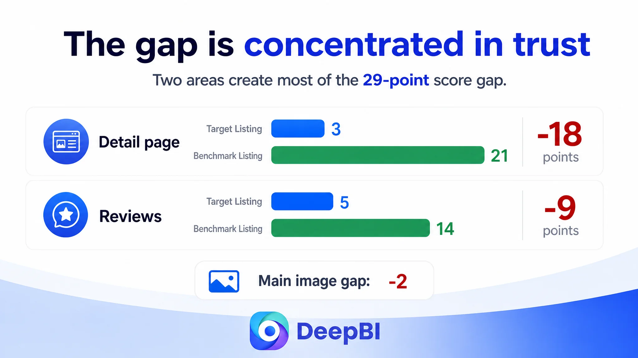
The total score difference was 29 points, but the gap was concentrated in two areas.
- Title: Target Listing: 16/20, Benchmark Listing: 15/20, Difference: +1
- Main image: Target Listing: 24/30, Benchmark Listing: 26/30, Difference: -2
- Bullet points: Target Listing: 6/10, Benchmark Listing: 7/10, Difference: -1
- Detail page: Target Listing: 3/25, Benchmark Listing: 21/25, Difference: -18
- Reviews: Target Listing: 5/15, Benchmark Listing: 14/15, Difference: -9
- Total: Target Listing: 54/100, Benchmark Listing: 83/100, Difference: -29
This changed the priority of the entire diagnosis.
The title, main image, and bullet points were not irrelevant. They were simply not the first problem to solve. Together, these three areas accounted for only a small portion of the total difference. The detail page and review profile accounted for the overwhelming majority.
The most visible optimization opportunities were not the most commercially important ones.
This is where a Listing score becomes more than a checklist. A seller can spend substantial time polishing a title that is already near the benchmark while leaving an 18-point detail-page gap untouched.
The Real Constraint Was Product-Page Trust
The target Listing used a text-only detail section without a meaningful visual module structure. The benchmark Listing used a sequence of visual explanations:
- Product and use-case introduction
- Blade close-ups
- Spring and handle details
- Safety-lock explanation
- Multiple gardening scenarios
- Clear differentiation between bypass and anvil tools
The difference was not merely aesthetic.
The benchmark page created a progression:
What the product is → how it works → why it is built this way → where to use it → why the buyer can trust it
The target page repeated product information without creating the same progression. A shopper could read about the tools, but still need to infer:
- Why two pruning mechanisms are useful
- Which tool is suitable for a particular branch or stem
- Whether the carbon steel claim reflects meaningful durability
- How the coating supports maintenance
- Whether the handles address fatigue
- How the safety lock works in practice
That is a conversion problem, not just a content-volume problem.
The page lacked visual proof of performance
The main image analysis identified a specific weakness: the product was shown, but its performance was not demonstrated strongly enough.
The benchmark Listing used visible technical signals such as:
- SK5 steel labeling
- A stated 0.75-inch or 19 mm cutting capacity
- Close-ups of construction details
- A more clearly differentiated gardening application
By comparison, the target Listing depended more on qualitative wording. Terms such as “razor sharp” can sound persuasive, but they are weaker when they are not supported by measurable specifications or close-up evidence.
For this product category, performance proof matters because shoppers are not buying a decorative gardening accessory. They are buying a tool expected to cut branches cleanly and repeatedly.
The recommended shift was therefore from general visual appeal to performance assurance:
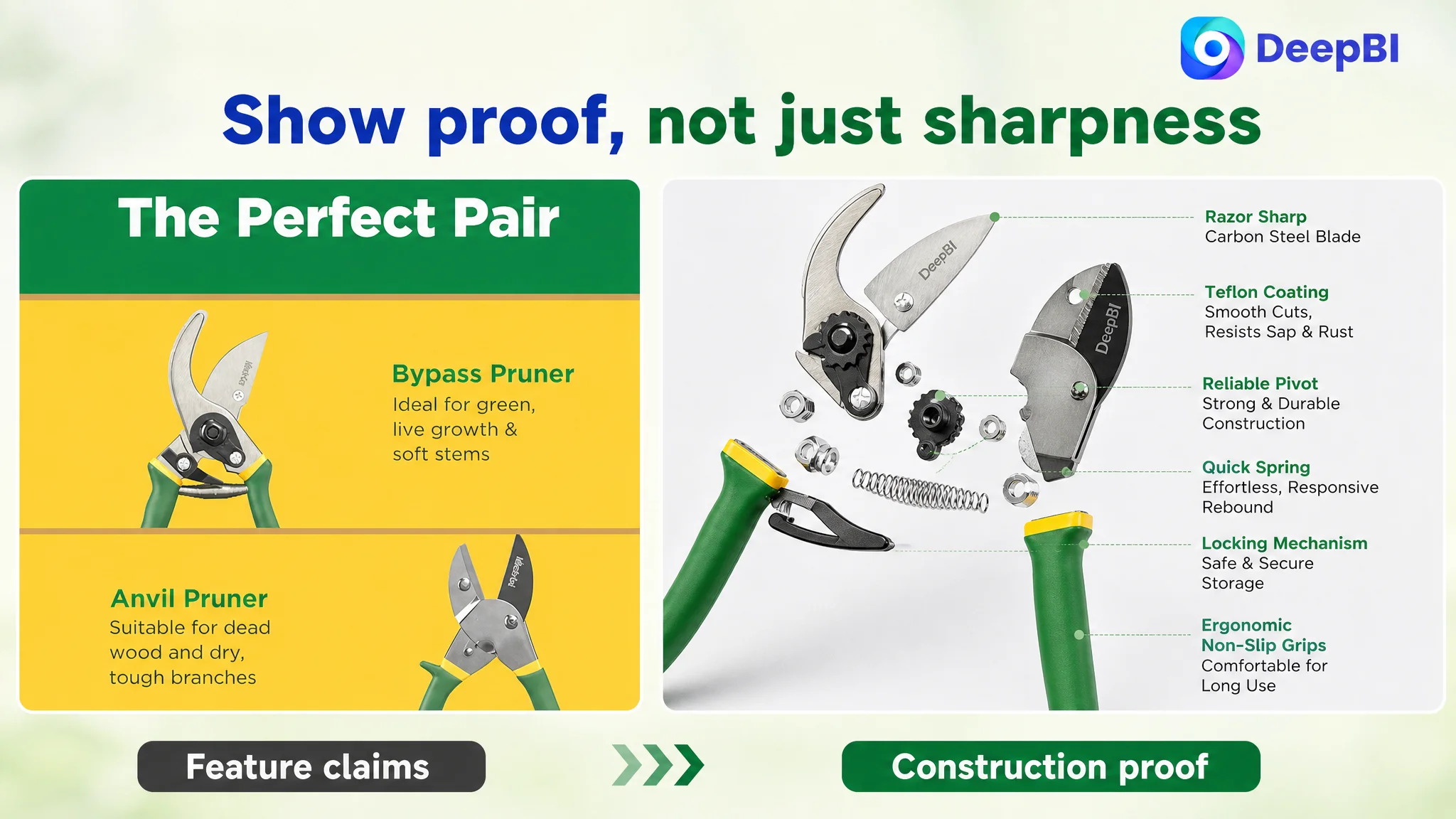
- Show the carbon steel blade more clearly
- Make the coating visible and understandable
- Present structural details through close-ups
- Use verified cutting-capacity information
- Distinguish live-stem and dead-wood applications
- Show the safety-lock mechanism in operation
The key principle was not to add impressive-sounding claims. It was to make existing product properties easier to verify.
The bullet points contained features, but not enough problem-solving logic
The benchmark bullet structure followed the shopper’s concerns more closely.
It began with cutting capacity and blade construction, then moved to hand comfort, spring-assisted operation, safety, and broader applications. The target Listing instead moved through materials, product type, general use, coating, and storage without a strong pain-point sequence.
That weakened the connection between product feature and buyer outcome.
For example:
- Carbon steel should be connected to strength and cutting precision.
- The anvil groove should be connected to dead wood and tougher branches.
- Anti-slip handles and shock-absorbing pads should be connected to reduced hand fatigue.
- The spring mechanism should be connected to easier one-handed operation.
- The safety lock should be connected to safer storage and transport.
- The two-piece set should be connected to covering both live growth and dry branches.
The revised bullet-point direction followed a clearer pattern:
Feature → evidence → practical use
For example, the anvil pruner was not presented merely as one half of a two-piece set. Its groove design and stated cutting capacity were tied to dead wood and stubborn branches. The bypass pruner was positioned as the tool for live growth and soft stems.
That structure helps shoppers decide, rather than asking them to organize the information themselves.
The Two-Piece Set Needed a Clearer Reason to Exist
The product’s strongest commercial advantage was also underused.
A bypass pruner and an anvil pruner are not interchangeable. Their value comes from covering different pruning jobs. But without a direct comparison, the two-piece format can feel like an ordinary bundle rather than a purposeful system.
DeepBI’s recommended A+ direction was to make the distinction explicit:
- Bypass pruner: Intended use: Live growth and delicate stems
- Anvil pruner: Intended use: Dead wood, dry stems, and tougher branches
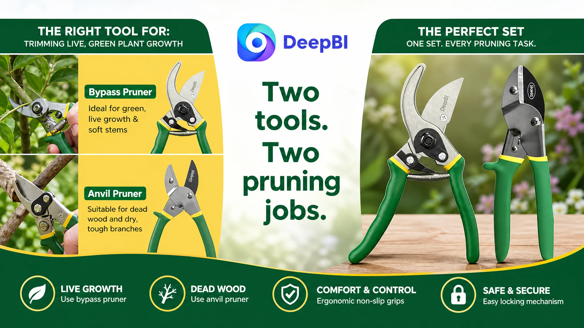
This comparison reduces a specific form of purchase uncertainty: the buyer does not have to guess which tool is designed for which task.
The page could then reinforce the same logic through realistic scenarios:
- Bypass pruner trimming rose bushes and other live growth
- Anvil pruner cutting dead branches and dry stems
- Both tools shown together as a practical gardening set
The goal was not to add more lifestyle imagery for its own sake. It was to use each scene to answer a product-use question.
Reviews Created a Second Trust Barrier
The detail-page gap was the largest weakness, but the review profile made the page-level problem more serious.
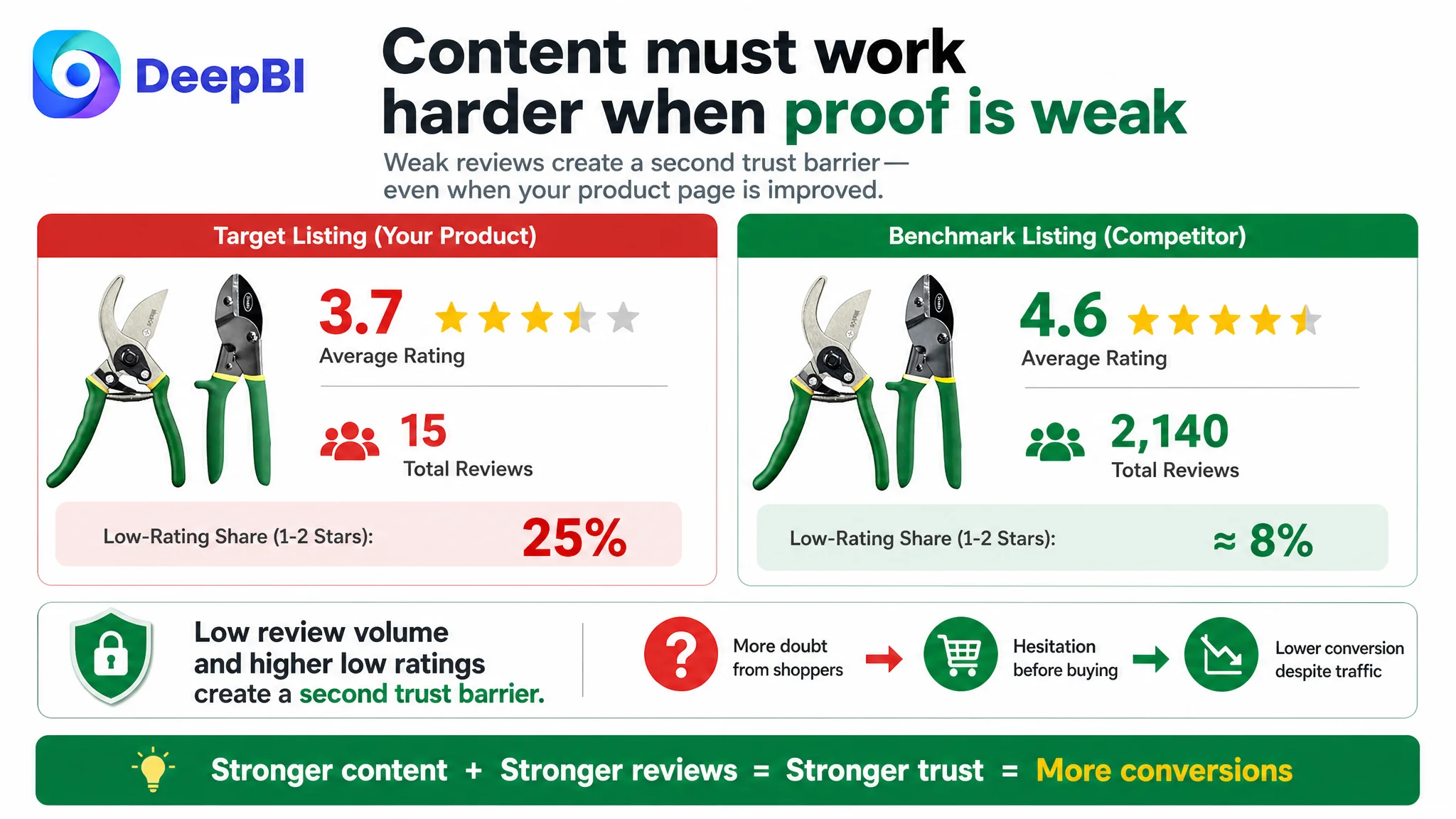
The target Listing had:
- A 3.7-star rating
- 15 total reviews
- Eight reviews visible on the first page
- Approximately 25% of visible reviews rated between one and three stars
- Negative feedback including concerns about breakage and dullness
The benchmark Listing had:
- A 4.6-star rating
- 2,140 total reviews
- A much stronger volume of social proof
- Approximately 8% of visible reviews rated between one and three stars
This created a difficult trust environment for the target Listing. Even if the title and images were improved, shoppers could still encounter doubts when they reached the review section.
The review gap also affected how other page claims were interpreted. When a Listing says “ultra-sharp” or “durable,” buyers naturally compare those claims against customer experiences. If negative feedback mentions dullness or breakage, broad performance language can feel overstated unless the page provides more concrete, credible evidence.
This is why the recommended direction emphasized:
- Precise cutting-capacity information
- Blade-material confirmation
- Close-up construction details
- Clear use boundaries
- Honest differentiation between bypass and anvil functions
- Content that addresses maintenance and safe storage directly
Listing content cannot erase an existing review history. It can, however, reduce ambiguity and ensure that the product is being judged against the right expectations.
Why DeepBI Did Not Start With More Aggressive Traffic
The case did not call for treating every weakness as equally urgent.
If the page cannot communicate product suitability or establish enough trust, additional traffic can increase exposure without creating proportional order growth. In that situation, advertising may reveal the weakness more clearly, but it does not solve it.
For this Listing, the decision sequence was therefore:
1. Confirm the largest competitive gap.
2. Repair the product page’s trust and decision logic.
3. Clarify the role of each pruning tool.
4. Add measurable and visually supported performance evidence.
5. Strengthen the title and bullets around the same positioning.
6. Only then evaluate whether additional traffic is being converted efficiently.
This does not mean Amazon ads are unimportant. It means advertising should not be used as a substitute for a page that still leaves basic purchase questions unanswered.
Ads can bring a shopper to the product page. They cannot decide whether the page deserves the shopper’s trust.
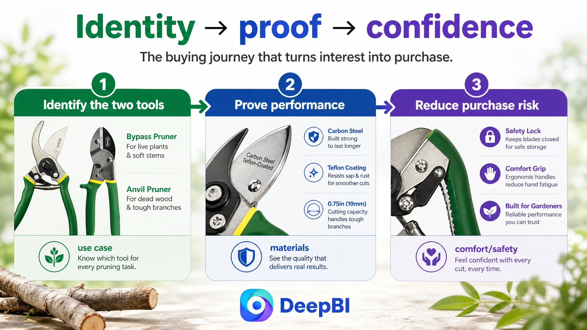
The Recommended Page Architecture Followed the Buying Journey
The proposed A+ and detail-page structure was designed as a sequence rather than a collection of disconnected modules.
Establish the two-tool value immediately
Introduce both eight-inch pruners and state their distinct roles:
- Anvil for dead wood and tougher branches
- Bypass for live growth and soft stems
This makes the two-piece set understandable before the shopper reaches the more technical details.
Prove material and maintenance value
Use close-ups to confirm:
- Carbon steel blades
- Sharpness and strength
- Teflon coating
- Resistance to sap buildup and rust
- Easier cleaning and smoother cuts
The purpose is to replace vague quality language with visible and specific evidence.
Address comfort and fatigue
Show the comfort-grip handles and explain the anti-slip and shock-absorbing properties. This connects the design to long gardening sessions instead of leaving comfort as an implied visual benefit.
Demonstrate safe storage
Show the easy-locking mechanism clearly, including how the blades remain closed when not in use. The safety feature should function as risk reduction, not merely as an additional specification.
Resolve tool-selection uncertainty
Use a direct comparison between bypass and anvil pruners. This is one of the highest-value content modules because it answers the central question created by the two-piece format: which tool should be used for which job?
Make the scenarios specific
Use gardening scenes that match the product’s intended applications, such as rose bushes, live stems, dry branches, and dead wood. A scene should confirm a use case, not simply make the page look more active.
Close with a rational value proposition
Bring together carbon steel, Teflon coating, clean cuts, durability, and two-tool versatility. The final message should reinforce why the set is useful rather than repeat the opening description.
The Title and Main Images Still Needed Refinement
Once the major trust gap was identified, the title and main-image work could be placed in the correct role.
The suggested title direction brought the most important search and buying terms closer to the beginning:
- Two-piece pruning shears set
- Bypass and anvil pruners
- Carbon steel blades
- Live plants and dry stems
- Comfort grip
- Yard use
It also removed repeated measurement wording and made the two-tool purpose clearer.
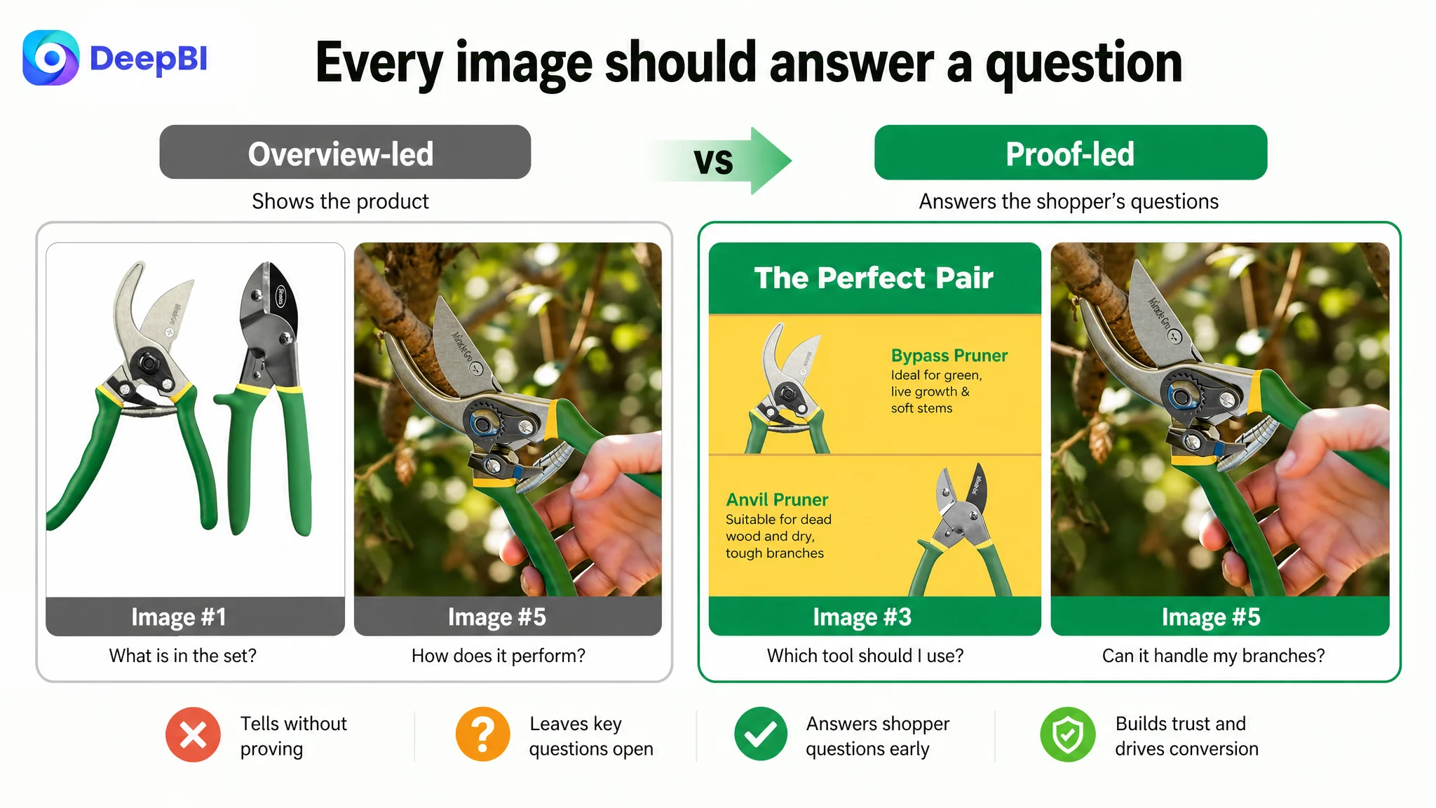
For the image sequence, the recommendations followed a similar logic:
- Use the first image to confirm the two-piece set and product identity.
- Move blade-material and coating proof earlier.
- Use structural close-ups to establish construction trust.
- Show measurable cutting capacity where the specification is verified.
- Demonstrate the locking mechanism rather than repeating a product overview.
- Use application imagery to distinguish the two tools in real gardening contexts.
The important change was not simply “more images.” It was assigning each image a distinct decision-making job.
What This Case Changes About Amazon Listing Optimization
This case does not include post-optimization CVR, ACOS, or organic-order data, so it would be inaccurate to claim a completed performance lift. The business value of the diagnosis lies in identifying the order of operations before further traffic or creative testing.
The target Listing had a manageable title gap and a relatively small main-image gap. Its most serious weakness was the absence of a structured trust-building experience on the Amazon product page, compounded by a weak review profile.
That led to several practical conclusions:
- A high-level Listing score can hide where the business risk is concentrated.
- A title that is slightly weaker than the benchmark may not be the primary conversion constraint.
- A product page with little visual content cannot rely on descriptive copy alone to build trust.
- Two complementary products need an explicit comparison, not just a bundle label.
- Performance claims are stronger when supported by verified measurements and close-up evidence.
- Review weakness increases the importance of clarity and proof elsewhere on the page.
- Amazon ads should not be asked to compensate for unresolved Listing ambiguity.
The customer’s optimization question therefore changed from:
How can this pruning shears Listing look more competitive?
to:
What evidence does an Amazon shopper need before trusting this two-tool set for a specific pruning task?
That is the more useful question because it connects title, main image, bullets, A+ content, reviews, organic traffic, and paid traffic to one commercial objective: making the product page capable of converting the attention it receives.
The Broader Lesson for Amazon Sellers
A Listing does not become stronger because every module contains more words or more images. It becomes stronger when every module advances the buying decision.
For this gardening tools seller, the most important work was not to add another generic scene or intensify a broad claim about sharpness. It was to make the product’s logic visible:
- Two tools serve two different pruning needs.
- Carbon steel supports strength and precision.
- Teflon coating supports smoother maintenance.
- Ergonomic handles address fatigue.
- The locking mechanism reduces storage risk.
- Verified cutting capacity gives performance claims a measurable foundation.
- A structured A+ page turns separate features into a coherent reason to buy.
The page did not need more decoration. It needed a clearer chain of proof.
That is the central judgment DeepBI brought to the case: diagnose the conversion bottleneck before expanding the optimization surface. When the largest gap sits in product-page trust and decision logic, the next best move is not to keep adjusting traffic first. It is to make the Amazon Listing more capable of converting both paid and organic shoppers.