

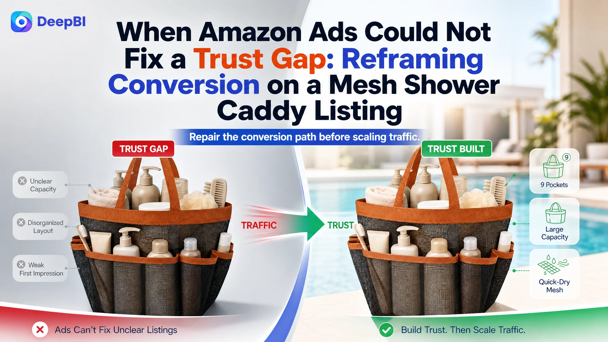
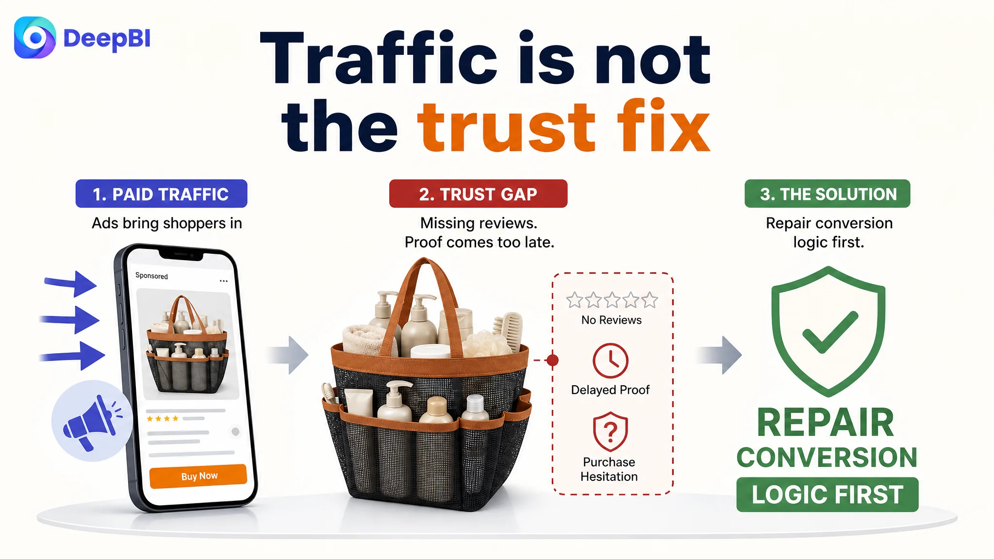
This case involved an Amazon US seller whose mesh shower caddy Listing was competing for traffic but lacked enough proof to turn product interest into purchase confidence. The initial direction focused on tightening the title, refining the images, and expanding use-case keywords such as gym, beach, travel, and camping.
That direction was not entirely wrong, but it missed the larger constraint. DeepBI found that the Listing was not simply losing because of copy or aesthetics. Its total score was 71/100 against 83/100 for a comparable high-performing Listing, with the largest gap concentrated in customer proof: the target Listing had no review data, while the comparison Listing showed a 4.7-star rating from 515 reviews.
The later optimization therefore focused on rebuilding the Amazon product page as a clearer trust path. The title had to communicate capacity and use cases more naturally, the image sequence had to prove organization and durability earlier, and the A+ content had to connect dorm, gym, pool, beach, and travel scenarios with concrete product evidence. The lesson for other Amazon sellers is straightforward: before pushing more paid traffic, determine whether the Listing can give that traffic enough reasons to believe and buy.
The Listing Had Content Strengths, but the Business Outcome Was Still Exposed
At first glance, the page did not look like a weak Listing in every dimension.
The five bullet points were actually stronger than those of the comparable Listing, scoring 8/10 versus 6/10. Their structure began with customer friction rather than a plain specification list:
- Less searching and more convenience
- A balance between capacity and portability
- A structure designed to stay upright
- Quick-draining, breathable mesh
- Use across dorms, gyms, pools, beaches, and travel
The A+ content also had a coherent narrative. It moved from emotional relevance to problem solving, then to functional explanation and multi-scenario usage. Modules such as the pocket map, upright-versus-collapsed comparison, and “One Bag Every Routine” concept gave the page more structure than a basic product showcase.
That made the diagnosis less obvious.
The Listing was not simply missing information. It was missing enough early, credible proof to make the information commercially effective.
A product page can contain the right claims and still fail to create enough confidence at the moment of purchase.
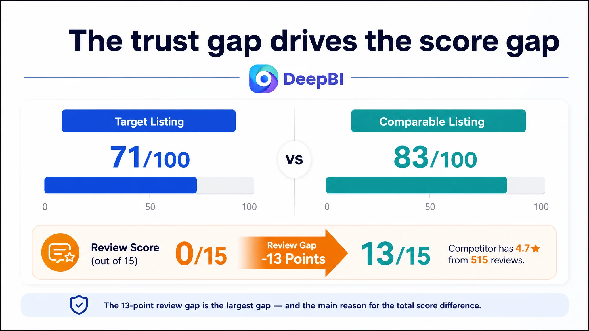
The score comparison made this distinction visible:
- Title: Target Listing: 15/20, Comparable Listing: 18/20, Gap: -3
- Main image: Target Listing: 25/30, Comparable Listing: 26/30, Gap: -1
- Bullet points: Target Listing: 8/10, Comparable Listing: 6/10, Gap: +2
- A+ content: Target Listing: 23/25, Comparable Listing: 20/25, Gap: +3
- Reviews: Target Listing: 0/15, Comparable Listing: 13/15, Gap: -13
- Total: Target Listing: 71/100, Comparable Listing: 83/100, Gap: -12
The most important conclusion was not that every section needed to be rewritten. It was that the page’s strongest content was not compensating for its weakest trust signal.
The Initial Diagnosis Stayed Too Close to Incremental Optimization
The first optimization direction centered on visible Listing elements: improve the title, strengthen the main image, refine the bullet points, and broaden the usage scenarios.
Those actions were reasonable. The proposed title, for example, improved the relationship between product type, capacity, audience, and use case:
Mesh Shower Caddy Portable for College Dorm Room Essentials for Girls, 9-Pocket Quick-Draining Shower Basket, Large Capacity Toiletry Tote Bag for Women, Gym, Travel, Beach & Camping Essentials
This version made several useful changes:
- It retained the core search term, “Mesh Shower Caddy.”
- It made “9-Pocket” and “Quick-Draining” easier to read together.
- It brought “Large Capacity” and “Toiletry Tote Bag” into the title.
- It expanded the audience from girls to women.
- It added camping as a relevant use scenario.
- It separated the dorm, gym, travel, beach, and camping contexts more clearly.
The problem was not that this work had no value. The problem was that it could be mistaken for the complete solution.
If the team treated the issue as a keyword or creative problem alone, it could keep adjusting ad-facing assets while leaving the deeper conversion constraint untouched. Better wording might improve relevance. A more attractive image might improve attention. But neither would fully solve the absence of social proof or the delayed presentation of durability evidence.
This is where the original diagnosis had to be reframed.
The page did not primarily lack more claims. It lacked a sufficiently ordered chain of proof.
The Biggest Gap Was Not the Bullet Points
The comparison showed an important reversal.
The target Listing’s bullet points were, in several respects, more persuasive than the comparison Listing’s. They used a problem-to-solution structure instead of presenting only material and capacity claims.
For example, the target copy connected a familiar problem—having a shower bag tip over—with a functional outcome: the caddy stays upright. It also used scenes such as dorms, gyms, pools, and beaches to help shoppers imagine the product beyond a single bathroom setting.
That meant replacing the entire bullet-point strategy with a specification-heavy approach would have been counterproductive.
The better move was to preserve the customer-centered logic while adding the proof that shoppers needed to believe it.
The title needed cleaner commercial logic
The original title included the right general product category and several useful features, but its structure was less fluent. “For girls” was followed directly by “Large 9-Pocket,” while the comparison Listing placed “Large-Capacity Shower Basket” in a more prominent position and added “Camping Essentials.”
The revision therefore focused on ordering, not keyword accumulation:
1. Product category
2. Core capacity and drainage benefit
3. Primary audience and dorm use
4. Supporting occasions
5. Search-relevant product form
The goal was to make the title easier to scan while ensuring the shopper understood both what the product is and where it fits into daily routines.
The bullets needed stronger proof, not a different personality
The proposed bullet revisions added details such as:
- One center compartment and eight side pockets
- Full-size toiletries, towels, or a hair dryer
- Reinforced handles
- Breathable mesh and faster drainage
- Rinse or machine-wash maintenance
- Foldable use for dorms, gyms, beaches, camping, and RV travel
These additions made the existing emotional structure more credible. “Less searching” became more persuasive when the page showed how nine pockets organize actual items. “Stays upright” became more credible when connected to a structured base and specific locations such as dorm counters, locker room benches, and poolside surfaces.
The logic was not to make the copy louder. It was to make each promise easier to verify.
The Main Image Was a Decision Problem, Not Just a Design Problem
The main-image score was 25/30, only one point below the comparison Listing. That gap did not justify treating the images as a complete failure.
However, the image sequence was not doing enough at the right moment.
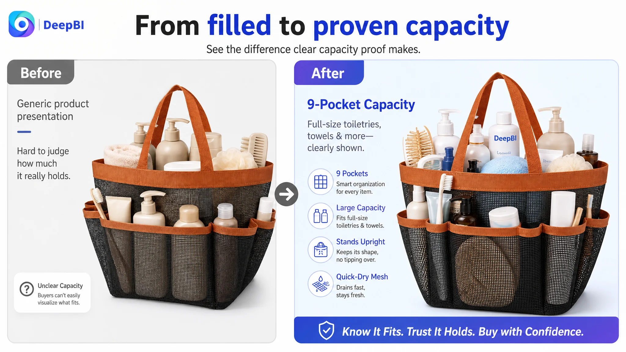
The first image showed the product with generic toiletry items, but it did not quantify the capacity or immediately answer whether the caddy could hold a complete routine. A more useful visual proof would show full-size bottles together with a folded towel or hair dryer, supported by a clear “9 Pockets” or “Large 9-Pocket Capacity” message where permitted.
The issue was not merely whether the image looked attractive. It was whether the shopper could resolve two questions quickly:
- What exactly is this product?
- Is it large enough for what I need?
The scenario image needed to appear earlier
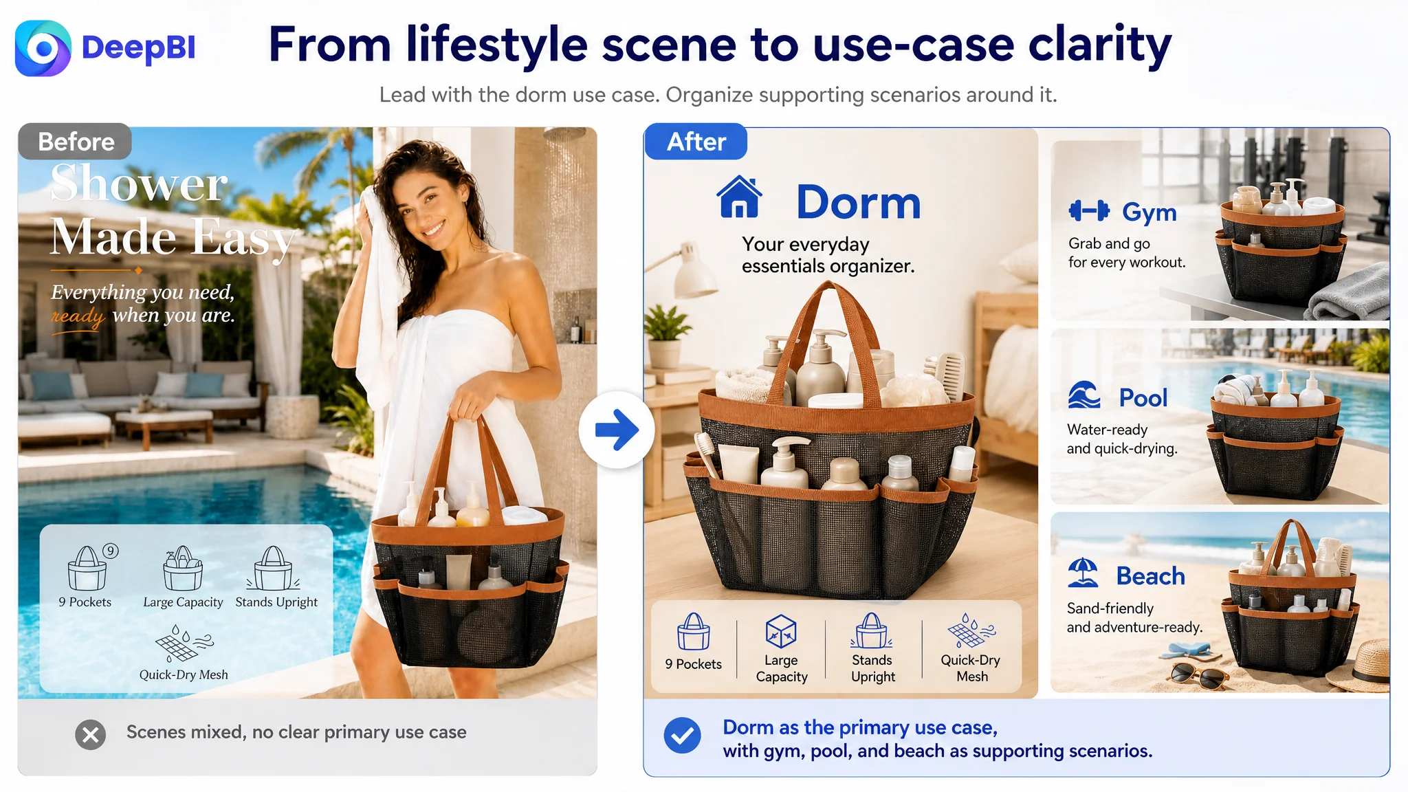
The multi-use collage originally appeared later in the image sequence. Moving it forward created a stronger path from recognition to relevance.
The dorm use case was especially important because it was a primary search and purchase context. Gym, pool, beach, travel, and camping could then extend the product’s value instead of competing for attention at the same level.
A clearer message such as “One Bag. Every Routine” could connect these occasions, provided the visuals showed real and consistent usage rather than a loose collection of lifestyle scenes.
Durability proof needed to arrive before the final decision
The quality-detail image was positioned too late. That delayed answers to common purchase concerns:
- Will the handles hold a heavy load?
- Will the stitching withstand repeated use?
- Will the mesh dry quickly?
- Will the bag remain fresh rather than trap moisture?
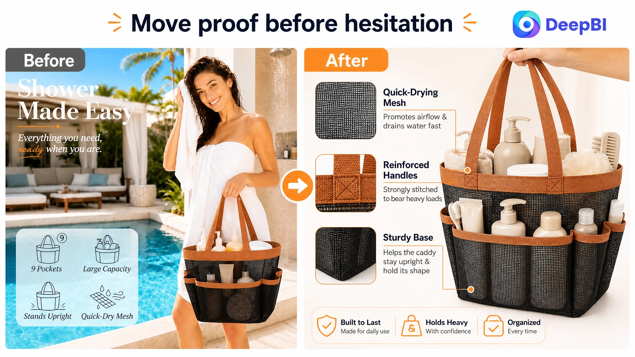
Moving reinforced-handle details, sturdy stitching, and breathable mesh earlier in the sequence would allow the page to reduce risk before the shopper reached the final buying decision.
The recommendation was deliberately evidence-based. It did not assume a thicker Oxford base or another material property that the product could not verify. Where the physical structure was not confirmed, the safer direction was to emphasize exact dimensions, visible construction, and supported benefits rather than add a stronger-sounding claim.
On Amazon, a stronger claim is not a stronger Listing if the image cannot prove it.
The A+ Page Was Stronger Than the Score Alone Suggested
The A+ content scored 23/25, three points above the comparable Listing. This was another reason not to follow a simple “copy everything the competitor does” strategy.
The target A+ page already had several strengths:
- A clear emotional entry point around clutter and searching
- A visual pocket map
- A comparison showing the product staying upright
- A quick-draining mesh explanation
- Consistent lifestyle scenes across pool, beach, gym, and dorm settings
- A cleaner presentation that avoided low-signal testimonial-style graphics
The issue was sequencing and proof density.
The page opened with brand storytelling and organization, while the comparison Listing led more directly with beach and outdoor use. For a product whose value extends beyond the shower, the first A+ module should confirm the strongest scenarios quickly: dorm, gym, pool, beach, travel, and camping.
Quality proof had to follow capacity proof
After showing what the caddy could hold, the page needed to answer whether it could withstand everyday use.
The recommended order was:
1. Confirm the main usage scenarios.
2. Show how water and sand are managed in those environments.
3. Map the pockets and capacity.
4. Prove structure, handles, stitching, and mesh construction.
5. Quantify dimensions and clarify what fits.
6. Reinforce quick drainage and cleanliness.
7. Close with the full routine across dorm, gym, pool, beach, and travel.
This was a decision path, not a collection of modules.
The shopper first needs to recognize the product’s relevance. Then they need to understand its organization. Then they need to trust its construction. Finally, they need confirmation that the same product works across the situations promised by the Listing.
The full-mesh construction could become a differentiated argument
The comparison Listing emphasized a reinforced base. The target Listing could not simply copy that positioning without verified evidence.
Instead, the full mesh construction could be framed around a different benefit: faster drainage, airflow, less trapped moisture, and easier cleaning across the entire bag. That would give the product its own reason to be considered rather than making it look like a weaker version of the competitor.
The distinction mattered:
- A material claim describes what the product is made of.
- A conversion claim explains why that construction matters in a dorm, pool, beach, or gym routine.
DeepBI’s diagnosis focused on making that second connection visible.
Why Reviews Changed the Priority Order
The review dimension created the clearest business risk.
The target Listing had:
- No rating data
- No customer reviews on the first page
- No social proof from prior buyers
The comparable Listing showed:
- 4.7 stars
- 515 total reviews
- 45 reviews visible on the first page
- Additional image and video review support
This was a 13-point gap out of a possible 15 in the scoring model.
Reviews could not be manufactured through title editing or image generation. But their absence changed how every other page element had to work. Without customer proof, the Listing needed especially clear product evidence: actual capacity, visible construction, realistic scenarios, exact dimensions, and a coherent explanation of why the bag would remain useful after repeated exposure to water and daily carrying.
This is also why increasing Amazon ad traffic first would have carried risk. Paid traffic can bring more shoppers to the product page, but it cannot independently supply the trust that the page lacks.
Advertising can amplify a strong conversion path, but it can also amplify the weakness of an unproven Listing.
The right decision was therefore not to stop advertising permanently. It was to avoid treating advertising as the first or only lever while the page’s trust structure remained incomplete.
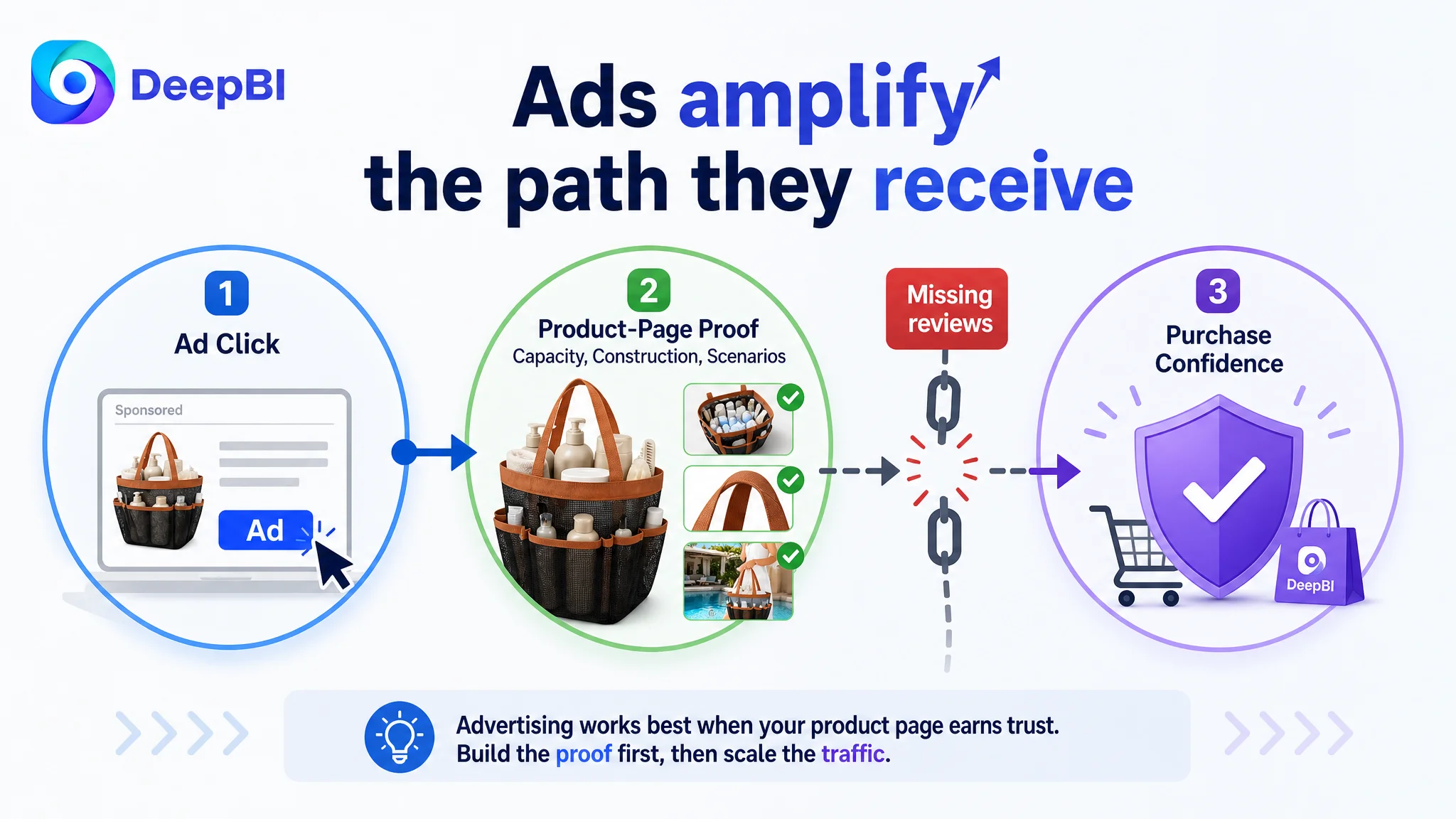
DeepBI’s Judgment: Repair the Page’s Conversion Capacity Before Scaling Traffic
The case did not call for a broad redesign of every component. It called for a prioritized repair.
DeepBI’s comparison logic identified three different types of gap:
Gaps that were worth preserving
The target Listing already had a stronger emotional and problem-solution approach in its bullet points. Its A+ page also had a more coherent product-centered narrative than the comparison Listing.
These elements should not be discarded simply because the total score was lower.
Gaps that needed earlier visibility
The page had useful durability and scenario content, but some of it appeared too late. Moving those signals earlier could reduce uncertainty during the middle of the buying journey.
The main image sequence and A+ order therefore required restructuring.
Gaps that could not be solved through content alone
The review deficit was a structural trust limitation. The page needed to compensate with stronger visual and functional proof while the Listing built its own customer evidence over time.
That distinction determined the decision order:
1. Clarify the title and search-facing promise.
2. Improve the main image sequence around capacity, scenarios, and risk reduction.
3. Reorder A+ content so use cases and quality proof appear at the right decision points.
4. Preserve the stronger pain-point and lifestyle language in the bullets.
5. Avoid unsupported material, size, or durability claims.
6. Only then judge whether additional paid traffic is being converted efficiently.
This is a more disciplined path than repeatedly adjusting bids, keywords, or creative variants without first checking the page’s ability to convert.
The Optimization Was Designed to Make Traffic More Useful
The proposed changes were not presented as guaranteed performance results. The case material does not include post-optimization CTR, CVR, ACOS, TACOS, keyword-rank, or organic-order data.
What can be stated clearly is the intended operating change.
The Listing was being moved from:
- Generic product presentation toward quantified capacity proof
- Late durability explanation toward earlier risk reduction
- Broad scenario listing toward a more deliberate use-case sequence
- Feature claims toward visible benefit validation
- A page with no review support toward a page that used stronger product evidence to reduce uncertainty
- Traffic acquisition as the first response toward page readiness as the first judgment
If the page’s conversion capacity improved, Amazon ad traffic would have a more useful destination. Paid clicks could be evaluated against a clearer product promise, stronger visual proof, and a more complete decision path.
The commercial objective was not to claim that better images alone would solve the review gap. It was to prevent the store from spending more to send shoppers into a page that had not yet earned enough confidence.
What Amazon Sellers Can Take From This Case
This mesh shower caddy Listing illustrates a common Amazon diagnosis error: assuming the lowest-performing business outcome must come from the most visible content problem.
The target page did have a title gap and image-sequencing issues. But its bullets and A+ structure were not uniformly weak. The largest competitive disadvantage was the combination of missing social proof and delayed functional evidence.
Several practical judgments follow.
A lower total score does not mean every section should be replaced
The bullet points scored better than the comparison Listing. A useful diagnosis should protect what already works while repairing the constraint that limits the whole page.
Reviews change the burden placed on images and A+
When customer proof is absent, the product page must work harder to show capacity, construction, use context, and maintenance benefits. Visual clarity becomes part of the trust system.
Amazon ads cannot compensate for a weak conversion path
More impressions and clicks do not automatically create more orders. If the page cannot answer “Will it fit my routine?” and “Can I trust it to hold up?”, advertising may only expose the gap at greater cost.
Image order matters as much as image quality
A durability close-up at the end of the gallery may be technically strong but commercially late. The right proof must appear when the shopper is most likely to hesitate.
Competitor analysis should reveal logic, not encourage imitation
The comparison Listing’s strength was not simply that it used different words or more lifestyle scenes. Its structure made capacity, durability, and use scenarios easier to verify. The target Listing needed to learn from that logic while preserving its own stronger customer-centered positioning.
The Real Change in Understanding
The most important change was not a new title or a new image set.
It was a change in the question the team asked.
The initial question was close to:
How can this Amazon Listing attract more attention and compete more effectively?
The more useful question became:
Once Amazon traffic reaches the product page, what evidence is still missing before a shopper feels ready to buy?
That question led to a different priority order. Title relevance still mattered. Main-image appeal still mattered. Bullet-point clarity still mattered. But those elements had to work together with capacity proof, durability evidence, scenario relevance, and the reality of having no customer reviews.
The source material does not provide final post-optimization performance data, so no numerical improvement should be claimed. The documented outcome is a more defensible operating direction: repair the Listing’s trust and conversion logic first, then use Amazon ads to test and scale a page that is better prepared to receive traffic.
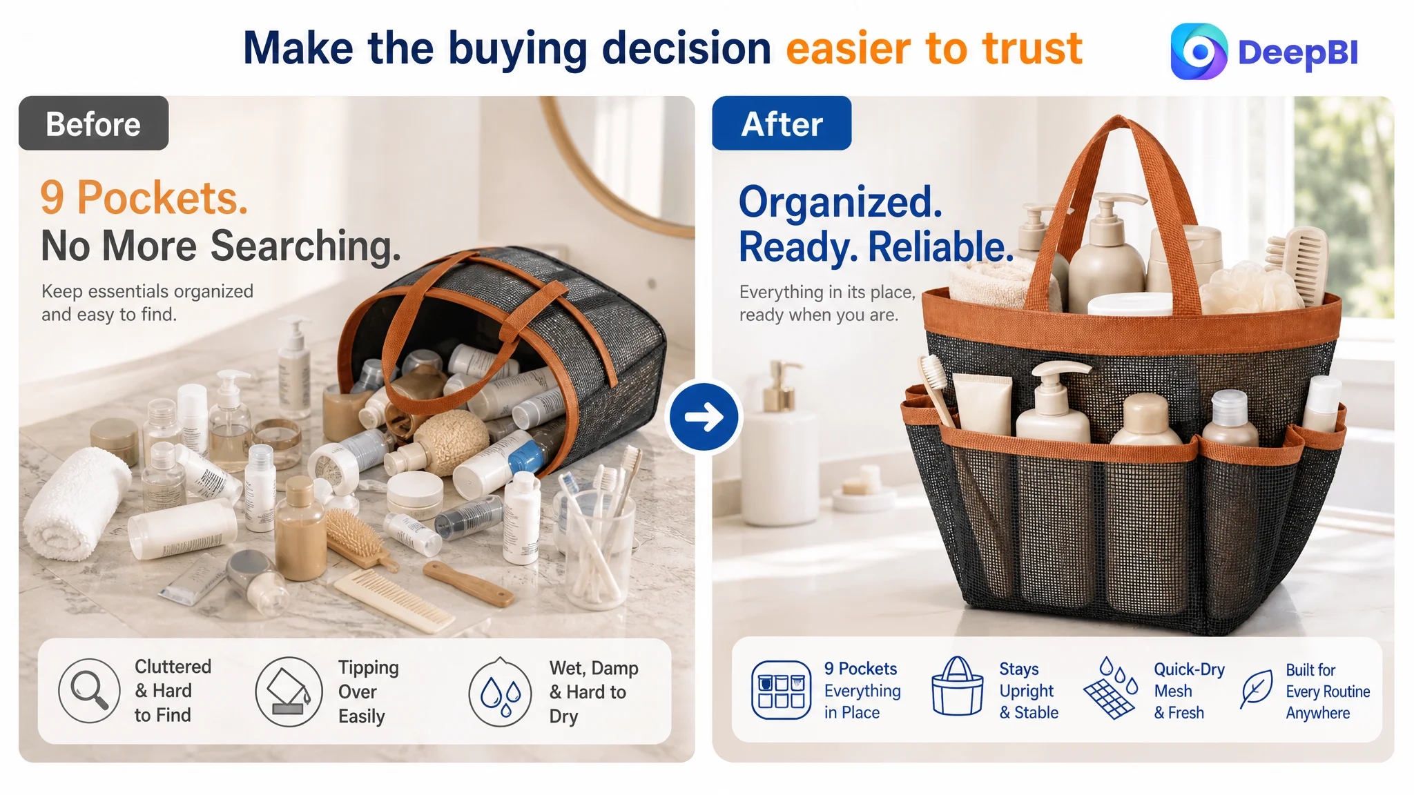
The goal was not to make the product page look more complete. It was to make the buying decision easier to trust.