

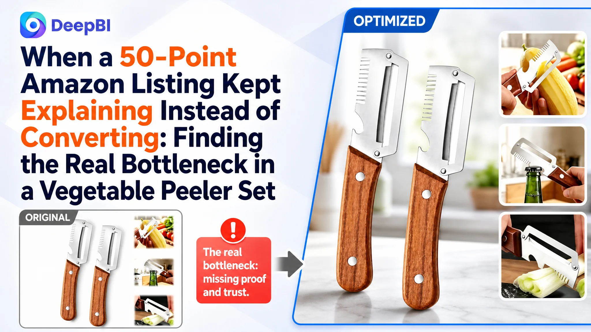
This case involved an Amazon US seller whose multifunctional vegetable peeler Listing scored 50 out of 100, while a comparable high-performing Listing reached 78. At first glance, the gap seemed spread across the title, images, bullet points, and reviews. But the largest weakness was not a keyword detail or a single creative asset. It was the product page's inability to build a complete buying argument.
The customer had been presenting more functions, repeating bottle-opening demonstrations, and using text to explain what the tool could do. That approach treated the problem as an information shortage. DeepBI's comparison showed something more important: the Amazon product page already had claims, but lacked proof, sequencing, and trust. The most serious gap was the A+ content, which scored 2 out of 25 against the comparable Listing's 24.
The later optimization therefore focused on restoring the Listing's sales logic: confirm exactly what comes in the two-piece set, establish strong peeling performance on difficult produce, prove the material and grip quality, demonstrate secondary functions in realistic settings, and clarify the product's right-handed design. For other Amazon sellers, the lesson is direct: before sending more paid traffic to a page, determine whether the page gives shoppers a clear reason to click, believe, and buy.
The Seller Saw a Product with Many Functions. Shoppers Saw an Unclear Decision
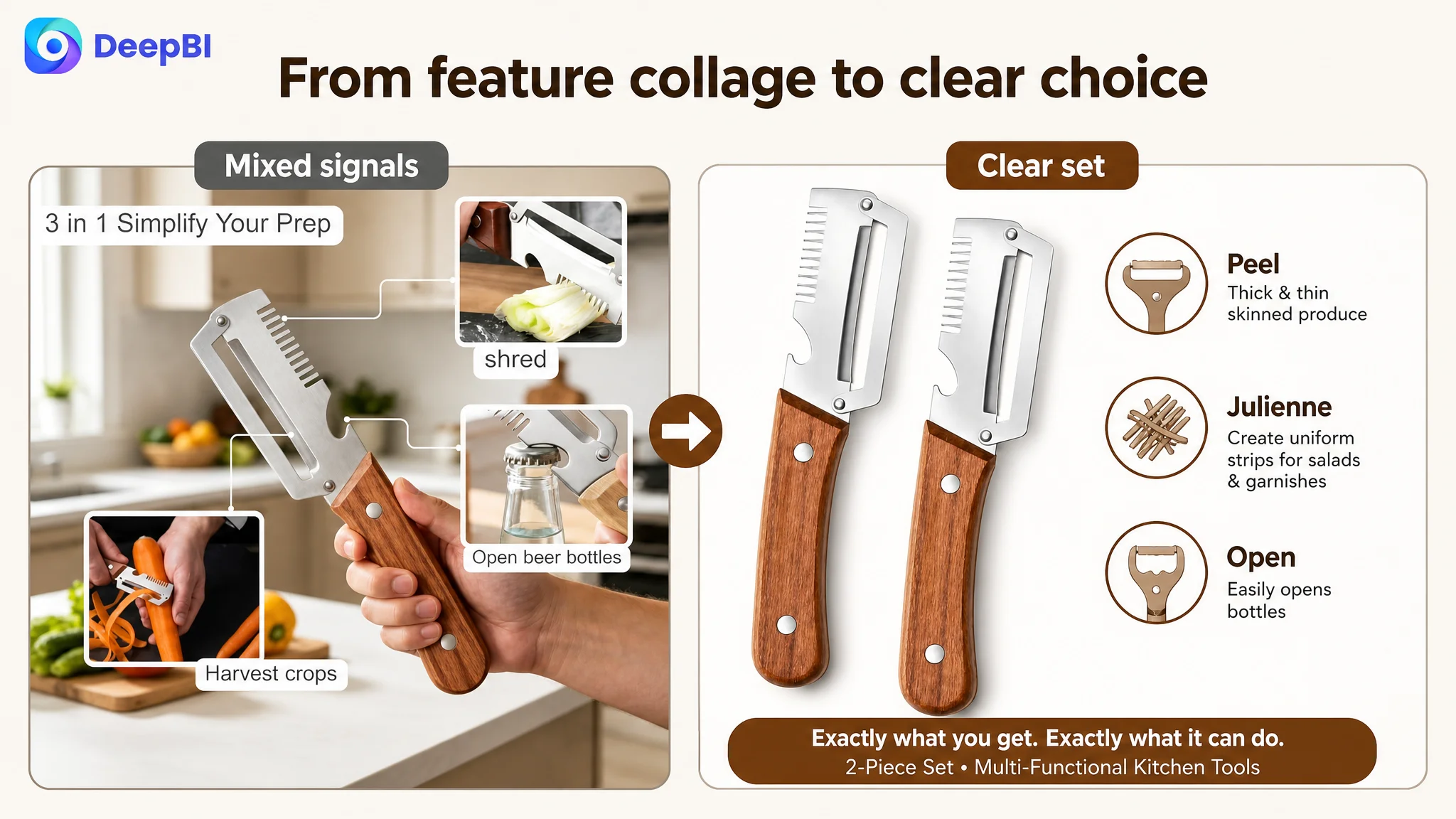
The product was positioned as a 3-in-1 kitchen tool combining peeling, a serrated slicing or julienne function, and a bottle opener. It also featured wooden handles and stainless steel blades, and was sold as a two-piece set.
On paper, this created several selling points:
- A multifunctional kitchen tool
- A two-piece configuration
- Stainless steel blades
- Wooden handles
- A bottle opener
- Use across fruits and vegetables
- Portability for gatherings, camping, or travel
The problem was not a lack of features. The problem was that these features were not arranged according to how an Amazon shopper makes a decision.
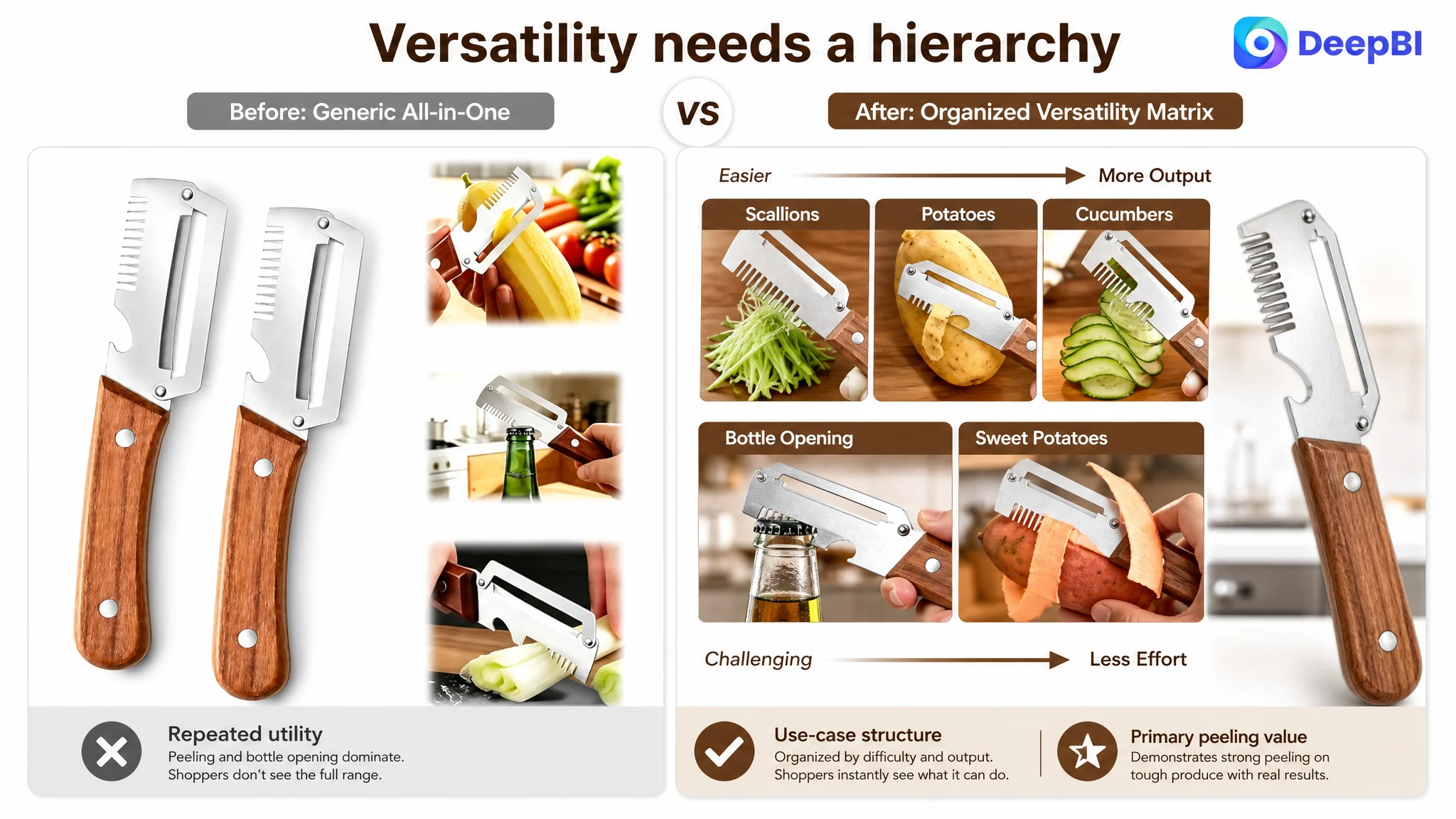
The Listing attempted to explain multiple functions at once. Some images repeated the same bottle-opening message. Other visuals showed peeler styles that were not actually included in the two-piece set. The result was a basic but damaging question at the very beginning of the shopping journey:
What exactly am I buying, and what can this specific tool reliably do?
That uncertainty matters on Amazon. A shopper may understand a product's individual claims and still fail to form enough confidence to purchase. When the page leaves the buyer to connect the claims alone, paid traffic becomes less useful, not more.
"The Listing did not lack information. It lacked a persuasive order for that information."
The Original Optimization Direction Stayed Too Close to Feature Explanation
The existing Listing tried to make the product attractive by emphasizing its multifunctionality. The title used broad language such as “MultiFunctional,” while the image sequence repeatedly demonstrated peeling, grating, and opening bottles.
The bullet points also leaned toward functional descriptions and material specifications. They explained the blade, handle, cleaning, storage, and handedness in a relatively orderly way. But much of the copy remained at the level of what the product was, rather than why a shopper's specific kitchen problem would be easier to solve with it.
This created an incomplete optimization loop:
1. Add or repeat a function.
2. Explain the function with text.
3. Show another usage action.
4. Assume that more information will resolve hesitation.
That direction was understandable. A multifunctional product appears to need more explanation. But in this case, the page was not being held back by a lack of possible uses. It was being held back by weak proof of the uses that mattered most.
The product's strongest commercial opportunity was not necessarily to present every function equally. It was to establish one dominant reason to choose the product, then use the remaining functions to support the purchase.
For this Listing, that primary reason was strong, efficient peeling, especially for thick-skinned produce. The julienne function and bottle opener could then reinforce versatility instead of competing for attention.
The Score Gap Located the Real Constraint
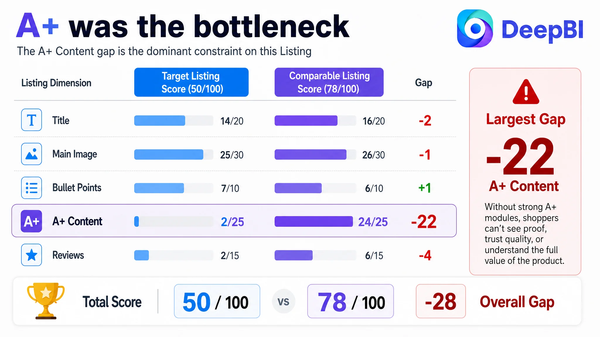
DeepBI's Listing comparison produced a total score of 50 versus 78 for the comparable Listing. The individual scores made the business priority much clearer:
- Title: Target Listing: 14/20, Comparable Listing: 16/20, Gap: -2
- Main image: Target Listing: 25/30, Comparable Listing: 26/30, Gap: -1
- Bullet points: Target Listing: 7/10, Comparable Listing: 6/10, Gap: +1
- A+ content: Target Listing: 2/25, Comparable Listing: 24/25, Gap: -22
- Reviews: Target Listing: 2/15, Comparable Listing: 6/15, Gap: -4
- Total: Target Listing: 50/100, Comparable Listing: 78/100, Gap: -28
The most important judgment was not that every dimension needed improvement. It was that the A+ gap was disproportionately large.
The title was behind, but only by two points. The main image was behind by one. The bullet points were already slightly ahead in the comparison. Reviews were weaker, but review volume and rating cannot be repaired through page copy alone.
The A+ content, however, represented a structural absence. The target Listing had no meaningful visual A+ modules. Its content largely repeated title-style text. The comparable Listing used a sequence of visual modules covering:
- The product's main value
- Kitchen usage
- Broader use cases
- Material details
- Functional integration
- Craftsmanship and product close-ups
This was not a small creative difference. It was the difference between a product page that stated claims and one that helped shoppers verify them.
The page had no visual trust layer
A shopper could not easily judge:
- The actual contents of the two-piece set
- How the blade handled difficult produce
- Whether the wooden handle looked sturdy and secure
- Whether the stainless steel head appeared durable
- How the bottle opener worked in a real setting
- Why two identical tools were useful
- What limitations applied to left-handed users
Without that layer, the product was more likely to be perceived as a low-priced, interchangeable kitchen gadget, even though the product had material and functional details that could support a stronger position.
The Main Image Was Not Only a Visual Issue
The main image comparison showed only a small numerical gap, but the qualitative diagnosis revealed a more serious risk: product clarity.
The current visual sequence used multiple peeler forms and lifestyle compositions that could make shoppers think the set contained different tools. The actual two-piece configuration consisted of two identical multifunctional peelers. That distinction needed to be clear immediately.
A main image should not make the buyer reconstruct the inventory from a collage. It should establish the purchase expectation in the first moment:
Two actual wooden-handle multifunctional peelers, shown clearly and consistently.
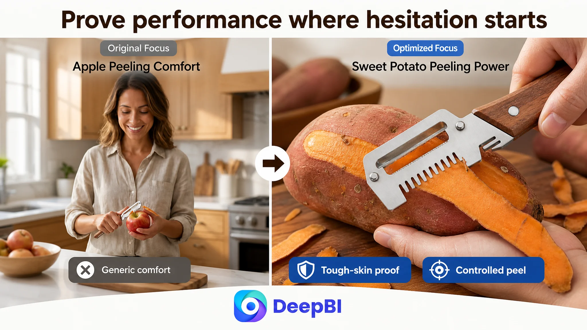
The image direction also placed too much emphasis on general comfort and repeated actions. That missed the more important performance concern. A shopper buying a vegetable peeler is likely to wonder whether it can handle firm or thick-skinned produce without slipping, struggling, or removing unnecessarily thick layers.
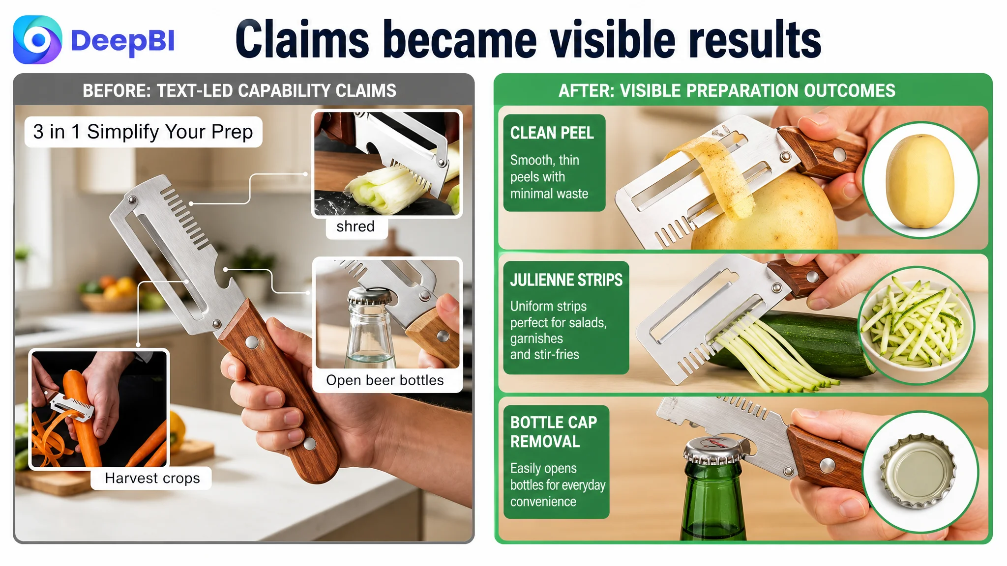
The visual story therefore needed to move from abstract capability to visible outcome:
- Show the two actual tools in the set.
- Demonstrate clean peeling on potatoes, sweet potatoes, or pumpkin.
- Show the resulting strips or peeled surface.
- Use close-ups to make the stainless steel blade and solid wood handle credible.
- Use scallions or similar produce to demonstrate the serrated slicing function.
- Show the bottle opener once in a realistic gathering or outdoor setting, rather than repeating it across several image positions.
This is a change in decision logic, not merely a change in styling.
"A product image should answer the buyer's largest unresolved question, not repeat the easiest function to photograph."
The Title Needed Better Search and Decision Structure
The title was not the central failure, but it was losing opportunities at the search and click stages.
The core keyword “Vegetable Peeler” appeared too late. The title also omitted the valuable “Julienne Peeler” phrase and relied on broad wording such as “MultiFunctional.” By contrast, the comparable Listing placed the core product term earlier and combined it with more concrete descriptors, including the set format, stainless steel material, wooden handles, and julienne function.
The proposed direction reorganized the title around the actual buying vocabulary:
2-Pack Wooden Handle 3-in-1 Vegetable Peeler with Bottle Opener, Stainless Steel Vegetable and Julienne Peeler Set for Kitchen, Multi-Functional Fruit Potato Carrot Peeling Tools
The purpose was not to add every possible keyword. It was to improve the order and clarity of the existing value proposition:
- Lead with the two-pack configuration.
- Put the core product type near the front.
- Use specific function language instead of repeating broad terms.
- Include “Julienne” to expand relevant search coverage.
- Connect material, handle, and use cases in a readable sequence.
On Amazon, title optimization is not separate from conversion. A title determines the shopper's initial expectation; the images and A+ content must then confirm that expectation. If those layers describe different products or emphasize different priorities, the Listing loses coherence.
The Bullet Points Had Structure, but Not Enough Buying Logic
The target Listing's bullet points scored slightly higher than the comparable Listing, which is an important nuance. The issue was not that the copy was poorly organized. Each point generally focused on one area: multifunctionality, blade material, handle design, cleaning, storage, or handedness.
The weakness was that the copy often presented capabilities as a list rather than forming a problem-and-solution path.
A stronger sequence would make each bullet do three things:
1. Name the relevant product advantage.
2. Connect it to a recognizable kitchen task.
3. Explain the practical result for the buyer.
For example, the blade point should not stop at “stainless steel” or “sharp.” It should connect the material and edge to peeling thick-skinned produce, reducing wasted food, and moving through meal preparation more efficiently.
The multifunctionality point should clarify the role of each function rather than treating “3-in-1” as a complete argument. The serrated blade should be associated with scallions, green onions, leeks, salads, soups, and garnishes. The bottle opener should be connected to gatherings, camping, or travel. The peeling function should remain the primary use case.
The handedness note also needed careful placement. It was commercially responsible to disclose that the ergonomic grip was optimized for right-handed use. But ending the Listing with a blunt caution could weaken purchase confidence. Pairing the note with easy cleaning, lightweight storage, and practical gifting would preserve honesty while keeping the final impression useful and positive.
Missing A+ Content Removed the Final Layer of Persuasion
The largest gap was the absence of a visual A+ story.
A+ content should not repeat the title and bullet points in larger text. Its role is to help shoppers answer questions that search-result content cannot fully resolve.
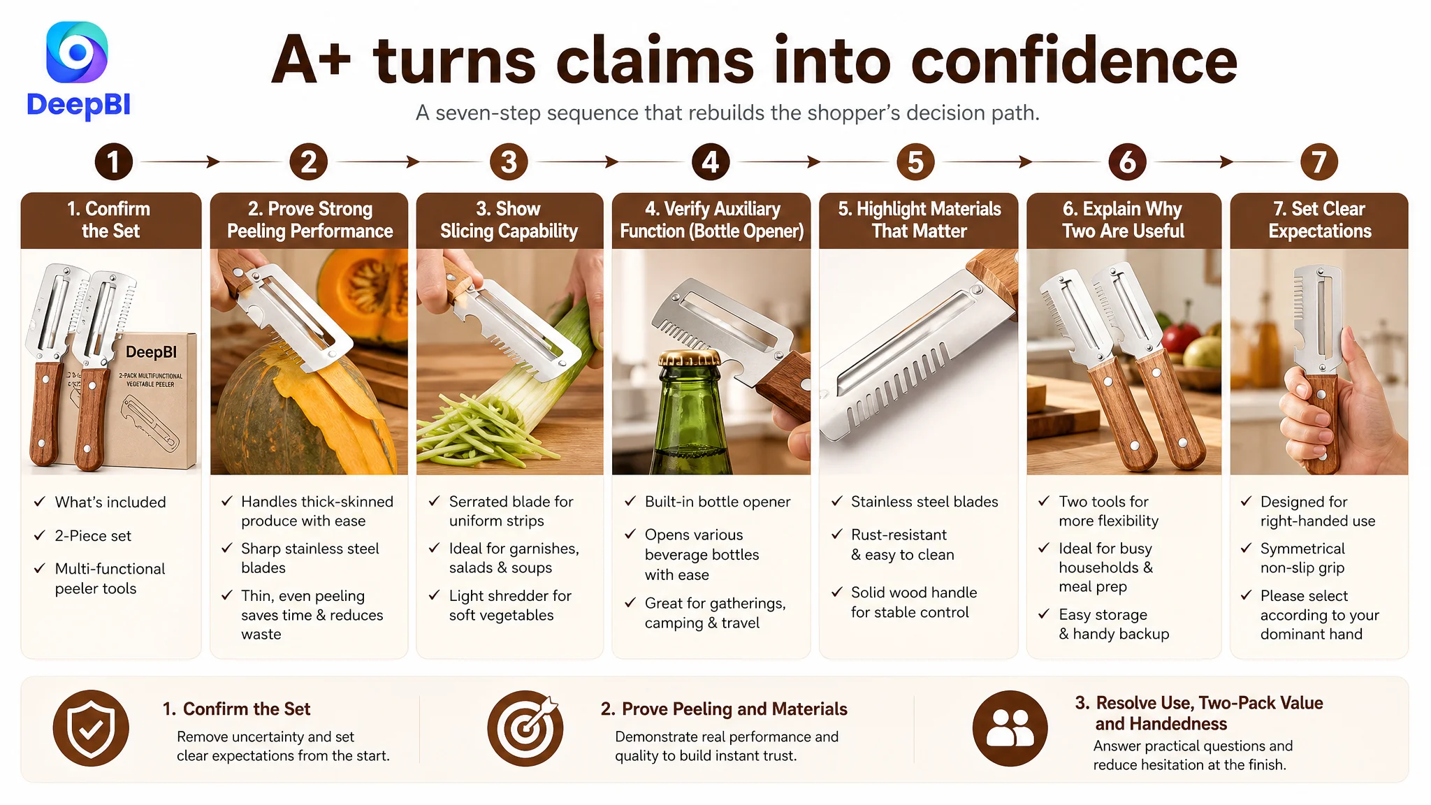
For this vegetable peeler Listing, the page needed a deliberate sequence.
First, confirm the two-piece set
The opening module should show two identical wooden-handle multifunctional peelers. This establishes the physical contents before discussing benefits.
It also addresses a potential source of disappointment: shoppers should not assume they are receiving several different peeler styles when the set contains two of the same product.
Then, prove the primary peeling function
The strongest visual evidence should focus on potatoes, sweet potatoes, pumpkin, or other difficult produce. The aim is to demonstrate controlled, efficient peeling rather than merely showing the tool touching an apple.
This helps resolve the underlying performance concern: whether the tool is sturdy enough for everyday and thick-skinned produce.
Use realistic settings for secondary functions
The bottle opener should be shown in a picnic, outdoor, or small gathering context. That makes the feature believable and gives the portability claim a practical role.
The serrated function should be demonstrated through finished results, such as uniform scallion strips for salads, soups, noodle bowls, or garnishes.
Build trust through material detail
Macro imagery of the precision-ground stainless steel blade and solid wood handle can make material claims more credible. The page should show the blade edge, wood grain, riveting, and grip in a way that supports “sturdy control,” not just a list of materials.
Resolve the two-pack objection
The page also needs to explain why a buyer might want two identical tools:
- Two people can prepare food at the same time.
- One tool can remain available while the other is being cleaned.
- A busy household can keep one in a second kitchen or storage area.
- The set can serve as a practical gift for home cooks.
This is a critical commercial question. Without an answer, “2-pack” can feel like redundancy rather than value.
State the handedness limitation clearly
The right-handed design note should appear after the product's primary benefits and proof points. It reduces regret and after-sales risk by setting an accurate expectation before purchase.
The result is a complete decision path:
What is included → what it does best → how it performs → why the materials matter → where secondary functions fit → why two are useful → who the design suits.
Why More Ad Tuning Would Not Be the First Move
The case did not provide post-optimization advertising results, so it would be misleading to claim that ACOS fell or CVR recovered. But the Listing diagnosis still establishes the correct order of operations.
If an Amazon seller sends more traffic to a page with unclear product contents, weak visual proof, and almost no A+ support, advertising may amplify the page's weaknesses. More impressions do not repair uncertainty. More clicks do not automatically create trust.
At this stage, the largest business risk was not simply inefficient traffic. It was paying to bring shoppers into a product page that was not prepared to convert them.
That is why DeepBI did not treat every weakness as equally urgent. The title and main image needed refinement, but the A+ gap was the more fundamental constraint. Reviews were also weaker, but there was no responsible way to use content optimization to manufacture review volume or change the existing rating.
The decision path was therefore:
1. Clarify the actual product and two-piece configuration.
2. Establish strong peeling as the primary value.
3. Replace repeated function claims with visible results.
4. Add the missing A+ trust and usage sequence.
5. Improve the title and bullet points so they support the same positioning.
6. Only then evaluate whether additional Amazon ad traffic can be converted more efficiently.
This is the difference between optimizing activity and repairing business capacity.
The Real Change Was a Recovered Sales Logic
The proposed optimization did not turn the vegetable peeler into a different product. It made the existing product easier to understand and more credible.
The revised Listing direction would give each element a defined role:
- Title: Capture relevant Amazon search intent and establish the two-pack, material, and core functions.
- Main image: Show the exact product configuration without misleading visual elements.
- Secondary images: Prove peeling performance, material quality, grip, julienne results, and versatility.
- Bullet points: Convert specifications into problem-solution explanations.
- A+ content: Build a complete visual narrative from product confirmation to trust and use cases.
- Reviews: Remain a separate credibility constraint that should be monitored honestly rather than obscured.
The operating state after optimization should be judged through later Amazon data: CTR, CVR, paid and organic order mix, ACOS, and the Listing's ability to convert traffic from different sources. Those results are not included in the case material, so no numerical outcome should be assigned here.
What can be concluded is the change in decision quality. The team moved away from asking, “How do we explain every feature more aggressively?” and toward asking, “What does the shopper need to see before this product feels like a reliable choice?”
"Before an Amazon Listing can benefit from more traffic, it has to prove that it deserves that traffic."
What Other Amazon Sellers Can Take From This Case
A low Listing score does not mean every module deserves the same amount of attention. The useful diagnosis is the one that identifies where the conversion path breaks.
For this Amazon vegetable peeler Listing, the answer was not primarily a missing keyword, an unattractive handle, or an insufficient number of functions. The decisive gap was the absence of a visual and persuasive layer that connected the product's claims to real buyer concerns.
The case points to several practical judgments:
- A product page can contain many features and still fail to communicate a clear reason to buy.
- A small main-image score gap can conceal a larger problem with product clarity and visual sequencing.
- Bullet points may be logically organized yet still lack a strong problem-solution structure.
- A+ content is not decoration; it is often where material quality, usage proof, and purchase reassurance are established.
- A two-pack requires an explanation of why two are useful.
- Honest limitations, such as right-handed optimization, can reduce risk when presented as part of a precise product expectation.
- Amazon ads cannot compensate for a page that does not convert the traffic it receives.
- Before scaling paid traffic, sellers should identify whether the product page can convert both paid and organic shoppers.
The most valuable outcome of this diagnosis was not a longer title or a more colorful image set. It was a clearer understanding of the constraint: the Amazon Listing needed to convert explanation into confidence before advertising could become more productive.