

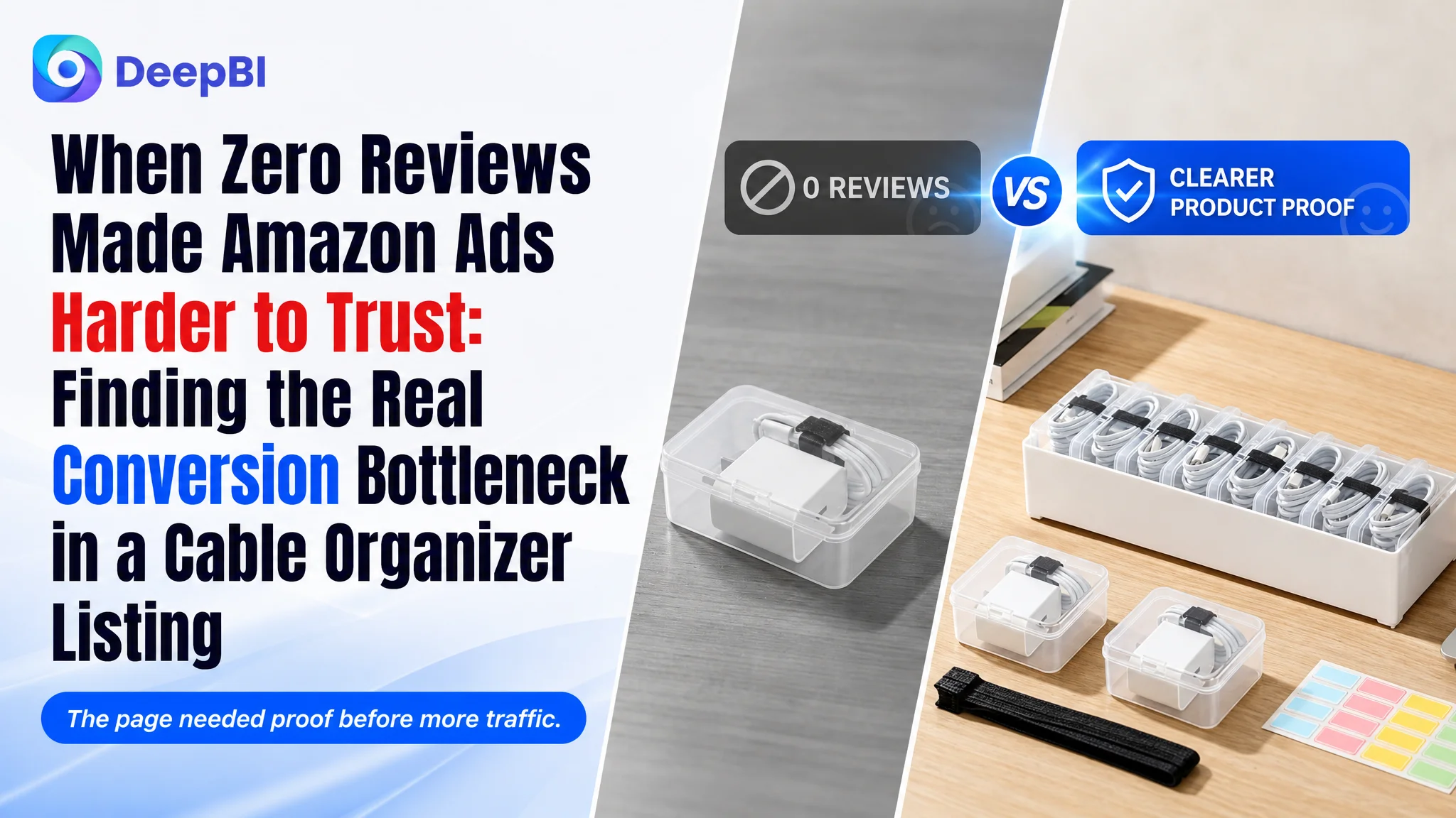
An Amazon seller in the US marketplace was working with a cable organizer Listing that appeared visually complete. It had lifestyle scenes, feature icons, product details, usage instructions, and accessory displays. Yet its competitive score was 68/100, ten points behind a comparable high-performing Listing, and the product page lacked the reviews that help shoppers feel safe buying from an unfamiliar offer.
The initial direction was easy to misread. The title needed keyword refinement, the main image could show more information, and the existing A+ content seemed to require only additional polishing. That made the problem look like a matter of better creatives or broader search coverage.
DeepBI found a more consequential issue: the Amazon product page was not consistently proving why this particular organizer was useful, flexible, and worth trusting. The largest gap was not a single keyword or isolated image. It was a missing chain of decision evidence, made more serious by zero review coverage.
The later optimization therefore focused on rebuilding the Listing's sales logic: clarify the package and dimensions, prove the eight-small-case structure, demonstrate removable storage and stacking, show compatibility with cables and adapters, and make the before-and-after payoff easier to understand. Other Amazon sellers can learn from the case that more traffic cannot compensate for a page that leaves key buying questions unanswered.
The Listing Looked Complete. The Conversion Logic Was Not.
The product was a clear cable organizer box designed for home offices, desks, drawers, and other everyday storage situations. Its structure was differentiated: one large outer box with eight smaller clear cases, plus cable ties and label stickers.
On paper, this gave the Amazon seller plenty to communicate.
The product page already included:
- A main product scene
- Feature icons
- Detail close-ups
- Multi-use scenarios
- A four-step usage guide
- Drawer, desk, and nightstand scenes
- Accessory displays
- A+ lifestyle content
This created an important diagnostic tension. The page did not suffer from a total lack of content. In several areas, it was more systematic and visually complete than the comparable Listing.
But completeness is not the same as persuasion.
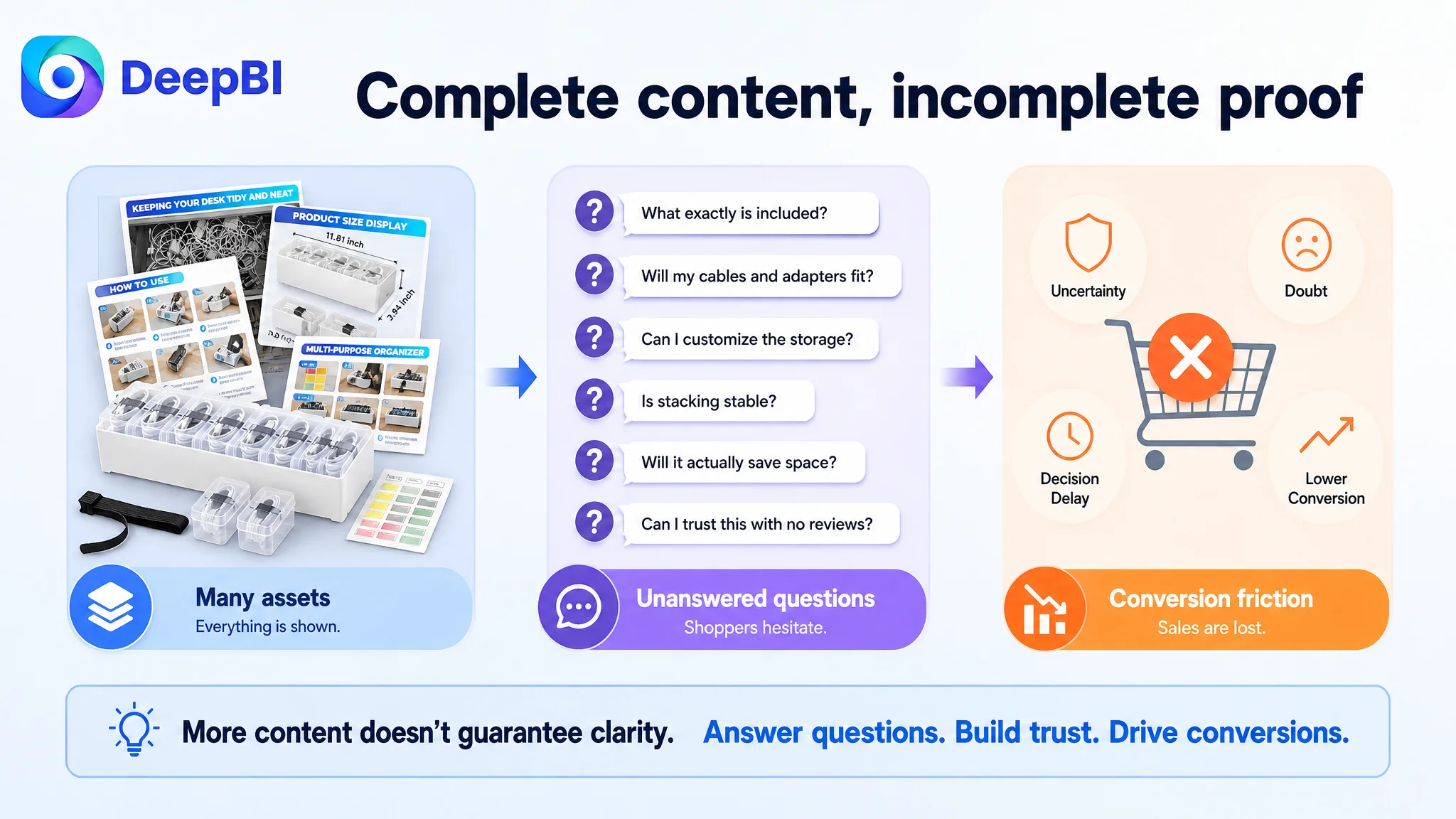
A shopper considering a cable organizer is usually trying to resolve a small set of practical uncertainties:
- What exactly is included?
- Will my cables and adapters fit?
- Can I see what is inside without opening the lid?
- Can the compartments be changed?
- Will the box save space or simply add another container?
- Is the product durable enough for drawers, desks, or travel?
- Can I trust this Listing when there are no reviews?
The existing content addressed many of these points somewhere on the page. The problem was that the evidence was not arranged in the order shoppers needed it.
A product page can contain every important fact and still fail to make the buying decision easy.
The Initial Diagnosis Focused on Refinement, Not Friction
The first apparent problems were relatively familiar Amazon Listing issues.
The title was somewhat crowded. It placed “Large Cable Organizer Box” early, but also included less focused wording such as “Stationery Supplies.” The competing title was shorter, more concentrated on cable and electronics organization, and clearer about included accessories.
The bullet points also contained useful information, but they leaned toward feature listing. They described organization, dimensions, transparency, and multiple uses without always connecting each feature to a concrete shopper outcome.
The main images were clean and product-focused. However, the first impression did not immediately show the product's most distinctive structure: small clear cases positioned inside a larger box. Nor did it prove how the organizer could handle different cable types, adapters, and small accessories in one system.
This made the working diagnosis look straightforward:
- Improve keyword placement in the title
- Rewrite the bullets for readability
- Add more information to the first images
- Expand the range of lifestyle use cases
- Make the product look more competitive
These actions were not wrong. They were incomplete.
They treated the Listing as a collection of assets that needed polishing rather than as a decision path that needed restructuring.
The Score Gap Pointed to a Trust and Proof Problem
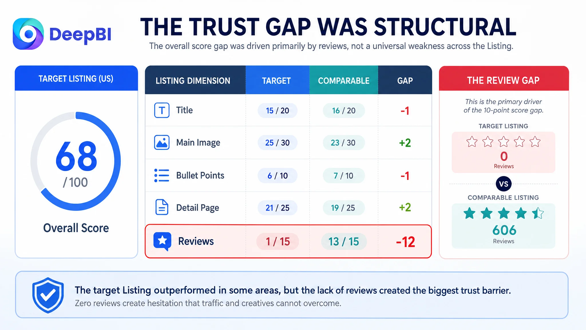
DeepBI's comparison produced a total score of 68/100 for the target Listing, versus 78/100 for the comparable high-performing Listing.
The dimension-level results were more revealing than the headline score:
- Title: Target Listing: 15/20, Comparable Listing: 16/20, Gap: -1
- Main image: Target Listing: 25/30, Comparable Listing: 23/30, Gap: +2
- Bullet points: Target Listing: 6/10, Comparable Listing: 7/10, Gap: -1
- Detail page: Target Listing: 21/25, Comparable Listing: 19/25, Gap: +2
- Reviews: Target Listing: 1/15, Comparable Listing: 13/15, Gap: -12
The target Listing was not losing everywhere.
Its main image and detail-page scores were actually higher. Its A+ content also had strengths: higher-resolution lifestyle imagery, a more complete visual sequence, and direct presentation of included labels and cable ties.
The decisive gap was the review dimension.
The target Listing had no effective review data: no visible rating, no review count, and no homepage comments. The comparable Listing had a 4.5-star average, 606 reviews, and multiple image and video reviews. Even with some mixed ratings among the top comments, the overall page carried established social proof.
That twelve-point review gap changed the business judgment.
The page was not merely competing on whether it looked attractive. It was asking shoppers to accept a relatively unfamiliar storage product without the reassurance that a mature Listing receives from customer feedback.
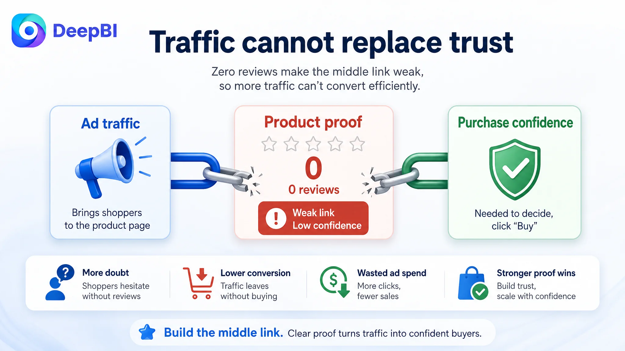
Advertising can bring a shopper to the page. It cannot manufacture confidence once the shopper arrives.
The Real Constraint Was Listing Conversion Capacity
The core problem was not simply “the images were weak” or “the title needed more keywords.”
It was this:
The Amazon product page did not provide enough immediate, organized proof for a shopper to understand the product's value and trust the purchase.
The absence of reviews was the largest structural disadvantage, but the content strategy could either reduce or intensify that disadvantage.
When social proof is limited, the Listing has to be especially precise about product truth:
- The package contents must be unmistakable.
- Dimensions must be easy to verify.
- The relationship between the large box and the eight small cases must be obvious.
- Capacity must be demonstrated rather than implied.
- Flexibility must be shown through actual removal and reconfiguration.
- The shopper must see how the product resolves cable clutter in a real setting.
The existing page often introduced these points later than necessary or repeated lower-priority scenarios before fully answering the core questions.
That sequencing created conversion friction. A shopper might understand that the product was versatile, but still remain unsure whether a standard charger adapter would fit. They might see that the box was transparent, but not immediately know the exact package count. They might see organized drawers, but not understand how the internal structure could be changed.
Why DeepBI Did Not Keep Chasing the Ads First
The case material does not include post-optimization advertising results, so it would be inaccurate to claim a specific ACOS decline, CVR increase, or organic-order recovery.
The decision logic is still clear.
If Amazon ads are sending traffic to a page with weak trust signals and incomplete product proof, further traffic can amplify the page's limitations. More impressions may create more clicks, but those clicks do not become efficient sales when shoppers continue to hesitate.
This is the point at which many Amazon teams become trapped. They adjust bids, search terms, match types, or campaign structure because the visible business pressure appears in advertising performance. But the ad account may be exposing a product-page problem rather than causing it.
Advertising does not only amplify a Listing's strengths. It can also amplify the uncertainty already present on the page.
For this cable organizer, the priority was therefore not to keep expanding traffic before the page could convert it more convincingly. The priority was to make the product's sales logic easier to verify.
That meant fixing the page-level constraint first, then allowing paid traffic to test a clearer proposition.
The Main Image Needed to Prove the Product's Difference
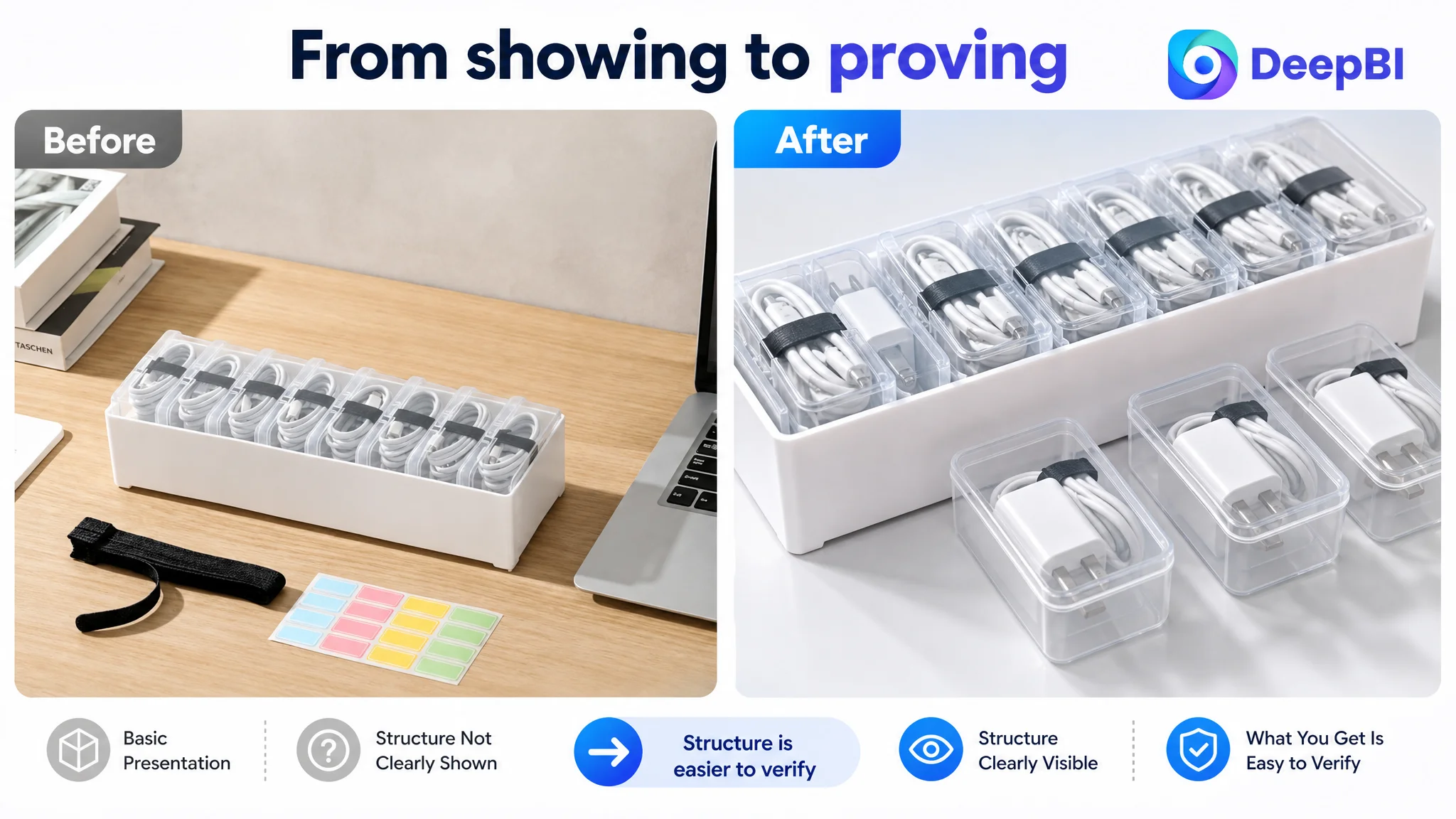
The first image was clean, but it functioned mainly as a basic offer confirmation: one large box, included small cases, and a neat presentation.
That was not enough for a product whose main differentiation was structural.
The revised visual direction focused on showing:
- One large cable organizer box
- Eight clear inner cases
- Distinct cable and adapter types stored at the same time
- The exact pack structure
- The product's capacity for cables up to 5 feet, where supported by the Listing information
The goal was not to add decorative complexity. It was to increase the amount of useful information delivered in the first impression.
A shopper should be able to understand the “box-in-box” system without studying several images or reading every bullet point.
The later image sequence also needed to answer questions in a more rational order:
1. What is included?
2. What are the dimensions?
3. How does the storage structure change?
4. How does it solve visible clutter?
5. Where can it be used?
This was a shift from showing a product to demonstrating a storage system.
The Title Needed Search Clarity, Not More Description
The title gap was smaller than the review gap, but it still affected how the product entered the shopper's consideration set.
The original wording placed the main product term early but added several overlapping or less relevant phrases. The competing Listing used a tighter formula built around:
- Product type
- Included accessories
- Core use case
- Material or closure detail
- Home and office application
The recommended direction retained the product's actual differentiator while improving search and reading clarity:
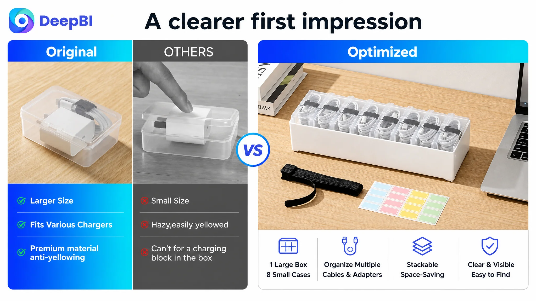
“Clear Cable Organizer Box with 8 Small Clear Cases” was positioned at the beginning, followed by the large box, lid, electronics organization, and wire management context.
The reasoning was not to copy a competitor's wording. It was to make the product category and unique structure legible faster, while removing terms that could dilute the relevance of the Listing.
For Amazon sellers, this distinction matters. A title can contain many keywords and still communicate too little. Search coverage is useful only when it supports a clear product interpretation.
The Bullet Points Had Information, but Not a Buying Path
The bullet points contained dimensions, materials, storage functions, use cases, and accessories. Their weakness was not the absence of facts. It was the order and form in which those facts were presented.
The revised logic moved each bullet toward a simple sequence:
Buyer concern → product proof → practical outcome
Quick access should be visible in the wording
Instead of stopping at “easy organization,” the first bullet needed to connect labels and cable ties with a practical result: identifying the needed cord quickly and reducing clutter or misplacement.
The eight-case structure should be the central differentiator
The second bullet needed to explain the large outer box and eight removable inner cases, including dimensions and supported cable length where relevant. This made the product's structure more concrete than a generic claim about adjustable storage.
Transparency should reduce uncertainty
The third bullet brought together clear visibility, a transparent lid, dust protection, and the stated PP material. The point was not to embellish the material claim, but to show why shoppers would not need to open every container to identify its contents.
Additional uses should follow the core use case
Makeup items, jewelry, office supplies, cards, and small first-aid items could broaden perceived value. But they should not appear before the Listing had firmly established its primary job: organizing cables, chargers, and power cords.
Flexibility and stacking should close the argument
The final bullet could show that the inner cases can be removed and that the outer boxes can be stacked, connecting customization with space efficiency.
This structure made the bullet points function as a decision sequence rather than five separate feature blocks.
A+ Content Needed Better Sequencing, Not More Lifestyle Scenes
The target Listing's A+ content was not inherently weak. Its lifestyle approach gave shoppers more context than a page built only from isolated product shots.
The problem was that lifestyle content appeared before some of the more important functional proof had been fully established.
DeepBI's recommendation was to reorder the page around the shopper's highest-risk questions.
First, establish what the system includes
The page should visually count and display:
- One large organizer box
- Eight small cases
- Eight cable ties
- One label sticker sheet
This reduces ambiguity around a one-pack offer and turns the package contents into visible value.
Then verify dimensions and compatibility
Dimension diagrams should appear earlier, alongside standard charger and adapter references where the fit can be truthfully demonstrated. This addresses a practical concern before the shopper becomes distracted by secondary use cases.
Next, prove flexibility
The removal of the inner cases should be shown as a physical transformation. The shopper should see how the outer box becomes a larger open compartment for bulkier items, rather than reading only that the storage is customizable.
After that, show the payoff
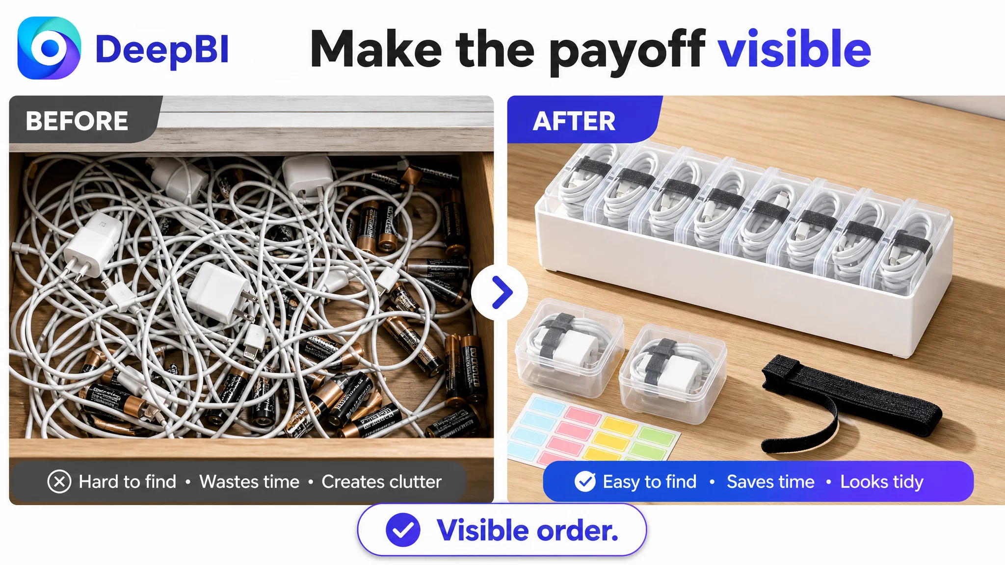
A before-and-after comparison can make the benefit tangible: tangled cables and scattered accessories before, organized and visible items after. The existing organized scenes become more persuasive when they follow a clear problem-and-resolution structure.
Finally, support broader use cases
Travel, drawers, desks, and small-item storage can expand the product's relevance after the main cable-organization argument is secure.
This was not a request to add unlimited modules. In fact, some repeated small-item scenes could be consolidated. The objective was to spend the page's limited attention on the evidence most likely to resolve hesitation.
The Optimization Direction Was a Reframing of Risk
The most important change was not a new title or a redesigned image by itself.
It was a change in the order of operations.
The customer team was looking at an Amazon Listing with a respectable visual foundation, a differentiated product structure, and a large review disadvantage. DeepBI's diagnosis connected those facts instead of evaluating them in isolation.
The practical implication was:
- Do not treat a polished A+ page as proof that conversion is healthy.
- Do not assume more scenes will solve uncertainty.
- Do not prioritize secondary use cases before dimensions and package contents.
- Do not let advertising scale before the page can explain the product quickly.
- Do not hide the strongest structural advantage inside later content modules.
The page needed to compensate, as far as its own content could, for the absence of social proof by becoming more verifiable.
That is why the recommended optimization concentrated on product truth, visual evidence, and decision order:
- Clearer title structure
- More informative first-impression imagery
- Earlier package and dimension confirmation
- Direct proof of removable inner cases
- Visible stacking and space-saving behavior
- Stronger cable-and-adapter compatibility cues
- More concrete before-and-after organization
- Less repetition among secondary scenarios
What Other Amazon Sellers Should Take From This Case
This case does not support a claim that the Listing achieved a specific post-optimization metric. It does support a more durable operational conclusion.
A high-conversion Amazon product page is not built by accumulating more content. It is built by removing the reasons a qualified shopper might hesitate.
For this cable organizer, the critical hesitation was not only whether the product looked good. It was whether the shopper could quickly understand the offer, verify the structure, judge the capacity, and trust the purchase despite the absence of reviews.
That also changes how Amazon ads should be evaluated.
When paid traffic is expensive and conversion is weak, the first question should not always be whether the campaign needs more adjustment. The team should also ask whether the product page deserves more traffic in its current state.
The wider lesson is straightforward:
Before scaling Amazon ads, confirm that the Listing can convert the questions those ads are creating.
DeepBI's value in this case was not a list of isolated copy or image suggestions. It was the ability to identify where the competitive gap actually mattered, distinguish strengths from distractions, and set a more defensible order for the next decision.
The product page already had content. It needed stronger proof, clearer sequencing, and a conversion logic that could make paid and organic traffic more useful again.