

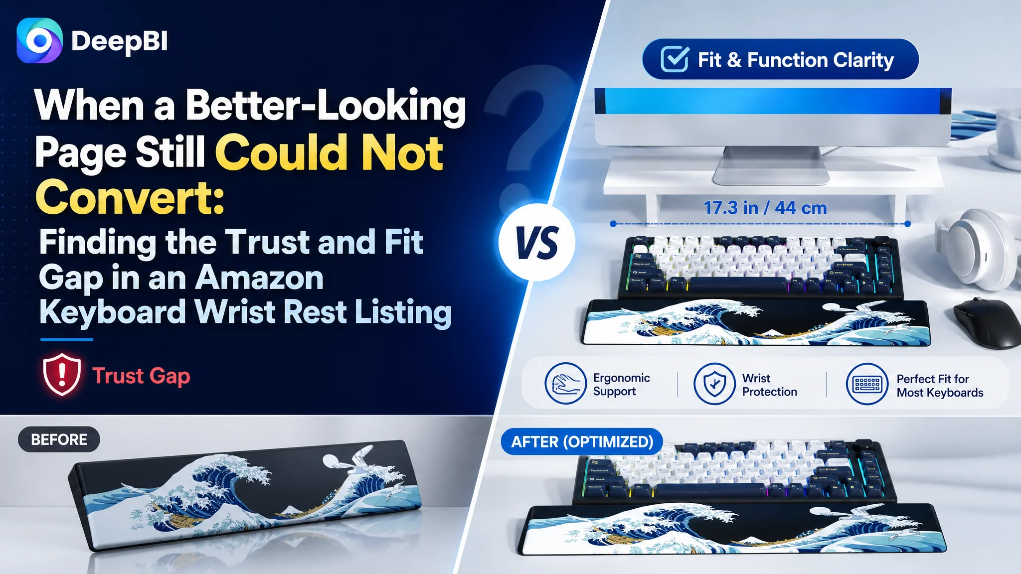
An Amazon seller in the keyboard accessories category was facing a product-page conversion problem. The Listing had strong visual differentiation, a distinctive Japanese wave design, and more complete lifestyle content than a comparable high-performing page. Yet its competitive score was still 10 points lower, and the page lacked the signals that help shoppers make a confident decision quickly.
The initial direction focused on making the Listing more attractive and describing more product features. That approach was incomplete. DeepBI found that the deeper constraint was not a lack of creative content, but a lack of conversion sequence: the title delayed important compatibility information, the page took too long to resolve size and stability concerns, and the Listing had no review base to support trust.
The later optimization therefore focused on Amazon Listing logic rather than isolated image polish. The goal was to bring fit, ergonomic support, material response, and non-slip performance forward, while turning the page from a collection of features into a clearer buying argument.
For other Amazon sellers, the case offers a practical reminder: before sending more paid traffic to a product page, determine whether the page can quickly answer the shopper’s most important questions—and whether it has enough trust to make the final conversion possible.
The Listing Looked Differentiated. The Score Told a More Complicated Story.
At first glance, this Amazon keyboard wrist rest Listing had several advantages.
Its visual identity was distinctive. The black Japanese wave artwork separated it from the plain black and gray products common in the category. The A+ content included desk setups, RGB keyboards, gaming scenes, dimensions, material details, cleaning information, and ergonomic support. The product had a clear aesthetic position for gamers, creators, programmers, and mechanical keyboard users.
It would have been easy to conclude that the page mainly needed more visual polish.
But the comparative diagnosis showed a different picture:
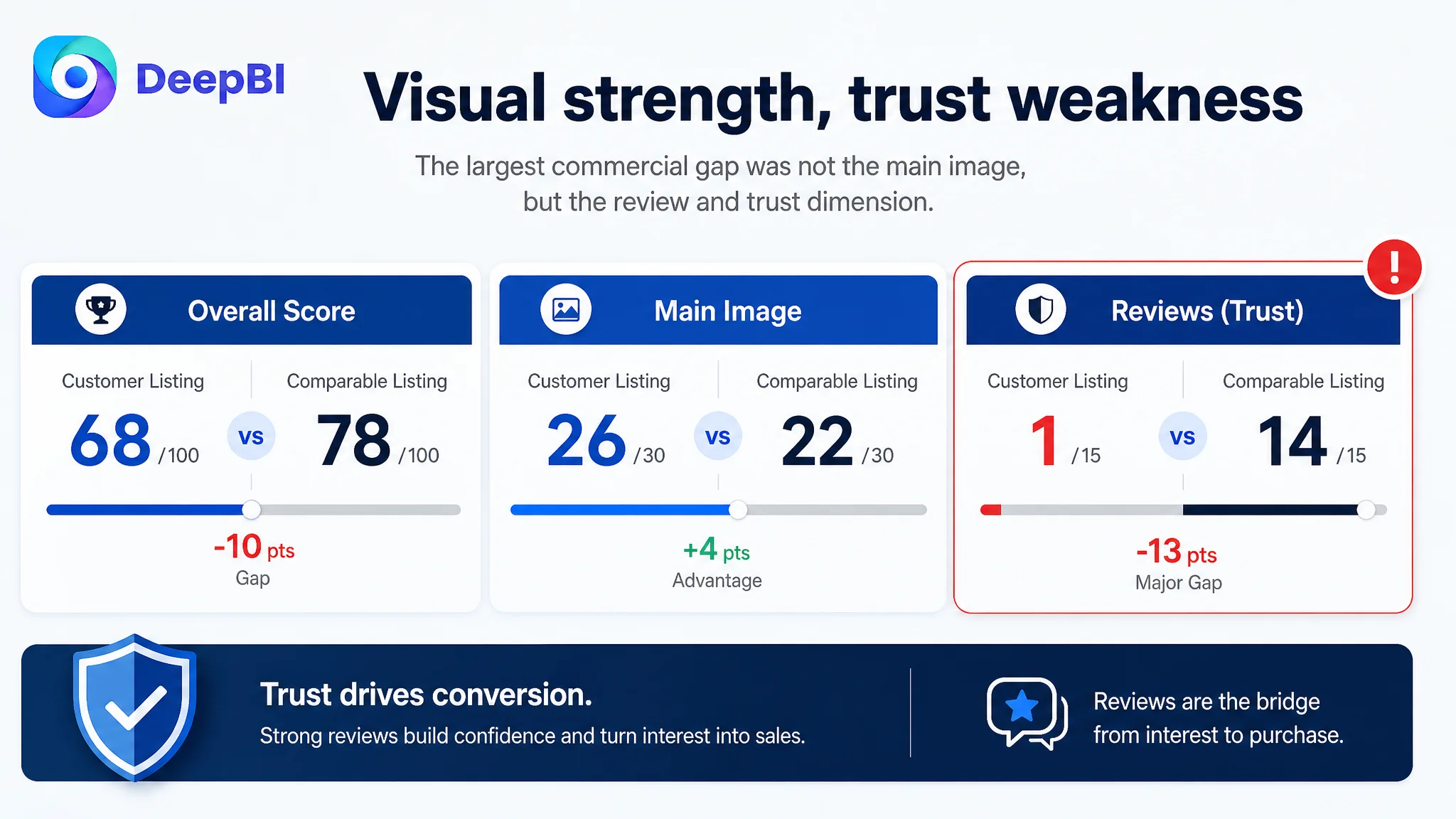
- Overall score: Customer Listing: 68/100, Comparable Listing: 78/100, Difference: -10
- Title: Customer Listing: 13/20, Comparable Listing: 16/20, Difference: -3
- Main image: Customer Listing: 26/30, Comparable Listing: 22/30, Difference: +4
- Bullet points: Customer Listing: 7/10, Comparable Listing: 7/10, Difference: 0
- Detail page: Customer Listing: 21/25, Comparable Listing: 19/25, Difference: +2
- Reviews: Customer Listing: 1/15, Comparable Listing: 14/15, Difference: -13
The customer Listing was not weaker everywhere. In fact, it scored higher on the main image and detail-page dimensions.
The most serious gap was the review dimension. The Listing had no meaningful review base, while the comparable page had a strong rating and hundreds of reviews, including image and video reviews.
The page had visual advantages, but visual advantages alone could not replace missing trust.
This distinction changed the diagnosis. The issue was not simply that the Listing looked less professional. It was that the page did not guide an uncertain shopper from interest to confidence quickly enough.
The Initial Optimization Direction Overvalued Aesthetic Differentiation
The customer had already invested in a strong visual concept.
The product’s artwork created a memorable impression. Its A+ content carried a clear brand tone and showed the wrist rest in several desk environments. The page also included information about water resistance, cleaning, memory foam support, dimensions, and the non-slip base.
The initial optimization direction therefore leaned toward improving the visual presentation and expanding feature communication. That instinct was understandable. In a crowded Amazon category, a distinctive product needs to stand out from generic alternatives.
But differentiation and conversion are not the same thing.
A shopper searching for a keyboard wrist rest may appreciate the artwork, yet still hesitate over more basic questions:
- Will it fit my keyboard?
- Is the height suitable for my keycap profile?
- Will it move during typing or gaming?
- Does the material provide real support?
- Is the product surface durable and easy to maintain?
- Can I trust a Listing with no review history?
The customer page answered many of these questions somewhere in the content. The problem was that the answers were not presented in the order shoppers needed them.
The Listing often led with product description, craftsmanship, and visual atmosphere. The comparable page led more directly with pain relief, material feel, stability, ergonomic support, and specific compatibility.
This was the central misdiagnosis: treating the challenge as a creative presentation gap when the larger issue was conversion logic and trust formation.
Amazon Ads Could Not Fix a Page That Delayed Basic Reassurance
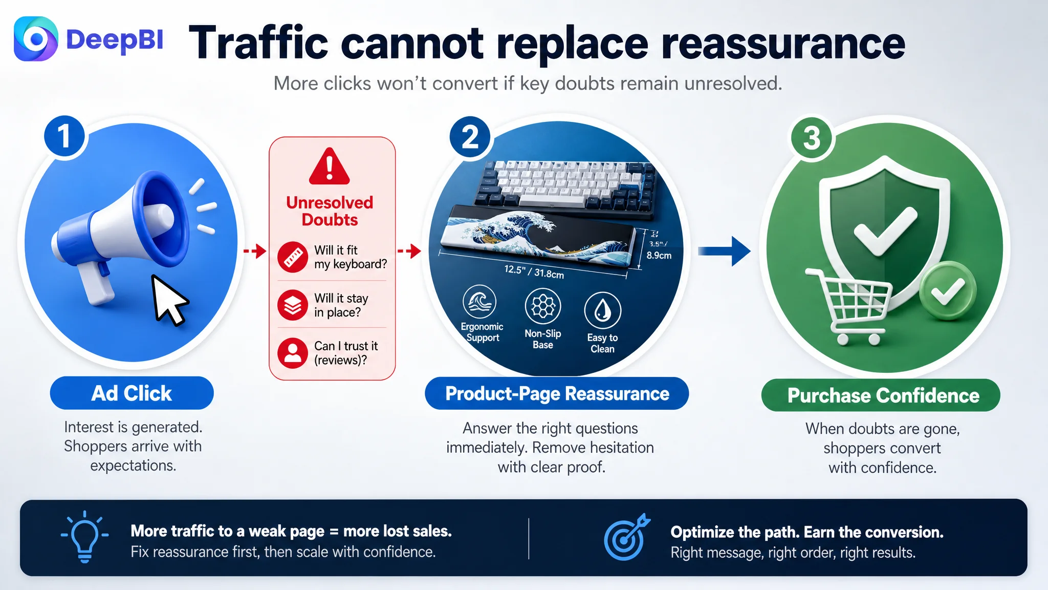
For an Amazon seller, advertising can create visibility, clicks, and new opportunities to evaluate a product. But paid traffic does not remove the need for a convincing product page.
It often makes page weaknesses more visible.
A shopper arriving from an Amazon ad has already shown some level of interest. If the Listing then makes the shopper search for the product’s dimensions, compatibility, support characteristics, or stability proof, the traffic is not being properly received.
That is why continued ad tuning would not have been the first decision in this case.
Changing bids or campaign structure might alter the amount and cost of traffic. It would not solve the fact that:
- The title placed the most important keyword and fit information too late.
- The page did not quickly validate common compact keyboard layouts.
- The main visual sequence delayed dimension confirmation.
- Stability was combined with cleaning instead of being demonstrated as a standalone benefit.
- The bullet points described product features without consistently beginning from user pain.
- The absence of reviews left the page without a strong external trust layer.
Advertising can amplify a strong page. It can also amplify a page that loses shoppers after the click.
The correct operating question was therefore not, “How can the seller drive more traffic?” It was:
Can this Amazon Listing convert the traffic it is already capable of attracting?
DeepBI Located the Constraint by Comparing Decision Roles, Not Just Page Elements
DeepBI’s diagnosis did not treat the Listing as a collection of independent assets. It examined what each asset was supposed to accomplish in the shopper’s decision process.
That distinction mattered.
A main image has a different role from an A+ module. A title has a different role from a bullet point. A review section cannot be substituted by better artwork. The diagnosis became clearer when each element was evaluated according to the doubt it should remove.
The title did not prioritize search clarity and fit confidence
The title had relevant information, but its structure diluted the most important signals.
The core product term was not positioned as efficiently as it could have been. Compatibility was expressed in broad layout language rather than through a more concrete explanation of compact keyboard fit. Decorative wording occupied valuable title space without adding much search or conversion value.
The comparable Listing used a clearer sequence:
- Core product type
- Specific length
- Keyboard category
- Ergonomic support
- Non-slip structure
- Compatibility examples
The customer Listing needed a similar logic—not a direct imitation, but a clearer order of information.
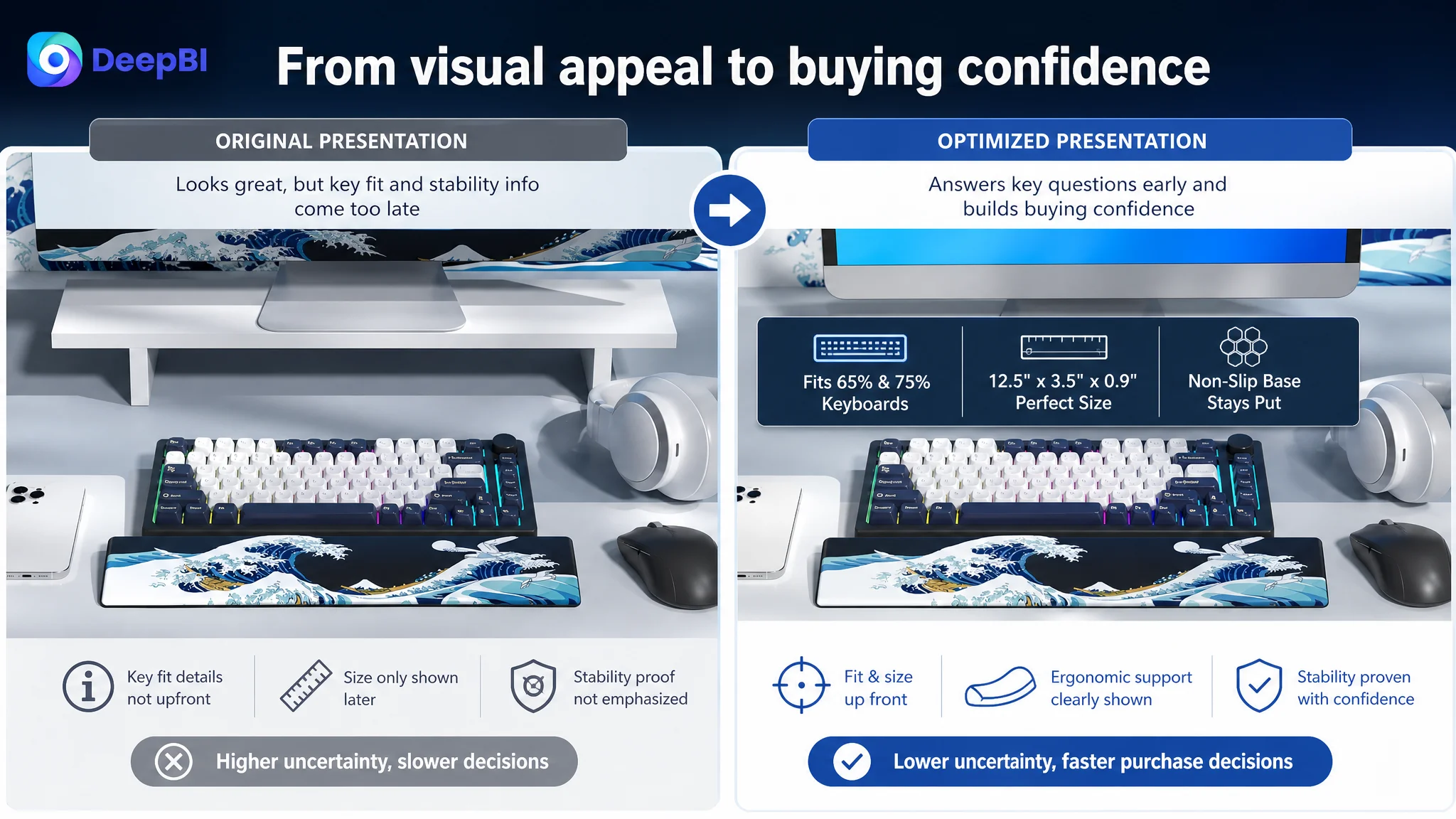
The revised direction placed the product type and key function earlier, then clarified compatibility with 65%, 75%, and tenkeyless layouts. The purpose was not to add more words. It was to make the title answer the shopper’s first practical question sooner.
The main image was visually strong but did not resolve enough doubt early
The main image scored higher than the comparable page, which is important. DeepBI did not recommend replacing the product’s visual identity with a generic style.
The judgment was more precise: preserve the aesthetic advantage, but use the image sequence to build rational confidence sooner.
The first visual created aesthetic interest, but it did not communicate scale and material quality as clearly as it could. A shopper could still wonder whether the wrist rest was a standard size or whether the surface would look and feel premium in person.
The scene image also looked more like a bright render than a grounded desktop setup. That weakened the impression of natural fit with a compact mechanical keyboard.
The before-and-after ergonomic image introduced a useful idea, but the material response was not sufficiently visible. Memory foam support is more credible when the image shows how the material responds to wrist pressure rather than presenting the claim as a static graphic.
DeepBI therefore assigned clearer roles to the image sequence:
- Establish the product and artwork cleanly.
- Show a realistic compact-keyboard setup.
- Bring dimensions and layout compatibility forward.
- Demonstrate ergonomic alignment and pressure support.
- Give the non-slip base its own visual proof.
- Address water resistance and artwork durability after the primary buying concerns are handled.
This is not a matter of adding more images for the sake of completeness. It is a matter of placing each proof point where it can remove the next major hesitation.
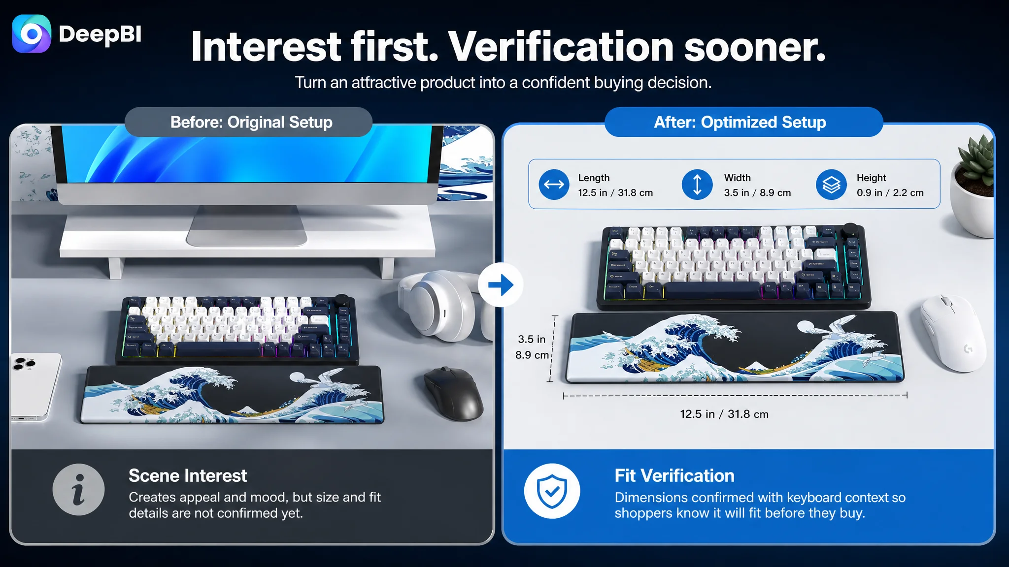
Compatibility Needed to Move From General Claim to Immediate Verification
The product was intended for compact keyboard users, but the page expressed compatibility too broadly.
The Listing referred to 65% and 75% layouts, yet shoppers often compare a wrist rest against the exact keyboard already on their desk. A general layout label may not be enough when dimensions, height, and keyboard proportions vary across models.
The recommended direction was to show:
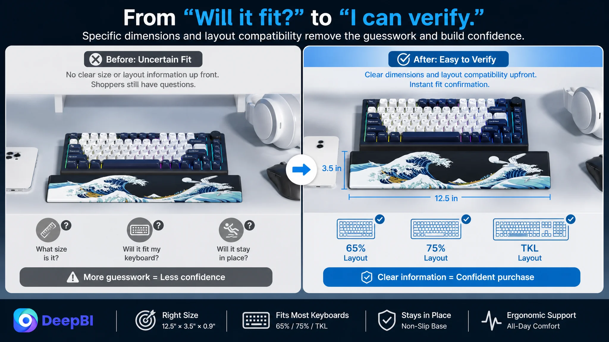
- A clear dimension of approximately 12.5 by 3.5 inches.
- A height of approximately 0.9 inches.
- Compatibility with 65%, 75%, and tenkeyless layouts where appropriate.
- A realistic setup using a compact keyboard with visible proportions.
- A reminder for shoppers to check their keyboard dimensions before purchasing.
This was not simply an SEO adjustment.
Specific compatibility language creates a bridge between search intent and purchase confidence. It allows the shopper to move from “This looks interesting” to “This appears to fit my setup.”
The title did not communicate fit early enough
The title needed to make the product’s form and intended use clear near the beginning.
Instead of allowing artwork or decorative wording to take priority, the recommended structure emphasized the product type, ergonomic support, non-slip base, layout compatibility, and water-resistant surface.
The Japanese wave artwork remained part of the product’s differentiation. It simply stopped carrying the burden of explaining the product’s practical value.
The A+ content showed many scenes but did not always build a straight argument
The A+ page contained rich visual material, but the sequence was not fully aligned with the shopper’s decision path.
Several modules repeated desk setups or general product impressions. Meanwhile, the most important rational proof—fit, physical support, and stability—appeared later or was spread across multiple sections.
DeepBI recommended a clearer progression:
1. Confirm the intended keyboard layouts and dimensions.
2. Show the difference between unsupported and supported wrist positioning.
3. Explain the memory foam response and pressure distribution.
4. Prove non-slip stability during active typing and gaming.
5. Explain water resistance and ease of cleaning.
6. Reinforce the durability of the printed artwork.
7. Close with the product’s broader desk and lifestyle appeal.
The change was not to remove the product’s aesthetic character. It was to stop aesthetics from appearing before the functional questions had been answered.
The Bullet Points Had Information, but Not Enough Buying Logic
The five bullet points were not materially weaker than the comparable Listing by score. Both scored 7 out of 10.
That meant the issue was not a complete copywriting failure. It was a difference in emphasis and sequencing.
The customer’s bullet points leaned toward:
- Product function
- Manufacturing process
- Artwork
- Dimensions
- Water resistance
- Non-slip structure
The comparable Listing more consistently began with the user’s problem:
- Wrist discomfort during extended use
- Surface feel
- Stability
- Ergonomic angle
- Compatibility
The recommended rewrite connected each feature to a specific decision concern.
Support needed to begin with the user’s discomfort
“Support design” is descriptive. “Relieve wrist discomfort during extended computer use” is closer to the shopper’s reason for buying.
The memory foam should therefore be presented as the mechanism that conforms to the natural wrist angle and reduces pressure points, without overstating medical outcomes.
Artwork needed to support function, not replace it
The Japanese wave design was a real differentiator. The issue was not whether to keep it, but how to frame it.
The artwork could be positioned as a durable visual finish supported by UV printing, while the page continued to establish the more basic reasons to buy: fit, comfort, stability, and maintenance.
That created a stronger relationship between emotional value and rational proof.
Compatibility needed concrete boundaries
The page should state the intended layouts, dimensions, and relevant height relationship clearly. It should avoid vague universal claims and encourage shoppers to verify their keyboard dimensions.
Water resistance should be presented as practical maintenance
The water-resistant surface was useful, but it was not the first reason most shoppers would purchase the product. It belonged after the page had established comfort, fit, and stability.
The non-slip base deserved dedicated proof
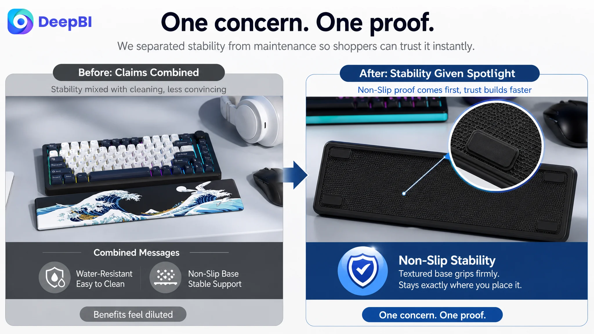
The non-slip base was treated as one feature among several. DeepBI identified it as a stronger purchase concern than its placement suggested.
For gamers and fast typists, movement is not a minor inconvenience. A wrist rest that shifts during use undermines the product’s main purpose.
The page therefore needed to show the textured base and explain how it stays in place during active typing or gaming, rather than combining the claim with cleaning information.
The Review Gap Was the Hardest Constraint to Solve Through Content Alone
The review score created the largest numerical disadvantage: 1 out of 15 compared with 14 out of 15 for the comparable Listing.
The customer page had no meaningful review history or rating data. The comparable page had hundreds of reviews, a strong average rating, and review content supported by images and videos.
This difference affects more than the review module itself.
Reviews influence how shoppers interpret every other part of the page. A claim about ergonomic support feels different when many customers have already described their experience. A claim about stability feels more credible when shoppers can see the product used in real desk environments. A distinctive artwork design feels less risky when the Listing already has a history of customer validation.
No title rewrite or image refresh can instantly create that trust layer.
This is why DeepBI did not treat the review deficit as a reason to stop all Listing work. Instead, it separated the problems:
- Content could improve how quickly the page explains fit and value.
- Image sequencing could reduce uncertainty.
- Bullet-point logic could connect features to user concerns.
- A+ content could provide stronger physical and situational proof.
- Reviews remained a structural trust constraint that required its own compliant, long-term operating plan.
That distinction prevented the team from expecting creative optimization to solve a problem it could not directly control.
A better Listing can reduce uncertainty. It cannot pretend that missing customer validation does not matter.
Why DeepBI Did Not Recommend Tuning Ads First
The decision order followed the evidence.
The page already had visual strengths. It also had a meaningful gap in the title and a major trust deficit in reviews. More importantly, the functional proof was not arranged in the sequence needed to support conversion.
Under those conditions, sending additional traffic would create a business risk: the seller could spend more to expose the same unresolved doubts.
The priority became:
1. Make the product type and compatibility clearer.
2. Bring dimensions and layout fit closer to the first decision point.
3. Show ergonomic support as a physical result rather than a general claim.
4. Separate non-slip proof from secondary maintenance information.
5. Use the A+ page to build a continuous argument from fit to function to durability.
6. Treat the review gap as a separate trust-building challenge.
7. Reassess advertising efficiency only after the page had stronger conversion capacity.
This was not an argument against Amazon ads.
Ads remained useful, but they needed a page capable of receiving the traffic productively. The Listing had to become a more reliable conversion environment before ad optimization could be judged fairly.

From Visual Differentiation to Commercial Clarity
The later direction did not remove what made the product distinctive.
It kept the Japanese wave artwork, the darker desk aesthetic, the memory foam construction, and the product’s appeal to gamers, creators, and mechanical keyboard users.
What changed was the order in which the page made its case.
The product should first answer:
Will it fit my keyboard?
Then:
Will it support my wrists comfortably?
Then:
Will it stay in place?
Then:
Will the surface remain practical over time?
Finally:
Does the design make this a better choice than a plain alternative?
That order allows the artwork to strengthen the decision rather than distract from unresolved concerns.
DeepBI’s role in this case was not to declare one design more beautiful than another. It was to connect the page’s measurable gaps to the decisions shoppers were trying to make.
The score difference showed where the Listing stood. The module-level analysis showed why. The optimization direction translated those findings into a more deliberate title structure, image sequence, bullet-point logic, and A+ narrative.
The Business Understanding Changed Before the Page Changed
The most important shift was not a single headline rewrite or image replacement.
It was the seller’s understanding of the problem.
The Listing did not primarily need more content. It needed better prioritization.
The product did not primarily lack differentiation. It lacked enough early reassurance around fit, comfort, stability, and trust.
The page did not need to imitate a plain competitor. It needed to preserve its aesthetic advantage while making the functional proof easier to verify.
And Amazon ads were not the first place to search for the answer. Before increasing traffic, the team had to determine whether the product page deserved more traffic.
The strongest creative asset is not automatically the strongest conversion asset. It becomes commercially valuable when it appears at the right point in the buying decision.
For Amazon sellers, that is the broader lesson from this keyboard wrist rest case. A Listing can have attractive images, clear features, and a distinctive product identity while still losing the conversion battle.
The real work is to identify which uncertainty is blocking the purchase, determine whether the page resolves it in the right order, and separate problems that content can fix from problems—such as missing review history—that require a longer operating response.
That is how Listing optimization moves beyond visual refinement and becomes a more disciplined part of Amazon business decision-making.