


This case involved an Amazon US seller whose pet food storage container and manual feeder Listing was competing in a category where shoppers needed more than a product description. The page explained the two-in-one design, capacity, feeding mechanism, and stainless steel bowl, but its overall Listing score was 65, compared with 78 for a comparable high-performing Listing.
The initial optimization direction focused on making the product’s functions clearer: explain the storage system, show the rotation button, describe the movable drawer base, and present the product in more daily-use scenarios. That direction was reasonable, but incomplete. It treated the page mainly as an information problem.
DeepBI’s diagnosis reframed the issue. The product page did not lack features; it lacked a persuasive order of proof. The title delayed the core search term, the bullet points listed functions without consistently connecting them to pet-owner concerns, and the A+ content did not provide enough material, freshness, structure, and hygiene evidence to compensate for a Listing with no review history.
The later optimization therefore focused on Amazon Listing conversion capacity: place the core product term earlier, make capacity and material trust easier to verify, convert feature descriptions into problem-solution logic, and use the main images and A+ content to answer purchase objections before asking shoppers to decide. For other Amazon sellers, the lesson is direct: before scaling Amazon ads or continuing to tune traffic, determine whether the product page has enough clarity and trust to convert the traffic it receives.
The Page Was Explaining the Product, but Not Making the Decision Easier
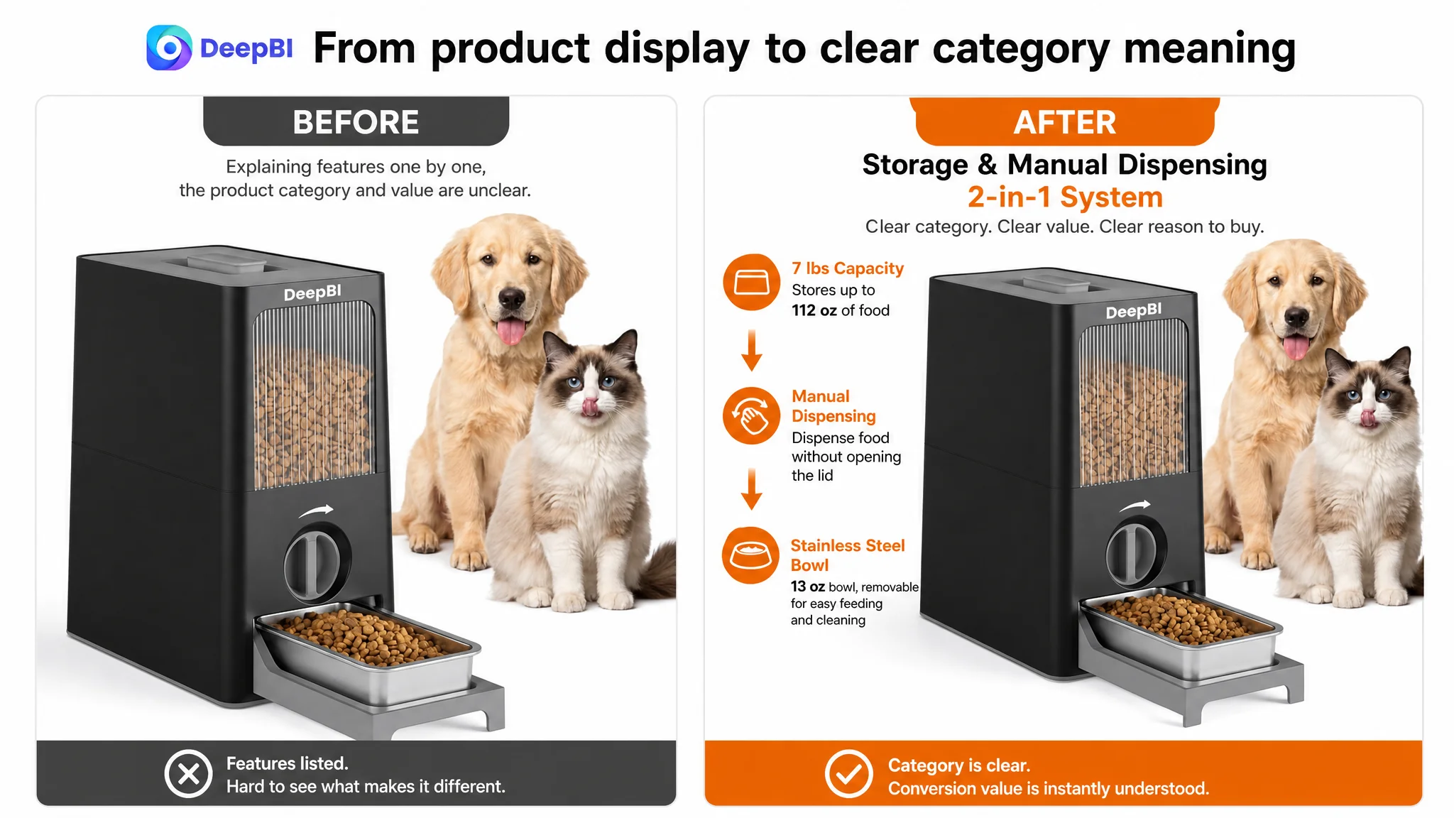
The Listing presented a distinctive product concept: a food storage container combined with a manual feeding system, stainless steel bowls, and a movable drawer-style base.
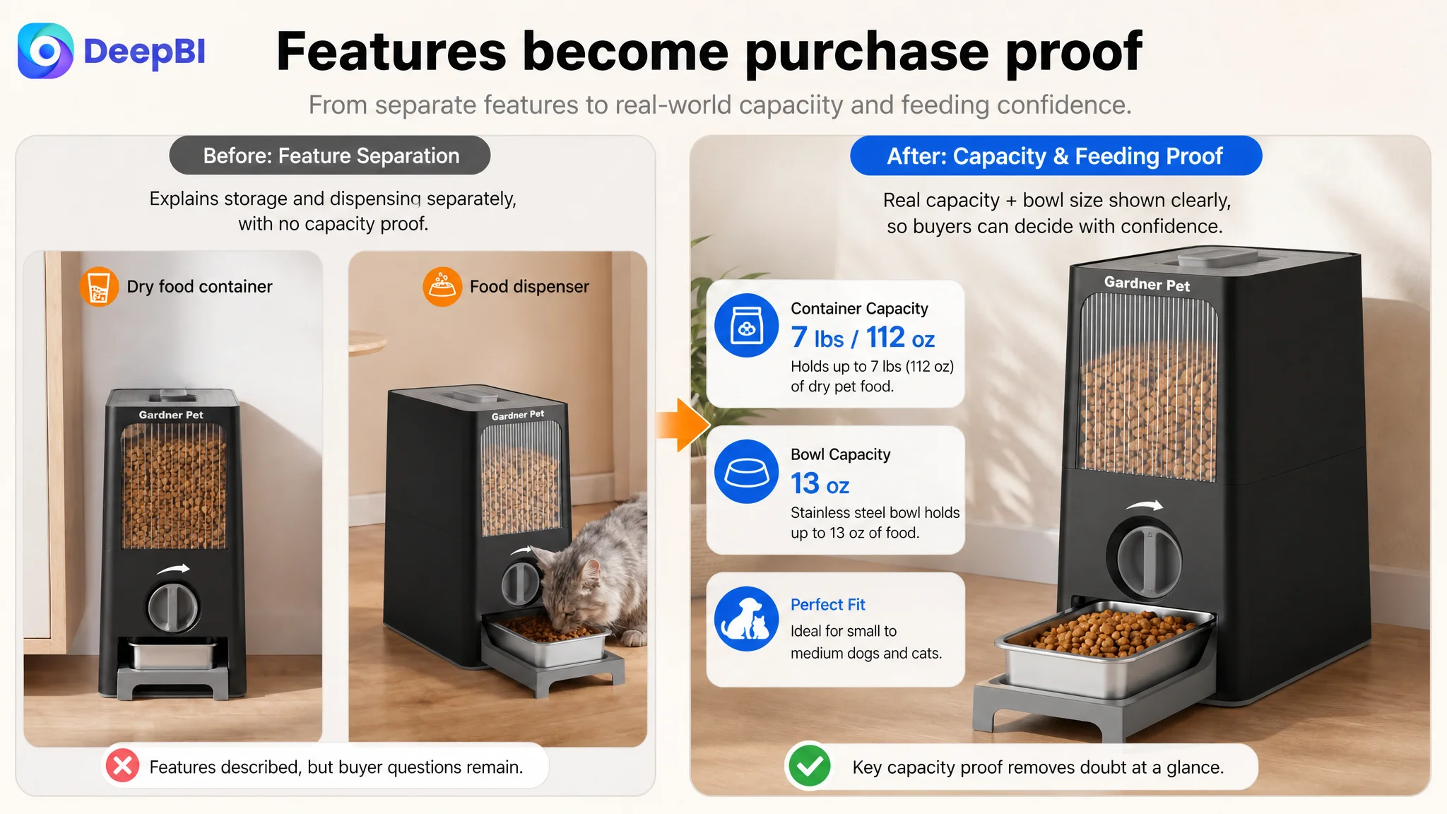
On paper, that gave the product several points of differentiation. It could store up to 7 pounds, or 112 ounces, of dry food. The feeding bowl could hold approximately 13 ounces. The rotation mechanism allowed food to be dispensed without opening the main lid, while the drawer base supported removal, feeding, and cleaning.
Yet the page’s sales logic was not organized around the questions a pet owner would ask:
- Is the storage capacity sufficient for my pet?
- Will the food stay dry and protected?
- Is the material hygienic and durable?
- Can I control portions without making feeding more difficult?
- Will the product be easy to clean every day?
- Is this suitable for my dog or cat and the food they eat?
The product had answers to many of these questions. The Listing did not present them in a sufficiently convincing sequence.
“The conversion issue was not a lack of product information. It was a lack of decision logic connecting that information to the buyer’s concerns.”
This distinction matters on Amazon. A shopper rarely evaluates a product page as a complete specification sheet. They scan the title, main image, first few images, bullet points, and A+ content in a compressed sequence. Each element must either attract attention, reduce uncertainty, or strengthen the reason to buy.
In this case, several elements were performing those jobs only partially.
The Score Difference Revealed a Conversion Structure Problem
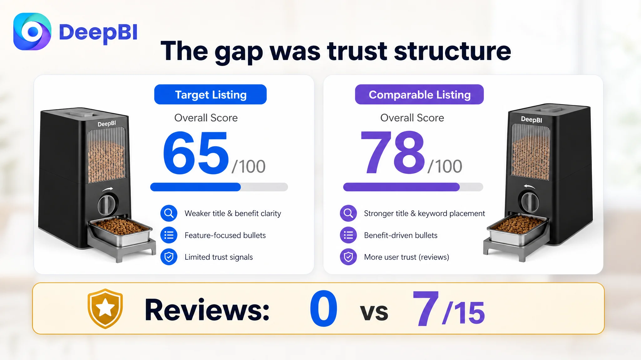
The overall comparison gave the target Listing a score of 65 out of 100, while the comparable Listing scored 78.
The gap was not concentrated in one isolated creative asset:
- Title: Target Listing: 14/20, Comparable Listing: 17/20, Gap: -3
- Main image: Target Listing: 25/30, Comparable Listing: 24/30, Gap: +1
- Bullet points: Target Listing: 5/10, Comparable Listing: 7/10, Gap: -2
- A+ content: Target Listing: 21/25, Comparable Listing: 23/25, Gap: -2
- Reviews: Target Listing: 0/15, Comparable Listing: 7/15, Gap: -7
- Total: Target Listing: 65/100, Comparable Listing: 78/100, Gap: -13
The main image score was not lower than the comparable Listing. That was important. It meant the diagnosis could not simply be “the images are worse.”
The deeper issue was how the entire page worked together.
The target Listing had a reasonable visual foundation, but its supporting content did not consistently convert that attention into confidence. The title was less precise, the bullet points were more feature-oriented, the A+ content offered weaker evidence for the central freshness and hygiene claims, and the review section provided no user-generated trust signals.
This is where a purely visual or purely advertising-focused diagnosis could have led the team in the wrong direction. Reworking one image or adjusting traffic would not, by itself, resolve the lack of proof across the page.
The First Misdiagnosis: More Explanation Would Solve the Problem
The initial direction was to clarify the product’s functions and show more of its use cases.
That meant explaining:
- The two-in-one storage and feeding design
- The storage capacity
- The manual dispensing process
- The movable drawer base
- The stainless steel bowl
- The visible food-level window
- The use of the product with dogs and cats
These were all valid communication needs. The problem was that they were being handled as separate features rather than as one connected buying argument.
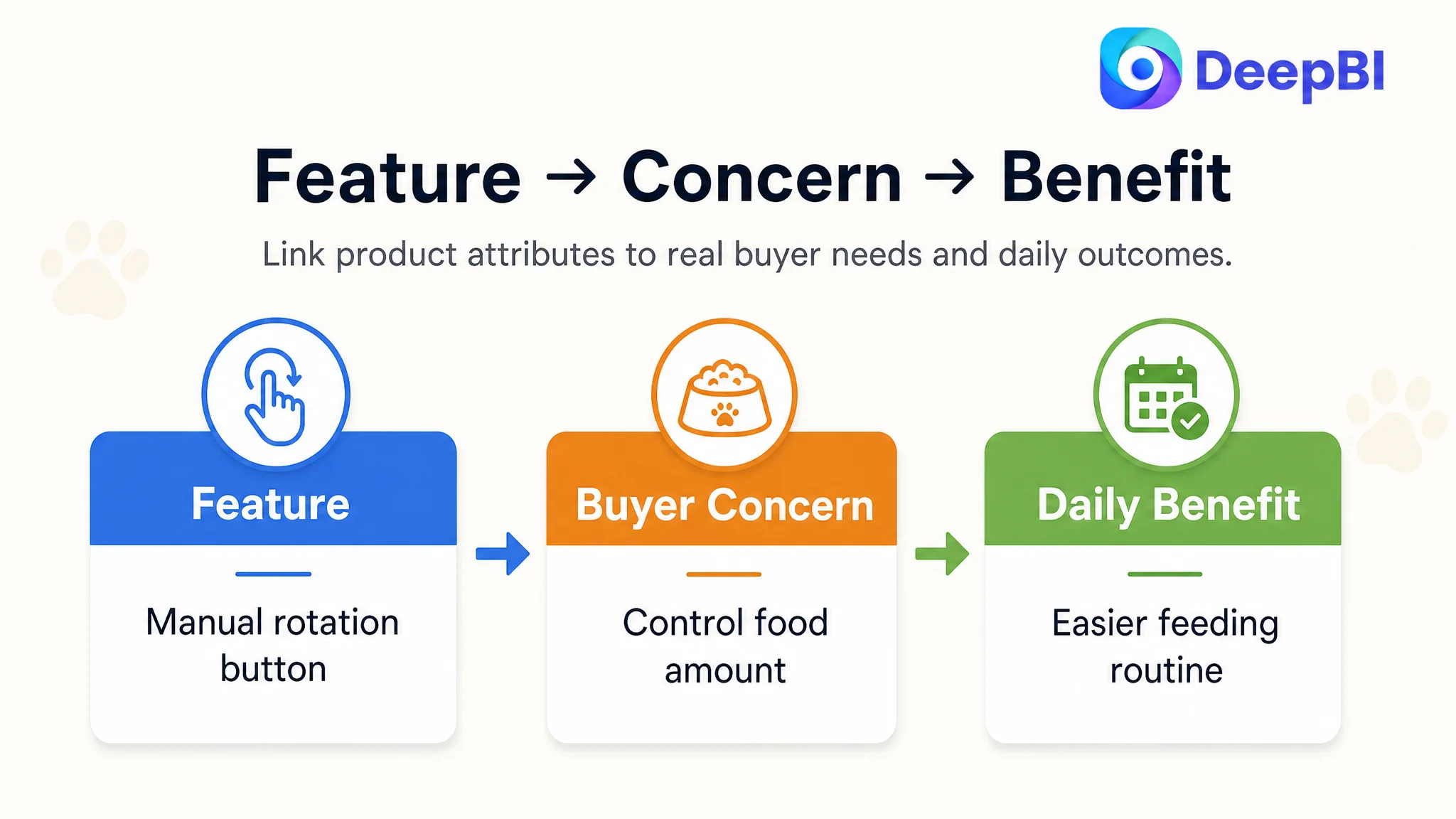
For example, “manual feeding” describes what the mechanism does. It does not immediately explain why a pet owner should care. The stronger interpretation is that controlled dispensing can make portion management easier and reduce the need to open the main container at every feeding.
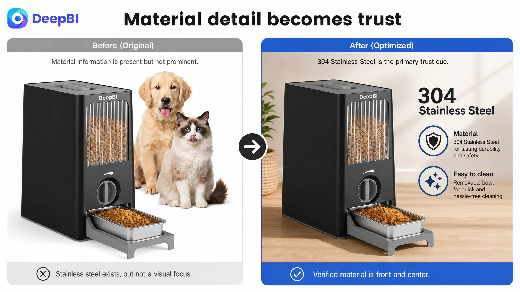
Similarly, “304 stainless steel bowl” is a material statement. It becomes more persuasive when connected to the buyer’s hygiene and maintenance concerns, supported by clear explanations of smooth surfaces, removability, and cleaning.
The page was therefore not suffering from a simple content shortage. It was suffering from a translation gap between product attributes and buyer outcomes.
A feature list tells shoppers what exists.
A conversion-oriented Listing shows why each feature matters in daily use.
The Title Delayed the Most Important Search and Purchase Signals
The title comparison exposed a clear weakness.
The comparable Listing placed “Stainless Steel Pet Food Storage Container” near the beginning, making the product type and material immediately recognizable. It also used concrete benefits such as an airtight lid, scoop, capacity, freshness, and easy cleaning.
The target title placed “Pet Food Storage Container” further back and used a more diffuse structure. “Two-in-One Set” and “7 lbs” provided some information, but they did not communicate the full value as clearly. The phrase “Manual Feeding Feeder” also created unnecessary repetition and weakened the connection between the product form and its primary use.
DeepBI’s proposed structure moved the product’s core identity forward:
“Pet Food Storage Container with Manual Feeder”
It also brought the verified material, capacity, bowl, drawer base, and intended users into a more readable order.
This was not just an SEO adjustment. It was a way to reduce search-result ambiguity and establish the product’s unique category relevance before the shopper moved on.
The title needed to answer three questions quickly:
1. What is the product?
2. What makes it different?
3. Who is it for?
For an Amazon Listing, that sequence supports both search matching and early-stage click confidence.
The Main Image Was Not the Weakest Score, but Its Role Was Underused
The main image dimension scored 25 out of 30, slightly above the comparable Listing’s 24. That result prevented an oversimplified conclusion that the visual assets were fundamentally poor.
However, the image analysis showed that the supporting image sequence was not using each position for a distinct decision task.
The first image established the basic product type and showed the intended dog-and-cat audience, but the two-in-one storage and manual dispensing concept was not immediately prominent. The product’s strongest differentiator remained implicit.
The second image explained the system again, even though the next major buyer concern was likely capacity. A more useful role would be to state the concrete capacity clearly:
- Holds up to 112 ounces, or 7 pounds, of dry food
- Stainless steel bowl holds approximately 13 ounces
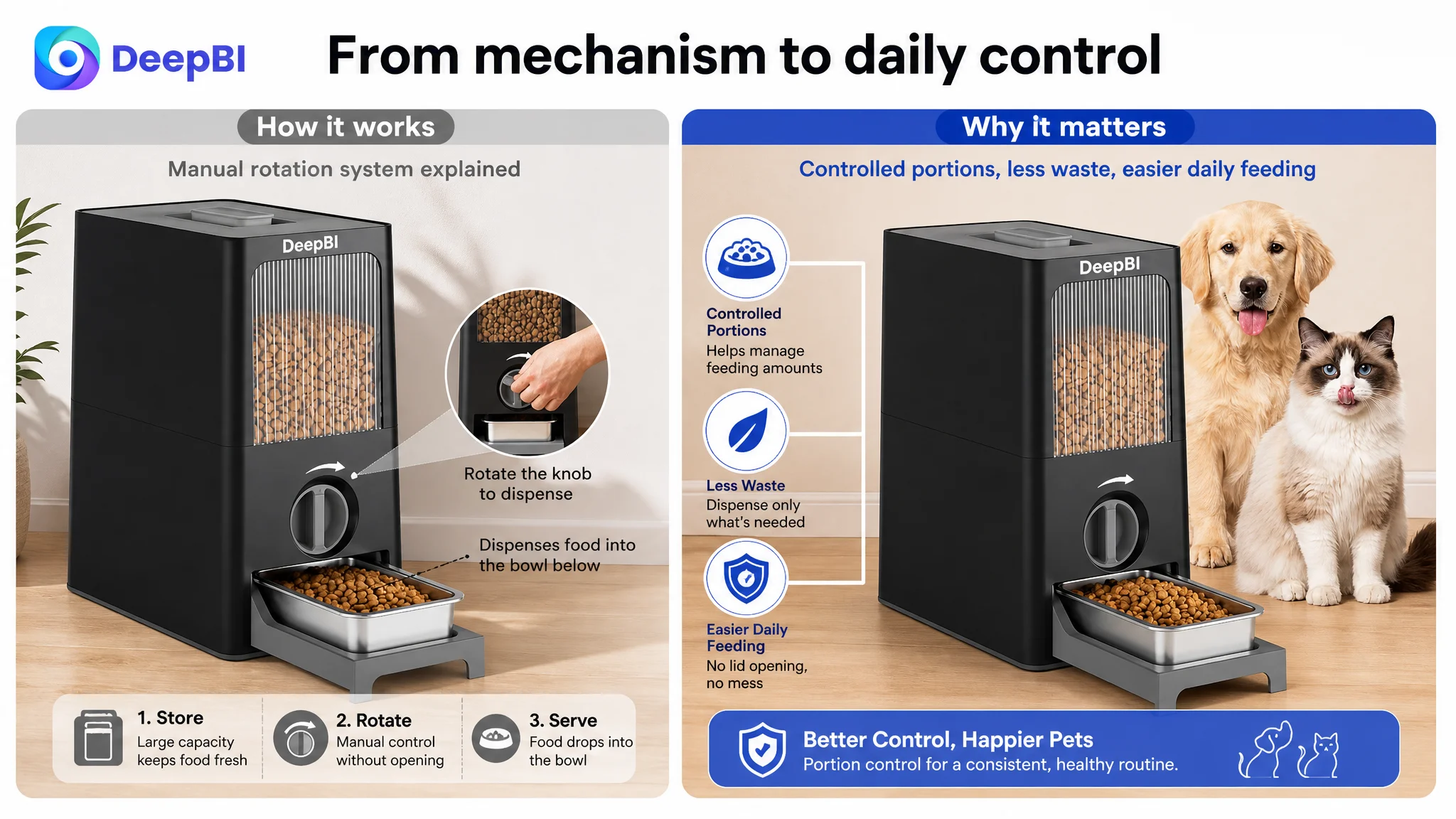
The third image showed how the rotation mechanism worked, but it emphasized operation rather than the reason for operation. The visual should connect manual dispensing to easier portion control and reduced overeating concerns without making unsupported health promises.
The fourth image contained the 304 stainless steel material signal, but it was not prominent enough in the sequence. Material trust needed to appear earlier and more clearly.
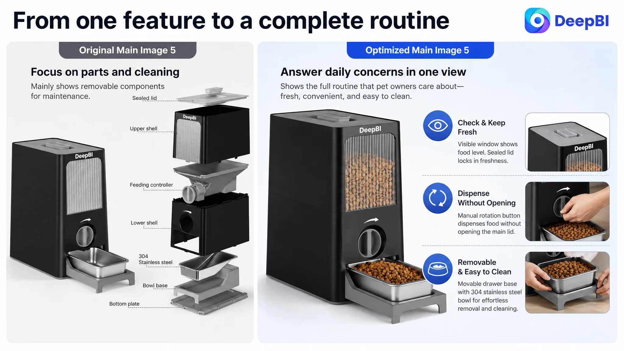
The fifth image focused on removability and cleaning. That was useful, but it could have closed the decision more effectively by combining the product’s everyday convenience points: visible food level, sealed top, dispensing without opening the lid, and a removable bowl.
The issue was not simply that the images needed to look better.
Each image needed a clearer job in the conversion sequence.
The Bullet Points Had Information, but Not Enough Buying Logic
The bullet points were scored 5 out of 10, compared with 7 for the comparable Listing.
The target copy emphasized the product’s functions:
- Two-in-one design
- Storage capacity
- Sealing
- Manual feeding
- Drawer-style base
The comparable Listing more consistently followed a problem-solution pattern:
- Plastic may absorb residue and create hygiene concerns; stainless steel offers a non-porous, odor-resistant alternative.
- Moisture and pests can affect dry food; airtight sealing helps protect freshness.
- A snap-on scoop and practical structure reduce daily feeding friction.
- Removable parts and smooth surfaces make cleaning easier.
DeepBI’s revised bullet strategy reorganized the product around the owner’s concerns rather than around the order in which the product was designed.
Material became a hygiene argument
The 304 stainless steel bowl was presented not merely as a material specification, but as part of a cleaner feeding environment. The copy also connected the bowl to BPA-free materials, non-porous surfaces, odor resistance, and easier maintenance.
The claim needed to stay within the product’s verified attributes. It did not require exaggerated health language. The goal was to make the material’s practical value easier to understand.
Capacity became a daily-use answer
The 7-pound capacity and 112-ounce equivalent gave shoppers a concrete basis for judging fit. The product was positioned for short-term storage needs rather than left as an abstract “large capacity” claim.
Airtight sealing became a freshness solution
The original sealing explanation focused on the mechanism. The revised logic emphasized the concern behind the mechanism: helping keep dry food protected from moisture, pests, and oxidation.
The point was not to imitate a competitor’s unsupported time-based proof. The source material specifically noted that the product could not claim the same 90-day comparison. Instead, the page needed to provide truthful, visible evidence of a tightly closed container and explain what that design was intended to accomplish.
Manual dispensing became portion control
The rotation button was reframed as a way to manage the amount dispensed without opening the main lid. This connected the mechanism to a daily feeding task and to the owner’s desire for more consistent portions.
The drawer base became a maintenance advantage
The movable base and detachable stainless steel bowl were presented as part of a complete cleaning and feeding routine, rather than as isolated structural details.
This reordering gave the bullet points a more coherent rhythm:
Concern → Product proof → Daily benefit
That structure was more likely to support conversion than a sequence of disconnected specifications.
The A+ Content Was Missing the Strongest Trust Anchors
The A+ content score was 21 out of 25, only two points below the comparable Listing. Again, the problem was not a complete absence of content.
The target page already included:
- A lifestyle introduction
- Feature icons
- Comparison imagery
- Material details
- A visible food-level window
- Cleaning demonstrations
- Multi-pet scenes
- Usage steps
The weakness was that the modules were not prioritized around the highest-risk objections.
The comparable Listing used a stronger trust sequence:
- Material comparison
- Structural callouts
- Functional detail panels
- Freshness evidence over time
- Multi-category compatibility
- Human-and-pet usage scenes
DeepBI identified three important gaps.
The page described freshness without proving enough of it
The visible window showed a feature, but did not establish why the food would remain protected. The module needed to connect the window and sealed lid to the actual concern of keeping kibble dry and suitable for longer storage.
The recommendation was not to invent a long-term test or imitate evidence the product did not have. It was to use the available product truth more effectively: show the sealed lid, explain the purpose of the airtight environment, and make the food-protection logic visually apparent.
The page showed use cases without enough structural explanation
The target A+ content relied more heavily on lifestyle scenes. Those scenes helped establish context, but they did not fully explain how the rotation mechanism, sealing structure, bowl, and drawer base worked together.
A higher-decision-cost shopper could still be left asking how the product operated in practice.
The revised direction therefore gave greater weight to:
- Structural callouts
- The manual rotation process
- The relationship between storage and dispensing
- The detachable bowl and drawer base
- The material and food-safety rationale
The page implied versatility without defining it clearly
Showing different pets suggested broad use, but did not explicitly clarify compatibility. The improved module needed to state the intended use for common dog and cat food formats and small-to-medium-sized pets, based on the product’s confirmed positioning.
This was a small but important distinction.
A visual scene creates an impression.
A clear compatibility statement reduces uncertainty.
The Zero-Review Gap Changed the Priority of the Entire Page
The largest score difference was in reviews.
The target Listing had no review data: no star rating, no review count, and no user-generated content on the first page. The comparable Listing had 10 reviews, an average rating of 3.9 stars, and several reviews with images or videos.
The comparable product did not have an especially high rating, but it had something the target Listing did not: evidence that real customers had purchased and used the product.
This created a structural trust disadvantage.
The content team could not solve the review gap through better copy alone. Nor should the page attempt to imply customer validation that did not exist. The practical response was to make every controllable trust signal stronger:
- Put the verified material specification where shoppers could see it early.
- State the capacity precisely.
- Explain the sealing purpose without overstating results.
- Show the actual dispensing process.
- Demonstrate removable and cleanable parts.
- Clarify the intended pet and food use cases.
- Replace generic lifestyle repetition with structure and evidence.
When reviews are absent, the Listing has less social proof available. That makes product proof more important, not less.
“A product page without reviews cannot afford to leave its other trust signals implicit.”
Why DeepBI Did Not Recommend Tuning Ads First
The case did not support treating advertising as the primary problem. The more defensible conclusion was that the Listing needed to become a stronger destination for any traffic it received.
Amazon ads can bring a shopper to the product page, but they cannot make a vague title precise, turn a feature list into a persuasive argument, or create review history. They can expose a weak page to more shoppers, but that does not repair the page’s underlying conversion logic.
In this case, the target Listing had a measurable content and trust gap before the ad funnel could be judged fairly.
The priority order was therefore:
1. Clarify the product’s category and core value in the title.
2. Make capacity, material, and dispensing benefits immediately understandable.
3. Rebuild the bullet points around pet-owner concerns.
4. Reorganize the A+ content around proof, structure, freshness, hygiene, and daily use.
5. Use the image sequence to remove objections in a deliberate order.
6. Only then evaluate whether paid traffic is being converted efficiently.
This sequence reduced the risk of using Amazon ads to amplify a page that still required shoppers to do too much interpretation.
The Revised Page Was Built Around a Stronger Proof Sequence
The optimization direction did not ask the product to become something else. It worked within the verified product structure and repositioned the available evidence.
The revised page logic was:
First: establish what the product is
The title and opening visual should immediately communicate that this is a pet food storage container with a manual feeder, not just another storage bin.
Next: remove capacity anxiety
The page should show the 7-pound or 112-ounce storage capacity and approximately 13-ounce bowl capacity early, allowing shoppers to judge suitability quickly.
Then: establish material and hygiene trust
The 304 stainless steel bowl, BPA-free materials, smooth surfaces, and detachable components should be presented as a coherent quality and maintenance story.
After that: demonstrate the mechanism
The manual rotation button should be shown as a simple way to dispense food without opening the main lid, while supporting portion management.
Finally: close with everyday convenience
The sealed lid, visible food level, removable bowl, drawer base, and cleaning process should work together to answer the question: will this make daily feeding easier?
This sequence was more commercially useful than simply adding more feature statements.
What Changed in the Business Understanding
The source material does not provide post-optimization CVR, ACOS, TACOS, organic-order, or keyword-ranking results. It would therefore be inaccurate to claim a confirmed performance lift.
What can be stated clearly is the change in operating diagnosis.
The seller’s problem was no longer framed as “the product needs more explanation” or “the images need to look more attractive.” It was reframed as a conversion-capacity problem across the Amazon Listing.
The page needed to:
- Match search intent earlier in the title
- Give the main images distinct decision roles
- Connect material to hygiene and maintenance
- Connect sealing to food protection
- Connect manual dispensing to portion control
- Connect the drawer base to daily cleaning
- Replace repeated scenarios with structural proof
- Compensate for the absence of reviews through stronger product evidence
That reframing also clarified the relationship between Listing optimization and Amazon ads.
Ads are useful when the page can receive traffic and convert it. But when the page lacks clarity and trust, more traffic can make the underlying weakness more visible without making the business more controllable.
“Before asking Amazon ads to scale the Listing, the team first had to decide whether the Listing had earned the right to receive more traffic.”
The Broader Lesson for Amazon Sellers
This pet food storage case is not mainly about stainless steel, feeding buttons, or drawer bases. Those are the product-specific details. The transferable lesson is how to diagnose an Amazon Listing when the page appears complete but still lacks persuasive power.
A page can contain:
- A title
- Five bullet points
- Multiple images
- A+ content
- Several product benefits
And still fail to answer the buyer’s most important questions in the right order.
The stronger diagnosis looks beyond whether an element exists. It asks what job that element is performing:
- Does the title identify the product quickly?
- Does the first image communicate the real differentiator?
- Does the next image reduce a concrete concern?
- Do the bullet points explain consequences, not just features?
- Does the A+ content provide evidence where the shopper is most uncertain?
- Does the page have enough trust to support paid traffic?
- If reviews are absent, are the remaining proof points doing enough work?
DeepBI’s value in this case was not a list of isolated content edits. It was the ability to compare the Listing against a relevant market benchmark, identify where the 13-point gap came from, and prioritize the conversion bottleneck instead of treating every weakness as equally urgent.
The final judgment was straightforward:
The Listing did not need more content for its own sake. It needed a clearer path from product identity to buyer confidence.
That is the foundation on which both organic Amazon traffic and paid traffic can become more useful.