

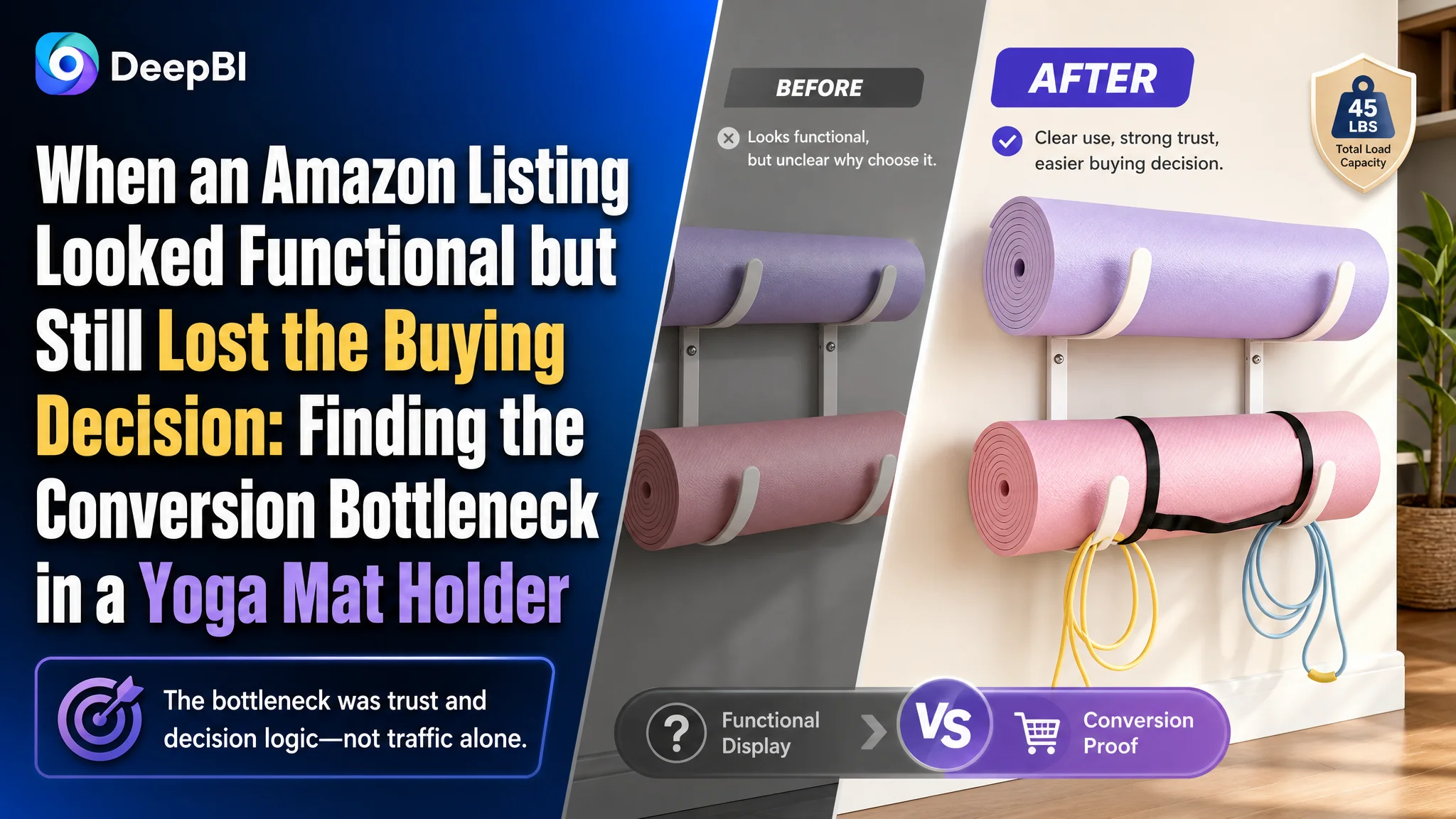
The customer was an Amazon US seller whose wall-mounted yoga mat holder Listing had a familiar problem: the product was clearly visible, the basic functions were present, and the page included several useful images, yet the Listing still lacked the persuasive force needed to turn browsing into buying.
The initial instinct was to improve individual assets—add keywords to the Amazon product title, emphasize materials, and make the images more informative. Those changes were reasonable, but they did not address the deeper issue. The page was describing a storage rack; it was not yet building a complete reason to trust, understand, and choose it.
DeepBI reframed the case around Listing conversion capacity. The core weakness was not that every visual element was poor. In fact, the main-image dimension scored above the benchmark. The larger gap was in the page’s decision logic: limited trust signals, incomplete product proof, weak pain-point storytelling, and no review base to support the purchase decision.
The later optimization therefore focused on the Amazon product page as a connected system—title, main-image sequence, bullet-point logic, detail modules, A+ storytelling, installation proof, material evidence, and compatibility information. The lesson for other Amazon sellers is direct: before sending more traffic to a Listing, first determine whether the page can convert that traffic with enough clarity and confidence.
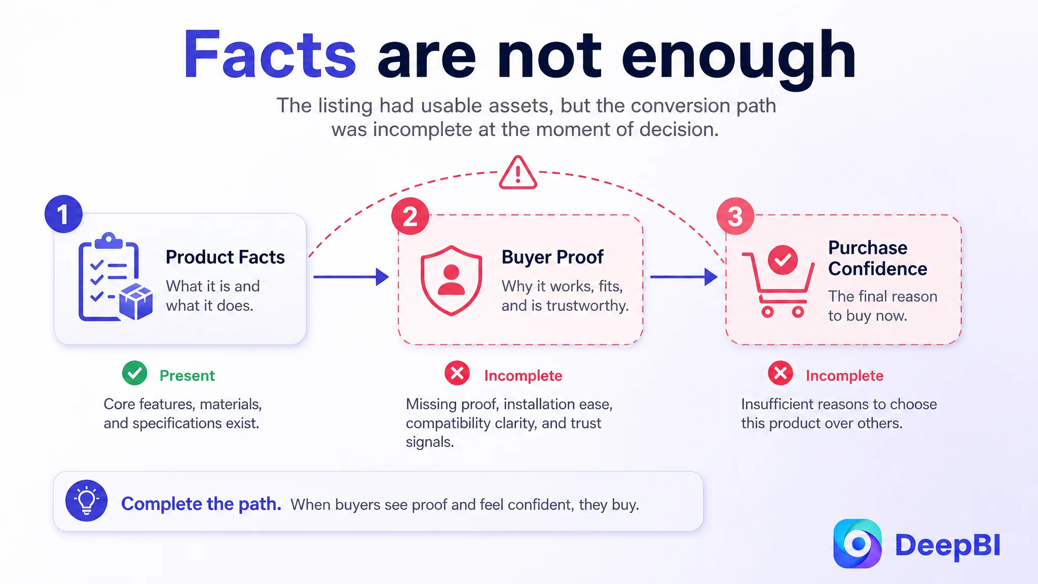
The Listing Was Not Empty. It Was Incomplete at the Moment of Decision.
The product was a wall-mounted storage rack designed for yoga mats, foam rollers, exercise mats, Pilates mats, and other home fitness equipment.
At first glance, the Listing had several usable assets:
- A clear product form
- Lifestyle images showing home fitness storage
- A white rubber coating positioned as a protective feature
- A semicircular structure designed to hold mats without straps
- Installation accessories
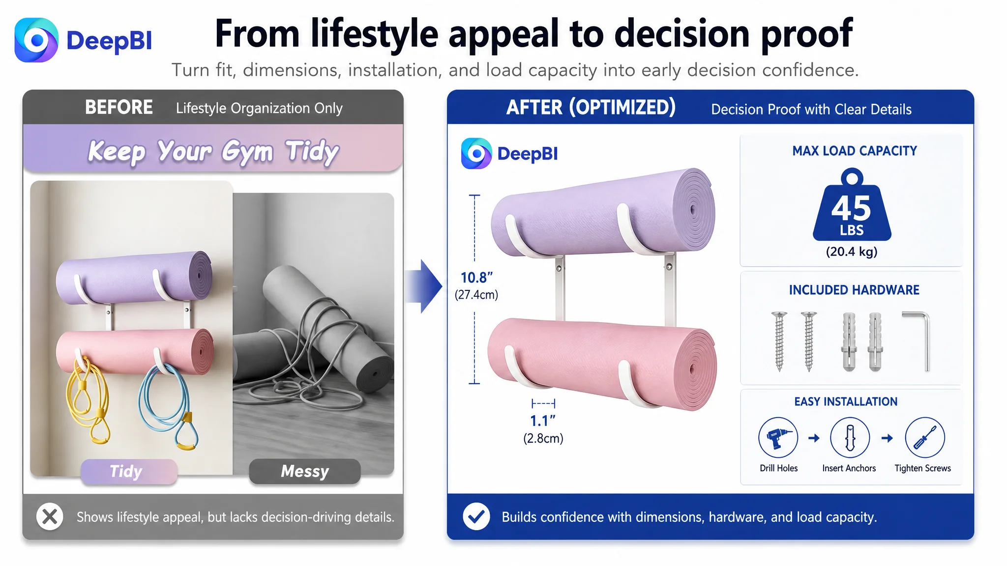
- A final image combining dimensions, accessories, and load capacity
This made the problem easy to misread.
The Listing did not look broken in the conventional sense. It contained product information. It included visual content. It communicated storage, installation, and material-related benefits.
But Amazon conversion does not depend on whether information exists somewhere on the page. It depends on whether the information appears in the right order, answers the buyer’s main concerns, and creates enough confidence to complete the purchase.
A product page can contain the right facts and still fail to create a convincing buying decision.
That distinction became important in this case.
The Customer Initially Looked at the Problem as an Asset-Level Optimization Task
The early direction focused on improving the visible components one by one:
- Strengthen the core keyword in the title
- Add material information
- Clarify the included hardware
- Show more equipment types
- Emphasize the product’s protective coating
- Improve installation communication
These were not wrong recommendations. They were simply not yet organized around the full Amazon buying journey.
The customer’s title was search-friendly because it opened with “Wall Mount Yoga Mat Holder.” However, compared with the benchmark Listing, it lacked several elements that helped shoppers make a faster judgment:
- A more specific product form such as “Yoga Mat Hanger”
- Adjustable-hook or storage-related language used by the benchmark
- Quantified size information
- Stronger installation reassurance
- More explicit material and trust language
- A clearer combination of product identity, use case, and buying reason
The issue was therefore not only keyword coverage. It was that the title mainly listed what the product was for, without communicating enough about why this particular holder deserved consideration.
The same pattern appeared in the bullet points. The original structure opened with convenient storage and continued through appearance, material, space optimization, and installation. The content was factual, but it did not consistently connect each feature to a buyer concern.
The benchmark followed a more persuasive sequence:
1. Durability and structural strength
2. Space-saving value
3. Adjustability and compatibility
4. Installation simplicity
5. Brand or service reassurance
The customer’s bullets began with function. The benchmark began with confidence.
That difference matters on Amazon, where shoppers often decide whether a product is worth further consideration before they have read every detail.
The Score Gap Showed Where the Page Was Losing Trust
DeepBI’s comparison produced a total score of 62 out of 100 for the customer’s Listing, compared with 78 for the benchmark.
The dimension breakdown was more useful than the total score itself:
- Title: Customer Listing: 15, Benchmark Listing: 17, Gap: -2
- Main image: Customer Listing: 25, Benchmark Listing: 21, Gap: +4
- Bullet points: Customer Listing: 6, Benchmark Listing: 8, Gap: -2
- Detail content: Customer Listing: 16, Benchmark Listing: 23, Gap: -7
- Reviews: Customer Listing: 0, Benchmark Listing: 9, Gap: -9
- Total: Customer Listing: 62, Benchmark Listing: 78, Gap: -16
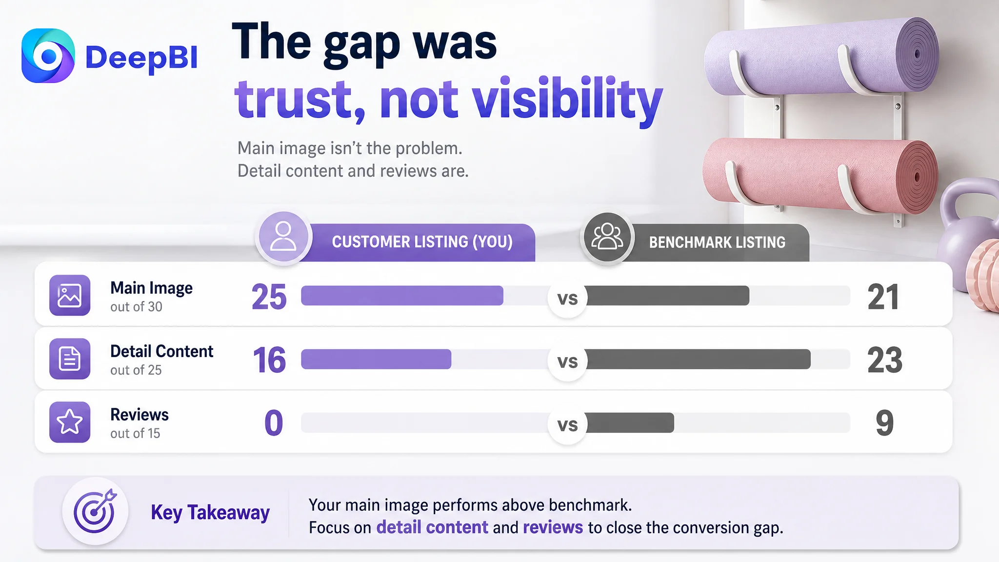
The first important judgment was that the main image was not the primary weakness.
The customer’s main-image dimension scored four points higher than the benchmark. Its lifestyle-oriented imagery better supported the home fitness storage context, and the later images integrated dimensions, accessories, and load capacity into a more complete product presentation.
That prevented a common misdiagnosis: blaming the images simply because the Listing was underperforming.
The most significant gaps were elsewhere:
- Detail content: seven points behind
- Reviews: nine points behind
- Title and bullet points: each two points behind
This shifted the diagnosis from “make the Listing look better” to “repair the trust and decision structure of the product page.”
The Real Constraint Was Listing Conversion Capacity
The review gap was especially severe.
The customer’s Listing had no rating data and no customer reviews on the homepage. The benchmark had 96 reviews, a 4.0-star rating, and 45 reviews visible on the first page, including image and video content. Its customers also mentioned installation convenience and durability—exactly the types of reassurance that matter for a wall-mounted storage product.
This did not mean the customer could solve the problem through reviews alone. Reviews cannot be created by page design. But the absence of reviews changed the burden placed on the rest of the Listing.
When social proof is limited, the product page must work harder through:
- Clearer specifications
- More convincing installation evidence
- Stronger material communication
- Better compatibility explanation
- More direct handling of failure concerns
- A more complete brand and service impression
- A+ content that makes the product feel reliable rather than generic
The detail-content gap made that burden even more difficult.
The customer’s page used a main scene image, selling-point images, and product images. The benchmark used a broader narrative structure:
- Brand positioning
- Application scenarios
- Structural and material evidence
- Installation guidance
- Trust and service reinforcement
The difference was not merely visual style. It was the number of buyer questions each page answered before checkout.
The Page Did Not Fully Explain How the Product Prevented Problems
For this category, shoppers are not only asking whether the rack can store a yoga mat.
They are also asking:
- Will the mat pop open?
- Will the equipment fall?
- Will the rack deform under load?
- Will the coating scratch the mat?
- Will the holder fit different equipment types?
- Is installation difficult?
- Are all the required accessories included?
- Will the finished setup make the workout space look better or more cluttered?
The existing Listing mentioned several relevant features, but the explanation was not always connected to these risks.
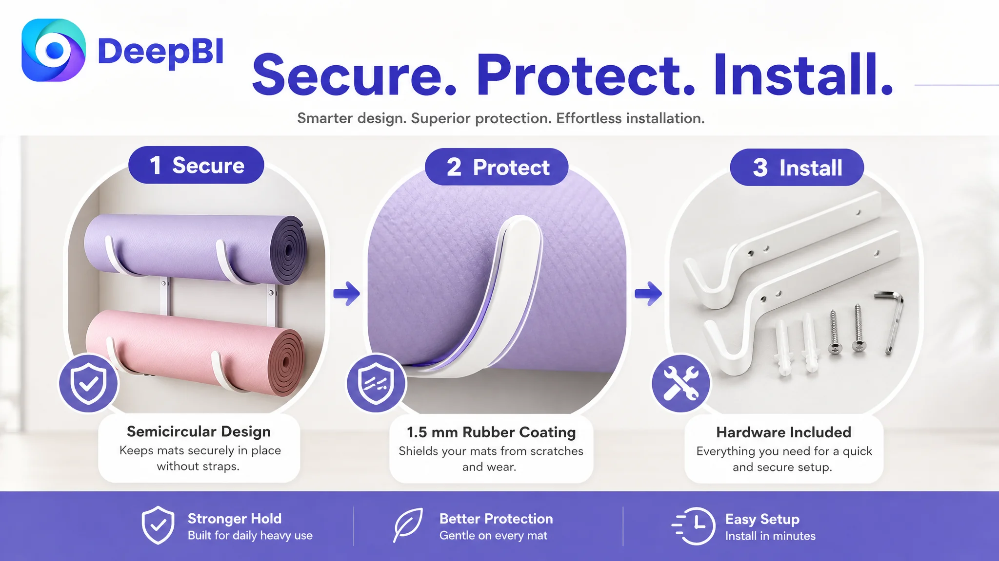
For example, the semicircular structure was an important differentiator. Its value was not simply that it looked different. It was designed to secure mats naturally without cumbersome straps and help prevent them from popping open.
That mechanism needed to be explained earlier and more visually.
Likewise, the rubber coating was not just a finish. Its commercial value was protection: reducing the risk of scratches and avoiding pressure marks on the stored mats. The detail page needed to show that relationship instead of leaving the buyer to infer it from a material label.
The same principle applied to the product’s load and material claims. A statement about Q325 carbon steel and deformation resistance becomes more persuasive when it is connected to the buyer’s concern about long-term, heavy-load use.
DeepBI’s diagnosis therefore treated each specification as part of a solution, not as isolated technical information.
The structure had to answer the falling-off concern first
The first detail module needed to show how the semicircular design keeps mats secured.
Simply listing “yoga mats” and “foam rollers” does not prove stability. The buyer needs to see the structure solving a recognizable problem.
The material needed to become evidence of reliability
The Q325 carbon steel claim and stated deformation-resistance advantage were most valuable when presented as support for heavy-duty, long-term use—not as disconnected engineering language.
The coating needed to protect the buyer’s existing equipment
The 1.5 mm white rubber coating could become a confidence point by showing scratch protection and a wider contact area that avoids mat indentations.
Compatibility needed to be visual and specific
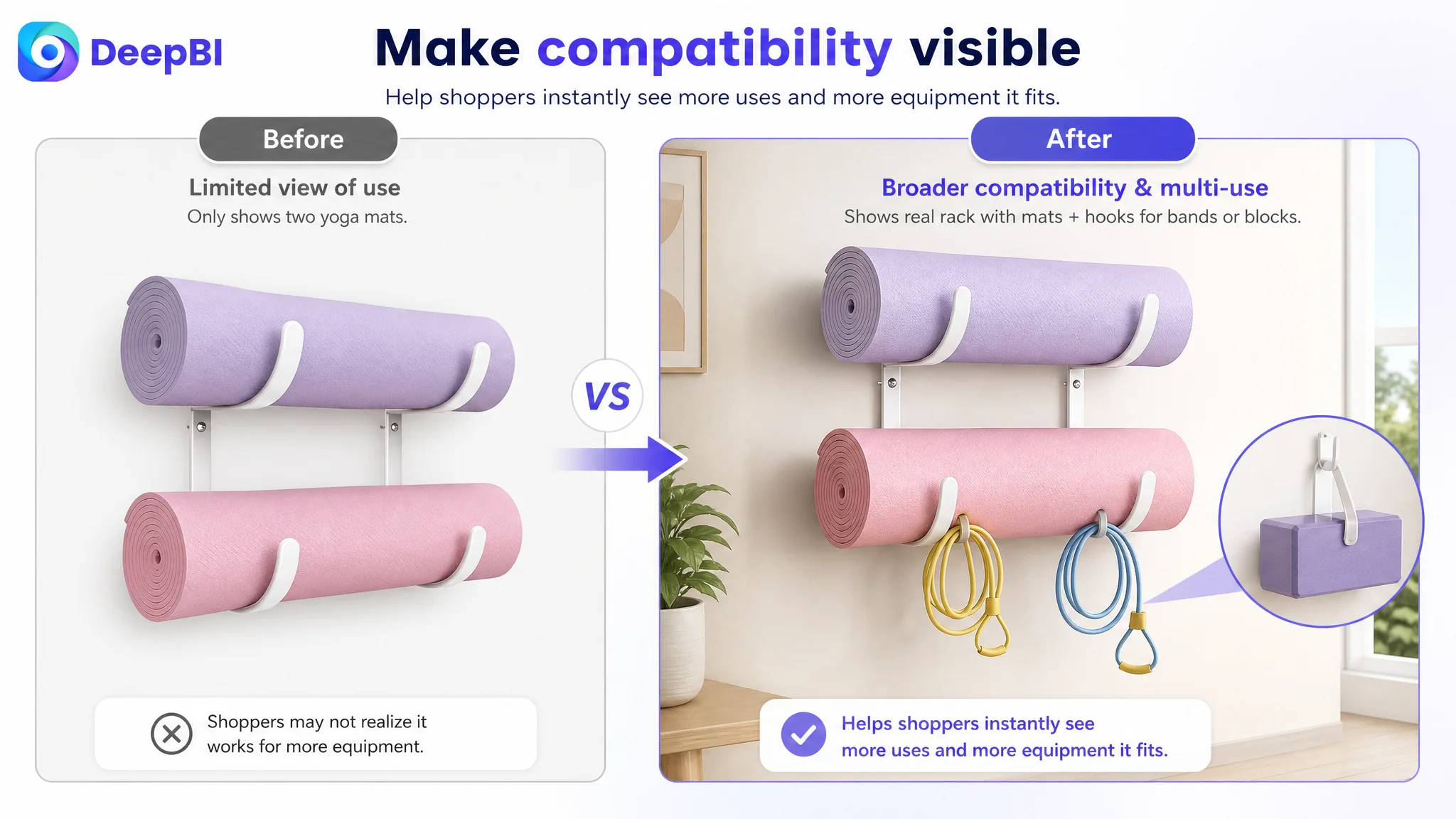
The page should identify confirmed use cases such as yoga mats, foam rollers, exercise mats, Pilates mats, and hanging home fitness equipment. A generic “multi-use” claim leaves too much room for uncertainty.
Why DeepBI Did Not Keep Tuning the Amazon Ads First
The case material does not provide post-optimization advertising metrics, so it would be inaccurate to claim a specific ACOS reduction, CVR increase, or organic-order recovery.
The business logic is still clear.
If an Amazon Listing has weak trust content and incomplete product proof, sending more paid traffic to it can increase exposure without resolving the reason shoppers hesitate. Advertising may bring the shopper to the product page, but the page must then answer the buyer’s practical and emotional questions.
This is why Listing conversion had to be addressed before treating traffic expansion as the main solution.
Advertising can deliver the visit. It cannot make an incomplete product page feel complete.
The greatest risk at this stage was not simply wasted spend. It was allowing traffic to amplify a page that had not yet established enough confidence.
A better decision order was:
1. Identify whether the product page could explain the product clearly
2. Repair the most important trust and decision gaps
3. Make the image sequence follow the buyer’s questions
4. Rebuild the title and bullets around benefits and proof
5. Strengthen detail content and A+ storytelling
6. Then evaluate how paid and organic traffic respond
This order also explains why the main image should not be changed indiscriminately. Since the customer’s main-image score was already stronger than the benchmark’s, the objective was not to replace every image with a more industrial or information-heavy style.
The better direction was selective refinement.
The Main-Image Sequence Needed to Guide the Buyer
The existing visual assets had useful strengths, but the browsing order did not fully support the decision path.
The recommended sequence moved toward:
Fit confirmation → multi-use proof → protection and strength → installation → load reassurance
That sequence addresses the most immediate questions in a practical order.
First, make the product’s broader use easier to recognize
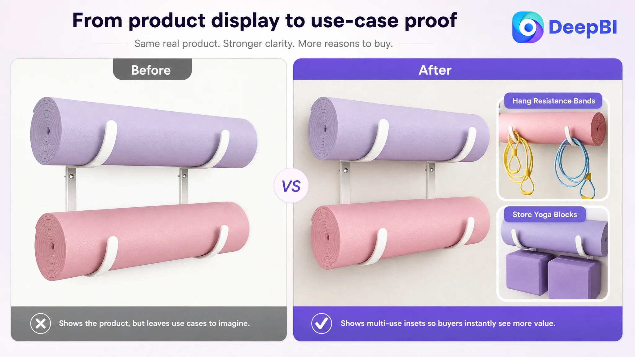
The opening image should preserve product clarity while suggesting that the holder is not limited to a single type of mat. A restrained functional inset or clear visual cue could show other confirmed equipment uses without overcrowding the image.
Next, bring dimensions forward
The detailed size specifications were positioned too late. Moving them earlier would help buyers confirm fit before investing more attention in the page.
Then, show the equipment range
A dedicated image should visibly demonstrate confirmed use cases such as yoga mats, foam rollers, exercise mats, Pilates mats, and other supported home fitness equipment.
This is stronger than placing a list of equipment names beside a single product image.
After that, explain protection and durability
The Q325 carbon steel construction, deformation-resistance claim, white rubber coating, scratch protection, and wider contact area should be shown as a connected proof system.
Finally, simplify installation and confirm load capacity
The installation diagram and included accessories should connect directly to the finished result: a stable, organized storage solution that supports up to 45 pounds.
The goal was not to add more information everywhere. It was to make the existing information appear when the buyer was most likely to need it.
The Bullet Points Needed a Buying Logic, Not More Specifications
The five bullet points required a similar reordering.
The recommended structure converted each point into a small problem-and-solution unit.
A safer way to store mats
The semicircular curved structure should lead with the outcome: mats stay secured without straps and are easier to store and retrieve.
Strength for repeated use
The Q325 carbon steel construction and stated deformation resistance should explain why the rack is suitable for long-term use in home gyms or professional fitness spaces.
Protection for the equipment being stored
The white rubber coating should be framed as protection against scratches and indentations, not only as an aesthetic difference from a black powder finish.
A cleaner fitness environment
The wall-mounted design should connect organization with the buyer’s environment: less floor clutter, a more professional workout area, and a more considered appearance.
Installation without unnecessary uncertainty
The final point should make the setup process concrete by confirming that the necessary mounting hardware is included and that installation can be completed in a few minutes.
This sequence allows the bullets to do more than repeat the images. It gives the shopper a reason to keep reading.
The Detail Page Needed a Complete Story
The largest content gap was in the detail and A+ area.
The customer’s page communicated basic features, but it lacked the narrative depth of the benchmark. The recommended direction was to build a progression from concern to proof:
1. Explain how the semicircular structure prevents mats from popping open
2. Demonstrate strength and load support
3. Show the protective coating in contact with the equipment
4. Clarify supported equipment types
5. Present the storage benefit as a cleaner, more attractive fitness space
6. Make installation steps transparent
7. Close with use occasions and gifting relevance for fitness lovers
This sequence matters because the buyer’s decision is cumulative.
A single feature rarely creates enough confidence. The buyer needs to move from:
- “What is this?”
- “Will it fit my equipment?”
- “Will it stay secure?”
- “Will it hold up?”
- “Will it damage my mat?”
- “Can I install it?”
- “Will it improve my space?”
The improved A+ direction also needed to provide a stronger identity for the product. The benchmark used brand presence, manufacturing claims, and service reassurance. The customer’s page had little brand exposure and no comparable trust layer.
Where verified brand or service information is available, that material can help complete the final stage of the decision. Where it is not available, the page should not imitate unsupported claims. The priority is to build trust from accurate product evidence rather than add decorative promises.
This Was a Judgment Problem Before It Was a Copywriting Problem
The value of DeepBI in this case was not the ability to produce a new title or rewrite five bullets in isolation.
The more important contribution was identifying which weaknesses mattered most at the current stage.
A superficial review might have concluded:
- The title needs more keywords
- The images need a different style
- The bullets need stronger wording
- The competitor has better branding
- More reviews are needed
Those observations are individually true but strategically incomplete.
The scored comparison created a more useful evidence chain:
- The main image was not the central deficit
- The title and bullets needed refinement, but were not the largest gaps
- Detail content was substantially behind the benchmark
- Reviews created a major trust disadvantage
- The page needed to compensate through clearer proof and stronger decision sequencing
That is the difference between editing assets and diagnosing a Listing.
DeepBI’s role was to compare the customer’s page with a genuinely relevant benchmark, separate strengths from weaknesses, and translate the gaps into specific changes that could be executed without altering the product’s real structure or unsupported attributes.
What Changed in the Business Understanding
The case did not include confirmed post-optimization performance data, so the outcome should not be described as a measured ACOS or CVR success.
The more defensible result is a change in operating direction.
The customer’s team gained a clearer understanding that:
- Amazon ads cannot solve every product-page conversion problem
- A page with traffic still needs sufficient conversion capacity
- The main image should not be blamed when the larger gap is in trust and detail content
- Title structure must balance search visibility with a clear reason to choose
- Bullet points should connect features to buyer concerns
- A+ content should provide proof, not just visual decoration
- Reviews are part of the conversion environment, even when they cannot be replaced by content optimization
- Before increasing traffic, the team must ask whether the Listing deserves more traffic
For this yoga mat holder, the next stage was therefore not “make everything more attractive.”
It was to make the product page more decisive.
The rack needed to be understood quickly, its structure needed to be trusted, its use cases needed to be confirmed, its installation needed to feel manageable, and its value needed to extend beyond simply holding a mat.
That is where Amazon Listing optimization becomes business diagnosis: not changing every element, but finding the constraint that prevents the rest of the store’s effort from producing its intended result.