

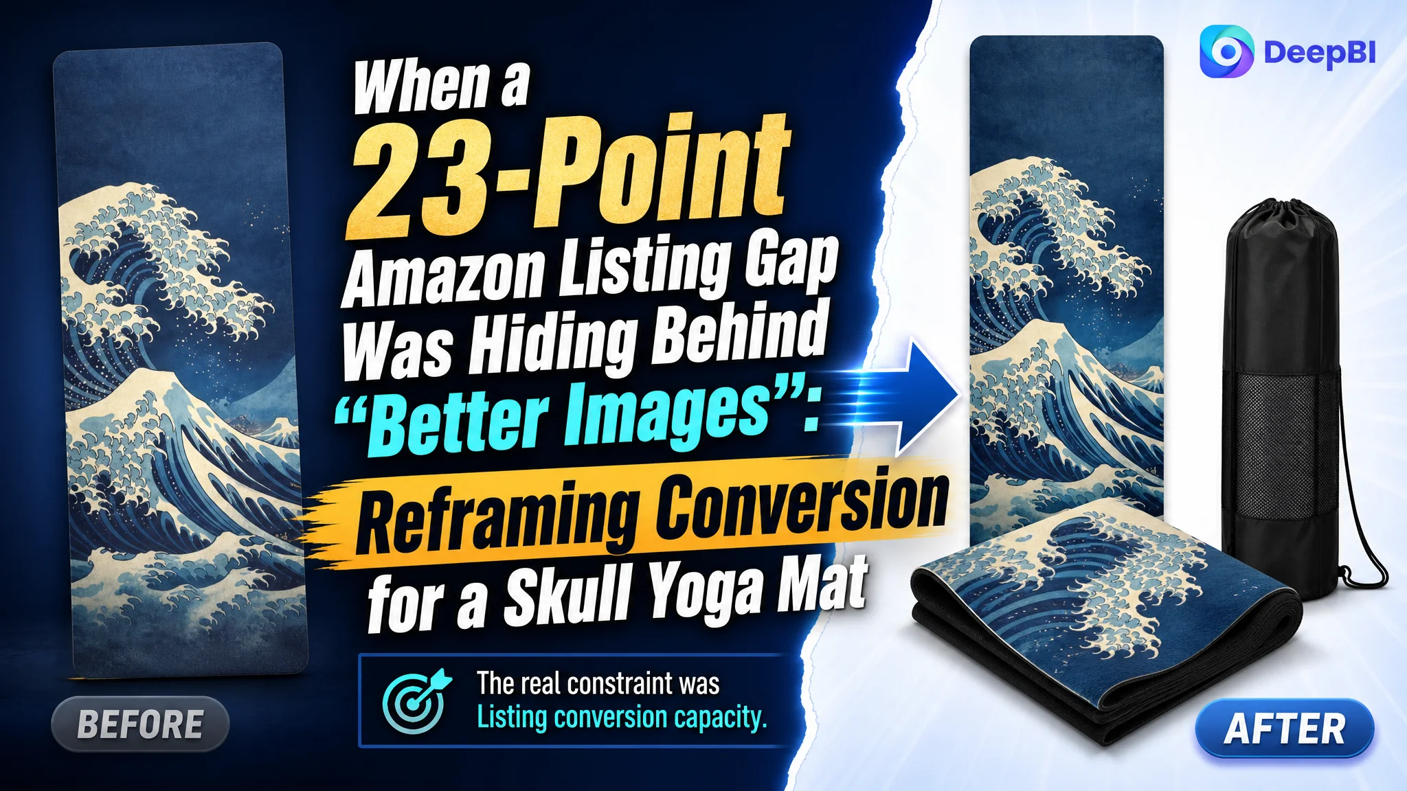
An Amazon seller in the yoga and fitness category was facing a familiar product-page problem: the Listing had traffic potential, but the page was not giving shoppers enough reasons to trust the product and continue toward purchase. The initial direction leaned toward improving visual appeal and following the structure of a stronger competing Listing.
DeepBI’s diagnosis pointed somewhere more specific. The main image was not simply “bad,” and the Listing did not lack product information. The deeper issue was that the page did not build a complete buying logic around a very thin, portable yoga mat. Its material benefits, sweat-activated grip, machine-washable design, and included carrying bag were present in fragments, but not presented as clear purchase reasons.
The later optimization therefore focused on conversion architecture across the Amazon product page: clarify the product type and use case earlier, make the 1mm thickness understandable, visualize the suede-and-natural-rubber structure, strengthen the carrying-bag value, and add A+ content that could turn functional claims into credible proof.
For other Amazon sellers, the case offers a useful reminder: when paid traffic is not converting, the answer is not always more ad adjustments or more attractive creative. Before sending additional traffic to an Amazon Listing, the page must be able to explain what the product is, why its unusual attributes matter, and why the shopper should believe the claims.
The Amazon Listing Had Information. It Did Not Yet Have a Persuasive Sequence.
The target product was a 71-by-26-inch, 1mm yoga mat with a suede surface, a natural rubber base, a foldable design, and a carrying bag.
On paper, it had several identifiable selling points:
- A skull-inspired design
- A very thin and portable form
- Sweat absorption from the suede surface
- Grip support from the natural rubber backing
- A foldable structure
- Machine-washable maintenance
- Use on its own or with a thicker mat
The problem was not a complete absence of value. The problem was the order and strength in which that value appeared on the Amazon product page.
The Listing received a total score of 54 out of 100, while a comparable high-performing Listing scored 77. That 23-point difference initially suggested a broad performance gap across the page. A closer look showed that the gap was concentrated in one place.
- Title: Target Listing: 14/20, Comparable Listing: 16/20, Gap: -2
- Main image: Target Listing: 25/30, Comparable Listing: 23/30, Gap: +2
- Bullet points: Target Listing: 6/10, Comparable Listing: 8/10, Gap: -2
- Detail page: Target Listing: 3/25, Comparable Listing: 23/25, Gap: -20
- Reviews: Target Listing: 6/15, Comparable Listing: 7/15, Gap: -1
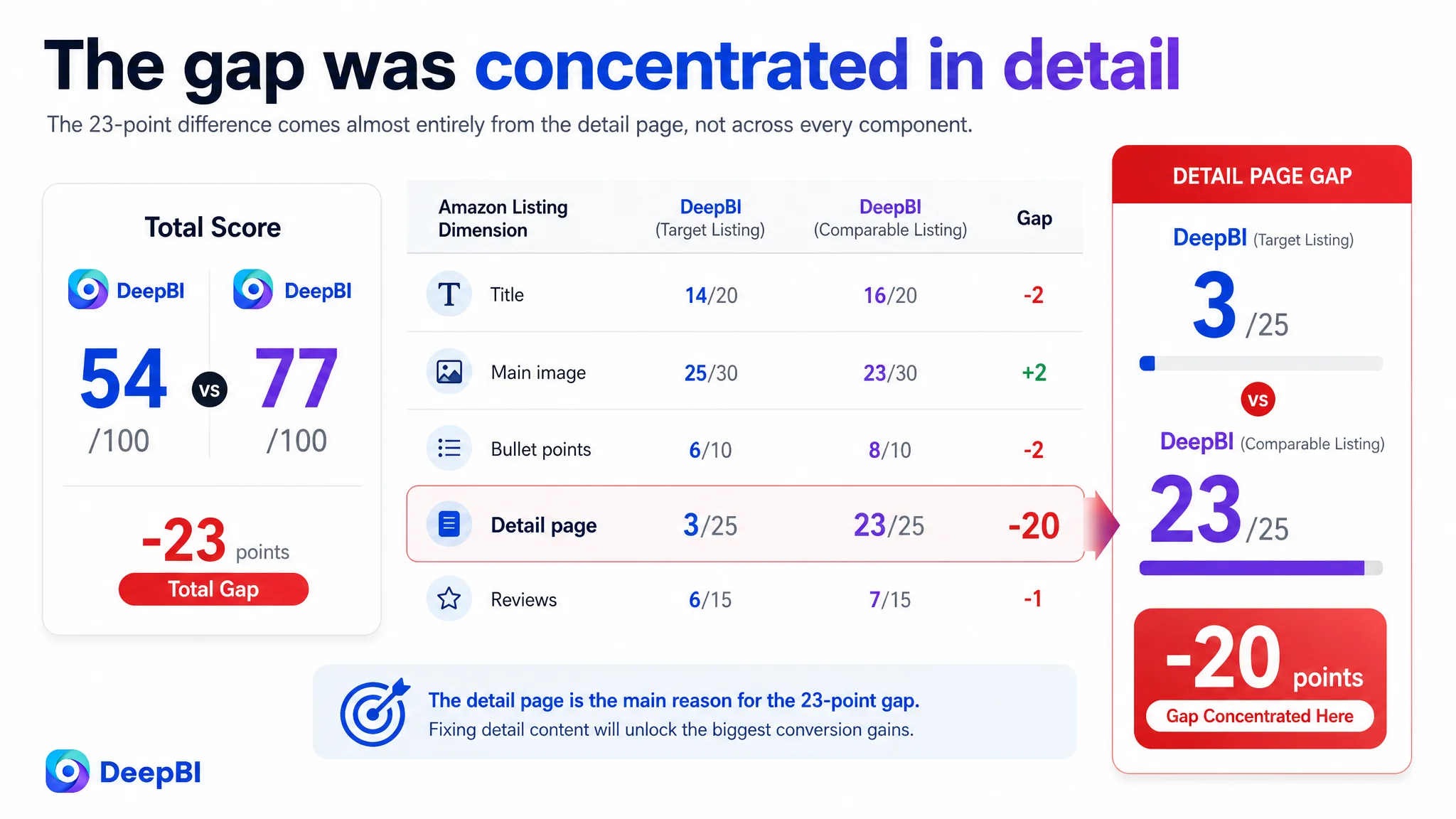
The most important finding was not that every component needed to be rebuilt.
It was that the detail-page score was only 3 out of 25, compared with 23 out of 25 for the comparable Listing.
The page was not losing because one isolated element was imperfect. It was losing because the product’s selling logic stopped before the shopper received enough proof.
The Initial Direction Was “Make the Creative Better”
The customer’s Listing had an artistic visual style. That created aesthetic interest, but it also introduced uncertainty at the first point of contact.
A shopper scanning Amazon search results could reasonably ask:
- Is this a standard cushioned yoga mat?
- Is it closer to a thin towel-style mat?
- Is the 1mm thickness intentional or a limitation?
- Is it designed for travel, hot yoga, home workouts, or layering?
- Does it include a useful carrying solution?
The original image direction emphasized decoration before function. Some supporting images also followed a familiar competitor-style split structure, focusing on material safety or general anti-slip claims.
That created two risks.
First, the product type was not immediately obvious enough. A visually distinctive skull design could attract attention, but attention without quick functional confirmation can increase hesitation rather than improve the click.
Second, the page was beginning to imitate the competitor’s presentation without fully explaining the target product’s own advantages. A 1mm mat should not be positioned as a thick, cushioned support surface. Experienced buyers understand that thinness implies a different use case: portability, storage convenience, travel, or use over another mat.
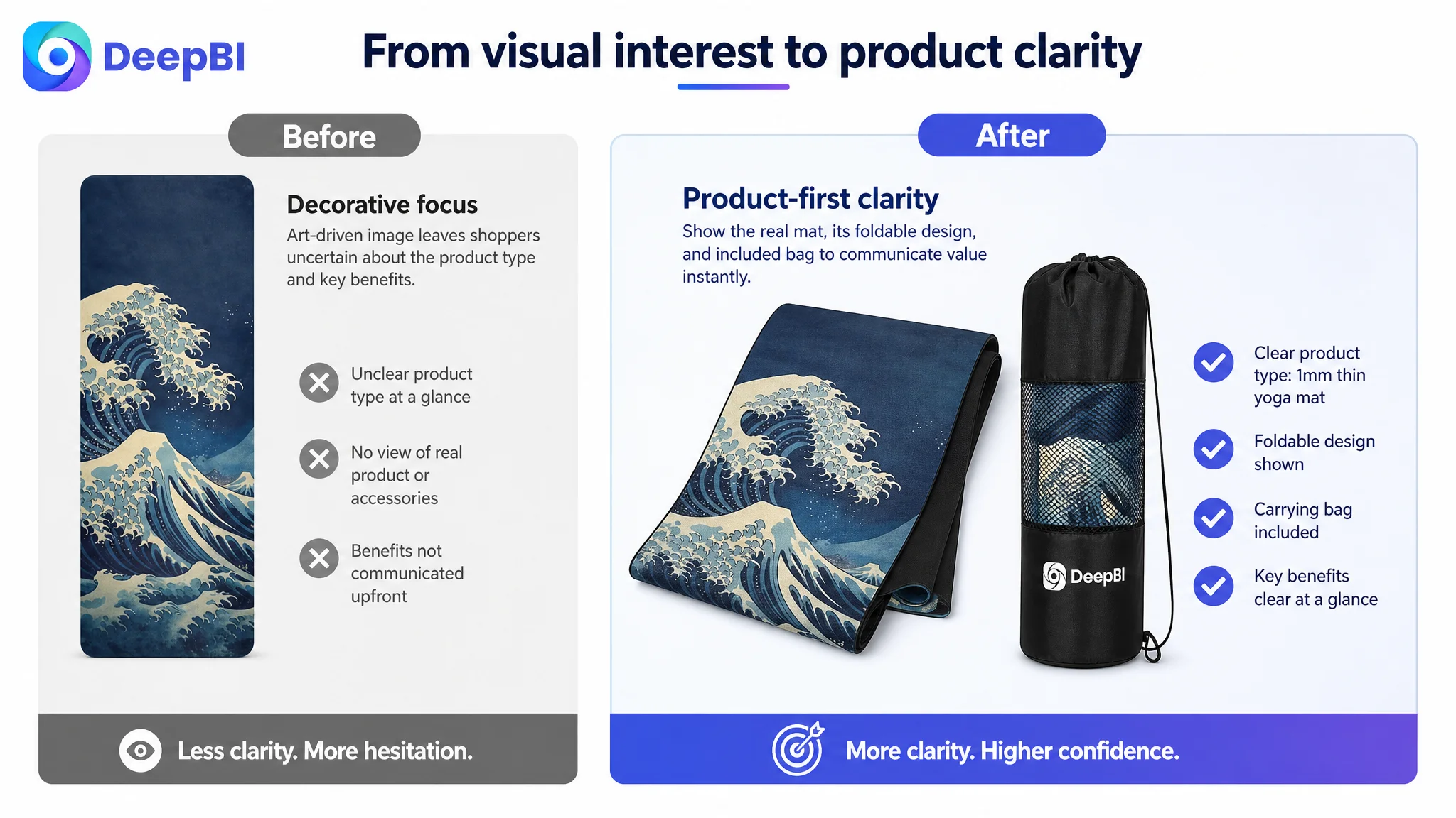
The issue was therefore not simply “the images are unattractive.”
It was that the images and copy were not helping shoppers interpret the product correctly.
The Data Showed That the Real Constraint Was Listing Conversion Capacity
The title and bullet points had gaps, but they were relatively limited.
The title scored 14 versus 16. It placed “Yoga Mat” early, which supported basic category recognition, but it did not connect the skull design to a meaningful product position. “1mm Thick” appeared as a parameter, without explaining why that thinness could be useful. The title also lacked some valuable context around natural rubber, home workouts, gym use, and stretching.
The bullet points scored 6 versus 8. They described materials and functions, but mostly in an instruction-manual style:
- Material first
- Function listed separately
- Portability mentioned without a concrete scenario
- The carrying bag treated as an accessory rather than part of the solution
- Sweat absorption and anti-slip performance stated without a clear cause-and-effect explanation
The comparable Listing took a different approach. It began with a buyer concern, explained how the product addressed it, and then connected the feature to a practical outcome.
For example, “anti-slip” was not left as a standalone claim. The page built a sequence around concern, mechanism, and confidence during exercise. Portability was not just described as “foldable”; it was connected to backpacks, handbags, and a carrying bag.
Those were meaningful differences, but they still did not explain the full 23-point gap.
The decisive abnormality was the detail page.
The target Listing relied on text description without A+ modules. The comparable Listing used a fuller visual system that included:
- A brand and lifestyle introduction
- Size and function confirmation
- A care guide
- A material structure explanation
- A grip-performance explanation
- Pattern and design presentation
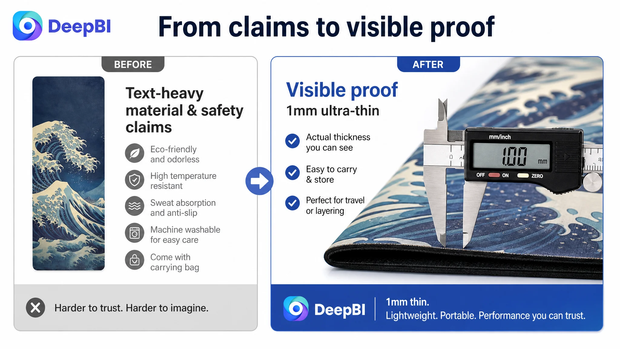
This difference mattered because the product had several attributes that required interpretation.
A shopper does not automatically know whether 1mm thickness is a benefit. They do not automatically understand how a suede top and natural rubber base work together. They may also question whether a thin mat is difficult to clean, easy to carry, or durable enough for repeated use.
Without visual explanation, the Amazon product page asked the shopper to do too much reasoning alone.
The Main Image Was Not Just a Visual Issue
The main image did have a conversion concern, but not because its aesthetic quality was objectively lower. In fact, it scored 25 out of 30, two points higher than the comparable Listing.
That result was important. It prevented a simplistic conclusion that the product only needed a prettier image.
The deeper concern was functional recognition.
The artistic treatment created visual interest but did not sufficiently confirm the product’s category, thinness, portability, or total value. A shopper might notice the skull pattern before understanding what made this yoga mat worth choosing.
The better direction was to shift from aesthetic-first to function-and-value-first communication.
That meant making the visual sequence answer practical questions earlier:
- What kind of product is this?
- How thin is it?
- What does the thinness enable?
- How does the mat grip?
- What materials create that experience?
- How does the carrying bag make portability easier?
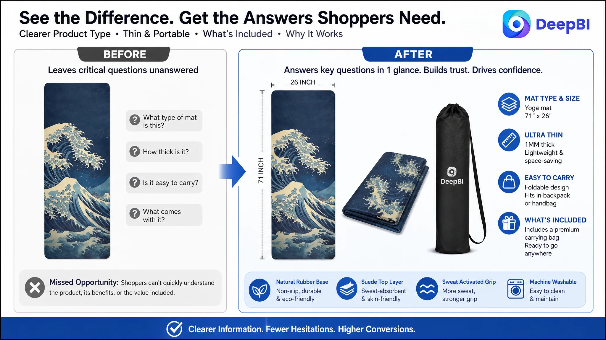
The 1mm specification also needed to be handled carefully. It should not be presented as though it provides cushioning comparable to a thick mat. That would create a credibility problem.
Instead, the page could frame the thinness around:
- Easy folding
- Compact storage
- Travel use
- Use independently for certain practices
- Use as a hygienic layer over a thicker mat
- Lightweight movement between home, gym, studio, and outdoor settings
This is a critical Amazon Listing principle: an unusual specification should not be hidden, but it should be given a clear job in the product story.
The Bullet Points Needed to Move From Features to Buying Logic
The bullet points were not empty. They were incomplete as persuasion.
The revised direction addressed that by giving each point a more defined role.
The first concern was stability
Instead of opening with a material description, the first bullet should begin with the shopper’s concern about slipping and then connect the solution to the natural rubber base and irregular texture.
The value is not merely that the mat has a textured underside. The value is greater stability and confidence during movement.
The second concern was sweat during practice
The suede surface needed more than a “soft and skin-friendly” description. The page should explain its role in absorbing sweat and supporting friction during intense sessions.
That cause-and-effect relationship gives the material a reason to exist in the customer’s mind.
The third concern was whether 1mm was too thin
The page should acknowledge the specification directly and reposition it around flexibility. A thin mat can work independently for travel-oriented practice or be paired with a thicker mat when additional cushioning is preferred.
This does not turn a limitation into an exaggerated promise. It clarifies the intended use.
The fourth concern was portability
“Foldable” is a feature. “Fits into a backpack or handbag and comes with a dedicated carrying bag” is a use case.
The carrying bag was especially important because it completed the portability solution. Leaving it as a minor accessory weakened the value of the product package.
The fifth concern was maintenance
The target Listing had an opportunity that should have been placed much earlier: machine-washable care.
The comparable Listing invested in a manual care guide. The target product could differentiate through a simpler maintenance message, supported by clear precautions. That benefit directly reduces a practical ownership concern and belongs in the conversion story, not at the bottom of an undifferentiated specification list.
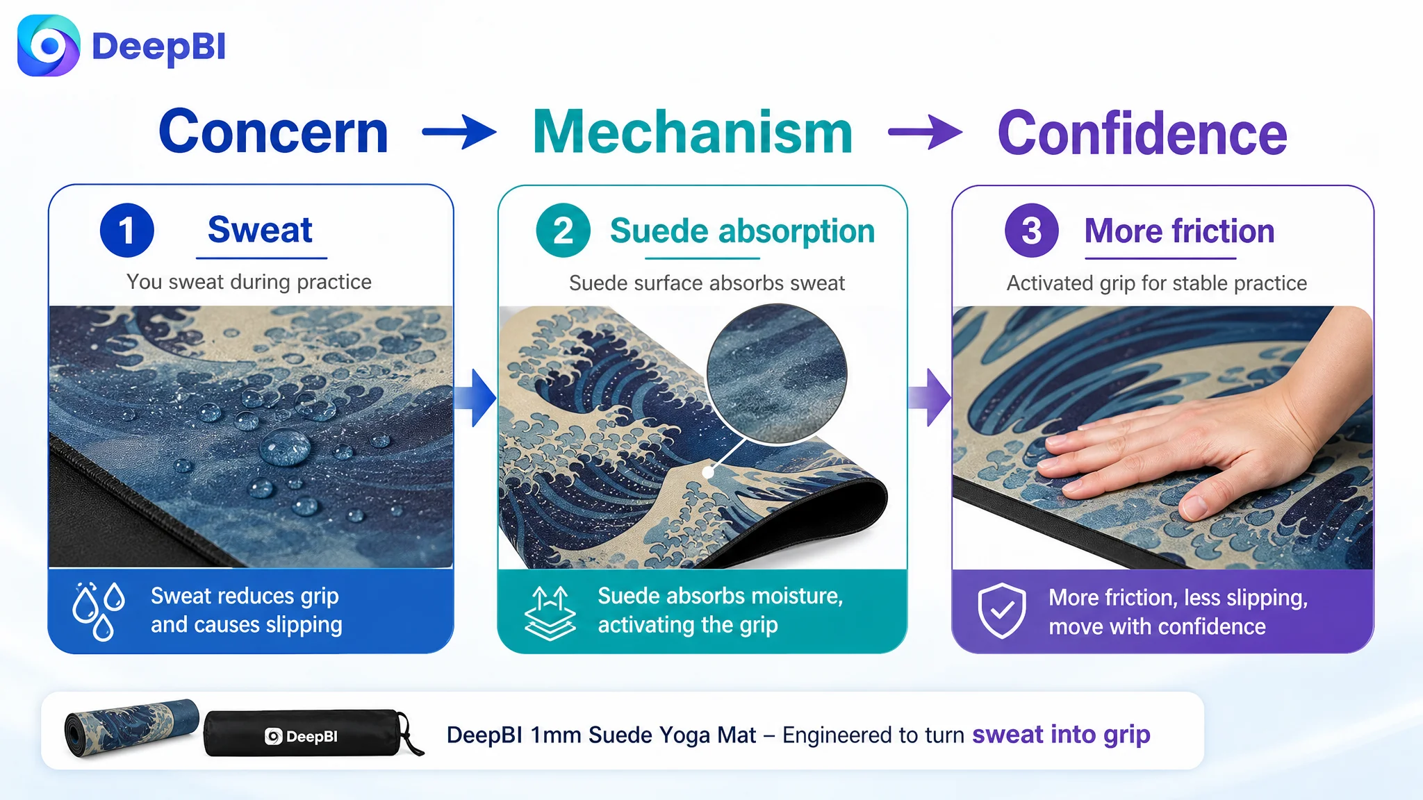
A bullet point should not only tell shoppers what the product has. It should explain why that feature changes the ownership or exercise experience.
Missing A+ Content Removed the Final Layer of Trust
The largest conversion leak was the absence of A+ content.
The basic title and bullets could introduce the product, but they could not fully demonstrate the relationship between design, materials, portability, performance, and care.
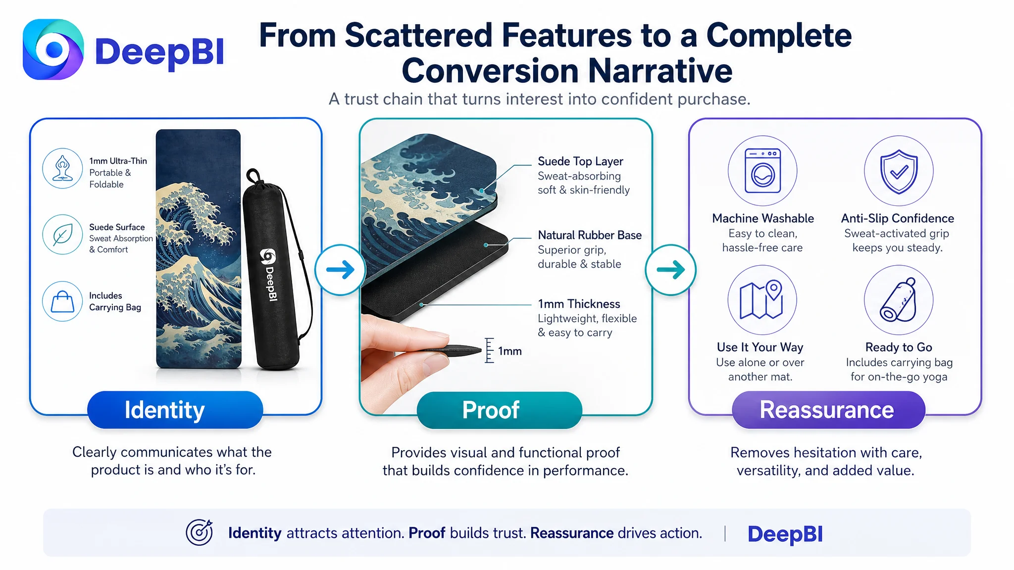
For this yoga mat, A+ content needed to function as a sequence of trust-building answers.
Start with identity and use
The first module should combine the skull design with a serious yoga practice. The product needs to be recognized as a real yoga mat for women and men, not only as a decorative graphic product.
Confirm dimensions and included value
The next module should make the 71-by-26-inch dimensions visible and show the included carrying bag. This reduces uncertainty around size, storage, and what arrives in the package.
Address maintenance early
A machine-washable message, supported by simple visual steps and care precautions, can reduce concern about sweat, cleanliness, and long-term upkeep.
Explain the material structure
A visual cross-section or clear callout should show the role of each surface:
- Suede surface for softness and sweat absorption
- Natural rubber base for grip and stability
This makes the performance claim easier to believe than repeated text alone.
Demonstrate sweat-activated grip logic
The page should connect sweat absorption with increased friction during practice. The goal is not to make a vague technical claim, but to show why the surface is relevant for sweaty sessions.
Clarify the role of 1mm thickness
The page should present thinness as a portability and versatility feature, including independent use or pairing with a thicker mat.
Close with total value
The final module should bring together the skull design, natural rubber quality, grip support, durability, portability, and maintenance convenience. It should leave the shopper with a coherent answer to one question:
Why this mat, rather than another thin mat with a different pattern?
Why DeepBI Did Not Recommend Tuning Ads First
No amount of additional traffic can compensate for a page that leaves basic purchase questions unanswered.
That was the key decision point in this case.
The Listing was not primarily suffering from a missing keyword or a single weak image. It had a structural conversion problem: the Amazon product page did not sufficiently connect the product’s attributes to the buyer’s decision.
Continuing to focus first on ad adjustments would have created a business risk. More paid traffic could simply send more shoppers to a page that:
- Did not clearly frame 1mm thickness
- Did not visualize material performance
- Did not highlight the carrying bag strongly enough
- Did not explain maintenance convenience
- Did not provide A+ content to reinforce trust
- Did not fully resolve concerns reflected in the reviews
The review data reinforced this concern. The target Listing had a 3.5-star rating from 20 reviews, while the comparable Listing had a 3.8-star rating from 16 reviews. Review volume was low for both, but the target Listing faced a weaker trust position. On the target Listing’s first-page reviews, half were three stars or below, with recurring concerns around thinness, slipping, and a low-cost impression.
These concerns could not be solved by changing bids.
They had to be answered by making the product’s real use case clearer and by presenting its actual materials and functions more convincingly.
Advertising can amplify a strong page, but it can also amplify unresolved doubts.
The Optimization Direction Became More Specific, Not More Decorative
The revised strategy was not to copy the comparable Listing’s layout. It was to learn from the logic behind its stronger conversion path while preserving the target product’s own attributes.
That distinction matters.
The optimization focused on:
- Rewriting the title around natural rubber, non-slip performance, 1mm thickness, relevant exercise scenarios, and the carrying bag
- Moving thinness and portability closer to the beginning of the visual sequence
- Showing the suede surface and natural rubber base as a coordinated system
- Presenting grip as a functional outcome rather than a generic label
- Making machine washing a visible ownership benefit
- Showing the carrying bag as part of the complete portability solution
- Building A+ modules around identity, proof, mechanism, care, versatility, and final value confirmation
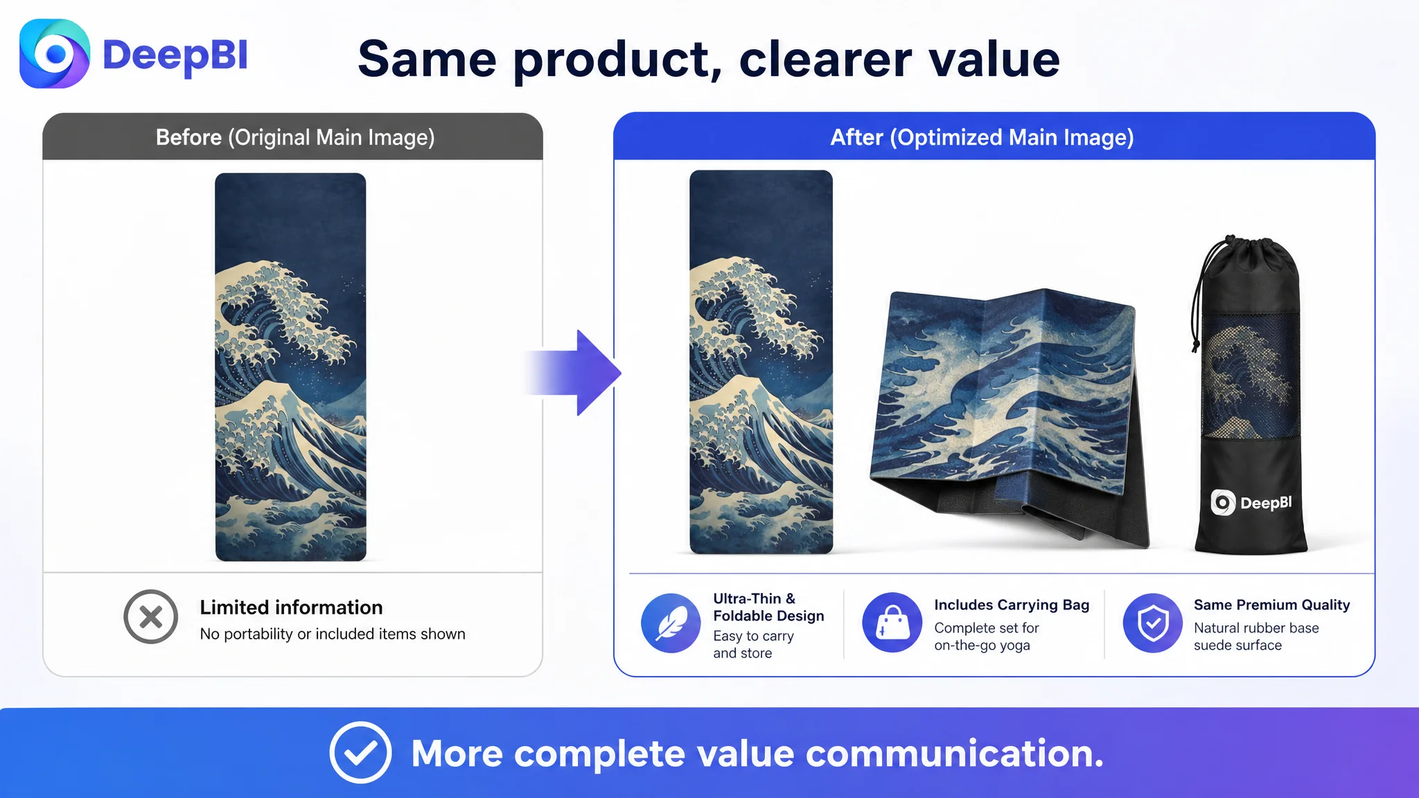
The visual direction also required restraint. The goal was not to make the yoga mat appear thicker than it is, or to imply cushioning that a 1mm product cannot provide.
The product had to remain physically truthful.
That meant improving composition, information hierarchy, material close-ups, use scenes, and explanatory graphics without changing the product’s real structure or inventing capabilities. The commercial value came from making existing strengths easier to understand.
What Changed in the Business Understanding
The case did not conclude with unsupported claims about a completed CVR increase or ACOS reduction. The available material records the diagnosis and recommended optimization path, but does not provide verified post-optimization performance data.
What did change was the operating judgment.
The customer’s problem was no longer framed as “the images need to look better” or “the Listing should look more like the competitor.” It became a more precise business question:
Can this Amazon product page help the right shopper understand and trust an unusually thin yoga mat before more traffic is sent to it?
That reframing changes the order of operations.
The title and main image still matter for search visibility and click behavior. The bullet points still need to communicate relevant keywords and benefits. But the detail page was the largest unresolved constraint, and it had to be addressed first because it determined whether both organic and paid traffic could produce useful outcomes.
Once the product story became more complete, future ad data could be interpreted more accurately. A change in CTR could be evaluated against the revised image communication. A change in CVR could be evaluated against the new A+ content and bullet-point logic. Traffic would no longer be directed toward a page whose central benefits remained difficult to verify.
The Lesson for Amazon Sellers
A low-converting Amazon Listing can easily be mistaken for an advertising problem, a keyword problem, or a creative problem.
Sometimes the real issue is more fundamental: the page has not yet earned the traffic it is receiving.
In this yoga mat case, the product had a distinctive design and several usable advantages. But those advantages were scattered across basic copy and incomplete visuals. The 1mm thickness was not given a clear role. The material structure was not made visible. The carrying bag was underused as a value signal. Machine-washable care was not positioned as a meaningful differentiator. Most importantly, the Listing had no A+ content to connect these points into a trustworthy product narrative.
The practical conclusion is straightforward:
Before scaling Amazon ads, judge whether the Listing can convert the traffic it already has.
When a page is missing trust, explanation, and decision logic, more traffic may only make the inefficiency more expensive. When the page begins to communicate the product accurately and persuasively, ad traffic has a better chance of becoming useful—and organic traffic has a stronger foundation to recover as well.