

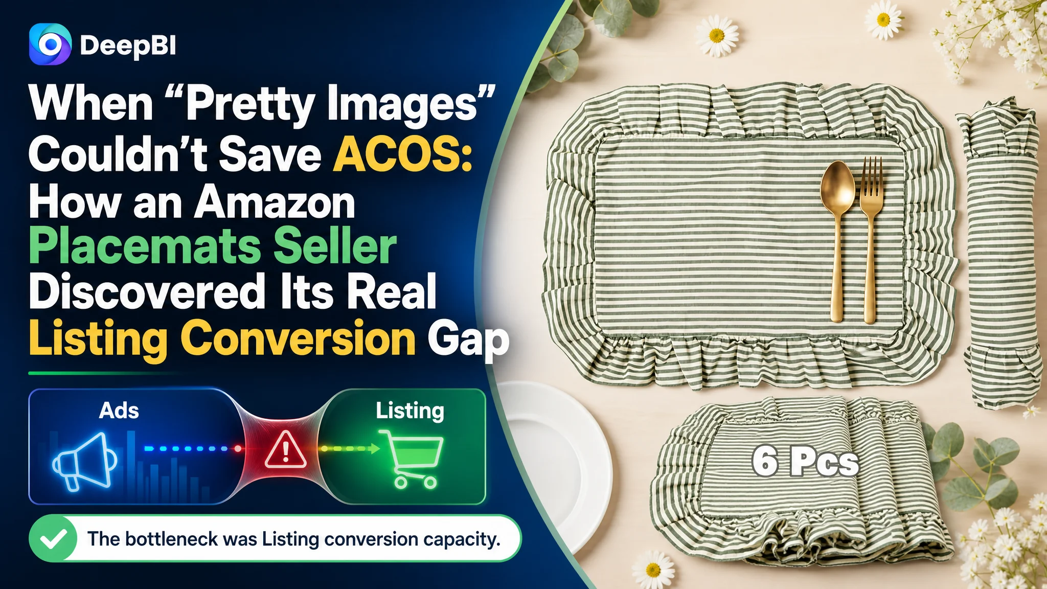
This Amazon seller in the US home & kitchen category makes vintage-style cotton placemats. On the surface, their Amazon Listing looked solid: consistent aesthetics, complete image set, and a clear title. Yet ads were becoming harder to control, and the page could not convert traffic like a comparable competitor. The team initially believed the issue lay mostly in ad optimization and “tweaking creatives,” not in how the product page itself built rational trust.
Once DeepBI benchmarked this Listing against a strong competing Amazon placemat Listing, the picture changed. The seller’s page scored 49/100 vs. the competitor’s 77/100. The biggest gap was not in visual beauty, but in hard conversion infrastructure: no A+ content at all, weak bullet-point persuasion, and almost no reviews. In other words, ads were pushing traffic into a page that lacked a complete decision path.
From there, the optimization focus shifted away from “making images even prettier” and towards: making quantity and size instantly clear in the main images, rebuilding bullet points around heat resistance and protection, and, most importantly, constructing a full A+ (detail page) chain that combines rational proof (material, maintenance, fit) with contextual scenes. For many Amazon sellers, this case is a reminder: when ACOS stalls, the real bottleneck is often Listing conversion capacity, not bid management.
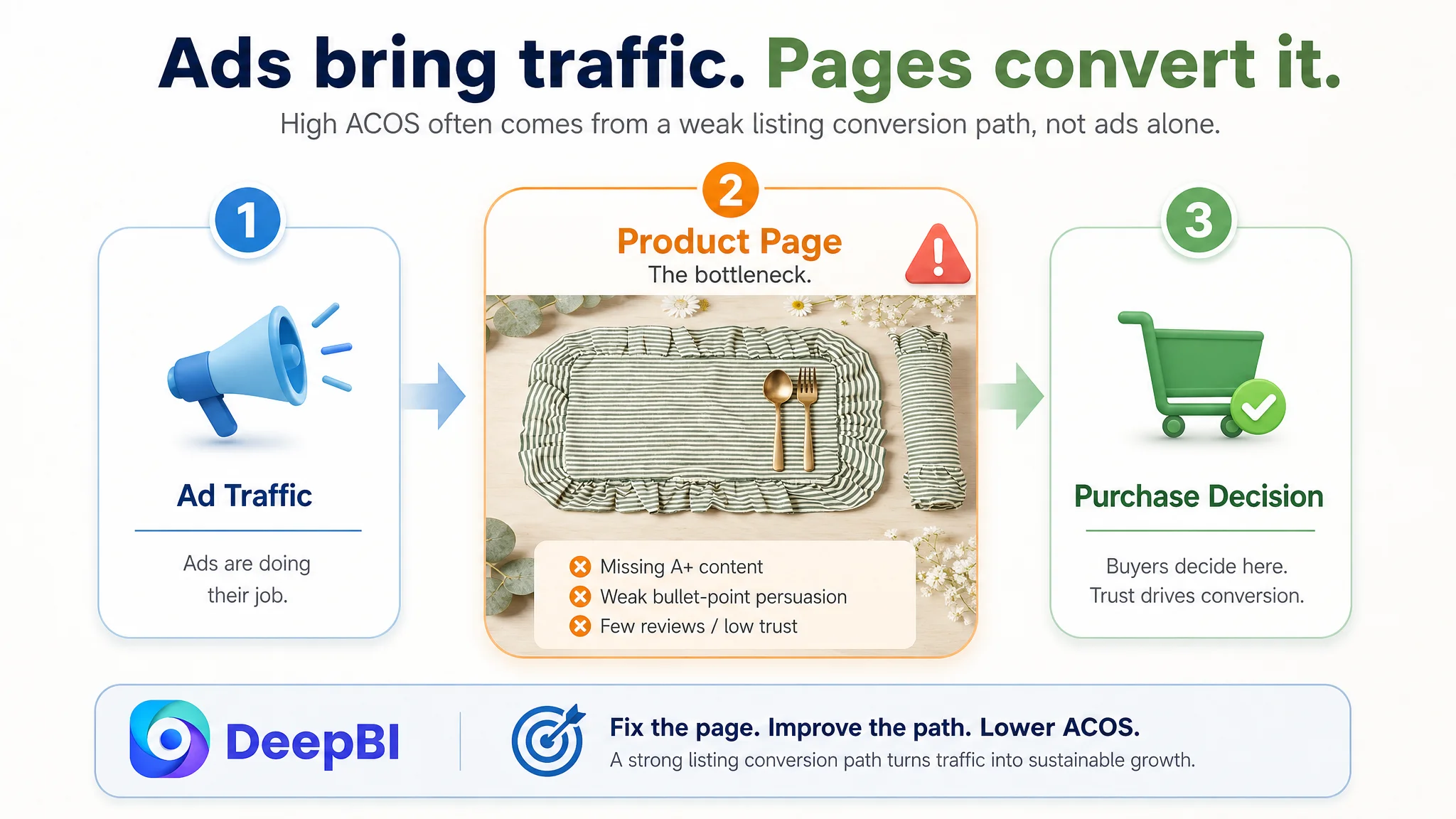
Amazon Ads Were Not Failing. The Page Was Consuming the Traffic.
The product is straightforward: a set of vintage green cotton placemats in the US Amazon marketplace, head-to-head with another cotton placemat Listing in the same segment.
From an operator’s point of view, the symptoms were familiar:
- Traffic was not the main bottleneck.
- Ads were running, but the return felt unstable.
- The Listing “looked good enough” visually, yet orders lagged behind a key competitor.
This led the team down a familiar path: keep tuning bids and keywords, adjust budgets, try different ad placements, and assume “we just haven’t found the right ad structure yet.”
“The real problem was not that ads failed to bring traffic. It was that the page could not convert the traffic.”
Only when we ran a deep Listing benchmark did the structural problem emerge clearly: this was not an advertising failure. It was a product-page conversion failure.
- Overall Listing score:
- Target Listing: 49/100
- Benchmark competitor: 77/100
- Gap: -28 points
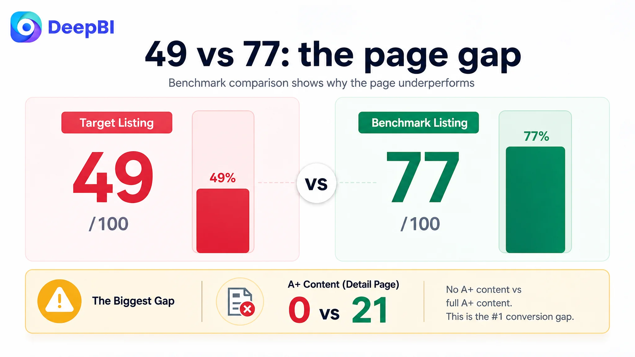
The breakdown showed where the real constraints sat:
- Title: 16 vs. 17 (almost on par)
- Main images: 26 vs. 23 (the target even slightly ahead in visual maturity)
- Bullet points: 5 vs. 7 (weak persuasion)
- Detail page / A+: 0 vs. 21 (no A+ at all)
- Reviews: 2 vs. 9 (thin, low-trust review layer)
Ads were not the primary issue. They were simply amplifying a half-finished product page.
The Original Misdiagnosis: Blaming Ads and Aesthetics
From the seller’s perspective, the logic seemed reasonable:
- The images already looked consistent and stylish.
- The title mentioned style and scene keywords.
- Ads were the visible cost center, so they felt like the natural optimization lever.
So the working assumption became: “If ACOS is high, ads and creatives are the problem; keep testing.”
The problem with this diagnosis:
1. It treated traffic acquisition as the lever for a conversion problem.
2. It overestimated how much “visual beauty” alone could compensate for missing rational proof.
3. It ignored that the competitor’s advantage was not only in style, but in how the entire Amazon product page walked a buyer from first impression to final trust.
Traditional ad tuning repeatedly failed because it was trying to squeeze more efficiency out of a page that could not adequately answer basic buyer questions:
- What exactly do I get? (Is it really a set of 6?)
- Will it protect my table from heat?
- Is it easy to wash and maintain?
- Can I trust the quality, given the low number of reviews?
Until those gaps were fixed, extra traffic was just extra waste.
Listing Data Exposed the Real Constraint: Conversion Infrastructure
Once the Listing was scored against a benchmark Amazon placemat ASIN, one core bottleneck was obvious: detail page conversion capacity.
A zero-score A+ is not a cosmetic issue
On the A+ (detail page) dimension:
- Target Listing: 0/25
- Competitor: 21/25
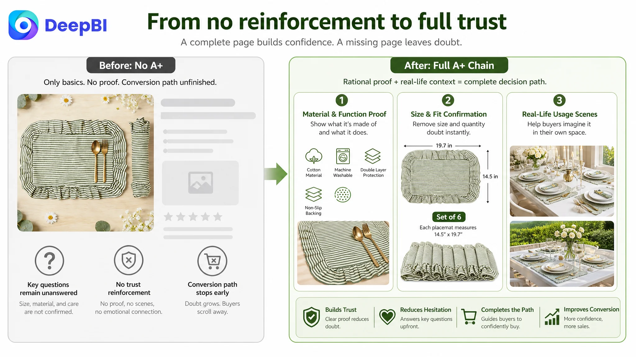
The competitor used:
- Brand identity header
- Lifestyle usage images in dining and outdoor scenes
- Icon-based feature blocks (cotton, washable, double-layer protection, anti-slip)
- Multi-angle scene layouts
- Close-up detail and construction explanations
- Color/variant display to reduce uncertainty
The target Listing:
- Had no A+ content at all.
- Relied solely on basic images and five bullet points to carry the entire conversion load.
This meant that once a shopper scrolled past the images and bullets, the page offered no additional rational or emotional reinforcement. The conversion funnel effectively stopped one step too early.
“Advertising does not only amplify advantages. It can also amplify a page’s existing defects.”
If you push more traffic to a page with no A+ story, thin reviews, and incomplete bullet logic, Amazon ads will faithfully scale that weakness.
Title and Main Images: Not the Weakest Links, but Misaligned Priorities
The title was “fine” structurally, but underweighted functional intent
Compared with the competitor, the title gap was small in pure score but meaningful in keyword logic:
- Competitor leads with:
- “Placemats Set of 4” as the first phrase
- Functional attributes like “Washable” and “Heat Resistant”
- Style terms (e.g., boho, embroidered) layered later
- Target Listing leads with:
- Brand + style first (“Vintage Green”, “Ruffle Stripe”)
- Quantity “Set of 6” pushed to the end
- Functional terms underrepresented
DeepBI’s recommendation was not to rewrite everything, but to re-weight:
Suggested direction: “[Brand] Vintage Green Ruffle Cotton Placemats Set of 6, 14.5 x 19.7 Inch Washable Heat Resistant Stripe Table Mats for Home Kitchen Dining Party Decor”
This keeps the aesthetic positioning while:
- Bringing core keyword + quantity forward
- Injecting Washable and Heat Resistant into the main line
- Maintaining search relevance and human readability
But even here, title optimization alone could not fix a 21‑point A+ gap.
Main images were beautiful—but too “aesthetic-first”
DeepBI’s visual comparison actually placed the target slightly ahead of the competitor on sheer aesthetic maturity:
- Consistent style
- Rich indoor/outdoor scenes
- Strong “vintage green” atmosphere
Yet the scoring also surfaced a key problem: role confusion between images.
Current image set behavior:
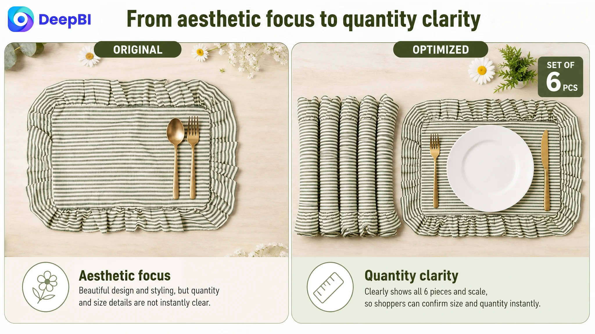
1. First image: shows pattern and basic size with cutlery, but only one mat is visible.
- Buyer doubt: “Do I really get 6 pieces?”
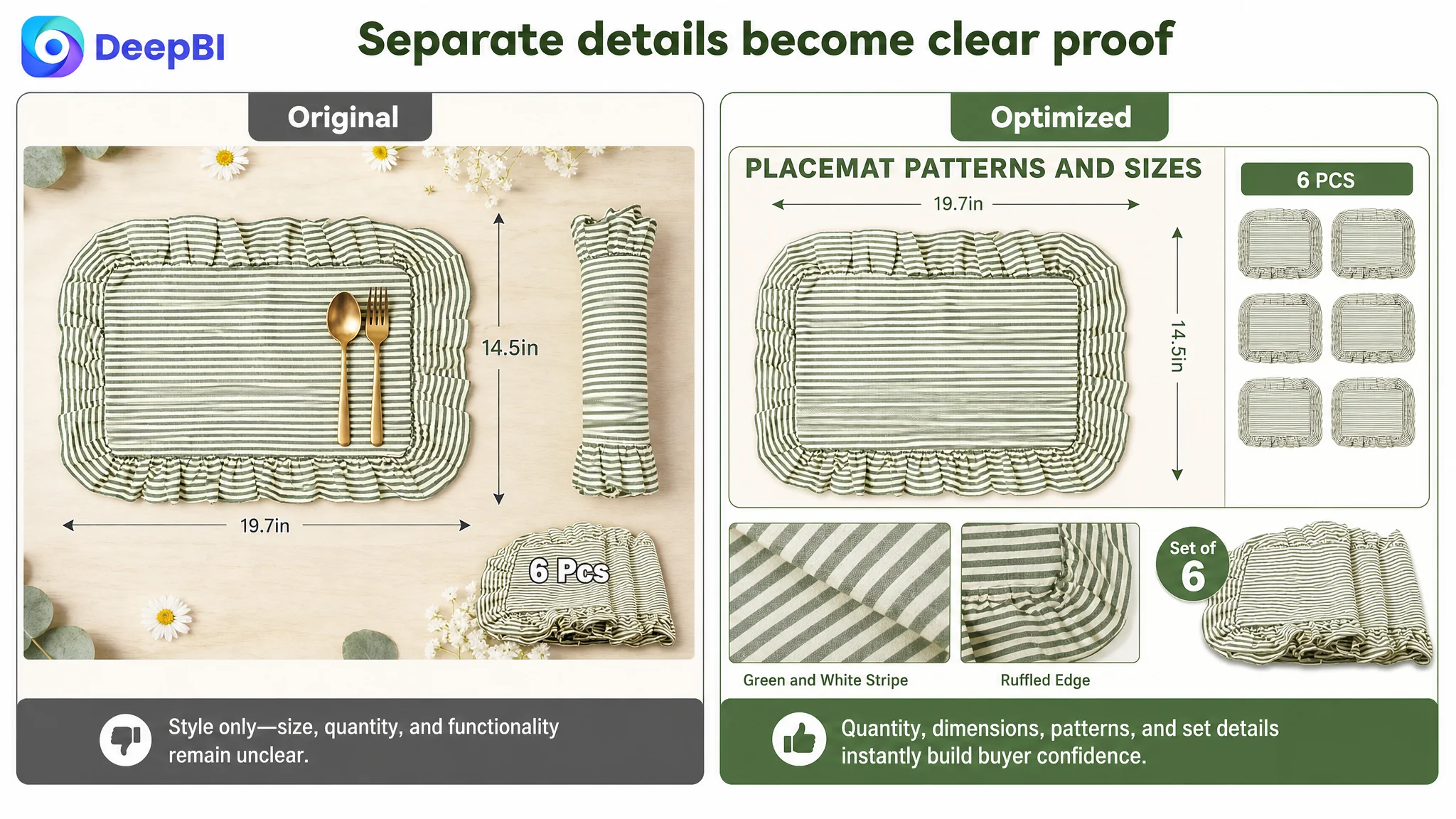
2. Second image: repeats pattern close-ups and dimensions, but separates quantity visual from size callout.
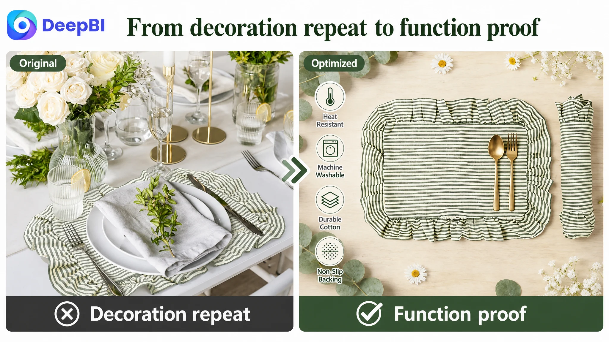
3. Third image: another lifestyle close-up—no new rational information.
4. Fourth and fifth images: more elaborate table scenes, purely decorative.
The result: five polished images, but insufficient confirmation of quantity, functional protection, and maintenance.
DeepBI’s judgment:
- This Listing did not lack beauty.
- It lacked fast rational confirmation: “6 pieces, generous size, heat-resistant, easy to wash, protects your table.”
So the main images were not the weakest module overall—but they were not serving the right job for a low-review, low-trust Listing.
Why DeepBI Did Not Recommend “More Ad Tests” First
Given the diagnostic results, DeepBI’s priority order was clear:
1. Repair Listing conversion capacity (especially A+ and bullet logic)
2. Clarify quantity and key functions in the image stack
3. Only then consider further ad scaling
The logic:
- With 3.5 stars and only 3 reviews, the Listing had almost no social proof.
- With 0 points in A+, it had no structured, visual trust-building modules.
- Bullet points were information-heavy but persuasion-light.
Under these conditions, pushing more traffic would:
- Inflate ad spend without reliably improving sales
- Mask the real problem by keeping the focus on ACOS instead of CVR
- Delay the inevitable: a full-page content rebuild
From a business risk perspective, the greatest danger was letting Amazon ads subsidize a structurally weak page. Until the page could stand on its own, ad tests would remain noisy and inconclusive.
This Product Page Did Not Lack Traffic. It Lacked a Buying Logic.
Bullet points: data but no decision path
On bullet points, the target Listing scored 5/10 vs. the competitor’s 7/10. The main issues:
- Entered with packaging/basic info, not a sharp pain point.
- Listed features, but rarely closed the loop:
- Pain → Solution → Outcome.
- Used scenes as decoration, not as value multipliers (e.g., gifting scenarios, special occasions).
- Logical order was flat; each point stood alone instead of building a progression.
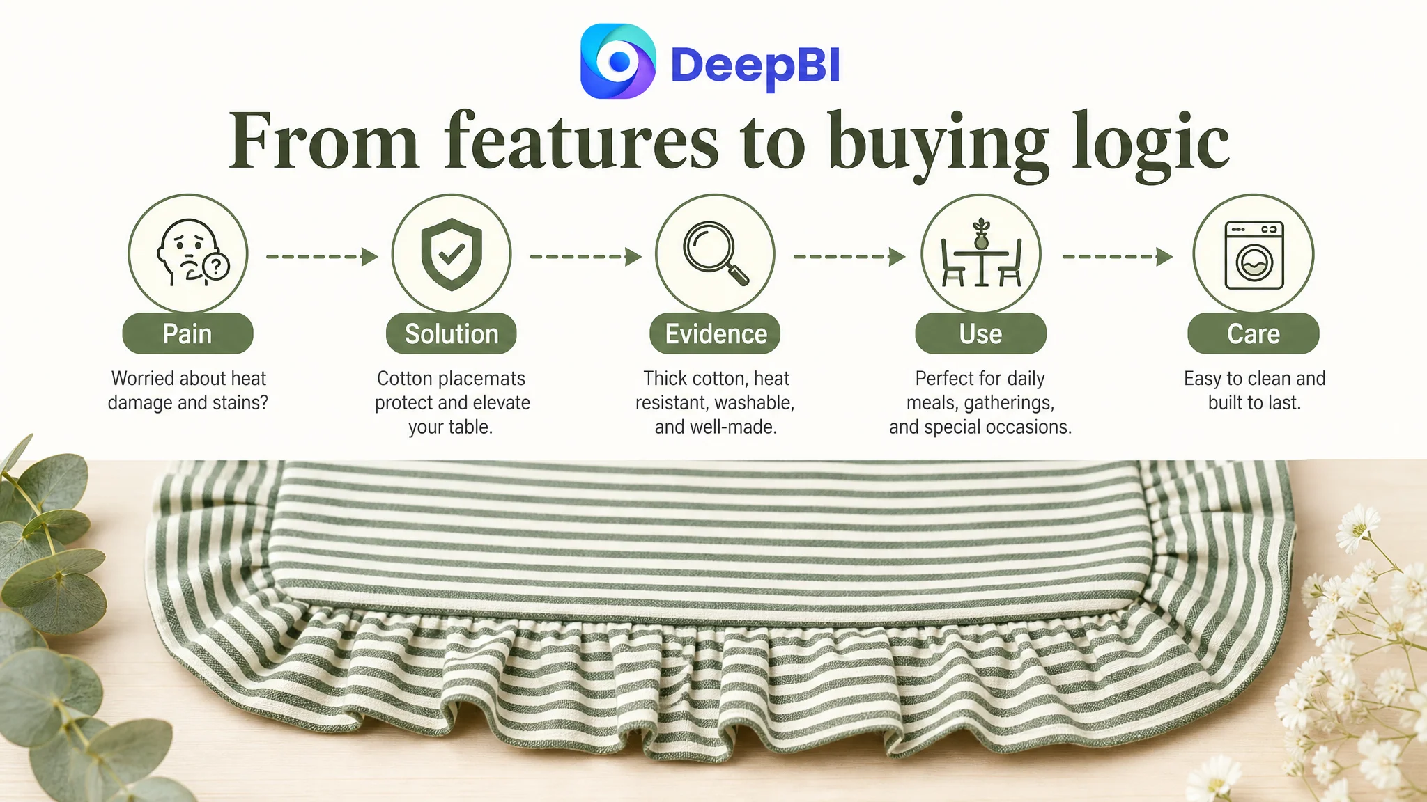
DeepBI reframed each bullet as a conversion step:
1. Start with what matters most to the buyer’s table.
- Material + heat resistance + table protection.
- Example: “[PREMIUM COTTON & HEAT RESISTANT] … protect your tabletop from heat damage and scratches.”
2. Then sell the design as emotional value.
- Ruffle edges, vintage stripes, and gifting potential.
- Example: “[ELEGANT RUFFLE DESIGN] … perfect home decoration and gift.”
3. Justify the size in practical terms, not only numbers.
- “14.5 x 19.7 inches” → “comfortably fits plates, cutlery, and napkins.”
4. Widen usage scenarios, but with a purpose.
- Family meals, baby showers, birthdays, weddings, indoor/outdoor—framed as versatility and value, not a random list.
5. Close with durability and easy care.
- Hand wash / gentle machine cycle, lay flat to dry, no bleach.
- Connect maintenance to long-term value and color retention.
The change was not “more text,” but a different logic: from parameter listing to “pain–solution–evidence–usage–maintenance.”
A+ Content: The Missing Middle of the Conversion Funnel
The starkest difference between this Listing and the competitor was the entire absence of A+ content.
How the competitor used A+ to stabilize conversion
The benchmark competitor’s A+ page did several things well:
- Opened with a strong visual introduction: placemats as the centerpiece of a social dining scene.
- Quickly answered rational questions with icons and short headers: material, heat resistance, washable, anti-slip.
- Provided macro scenes and micro details: lifestyle shots plus close-ups of stitching, thickness, and fabric texture.
- Displayed multiple colors/variants in one frame, reducing comparison clicks and decision friction.
- Clarified fit and versatility: how standard plates and cutlery sit on the mats across different occasions.
The result: buyers moved from curiosity to confidence with minimal cognitive strain.
How DeepBI reframed the A+ for the target Listing
For the target Listing, DeepBI’s direction was: “Prioritize rational evidence, then layer aesthetics.”
Recommended A+ module logic:
1. Immediate visual confirmation of style and central role
- A strong hero lifestyle image with the “vintage green” mats as the focal table decor in a realistic gathering scene.
2. Early rational block: icons and headers
- Material: quality cotton
- Heat resistance / table protection
- Washable / easy care
- “Keeps your table clean all the time”
3. Physical evidence module
- Macro close-ups of ruffle edge, stripe pattern, stitching, and thickness.
- Copy focused on construction quality and long-term use.
4. Fit and usability
- Overhead shots showing standard plates, cutlery, and napkins arranged on a single mat.
- Explicit explanations of how the 14.5 x 19.7 inch size works in real dining setups.
5. Scenario versatility
- Separate panels for everyday family dinner, parties, baby showers, and outdoor dining.
- Each tied to specific emotional and practical benefits.
6. Quantity and year-round value
- Clear visual of all 6 mats together.
- Text: “6-piece set for daily use and replacements, suitable for all seasons.”
7. Consistency confirmation
- Final reassurance that all 6 pieces share the same material, size, and design.
- Removes any last-minute doubts about variation or quality inconsistency.
This structure ensured that by the time a buyer finished scrolling, they had:
- Seen the design in context
- Understood material and functionality
- Verified size and quantity
- Imagined their own usage scenarios
- Resolved maintenance questions
Only then did it make sense to spend more on ads.
Main Image Stack: From Aesthetic Repetition to Trust-Building Roles
DeepBI’s recommendation for the image stack was not “make it prettier,” but “reassign each image a unique job.”
Reprioritizing the five key image slots
1. Image 1 – Confirm quantity and core fit immediately
- Show all 6 mats clearly in one shot.
- Include a standard plate and cutlery for intuitive scale.
- Reduce quantity doubt at the very first impression.
2. Image 2 – Combine generous size and quantity
- Overlay dimensions directly next to a mat with a plate on top.
- Add a simple, credible callout like “Generous Size – 14.5 x 19.7 in”.
3. Image 3 – Remove redundant lifestyle, double down on quantity clarity
- Replace the third aesthetic repeat with a clean, grouped layout of all 6 mats on a neutral background.
- Purpose: absolute confirmation of “Set of 6.”
4. Image 4 – Lifestyle with implied durability
- Keep a richer dining scene, but stage it to indicate protection: heavier dishes, hot items, or family-style serving.
- Prepare the visual ground for later claims about heat and table protection.
5. Image 5 – Functional validation instead of another party scene
- Transform this slot into pure functionality:
- Icons for “Heat Resistant,” “Washable,” “Soft Cotton,” “Durable,” etc.
- Simple, legible labels appropriate for mobile viewing.
By doing this, the image set stops being five variations of “pretty table” and becomes a ladder of trust:
- What you get → How big it is → How many pieces → Where it fits → Why it’s safe and easy to care for.
Reviews: A Thin Trust Layer That Magnified Page Weakness
On reviews, the numbers told a tough story:
- Target Listing:
- 3.5 stars, 3 total reviews
- Front page: essentially no valid, helpful review content
- Competitor:
- 4.1 stars, 12 reviews
- 66% 5‑star, about 19% 1–2 star
The competitor’s review base was not perfect—but it was enough to act as a basic trust layer for first-time buyers.
In contrast, the target Listing:
- Had a visible rating disadvantage (3.5 vs. 4.1).
- Lacked any meaningful text reviews or images to reassure buyers.
In that context, every other trust signal on the page mattered more:
- A+ depth
- Rational bullet points
- Clear, factual image callouts
Without these, the review gap was amplified: buyers saw low review volume, a modest rating, and no strong content to compensate, and many simply left.
DeepBI’s stance here was pragmatic: You cannot manufacture reviews, but you can:
- Reduce hesitation by answering every rational concern on-page.
- Make sure early buyers have a clear understanding of what they get (which reduces negative reviews caused by “misunderstanding”).
- Use stronger page logic to convert a higher share of the limited traffic you already have, giving the product a chance to accumulate better reviews over time.
How the Page’s Sales Logic Started to Recover
After this reframing, the optimization work followed a clear order:
1. Rebuild the rational spine
- Bullet points shifted from listing features to solving specific problems (heat, protection, cleaning).
- Easy-care instructions were made explicit to reduce hidden anxiety around cotton fabrics.
2. Construct a full A+ chain
- Modules were designed around material proof, size fit, versatility, and quantity clarity.
- Scenes were chosen not just for mood, but for decision support.
3. Reassign roles in the main image stack
- Early images confirmed quantity and size.
- Later images validated function and durability, instead of repeating lifestyle decoration.
4. Accept the reality of the review gap—and work around it
- The page had to compensate with stronger visual and textual structure until reviews caught up.
With these changes, ad traffic started to have somewhere to go. Even without inventing numbers, you can describe the shift:
- The Listing began to regain basic conversion ability.
- Ads no longer drove most users to a dead-end of unanswered questions.
- The reliance on “maybe the next ad test will work” decreased.
In other words, the product page finally started doing the job ads had been paying for all along.
What Other Amazon Sellers Can Take from This Case
For many Amazon sellers, this placemat case will feel familiar:
- Visually, the Listing did not look “bad.”
- The team’s first instinct was to optimize ads and tweak creatives.
- The true constraint was a half-built page, especially the missing A+.
Key takeaways:
1. A good-looking page is not the same as a converting page.
- The target Listing’s aesthetics were competitive.
- Its A+ and bullet logic were not.
2. When reviews are thin, Listing structure matters even more.
- You cannot shortcut social proof, but you can minimize friction in every other part of the decision path.
3. Main images must confirm, not just decorate.
- Quantity, size, function, and care instructions should be visually obvious, especially for sets and fabrics.
4. A+ is a conversion system, not an optional add-on.
- In this case, a 0 vs. 21 A+ gap was the single biggest structural disadvantage.
- Fixing it was more urgent than any bid change.
5. Ads amplify whatever is already true about your Listing.
- If your Listing cannot convert, ads will scale waste.
- If your Listing is structurally sound, ads can become a predictable growth lever.
DeepBI’s real value in this case was not “producing better images” or “writing nicer copy.” It was reshaping the seller’s judgment: from “our ads aren’t good enough” to “our Amazon Listing doesn’t yet deserve more traffic.” Once that understanding changed, every optimization step that followed became far more meaningful—and far less wasteful.