

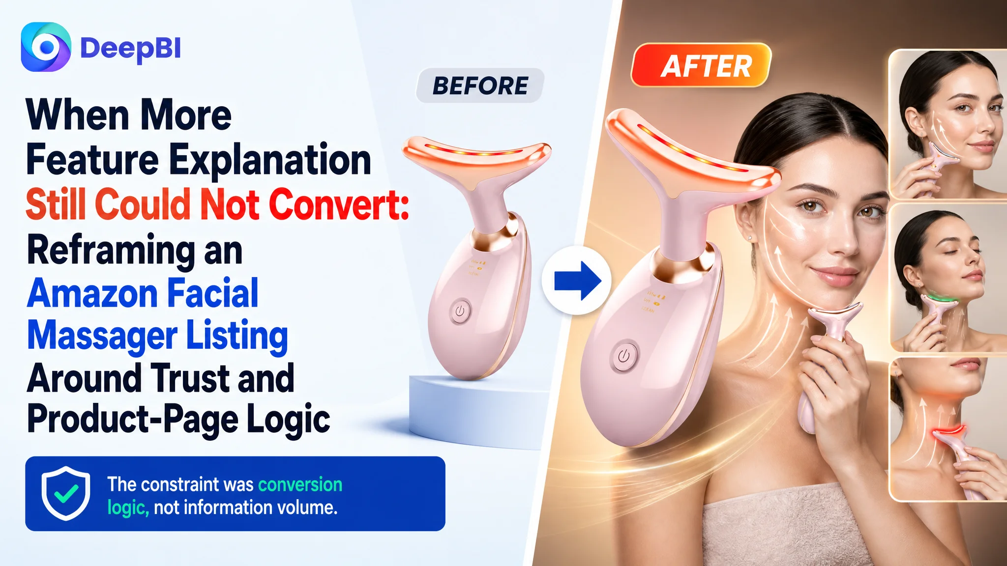
An Amazon seller in the beauty-device category was facing a product-page conversion problem on the US marketplace. The facial massager Listing had the expected building blocks—seven LED modes, three operating modes, heating, portability, usage instructions, and A+ content—but its overall competitive score was still 67/100, ten points behind a comparable high-performing Listing.
The initial direction was largely feature-led: explain the functions more clearly, add technical details, and continue refining the visual presentation. DeepBI’s diagnosis showed that this was not enough. The real issue was not a lack of information. It was that the Amazon product page did not guide shoppers from recognition to confidence to purchase as effectively as the benchmark Listing.
The later optimization therefore focused on rebuilding the page’s sales logic: make the face-and-neck use case immediately recognizable, translate LED specifications into buyer-relevant benefits, bring skin-suitability information forward, simplify the operating path, and present results without unsupported claims. The case offers a practical lesson for Amazon sellers: before increasing traffic or adding more feature language, judge whether the Listing can convert the attention it already receives.
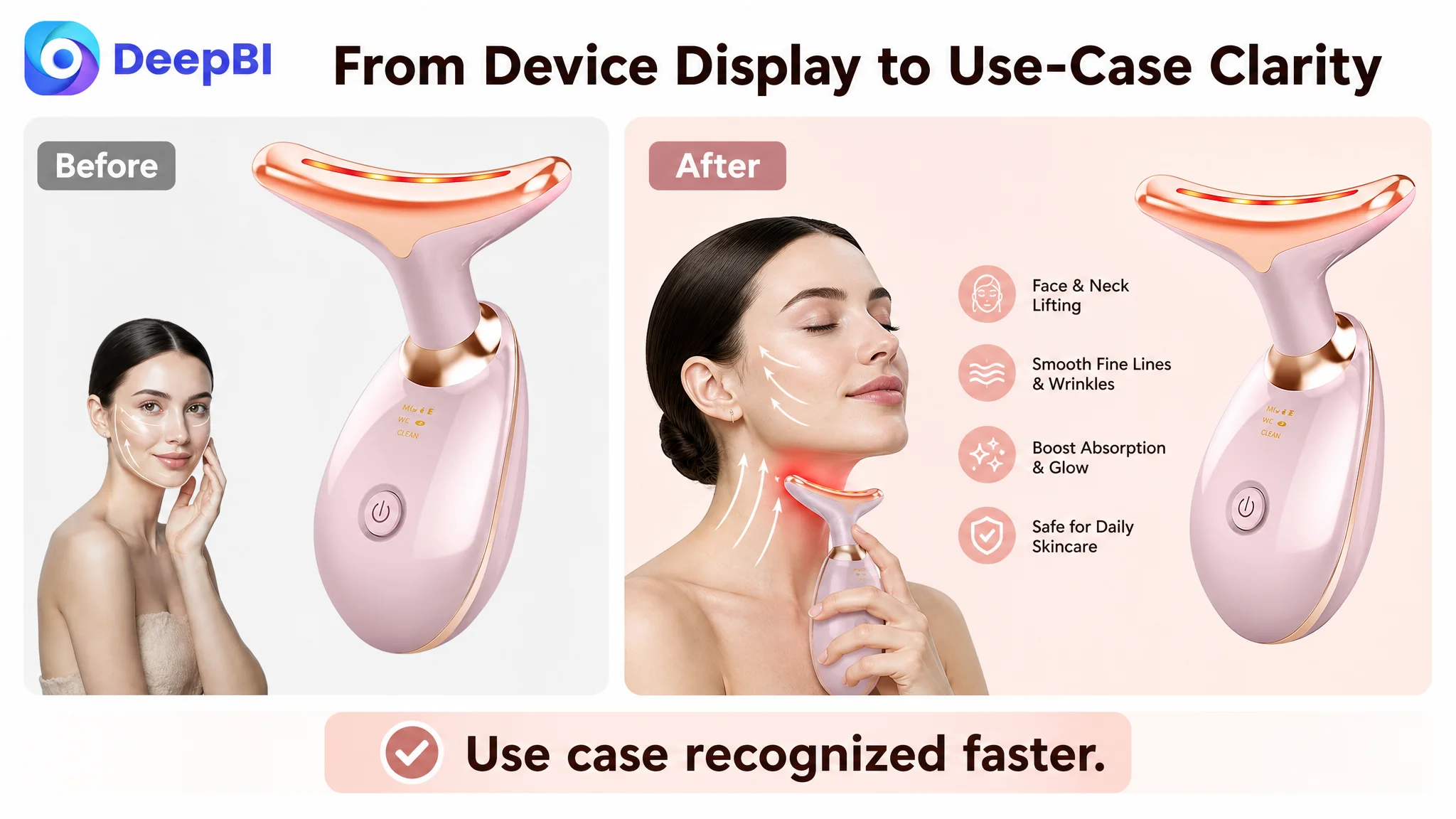
The Listing Had Content. It Did Not Yet Have Enough Conviction.
At first glance, the Listing did not look incomplete.
It included product benefits, usage instructions, seven-color LED information, heating details, vibration functions, a 30-day routine, skin-type messaging, package contents, and gift-oriented scenes. The product itself also had several recognizable selling points:
- Face and neck application
- Seven LED color modes
- Three-in-one functionality
- Heating and vibration
- Portable design
- Rechargeable use
- A dolphin-shaped massage head
- Support for daily skincare routines
The problem emerged when those elements were compared with the way shoppers make decisions on Amazon.
The target Listing scored:
- Title: Target Listing: 14/20, Comparable high-performing Listing: 15/20, Gap: -1
- Main image: Target Listing: 25/30, Comparable high-performing Listing: 24/30, Gap: +1
- Bullet points: Target Listing: 5/10, Comparable high-performing Listing: 5/10, Gap: 0
- Detail page: Target Listing: 21/25, Comparable high-performing Listing: 23/25, Gap: -2
- Reviews: Target Listing: 2/15, Comparable high-performing Listing: 10/15, Gap: -8
- Total: Target Listing: 67/100, Comparable high-performing Listing: 77/100, Gap: -10
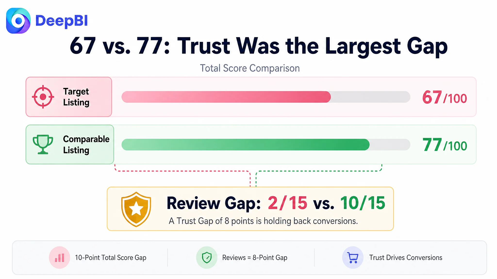
This was not a case of one obviously broken module. The page was reasonably strong in several areas, especially the main-image score. But the weaker areas were connected.
The title did not make the product’s core use case as direct as it could be. The bullet points described functions without creating a strong problem-to-solution path. The A+ content contained many modules, but the sequence did not consistently answer buyer concerns in the order they appeared. Most importantly, the review profile created a significant trust disadvantage.
The Listing was not empty. Its problem was that its information was not working together as a buying argument.
The Working Assumption Was “Explain More.” The Real Gap Was “Prove and Clarify Earlier.”
The page’s original structure leaned toward completeness.
It explained packaging, design details, operating steps, modes, and technical functions. This is a familiar optimization direction for Amazon sellers: when conversion is weak, add more information so shoppers have fewer unanswered questions.
That approach can fail when the issue is not information volume but decision friction.
A shopper encountering a facial massager may quickly want to know:
- Is this actually designed for both the face and neck?
- What does each LED mode mean for my skincare concern?
- Is it suitable for my skin type?
- Will it be easy to use consistently?
- What areas can it treat?
- What kind of result should I reasonably expect?
- Why should I trust this product when another Listing has stronger reviews?
The original Listing addressed several of these questions, but not always at the moment when they mattered. Some content was technical without being translated into practical value. Some modules repeated functions instead of building a deeper persuasion sequence. Safety and skin-compatibility information appeared too late. Results were presented through broad language such as “30 Days to Rejuvenate,” without the kind of evidence or structured expectation that could strengthen confidence.
This created the central misdiagnosis: treating the page as a content-coverage problem rather than a conversion-logic problem.
The distinction matters for Amazon advertising as well. If paid traffic reaches a page that has not established product identity, safety, use cases, and credibility in the right order, further ad tuning may only send more shoppers into the same uncertainty.

DeepBI Located the Constraint Through Competitive Gaps, Not Isolated Opinions
DeepBI’s assessment did not rely on whether one image looked more attractive than another. It compared the Listing across the elements that shape Amazon search and product-page decisions: title structure, main-image communication, bullet-point logic, A+ content, and customer trust signals.
The diagnosis showed that the ten-point gap was concentrated in how the Listing communicated value and confidence.
The title named the product, but did not lead with the strongest reason to notice it
The original title began with “Facial Massager,” while the comparable Listing led with “7 Color Face and Neck Massager.”
That difference is small in wording but meaningful in search-page behavior. The benchmark exposed the product’s strongest differentiators earlier:
- Seven-color functionality
- Face-and-neck application
- A more precise product type
- At-home use
- A more premium color description
The target title also used broader wording such as “Portable Beauty Skin Care Tools,” which was less precise than “Portable Facial Massager Tool.” It communicated a category, but not as directly what the product was.
The recommended direction was:
“7 Color LED Face and Neck Massager, Portable Facial Skin Care Tool, Professional Beauty Device for Home Use, Pink”
The purpose was not to copy the competitor’s title. It was to reorganize the target Listing around its own confirmed attributes:
1. Put “7 Color LED” near the front.
2. Make “Face and Neck Massager” the clearest product identity.
3. Replace repeated or broad wording with more precise product language.
4. Add the at-home context without making the title unnecessarily long.
5. Preserve the actual product color and known functions.
The title therefore became part of the diagnosis—not merely a keyword-editing task, but an issue of whether the search result immediately communicated why this product was relevant.
The main image showed the device, but did not make its use case instantly obvious
The main-image score was slightly higher than the benchmark, 25 versus 24. That result is important because it prevented an overly simple conclusion that the Listing’s visual problem was just image quality.
The deeper issue was image-to-message alignment.
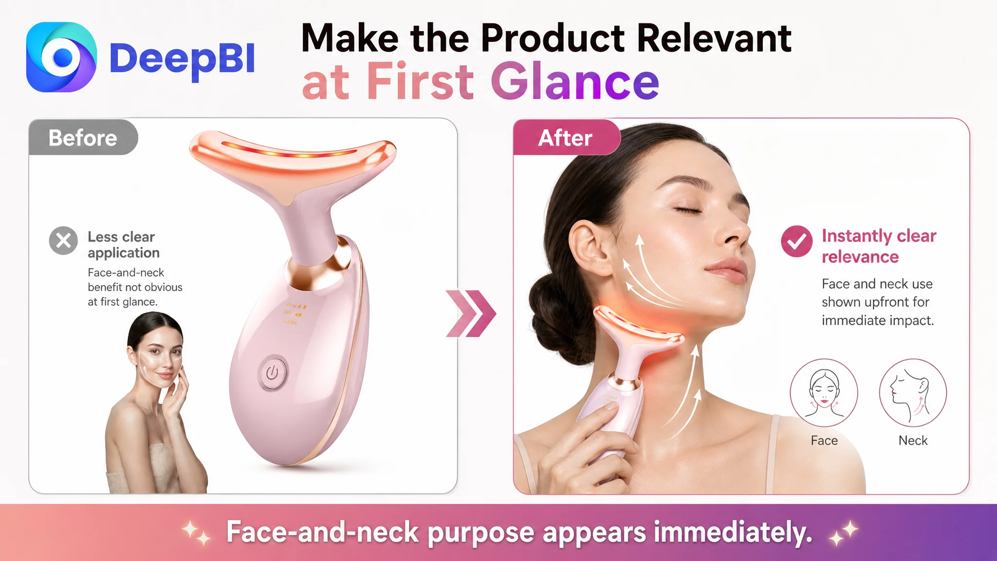
The product was positioned as a face-and-neck massager, but the primary pose and visual focus were more generic and concentrated around the face and eye area. A shopper could see a beauty device, yet still need to infer how the product relates to the neck—the use case emphasized in the title and product positioning.
DeepBI therefore recommended strengthening identification and application matching:
- Use a clearer neck-focused application pose.
- Make the face-and-neck purpose visible at a glance.
- Reduce repetition across secondary images.
- Use one image to explain technical credibility, such as confirmed LED wavelength information.
- Use another to show practical operation, charging, or temperature details only where verified.
- Reserve an additional image for supported visual results and broader application areas.
The change was from “show more features” to “assign each image a job in the decision sequence.”
The bullet points had functions, but not enough buyer-oriented structure
Both the target Listing and the benchmark scored 5/10 in the bullet-point dimension. This meant the gap was not simply that one page had better copy. Both pages had room to improve.
The target bullets were relatively comprehensive, but they leaned toward an instruction-manual style. They covered packaging, support, and design details, while the functional benefits were not always connected to a specific consumer concern.
The recommended rewrite moved toward a clearer structure:
- 7 Professional LED Modes: connect the seven modes to daily skincare needs without making unverified medical claims.
- 3-in-1 Modes and Ergonomic Design: combine cleansing, soothing, and warming with the confirmed dolphin-shaped head and face-and-neck contours.
- Enhanced Absorption and Easy to Use: explain serum or cream use, upward motion, session length, and frequency.
- Portable, Rechargeable, and Ideal Gift: combine portability, the USB cable, manual, gift suitability, and support details.
The important shift was structural. Each bullet needed to connect:
Buyer concern → product capability → practical use or expected experience
A list of modes tells shoppers what the device contains. A decision-oriented bullet explains why that capability matters and how the shopper would use it.
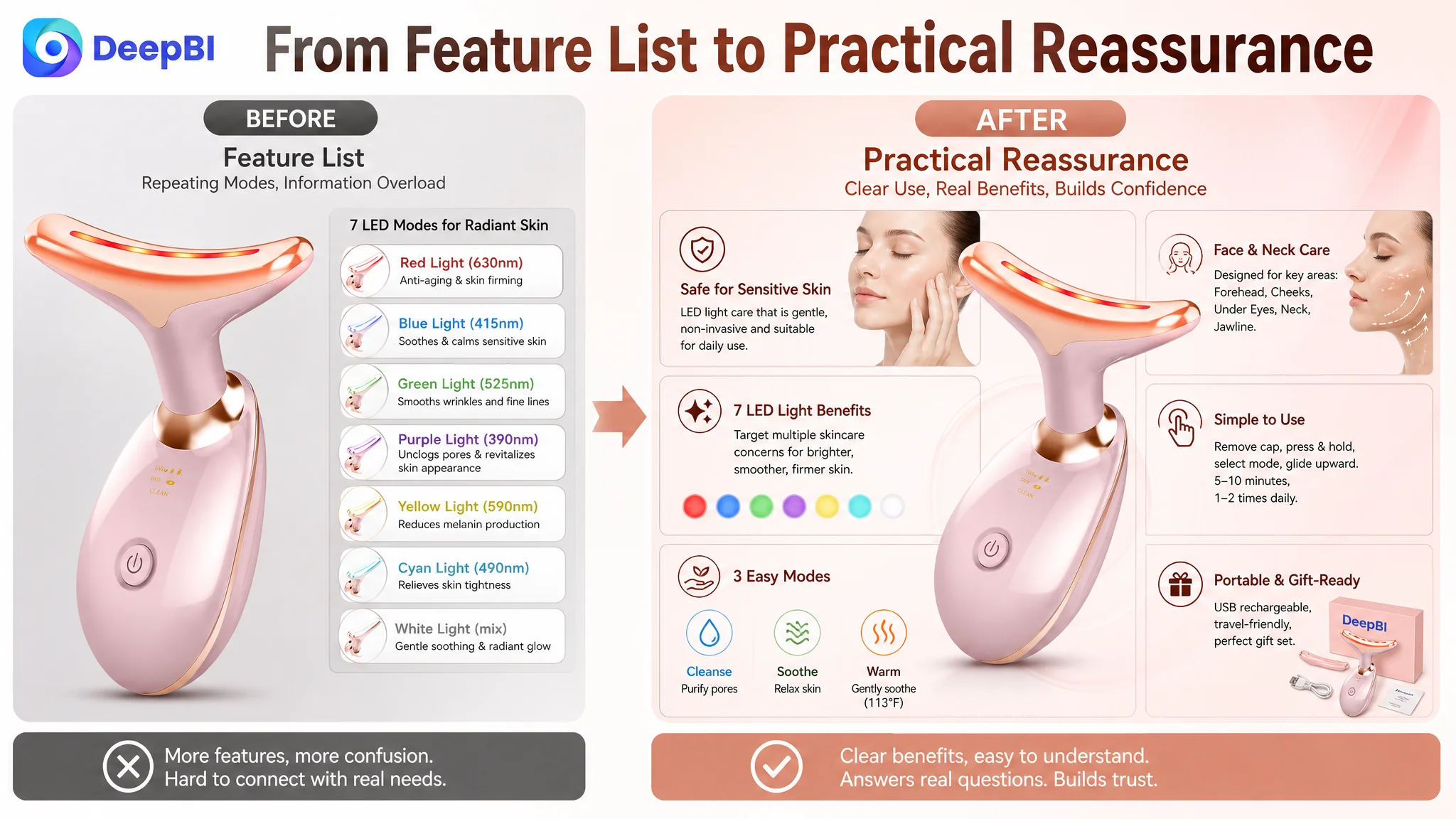
The A+ Content Was the Larger Conversion Opportunity
The detail-page score was 21/25 versus 23/25 for the comparable Listing. The difference was not caused by an absence of A+ material. In fact, the target page already contained a substantial amount of content:
- Core selling-point imagery
- Before-and-after presentation
- Seven-color LED explanation
- Temperature principles
- Vibration information
- Cleaning mode
- Four-step usage guide
- Skin-concern messaging
- A 30-day routine
- Skin-type suitability
- Package display
- Gift scenarios
The problem was the order and depth of persuasion.
Safety and suitability appeared too late
A buyer considering a skincare device may have an immediate concern about whether it is appropriate for their skin type and how it should be used.
On the target Listing, relevant suitability content was positioned too late. DeepBI recommended moving this information forward so that the page addressed an early risk question before asking shoppers to evaluate technical features.
The logic was straightforward:
Reduce uncertainty first, then explain the technology.
This does not mean making the first screen overloaded with disclaimers. It means ensuring that concerns about compatibility and basic safety do not remain unresolved while the page moves into LED wavelengths, modes, or lifestyle imagery.
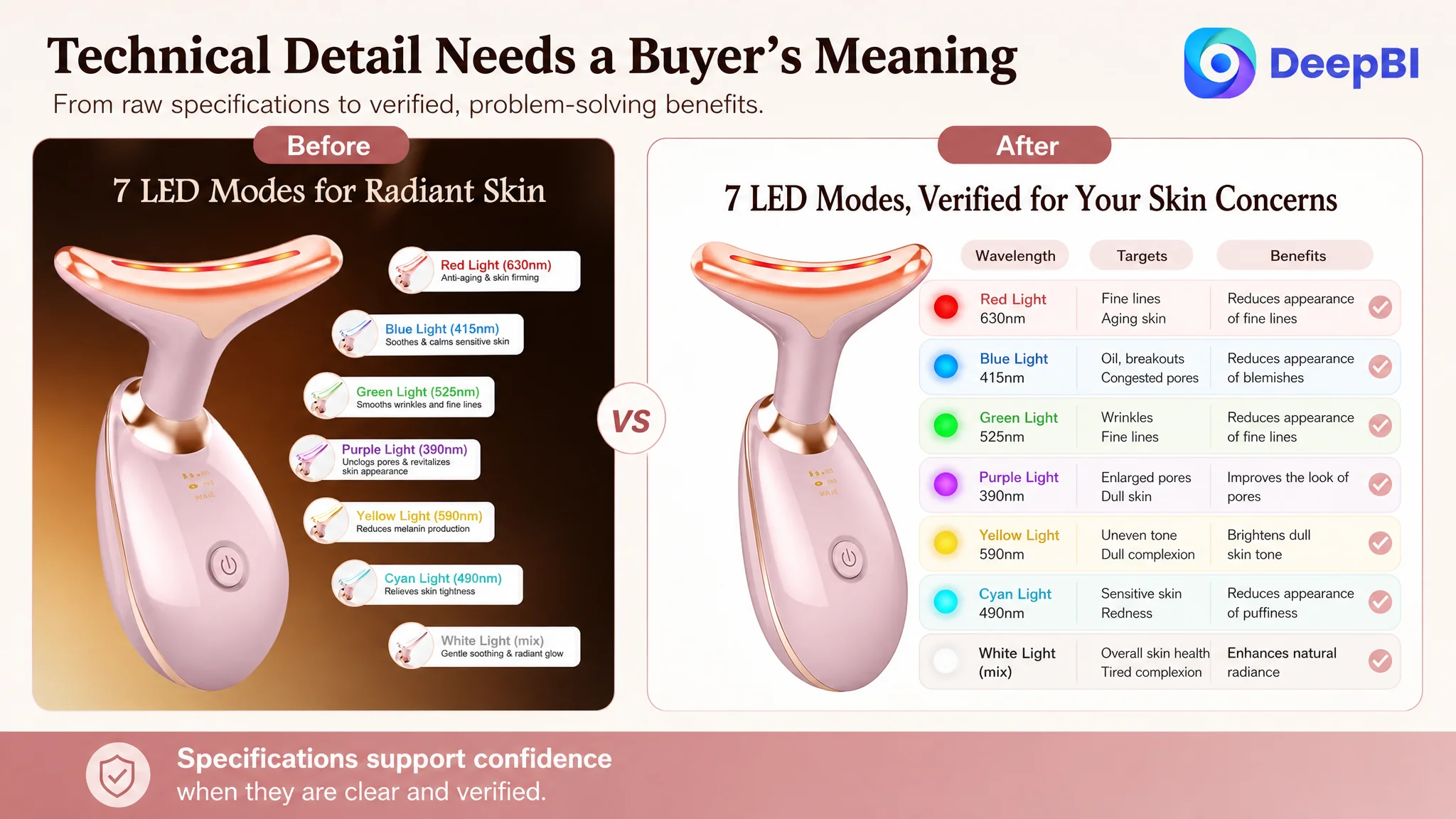
Technical specifications were not translated into buyer value
The target page listed LED colors and wavelengths, but the technical information was not consistently connected to specific skincare needs.
A wavelength such as 630nm may look credible as a specification, but by itself it does not tell the shopper why that mode belongs in the product.
The recommended direction was to map confirmed modes to relevant, supportable benefits:
- Cleanse mode for daily pore-purifying routines
- Soothe mode for a relaxing skincare step
- Warm mode for gentle warmth and comfort
- LED modes connected to concerns such as the appearance of fine lines, blemishes, puffiness, or dark circles, where the wording remains within the product’s supported claims
This was a key judgment from DeepBI: technical data should not remain isolated from the decision it is meant to support.
The module sequence mixed different questions together
The target page combined treatment areas with operating instructions, and it repeated feature explanations across multiple sections.
DeepBI recommended separating the communication into a more deliberate path:
1. Establish the product and its daily-use promise.
2. Address skin-type suitability early.
3. Explain the seven LED modes through buyer-relevant benefits.
4. Confirm treatment areas such as the face, neck, cheek, chin, periocular area, and forehead.
5. Show the four-step operation clearly.
6. Present the intended 30-day routine and supported before-and-after results without inventing percentages.
7. Close with package completeness, gift value, portability, and practical reassurance.
This sequence reduced cognitive switching. A shopper should not have to interpret a treatment-area diagram while also learning how to turn the device on.
The Review Gap Was Serious, but It Was Not Solved by Page Copy Alone
The largest numerical disadvantage was in reviews.
The target Listing had:
- 3.8 stars
- 5 total reviews
- No meaningful reviews visible on the first page
- A 24% one-star share
The comparable Listing had:
- 4.2 stars
- 13 total reviews
- 5 visible first-page reviews
- A 7.7% one-star share
The target Listing’s one-star share was more than three times the benchmark’s reported level. That created a trust problem that better wording or more polished images could not erase.
DeepBI therefore treated reviews as a major conversion constraint rather than something to hide behind A+ design.
At the same time, the page still needed to be repaired. When review strength is limited, every other trust signal becomes more important:
- Clear product identity
- Immediate application recognition
- Precise operating guidance
- Skin-type suitability
- Credible technical explanation
- Carefully presented results
- A complete and reassuring package explanation
The goal was not to pretend that the review gap did not exist. It was to prevent the rest of the Listing from adding unnecessary doubt.
A stronger A+ page cannot replace customer proof. It can, however, stop weak page logic from making a difficult review situation even harder.
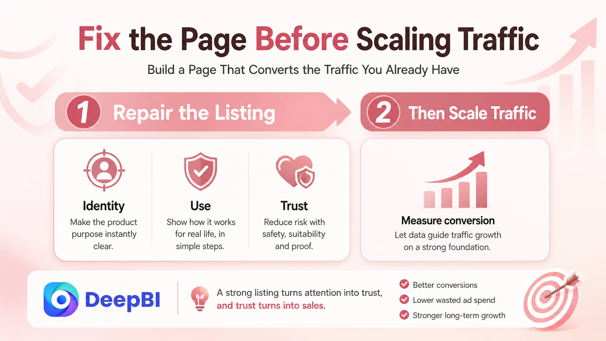
Why the Team Should Not Keep Tuning Amazon Ads First
The case material does not provide a before-and-after advertising data series, so it would be inaccurate to claim a specific ACOS decline, CVR increase, or organic-order recovery.
The business judgment is instead about optimization order.
If the Amazon product page does not clearly communicate what the device is, where it is used, how it works, and why the shopper should trust it, increasing ad pressure does not solve the underlying constraint. It risks amplifying an inefficient product-page outcome.
A more disciplined order is:
First, repair the Listing’s ability to receive and explain attention
The title should make the product relevant in search. The main image should make the face-and-neck application recognizable. The bullet points should connect functions to daily concerns. The A+ content should answer suitability, mechanism, use, treatment areas, expectations, and package questions in sequence.
Then, evaluate whether paid traffic is being received properly
Once the page’s logic is clearer, advertising data becomes easier to interpret. A weak click signal may point toward the search-result presentation. A weak conversion signal after a click may point toward trust, value communication, reviews, or product-page structure.
Without that separation, sellers can mistake a page problem for a bid problem.
Only then should traffic be scaled with greater confidence
The objective is not to stop advertising. It is to ensure that advertising is sending shoppers to a page with a reasonable chance of converting them.
This is especially important for a product whose value depends on education. A skincare device cannot rely only on a product name and a list of modes. It needs a page that reduces skepticism without exceeding what the product can substantiate.
The Optimization Direction Became More Specific and More Defensible
The final direction did not ask the team to make every image more dramatic or add every possible claim.
It focused on specific, verifiable changes:
- Reframe the first image around face-and-neck use.
- Use technical wavelength information only where confirmed.
- Replace repeated feature lists with practical-use communication.
- Add supported before-and-after presentation without fabricated percentages.
- Translate LED modes into clear skincare relevance.
- Move skin-type suitability earlier.
- Separate treatment-area mapping from operating instructions.
- Make the four-step routine easy to follow.
- Connect the 30-day routine to consistent use rather than vague promises.
- Consolidate package and gift information to reduce final purchase friction.
- Preserve the product’s real shape, color, structure, and confirmed capabilities in all visual revisions.
This last point is commercially important. Visual improvement cannot come at the cost of product accuracy. A generated image that makes the device look more premium but changes its physical design can create a new problem through customer disappointment, returns, and negative reviews.
DeepBI’s role in the case was therefore not to produce more content for its own sake. It was to connect competitive evidence with a controlled execution path.
What Changed in the Seller’s Understanding
The case did not prove that every Amazon Listing with high advertising costs has a page problem. It showed why sellers need to distinguish between traffic acquisition and traffic conversion before choosing the next action.
The target Listing had a moderate main-image score, a meaningful amount of A+ content, and several valid product benefits. Yet the overall result remained constrained because the page did not turn those assets into a sufficiently clear trust journey.
The seller’s operating question shifted from:
“Which feature should we add next?”
to:
“What does the shopper still need to understand or believe before purchasing?”
That change in perspective affects more than one facial massager Listing. It applies to any Amazon product page where paid traffic is present but the conversion path remains uncertain.
The practical lessons are clear:
- Amazon ads cannot repair every product-page weakness.
- A Listing can contain plenty of information and still lack persuasive structure.
- Title, main image, bullet points, A+ content, and reviews must support the same buying logic.
- Technical specifications create value only when shoppers understand their relevance.
- Review weaknesses should be acknowledged as a trust risk, not concealed by visual polish.
- Before scaling Amazon ads, sellers should judge whether the product page deserves more traffic.
- The strongest optimization decision is often the one that identifies what should not be adjusted first.
For this Amazon facial massager Listing, the path forward was not another round of disconnected feature edits. It was a coordinated rebuild of recognition, explanation, reassurance, and proof—so that paid and organic traffic could meet a product page prepared to convert them.