

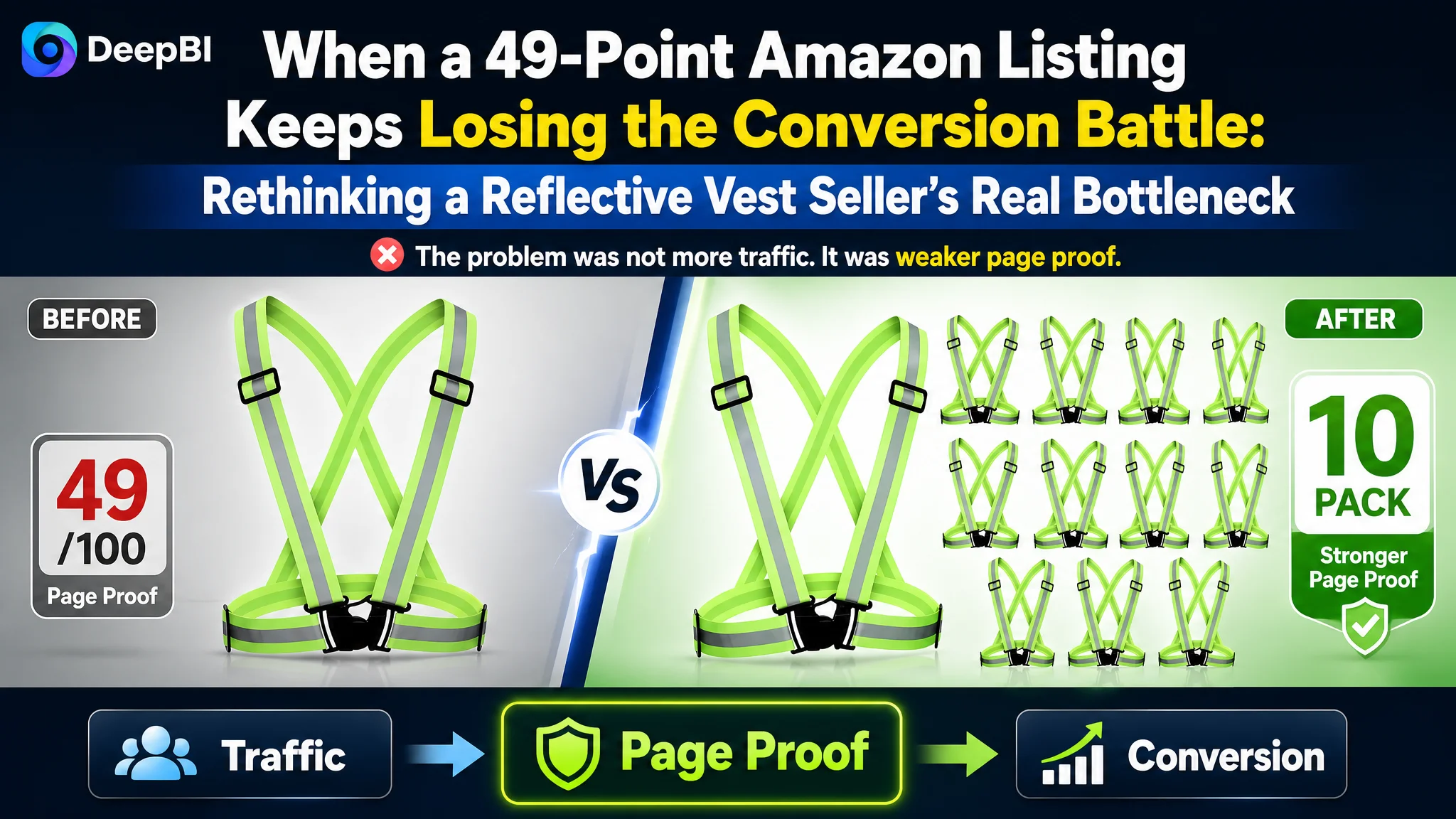
An Amazon seller of reflective safety vests was facing a product-page problem that could easily be mistaken for an advertising problem. The Listing offered a 10-pack, broad search-term coverage, and several functional claims, yet its overall competitive score was 49 out of 100—26 points behind a comparable high-performing listing.
The customer’s initial direction was to make the offer more visible through keywords, quantity messaging, and product specifications. But the deeper issue was not a lack of information. It was that the Amazon product page did not turn those advantages into sufficient trust or buying motivation.
DeepBI found the largest gap in the detail-page experience: the customer’s page had no visual content module and relied on repeated specification text, while the benchmark listing used usage scenarios, product close-ups, fit demonstrations, and structured A+ content. The later optimization therefore focused on rebuilding the Listing’s sales logic—from the main image and title to the bullet points and A+ content—before treating more traffic as the answer. For other Amazon sellers, the case offers a practical warning: when paid traffic does not convert, the first question should be whether the page has earned the right to receive more of it.
The Amazon Listing Looked More Complete Than It Actually Was
At first glance, the customer’s Listing had several apparent strengths.
The title covered more long-tail search contexts, including night cycling, jogging, and dog walking. It placed “10 Pack” near the front and described the product with terms such as “High Visibility Reflector” and “Safety Straps.” Compared with the benchmark title, it appeared to offer broader search coverage and a clearer quantity advantage.
The Listing also had product images and five bullet points. Its content was not empty. It mentioned visibility, materials, adjustability, comfort, and outdoor use.
That surface-level completeness created a misleading impression: perhaps the product only needed more keyword refinement or more aggressive promotion.
But the competitive diagnosis showed a different picture.
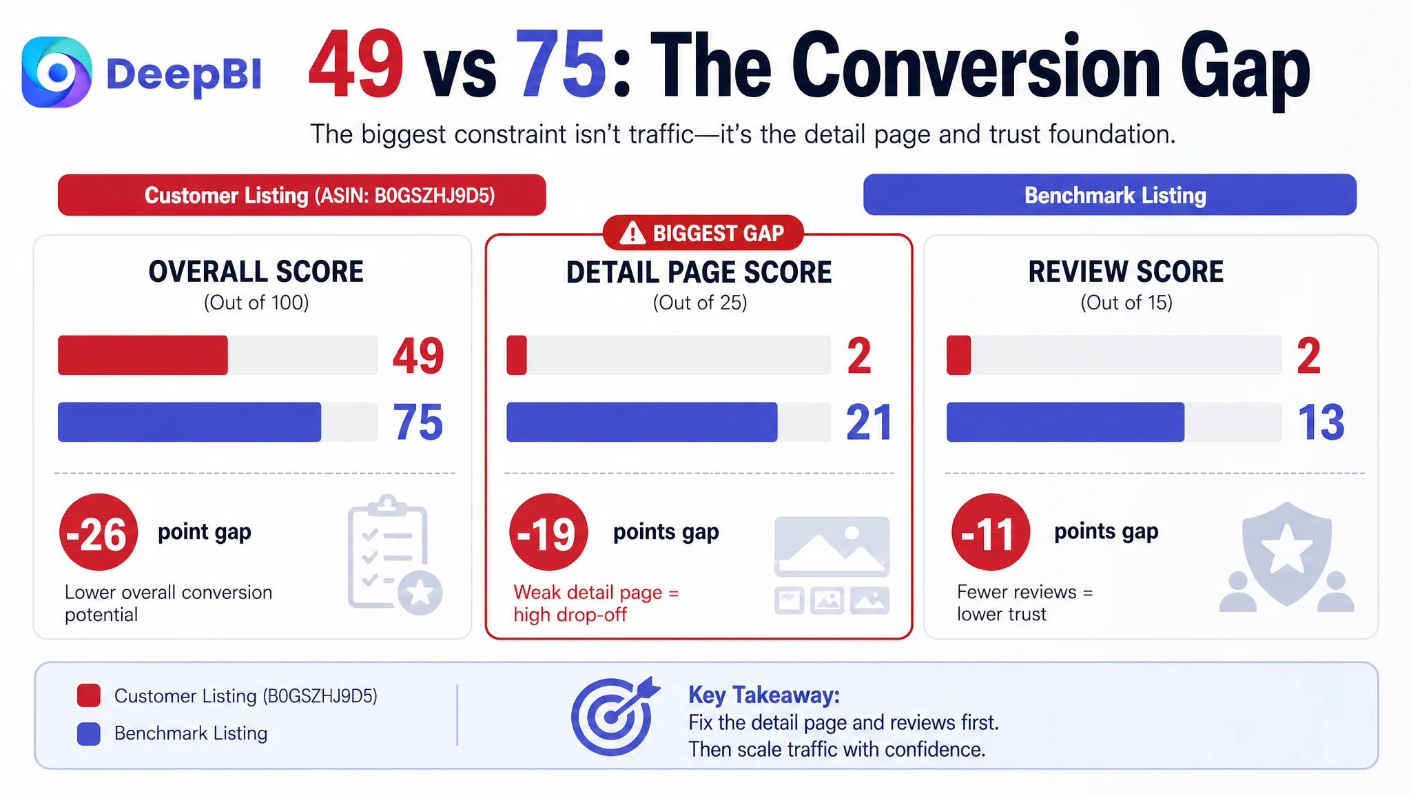
- Title: Customer Listing: 15/20, Benchmark Listing: 13/20, Gap: -2
- Main image: Customer Listing: 25/30, Benchmark Listing: 23/30, Gap: -2
- Bullet points: Customer Listing: 5/10, Benchmark Listing: 5/10, Gap: 0
- Detail page: Customer Listing: 2/25, Benchmark Listing: 21/25, Gap: -19
- Reviews: Customer Listing: 2/15, Benchmark Listing: 13/15, Gap: -11
- Total: Customer Listing: 49/100, Benchmark Listing: 75/100, Gap: -26
The largest weakness was not the title. It was not even the main image.
It was the product page’s ability to explain, verify, and support the purchase decision.
The Listing did not primarily suffer from a traffic problem. It suffered from a weak conversion foundation.
The Customer Was Optimizing the Entrance, Not the Decision
The original optimization logic focused on the most visible parts of the Amazon Listing.
The 10-pack advantage was made prominent. Search terms were expanded. The title emphasized reflective safety gear and multiple outdoor activities. The product’s functional benefits were present in the bullet points.
Those actions were understandable. A seller sees a product with a strong quantity proposition and assumes the main challenge is getting more shoppers to notice it.
However, the title analysis showed that the customer’s advantage was not being fully converted into readability or persuasion. The title contained repeated expressions such as “Reflective Running Vest” and “Reflective Vest,” which created redundancy even while covering relevant search terms.
The bullet points had a similar problem. They described product features, but did not consistently connect those features to the user’s situation:
- A person running after dark and needing to be seen
- A cyclist wearing the product over seasonal clothing
- A family or team needing multiple units
- A worker requiring high-visibility gear
- A buyer concerned about fit, comfort, or durability
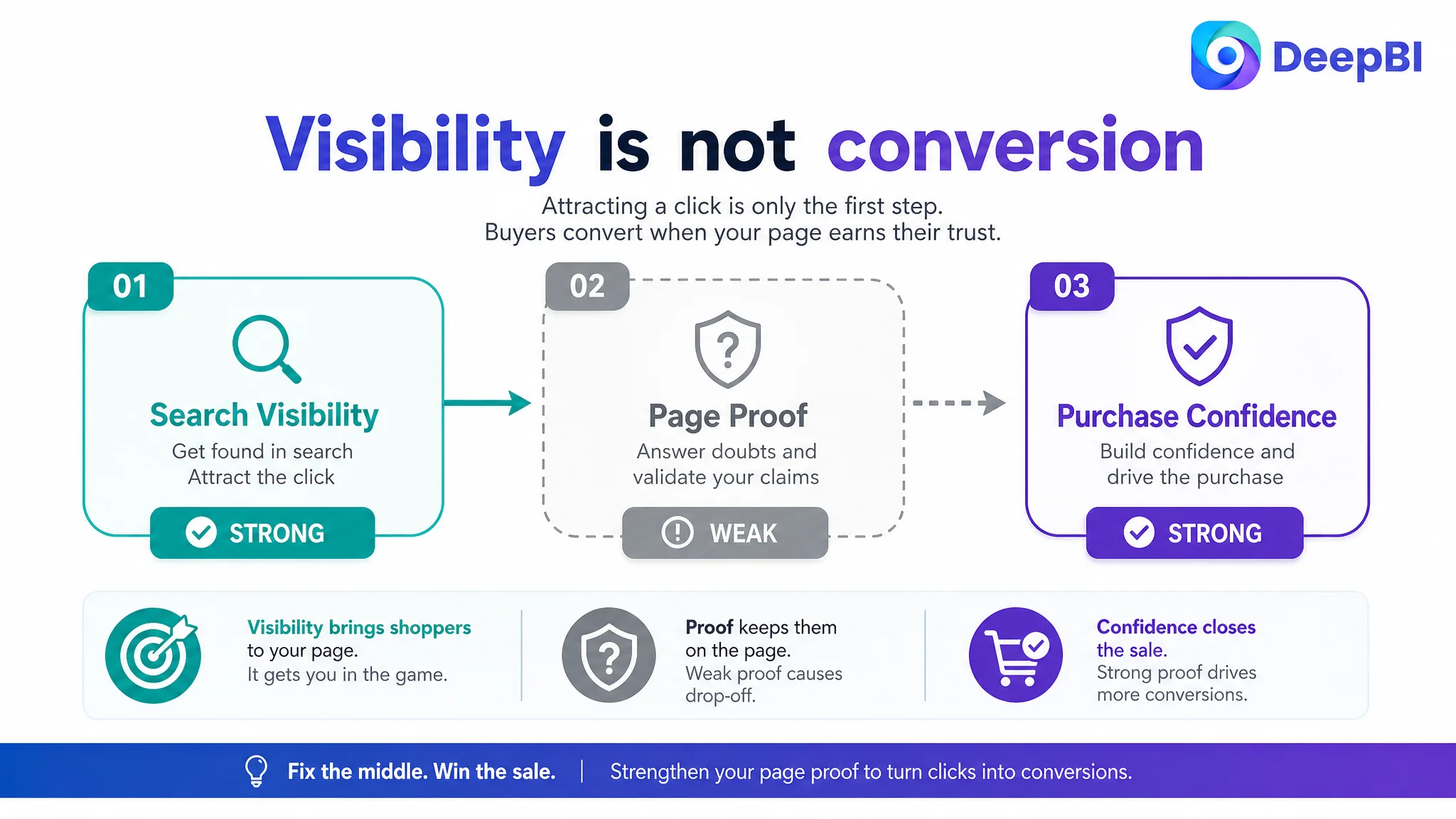
This distinction matters on Amazon. Search relevance may help a Listing enter the consideration set, but it does not explain why the buyer should trust the product enough to order.
The customer had been strengthening the entrance to the funnel while leaving the middle of the decision process underdeveloped.
The 19-Point Detail-Page Gap Changed the Diagnosis
The detail-page score made the problem difficult to dismiss as a small creative weakness.
The customer’s detail page contained no meaningful image module and relied heavily on repeated text covering specifications and disclaimers. It did not give shoppers a structured visual explanation of how the reflective straps looked in use, how they adjusted, how they fit over clothing, or why the materials and components could be trusted.
The benchmark listing used a much broader persuasion sequence:
- Running and cycling scenarios
- Product views from multiple angles
- Close-ups of buckles and materials
- Portability and folding demonstrations
- A brand-message banner
- Icon-based summaries of core benefits
- Real-person wear demonstrations
This was not simply a difference in visual polish.
It was a difference in how each page handled buyer uncertainty.
The customer page stated benefits
The customer’s content referred to visibility, lightweight construction, breathability, adjustability, and broad outdoor use.
The benchmark page demonstrated the use case
The benchmark listing showed shoppers where the product belonged in their lives and what the product looked like when worn.
That difference reduced the amount of interpretation required from the buyer. Instead of asking shoppers to believe that the product was comfortable, adjustable, and suitable for active use, the page gave them visual material with which to judge those claims.
DeepBI’s diagnosis therefore moved beyond “the images need improvement.”
The more precise judgment was:
The page lacked a visual trust chain connecting the product’s stated benefits to recognizable, real-world situations.
The Main Image Was Not Just a Design Issue
The main-image score was relatively close to the benchmark—25 versus 23 out of 30. That could suggest the main image was not a priority.
But the image analysis revealed several missed opportunities that affected both value perception and trust.
Quantity was visible, but not forceful enough
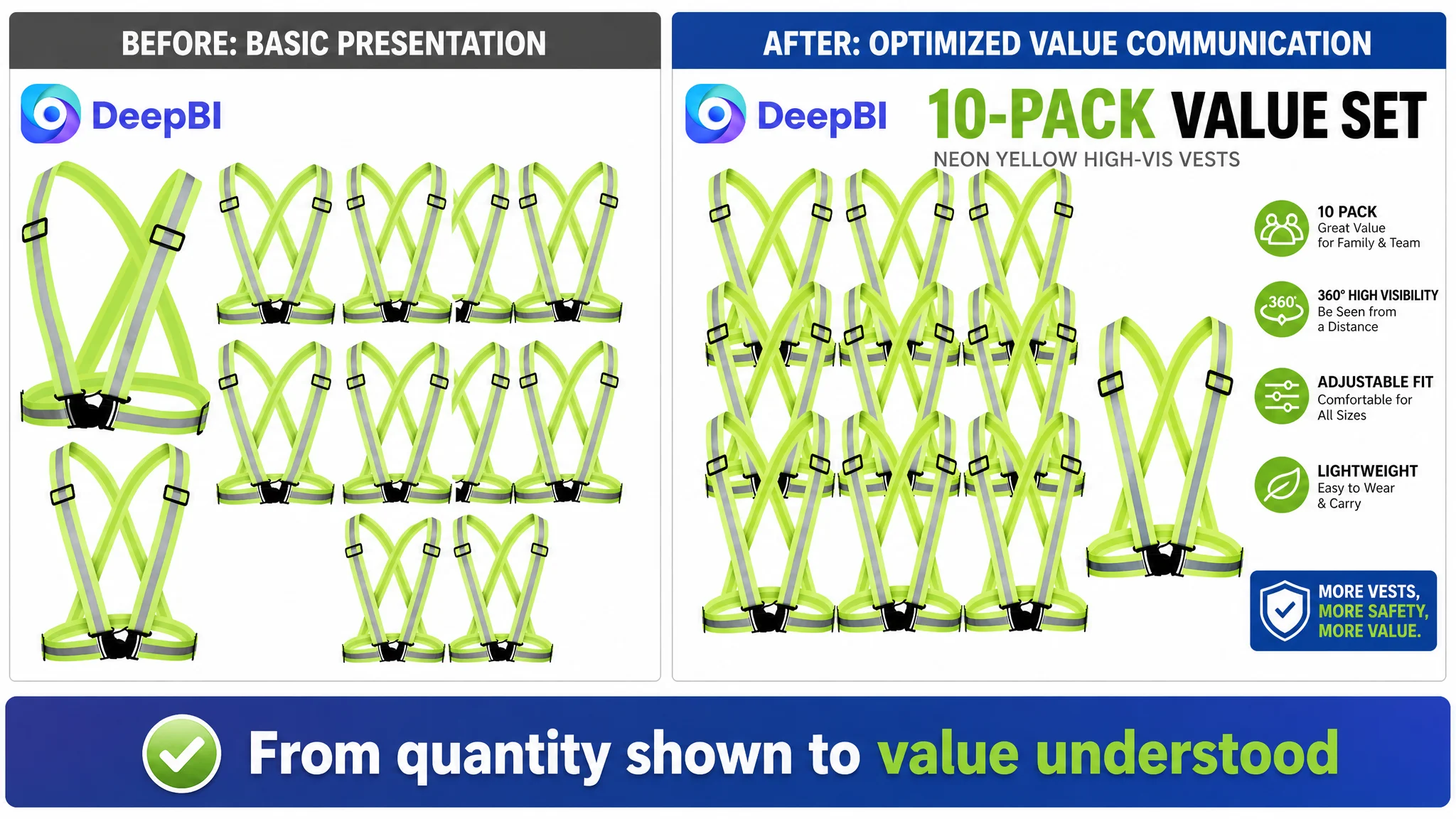
The customer’s 10-pack was a meaningful commercial advantage. Yet the stacked presentation risked making the product feel like a bulk commodity rather than a valuable safety solution.
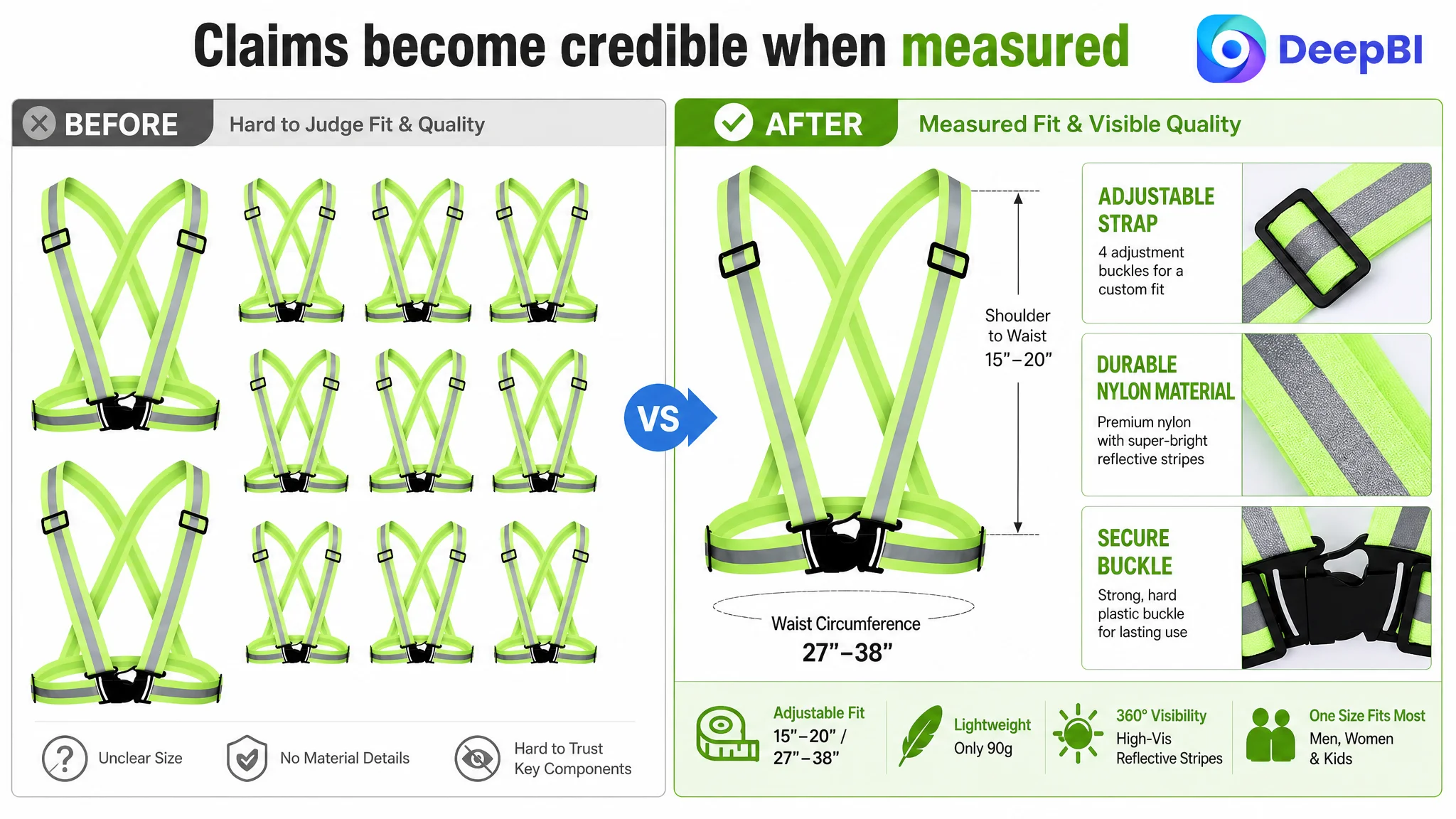
The first image needed to make the quantity advantage immediately legible without weakening the perceived quality of each unit. The intended direction was to present the 10 vests in a clearer, more deliberate arrangement so the offer communicated scale and value at the search-result stage.
The page did not sufficiently prove lightweight comfort
The Listing referenced a 90-gram weight, but the visual content did not create a convincing connection between that number and actual use.
A shopper could still wonder:
- Will the straps feel bulky during movement?
- Will they restrict the shoulders?
- Can they be worn over other clothing?
- Are they practical for longer walks or runs?
A dynamic wear scenario, supported by a clear visual comparison, would make the lightweight claim more credible than text alone.
Fit and material quality were under-explained
The product included adjustable straps and nylon construction, but the image sequence did not provide enough measurable information about fit or enough close-up detail about the buckles, adjusters, and reflective strips.
For functional safety equipment, buyers are often less persuaded by broad quality language than by visible evidence:
- How does the adjustment mechanism work?
- What range does it accommodate?
- What does the material look like at close range?
- Does the product appear secure when worn?
The main-image sequence needed to answer those questions in the order a shopper naturally encounters them.
The Bullet Points Had Information, but Not a Buying Logic
Both Listings received 5 out of 10 for their bullet points. The customer’s copy was not uniquely poor, but it did not turn specifications into a strong problem-to-solution argument.
The existing structure moved through visibility, use cases, materials, comfort, and versatility. What it lacked was sharper prioritization.
A more effective sequence would connect each feature to a specific buying concern.
Visibility should answer the safety concern
Instead of only describing reflective material, the first bullet should establish who needs to be seen, in which conditions, and why the 10-pack matters. The proposed direction combined the pack size with 360-degree reflective coverage and the product’s intended visibility benefit.
Any distance claim, such as visibility from 800 feet, would need to remain grounded in a verified product specification before publication. The important diagnostic point was not the number itself, but the need to make the safety proposition concrete and credible.
Adjustability should answer the fit concern
The benchmark listing supplied specific adjustment ranges of 15 to 20 inches from shoulder to waist and 27 to 38 inches around the waist. The customer’s Listing did not provide equivalent clarity.
If those measurements are verified for the customer’s product, they can reduce uncertainty and help prevent fit-related hesitation. If not, the page should use only confirmed dimensions rather than borrow the benchmark’s numbers.
Materials should answer the durability concern
The nylon fabric, reflective silver strips, belt buckles, and strap adjusters were all available product attributes. The problem was that they were presented as a list rather than as evidence addressing a buyer’s concern about repeated use.
The improved logic should show what each component contributes to the experience while avoiding unsupported promises such as lifetime durability.
Comfort should answer the movement concern
The harness-style design offered a useful distinction from bulkier traditional vests. That difference should be connected to practical movement, breathability, portability, and layering over clothing.
Versatility should answer the relevance concern
“Outdoor activity” was too broad on its own. The page could be more persuasive by mapping the product to concrete situations such as running, cycling, dog walking, construction work, traffic work, and roadside emergencies—provided those uses accurately reflect the product’s intended application.
The goal was not to add more keywords for their own sake.
It was to help different shoppers recognize why the product was relevant to them.
Why DeepBI Did Not Recommend Tuning Ads First
When an Amazon seller sees weak orders or inefficient advertising, the usual responses are familiar:
- Adjust bids
- Reorganize campaigns
- Add keywords
- Negate irrelevant search terms
- Shift budget toward better-performing targets
Those actions can be necessary. But they cannot repair a product page that fails to establish trust after the click.
In this case, the Listing already showed several signals of a page-level constraint:
- A 49-point overall competitive score
- A 19-point detail-page gap
- No meaningful A+ visual content
- No customer reviews
- Weak visual proof of fit, comfort, durability, and real-world visibility
- Bullet points that described features without a strong problem-to-solution structure
Continuing to increase traffic before addressing those weaknesses created a clear business risk.
Advertising could amplify exposure, but it could also amplify the page’s inability to convert.
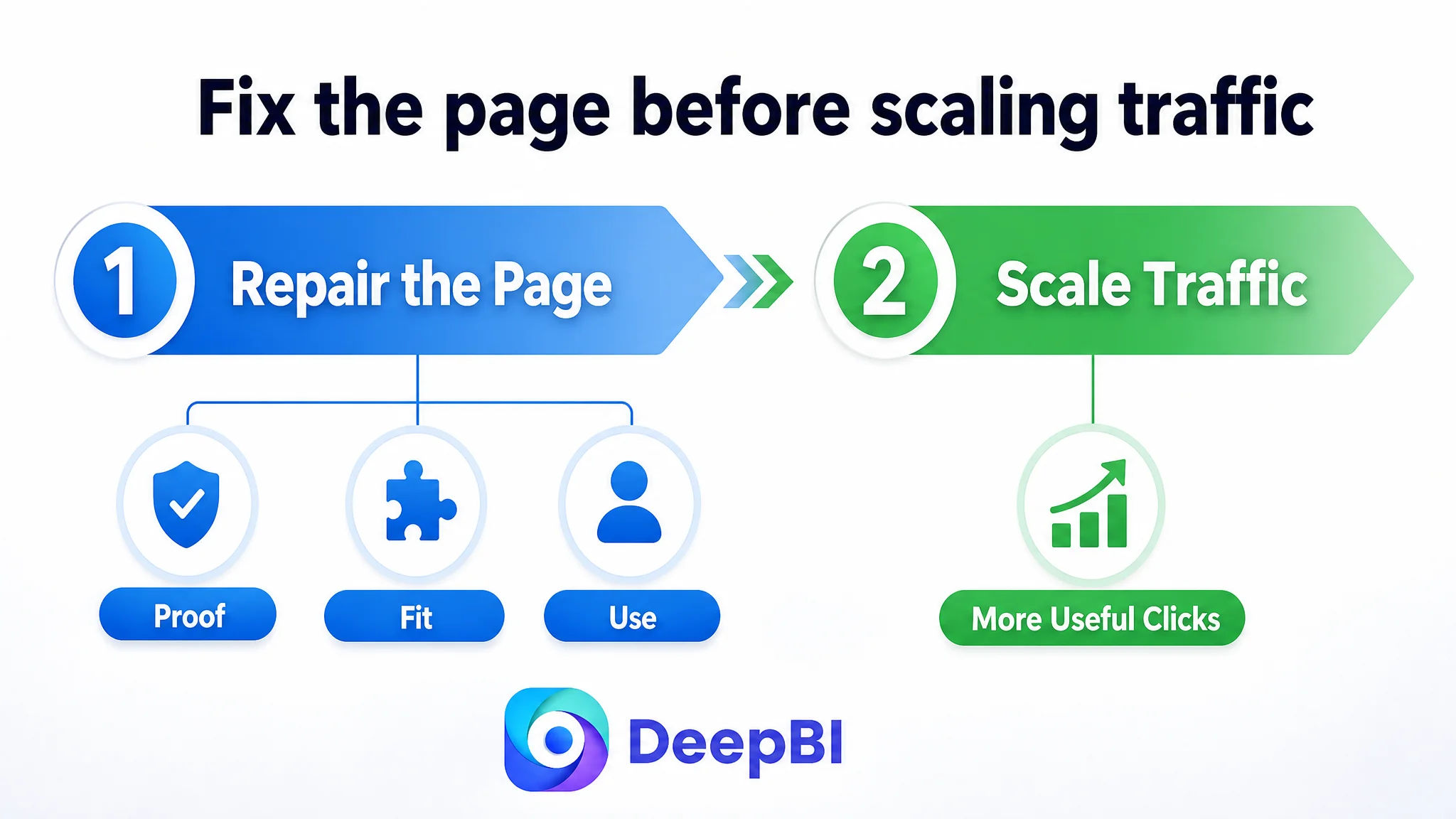
That is why the decision order mattered. The first task was not to abandon advertising. It was to make paid traffic more useful by improving the page that received it.
A stronger Listing would give both paid and organic visitors a clearer reason to continue:
1. The main image communicates the quantity and product type.
2. The title makes the offer and intended use easy to understand.
3. The bullet points connect features to practical concerns.
4. The image sequence proves fit, comfort, visibility, and durability.
5. A+ content builds a coherent visual story.
6. Reviews, once available, can reinforce the experience with customer evidence.
Without that sequence, ad optimization remained vulnerable to the same conversion leak.
The A+ Content Was the Missing Layer of Persuasion
The largest content gap was not solved by adding another paragraph of copy.
The page needed a visual narrative.
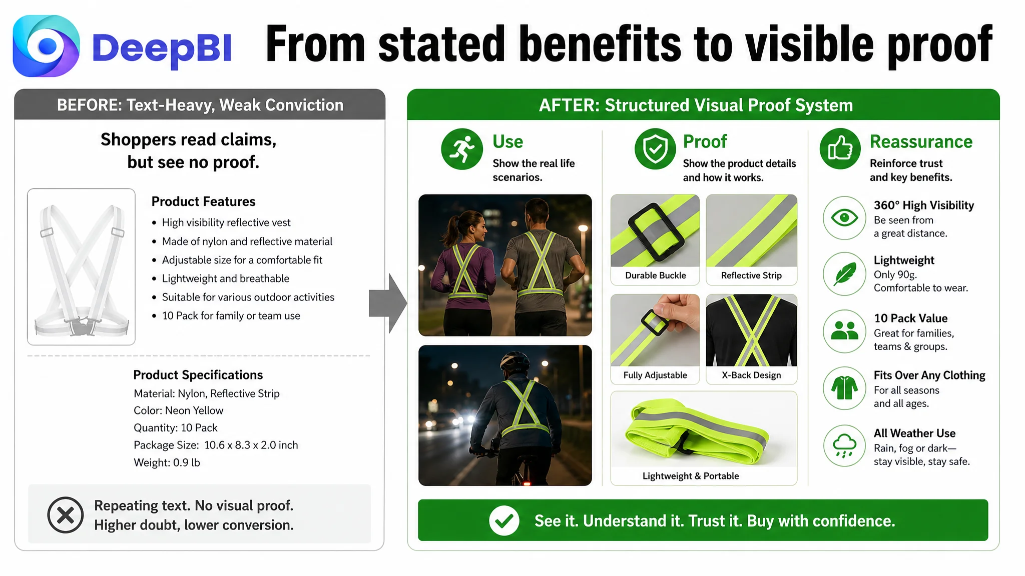
The recommended A+ direction began with scenario clarification. Running, cycling, dog walking, and other relevant activities should appear early enough to answer the basic question: “Is this product suitable for my use?”
The next layer was performance verification through context. Daylight and nighttime comparisons, including use over outerwear and during movement, could make the reflective function easier to understand. The purpose was not to create dramatic advertising imagery without evidence. It was to show the product behaving in situations that matter to the buyer.
Then came material and construction proof:
- Nylon fabric texture
- Reflective strip details
- Buckle construction
- Strap adjusters
- How the product is secured and adjusted
The page also needed to demonstrate comfort and flexibility rather than merely claim them. A wearer moving freely in different clothing layers would communicate more than a repeated statement that the design was breathable.
Finally, portability and storage deserved a place in the story. If the straps were lightweight and easy to carry, a folding or compact-storage demonstration could resolve a practical objection that the original page left untouched.
The A+ page therefore had to function as a decision sequence, not a collection of decorative modules.
The product did not need more claims. It needed a clearer chain of proof.
The Reviews Created a Separate Trust Constraint
The customer Listing had no review data: zero total reviews and no ratings visible on the first page. The benchmark listing had 825 reviews and a 4.6-star rating, including image and video reviews that discussed comfort, safety, and adjustability.
This gap could not be solved through copywriting or image generation.
It represented a separate trust constraint in the Amazon purchase decision.
Still, the absence of reviews made the page’s other weaknesses more serious. When shoppers cannot rely on customer experience, the product page must work harder to establish confidence through:
- Clear sizing information
- Realistic usage scenarios
- Visible material and component details
- Specific, verified product claims
- A coherent explanation of how the product is worn and used
DeepBI therefore treated the review gap as an important risk, but not as a reason to postpone all other Listing improvements. The customer could not immediately manufacture social proof. It could, however, make the page more transparent and reduce avoidable uncertainty.
The Title Needed Refinement, Not a Complete Rewrite of the Strategy
The title was one of the customer’s stronger areas. Its score was 15 out of 20, only two points below the benchmark.
That mattered because it prevented the team from overcorrecting in the wrong place.
The proposed title direction retained the product’s legitimate strengths:
- 10-pack quantity
- Reflective vest and safety strap terminology
- Nylon material
- Adjustability
- High visibility
- Night cycling, hiking, jogging, and dog walking contexts
At the same time, it reduced redundant wording and improved the order of information.
The broader judgment was that the title should support the product page’s sales logic, not carry the entire burden of conversion. Better keyword coverage can improve discoverability, but it cannot compensate for absent A+ content, unclear fit information, or weak proof of use.
The title was a supporting correction.
The detail page was the operating constraint.
What the Optimization Direction Changed
The case material does not provide post-optimization advertising or sales results, so it would be premature to claim a specific CVR increase, ACOS decline, or organic-order recovery.
The meaningful change was in the operating decision itself.
Instead of treating the Listing as an advertising asset that needed more traffic, the team began treating it as a conversion system that needed to become more credible and easier to understand.
The revised direction centered on:
- Making the 10-pack value immediately legible
- Using verified size information to reduce fit uncertainty
- Showing nylon, reflective strips, buckles, and adjusters in greater detail
- Demonstrating nighttime visibility in realistic contexts
- Showing comfort and range of motion during activity
- Mapping the product to specific user scenarios
- Replacing repetitive text with structured visual communication
- Building A+ content around use, proof, reassurance, and practical fit
- Keeping all claims within confirmed product boundaries
This sequence also created a cleaner basis for later testing. Once the page communicates its value more clearly, changes in CTR, CVR, ACOS, TACOS, and organic traffic can be interpreted with greater confidence.
The Seller’s Understanding Had to Move One Step Upstream
The most important outcome of the diagnosis was not a new title or a new image concept.
It was a change in how the Amazon business problem was framed.
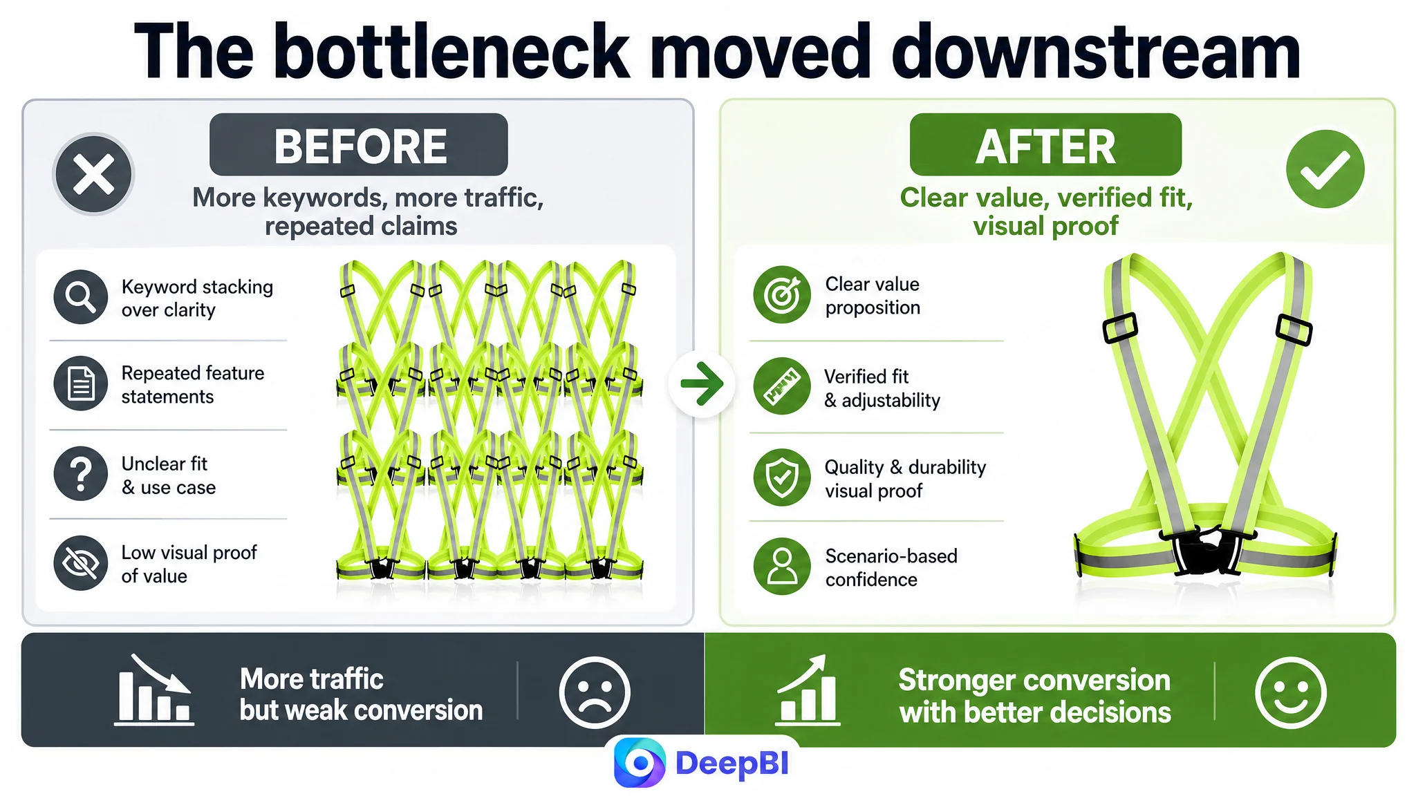
The customer initially viewed the Listing through the lens of visibility: more keywords, stronger quantity messaging, and broader activity terms. DeepBI’s analysis shifted attention toward the quality of the decision that followed the click.
That shift leads to several practical conclusions for Amazon sellers:
- Amazon ads cannot solve every conversion problem.
- A product page with weak trust signals can waste otherwise relevant traffic.
- Main images, titles, bullet points, and A+ content must work as one decision system.
- A high quantity value does not automatically create a high-value perception.
- Product claims become more persuasive when fit, use, and performance are shown rather than repeated.
- Review gaps increase the importance of transparent page content.
- Before scaling ads, sellers should judge whether the Listing is ready to convert the additional traffic.
For this reflective vest Listing, the priority was not to keep pushing traffic into the same page and hope that better campaign settings would overcome the gap.
The priority was to repair the page’s ability to explain the product, prove its relevance, and reduce buyer hesitation.
Only then could Amazon advertising traffic become more useful—and could the Listing begin to build a more stable foundation for both paid and organic conversion.