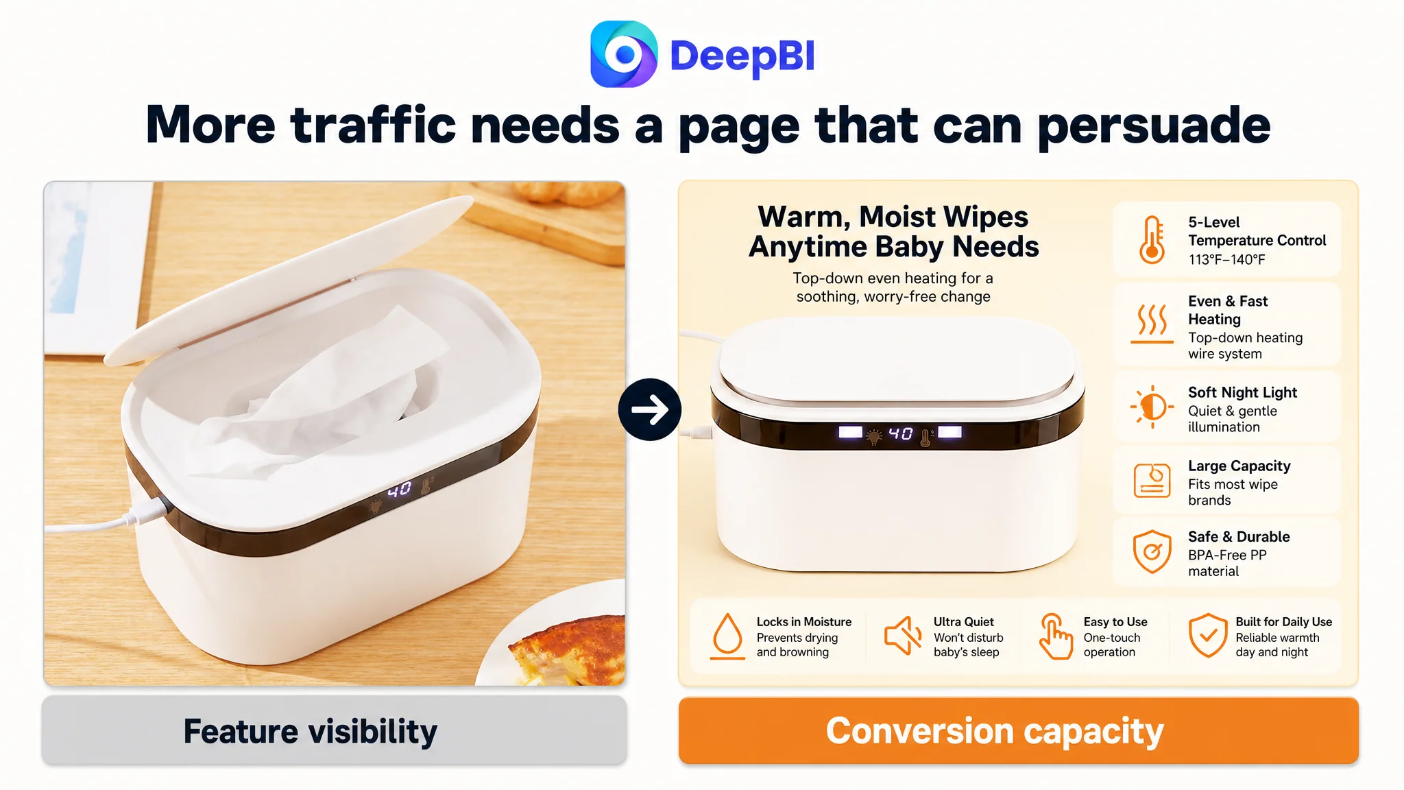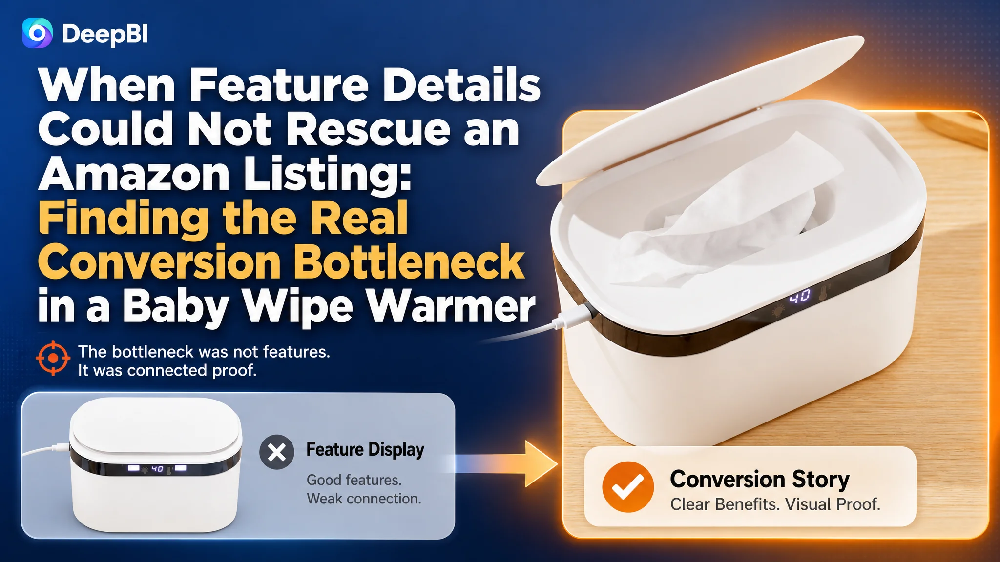
This case follows an Amazon seller in the US baby-care category whose baby wipe warmer Listing was carrying the right kinds of features—temperature control, quiet heating, night light, large capacity—but still looked materially weaker than a comparable high-performing listing. The initial working direction was to make those functions more visible through title wording, image sequencing, and feature descriptions.
DeepBI’s diagnosis pointed to a different constraint. The problem was not mainly a lack of specifications. It was that the Amazon product page did not turn those specifications into a convincing buying story. The largest gap was in the detail experience: the Listing had text, but almost no visual proof, usage context, or trust-building structure.
The later optimization therefore focused on repairing Listing conversion capacity before treating the page as ready for more traffic: clarify the heating logic, show how the product addresses drying and uneven-heating concerns, validate the night-use experience, organize the five bullets around parent pain points, and build an A+ story instead of repeating parameters. Other Amazon sellers can learn a practical lesson from this case: a product page may contain many features and still fail to give shoppers a sufficient reason to buy.
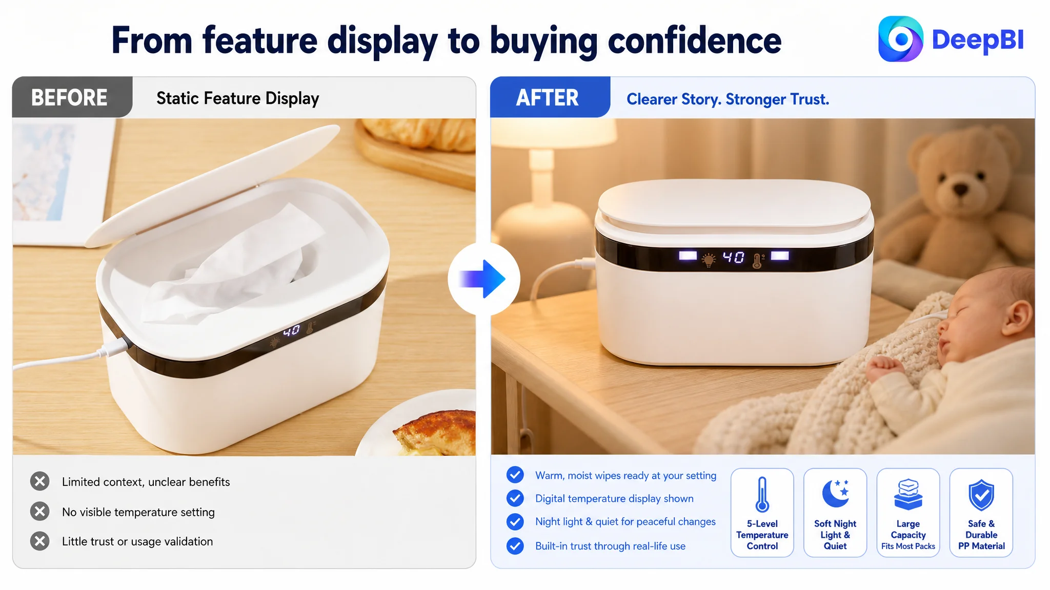
The Amazon Listing Was Not Empty. It Was Under-Persuading.
At first glance, the target Listing did not appear to have a product-definition problem.
It already communicated several functional points:
- Multiple temperature settings
- Quiet and even heating
- A night light
- Large capacity
- Compatibility with common wipe packs
- Simple operation
- Material and safety information
The issue was that these points were presented largely as a list of functions.
They did not yet form a clear sequence from parent concern to product mechanism to visible proof to purchase confidence.
That distinction matters on Amazon. Shoppers do not evaluate a baby-care product by counting how many features appear in the title or bullet points. They are trying to answer more practical questions:
- Will the wipes remain warm and moist?
- Will the wipes dry out or turn brown?
- Is the temperature even throughout the container?
- Can it be used during a late-night diaper change without disturbing the baby?
- Will it fit a full pack of wipes?
- Is the material appropriate for repeated daily use?
- Does the page look trustworthy enough to justify the purchase?
The Listing did not consistently answer those questions in the order shoppers needed.
The central problem was not a shortage of features. It was a shortage of connected proof.
A 54-Point Listing Was Facing a 91-Point Market Standard
DeepBI’s comparison produced a clear competitive signal.
The target Listing scored 54 out of 100, while the comparable high-performing listing scored 91. The 37-point difference was not evenly distributed across every part of the page.
- Title: Target Listing: 15/20, Comparable listing: 18/20, Gap: -3
- Main images: Target Listing: 23/30, Comparable listing: 28/30, Gap: -5
- Bullet points: Target Listing: 7/10, Comparable listing: 8/10, Gap: -1
- Detail experience: Target Listing: 3/25, Comparable listing: 24/25, Gap: -21
- Reviews: Target Listing: 6/15, Comparable listing: 13/15, Gap: -7
- Total: Target Listing: 54/100, Comparable listing: 91/100, Gap: -37
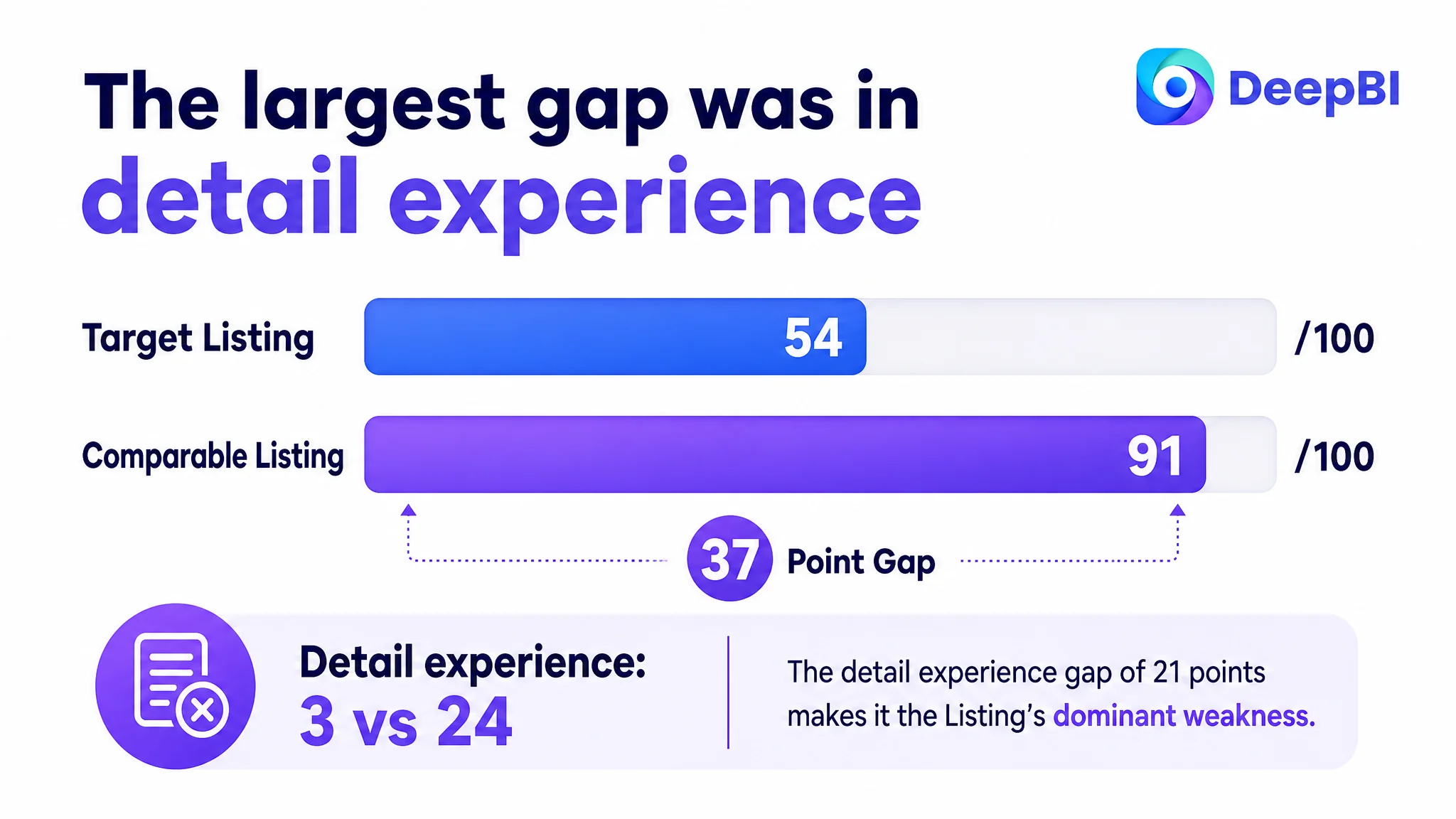
The conclusion was difficult to ignore: the detail experience accounted for most of the Listing’s competitive weakness.
The title and main images had meaningful room for improvement. Reviews also created a serious trust disadvantage. But the A+ section was the most urgent problem because it offered no visual modules and repeated the product description in text.
That changed the order of operations.
The page did not simply need more polished copy or a few better-looking images. It needed a stronger sales logic.
The Initial Direction Focused on Features, Not the Decision Barrier
The original optimization direction was understandable.
The product had several differentiating specifications, including five temperature settings compared with the comparable listing’s four. It also had quiet operation, a night light, large capacity, and an even-heating claim. Bringing these advantages forward in the title and image set seemed logical.
The existing page also devoted attention to secondary convenience points such as the lid and USB-related information. Temperature settings and basic operating details received prominent treatment as well.
But this direction risked treating the Listing as an information problem:
If shoppers can see more features, perhaps they will understand the product better.
DeepBI reframed the question:
Which concern is preventing a parent from trusting the product enough to place an order?
That question exposed why feature accumulation alone was unlikely to solve the page’s conversion weakness.
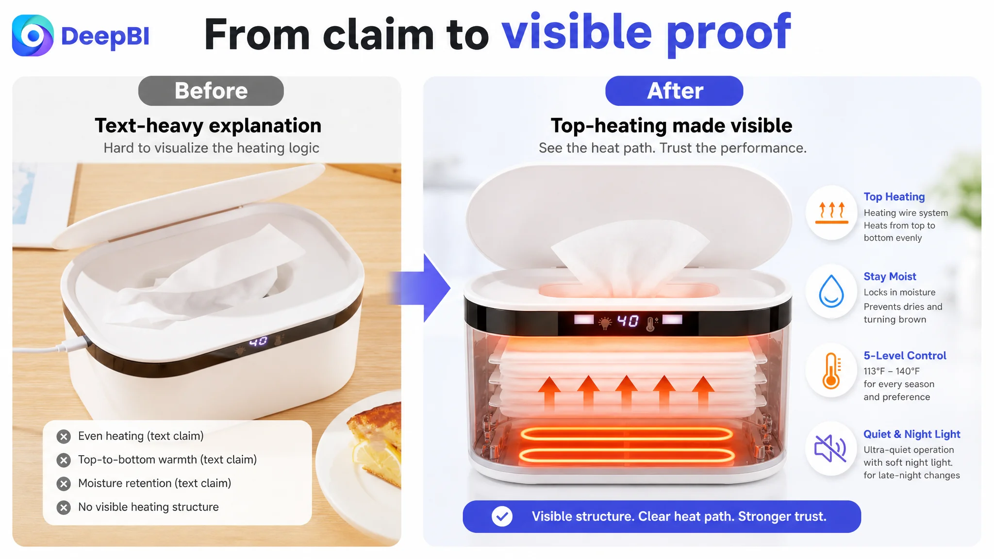
A five-level temperature system is not persuasive by itself. It becomes persuasive when the shopper understands why the settings matter in different conditions.
“Even heating” is not persuasive by itself. It becomes persuasive when the page shows how the heating-wire system conducts heat from top to bottom and how that addresses uneven temperature or drying concerns.
A night light is not merely a specification. Its value is connected to a late-night diaper change, soft illumination, and avoiding unnecessary disturbance.
The page needed to translate functions into outcomes.
The Biggest Gap Was Not a Missing Keyword. It Was a Missing A+ Story.
The target Listing’s detail section contained no image modules. It relied on repeated text descriptions.
The comparable listing, by contrast, used a sequence of visual explanations covering:
- A parent-and-baby usage scene
- Internal structure
- Heating logic
- Night-light brightness
- Product dimensions
- Product composition
- Feature summaries
- Quiet nighttime use
- Multiple usage contexts
- Installation or setup guidance
The competitive difference was not simply that one page had more images.
The stronger Listing used images to answer objections progressively:
1. Here is the product in a relevant family setting.
2. Here is how the heating design works.
3. Here is why the wipes can remain warm and moist.
4. Here is how the night light supports nighttime use.
5. Here is how the product fits and operates.
6. Here is what the material and construction communicate about safety.
7. Here is the complete reason to choose it.
The target page stopped at descriptive information.
That created a trust gap between “the product claims this function” and “I can see why this function will matter in my home.”
A+ content was not an optional brand layer in this case. It was the missing bridge between technical claims and purchase confidence.
The Title Had Keywords, but Not Enough Competitive Meaning
The title score was 15 out of 20, so the title was not the primary failure. Still, it reflected the broader issue: the Listing was describing functions without giving the strongest benefits enough priority.
The existing title included temperature control and quiet, even heating. However, its structure was relatively dense, and the differentiating promise was not expressed as directly as it could be.
The recommended direction was to organize the title around:
- The core product keyword
- Large-capacity positioning
- Temperature control
- Fast, quiet, and even heating
- Night-light use
The important change was not simply adding more search terms.
It was moving from a feature-heavy sequence toward a clearer balance between search relevance and shopper meaning. “Fast heating” addresses urgency more directly than a quieter but less outcome-oriented phrase. “Five-level temperature control” gives the shopper a concrete reason to consider the product. “Night light” connects the device to an identifiable parenting situation.
The title still needed to remain readable. More information would not automatically create more clicks.
The Main Image Sequence Was Spending Its Best Positions Too Early
The main-image set also showed a sequencing problem.
The first image performed the basic discovery role: it showed the product and a temperature reading. That was necessary, but visually static compared with the stronger competitive presentation.
The second image largely confirmed temperature control again. The third explained heating, but only later in the sequence and with a generic heating visual. The fourth was used for dimensions, and the fifth emphasized secondary convenience features.
This meant the early image sequence did not address the most important objections quickly enough.
DeepBI’s recommended order placed greater emphasis on the following logic:
First: establish product identity and a clear reason to notice it
The first image should continue to show what the product is, while presenting the temperature display and product presence more clearly. The visual should feel active and relevant without adding unsupported claims.
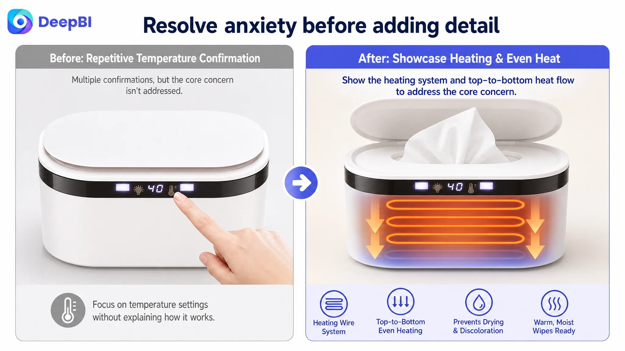
Second: address the drying concern earlier
The top-down heating system and heating-wire element should appear before repetitive temperature confirmation. This directly addresses the worry that wipes may dry out, turn brown, or remain unevenly heated.
Third: provide performance logic
The “rapid and even heating” message should be shown as a functional explanation rather than a generic decorative wave pattern. The shopper should be able to understand the intended heat path from top to bottom.
Fourth: validate the nighttime use case
The night light belongs in an earlier persuasion position because late-night diaper changes are a concrete and emotionally recognizable use situation. Dimensions can remain available later, but they should not occupy a critical early slot when the page still lacks usage context.
Fifth: confirm temperature choice
The five temperature presets should show control and flexibility, especially across different seasons and comfort preferences. This is a stronger verification point than secondary features at the top of the image sequence.
The principle was straightforward:
Early images should resolve buying anxiety before they provide logistical detail.
The Bullet Points Needed a Pain-Point Structure
The original bullets were not useless. They contained relevant information about the heating system, temperature levels, material, capacity, compatibility, and quiet operation.
Their weakness was the relationship between those facts and the parent’s problem.
The revised structure began with the product’s most consequential concern: keeping wipes warm and moist. It then moved through nighttime use, moisture retention, temperature control, and ease of operation.
That order created a more useful progression:
The heating system should explain the outcome
Instead of presenting heating as a technical feature alone, the first bullet should connect the heating-wire element with rapid and even heat conduction. The customer should understand why the design matters to the wipes at the top and bottom of the container.
The night light should be tied to a real routine
The night-light bullet should describe gentle illumination for late-night changes, alongside quiet operation. The value is not “a light exists.” The value is being able to use the product without harsh glare or unnecessary noise.
Moisture retention should carry safety and care relevance
The moisture-lock message, seal, and BPA-free PP material should be presented as part of a daily-use experience. This is more credible and useful than a broad statement that the wipes remain wet.
Five temperature levels should support choice
The five-level range provides a tangible control advantage. It should be used to explain comfort and seasonal flexibility rather than treated as a number to insert into the page.
Capacity should remove compatibility anxiety
A full-pack capacity and compatibility with standard wipe brands answer a practical pre-purchase concern. This information belongs after the higher-impact concerns have been addressed.
Maintenance, usage, and power requirements also deserved clearer treatment. These details may not be the primary conversion trigger, but they help reduce avoidable confusion, misuse, negative feedback, and return risk.
The Page Needed to Prove, Not Repeat
The most important redesign decision was to stop using A+ content as another place to repeat the bullets.
The proposed A+ sequence was built around seven business questions.
Can the shopper see the desired outcome?
The opening module should connect the product with the experience of using a warm wipe during childcare. It should use available materials and avoid inventing scenes or results that the product cannot support.
Can the shopper understand the heating mechanism?
A clear diagram should explain how the heating-wire system conducts heat from top to bottom. This is where the page converts a technical claim into a reason to believe.
Can the shopper control the experience?
The temperature-control module should show how the five settings are selected and how the 24-hour constant-temperature function supports use in different seasons.
Can the product work during the night?
The page should validate both quiet operation and the gentle night light. These are not decorative additions; they answer a specific household-use concern.
Will it fit the wipes already being used?
A visual demonstration of a full standard wipe pack helps reduce compatibility hesitation and gives the large-capacity claim practical meaning.
Is the material appropriate for daily use?
The BPA-free PP material should be presented clearly, with its intended durability and heat-resistance characteristics stated only within the confirmed product information.
Is there enough information to make a final decision?
A concise icon-based summary can bring the main benefits together: heating, temperature control, safety, capacity, quiet operation, and night light.
This is the difference between a content-filled page and a decision-supporting page.
Why DeepBI Did Not Recommend Tuning the Page Around Secondary Features First
The target Listing had several smaller issues that could easily attract operational attention:
- Whether to highlight the lid
- Whether to mention USB-related convenience
- Whether to add more temperature detail
- Whether to refine dimensions
- Whether to shorten or expand the bullets
Those questions were not irrelevant. They were simply not the first constraint.
The score gap showed that the page lacked a complete trust-building experience. Improving a secondary convenience feature while leaving the A+ section visually empty would have produced a more detailed version of the same weak persuasion path.
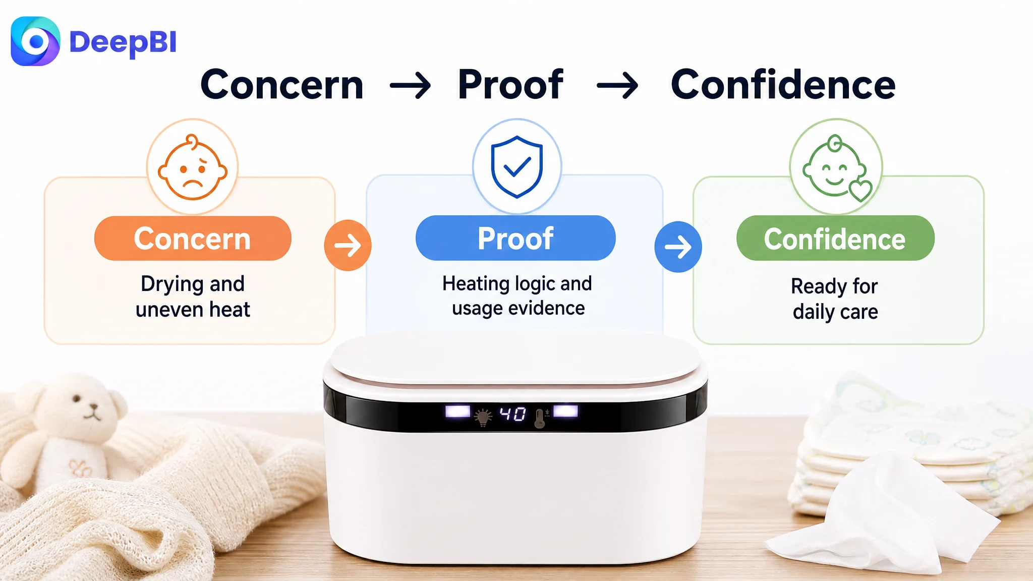
DeepBI’s decision logic therefore prioritized the largest conversion constraint first:
1. Establish the product’s core outcome.
2. Explain the heating logic.
3. Address drying and uneven-heating concerns.
4. Validate nighttime use.
5. Confirm capacity, materials, and operation.
6. Use the title and image sequence to direct attention to those benefits.
7. Treat reviews and product experience as a separate trust challenge.
This order reduces the risk of amplifying a low-conversion page. More traffic is not automatically more valuable when the product page still leaves major objections unanswered.
Advertising can bring a shopper to the Listing. It cannot make an unproven page feel trustworthy on the shopper’s behalf.
Reviews Were a Structural Trust Risk, Not a Copy Problem
The review gap was also material.
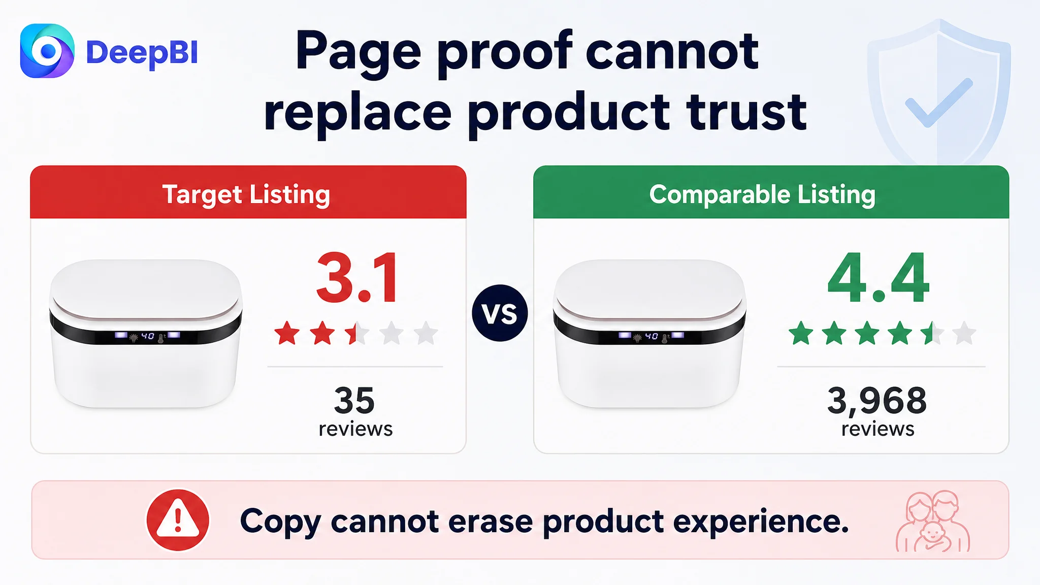
The target Listing showed:
- 3.1 stars
- 35 total reviews
- 8 reviews visible on the first page
- 37.5% of first-page reviews at three stars or below
The comparable listing showed:
- 4.4 stars
- 3,968 total reviews
- 15 reviews visible on the first page
- 13.3% of first-page reviews at three stars or below
This difference affects how every other page element is interpreted.
A polished image may attract attention, but a low rating can interrupt the purchase decision. A stronger A+ page can explain the product more clearly, but it cannot erase product-quality or service problems reflected in customer feedback.
The Listing work therefore needed to do two things at once:
- Improve the page’s ability to explain and prove the product’s value
- Recognize that product experience, customer support, hygiene guidance, and maintenance education also influence future review quality
The proposed maintenance and usage notes were relevant for that reason. Clear instructions about cleaning, moisture management, power requirements, and extended non-use can reduce misuse and confusion. They are not a substitute for product improvement, but they are part of a more responsible conversion strategy.
The Reframed Optimization Was About Conversion Capacity
The final direction did not treat the Amazon Listing as a collection of isolated assets.
The title, main images, bullets, A+, and reviews each played a different role:
- The title captures search relevance and introduces the strongest differentiators.
- The first images create attention and address the most important functional concerns.
- The bullet points connect features to parenting situations and expected outcomes.
- The A+ content provides visual proof, structure, and confidence.
- The reviews validate or weaken the entire promise through customer experience.
The most urgent repair was the page’s ability to convert interest into trust.
That is why the heating-wire explanation, moisture-retention logic, nighttime scenario, temperature-control proof, capacity confirmation, and material information were prioritized over simply adding more feature labels.
No post-optimization advertising or conversion results were provided in the case material, so it would be inappropriate to claim a confirmed CVR increase, ACOS decline, or organic-order recovery. The measurable value of this stage was the change in operating judgment: the team could stop treating the Listing as a feature-visibility issue and begin treating it as a conversion-system issue.
What Other Amazon Sellers Should Take From This Case
A Listing can have a reasonable product concept, several useful features, and still underperform because the page does not make the buying decision easy.
The most important questions are not:
- How many features are listed?
- How many images have been uploaded?
- How many temperature settings can be mentioned?
- Can another keyword be added to the title?
The more important questions are:
- What is the shopper most worried about?
- Does the first part of the page address that concern?
- Is the product mechanism visible?
- Does each bullet connect a feature with a real use situation?
- Does the A+ section prove the promise or merely repeat it?
- Are review problems being treated as a product and service issue rather than a copy issue?
- Is the Listing ready to convert additional Amazon paid or organic traffic?
For this baby wipe warmer, the real bottleneck was not the absence of traffic-oriented language. It was the absence of a convincing bridge between warm wipes, even heating, nighttime usability, and trust in daily baby-care use.
That is the judgment DeepBI surfaced through the comparison: before asking Amazon ads to work harder, the page had to become more capable of converting the traffic it already received.