

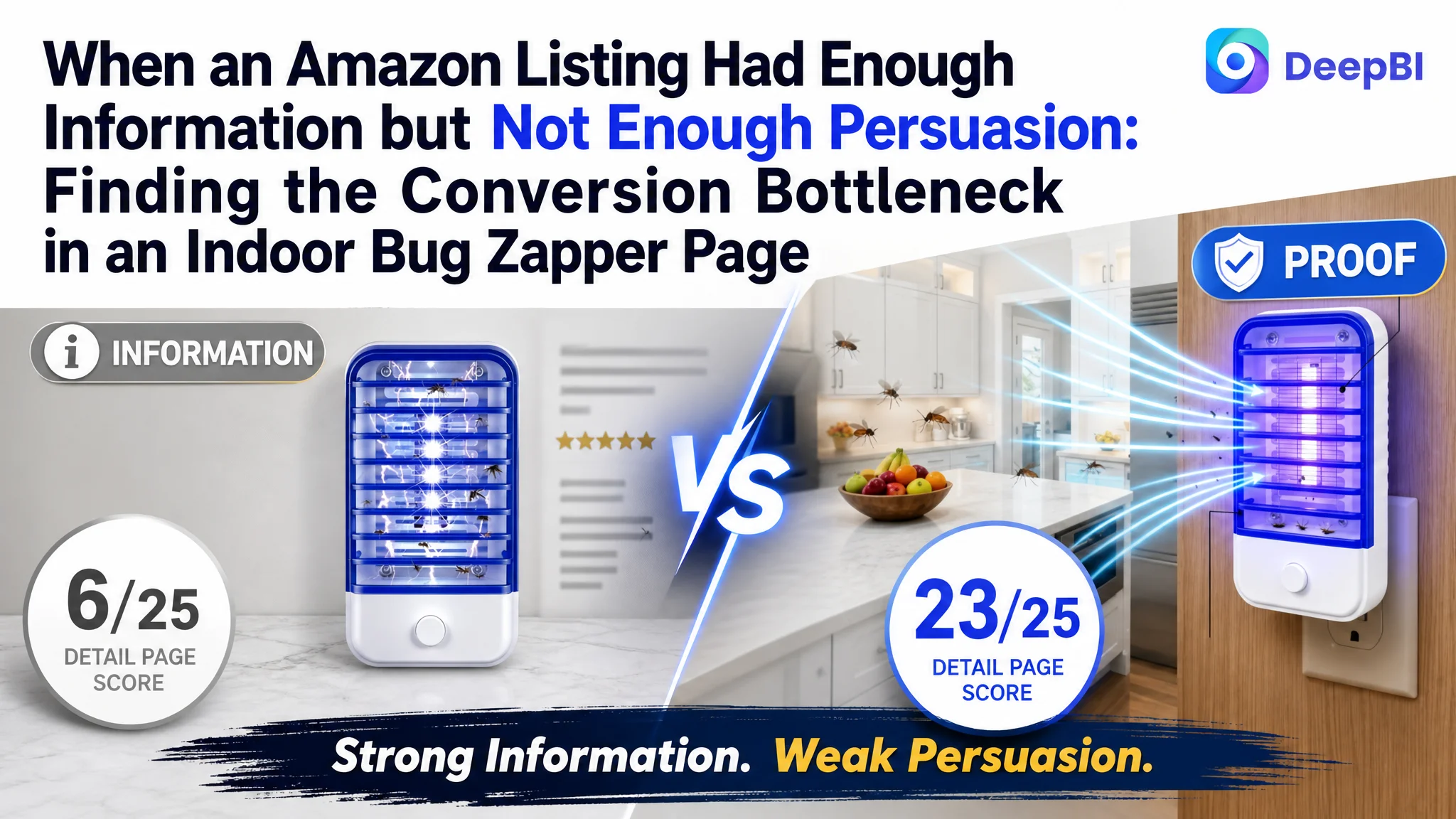
An Amazon seller in the US indoor pest-control category was reviewing an underperforming Listing for a four-pack plug-in bug zapper. The page contained detailed product information, practical usage guidance, and stronger customer reviews than the comparable high-performing listing. The initial optimization direction therefore focused on tightening keywords, improving the title structure, and refining the feature copy.
That diagnosis was incomplete. DeepBI’s comparison showed that the most serious weakness was not a lack of product information. It was the product page’s inability to turn that information into confidence. The Listing scored 63 out of 100, compared with 75 for the benchmark listing, and the largest gap appeared in the detail-page experience: 6 points versus 23.
The later direction moved from text refinement to conversion logic. The focus became a more persuasive main-image sequence, clearer pest and safety communication, a visual A+ story, easier maintenance guidance, and stronger whole-home usage validation. For other Amazon sellers, the case shows why a page can have useful copy and positive reviews yet still lose conversion when its visual and trust-building structure is too weak to support paid or organic traffic.
The Listing Looked Complete Until the Dimensions Were Separated
At first glance, the target Listing did not appear fundamentally weak.
Its five bullet points were more developed than the benchmark’s. They started with customer problems such as flying insects, nighttime noise, and household safety concerns. They also included concrete usage guidance, such as coverage of up to 300 square feet and a recommendation to activate the device three hours before use.
The review position was also relatively favorable:
- Target Listing: 3.9 stars, 23 total reviews
- Benchmark Listing: 2.4 stars, 14 total reviews
That meant the seller was not starting from a position of weak customer sentiment. The target Listing had a 1.5-star advantage and nine more reviews.
The problem became visible only when the Listing was assessed as a complete conversion system rather than as a collection of individual assets.
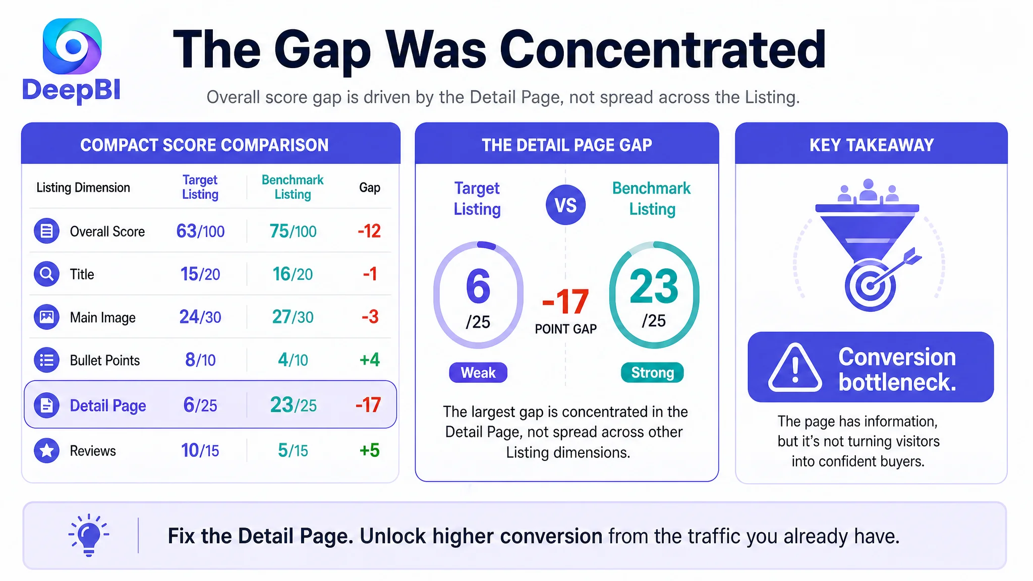
- Overall score: Target Listing: 63/100, Benchmark Listing: 75/100
- Title: Target Listing: 15/20, Benchmark Listing: 16/20
- Main image: Target Listing: 24/30, Benchmark Listing: 27/30
- Bullet points: Target Listing: 8/10, Benchmark Listing: 4/10
- Detail page: Target Listing: 6/25, Benchmark Listing: 23/25
- Reviews: Target Listing: 10/15, Benchmark Listing: 5/15
The result was not a general weakness across every section. The title and main image were slightly behind. The bullet points and reviews were comparatively strong.
The decisive gap was concentrated in the detail page.
That distinction changed the business question. Instead of asking, “How can the seller add more keywords or more feature claims?” the more useful question became:
Can the page make a shopper believe that this product is effective, safe, easy to maintain, and worth placing throughout the home?
The First Optimization Direction Was Too Close to the Text
The original direction was understandable.
The title placed “2026 Upgraded” at the beginning, while the core term “Bug Zapper” appeared later. It also repeated variations of “Indoor Plug in,” creating a heavier keyword structure than the benchmark. The page covered multiple use cases, including bedrooms, baby rooms, kitchens, and offices, but the sequence of terms was not as clear or compact.
From a search and click perspective, those were valid issues.
The title could bring the core product term forward, reduce repeated wording, add “Mosquito Killer” and “Gnat Trap,” and present the four-pack specification more cleanly. These changes could make the search result easier to understand, especially on mobile screens.
The five bullet points also had room for refinement. The underlying content was stronger than the benchmark’s, but it could be reorganized so that each point moved from a customer concern to a clear solution:
- Targeted UV and phototaxis technology for gnats, fruit flies, moths, flies, and mosquitoes
- Fully enclosed physical safety design
- Quiet, odorless, low-energy nighttime operation
- Slim form factor that leaves the second outlet available
- Low-maintenance cleaning without complicated disassembly
The risk was that these improvements could make the page more precise without making it more persuasive.
A shopper may understand the product better and still remain unconvinced.
That is what DeepBI’s cross-dimensional comparison exposed. The page had information, but the information was not being delivered in the order or format required by the purchase decision.
The Real Constraint Was Listing Conversion Capacity
The detail-page score was the clearest signal: 6 out of 25 versus 23 out of 25.
The target Listing used a text-only A+ structure covering specifications, functions, usage scenarios, and FAQs. The benchmark listing used a more visual sequence:
1. Product value and simple setup
2. Target pest coverage
3. Family and safety reassurance
4. Cleaning guidance
5. Whole-home scenarios
The difference was not merely aesthetic.
The benchmark’s A+ content addressed the buyer’s decision barriers in sequence. The target page mainly described the product in a linear format. Important claims were present, but they were not given enough visual weight or placed early enough to reduce hesitation.
“The page did not lack information. It lacked a persuasive path through the information.”
For an indoor bug zapper, that path matters because the product is purchased around several concerns at once:
- Will it actually attract the insects I am dealing with?
- Is it suitable for a bedroom or baby room?
- Will it create noise or odor?
- Is it safe around children and pets?
- Will it be difficult or unpleasant to clean?
- Does a four-pack make sense for my home?
A text-heavy FAQ may answer these questions eventually. But high-intent shoppers often decide whether to continue within the first few visual sections of the page.
The Listing needed to address the highest-friction concerns earlier, especially effectiveness and household safety.
The Main Image Was Not Just a Visual Issue
The target Listing’s main-image set showed the product and several usage scenes, including the kitchen, bedroom, and living room. But the sequence did not create a strong enough chain from product recognition to purchase confidence.
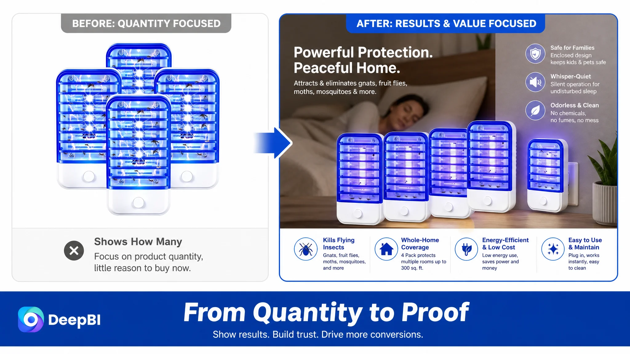
The first image mainly communicated quantity. It showed the multi-pack, but did not visually demonstrate why having multiple units created greater value or broader protection.
The recommended shift was from a passive quantity display to an active results story: show several devices working together and use visible evidence of captured insects to communicate high-efficiency operation at a glance.
This was not about adding decoration. It was about making the four-pack understandable as a solution rather than merely a count.
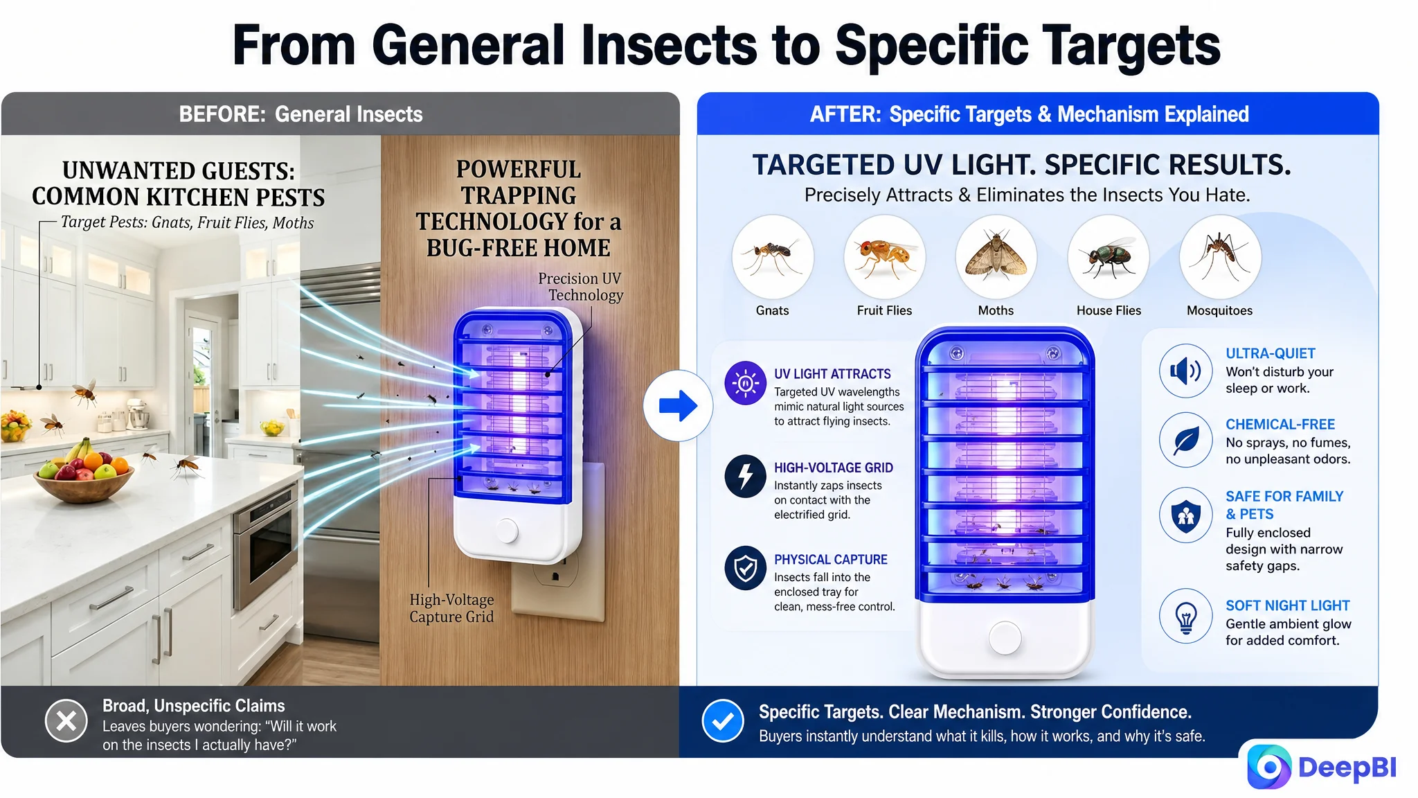
The pest problem needed to become specific
The Listing referred to mosquitoes and flying insects, but the visual communication did not isolate the specific pest types clearly enough.
A stronger image could focus on gnats, fruit flies, moths, flies, and mosquitoes, supported by a visual explanation of UV wavelengths attracting insects through their natural phototactic response.
That gives the shopper an immediate answer to a practical question:
Is this product designed for the pest problem in my home?
The more specific the problem recognition, the less work the shopper has to do before considering the product’s benefits.
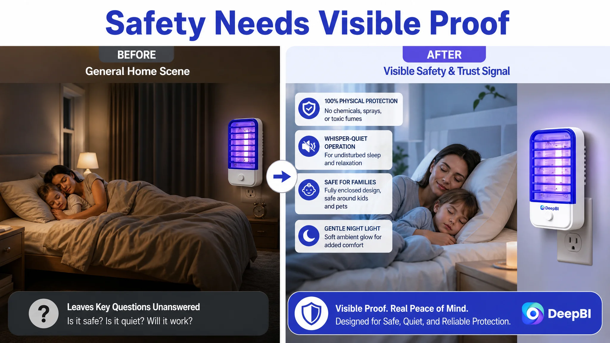
Safety needed to appear earlier
The bedroom and family scenes were useful, but safety concerns were addressed too late in the browsing sequence.
For an indoor product used near sleeping children, pets, or family spaces, “safe,” “odorless,” and “quiet” are not secondary benefits. They are part of the initial buying decision.
The visual sequence therefore needed to bring forward:
- A sleeping family or bedroom context
- No chemical spray or airborne substance
- Odorless operation
- Quiet nighttime use
- A fully enclosed electric grid within durable, heat-resistant ABS housing
The goal was not to make unsupported safety claims. It was to make the product’s existing physical and usage attributes easier to verify visually.
The safety claim needed evidence, not repetition
The existing family and pet imagery created a useful emotional association, but it lacked stronger verification signals.
The proposed direction was to pair the scene with clear non-toxic and odorless icons, along with a close-up showing how the enclosed housing prevents casual contact with the internal grid. This would translate an abstract claim into an observable product-design explanation.
For household products, trust is often built through small moments of proof.
The Bullet Points Were Stronger Than the Page Around Them
One of the important findings was that the bullet points were not the primary weakness.
In fact, the target Listing’s bullet-point score was 8 out of 10, compared with 4 out of 10 for the benchmark. The seller’s copy already had several advantages:
- It started from user pain points rather than only listing specifications.
- It included a 300-square-foot coverage reference.
- It recommended activating the unit three hours before use.
- It addressed quiet operation, safety, space-saving design, and maintenance.
- It gave each bullet a relatively distinct role.
That strength should not be discarded.
The better decision was to use the bullet points as the strategic foundation for the visual and A+ redesign. The text had already identified the important value propositions. The page needed to make those propositions easier to see, believe, and remember.
This is where the diagnosis moved beyond “rewrite the bullets.”
The issue was not whether the Listing had enough claims. It was whether the title, images, bullets, and A+ content were working as one decision system.
Why DeepBI Did Not Keep Tuning the Title First
The title still required improvement. Moving “Bug Zapper” and other high-value search terms earlier, removing repeated wording, and clarifying the four-pack specification could improve search readability.
But the title gap was only one point against the benchmark.
The main-image gap was three points. The detail-page gap was seventeen points.
That difference established the priority order.
Continuing to focus mainly on title wording would have risked improving the entrance to the funnel while leaving the largest conversion barrier untouched. More relevant traffic would still arrive at a page that relied on text-heavy A+ content and did not visually prove effectiveness, safety, maintenance simplicity, or whole-home coverage.
The page had to be repaired before more traffic could become commercially useful.
This is particularly important when sellers are under advertising pressure. If paid traffic is sent to a low-conversion page, advertising does not solve the underlying problem. It increases the volume of shoppers experiencing it.
“Advertising can amplify a product’s strengths, but it can also amplify the Listing’s existing weaknesses.”
DeepBI’s judgment was therefore not to ignore advertising or search relevance. It was to identify the constraint that limited the value of every additional visit.
The A+ Content Needed to Become a Trust-Building Sequence
The recommended A+ redesign followed the actual questions a shopper would ask.
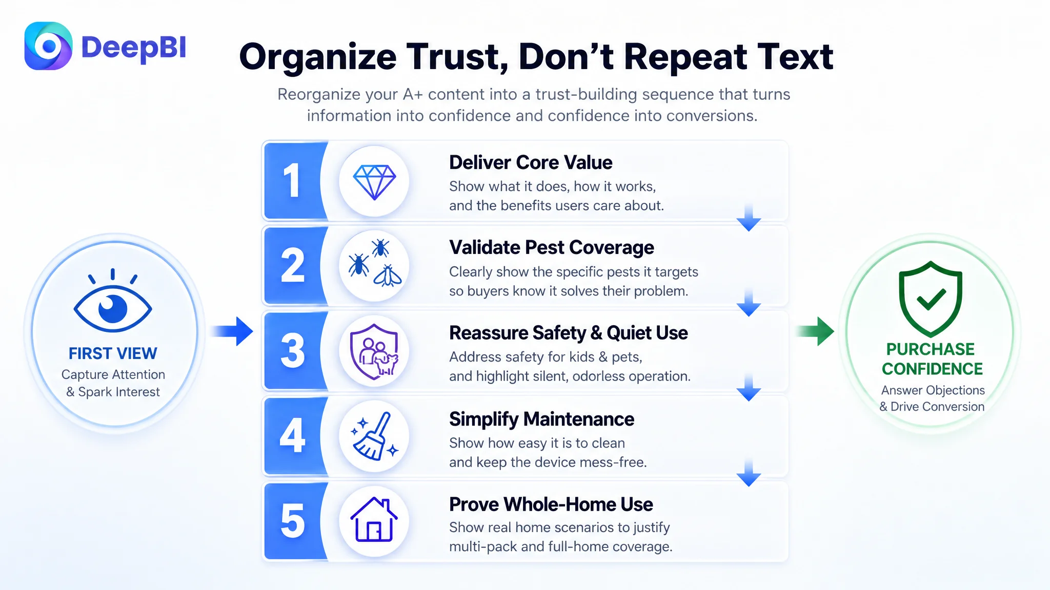
Start with simple setup and whole-home value
The opening module should make the four-pack easy to understand:
- Plug-in operation
- Powerful UV insect attraction
- Safe and odorless indoor use
- Slim design that does not block the second outlet
- Low-maintenance cleaning
- A practical reason to place units in multiple rooms
This gives the pack structure a clear commercial purpose.
Validate the target pests
A dedicated pest-coverage module should show the insects the product is intended to target, including gnats, fruit flies, moths, and other flying insects.
The point is not to make the page look busier. It is to connect the technology to recognizable household problems, such as fruit flies in the kitchen or gnats in an office.
Address bedroom and family concerns directly
A high-stakes safety module should bring together the product’s existing claims:
- Physical, non-spray operation
- No chemicals or diffused substances
- Odorless use
- Quiet operation
- Gentle night-light functionality
- Enclosed grid and durable ABS housing
Placing these assurances in a dedicated visual block reduces the need for shoppers to search through FAQs before deciding whether the product belongs in their home.
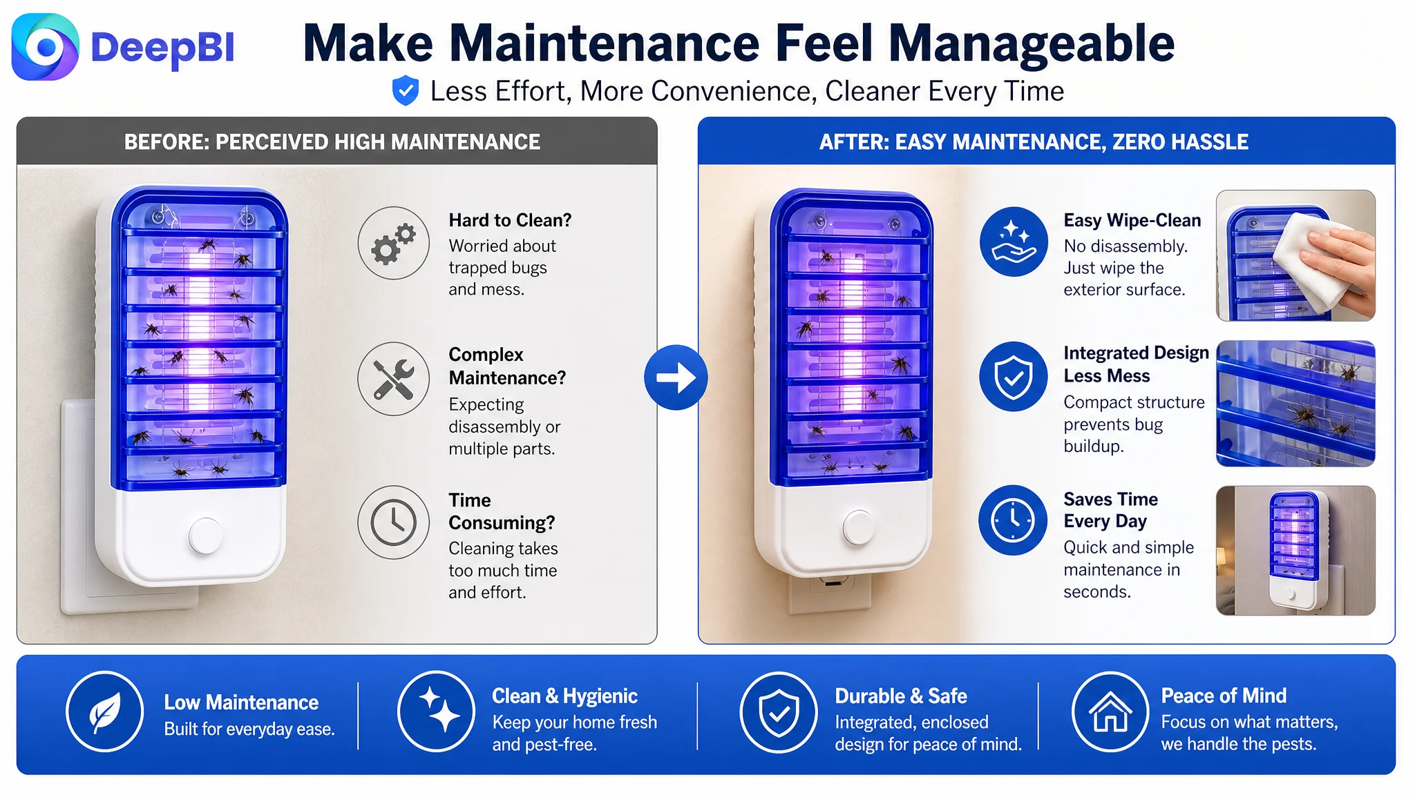
Make maintenance transparent
Maintenance was another missing part of the conversion story.
The proposed content should show the simple cleaning process: unplug the unit, use a small brush to remove dead insects from the grid, and wipe the exterior with a dry cloth or soft duster. It should also clarify that the integrated structure is designed to avoid complicated disassembly or trays that need to be emptied.
This is a practical concern, but it can become a purchase blocker when left unanswered.
Explain the four-pack through room coverage
The page should show distinct indoor environments such as the bedroom, kitchen, living room, office, and bathroom. Each device’s stated coverage of up to 300 square feet can then be connected to a practical whole-home placement strategy.
This turns “4 Pack” from a specification into a usage plan.
Set expectations for best use
The final guidance module should recommend activating the indoor bug zapper three hours before entering the room and operating it consistently for persistent protection.
This type of instruction is commercially important because it helps reduce misuse, unrealistic expectations, and avoidable negative feedback.
The Optimization Was About Reordering Proof
The final direction did not require abandoning the product’s existing positioning.
The core claims were already available:
- UV-based attraction
- Coverage for common flying insects
- Quiet and odorless operation
- Family- and pet-conscious physical design
- Space-saving plug-in format
- Easy cleaning
- Multi-room utility
The problem was that these claims were scattered across text, images, and FAQs without a strong hierarchy.
DeepBI reframed the page around a more complete sequence:
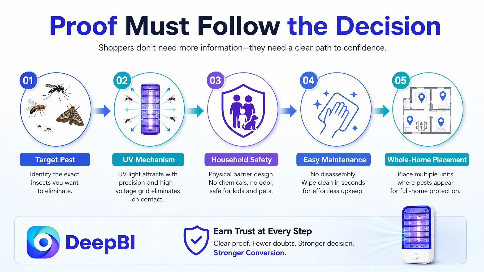
Identify the pest → demonstrate the mechanism → remove safety concerns → show ease of maintenance → justify whole-home placement.
That sequence is stronger because it follows the shopper’s decision process rather than the seller’s product-information checklist.
The visual recommendations also stayed within the product’s real boundaries. They focused on composition, scene, information hierarchy, pest visualization, safety context, and cleaning guidance. They did not require changing the product’s physical structure, inventing new functions, or adding unsupported specifications.
That constraint matters. A visually stronger Listing is only useful if it remains faithful to the item customers will receive.
The Business Lesson Was Larger Than a 12-Point Score Gap
The 12-point overall gap was important, but the more valuable finding was where those points were lost.
The target Listing had:
- Better star rating
- More reviews
- Stronger bullet-point logic
- Detailed usage guidance
Yet it still lagged because the page did not convert those advantages into a sufficiently convincing product experience.
This is why a Listing score should not be treated as a single health label. The business decision depends on the distribution of weakness across the page.
A small title gap may matter for search clarity. A small main-image gap may matter for click appeal. But a 17-point detail-page gap can determine whether the shopper trusts the product enough to purchase after arriving.
The real bottleneck was not the absence of traffic-facing content. It was the absence of conversion-facing structure.
Before Amazon Ads Can Work Harder, the Page Has to Earn the Visit
This case does not provide post-optimization advertising or sales results, so it would be premature to claim a specific CVR increase, ACOS decline, or organic-order recovery.
What the diagnosis did establish was a clearer operating priority.
The seller should not keep treating every performance concern as a keyword or bid problem while the Amazon product page remains visually underdeveloped. The Listing first needs to become capable of converting both paid and organic visitors through a coherent combination of:
- Search-readable title structure
- A stronger first-image value signal
- Specific pest identification
- Earlier safety reassurance
- Visual proof of product use
- Clear maintenance guidance
- Whole-home scenario validation
- A+ content that organizes trust instead of repeating text
Once that foundation is in place, advertising data becomes easier to interpret. Weak traffic quality, weak click appeal, and weak product-page conversion can be separated more responsibly instead of being treated as one blended problem.
The seller’s understanding also changes at this point.
Amazon ads are not a universal solution for a conversion bottleneck. Reviews are not the only source of trust. A page can have useful bullets and positive customer sentiment while still losing the sale because its visual story does not answer the shopper’s most important questions soon enough.
For this indoor bug zapper Listing, the most important next step was not to make the page say more.
It was to make the page prove more.