

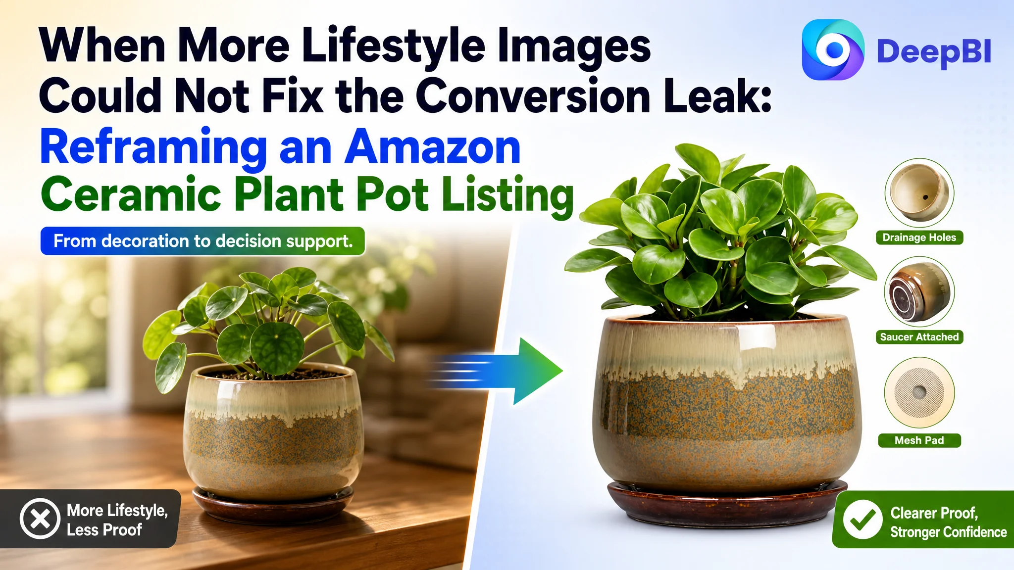
An Amazon seller in the indoor gardening category believed its ceramic plant pot Listing mainly needed stronger visual appeal. The page already showed the product in several home settings, while the team continued to emphasize decorative placement, material description, and general product features.
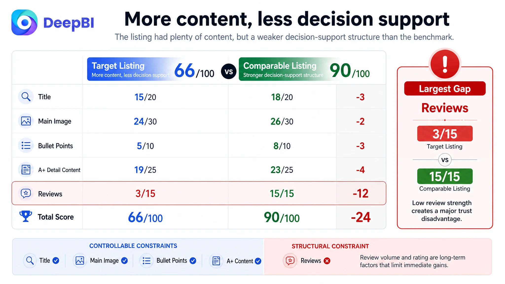
A comparison with a stronger Amazon product page revealed a different problem. The target Listing scored 66 out of 100, versus 90 for the comparable category-leading Listing. The largest gaps were not simply about whether the images looked attractive. The page was failing to explain drainage, size suitability, durability, and product value in the order shoppers needed to make a decision.
DeepBI reframed the work from “add more lifestyle content” to “repair the Listing’s sales logic.” The later direction focused on functional proof first, followed by material confidence, clear dimensions, structured A+ content, and a more persuasive connection between plant care and home decor. For other Amazon sellers, the case shows why a product page can contain plenty of content and still lack the information architecture required to convert paid and organic traffic.
The Amazon Listing Was Not Empty. It Was Asking Buyers to Decide Too Early.
The product page belonged to a single-size, six-inch ceramic planter with a drainage hole, drainage mesh, attached saucer, and reactive glaze finish.
At first glance, the Listing appeared reasonably complete:
- A title centered on the core keyword “6 Inch Plant Pot”
- Several lifestyle images
- Functional product details
- Ceramic material and glaze descriptions
- Indoor and outdoor placement scenes
- Gift-related messaging
That appearance made the problem easy to misread. The page was not missing content in an obvious way. It was missing a convincing sequence.
The customer’s page moved quickly toward decoration. The stronger comparable Listing moved through a more complete buying path:
1. Establish what the product is and why it is distinctive
2. Confirm size and fit
3. Explain drainage and root health
4. Build confidence in quality and durability
5. Show how the product fits into the buyer’s space
6. Reinforce trust through customer evidence and practical reassurance
The difference was not merely a matter of taste. It was a difference in how much uncertainty each page removed before the buyer reached the purchase decision.
A product page can have more images than its competitor and still provide less decision support.
The Original Diagnosis Focused on Appearance, Not Conversion Capacity
The customer team’s working direction was understandable. The planter had a reactive glaze finish and a decorative rounded shape, so lifestyle imagery seemed like a natural way to communicate value.
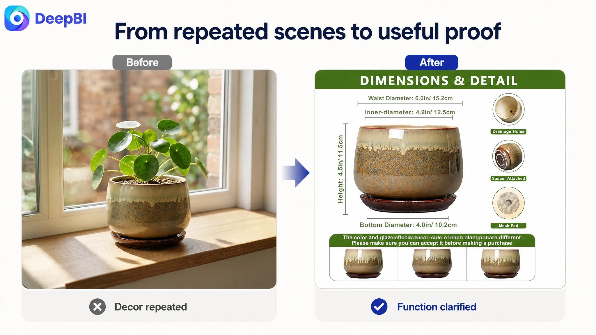
The page used multiple scenes—a windowsill, outdoor table, living room table, bathroom, bedside table, and marble ledge—to help shoppers imagine the planter at home.
But the images repeated the same basic message: the product can be placed in attractive spaces.
They did not answer several more immediate questions:
- Will excess water drain properly?
- Is the saucer attached or separate?
- What are the actual dimensions?
- Which plants fit this single-size planter?
- Is the ceramic durable enough for long-term use?
- Does the glaze make every piece look different?
- Is the product worth trusting despite its limited review history?
The original direction therefore treated visual optimization as an aesthetic task. DeepBI’s diagnosis treated it as a conversion task.
That distinction changed the priority order. The issue was not that the page needed more atmosphere. It needed to establish practical confidence before asking the shopper to imagine the product as decor.
The Score Gap Showed Where the Page Was Losing Persuasion
DeepBI compared the target Listing with a closely matched, higher-performing category Listing across five core areas.
- Title: Target Listing: 15/20, Comparable Listing: 18/20, Gap: -3
- Main image: Target Listing: 24/30, Comparable Listing: 26/30, Gap: -2
- Bullet points: Target Listing: 5/10, Comparable Listing: 8/10, Gap: -3
- A+ detail content: Target Listing: 19/25, Comparable Listing: 23/25, Gap: -4
- Reviews: Target Listing: 3/15, Comparable Listing: 15/15, Gap: -12
- Total: Target Listing: 66/100, Comparable Listing: 90/100, Gap: -24
The overall score alone did not determine the strategy. The important point was how the gaps connected.
The review difference was the largest numerical disadvantage, but it was not the first problem the seller could solve through page editing. The target Listing had a 3.8-star rating and 12 total reviews. The comparable Listing had a 4.7-star rating and 2,851 reviews, with substantially stronger review content visible on the first page.
That gap created a major trust disadvantage. It also meant the team could not simply “write better copy” and expect the review dimension to disappear.
The more actionable diagnosis sat in the controllable parts of the Listing:
- The title communicated the product category but carried limited differentiation.
- The main-image sequence gave too much space to lifestyle scenes and too little to functional proof.
- The bullet points listed features without consistently connecting them to customer concerns and outcomes.
- The A+ content repeated placement scenes instead of building a complete path from product identity to practical confidence.
This was the point at which DeepBI’s analysis moved beyond scoring. It separated structural disadvantages from editable conversion leaks.
The Main Image Was Not Just a Visual Issue. It Failed to Establish the Product’s Reason to Win.
The target Listing’s images were visually usable, but their order did not match the buyer’s likely questions.
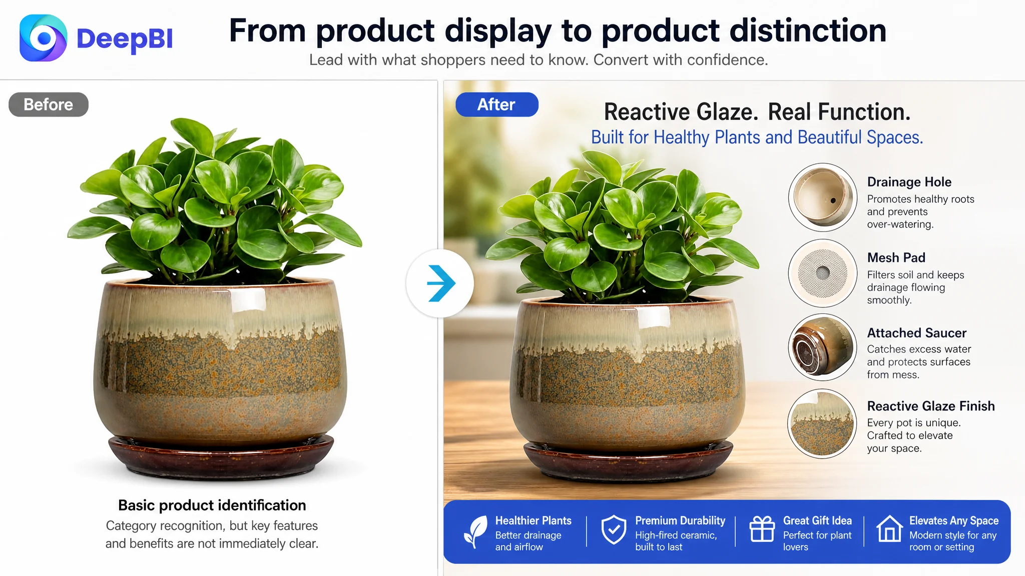
The first image introduced a ceramic planter with a live plant. It established category recognition and basic appeal, but it did not make the reactive glaze finish, drainage system, or product distinction immediately memorable.
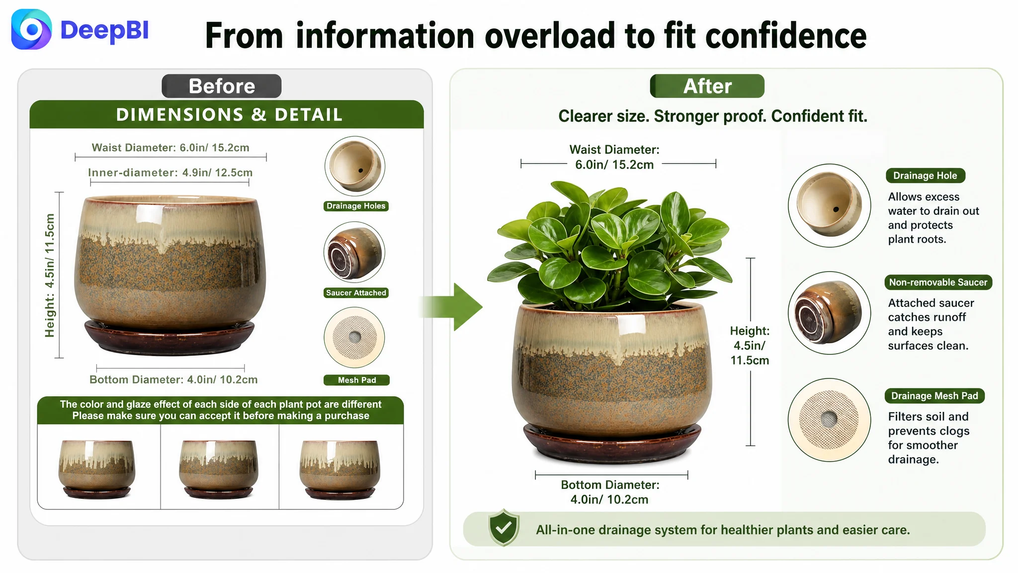
The next image attempted to communicate too many things at once:
- Dimensions
- Glaze variation
- Accessories
- The attached saucer
- Product fit
This created information congestion. A shopper trying to confirm whether the pot would fit a plant could also encounter a glaze-variation warning and accessory details in the same frame. The result was not stronger proof, but a less efficient reading experience.
DeepBI’s recommended image logic was more deliberate.
First, make the product distinctive
The reactive glaze finish should become an immediate visual asset rather than a secondary material note. Each side of the ceramic pot can have a unique color and glaze effect, creating visual variation without changing the product’s actual attributes.
The goal is not to make the product look more luxurious through unsupported claims. It is to make an existing, verifiable feature easier to recognize.
Then, confirm the dimensions
Because the product is available in one size, the image should not imply a multi-size system. It should instead make the available measurements easy to understand:
- 6.0-inch waist diameter
- 4.9-inch external caliber
- 4.5-inch height
The plant-use examples can then connect those measurements to realistic applications such as succulents, cactus, aloe vera, orchids, snake plants, pothos, herbs, mint, rosemary, parsley, and chrysanthemums.
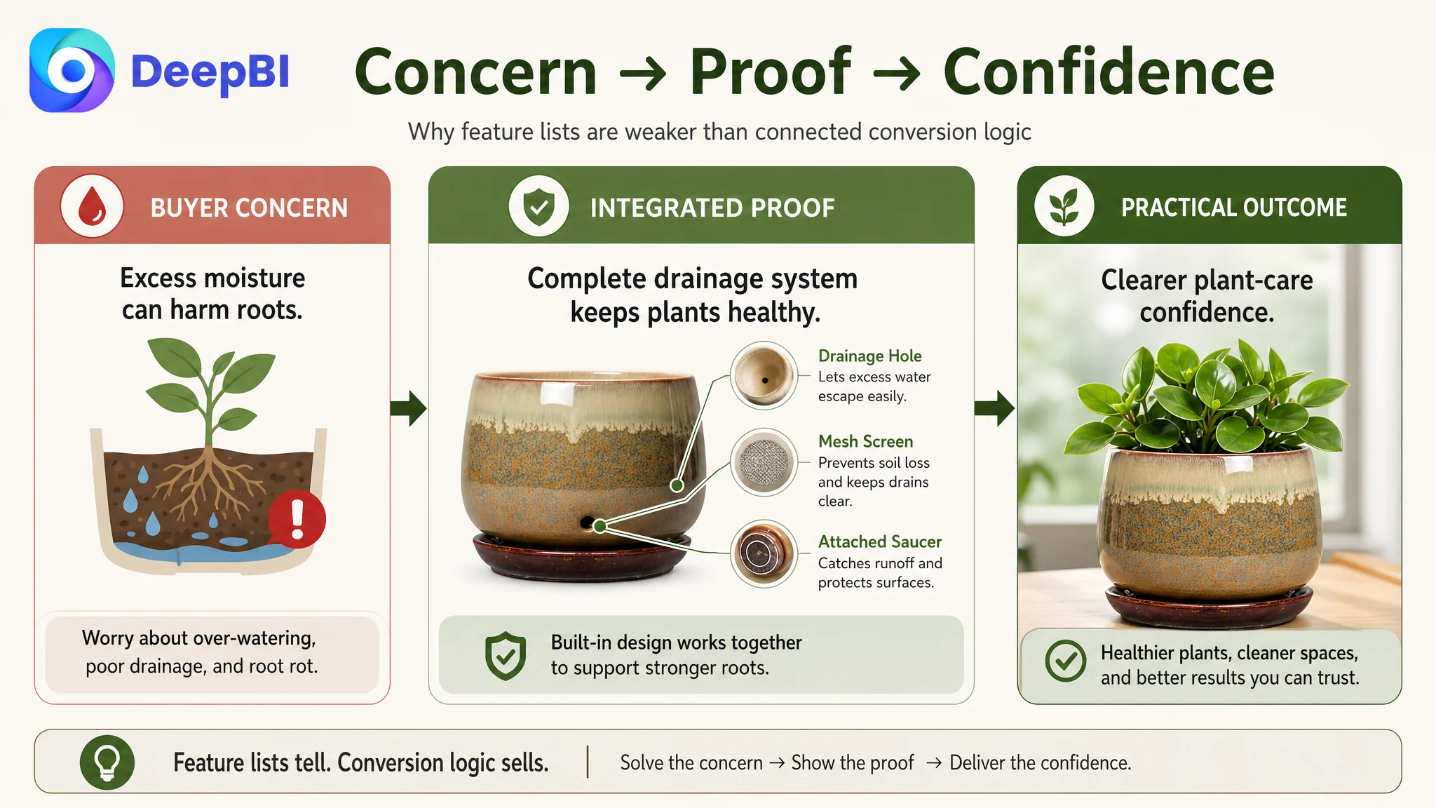
Next, prove the drainage structure
The drainage hole, drainage mesh, and non-removable saucer should be shown as one functional system.
This is more persuasive than showing the planter in another room. It answers a central product-care concern: how excess water leaves the pot and how the plant’s root environment is supported.
Only after that, return to lifestyle
Lifestyle scenes still have a role. They can show the planter as a rustic accent in a home office, bedroom, bathroom, living room, patio, porch, or vanity setting.
But lifestyle validation works better after functional objections have been reduced. The buyer first needs a reason to trust the pot as a planting container. The decorative value then becomes a reason to prefer it.
The Bullet Points Had Information, but Not a Buying Logic
The target bullet points began with functional and material descriptions. They mentioned drainage, ceramic construction, dimensions, plant types, decor applications, and gifting.
The weakness was not a lack of keywords. It was the absence of a consistent problem-to-solution-to-result structure.
A stronger bullet point does more than state that a product has a drainage hole. It explains what the complete drainage design is intended to help the buyer manage.
From component list to plant-care solution
Instead of presenting the drainage hole, mesh, and saucer as separate accessories, the copy should connect them:
Enhanced Drainage for Healthier Roots: This six-inch ceramic planter combines a drainage hole, mesh screen, and attached saucer to support water flow and airflow. The integrated design helps manage excess moisture and gives indoor plant roots a healthier growing environment.
The value lies in the relationship between the components. The buyer is not purchasing three disconnected features. They are purchasing a more understandable care solution.
From material description to quality reassurance
The reactive glaze finish can also be connected to durability and product character:
Reactive Glaze and Durable Ceramic: Made from high-fired ceramic, each planter features a distinctive glaze pattern and texture. Its substantial construction is designed for lasting use while bringing a handcrafted accent to indoor plant displays.
This communicates what is observable and supported without turning the copy into an unsupported durability guarantee.
From measurements to fit confidence
The dimensions should be tied directly to plant suitability rather than presented as isolated numbers. A single-size product needs especially clear fit guidance because shoppers cannot choose between multiple diameters.
From room list to design value
Listing every possible placement can create repetition. A more effective approach is to define the design style—rounded, rustic, modern, and adaptable—then use selected settings to validate it.
From gift mention to meaningful use
The gifting message is stronger when it combines appearance with practical value. A plant pot can be presented as a useful and lasting choice for birthdays, housewarmings, anniversaries, holidays, and plant enthusiasts, rather than as a generic decorative gift.
Missing A+ Content Removed the Final Layer of Persuasion
The A+ gap was especially important because it reflected the same diagnosis as the main-image and bullet-point gaps.
The target page used four scene images and product-detail text. The comparable Listing used fewer general scenes but added more decision-support modules:
- A size comparison
- Structured customer testimony
- A video prompt
- Multiple use-case narratives
- More explicit practical guidance
The target page therefore had visual coverage without enough progressive persuasion.
The first A+ module needed a stronger hook
A general coffee-table scene showed that the planter could look good in a living space. It did not strongly communicate why this planter was distinctive.
The opening module should emphasize the reactive glaze finish and the fact that the color and glaze effect can vary across the ceramic surface. This provides a clear visual identity before the page moves into technical proof.
The next module needed to answer the drainage question
A bathroom scene was visually appropriate but strategically repetitive. It did not explain drainage or root health.
This section should show the drainage hole, mesh, and attached saucer in a clear functional composition. The message should be practical: water management and airflow are part of the product’s design, not details the buyer has to infer.
Quality validation had to precede more room scenes
The bedside-table and patio images added placement variety but did not reduce the risk associated with buying a ceramic product online.
A dedicated quality module should focus on high-fired ceramic construction, reactive glaze texture, and the product’s physical integrity. It should help the shopper feel that the item is a considered planting container rather than a fragile decorative object shown only under favorable lighting.
The single-size limitation needed to be handled directly
The target Listing could not copy the comparable Listing’s multi-size comparison because it offered one size. That was not a reason to avoid detailed fit information.
The better response was to provide exact measurements and a clear plant-match list. Transparency is more useful than implying versatility that the product does not actually offer.
The page needed trust-building modules, not simulated proof
The comparable Listing benefited from customer testimony and a large body of review content. The target Listing did not have equivalent social proof.
The correct response was not to invent testimonials or imply third-party endorsement. It was to strengthen the forms of trust the page could legitimately control:
- Clear functional demonstrations
- Accurate dimensions
- Material and construction detail
- Explicit plant-use guidance
- Clear gifting and decor positioning
- Consistent quality and support language
Reviews remained a structural business gap that required genuine customer experience and time. A+ content could not replace them, but it could prevent the rest of the page from making the trust deficit worse.
When social proof is limited, every controllable part of the Listing has to become more precise.
Why DeepBI Did Not Prioritize More Ad Tuning First
The case did not support a conclusion that the seller’s Amazon ads were incorrectly structured or that bids were the primary cause of weak performance.
That limitation was itself important. Without advertising data such as CTR, CVR, ACOS, or TACOS, it would have been premature to prescribe bid changes, keyword pruning, or campaign restructuring.
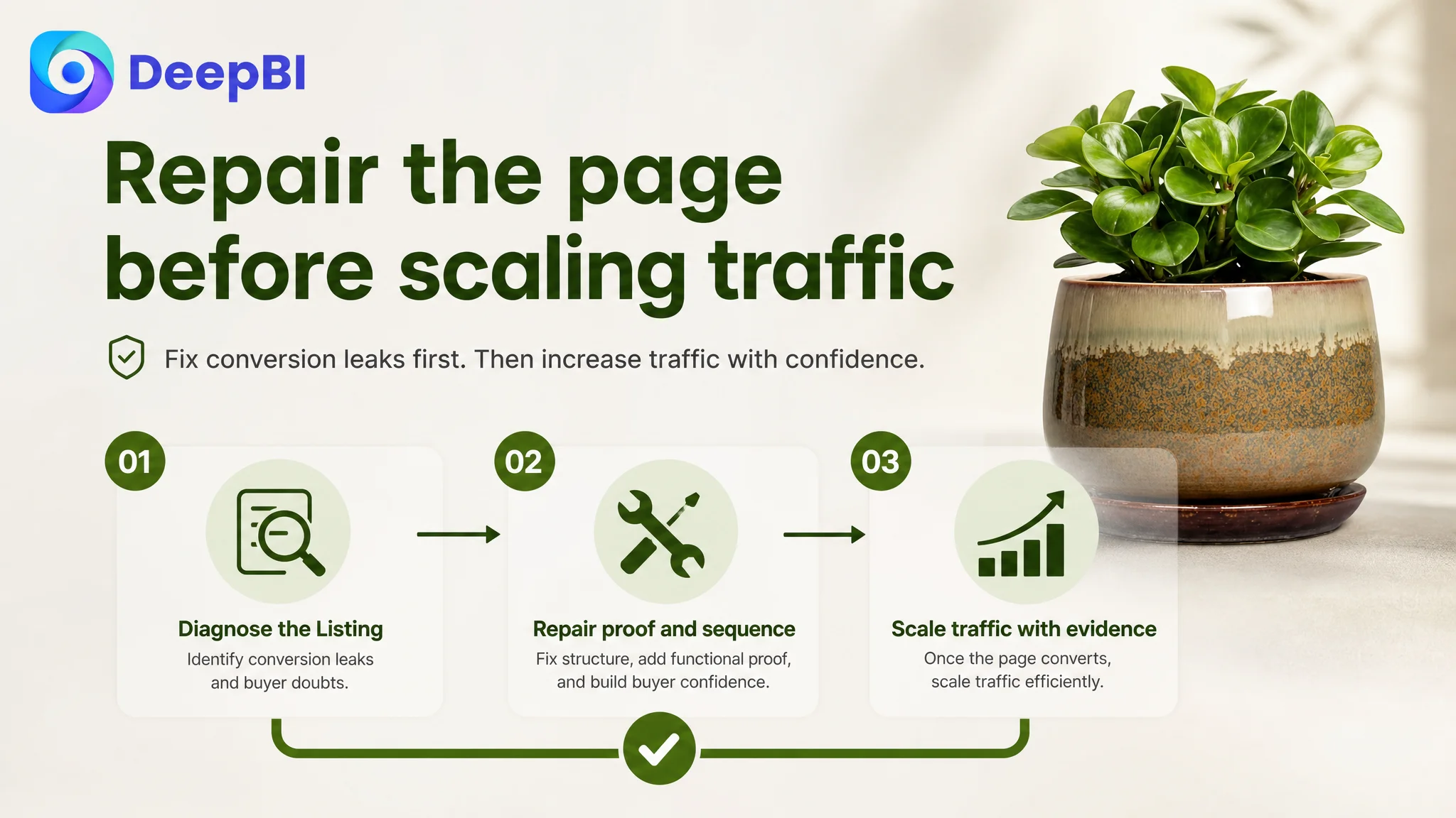
DeepBI instead focused on the business condition that would determine whether additional traffic could be converted: Listing conversion capacity.
If paid traffic reaches a page that does not clearly explain fit, drainage, durability, and value, more traffic may only expose the same page-level weakness at a larger scale. Advertising can amplify a strong offer, but it can also amplify uncertainty.
The decision order was therefore:
1. Diagnose the Listing against a relevant market benchmark
2. Identify which page gaps were most connected to purchase hesitation
3. Repair the explanation of product function and quality
4. Improve the visual and textual sequence
5. Allow future advertising data to show whether the revised page converts traffic more effectively
This was not a decision to ignore Amazon ads. It was a decision not to treat ads as the only available lever before the product page had earned more traffic.
The Optimization Direction Shifted From Decoration to Proof
The later plan did not remove the product’s decorative positioning. It put that positioning in the right place.
The revised Listing logic was built around a clearer hierarchy:
Product identity
A six-inch ceramic plant pot with drainage and saucer should be immediately recognizable in the title and opening image.
Functional confidence
The drainage hole, mesh, and attached saucer should be explained as an integrated system that supports water management and airflow.
Fit confidence
Exact measurements and suitable plant examples should reduce uncertainty about whether the pot is appropriate for the buyer’s plant.
Material confidence
High-fired ceramic and the reactive glaze finish should communicate both construction quality and distinctive appearance without altering the product’s actual claims.
Lifestyle relevance
Home office, bedroom, living room, bathroom, patio, porch, and vanity scenes should show how the pot fits into real decor contexts.
Gift value
The product should be framed as a practical, lasting gift for plant enthusiasts and occasions such as housewarmings and birthdays.
This sequence gave each content element a job. It also prevented five images or seven A+ modules from repeating the same decorative message.
What Changed in the Business Understanding
The source material does not include post-optimization advertising or sales results, so no numerical performance improvement should be claimed.
The important change was in the operating diagnosis.
The customer no longer had to view the Listing as a collection of images and copy blocks that needed to look more polished. It could be evaluated as a conversion system with identifiable gaps:
- The title needed stronger information density and clearer product positioning.
- The main-image sequence needed to answer functional questions before showing additional scenes.
- The bullet points needed to connect features with customer concerns and practical outcomes.
- The A+ page needed to introduce new evidence in each module rather than repeat room placement.
- The review gap needed to be recognized as a long-term trust disadvantage, not disguised through copy.
- Amazon advertising should be judged together with the page’s ability to convert the traffic it receives.
That shift also reduced the risk of making attractive but low-impact changes. The team could prioritize the largest controllable constraint instead of continuing to add more lifestyle content simply because the category appeared visual.
The Broader Lesson for Amazon Sellers
For Amazon sellers, the case offers a practical diagnostic principle:
Before increasing traffic, determine whether the Listing can explain the product well enough to deserve that traffic.
A low or unstable conversion outcome may not come from one bad image, one weak keyword, or one poorly structured campaign. It may come from the way the title, main image, bullet points, A+ content, and reviews work—or fail to work—as a single decision path.
For this ceramic plant pot Listing, the central problem was not a shortage of content. It was a shortage of proof in the places where shoppers needed confidence.
DeepBI’s role was therefore not to generate more assets for their own sake. It was to identify the gap between what the page showed and what the buyer still needed to know, then set the optimization order around that gap.
That is the difference between making an Amazon Listing look more complete and making it more capable of converting both organic and paid traffic.