

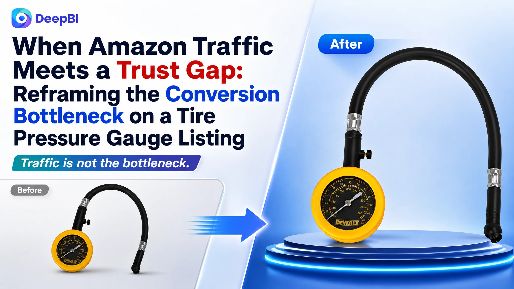
An Amazon seller in automotive accessories was reviewing an analog tire pressure gauge Listing that looked functional on paper but remained far less competitive than a comparable high-performing product page. The initial attention was directed toward keywords, specifications, and image adjustments. Yet the deeper issue was not a missing feature or an isolated copy problem.
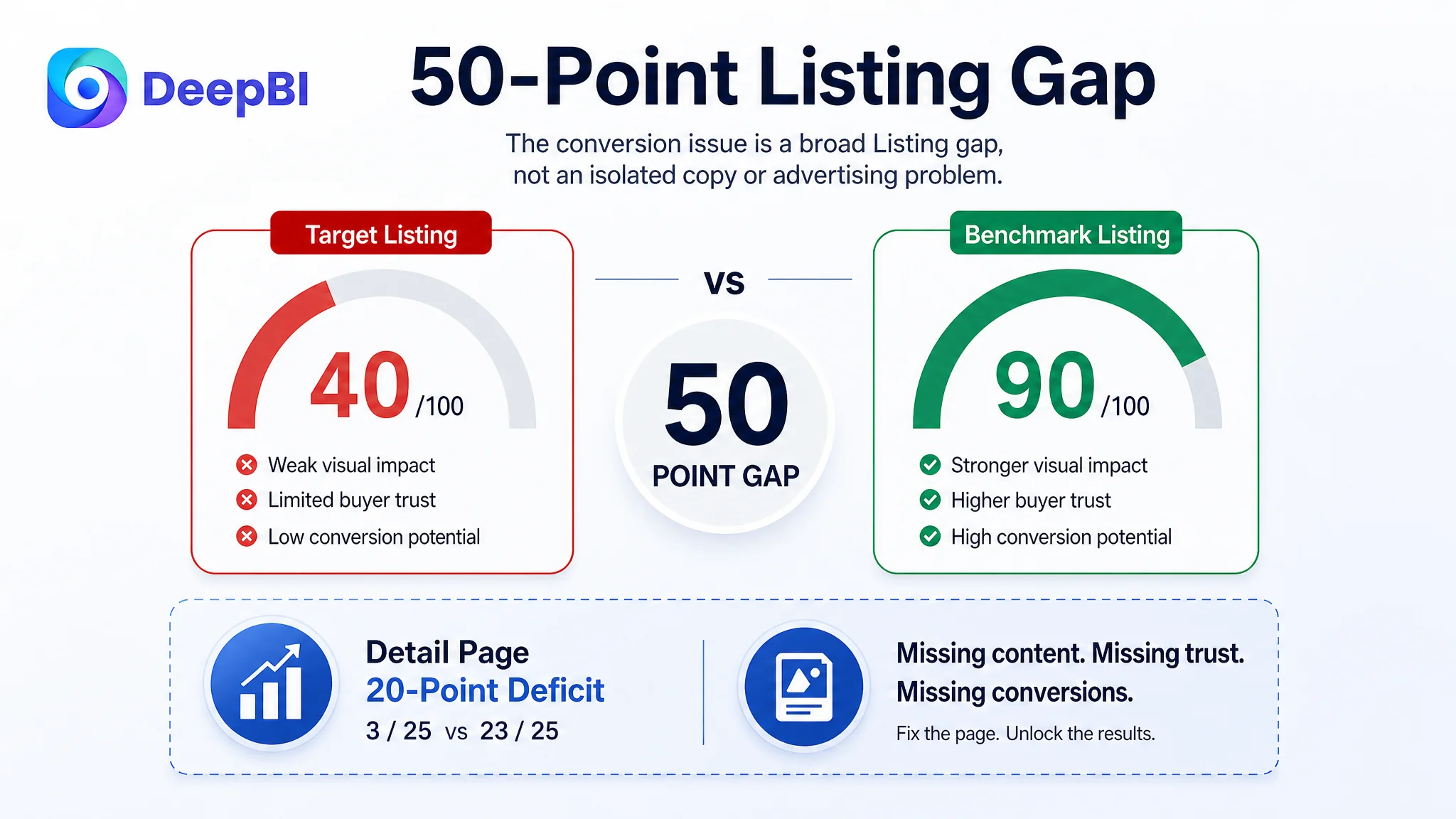
DeepBI’s comparison found a much larger gap in the product-page sales logic. The Listing scored 40 out of 100, compared with 90 for the benchmark Listing. Its title and bullet points mainly described product attributes, while the main images repeated the same view and the A+ area provided no visual content. The page gave shoppers information, but not enough reasons to trust the tool or understand its value quickly.
The later optimization therefore focused on rebuilding the Amazon Listing around decision-making: clearer title structure, more purposeful images, benefit-led bullet points, real-use scenarios, connection security, measurement readability, and precision control through the bleeder button. The case offers a useful reminder for Amazon sellers: before trying to scale traffic or refine ad settings, first determine whether the product page is ready to convert the traffic it receives.
The Listing Looked Complete Until It Was Compared With the Market
The target product was an analog tire pressure gauge for common automotive use, including cars, trucks, motorcycles, and similar vehicles. Its basic specifications were present:
- A 0–60 PSI range
- A compact 2-inch dial
- A 12-inch rubber hose
- A 45-degree ball chuck
- A built-in pressure bleeder button
From a product-information perspective, the page was not empty. The problem was that the information did not form a persuasive buying path.
A shopper evaluating a tool like this is not only asking, “What is the pressure range?”
They are also asking:
- Can I read the dial quickly?
- Will the connection hold without leaking air?
- Can I use it from different angles?
- Is the tool durable enough for regular garage or roadside use?
- Can I fine-tune pressure instead of only checking it?
- Is this product reliable enough to justify the purchase?
The Listing answered some of these questions indirectly, but left too much of the decision to the shopper.
The page contained product information, but it did not consistently convert that information into confidence.
That distinction became visible through the Listing score comparison.
- Title: Target Listing: 12/20, Benchmark Listing: 18/20, Gap: -6
- Main image: Target Listing: 16/30, Benchmark Listing: 27/30, Gap: -11
- Bullet points: Target Listing: 5/10, Benchmark Listing: 8/10, Gap: -3
- Detail page: Target Listing: 3/25, Benchmark Listing: 23/25, Gap: -20
- Reviews: Target Listing: 4/15, Benchmark Listing: 14/15, Gap: -10
- Total: Target Listing: 40/100, Benchmark Listing: 90/100, Gap: -50
The most important signal was not that every dimension lagged behind. It was that the detail-page gap was extremely large.
A 3 out of 25 score in the detail-page dimension indicated that the Listing was not merely missing a decorative upgrade. It lacked the visual and structural content needed to support a serious purchase decision.
The Original Direction Was Too Close to Product Specifications
The initial Listing direction relied heavily on functional descriptions and basic specifications. The title introduced the product through its form and components. The bullet points emphasized range, dial size, hose length, chuck structure, and the bleeder function.
These details were relevant, but they were not prioritized according to how shoppers make decisions.
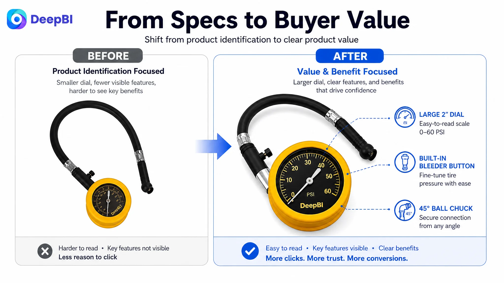
For example, stating that the gauge has a 12-inch hose communicates length. It does not immediately communicate why that length matters. A shopper is more likely to care that the hose helps reach difficult valve stems and makes connection easier from different angles.
Likewise, mentioning a pressure bleeder button describes a component. It does not fully communicate that the user can release excess air and fine-tune the tire to a target PSI.
The Listing team was therefore working from a specification-first logic:
What does the product include?
The stronger market example was using a buyer-decision logic:
Why should the shopper trust this tool, and how will it make the task easier?
This was the central misdiagnosis. The page was being treated as though it needed more complete technical wording. In reality, it needed a clearer relationship between technical features, use conditions, and user outcomes.
Amazon Ads Cannot Repair a Page That Has Not Earned the Click
The case is primarily a Listing conversion diagnosis rather than an ad-campaign restructuring exercise. That distinction matters.
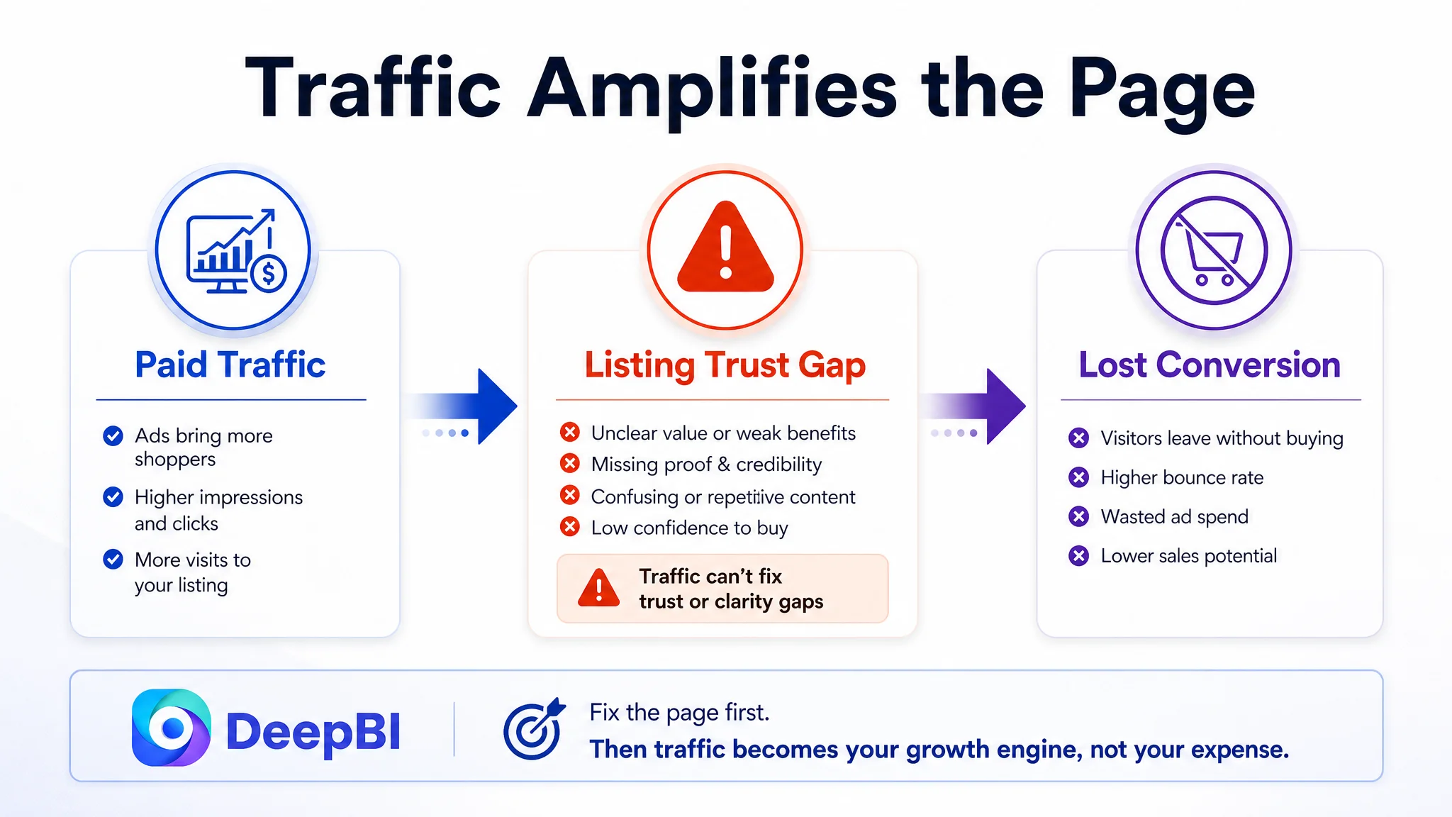
Amazon ads can bring a product into more searches and place it in front of more shoppers. But paid traffic does not automatically solve weak product-page communication. If the main image fails to create interest, the page loses opportunities before the shopper reaches the details. If the A+ content does not build trust, the additional traffic may leave without converting.
In that situation, ad optimization can become an attempt to compensate for a page-level constraint.
Advertising does not only amplify a product’s strengths. It can also amplify the outcome of a weak product page.
For this Listing, the most immediate risk was not simply wasted traffic. It was increasing exposure to a page that did not clearly establish accuracy, durability, ease of use, or product credibility.
That is why continuing to adjust bids, keywords, or campaign structures first would have been a weak decision path. Those changes might alter traffic volume or cost, but they would not address the missing persuasion layers identified in the Listing comparison.
Before asking whether the Amazon ads were attracting enough traffic, the team needed to ask whether the product page deserved more of it.
The Biggest Conversion Leak Was the Missing Detail-Page Story
The target Listing’s detail page used no meaningful image modules. Its content was largely repetitive text. By contrast, the benchmark Listing used multiple visual modules to show:
- Real-world use
- Low-light readability
- Product details
- Storage and handling
- Functional components
- A clearer progression from use case to purchase confidence
This created a 20-point gap in the detail-page dimension, the largest single difference in the comparison.
For an automotive tool, this gap has direct commercial consequences. A shopper cannot easily verify durability from a short specification. They need to see how the tool is used, how the dial is read, how the hose connects, and how the product handles common working conditions.
The target page had the raw material for this story, but not the structure.
The opening needed to prove the tool in use
The first detail-page module should show the gauge being used on a vehicle tire, trailer, or comparable automotive application. The purpose is not to create a dramatic lifestyle scene. It is to answer an immediate question:
Can this tool handle the job I need it for?
The product’s 0–60 PSI range, large dial markings, rubber hose, and bleeder button could then be introduced within a real application context.
The page needed to make readability visible
The 2-inch dial and clear markings were useful selling points, but they were not being demonstrated strongly enough.
A close-up should make the gauge face legible and show how quickly a user can interpret the reading. This is especially important in garage, roadside, or low-attention conditions, where a shopper values clear measurement more than decorative presentation.
The connection system needed its own proof
The 12-inch durable rubber hose and swivel chuck were presented as specifications rather than as part of a secure connection system.
A stronger module would show how the hose provides reach and flexibility, while the chuck helps the user connect from a practical angle. The purpose is to reduce uncertainty around valve access, air leakage, and handling.
The bleeder button needed to become a decision point
The pressure bleeder button is more than an additional component. It changes the tool from a device that only reads pressure into one that also supports fine adjustment.
That distinction should be shown clearly. A shopper should understand that the tool can help measure pressure and release excess air to reach the desired level.
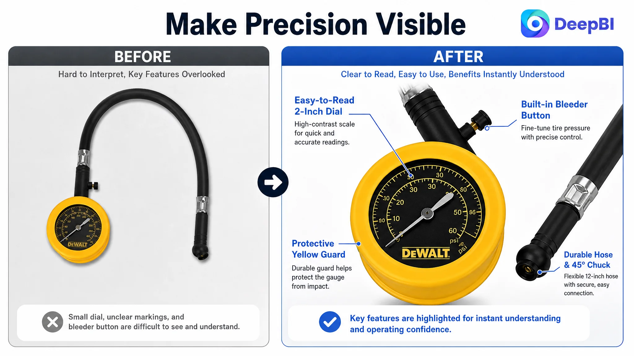
The Main Images Were Consuming Attention Without Advancing the Sale
The main-image score was 16 out of 30, 11 points below the benchmark. The issue was not that the product was invisible. It was that the image sequence did not communicate enough new information.
The first image provided basic identification, but the gauge face was difficult to read and the complete value of the product was not immediately clear.
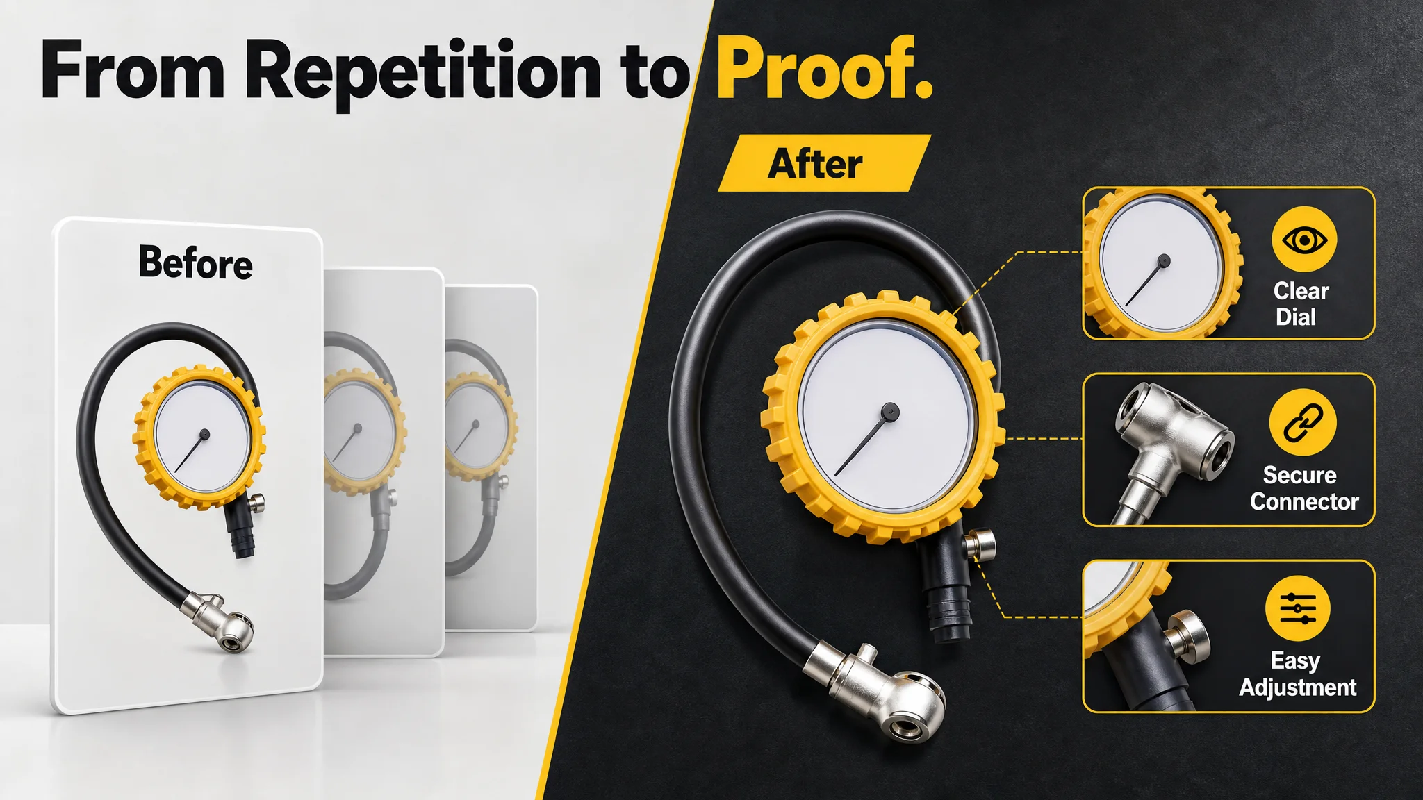
The following images were highly similar to one another. They repeated frontal or product-only views instead of moving the shopper through a sequence of questions.
That created information waste.
A useful image sequence should progressively answer:
1. What is included?
2. What is the main value?
3. How is the product used?
4. Why is it easy to read and control?
5. Why should I trust its construction?
6. Is it suitable for my vehicle or use case?
The target Listing was answering the first question repeatedly.
The first image needed to establish value, not only identity
The opening image should present the complete product view with a stronger sense of what the tool does. The gauge scale should be crisp and readable, while the pressure bleeder should be visually identifiable.
The purpose is not to add unsupported claims or decorative labels. It is to make existing product value visible at the point where shoppers decide whether to continue.
The second image needed to address readability and durability
Instead of repeating the same product angle, the second image should use a close-up to show:
- The 2-inch dial
- Clear markings
- The rugged yellow protector
- The durable rubber hose
This would address two practical concerns at once: “Can I read it?” and “Will it hold up?”
The third image needed to demonstrate pressure control
The bleeder button should be shown as a working feature rather than listed as a technical detail. The image should help shoppers understand how the user can release excess pressure and fine-tune the reading.
That is a more useful decision message than another front-facing product shot.
The fourth image needed to validate the connection
The durable rubber hose and 45-degree ball chuck should be shown together. The visual logic should focus on flexibility, reach, and a secure connection to the tire valve.
This directly addresses the concern that a gauge may be difficult to attach or may lose air during measurement.
The fifth image needed to close the trust gap
The original Listing effectively lacked a meaningful fifth image. That left no final confirmation layer.
The last image should consolidate the practical value already established: accurate readings, quick measurement, clear markings, and easy control. It should not introduce a pouch, warranty, certification, or material claim that the product does not actually have.
The Title Had Keywords, but Not Enough Reasons to Click
The title scored 12 out of 20, six points behind the benchmark. Its core keyword appeared early, which was useful for search relevance. But the overall structure leaned toward a list of product components.
The benchmark title was stronger because it combined several types of information:
- Product category
- Accuracy or certification language
- Readability
- Hose and hardware quality
- Application scenarios
The target Listing needed a similar structural improvement without making unsupported claims.
The recommended direction was to:
- Use the full phrase “tire pressure gauge” rather than an abbreviation
- Keep the primary product term prominent
- Include the bleeder valve
- Describe the 12-inch hose and swivel chuck
- Add relevant vehicle scenarios such as cars, trucks, and motorcycles
- Use grounded durability and accuracy language
The important change was not simply adding more words. It was moving from component inventory to a clearer product position.
A stronger Amazon title should allow a shopper to understand both what the product is and why it fits a particular use case.
The Bullet Points Needed to Connect Features With Outcomes
The five-point score was 5 out of 10. The gap was smaller than the detail-page gap, but the underlying issue was consistent: the bullets mostly stated what the product had, while the benchmark Listing explained why those features mattered.
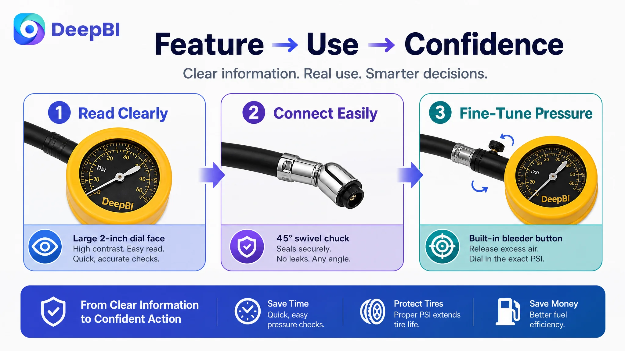
The revised structure should follow a feature-to-use-to-benefit sequence.
Accuracy and duty level
The first bullet should establish the tool’s role as a durable gauge for common vehicle applications, while accurately stating the 0–60 PSI range. This gives the shopper a clear reason to consider the product before moving into smaller specifications.
Readability
The second bullet should make the 2-inch glow or high-contrast dial claim only if it reflects the actual product. Based on the case material, the safer direction is to focus on the large dial face, clear markings, and quick reading in ordinary garage conditions.
The page should not borrow a benchmark’s glow-in-the-dark feature if the target product does not have it.
Hose and chuck usability
The third bullet should explain how the 12-inch durable rubber hose and 45-degree ball chuck support access and connection. The value is practical: easier positioning and a more secure measurement process.
Vehicle and user benefits
The fourth bullet can connect properly maintained tire pressure with fuel use, tread life, handling, and performance. These are user benefits associated with maintaining tire pressure, not unsupported performance promises about the gauge itself.
Pressure adjustment
The fifth bullet should make the bleeder button a clear control feature. The user can measure pressure and release excess air to fine-tune the tire rather than relying on a separate adjustment step.
This structure turns five bullets into a sequence:
Trust the measurement → read it quickly → connect easily → understand the value → control the final pressure.
That is more commercially useful than five disconnected specifications.
Reviews Added a Second Layer of Trust Risk
The review dimension scored 4 out of 15. The target Listing had a 3.6-star rating from five reviews, with three reviews visible on the first page. Two of those visible reviews were negative, including one 1-star and one 3-star review.
The benchmark Listing showed a 4.6-star rating from 5,094 reviews, with 15 visible reviews and no review below four stars on the first page.
This difference could not be solved through copywriting alone.
Reviews are not a page-design element that can be rewritten. They are a trust condition that must be acknowledged in the decision order.
The right response was not to hide the review gap behind stronger visual claims. It was to avoid making the page promise more than the product can support, while improving the areas that shoppers can evaluate directly:
- Clear product identity
- Accurate specifications
- Realistic usage scenes
- Visible construction details
- Straightforward explanation of the bleeder function
- A more complete answer to common pre-purchase concerns
The review weakness made the missing A+ story more serious. When social proof is limited or unfavorable, the rest of the page must work harder to provide credible product understanding. It cannot replace customer evidence, but it can prevent avoidable uncertainty.
Why DeepBI Prioritized Listing Conversion Before Ad Tuning
DeepBI’s diagnosis was based on the pattern across dimensions rather than on a single low score.
The evidence formed a consistent chain:
- The Listing was 50 points behind the benchmark overall.
- The detail page was 20 points behind, the largest gap.
- The main image sequence repeated information and did not establish strong value.
- The title emphasized product identity and components without enough scenario or trust language.
- The bullets described functions more than user outcomes.
- The review profile offered limited social proof.
- The page lacked the visual modules needed to demonstrate durability, readability, connection security, and precision control.
Together, these findings pointed to one core problem:
The Amazon Listing lacked sufficient conversion capacity to turn product traffic into buyer confidence.
That judgment explains why ad tuning was not the first priority.
If the team continued changing campaigns while leaving the page unchanged, it would be difficult to separate a traffic problem from a conversion problem. More exposure could simply send more shoppers to the same weak decision path.
The safer operating sequence was:
1. Clarify the product’s real competitive position.
2. Repair the Listing’s most consequential information and trust gaps.
3. Make the image sequence support the buyer’s decision process.
4. Strengthen the title and bullets around relevant search intent and user outcomes.
5. Then evaluate whether paid and organic traffic are being converted more effectively.
This is not an argument that Amazon ads are unimportant. It is an argument that ads should not be asked to solve a page-level problem.
The Optimization Focused on Sales Logic, Not Visual Decoration
The recommendations did not call for making the page simply more attractive. They called for assigning each content element a job.
The main image should earn attention.
The supporting images should remove practical doubts.
The bullet points should connect specifications to outcomes.
The A+ content should provide visual verification.
The title should improve both search clarity and click appeal.
The review section should be treated as a trust constraint rather than something copy can conceal.
The resulting page logic would move more deliberately through the shopper’s decision:
First: identify the tool
Make the category, use case, and core function immediately clear.
Then: establish usefulness
Show that the 0–60 PSI range, 2-inch dial, hose length, and chuck design fit common automotive tasks.
Next: reduce operating anxiety
Demonstrate how the gauge connects, how the dial is read, and how the bleeder button supports fine adjustment.
Finally: support confidence
Use real product details and realistic application scenes to create a more complete picture of quality and handling.
This structure is especially important for a tool that may be purchased infrequently. The shopper may not know every technical term, but they understand practical concerns: accuracy, access, durability, and ease of use.
The Product Page Had to Become More Useful to Both Paid and Organic Traffic
Once the Listing is rebuilt around a clearer sales argument, the same page can serve multiple traffic sources more effectively.
Paid shoppers need fast relevance. The title and main image must establish that the product matches their search and use case.
Organic shoppers need a convincing page experience after arriving through Amazon search. The bullet points and detail page must help them compare the product with alternatives.
Both groups need credible evidence that the product will work as expected.
This is why Listing optimization affects advertising efficiency even when the initial diagnosis does not involve campaign settings directly. A stronger page can make each click more valuable. A weak page makes every traffic source work harder.
The case does not provide post-optimization CVR, ACOS, TACOS, keyword, or organic-order data, so no numerical performance claim can be made. The measurable business test would be whether the revised page begins to show:
- Stronger click engagement from clearer visual positioning
- Better conversion from paid sessions
- Less traffic waste caused by page-level uncertainty
- More stable interaction between paid and organic traffic
- A healthier basis for subsequent ad decisions
The important change before those results appear is that the team now knows what to measure and why.
The Deeper Lesson for Amazon Sellers
This tire pressure gauge Listing did not fail because it had no usable features. It struggled because the page did not make those features easy to understand, verify, and value.
The product had a readable dial, a practical hose, a swivel chuck, and a bleeder button. But those advantages remained fragmented across specifications and repeated images. The page did not consistently show how the tool supports a real task.
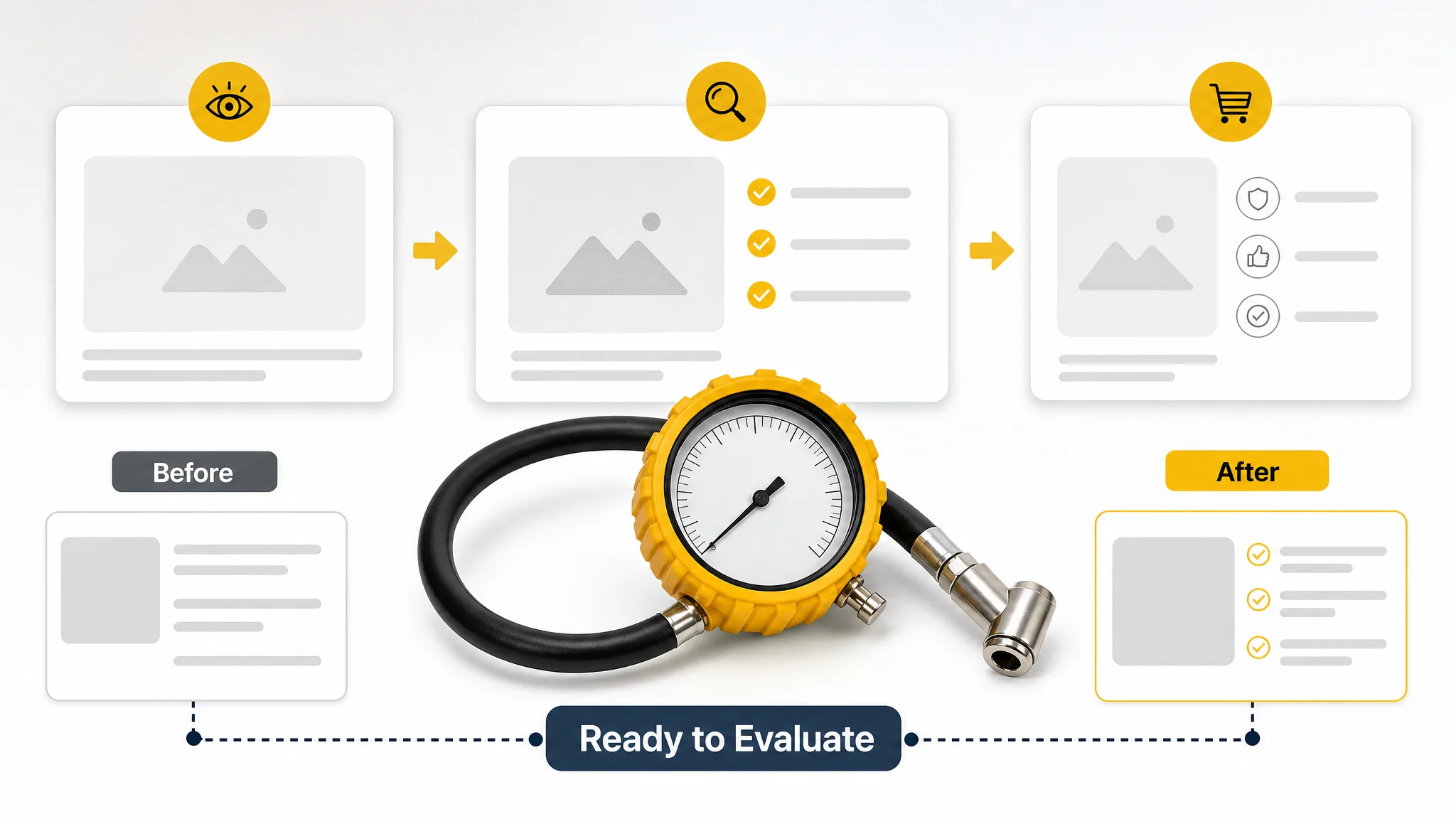
DeepBI’s role in the case was not to produce a longer list of edits. It was to connect the score gap to a business decision:
- The 3/25 detail-page score showed that the page lacked a persuasive content structure.
- The 16/30 main-image score showed that visual attention was not being converted into clear product value.
- The 5/10 bullet score showed that features were not consistently translated into buyer benefits.
- The 4/15 review score showed that social proof was weak and could not be ignored.
- The 40/100 total score showed that the Listing was not ready to rely on traffic expansion alone.
That diagnosis changed the optimization order.
Before scaling Amazon traffic, ask whether the Listing can convert the attention it already receives.
For this automotive accessories seller, the next step was not another round of isolated ad adjustments. It was to rebuild the product page so that the title, images, bullets, A+ content, and available trust signals worked as one system.
That is the difference between editing a Listing and diagnosing its commercial bottleneck.