

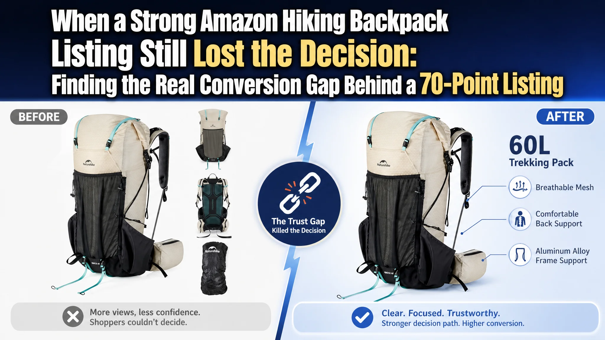
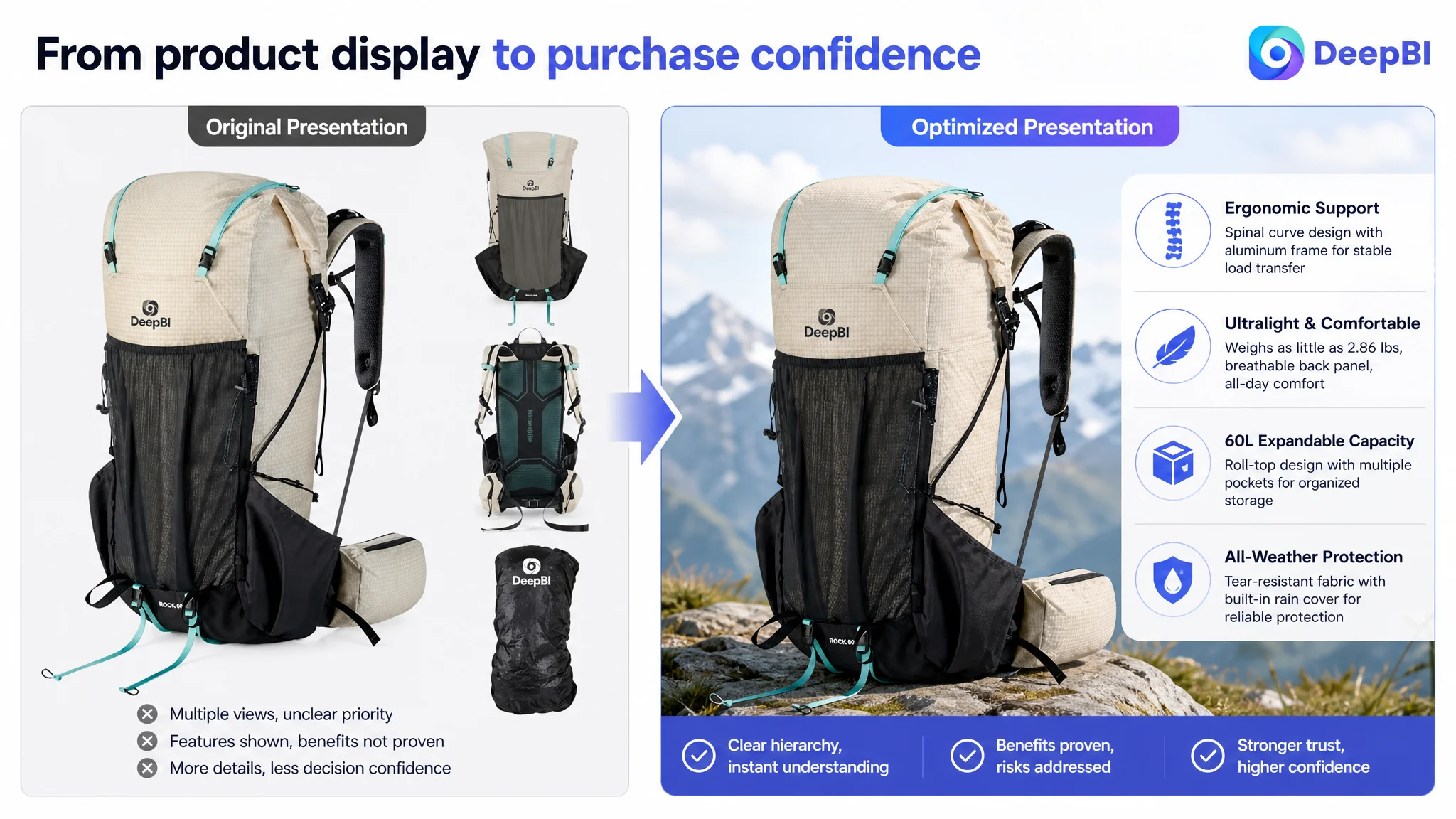
This case follows an Amazon seller whose internal-frame hiking backpack Listing looked technically complete but still failed to create enough purchase confidence. The customer’s first instinct was to refine product details, improve feature communication, and make individual images more persuasive. Yet the deeper issue was not a single weak asset or an obvious lack of information.
DeepBI found that the Amazon product page was asking shoppers to trust too much, too early. The Listing described the frame, capacity, materials, and storage system, but did not guide shoppers through the key risks of buying a technical backpack online: fit, weight, load distribution, weather protection, real capacity, and product reliability.
The later optimization therefore focused on rebuilding the page’s sales logic. The title was reorganized around the core search intent, the image sequence was reordered around purchase risk, and the A+ content was reshaped from a collection of feature panels into a more credible outdoor-use narrative. For other Amazon sellers, the lesson is direct: a Listing can contain plenty of information and still lack the proof structure required to convert paid and organic traffic.
The Listing Did Not Lack Features. It Lacked a Convincing Decision Path.
The customer’s product was a 60L internal-frame hiking backpack for camping, backpacking, and multi-day outdoor use on the Amazon US marketplace.
On paper, the Listing had several meaningful strengths:
- A removable aluminum alloy internal frame
- A back panel designed around the natural spinal curve
- A lightweight range of 2.86 to 3.02 pounds
- A roll-top closure with expandable capacity
- A built-in rain cover
- Multiple storage compartments and attachment points
- Clear size and weight information
- A structured set of five bullet points
The product page was not empty, and the product itself was not without differentiation.
That was precisely what made the problem difficult.
The customer had already invested in technical explanations and detailed product presentation. The page contained professional information, but the information was not arranged around the order in which shoppers needed to become confident.
The problem was not a shortage of product facts. It was the lack of a persuasive sequence that turned those facts into a purchase decision.
A 70-Point Listing Was Already Showing Where the Business Risk Was
DeepBI’s comparison placed the customer’s Listing at 70 out of 100, compared with 83 out of 100 for a closely comparable high-performing hiking backpack Listing.
The overall gap was 13 points, but the distribution mattered more than the total.
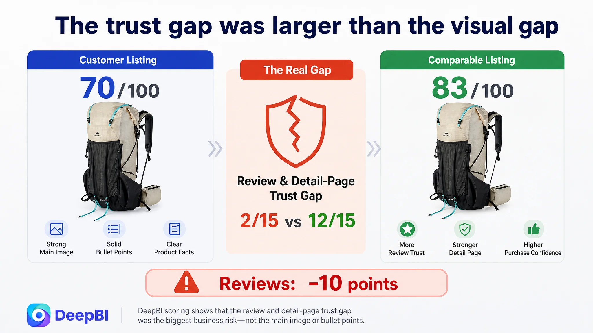
- Title: Customer Listing: 15/20, Comparable Listing: 17/20, Gap: -2
- Main image: Customer Listing: 25/30, Comparable Listing: 24/30, Gap: +1
- Bullet points: Customer Listing: 7/10, Comparable Listing: 6/10, Gap: +1
- Detail page and A+ content: Customer Listing: 21/25, Comparable Listing: 24/25, Gap: -3
- Reviews: Customer Listing: 2/15, Comparable Listing: 12/15, Gap: -10
- Total: Customer Listing: 70/100, Comparable Listing: 83/100, Gap: -13
At first glance, the customer’s main image and bullet points were not the weakest areas. In fact, they scored slightly above the comparable Listing in the evaluation.
The most severe gap was in reviews, followed by the detail page and title.
That changed the diagnosis.
The Listing did not primarily suffer from a failure to mention features. It suffered from a lack of trust reinforcement around those features.
The Original Optimization Direction Was Too Close to the Product
The customer’s existing content leaned heavily on technical details:
- Aluminum frame construction
- Spinal curvature
- Product dimensions
- Weight
- Rain protection
- Storage capacity
- Attachment points
Those details were valid and useful. But they were often presented as product specifications rather than as answers to the shopper’s most important questions.
A shopper evaluating a technical hiking backpack is not only asking:
- What material is used?
- How many liters does it hold?
- Does it have a frame?
- Does it include a rain cover?
They are also asking:
- Will this backpack fit my torso?
- Will the weight feel manageable over a long hike?
- Will the suspension system transfer load effectively?
- Can I really fit the gear I need?
- Can I access essentials without unpacking everything?
- What happens if the weather changes?
- Do other buyers trust the product enough to recommend it?
The customer’s initial direction treated these concerns as separate product details. DeepBI reframed them as a connected conversion path.
The page needed to move from technical description to risk reduction.
The Core Constraint Was Listing Conversion Capacity
The central problem was not simply that the Listing had a low score in one module.
It was that the product page could not consistently convert the attention generated by its product advantages.
The product had credible strengths, but those strengths were not being translated into enough visible proof. The page required shoppers to interpret the technical language themselves, connect separate images together, and trust the product without enough review support.
This created a conversion bottleneck across several connected layers:
1. The title did not place the highest-value search and product terms early enough.
2. The image sequence did not address fit and weight before secondary details.
3. The A+ content explained functions but did not demonstrate enough real-world use.
4. The page did not make the relationship between engineering and comfort sufficiently visible.
5. The review section provided very little usable reassurance.
6. The page lacked a final, high-confidence closing scene that brought the benefits together.
DeepBI’s judgment was therefore not to keep polishing every element equally.
The Listing needed to be repaired as a decision system.
The Review Gap Made Every Other Weakness More Expensive
The review dimension showed the clearest trust problem.
The customer’s Listing had:
- A 3.8-star rating
- 19 total reviews
- No effective customer comments displayed on the first page
- A reported negative-review share of 41%
The comparable Listing had:
- A 4.1-star rating
- 18 total reviews
- Seven visible first-page comments
- Customer photos and videos
- A reported negative-review share of 22%
The total review counts were close. The difference was not simply quantity.
It was review usability and trust quality.
The customer’s first-page review area did not provide meaningful customer validation. Instead, the page content was affected by display or capture errors, leaving shoppers without a reliable set of experiences to evaluate. The comparable Listing, by contrast, used visible customer feedback, images, and videos to reduce uncertainty.
This mattered particularly because the product belonged to a category where fit, comfort, carrying stability, and durability cannot be fully confirmed from a studio image.
A technical backpack requires a higher level of trust than a product whose function is immediately obvious.
When visible customer proof is weak, every technical claim carries a heavier burden.
This is why the review gap could not be treated as an isolated reputation issue. It weakened the performance of the title, images, bullet points, and A+ content at the same time.
The Main Image Was Not the Main Scoring Problem
The customer’s main-image score was 25 out of 30, slightly above the comparable Listing’s 24.
That result prevented a common but inaccurate conclusion: that the page simply needed a completely different visual style.
The issue was more specific.
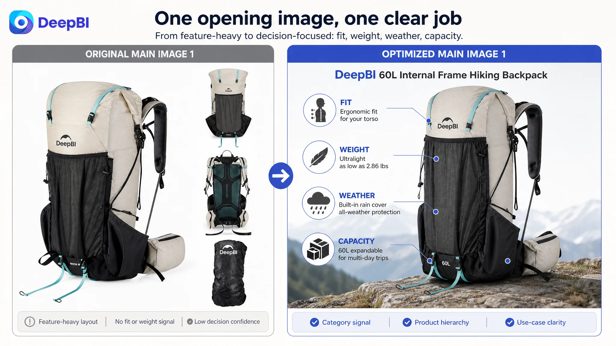
The first image provided a useful product introduction, but it combined several perspectives and included smaller supporting views, such as the back view and rain-cover presentation. This made the image work too hard at the first point of contact.
The page needed the main image and supporting images to perform different jobs.
The first image needed a sharper category signal
The first image should communicate more immediately that this is a technical pack for serious trekking, not merely a large travel backpack.
The recommended direction was a clean, high-detail front or three-quarter view that emphasizes:
- Internal-frame construction
- Technical outdoor positioning
- Roll-top structure
- Product scale and silhouette
Small inset views and accessories should not compete with the main product in the opening image. Those details could be given dedicated positions later in the sequence.
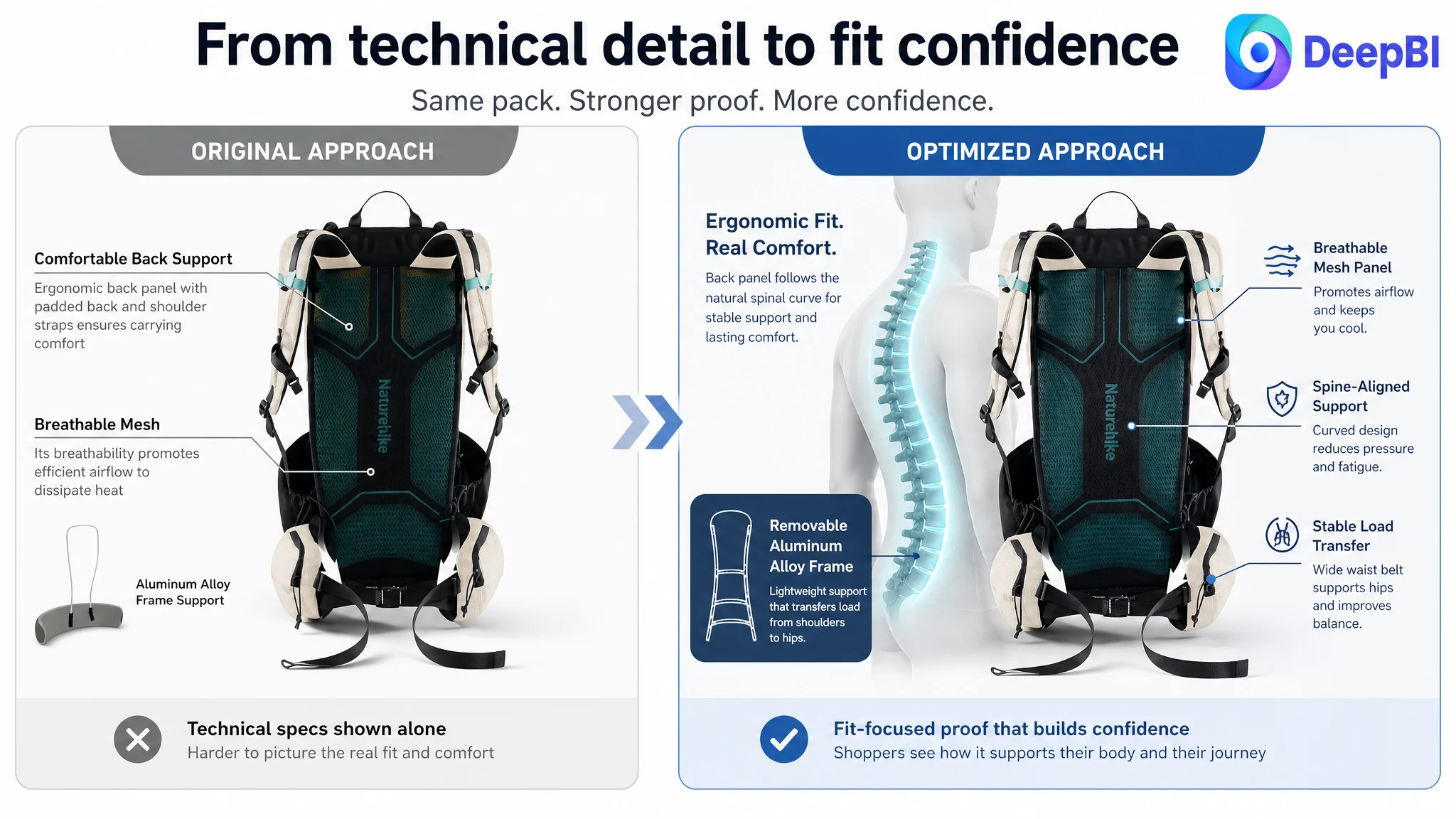
The second image needed to answer fit concerns
The existing second image focused on structural explanation, particularly the aluminum frame. That information was relevant, but it came before the more fundamental question of fit.
For a large internal-frame backpack, shoppers need early reassurance that the suspension system can work with their body and carrying posture.
The second image should therefore focus on:
- Back-panel construction
- Natural spinal-curve support
- Fit and personalization
- The relationship between the pack and the wearer
This is more persuasive than relying only on labels and dense annotations.
The third image needed to prove lightweight performance
The product’s weight was one of its strongest competitive advantages:
- Size M: 2.86 pounds
- Size L: 3.02 pounds
- Comparable Listing: approximately 3.3 pounds
Yet the existing image sequence did not make that advantage visually undeniable.
A dedicated lightweight proof image could connect the stated weight with the actual carrying experience, using the confirmed product specifications rather than vague claims.
The goal was not to make the backpack appear smaller than it is. It was to resolve a major buyer concern:
Can a 60L internal-frame backpack still be light enough for long-distance use?
The fourth image needed to reduce weather risk
The customer’s Listing had a built-in rain cover stored in the bottom pocket, as well as water-resistant fabric. That feature was present but under-expressed.
For outdoor buyers, weather protection is not just a material claim. It is a risk-reduction promise.
The image sequence should show:
- Where the rain cover is stored
- How it is deployed
- How it protects the loaded pack
- The relationship between the cover and the water-resistant outer material
This gives the feature a practical role instead of leaving it as another line of text.
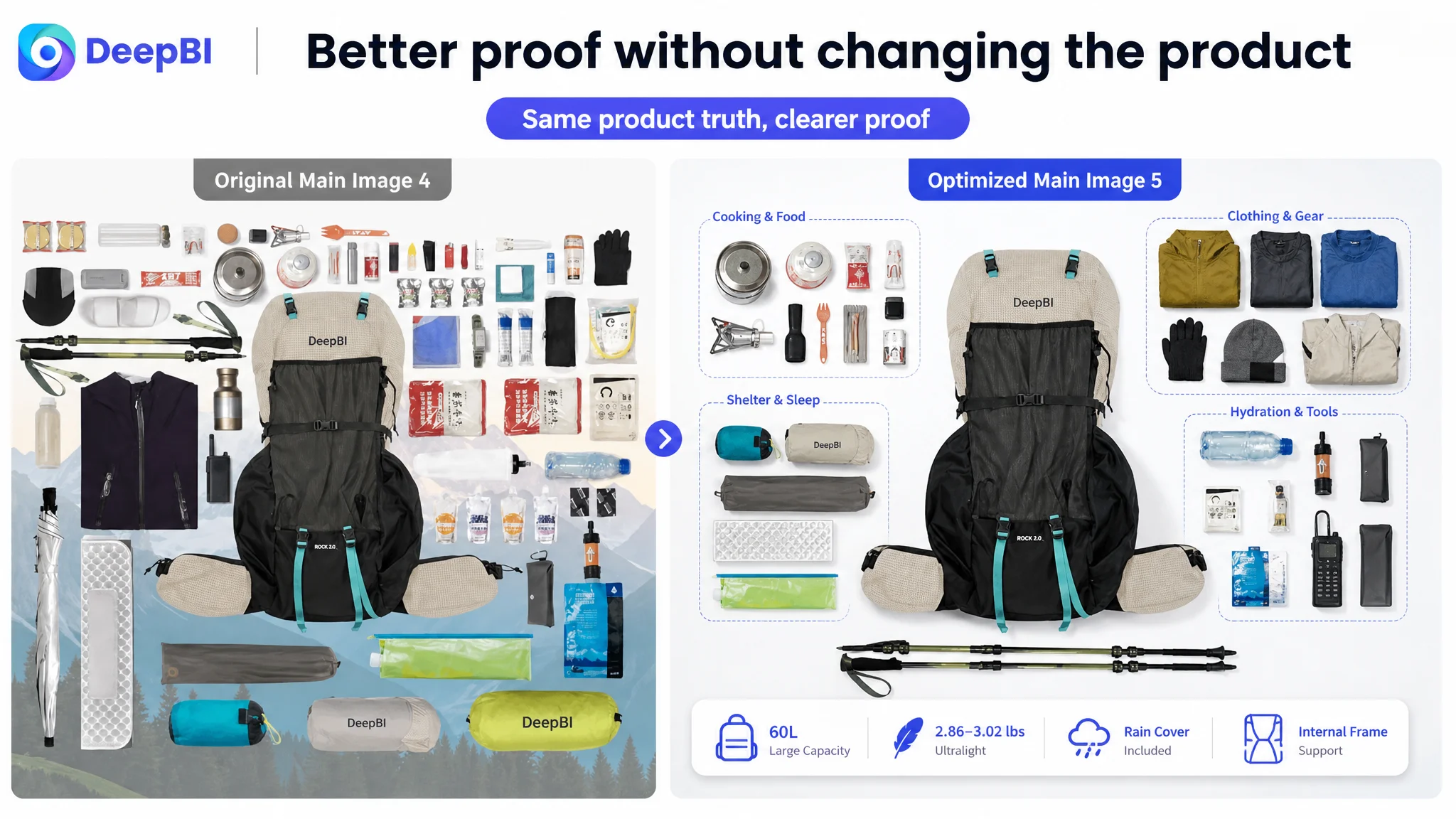
The fifth image needed to close the capacity question
The customer already had a capacity flat lay. Its role was not fundamentally weaker than the comparable Listing’s transparent volume visualization.
The problem was its position.
Capacity proof was more valuable as a closing reassurance than as an early technical detail. After shoppers understood fit, weight, and weather protection, the final supporting image could answer the remaining concern:
Is the advertised 60L capacity real enough for tents, sleeping bags, clothing, and other outdoor gear?
This created a more deliberate image path:
Identify the product → confirm fit → prove lightweight performance → reduce weather risk → confirm capacity.
The Title Was Technically Informative but Not Efficiently Organized
The customer’s title included useful product information, but the core search phrase was not arranged as efficiently as it could be.
The comparable Listing placed “Internal-frame Hiking Backpack” near the beginning and added clear capacity and structural information. It also used “for Men Women” to define the intended audience more directly.
The customer’s title used terms such as “Ultralight,” “Rain Cover,” and a model reference, but the structure created several problems:
- The core product phrase was not prioritized early enough.
- Capacity and product type were not grouped as tightly.
- “White/L/60L” appeared too late to support quick understanding.
- “60L Rock 2.0 Upgraded” risked creating redundancy.
- “Adults” was less specific than a direct audience description.
The recommended title logic was:
Product identity and core search intent → capacity and structure → lightweight and weather protection → audience and use cases.
A representative rewritten direction would be:
Internal Frame Hiking Backpack with Rain Cover, 60L Ultralight Travel Pack for Men and Women, Outdoor Camping and Backpacking
The purpose was not to imitate the comparable Listing.
It was to ensure that the customer’s genuine product strengths appeared in the order most useful for both Amazon search matching and shopper comprehension.
The Bullet Points Had Strong Facts but Needed a More Visible Benefit Structure
The customer’s bullet points were one of the stronger parts of the Listing. They included more technical detail than the comparable page, including:
- Specific dimensions
- Product weight
- Aluminum alloy frame construction
- Spinal-curve support
- Weather protection
- Storage and attachment functions
The issue was not that the bullets were inaccurate or empty.
The issue was that some of the most valuable benefits were not consistently placed in a clear concern → solution → proof structure.
Capacity needed to communicate flexibility and access
Instead of presenting capacity only as a size, the first bullet should connect the roll-top design with the way shoppers use a large pack:
- Expandable volume for multi-day trips
- Space for additional gear
- Vertical side zipper for access without unpacking the entire main compartment
- Confirmed dimensions and weight
The internal frame needed to connect engineering with fatigue reduction
The technical details were valuable, but shoppers needed the outcome immediately:
- Removable aluminum alloy internal frame
- Back panel following the natural spinal curve
- Weight transfer from shoulders to hips
- Reduced pressure during long-distance hiking
This is how a specification becomes a buying reason.
Lightweight performance needed to be unmistakable
The customer had a measurable advantage in weight. The bullet structure should make that advantage easy to compare:
- 2.86 pounds for Size M
- 3.02 pounds for Size L
- Breathable back panel
- Padded shoulder straps
- Adjustable waist belt
The message is not simply “lightweight.” It is that the pack combines lower weight with stable carrying support.
Weather protection needed a complete promise
The rain cover should be connected with the fabric and storage details:
- Water-resistant, tear-resistant fabric
- Built-in rain cover
- Bottom-pocket storage
- Compression straps to help secure the load
This gives the shopper a clear picture of how protection works in practice.
Storage needed to show what can be carried and reached
The final bullet should focus on real outdoor equipment rather than only the number of compartments:
- Front mesh pocket
- Side elastic pockets
- Zippered waist-belt pockets
- Attachment points for trekking poles, tents, and sleeping bags
- Quick access to frequently used items
The bullet points already contained credible material. The optimization was about making each one answer a specific purchase question.
The A+ Content Was Informative but Not Yet Persuasive Enough
The customer’s A+ content used:
- A main scenic image
- A feature icon bar
- Structural diagrams
- A parameter table
- Multi-angle product views
- Detail collages
- A back-length measurement guide
The comparable high-performing Listing used a more immersive structure:
- Multiple outdoor environments
- Capacity visualization
- Three-dimensional ergonomic explanation
- Wear-and-adjustment guidance
- Modular loading demonstrations
- Close-ups of quick-access storage
- Use across snow, forest, and mountain environments
- A final dynamic outdoor scene
The difference was not that one page had information and the other did not.
The difference was how each page converted information into confidence.
The opening needed to validate the use case immediately
The customer’s opening module was closer to a brand or feature introduction. It did not immediately show why this backpack belonged in serious outdoor use.
The revised opening should establish:
- Hiking
- Camping
- Climbing
- Travel
- Multi-day trekking
The first A+ screen should answer the shopper’s first question:
Is this backpack suitable for the kind of trip I am planning?
The early section needed loaded-state proof
The customer placed a technical upgrade list too early. That consumed valuable attention without showing the product in the condition that matters most: loaded and worn.
The better sequence was to show:
- A person wearing the backpack
- The fit of the back panel and waist belt
- The relationship between the pack and the wearer’s torso
- External gear attached to the pack
- Stability in a realistic carrying condition
A backpack should not only be shown as an object. It should be shown as equipment in use.
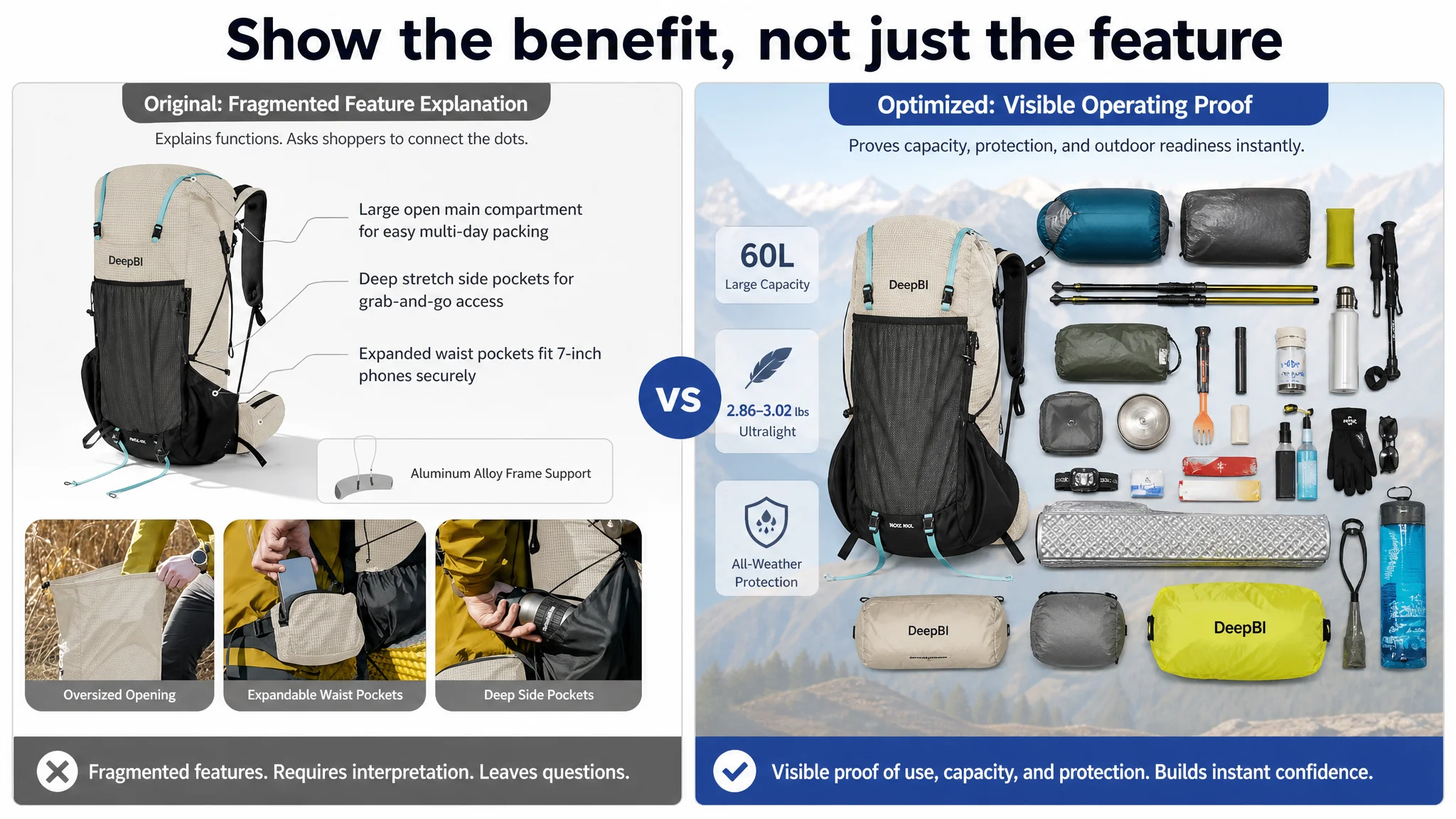
Capacity needed to become visually transparent
The existing detail page referred to capacity and storage, but the roll-top expansion logic remained abstract.
A stronger module would demonstrate:
- How the roll-top expands
- How the main compartment volume changes
- Where frequently used items are stored
- How tents, sleeping bags, and trekking poles can be carried
- How the vertical side zipper provides access
This turns “60L capacity” from a number into a visible operating advantage.
The suspension system needed a deeper explanation
The customer’s page mentioned support and comfort, but it did not fully translate the engineering into a physical benefit.
The revised module should make the load-distribution logic visible:
- Support from the internal frame
- Back-panel alignment
- Weight transfer from shoulders to hips
- Waist-belt stability
- Reduced pressure during extended carrying
The objective is not to add more technical language. It is to help the shopper understand why the construction matters.
Materials and structure needed one focused verification module
The customer’s existing modules repeated several individual features across different panels.
That repetition reduced information efficiency.
A more focused module could combine:
- Removable aluminum alloy frame
- Water-resistant, tear-resistant fabric
- Compression straps
- Front, side, and waist-belt pockets
- Physical attachment points
Each area should verify one claim rather than repeat a general feature list.
The sizing guide needed to connect measurement with comfort
A sizing guide is necessary for a technical backpack, but a static measurement diagram only confirms the process.
The revised module should connect:
- Torso-length measurement
- Size M and Size L dimensions
- Weight difference
- Adjustable fastening
- Back-panel support
- Stable carrying position
This helps reduce the concern that a large backpack may be technically capable but personally uncomfortable.
The page needed a closing scene
The original A+ structure ended after the sizing and feature sections. It did not give shoppers a final synthesis of the product’s value.
A closing module should bring together:
- Fit
- Stability
- Capacity
- Hydration or quick-access storage where shown in the available materials
- Outdoor use
- Carrying confidence
The final image does not need to introduce a new claim. It needs to confirm the claims already established.
Why DeepBI Did Not Recommend Tuning Every Element at Once
The score comparison made prioritization possible.
If the team had treated every weakness equally, it could have spent time rewriting minor phrases while leaving the largest trust barriers intact.
DeepBI’s decision order was different:
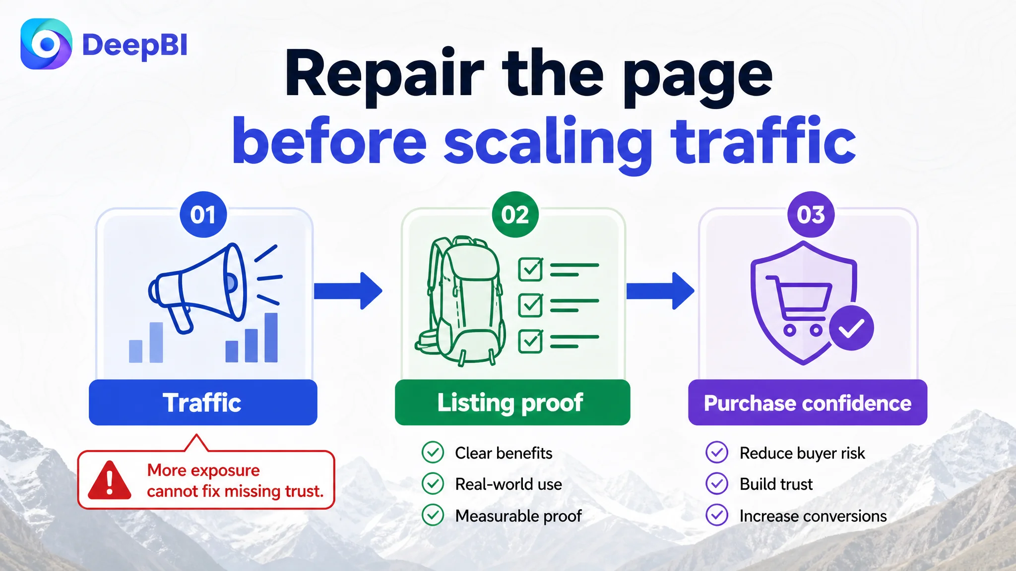
1. Recognize that the overall issue was Listing conversion capacity.
2. Separate scoring weakness from strategic importance.
3. Address the review and trust environment as a major conversion constraint.
4. Reorder the image sequence around fit, weight, weather protection, and capacity.
5. Rebuild A+ content around real use, engineering proof, and final reassurance.
6. Tighten the title and bullet-point logic so search intent and shopper concerns were aligned.
7. Only then use the improved page as a stronger destination for Amazon organic and paid traffic.
This order matters because advertising can increase exposure without repairing the page’s ability to persuade.
More traffic would not automatically solve the problem. It could expose the same trust gaps to more shoppers.
The correct question was not “Which ad setting should be changed next?”
It was:
Can the product page justify the traffic it is receiving?
The Optimization Was Designed Around Verified Product Truth
The recommended changes stayed within the product’s confirmed attributes.
They did not require inventing:
- A new frame design
- A new material
- A new capacity
- A new performance certification
- A new attachment function
- A new user outcome
The strategy used what was already supported:
- 60L capacity
- Roll-top expansion
- Vertical side zipper
- Removable aluminum alloy internal frame
- Natural spinal-curve back panel
- 2.86-pound and 3.02-pound weight options
- Built-in rain cover
- Water-resistant, tear-resistant fabric
- Multiple pockets and attachment points
The difference was how those facts were staged and visualized.
This is important for Amazon Listing optimization. Visual improvement cannot come at the cost of product accuracy. A more dramatic image that changes the product’s structure or implies unsupported performance may create a short-term visual lift but increase returns, negative reviews, and long-term trust damage.
The better approach is to improve:
- Composition
- Scene context
- Information hierarchy
- Demonstration order
- Visual proof
- Shopper comprehension
while preserving the product itself.
What Changed in the Business Understanding
The case did not end with a list of revised images and copy directions. It changed how the customer understood the Listing.
The customer’s product page had several genuine advantages, but those advantages were not automatically visible as reasons to buy.
The main image did not need to be replaced simply because it was visually weak. It needed to assign clearer roles to the image sequence.
The bullet points did not need more technical depth. They needed stronger connections between technical details and buyer concerns.
The A+ content did not need more modules for its own sake. It needed a better progression from use-case recognition to engineering proof to final confidence.
The review section did not need to be evaluated only by total count. The quality, visibility, rating, and usefulness of the customer evidence mattered more.
Most importantly, advertising and Listing optimization could no longer be treated as separate decisions.
The Broader Lesson for Amazon Sellers
For Amazon sellers in outdoor equipment and other technical categories, this case offers a practical diagnostic pattern.
When a Listing contains credible features but still struggles to convert, do not immediately assume that the product needs more specifications, more images, or more ad adjustments.
First ask:
- Does the title make the product and search intent clear quickly?
- Does the first image communicate the category and use case?
- Does the second image address the most foundational purchase risk?
- Are measurable advantages visibly proven?
- Do the bullet points connect functions with outcomes?
- Does the A+ content show the product in realistic use?
- Can shoppers understand why the engineering matters?
- Does the review area provide meaningful trust?
- Does the final page section leave the shopper with confidence or with another unanswered question?
A 70-point Listing is not necessarily a failed Listing. It may be a Listing whose strengths are trapped behind an inefficient decision path.
The role of diagnosis is to identify which part of that path is limiting the business outcome.
For this Amazon hiking backpack, the priority was not to make every component look more impressive. It was to make the entire product page easier to believe.
A strong Amazon Listing does more than describe a product. It removes the reasons a qualified shopper might hesitate.