

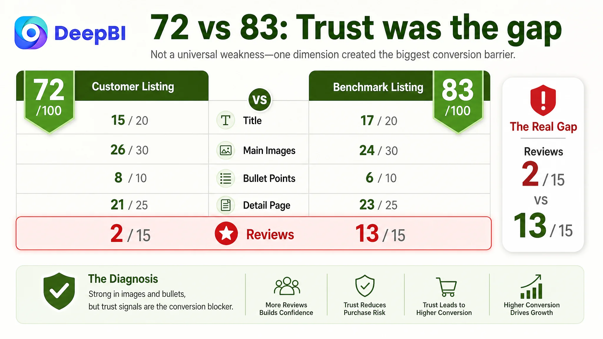
An Amazon seller in the home and garden category was not facing a simple lack-of-information problem. The product page already showed dimensions, structure, drainage, adjustable feet, and installation details. Yet its Listing score remained at 72, compared with 83 for a closely matched competing plant stand Listing.
The initial direction leaned toward adding more proof around load capacity, materials, connectors, and product specifications. That approach was reasonable, but incomplete. DeepBI found that the larger constraint was not the absence of features. It was the page’s ability to turn those features into confidence: confidence that the stand would fit a real home, remain stable, protect plants, and belong in the buyer’s intended space.
The later optimization therefore shifted from adding information to rebuilding the Amazon product page’s sales logic. The focus moved to clearer search positioning, stronger visual proof of stability and capacity, more relevant lifestyle scenes, and a more credible A+ sequence. The case offers a useful reminder for Amazon sellers: a Listing can contain plenty of technical detail and still fail to create enough trust for conversion.
The page did not lack product information. It lacked a convincing path from “I see the features” to “I can picture this working in my home.”
The Amazon Listing Looked Functional, but Its Conversion Logic Was Incomplete
The product was a four-tier metal plant stand designed for indoor and outdoor use, with space-saving dimensions, drainage trays, adjustable feet, and a structure intended to hold multiple potted plants.
At first glance, the Listing covered many of the expected selling points:
- Heavy-duty metal construction
- A widened base and grid structure
- Concave interlock connectors
- Rust-resistant material
- Hollow perforated trays
- Adjustable foot pads
- A staggered four-tier layout
- Indoor and outdoor use
- Compatibility with multiple plant types
The problem was not that these claims were missing. The problem was that they were not arranged around the buyer’s decision sequence.
A shopper considering a tall plant stand usually needs answers to several practical questions:
1. Will it fit the corner, balcony, or windowsill I have in mind?
2. Will it remain stable with several heavy pots?
3. Will the structure tolerate watering and outdoor exposure?
4. Will each plant receive enough light?
5. Will the product look natural in my living space?
6. Can I trust the page enough to place the order?
The Listing answered some of these questions through isolated specifications. It did not consistently connect them into a persuasive buying story.
That distinction mattered because the competing Listing was not simply presenting a different product. It was presenting a more complete decision path.
The Original Optimization Direction Focused on Proof, but Not Enough on Trust
The product page already invested heavily in technical explanation. Its images showed connectors, feet, drainage, dimensions, compatibility, and installation. Its bullet points emphasized structure, load-bearing performance, rust resistance, surface finish, and versatility.
This created a natural but incomplete optimization direction: if the page needed to convert better, it seemed logical to make the technical proof even stronger.
That direction could improve rational confirmation. It could show why the stand was sturdy, how much space it occupied, and how the drainage system worked. But it did not fully address the questions that technical diagrams alone could not resolve:
- Does this product look at home in an actual room?
- Can I imagine it in my own corner?
- Does the brand understand how people use plant stands?
- Has anyone else used it successfully?
- Does the page feel dependable, or does it feel assembled from product claims?
The competing Listing used a different communication structure. It led with multiple home settings, including bedrooms, studies, balconies, bathrooms, and living rooms. It also used real-user-style imagery to create social proof and placed space-saving benefits into a recognizable household context.
The customer’s page was more dependent on rendered visuals and technical demonstrations. That made it informative, but less immersive and less reassuring.
The important reversal was this: more detail could not compensate for a weak trust sequence.
DeepBI’s Diagnosis Started with the Competitive Gap, Not Personal Taste
DeepBI’s comparison placed the Listing at 72 out of 100, while the matched benchmark reached 83.
The score gap was not evenly distributed.
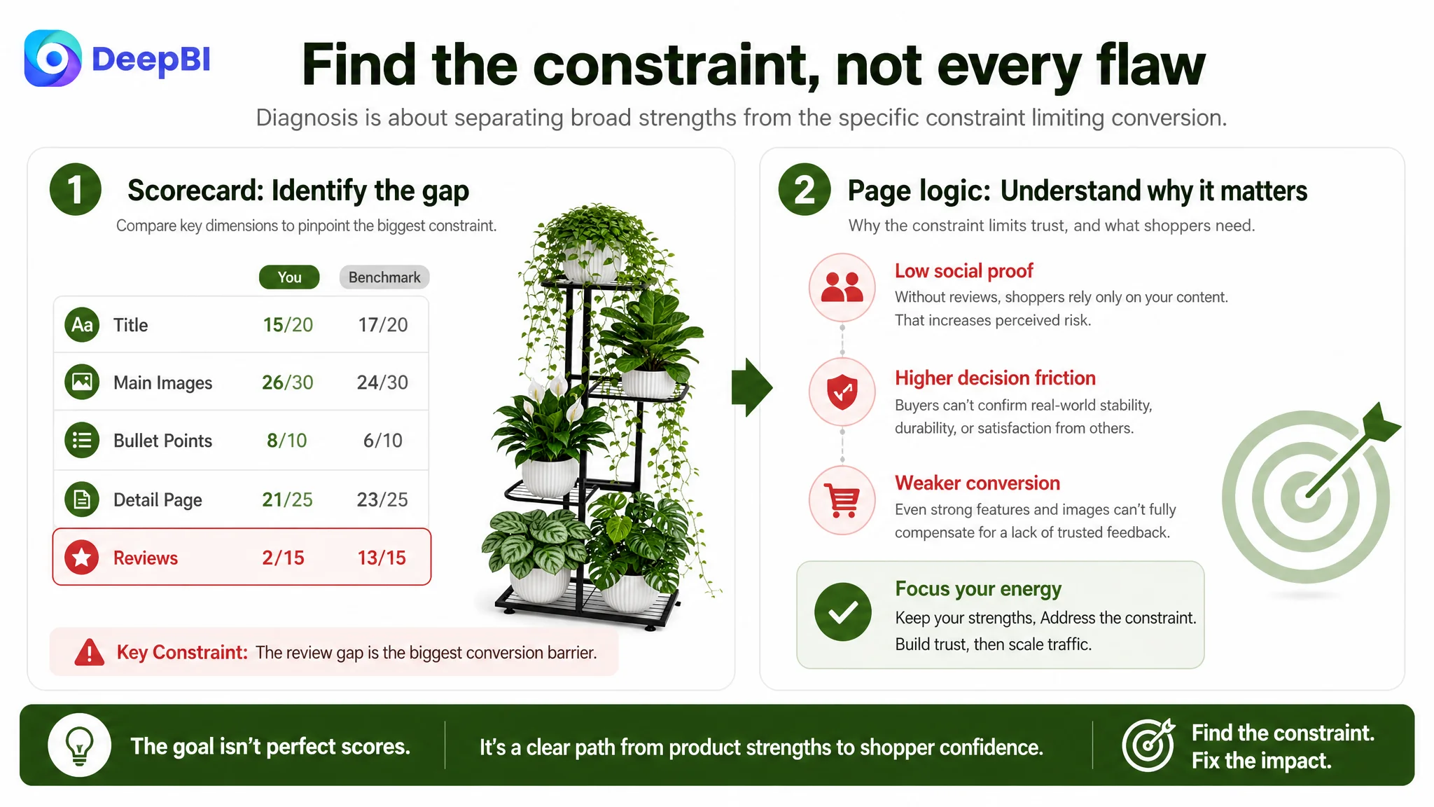
- Title: Customer Listing: 15/20, Benchmark Listing: 17/20
- Main images: Customer Listing: 26/30, Benchmark Listing: 24/30
- Bullet points: Customer Listing: 8/10, Benchmark Listing: 6/10
- Detail page: Customer Listing: 21/25, Benchmark Listing: 23/25
- Reviews: Customer Listing: 2/15, Benchmark Listing: 13/15
- Total: Customer Listing: 72/100, Benchmark Listing: 83/100
This comparison immediately changed the conversation.
The customer Listing was not weaker in every area. In fact, its main image and bullet-point scores were higher than the benchmark’s. Its bullet points contained more specific structural and material detail, and its main-image set included several useful forms of proof.
The problem was therefore not “make everything better.”
It was decide which weaknesses were constraining conversion most severely, while preserving the strengths already present.
The most visible numerical gap was reviews. The customer Listing had no meaningful review base, while the benchmark had a mature review profile with thousands of ratings and a 4.5-star average. That gap could not be solved through copywriting or image rearrangement alone. It represented a structural trust disadvantage that the page needed to acknowledge rather than hide.
At the same time, the detail-page comparison showed a second issue: the customer Listing had technical assets, but the benchmark used its content to create a stronger sense of real-life usability and social confirmation.
This was the point where DeepBI moved beyond a scorecard. The scores identified the gap; the page logic explained why the gap mattered.
The Real Constraint Was Listing Conversion Capacity
For this Amazon plant stand Listing, the core problem was not a lack of traffic evidence or a single defective image.
It was insufficient Listing conversion capacity caused by a weak connection between technical proof, lifestyle relevance, and trust.
The page could explain what the stand was made of. It was less effective at showing why those design choices mattered in the buyer’s life.
For example:
- The perforated trays were presented as a technical drainage feature, but the stronger buyer-facing benefit was helping prevent water accumulation and supporting healthier roots.
- The adjustable feet were shown as a component, but their real value was maintaining balance on uneven patios or older indoor floors.
- The concave interlock connectors were explained structurally, but their commercial role was to reduce wobble and increase confidence in supporting heavier pots.
- The compact dimensions were available, but they were not introduced early enough as a solution for narrow corners and limited indoor space.
- The staggered tiers were visible, but the page needed to connect them more clearly to sunlight access and plant display.
- Indoor and outdoor use was stated, but the visual story did not fully prove how the product belonged in both environments.
These are not minor wording differences. They determine whether a shopper experiences the page as a list of specifications or as a reliable answer to a practical home problem.
A technical feature becomes persuasive only when the shopper can connect it to a risk avoided or a use outcome gained.
The Main Images Were Not Simply “Bad”; Their Order Was Wrong for the Decision
The main-image score was already relatively strong at 26 out of 30. That made the diagnosis more precise.
The issue was not to replace every image with a more attractive version. It was to give each image a clearer role in the decision process and bring the highest-value proof forward sooner.
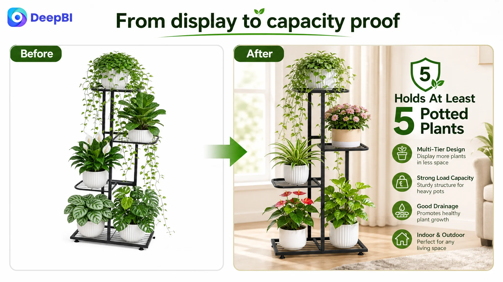
The first image needed a stronger capacity signal
The first image communicated the product’s appearance and showed multiple potted plants. However, the visual hook was not strong enough to distinguish the stand immediately from other plant racks.
The page stated that the product could hold at least five potted plants, including succulents, cacti, flowers, and trailing foliage. The image needed to make that capacity claim feel credible without creating a comparison problem with listings showing more pots.
The improvement was not to exaggerate capacity. It was to use a more representative mix of plant types and a cleaner, sharper presentation so the image supported the actual product claim.
The second image needed to answer the fit question
The existing image spent attention on watering activity and general product height. That was less important than helping shoppers decide whether the stand would fit their intended space.
The more useful visual sequence would introduce the full dimensions—16.8 inches long, 8.7 inches wide, and 31.5 inches high—and connect them to narrow indoor areas, windowsills, corners, and balconies.
For a space-saving product, fitment is not a secondary specification. It is part of the primary value proposition.
The third image needed to address stability directly
The “disorganized versus organized” comparison explained why someone might want a plant stand, but it did not prove why this stand was more dependable than another one.
A higher-value use of the slot would show:
- The thicker metal tubes
- The concave interlock connectors
- The wider base
- The grid structure
- The product supporting weight across multiple tiers
The purpose was not to create a dramatic load-test claim beyond the available evidence. It was to make the stability message visible and easy to verify.
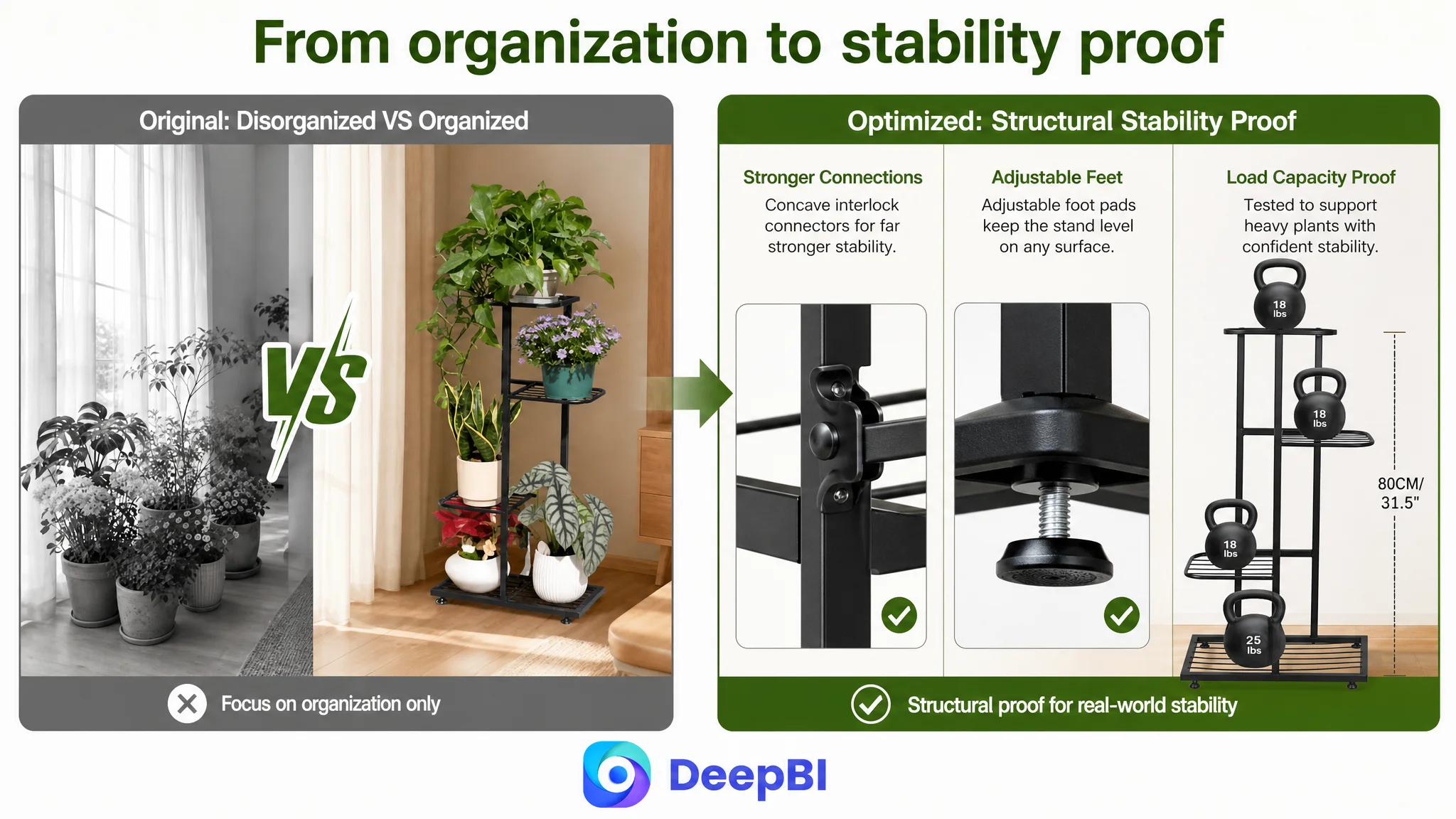
The fourth image needed clearer functional hierarchy
The existing dimension and weight-capacity content repeated some information and presented several ideas at once. The staggered layout, adjustable feet, and widened base each mattered, but they competed for attention.
The page needed to separate the questions:
- Will every plant receive enough light?
- Will the stand remain level?
- Can it adapt to uneven indoor or outdoor surfaces?
A clearer image sequence would make each answer easier to process.
The fifth image needed to turn drainage into plant protection
The drainage and tray details were technically valid, but a close-up alone did not make the benefit urgent.
The stronger message was not merely that water could pass through perforations. It was that the tray design helps prevent water accumulation and supports air circulation around plant roots.
This is the difference between displaying a component and explaining its role in protecting the buyer’s plants.
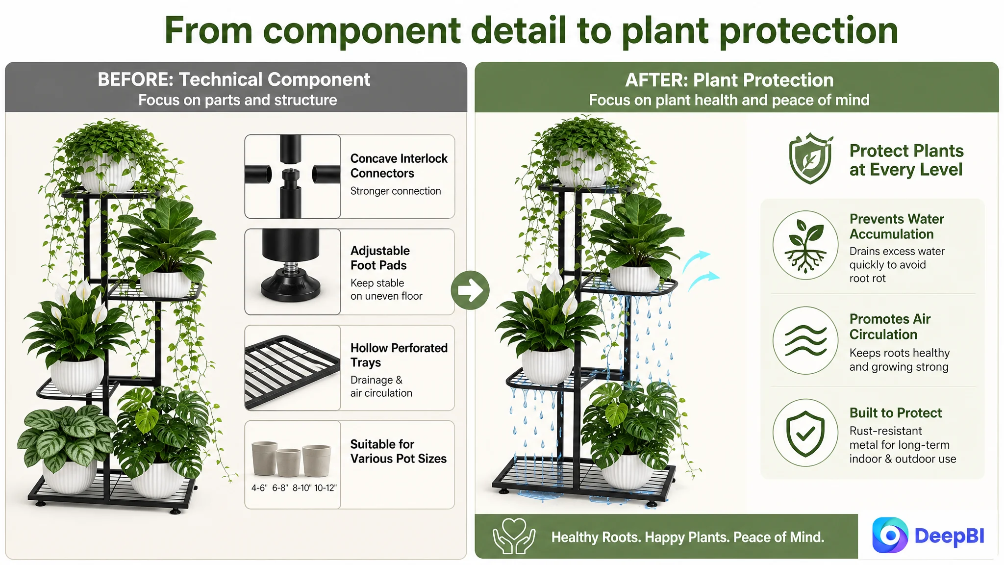
The A+ Page Was the Larger Trust Opportunity
The A+ content had a score of 21 out of 25, only two points behind the benchmark. Again, this was not a sign of a broken page. It was a sign that the remaining gap was strategic rather than cosmetic.
The customer’s A+ content included:
- Product scenes
- Structural comparisons
- Connector and foot details
- Waterproof and material visuals
- Drainage explanations
- Size and compatibility information
- Installation guidance
The benchmark used a more immersive progression:
- Multiple household settings
- Space-adaptation messaging
- Bedroom, study, balcony, bathroom, and living-room contexts
- Real-user-style home imagery
- Functional labels connected to specific spaces
The difference was the order of persuasion.
The customer’s page often moved from feature to feature. The stronger structure would move from lifestyle recognition to risk reduction to proof to practical confirmation.
Start with the life the buyer wants to create
The opening A+ module should not begin with generic icons or a dense feature summary. It should establish a styled living-room corner or comparable home setting where the product looks immediately useful.
For a plant stand, the shopper is not only buying storage. They are imagining a more organized, attractive, greener space.
That visual context creates the first layer of relevance.

Put stability before secondary details
The most important technical concern was stability. A tall, multi-tier plant stand carrying several pots creates an obvious question: will it wobble, bend, or tip?
The stability module should therefore appear before lower-priority details such as installation or exact pot compatibility.
The content can connect:
- Thicker metal tubes
- Concave interlock connectors
- Even weight distribution
- A widened base
- Adjustable feet
The message should remain grounded: these elements are designed to support a steadier display and better balance across different surfaces.
Replace artificial comparison with credible evidence
The customer’s existing visual comparison lacked credibility because it contrasted a colorless “before” state with a polished “after” state. It did not demonstrate a real competitive or user-facing difference.
If authentic user photos are available, a real-home gallery can create stronger social proof. If they are not available, the page should use credible multi-room scenes rather than imply third-party validation that does not exist.
This distinction matters. Trust cannot be created by making a comparison look more dramatic than the evidence allows.
Translate materials into ownership value
The rust-resistant metal and burr-free finish should be connected to long-term indoor and outdoor display. The waterproof visual should support an explanation of why the material matters in humid or frequently watered environments.
Likewise, drainage should be shown as plant protection, not as an abstract technical diagram.
The page becomes more persuasive when every technical module answers a practical ownership concern.
Why DeepBI Did Not Recommend More Advertising-Led Optimization First
This case was primarily an Amazon Listing diagnosis. The available material did not establish a post-optimization advertising result, so it would be premature to claim that ACOS, CVR, or organic orders improved.
But the Listing diagnosis still has a direct implication for Amazon ads.
Paid traffic can bring shoppers to a product page. It cannot make a page feel more trustworthy than the page itself allows.
If a shopper arrives from an Amazon ad and encounters:
- Weak social proof
- A generic opening visual
- Delayed stability proof
- Limited lifestyle relevance
- Technical claims without visible outcomes
then additional traffic may expose the same conversion constraint at greater scale.
That is why the decision order mattered. Before increasing pressure on ads, the team needed to judge whether the product page was ready to receive and convert more traffic.
The better sequence was:
1. Clarify the Listing’s core conversion constraint.
2. Preserve the existing strengths in technical detail and bullet-point specificity.
3. Reorder the visual and textual proof around buyer concerns.
4. Strengthen lifestyle relevance and credible trust signals.
5. Then observe how paid and organic traffic respond.
This is not an argument that Amazon ads are unimportant. It is an argument that ads should not be asked to compensate for a page-level trust gap.
Advertising can amplify a strong Listing. It can also amplify the cost of sending shoppers to an unconvinced one.
The Title and Bullet Points Needed Reframing, Not Keyword Inflation
The title was scored at 15 out of 20. The main weaknesses were structural:
- Core category terms were not positioned as strongly as they could be.
- The indoor bedroom use case was not covered clearly.
- The title lacked a differentiated trust or design cue where supportable.
- The product and use-case relationship was less immediate on mobile screens.
- The structure leaned toward feature listing rather than a complete search-and-use formulation.
The recommended direction placed the core phrase “4 Tier Metal Plant Stand Tall Corner” earlier, followed it with product form and capacity language, and added indoor and outdoor settings such as patio, garden, balcony, living room, and bedroom.
The goal was not to fill the title with every possible keyword. It was to make the product’s identity and primary use cases clearer at the search stage.
The bullet points were a different story. Their score was 8 out of 10, higher than the benchmark’s 6. The customer’s copy already had strong technical substance.
The opportunity was to make that substance easier to process:
- Lead with “Heavy-Duty & Stable Structure” rather than a highly technical connector term.
- Pair rust resistance with drainage and plant health.
- Present compact dimensions as a space-saving solution.
- Connect adjustable feet to balance on uneven floors.
- Add easy assembly and broader decor use without weakening the plant-stand positioning.
This reflects an important judgment: not every area with a lower benchmark score needs to be replaced, and not every area with a higher score should be left untouched.
The task was to preserve the stronger technical foundation while making the buying logic more direct.
What the Final Optimization Direction Changed
Because the source material does not include post-optimization performance data, the case does not support claims of a specific CVR increase, ACOS decline, or organic-ranking recovery.
The supported change is in the operating direction of the Listing.
The page moved toward:
- A clearer Amazon search identity for a tall, four-tier corner plant stand
- Earlier communication of compact dimensions and space-saving value
- More direct visual proof of stability and load-bearing structure
- A clearer relationship between adjustable feet and uneven surfaces
- Stronger presentation of drainage as root protection
- More varied indoor and outdoor lifestyle scenes
- A+ content ordered around relevance, trust, proof, and confirmation
- Less dependence on generic rendered visuals
- More disciplined use of authentic social proof where available
- Better alignment between title, bullets, main images, and A+ content
The risk profile also became clearer.
The Listing still faced a substantial review disadvantage. That could not be solved by changing the page alone. But the page could stop wasting its existing product strengths by presenting them in a fragmented or overly technical sequence.
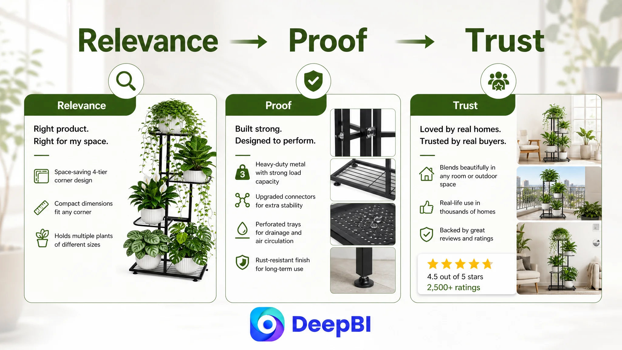
The Business Lesson for Amazon Sellers
This case is easy to misread as a plant-stand image optimization project. It was not.
It was a diagnosis of how an Amazon product page converts product advantages into buyer confidence.
The product had meaningful strengths:
- Specific structural design
- A heavy-duty positioning
- Drainage capability
- Adjustable feet
- Compact dimensions
- Multiple usage environments
- Stronger technical bullet-point content than the benchmark in several areas
Yet those strengths were not automatically persuasive. The page needed to make them visible at the moment each concern appeared in the shopper’s mind.
DeepBI’s role in the case was not to recommend more content for its own sake. It was to identify which content was doing the wrong job, which evidence needed to move earlier, and which product strengths should be translated into lived benefits.
For Amazon sellers, the broader lesson is straightforward:
Before increasing ad pressure, determine whether the Listing can convert the kind of shopper the ads are bringing.
A strong title can win attention. A clear main image can earn the click. Bullet points can organize the decision. A+ content can deepen confidence. Reviews can reduce perceived risk. But these elements work as a system.
When one part is overloaded with specifications while another lacks trust, the Listing may appear complete and still underperform as a sales page.
The most valuable optimization may not be the next keyword, the next bid adjustment, or the next decorative image. It may be the decision to rebuild the order in which the page earns confidence.