

This case involved an Amazon UK seller whose elastic shoelace Listing was not converting as efficiently as expected. The customer initially viewed the problem as a traffic and advertising issue: perhaps the keywords were too narrow, the bids were not precise enough, or the campaign structure needed another round of adjustment.
The deeper review pointed elsewhere. The Listing scored 68 out of 100, compared with 82 for a closely matched benchmark Listing. The largest gaps were not concentrated in one keyword or campaign setting. They appeared across the product page: the title communicated too little buying value, the bullets did not reduce installation concerns, the images showed the product without fully explaining its use, and the A+ content lacked the situations that make “no tie” shoelaces immediately relevant.
DeepBI therefore reframed the problem from “how to make Amazon ads work harder” to “whether the Amazon product page was ready to convert more traffic.” The later optimization focused on the title, main-image system, bullet-point logic, installation guidance, pain-point scenarios, and A+ content. For other Amazon sellers, the lesson is direct: before increasing traffic, determine whether the Listing can turn that traffic into confidence and purchase intent.
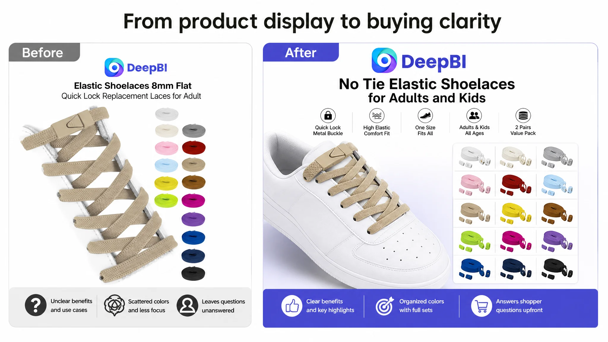
The seller saw a traffic problem. The page showed a conversion problem.
The product was a simple but decision-sensitive accessory: 8mm flat elastic shoelaces with a quick-lock metal buckle system. On Amazon, products like this often look easy to buy. They are inexpensive, visually familiar, and available in multiple colours.
That apparent simplicity creates a conversion challenge.
A shopper still needs answers to several practical questions:
- Will the laces fit my shoes?
- Will the elastic feel secure rather than loose?
- Will the buckle stay in place?
- Can I install them without difficulty?
- Do they work for children, older users, sports shoes, or boots?
- What exactly is included in the package?
- Will the final appearance look neat?
If the product page does not answer those questions quickly, paid traffic can become expensive without being productive.
The customer’s first instinct was understandable. When Amazon advertising costs become harder to control, sellers naturally look at search terms, bids, match types, and campaign structure. But in this case, continuing to tune ads first risked sending more shoppers to a page that had not yet established enough reasons to buy.
Advertising can amplify traffic, but it cannot compensate for a product page that leaves the main buying questions unanswered.
The score gap was broad, not isolated
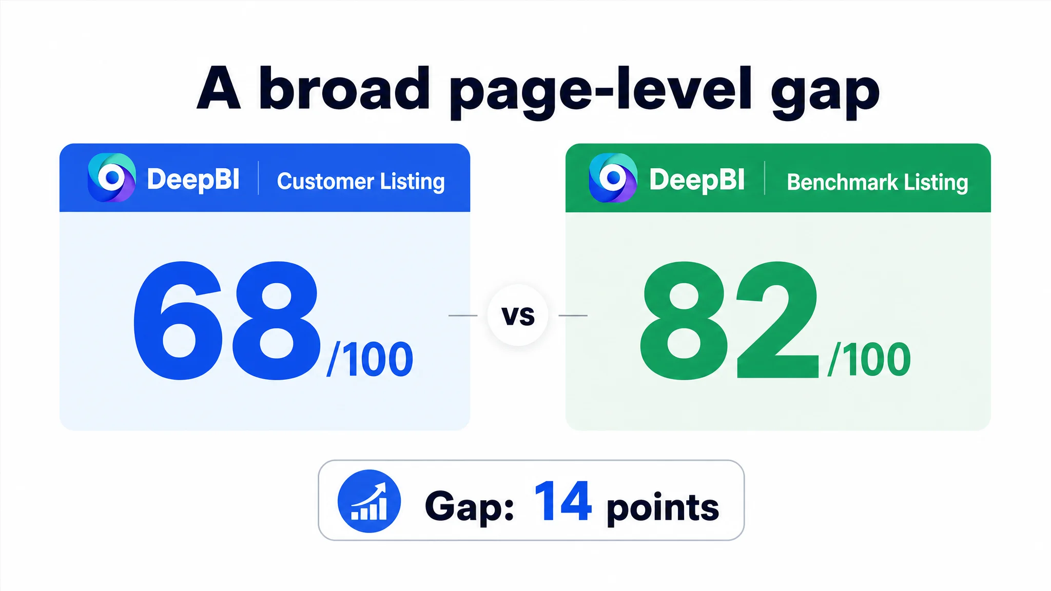
DeepBI’s comparison placed the customer’s Listing at 68/100, while the benchmark Listing reached 82/100.
The difference was distributed across the page:
- Title: Customer Listing: 12/20, Benchmark Listing: 15/20, Gap: -3
- Main image: Customer Listing: 24/30, Benchmark Listing: 26/30, Gap: -2
- Bullet points: Customer Listing: 5/10, Benchmark Listing: 7/10, Gap: -2
- A+ and detail content: Customer Listing: 19/25, Benchmark Listing: 23/25, Gap: -4
- Reviews: Customer Listing: 8/15, Benchmark Listing: 11/15, Gap: -3
The most important signal was not simply the total score. It was the pattern.
The Listing was not failing because of one broken element. It was underdeveloped at several points in the shopper’s decision path. The A+ and detail content showed the largest gap, while the title and bullets were not doing enough to communicate the product’s practical value before the shopper reached those lower sections.
That changed the business question.
Instead of asking, “Which ad setting should be adjusted next?” the team needed to ask:
Can the page explain the product clearly enough for the traffic it already receives?
The original diagnosis focused on the controllable part of the funnel
Advertising is easier to adjust than a complete Listing. A seller can change bids today, add negative keywords, restructure campaigns, or move budget between match types.
That creates a common operating trap: the team keeps optimizing the part of the funnel that is easiest to manipulate, even when the commercial constraint is further down the page.
For the elastic shoelace Listing, the customer’s initial direction was effectively centered on gaining or refining traffic. But traffic quality alone could not solve several page-level weaknesses:
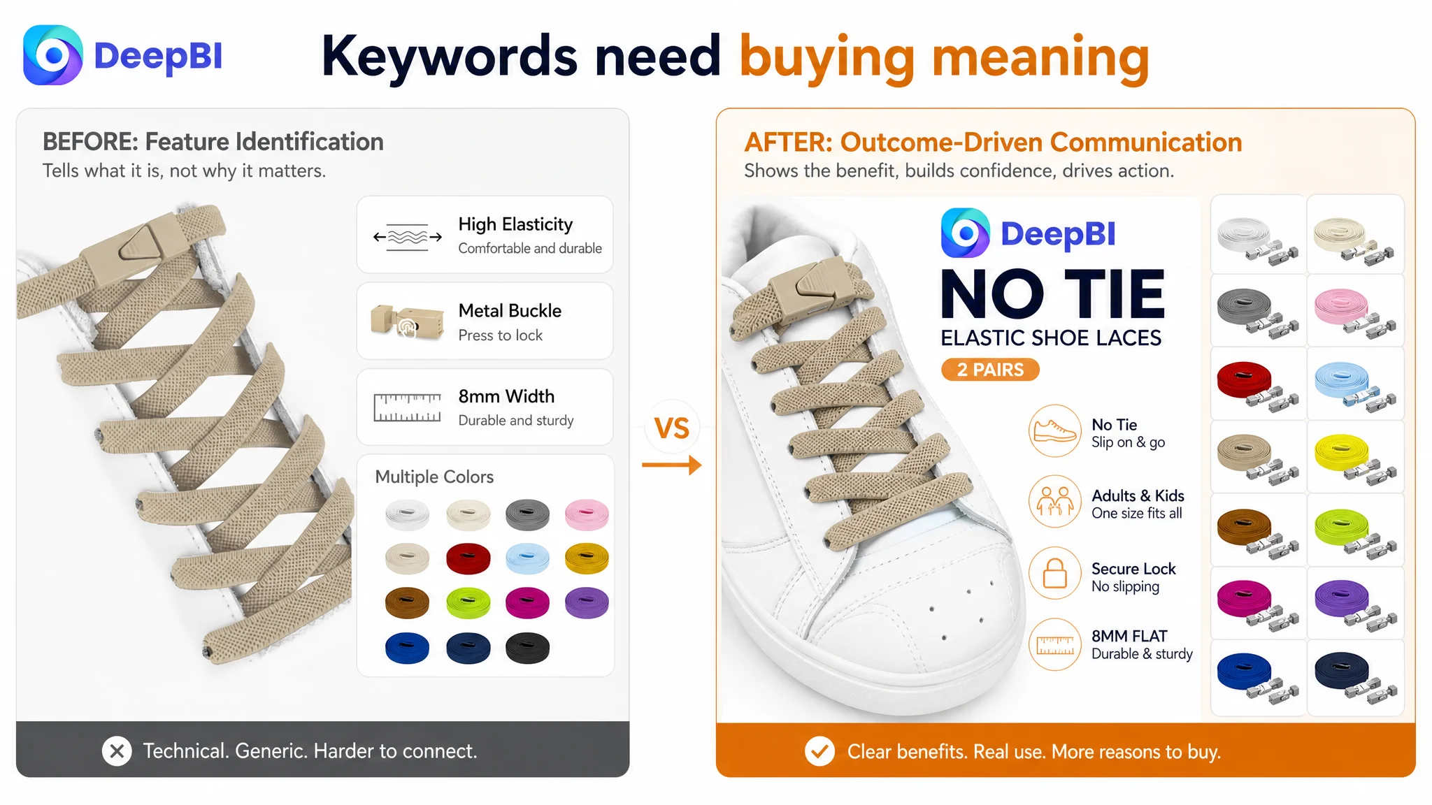
- The title prioritised the technical term “8mm,” but did not make the broader use case sufficiently clear.
- “Quick Lock” was less immediately understandable than a phrase such as “No Tie.”
- The title mentioned adults but did not clearly extend the use case to children and other relevant users.
- The bullets described product properties without consistently connecting them to shopper concerns.
- The images showed features, but did not always show why those features mattered.
- The A+ content explained the product process, but did not build enough emotional or practical urgency.
These are not primarily bid-management problems.
They are Listing communication problems.
The title contained keywords, but not enough buying reasons
The original title’s use of “8mm” helped communicate a real product attribute and supported search relevance. That part did not need to be discarded.
The problem was that the title gave too much weight to technical identification and not enough to the outcome the shopper wanted.
The benchmark Listing used several phrases that were easier to process at a glance:
- “No Tie”
- “2 Pairs”
- “One Size Fits All”
- “Adults and Kids”
These phrases did more than add keywords. They reduced uncertainty.
A shopper could understand the basic promise without interpreting what “Quick Lock” meant or deciding whether the product was suitable for a particular family member. The benchmark title also placed its brand identity early, creating a stronger sense of a mature, established product.
The recommended direction therefore kept important product attributes such as 8mm, flat, elastic, and quick lock, while reorganising them around a clearer buying logic:
1. Identify the no-tie benefit.
2. Clarify the product form and key specification.
3. Expand the relevant audience.
4. Make the fit and use case easier to understand.
5. Remove unnecessary repetition.
The change was not about filling the title with more terms. It was about making each term carry a clearer commercial role.
The bullets needed to answer the questions shoppers were already asking
The customer’s bullet points included useful information, but the sequence did not fully match the shopper’s decision process.
The benchmark structure moved more deliberately through the purchase:
- What comes in the package
- Why the product is convenient
- How the buckle works
- How to install it
- Who can use it
- Where to get help
By contrast, the customer Listing placed material durability, locking functionality, versatility, and appearance closer together without making the installation and everyday-use logic sufficiently explicit.
For this category, that matters. “Elastic shoelaces” are not purchased only for their material. They are purchased to remove a recurring inconvenience.
The first bullet needed to establish package value
The revised direction made the contents more concrete: two pairs of flat elastic laces and the associated metal buckles, where accurate for the product configuration.
This gives the shopper a better sense of what will arrive and makes the product feel like a complete set rather than an isolated replacement component.
The second bullet needed to lead with the outcome
“No More Tying” is easier to understand than a technical description of the lock mechanism.
The metal buckle should support the promise, not replace it. The shopper first needs to understand the benefit—slip-on convenience—then see how the buckle helps keep the laces secure.
The third bullet needed to reduce installation anxiety
Installation was one of the clearest gaps.
The proposed logic explained the sequence: thread the laces, trim excess length, fit the metal lock tips, and secure the ends. Clear instructions reduce the mental effort required to imagine setup.
For an installation product, unclear setup instructions can create a conversion barrier before the shopper ever considers colour or styling.
The fourth bullet needed to clarify the audience
The page originally used relatively neutral language around versatility. The stronger direction made the potential audience more visible: children, older users, athletes, busy adults, and anyone who finds traditional tying inconvenient.
This does not mean claiming universal compatibility without qualification. It means helping shoppers recognise whether the product solves a problem they actually have.
The fifth bullet needed to connect appearance with daily use
A neat, streamlined appearance is part of the product’s appeal. But it becomes more persuasive when connected to daily movement, commuting, exercise, and outdoor use.
The page needed to show that convenience was not separate from appearance. The intended message was: the laces make shoes easier to wear while keeping the finished look orderly.
The main image was clear, but it did not create enough distinction
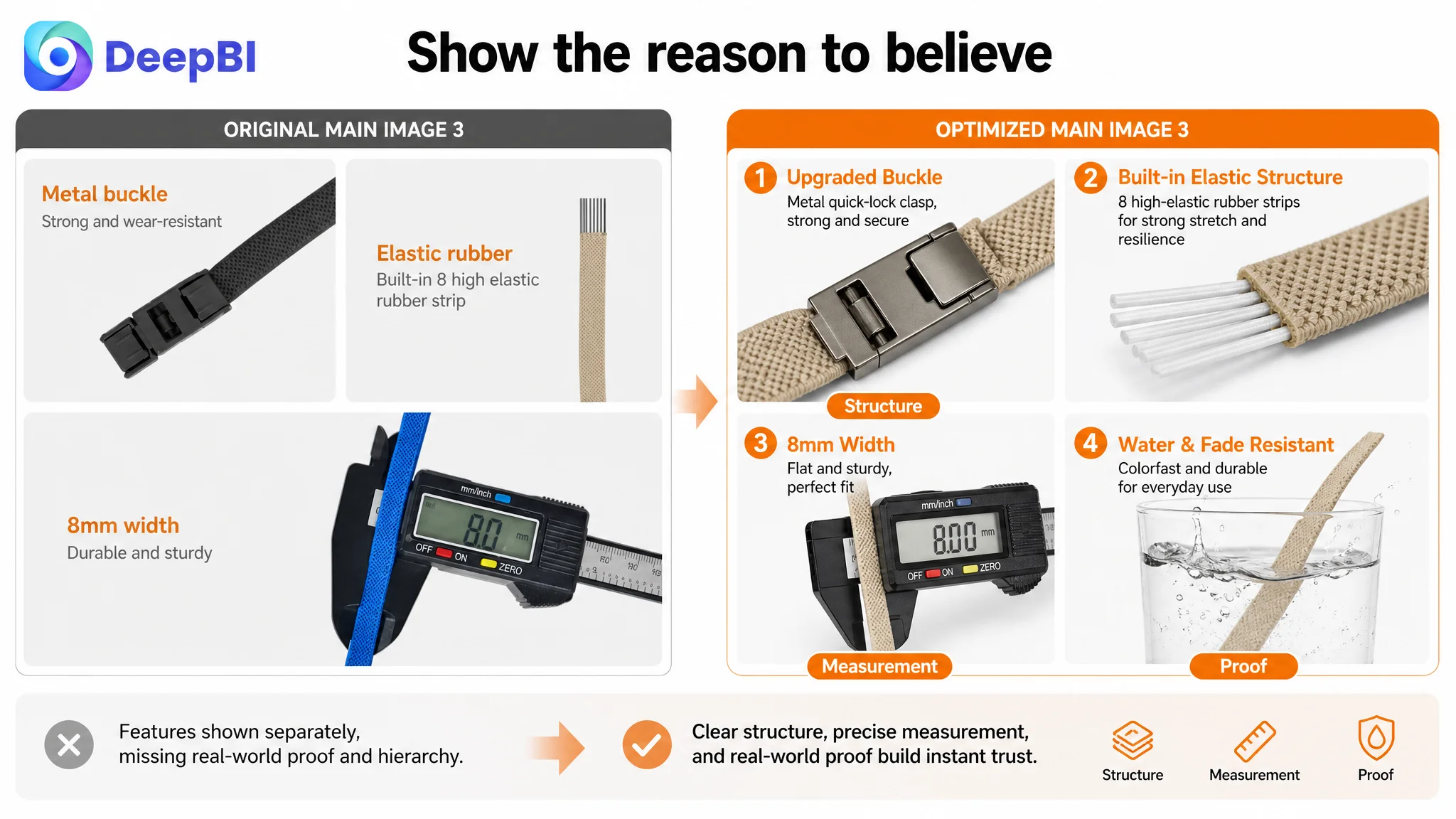
The main-image gap was smaller than the A+ gap—24 versus 26—but it still mattered because the main image often determines whether Amazon shoppers stop to inspect a product at all.
The diagnosis identified several visual issues:
- The colour swatches on the right were crowded and inconsistent in shape.
- The visual arrangement felt less polished than the benchmark.
- The product’s elasticity was not demonstrated with enough impact.
- The metal buckle and lace combination was not always shown together clearly.
- The 8mm width was not strongly supported through visual evidence.
- The multi-shoe presentation felt dated and visually fragmented.
- Installation guidance used inconsistent lighting and a distracting background.
The correct response was not to make every image louder. It was to give each image a distinct job.
The main image should remain clean, compliant, and immediately legible, with the product presented prominently against an appropriate white background. Supporting images can then carry the explanatory burden:
- A close-up of the buckle and lace combination
- A controlled stretch demonstration
- A clear 8mm measurement, if accurate
- A clean multi-shoe compatibility scene
- A standardised installation sequence
- A complete colour-and-accessory presentation
The visual issue was not that the product was invisible. It was that its practical value was not being communicated quickly enough.
A+ content was missing the situations that make the product necessary
The largest content gap appeared in the detail and A+ layer.
The customer’s A+ content already included useful components:
- Lifestyle imagery
- Core feature graphics
- Installation steps
- Colour displays
However, the benchmark Listing added more decision support. It showed not only what the product was, but why different types of shoppers might need it.
That distinction is central to conversion.
The proposed A+ direction added several layers of persuasion.
Pain-point scenes make the problem recognisable
A black-and-white pain-point module could show situations such as:
- A child dealing with a loose shoelace
- An older person struggling to tie shoes
- A pregnant shopper finding it difficult to bend down
- An athlete stopping because a lace has come undone
These scenes should not overstate the product’s capabilities. Their purpose is to make the inconvenience familiar.
A shopper who recognises the situation no longer has to translate a generic “no tie” claim into personal relevance.
Technical proof should make visible attributes easier to trust
The benchmark used visual demonstrations to support properties such as elasticity, width, and construction.
For the customer Listing, this suggested a more disciplined use of close-ups and measurement scenes:
- A macro view of the lace structure where the construction is genuinely visible
- A clear buckle detail
- A measurement reference for the 8mm width
- A controlled demonstration of relevant material performance only where the claim is verified
The important principle is not to add impressive-looking claims. It is to make real attributes easier to evaluate.
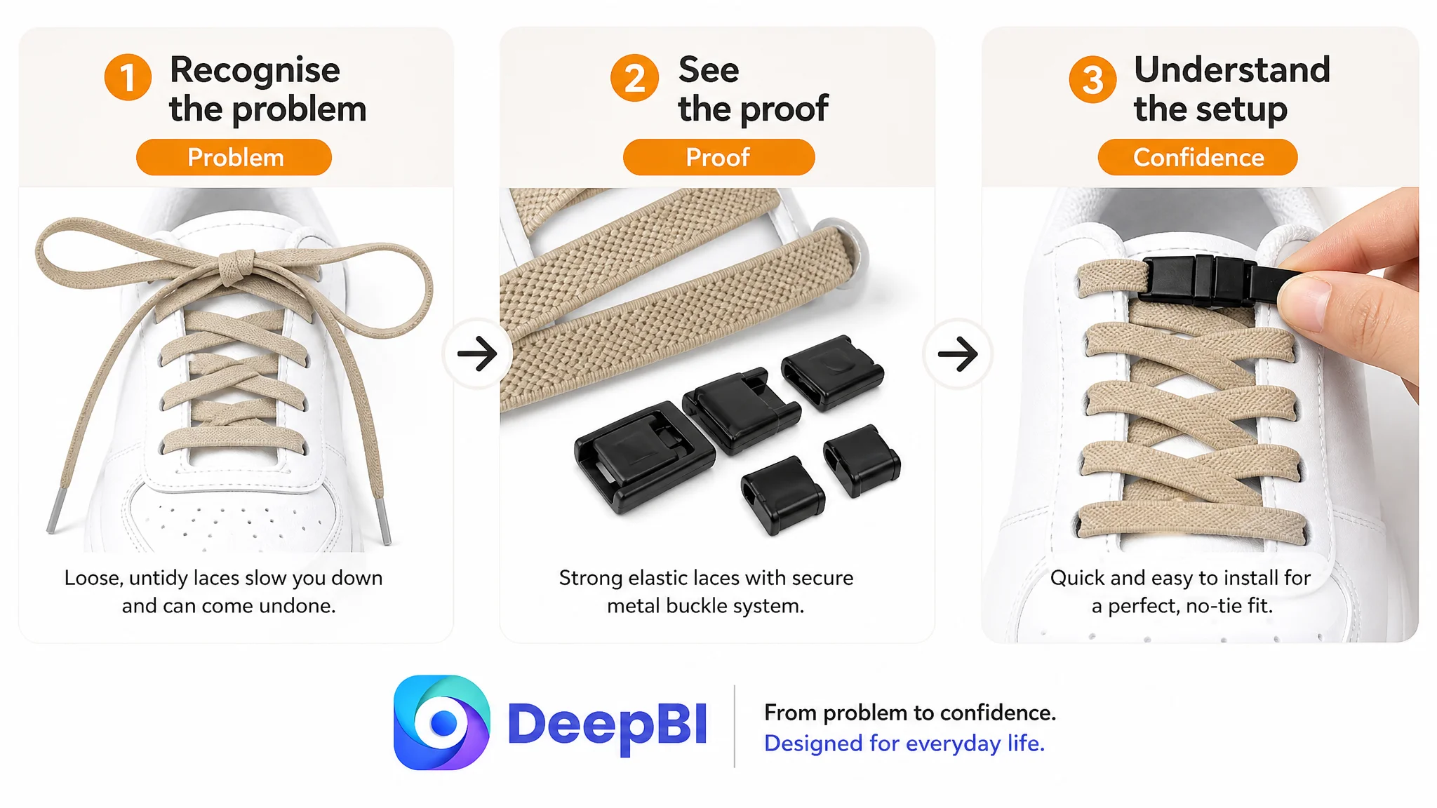
Installation should look simpler than shoppers expect
The installation module needed a consistent five-step presentation, using a clean background and the same hand model throughout:
1. Thread the laces.
2. Trim the excess.
3. Fit the metal lock tips.
4. Press the fastening mechanism.
5. Secure the ends.
This sequence reduces uncertainty because shoppers can preview the task before purchase.
Colour selection should show the complete set
The original colour display showed variety, but it did not always communicate the full package. Showing each colour with its associated components gives the product greater visual completeness and helps shoppers judge the final appearance.
For a product with many colour choices, the job is not merely to display options. It is to reduce the effort required to compare them.
The review gap was real, but not the first repair point
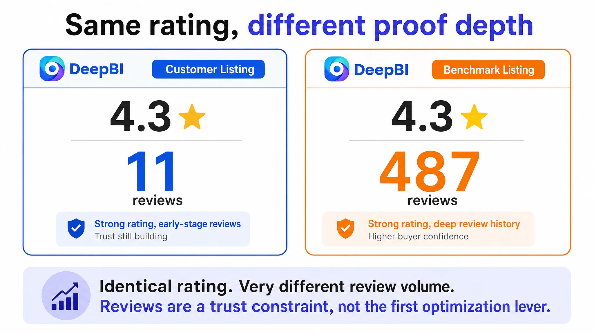
Both Listings showed a 4.3-star rating, which meant the star score itself did not explain the performance difference.
The scale of the review base did differ sharply:
- Customer Listing: 11 total reviews
- Benchmark Listing: 487 total reviews
That difference affects trust. A shopper may perceive a mature Listing with hundreds of reviews as more validated than one with only a small number, even when the average rating is identical.
The customer Listing did have a positive signal: its visible review set contained no three-star-or-lower review, while the benchmark displayed a larger and more mixed review history. But the smaller review count still limited the amount of social proof available to support the purchase.
This was important, but it was not the most controllable short-term lever.
The team could not immediately create the benchmark’s review history. It could, however, improve the page’s clarity, installation confidence, product presentation, and relevance to different users.
That is why the review gap was treated as a trust constraint rather than the first optimisation target.
Why DeepBI did not keep tuning the ads first
The decision order followed the evidence.
The Listing had a broad score deficit, with the largest gap in A+ and detail content. The title and bullets also failed to form a sufficiently direct path from search relevance to purchase confidence. The main-image system was serviceable but less persuasive and less differentiated than the benchmark.
Under these conditions, more ad traffic could create more exposure without solving the page’s underlying conversion friction.
The rational sequence was:
1. Repair the product page’s sales logic.
2. Clarify the title and bullet-point promise.
3. Strengthen visual proof and installation guidance.
4. Add pain-point and use-case context to A+ content.
5. Preserve product accuracy and avoid unsupported claims.
6. Only then use advertising data to judge how the revised page receives traffic.
This is not an argument for pausing all Amazon advertising. It is an argument for not treating advertising as the first and only answer.
The Listing had to become more capable of converting traffic before additional traffic could be evaluated fairly.
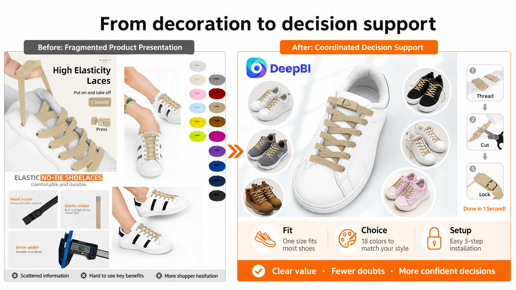
The optimisation direction changed from decoration to decision support
The recommended visual changes were not based on making the page more decorative.
They were designed around specific questions in the shopper’s mind:
- Does the product look professional and complete?
- Is the buckle secure?
- Will the laces stretch as expected?
- How wide are they?
- Can I install them easily?
- Will they work with my type of shoe?
- Which colour and package configuration should I choose?
- Why would this be better than ordinary laces?
That is where DeepBI’s role became commercially useful. The system did not treat the benchmark as a template to copy. It used the comparison to identify missing decision elements and translate them into concrete content directions.
For example:
- A weak visual hierarchy became a need for cleaner product placement.
- An unclear elasticity benefit became a controlled stretch demonstration.
- A generic versatility claim became multi-shoe and multi-user context.
- A missing installation explanation became a standardised step sequence.
- A thin A+ story became a combination of pain-point, proof, and use-case modules.
The optimisation remained bounded by the product’s real attributes. No new material, function, durability figure, or performance claim should be added unless it is verified.
What the customer could learn from the diagnosis
This case did not establish a post-optimisation percentage increase in CVR, ACOS, or organic orders, so those outcomes should not be invented.
The confirmed change was in the operating diagnosis.
The customer no longer had to treat weak performance as an advertising problem by default. The Listing itself had been identified as a conversion constraint, and the optimisation work could be prioritised around the parts of the page the team could actually improve.
The expected business value of that change was more practical:
- Advertising traffic would be sent to a clearer product story.
- Shoppers would spend less effort interpreting technical details.
- Installation concerns would be addressed before purchase.
- The product would become more relevant to several recognisable user groups.
- Visual assets would support the title and bullets rather than repeat them.
- The review disadvantage would be managed through stronger controllable page content.
- Future ad results could be judged against a better Listing foundation.
The core lesson for Amazon sellers is not that every high-ACOS Listing needs more images or longer bullets. It is that the correct optimisation order depends on where the conversion logic is blocked.
Before scaling Amazon traffic, check whether the page deserves it
The elastic shoelace Listing did not lack product information. It lacked enough coordination between that information and the shopper’s decision process.
The title had keywords, but not enough outcome language. The bullets had features, but not enough problem-to-solution flow. The images showed the product, but did not fully demonstrate its value. The A+ content explained usage, but did not create enough personal relevance. The reviews offered a reasonable rating, but not enough volume to carry trust on their own.
DeepBI’s diagnosis brought those gaps into one business picture.
Amazon ads were not the entire problem. They were exposing the limits of the product page.
For sellers facing rising advertising pressure, this is the more durable question to ask:
If the Listing receives more qualified traffic tomorrow, does the page have enough clarity, proof, and trust to convert it?
If the answer is uncertain, the next optimisation may not be another bid adjustment. It may be the Amazon Listing itself.