

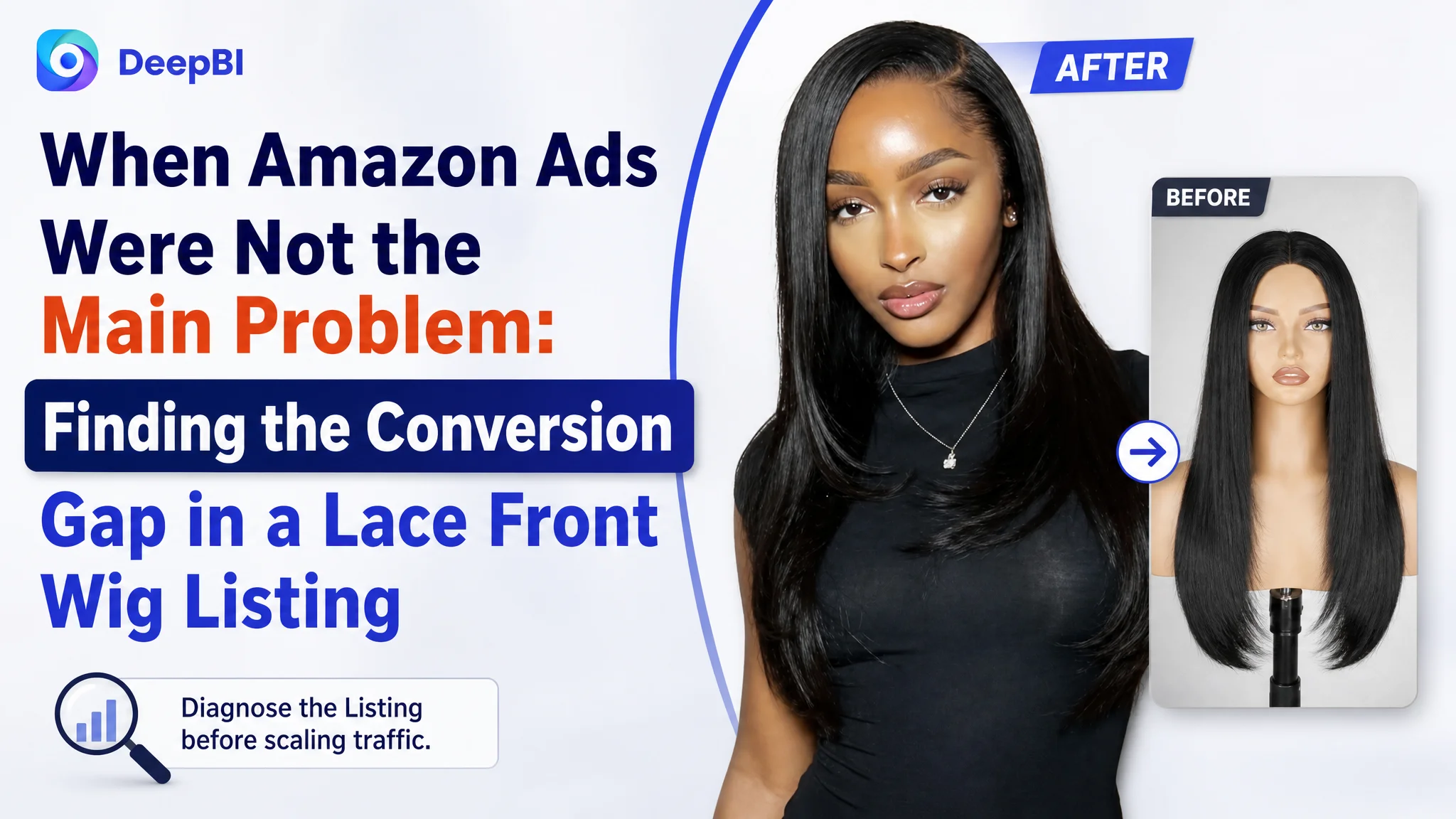
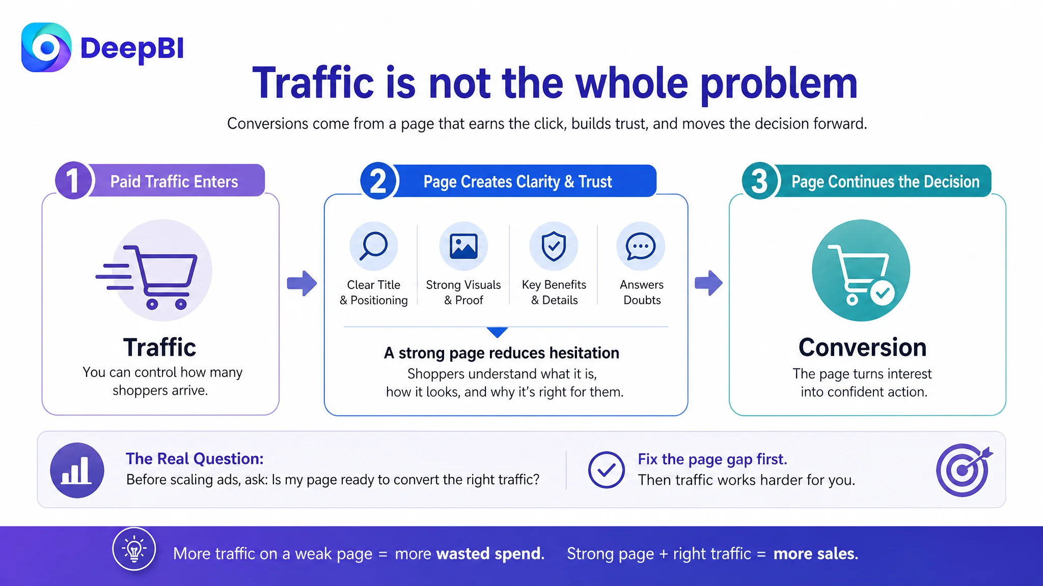
An Amazon seller in the U.S. beauty category was facing a familiar problem: the product page was receiving market exposure, but the Listing did not communicate its value as clearly as stronger competing listings. The team initially treated the situation as a traffic and advertising challenge—one that might be solved through more precise keyword coverage, bid adjustments, or additional campaign work.
DeepBI’s review pointed to a different constraint. The Listing scored 68 out of 100, compared with 82 for a closely comparable lace front wig listing. The largest gaps were not in the product itself, but in how the Amazon title, main image sequence, and A+ content helped shoppers understand the product and trust its appearance.
The later direction therefore focused on rebuilding the product-page logic: make the 4x6 HD lace and natural hairline easier to recognize, move the title toward clearer search intent, replace static presentation with realistic wearing and styling scenes, and use A+ content to answer doubts that advertising could not resolve. The broader lesson for Amazon sellers is straightforward: before scaling paid traffic, determine whether the Listing is ready to convert it.
The Store Did Not Have a Simple Traffic Problem
The customer’s product was a 26-inch long, straight synthetic lace front wig with a 4x6 HD lace area, pre-plucked hairline, and glueless design. On the Amazon U.S. marketplace, those attributes placed the Listing in a category where shoppers compare more than price.
They also compare:
- Whether the lace looks natural against the skin
- Whether the wig can be worn without complicated preparation
- Whether the cap feels secure and comfortable
- Whether the density and length look as expected
- Whether the product can support different parting or styling choices
- Whether the images resemble real-life wearing conditions
That creates a demanding conversion environment. A title can contain many product terms and still fail to establish a clear position. A main image can look polished and still fail to communicate why the product deserves attention. An A+ page can display product details and still leave the buyer uncertain about how the wig will look in daily use.
The customer’s Listing showed signs of this problem across several connected dimensions.
The page was not empty of information. It was short of a convincing buying sequence.
The First Diagnosis Pointed Toward More Advertising Work
When Amazon ads become harder to control, sellers often look first at campaign structure.
The usual questions are familiar:
- Are the bids too high?
- Are the keywords too broad?
- Is the search-term report being cleaned often enough?
- Should more exact-match campaigns be added?
- Are the ads attracting the wrong audience?
Those questions can be valid. But they become a distraction when the product page has not yet established a strong reason to click and buy.
In this case, the initial direction was close to treating the problem as an advertising efficiency issue. The assumption was that better keyword coverage and more precise traffic management could improve the outcome.
DeepBI reframed the situation by asking a more basic question:
If the Listing receives the right Amazon traffic, does the page give shoppers enough clarity and confidence to convert?
The comparative score made the answer difficult to ignore. The customer Listing scored 68, while the comparable high-performing Listing scored 82. The shortfall was concentrated in the content that controls search interpretation, first impression, and deeper product-page persuasion.
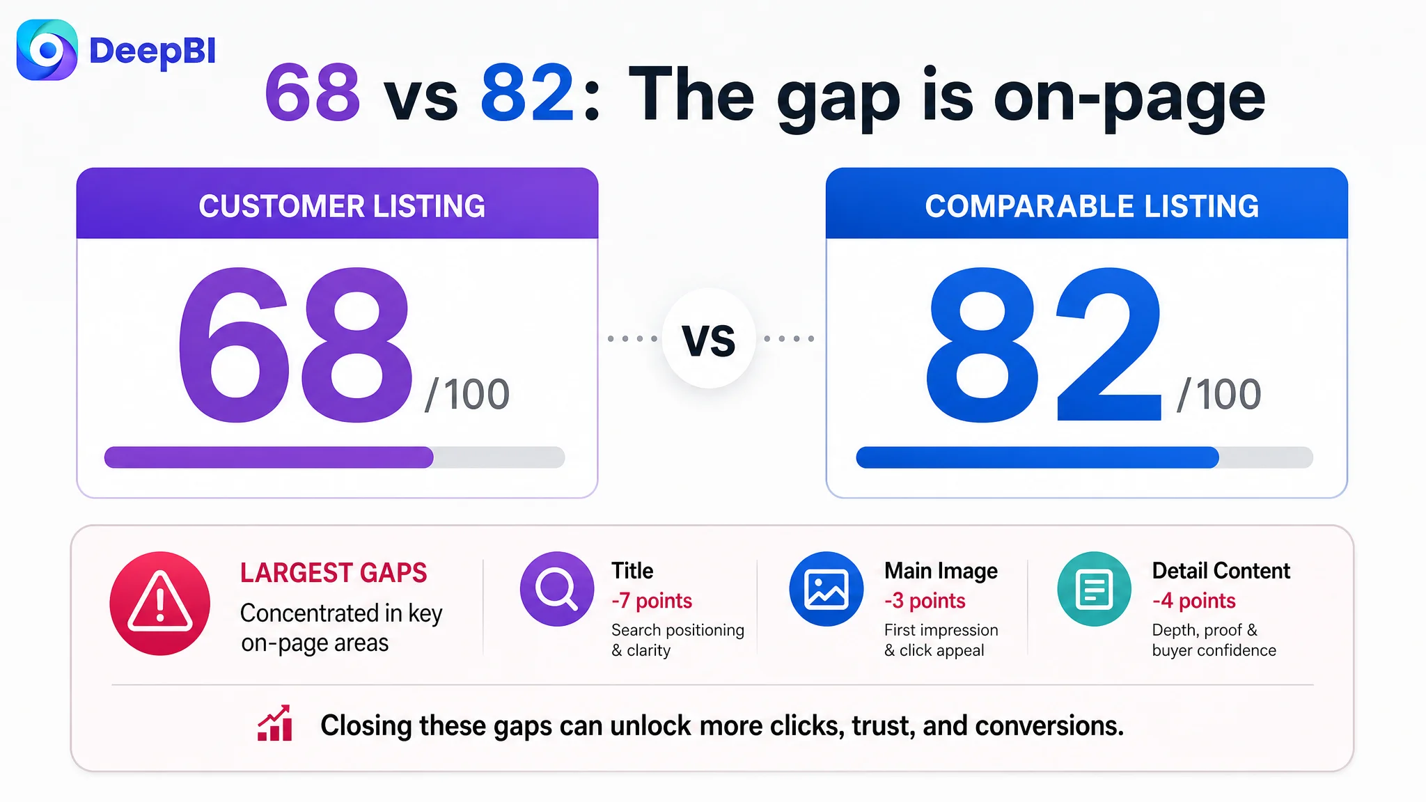
- Title: Customer Listing: 10/20, Comparable Listing: 17/20, Gap: -7
- Main image: Customer Listing: 24/30, Comparable Listing: 27/30, Gap: -3
- Bullet points: Customer Listing: 7/10, Comparable Listing: 6/10, Gap: +1
- Detail content: Customer Listing: 19/25, Comparable Listing: 23/25, Gap: -4
- Reviews: Customer Listing: 8/15, Comparable Listing: 9/15, Gap: -1
- Total: Customer Listing: 68/100, Comparable Listing: 82/100, Gap: -14
The pattern mattered more than the total score. The customer’s Bullet Points were not the weakest dimension. The greater risk was at the beginning and middle of the decision journey: search-page positioning, visual attraction, and the ability of A+ content to make the product feel real and suitable.
The Title Contained Product Terms, but Not a Clear Search Position
The customer title began with a broad phrase equivalent to “Black Lace Front Wig.” It then moved through a long list of features, use cases, and specifications.
The comparable Listing took a more deliberate approach. It placed the product type and commercially important specifications near the front, including:
- 13x4 lace front wig
- 200% density
- HD lace
- Frontal and closure terminology
- A more precise audience reference
The issue was not that the customer title lacked keywords. It was that the keywords did not form a clear hierarchy.
A shopper scanning Amazon search results needs to identify several things quickly:
1. What kind of wig is this?
2. What lace configuration does it use?
3. What are the most important physical specifications?
4. What appearance or wearing benefit should be expected?
5. Is it intended for someone like me?
The customer title emphasized general color and product language before establishing the specific 4x6 HD lace positioning. It also used broader audience wording, such as “for Women” and “for Girls,” instead of defining the most relevant shopper more precisely.
DeepBI’s title direction therefore focused on information order rather than simply adding more words:
The title needed to make the product legible before it tried to make it comprehensive.
The recommended structure brought the 4x6 HD lace configuration, length, straight layered appearance, glueless use, and natural hairline closer to the front. It also removed repetitive wording so the title could carry more useful search and conversion information without becoming a keyword list.
This is an important distinction in Amazon Listing optimization. Keyword inclusion helps create discoverability, but information hierarchy helps shoppers decide whether the product matches their expectations.
The Main Image Was More Than a Photography Issue
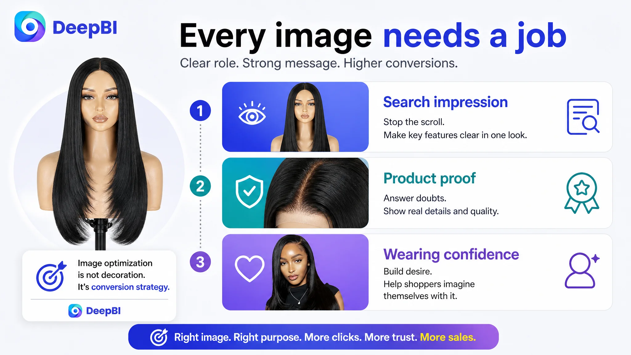
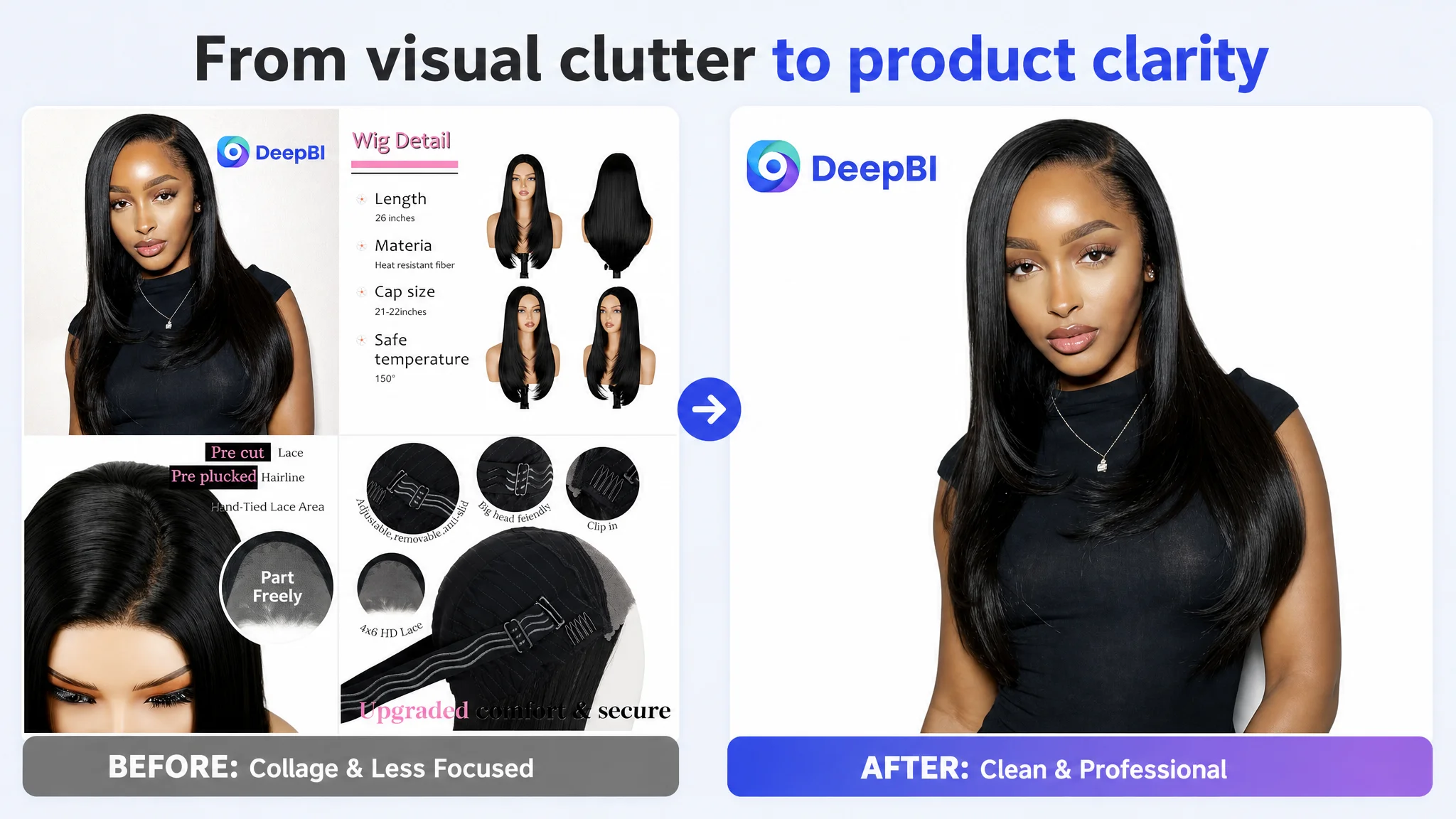
The customer’s main visual direction leaned toward a collage-like presentation and a fashion-oriented brand image. The overall result was not necessarily unattractive. The problem was that it did not establish enough product clarity at the point where the shopper was deciding whether to stop and inspect the Listing.
Compared with the stronger competitor, the customer’s visual presentation had three weaknesses.
It did not create a strong reason to pause
The competitor used more expressive model presentation and stronger emotional posture across its image sequence. The customer’s first image was more static and less dynamic.
For a beauty product, expression and posture can help shoppers imagine the result of wearing it. The question is not only whether the wig is visible, but whether the image suggests confidence, natural movement, and a believable finished look.
It did not resolve the “invisible lace” question early enough
Lace transparency is a central trust issue in this category. Shoppers want to know whether the lace will blend naturally, whether the hairline will look believable, and whether the product shown in the image can be achieved outside a studio setting.
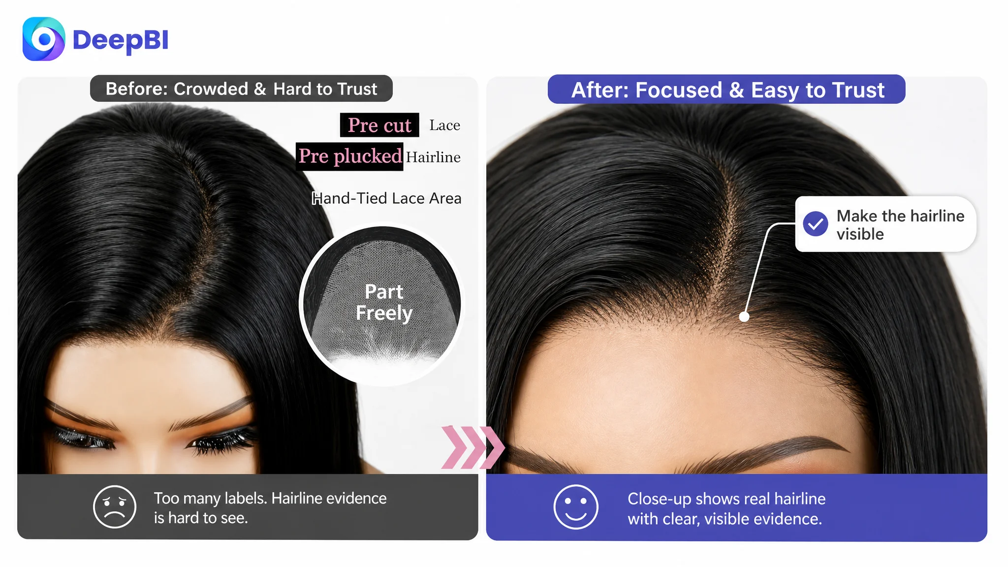
The customer’s images did not provide enough direct evidence through realistic wearing details, hairline close-ups, or skin-to-lace comparison.
It showed use cases without giving them enough meaning
The customer had multi-angle model imagery, but the scenes were not strongly connected to occasions or styling decisions. A competitor’s scene-based content made the product easier to imagine at weddings, graduations, parties, travel, and other social moments.
This does not mean every image needs decoration or emotional language. It means each image should perform a specific role in the Amazon conversion path.
The image sequence needed to separate those roles more clearly:
- The main image should establish a clean, professional product impression within Amazon’s image requirements.
- Secondary images should make the hairline, lace area, cap structure, length, and styling possibilities easier to verify.
- A+ content should carry the broader lifestyle and trust narrative.
The Product Page Had Information, but Not Enough Trust
The largest content gap appeared in the A+ detail experience.
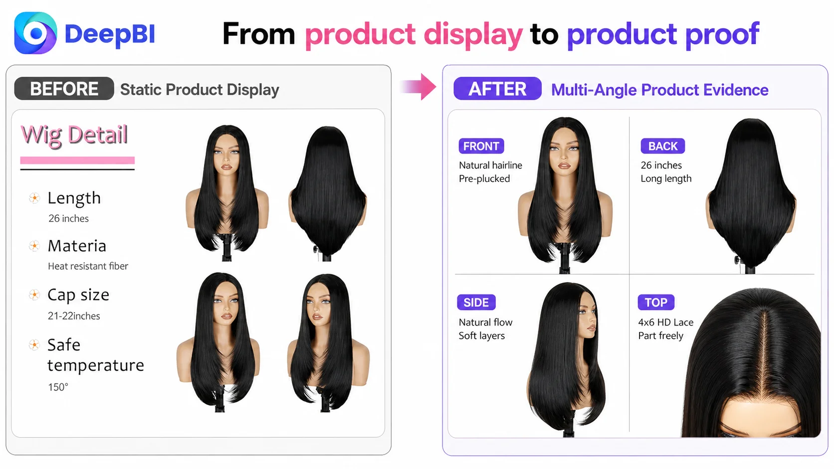
The customer’s A+ content included a brand-oriented banner, 360-degree presentation, lace structure information, cap details, color guidance, and available color options. These modules provided information, but they largely presented the product as an object.
The stronger comparable Listing used more active visual storytelling:
- Realistic model scenes
- Natural hairline comparisons
- HD lace explanations
- Multiple styling outcomes
- Social and life-event settings
- More direct demonstrations of how the product behaves when worn
That difference is critical for wigs. The shopper is not purchasing only synthetic fibers, a cap, and a lace panel. They are purchasing a projected appearance.
A product page that stays at the level of “what the product contains” leaves the shopper to imagine the result. A stronger page shows enough of the result that the shopper can evaluate it.
In this category, product information explains the construction. Wearing evidence explains the value.
DeepBI’s diagnosis did not suggest changing the physical product or inventing capabilities. It focused on making existing attributes more visible and more believable.
The 4x6 Lace Advantage Needed a More Precise Story
The customer’s 4x6 lace structure was explained in the Listing, but its commercial meaning was not fully developed.
A specification such as “4x6 HD lace” is useful only when the shopper understands what it changes in practice. The page needed to connect that specification with visible outcomes:
- A more natural-looking hairline
- A realistic middle or side part
- The relationship between lace and skin
- The difference between the lace area and the rest of the cap
- The styling range that the product can genuinely support
The competitor’s 13x4 configuration created a comparison risk because it appeared to offer a broader lace area. That did not automatically make the customer’s product uncompetitive. It meant the customer Listing needed to explain the value of its own configuration more effectively and avoid allowing the specification comparison to become the entire decision.
This is where DeepBI’s decision logic became important. The recommended direction was not to imitate the competitor’s construction or claim an unsupported equivalent. It was to use close-up imagery, middle- and side-part examples, and realistic wearing views to show what the customer’s actual 4x6 design can do.
That distinction protects both conversion quality and expectation accuracy.
The Bullet Points Were a Relative Strength, Not the First Repair
Interestingly, the customer’s Bullet Points scored slightly higher than the comparable Listing: 7 out of 10 versus 6.
The customer had already made several sound choices:
- Using short summary labels at the beginning of each point
- Explaining comfort and wearing security
- Including material and heat-resistance information
- Addressing practical use
- Managing expectations around color variation
The weakness was not a total absence of useful content. It was that the points could connect product attributes to shopper outcomes more consistently.
For example, the material point could move from heat-resistant synthetic fiber toward a clearer explanation of restyling capability, softness, shedding resistance, and tangle resistance—provided those claims are accurate for the product.
The cap point could combine the glueless, pre-cut, and pre-plucked characteristics with a clearer explanation of convenience and natural hairline appearance.
The internal cap point could make the relationship between adjustable straps, combs, fit range, breathability, and all-day use easier to follow, again without exceeding confirmed product specifications.
The fifth point could present the product’s actual use occasions more positively, while leaving the color-variation note in a less disruptive location where appropriate.
But these were not the first priorities.
A better bullet structure would not fully solve a page whose title and visuals were still failing to establish the product’s identity and appearance.
Why DeepBI Did Not Continue Tuning Ads First
The core decision was about sequence.
If the title does not clearly match high-value search intent, the Listing may attract less relevant attention or fail to communicate its value quickly.
If the main image does not create enough visual interest, paid impressions may produce weak click behavior.
If the A+ page does not demonstrate natural wearing results, the traffic that does arrive may still leave without enough confidence.
In that situation, more advertising can increase exposure without improving the underlying conversion capacity. It may even make the problem more expensive by sending additional paid traffic toward the same page-level weaknesses.
Advertising does not only amplify a product’s strengths. It can also amplify the Listing’s existing defects.
For this Amazon seller, repairing the Listing first was therefore a risk-control decision. It reduced the chance of using ad spend to test a page that had not yet presented its strongest commercial case.
The decision order was:
1. Clarify the product’s search and audience position in the title.
2. Improve the visual hierarchy of the image sequence.
3. Demonstrate the natural hairline and lace-to-skin effect.
4. Use A+ content to connect product features with realistic wearing situations.
5. Refine Bullet Points so they support the same story.
6. Reassess advertising performance after the page has a stronger conversion foundation.
This order does not suggest that ads are unimportant. It recognizes that ads and Listing content perform different jobs. Ads bring qualified shoppers into the decision process. The product page determines whether the traffic has enough reason to continue.
The Recommended Visual Direction Was “Professional Salon,” Not “More Decoration”
The main visual direction called for a shift away from a low-end wholesale impression and toward a more professional salon-oriented presentation.
That did not mean adding more graphic elements. In fact, the recommendation generally moved toward:
- Cleaner studio backgrounds
- More controlled lighting
- A centered and readable subject
- Fewer distracting decorative elements
- Close-up evidence of the hairline
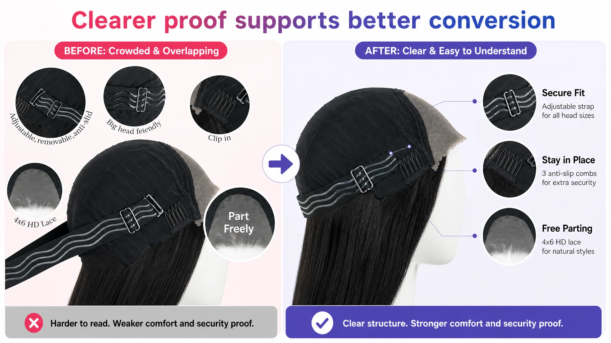
- Clearer presentation of the internal cap structure
- More consistent model photography
The image system needed to become easier to scan and easier to trust.
For the secondary image sequence, the proposed structure included:
A clean model presentation
A centered model image could establish the overall appearance without the competing visual weight of several overlapping mini-images.
A consistent multi-angle view
Front, side, and back views could help shoppers judge length, fall, and head-shape fit more realistically than isolated product diagrams.
A hairline close-up
A dedicated close-up could show the pre-plucked hairline and baby hair detail, making the naturalness claim visible rather than purely verbal.
An internal construction view
The adjustable straps, combs, pre-cut lace, and elastic components could be shown through organized callouts instead of text placed directly over the product.
A transparent lace demonstration
Showing the lace against skin could address one of the highest-risk uncertainties in this category: whether “HD invisible lace” corresponds to a believable wearing result.
Styling and length evidence
Images showing the product’s actual styling range, full length, and natural fall could support decisions that the current page left underdeveloped.
The important principle was not to make every image visually dramatic. It was to make every image answer a different buyer question.
A+ Content Needed to Move From Product Display to Life Context
The proposed A+ direction extended the same logic into the lower part of the Amazon product page.
Instead of relying mainly on a logo banner and static product modules, the page could be rebuilt around a sequence of questions:
- What will this look like when worn?
- How natural is the hairline?
- What does the 4x6 lace area allow?
- How does the cap stay in place?
- Can the style be adapted for different occasions?
- How will the product appear under different lighting conditions?
- Is it suitable for everyday use as well as special events?
This led to several recommended content modules:
- A three-scene introduction showing work, evening, and outdoor settings
- A full model view from front, side, and back
- A close-up comparison of hairline and lace blending
- A construction diagram focused on comfort and security
- A multi-style display using supported looks such as ponytail, half-up, and natural fall
- A visual explanation of how lighting may affect the appearance of dark hair
- A six-scene social grid covering occasions such as birthdays, weddings, graduation, travel, fitness, and daily shopping
These scenes were not intended to add unsupported promises. Their purpose was to make the product’s existing use cases more concrete.
The page also needed to preserve an important boundary: the competitor could serve as a reference for visual communication, but not as a template for copying product structure, claims, or design details.
The Review Count Was a Trust Challenge, but Not the First Bottleneck
The review data added another layer to the diagnosis.
The customer Listing had:
- A 4.1-star rating
- 59 total reviews
- Eight reviews visible on the first page
- A 25% share of reviews rated three stars or below
The comparable Listing had:
- A 3.7-star rating
- 3,624 total reviews
- Eight reviews visible on the first page
- A 38% share of reviews rated three stars or below
This created a mixed signal.
The customer had the stronger average rating and a lower share of less-positive reviews, which supported perceived product quality. However, the much smaller review base created a scale and history disadvantage. Shoppers may interpret a large review volume as evidence of market validation even when the average rating is lower.
That gap could not be repaired through image changes alone. It required continued, compliant review generation and customer experience management over time.
But the review score was not the first repair point because the Listing’s title, visual presentation, and A+ storytelling were already underperforming relative to the comparable page. Improving those areas could help the customer make better use of the positive quality signal it already had.
The Business Change Was a Change in Operating Logic
The source case does not provide verified post-optimization performance data, so it would be inappropriate to claim a specific CVR increase, ACOS decline, or growth in organic orders.
What can be stated clearly is the change in business judgment.
Before the review, the problem could easily be interpreted as an advertising optimization challenge. After the review, the more defensible diagnosis was:
- The Listing’s title did not establish a precise search position.
- The image sequence did not create enough visual confidence.
- The product’s natural hairline and lace benefit were not demonstrated strongly enough.
- The A+ page described the product more than it showed the wearing outcome.
- The customer had a positive rating signal, but insufficient review scale.
- The page needed stronger conversion capacity before additional ad traffic could be judged fairly.
That reframing changed what should happen next.
Instead of asking only how to buy more efficient traffic, the team could ask whether the page was ready to receive more traffic at all.
What Amazon Sellers Can Take From This Case
A strong Amazon Listing is not a collection of isolated assets. The title, main image, Bullet Points, A+ content, reviews, organic traffic, and paid traffic must support the same purchase decision.
For this lace front wig Listing, the central issue was not a lack of product features. It was the gap between those features and the shopper’s ability to recognize their value.
The case offers several practical judgments:
- A large keyword set does not guarantee a clear title.
- A polished image does not automatically create a strong click reason.
- A specification such as 4x6 HD lace needs visible proof and contextual explanation.
- A+ content should help shoppers imagine the wearing result, not only inspect the product.
- A better rating can still be weakened by a much smaller review base.
- Ads cannot compensate indefinitely for weak product-page conversion.
- Listing optimization should be prioritized according to the largest business constraint, not the easiest asset to edit.
- Before scaling Amazon ads, sellers should judge whether the product page deserves more traffic.
The most important conclusion is also the simplest:
When advertising performance becomes difficult to improve, the next question should not always be which campaign setting to change. It may be whether the Amazon Listing is giving qualified traffic a convincing reason to buy.