

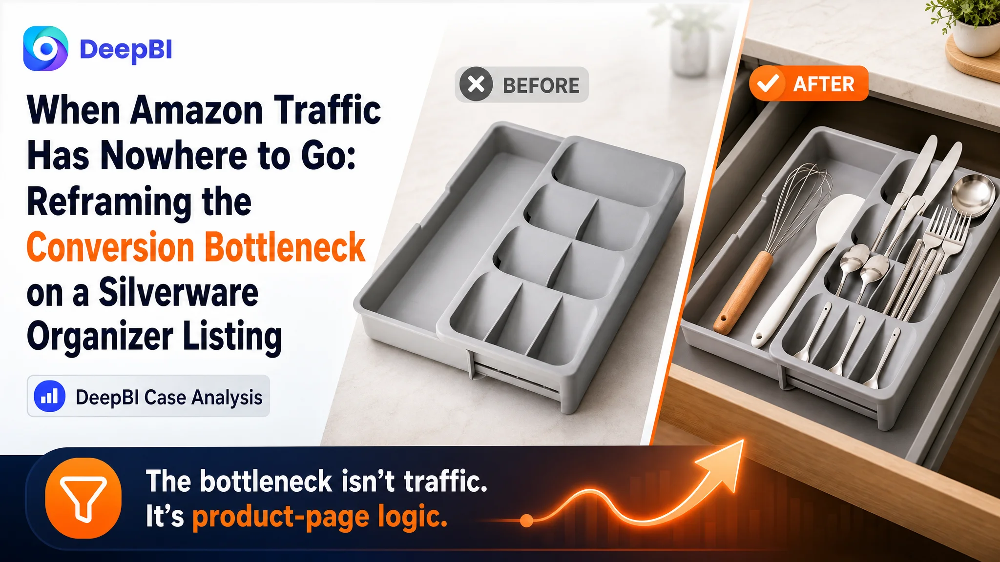
An Amazon seller came to the case with a familiar Listing problem: the product covered its main keywords, presented clear functions, and appeared to have a reasonable offer, yet the product page was not creating enough confidence to turn attention into purchase decisions. The initial direction focused on keyword coverage, functional descriptions, and general Listing refinement.
DeepBI’s diagnosis showed that the problem was not a single missing keyword or an isolated copy issue. The customer’s Amazon Listing was 13 points behind a comparable high-performing listing, with the largest weaknesses appearing in reviews, main-image communication, and A+ content. The page described the product, but did not guide shoppers through the full decision: what problem it solves, how it fits, why it is trustworthy, and how it works in real kitchens.
The later optimization therefore focused on rebuilding the Listing’s sales logic around adjustable fit, visible capacity, before-and-after organization, multi-scene use, and easy cleaning. For other Amazon sellers, the case offers a practical warning: before increasing ad pressure or continuing to tune keywords, check whether the product page is strong enough to convert the traffic it receives.
The Listing Looked Complete. The Buying Logic Was Not.
The product was an expandable silverware drawer organizer for kitchen use. Its functional foundation was clear:
- Adjustable width for different drawer sizes
- Multiple compartments for spoons, forks, and knives
- Detachable or flexible storage structure
- BPA-free plastic material
- Easy cleaning and daily use
On the surface, this appeared to be a standard Amazon Listing optimization task. The title included relevant product terms. The bullet points covered fit, organization, versatility, setup, material, and maintenance. The page contained product images and A+ content.
But Amazon shoppers do not evaluate a Listing by checking whether every function has been mentioned. They decide whether the page has answered the questions that create purchase confidence.
Will it fit my drawer?
Can it hold what I need?
Will the compartments remain stable?
Does it actually make a messy drawer easier to use?
Can I clean it without creating another maintenance problem?
The customer’s Listing had information. What it lacked was a sufficiently clear sequence from problem recognition to solution confidence.
The issue was not that the page had nothing to say. The issue was that its content did not make the buying decision easy enough.
The Original Direction Focused on Coverage, Not Conversion Capacity
The first optimization instinct was understandable. The title already covered the core category, but it did not fully use the attributes that help shoppers filter and decide.
A comparable high-performing listing placed its brand term early, added a clear size range, and stated the color near the end of the title. It also connected the product form with specific utensil terms such as spoons, forks, and knives.
The customer’s title was more like a functional list. It communicated what the product was, but not enough about which drawer it would fit, what it could organize, or why it was a precise choice for the shopper’s situation.
That made keyword expansion appear to be the obvious answer.
The bullet points created a similar impression. They were not empty or poorly written. In fact, the customer’s bullet-point score was 7 out of 10, higher than the comparable listing’s score of 5. The customer’s copy was organized around user pain points and solutions, including space adaptation, compartmentalized storage, versatility, safety, and maintenance.
However, the page’s stronger bullet-point score did not compensate for weaker visual and trust communication. The copy could explain the product, but it could not replace the missing evidence in the image set, A+ content, and review profile.
This was the first important judgment from the diagnosis:
A stronger text structure alone would not repair a Listing whose visual proof and trust signals remained incomplete.
DeepBI Found a 13-Point Gap, But the Distribution Mattered More Than the Total
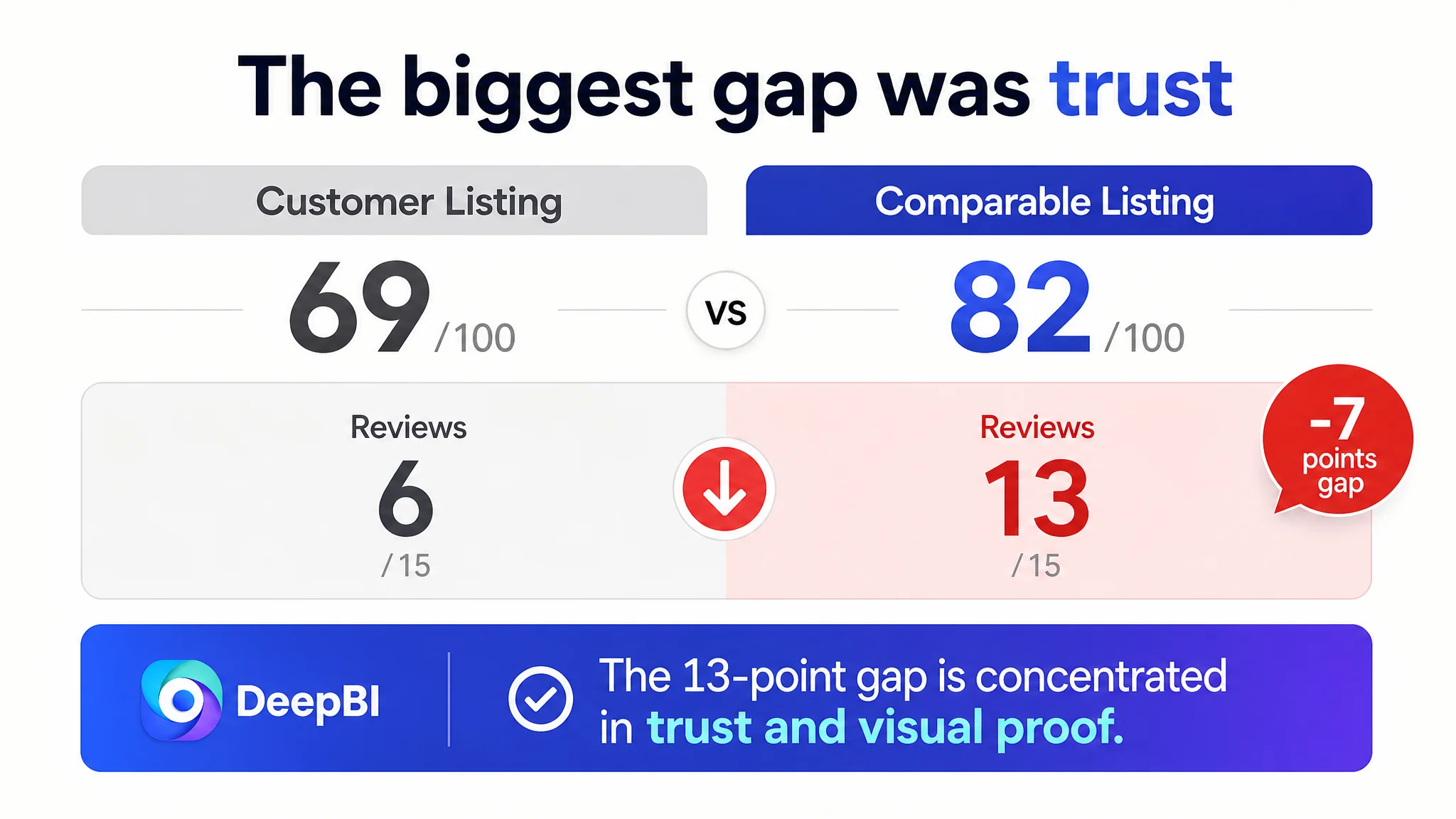
The customer’s Listing received a total score of 69 out of 100. The comparable high-performing Listing scored 82.
The gap was distributed as follows:
- Title: Customer Listing: 13, Comparable Listing: 15, Gap: -2
- Main image: Customer Listing: 24, Comparable Listing: 27, Gap: -3
- Bullet points: Customer Listing: 7, Comparable Listing: 5, Gap: +2
- A+ content and detail page: Customer Listing: 19, Comparable Listing: 22, Gap: -3
- Reviews: Customer Listing: 6, Comparable Listing: 13, Gap: -7
- Total: Customer Listing: 69, Comparable Listing: 82, Gap: -13
A superficial reading might have concluded that the Listing needed a better title and more polished bullet points. The score distribution pointed elsewhere.
The most serious weakness was the review dimension, followed by the detail page and main-image communication. The customer had a 4.3-star rating from only 10 total reviews, while the comparable listing had a 4.7-star rating from more than 27,000 reviews.
The review count itself could not be corrected through copywriting. But it changed the priority of every other page element. When a Listing lacks accumulated social proof, its images, title, bullets, and A+ modules must work harder to reduce uncertainty.
The page could not afford to communicate only that the product existed. It needed to show why the product was safe, practical, adaptable, and worth choosing despite its limited review history.
The Main Image Was Not Just a Design Weakness
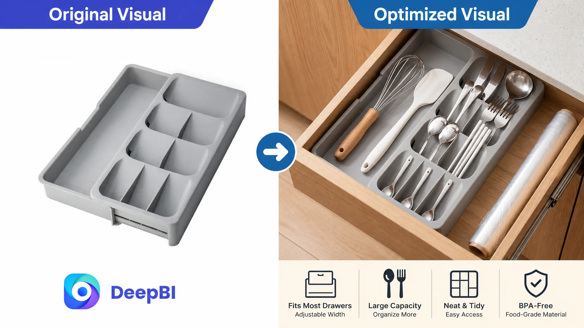
The customer’s image set showed the product, but the overall visual system did not build a clear decision path.
The comparable Listing used several forms of visual proof:
- A more attention-grabbing presentation in the image set
- A visible drawer-use context
- Before-and-after organization
- Material and cleaning demonstrations
- Detail views of adjustable or stable components
- Multiple use scenarios
- Video-led unpacking, installation, comparison, and operation guidance
By contrast, the customer’s images relied more heavily on static product presentation. Important messages such as food-safe material were present, but they were not given enough visual weight. The product’s eight compartments and adjustable structure were not demonstrated as quickly or clearly as they could have been.
For an Amazon shopper scrolling through search results and product pages, this creates friction. They must mentally connect several separate facts:
- The tray can expand
- It can fit a range of drawer widths
- It has enough capacity
- The compartments are useful
- The structure will remain stable
- The material can be cleaned
- The product will improve the drawer rather than merely occupy it
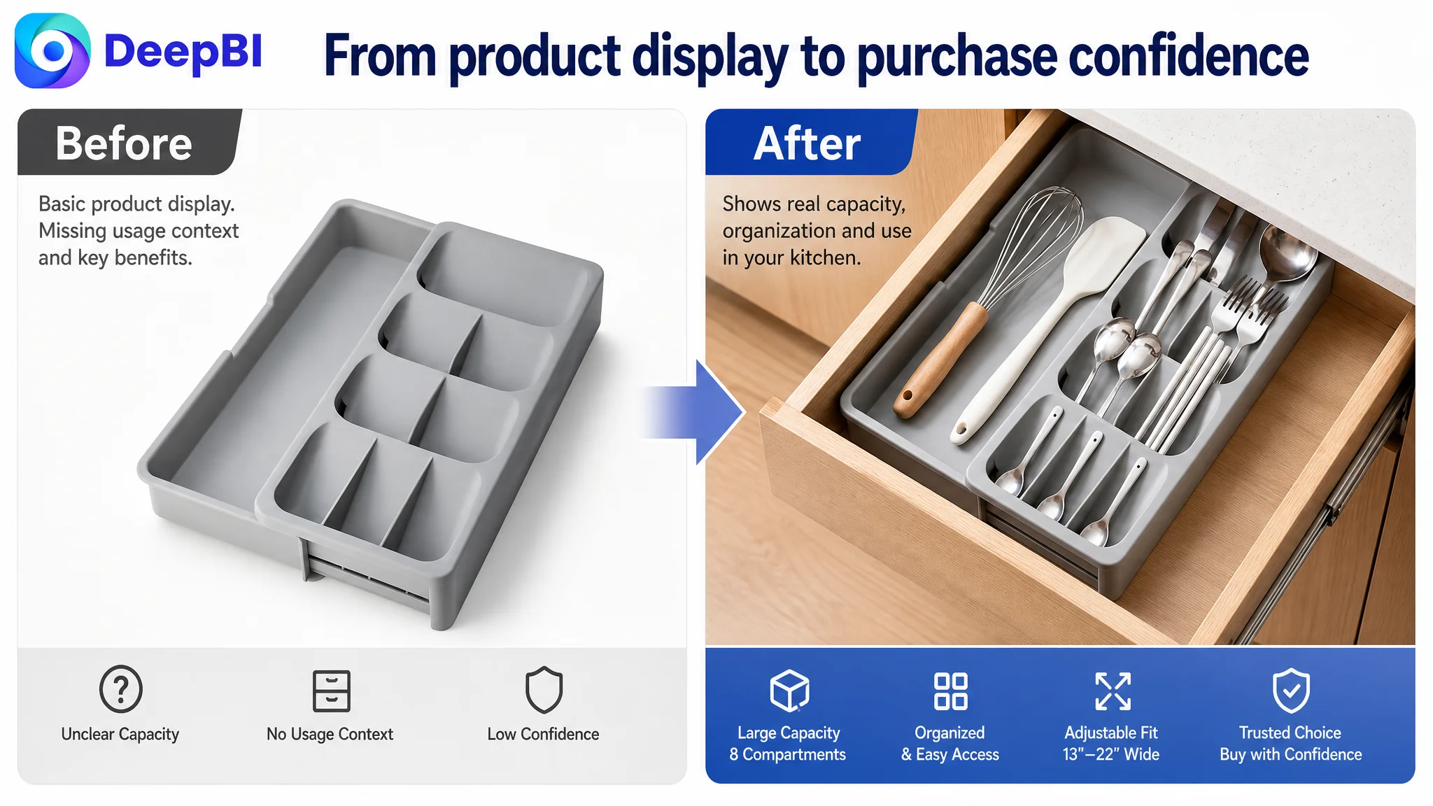
The recommended direction was therefore to move from product display toward decision-driven visual communication.
That does not mean adding arbitrary decoration. It means assigning each image a specific commercial role:
- Show capacity through an overhead view with utensils arranged in the compartments
- Show fit through a contracted-versus-expanded comparison
- Show stability through a close-up of the connecting mechanism
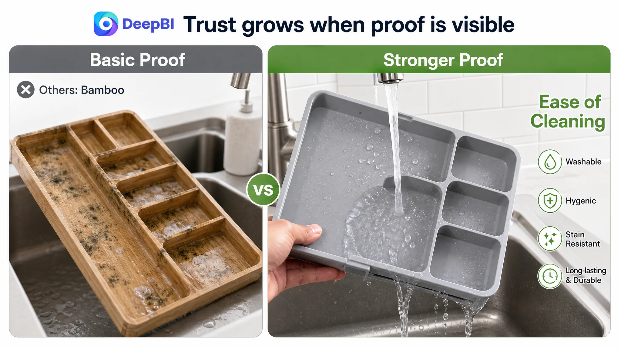
- Show cleanability through a clear washing demonstration
- Show the outcome through a messy-drawer-versus-organized-drawer comparison
For Amazon compliance, the main image must remain within the platform’s requirements. The broader visual storytelling belongs in compliant secondary images and A+ content, where shoppers can see the product in use and understand its advantages without relying on imagination.
A product image can be accurate and still fail commercially if it does not answer the shopper’s next question.
The Page Needed a Before-and-After Story
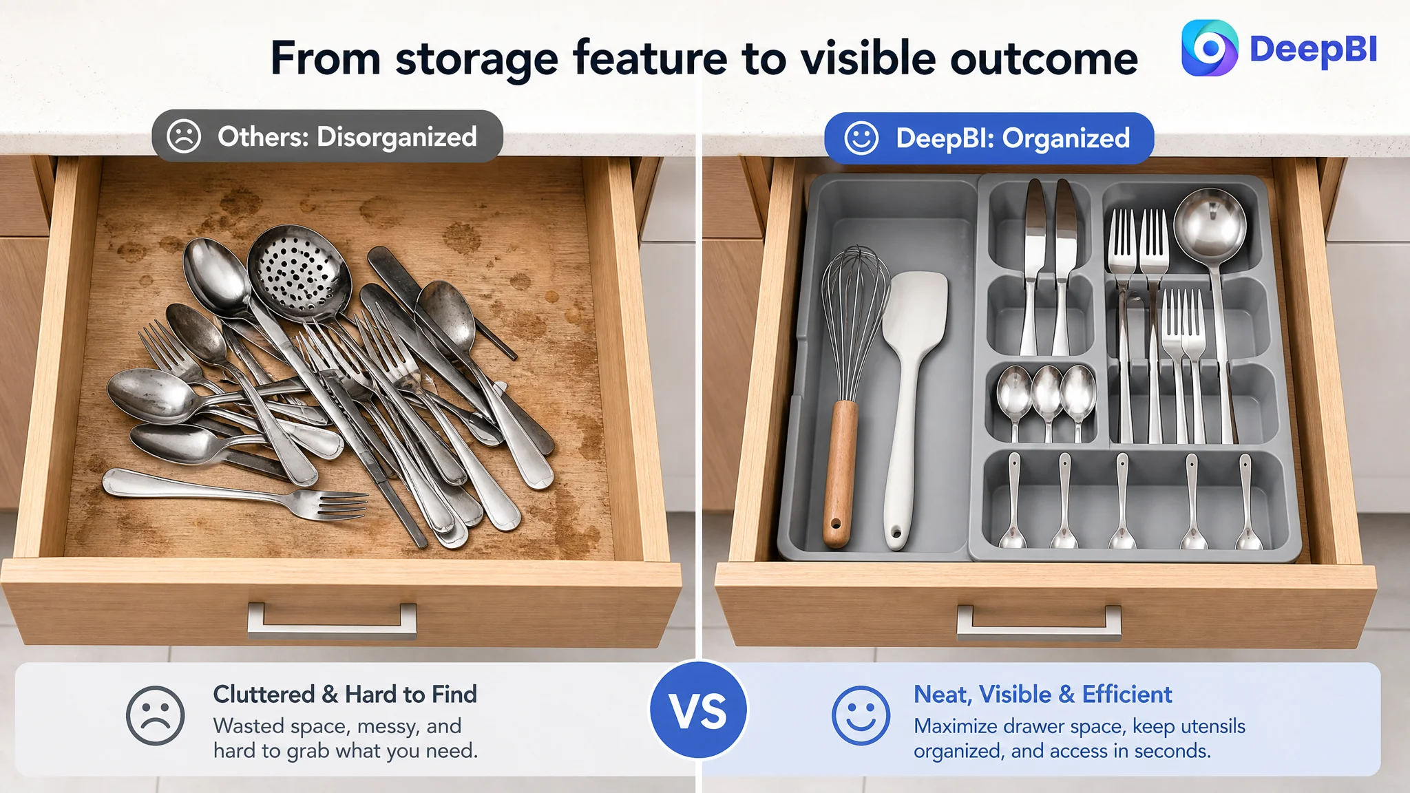
The strongest missing element in the A+ content was not another feature panel. It was a visible transformation.
The customer’s A+ modules included storage, material, compartmentalization, detachable design, durability, and cleaning. These were relevant topics, but they were presented mainly as separate product attributes.
The comparable Listing made the value easier to understand by showing the change from disorder to organization. It also expanded the usage context through drawer and countertop scenes, showed adjustable structure, demonstrated cleaning, and used video to explain operation.
This difference matters because home-organization products are purchased partly for the desired state they create.
A shopper is not only buying a gray plastic tray. They are buying:
- A drawer that no longer looks chaotic
- Faster access during meal preparation
- A more predictable place for each utensil
- Better use of limited kitchen space
- Less frustration when different drawer sizes create fit problems
The recommended A+ direction was therefore built around four connected scenes.
The messy drawer became the starting point
A strong before-and-after module would show the same drawer before and after organization. This turns a general claim about “keeping things tidy” into a visible outcome.
Adjustable fit became measurable
The page needed to show the organizer from its contracted to expanded state, with the actual width range clearly presented. This directly addressed the shopper’s primary physical concern: whether the tray would fit.
Use expanded beyond the drawer
The product’s detachable and expandable structure created an opportunity to show additional countertop or modular use. This helped the Listing communicate flexibility without changing the product’s core identity.
Cleaning became a trust signal
Because the organizer holds utensils, maintenance and hygiene are part of the purchase decision. A clearer washing demonstration could make the BPA-free and easy-cleaning claims more credible and easier to process.
Why DeepBI Did Not Keep Tuning the Ads First
The case material does not include post-optimization advertising results such as CTR, CVR, ACOS, or TACOS. It would therefore be incorrect to claim that ad efficiency improved by a specific percentage.
The decision logic is still clear.
If paid traffic is directed to a page that does not communicate fit, capacity, stability, and trust quickly enough, additional traffic does not solve the underlying issue. It can simply expose more shoppers to the same uncertainty.
This is where Amazon ads and Amazon Listing optimization have to be evaluated together.
- Ads can bring the shopper to the product page.
- The main image and title can earn the click.
- The bullet points can organize the key claims.
- The image set and A+ content must resolve practical doubts.
- Reviews and visible proof must support the final decision.
When those layers are not aligned, ad optimization becomes difficult to interpret. A campaign may appear inefficient when the deeper problem is that the Listing cannot convert the traffic it receives.
DeepBI’s role in this case was not to produce more isolated recommendations. It was to connect the score gap to a priority decision:
Repair the page’s conversion capacity before asking advertising to carry more pressure.
That meant prioritizing the elements most likely to reduce uncertainty:
1. Make drawer fit and width adjustment immediately understandable.
2. Show the product’s capacity and compartment logic visually.
3. Demonstrate the transformation from clutter to organization.
4. Build stronger trust around material, cleaning, and structural stability.
5. Use the title to add precise size and utensil-related search context.
6. Treat the limited review base as a reason to strengthen, not ignore, on-page proof.
The Title Needed to Help Shoppers Qualify the Product
The title optimization was not simply a request to add more keywords.
The recommended structure emphasized:
- “Expandable Silverware Drawer Organizer”
- “Utensil Tray for Kitchen”
- “BPA-Free Plastic Flatware and Cutlery Holder”
- “Spoons, Forks, Knives”
- “Adjustable Drawer Divider Storage”
- “Fits 13–22 Inch Wide Drawers”
This structure connects search relevance with purchase qualification.
The size range helps shoppers determine whether the product may fit before clicking or purchasing. Specific utensil terms align with common search behavior. The adjustable and expandable language communicates the product’s functional distinction.
The title therefore becomes more than an indexing surface. It becomes the first filter in the conversion path, helping the right shopper recognize the product as relevant.
The Bullet Points Had to Connect Features to Moments of Use
The customer’s existing bullet points already had a reasonable pain-point orientation. The later direction was to sharpen the connection between each feature and the shopper’s daily experience.
The revised logic prioritized:
- Adjustable width as a custom fit for different drawers
- Specialized compartments as a way to find utensils quickly
- Versatility for kitchen, countertop, office, or other storage situations where supported
- Tool-free placement and simple expansion
- BPA-free polypropylene and easy maintenance
This sequence is commercially stronger because it follows the shopper’s concerns rather than the manufacturer’s feature inventory.
A useful bullet point does not stop at “adjustable width.” It explains why adjustment matters.
It does not stop at “multiple compartments.” It shows how separation improves visibility and access.
It does not stop at “easy to clean.” It makes the maintenance action clear.
The goal is not to make the copy more dramatic. It is to make the relationship between product attribute and user outcome harder to miss.
What Changed in the Business Understanding
No final performance metrics were provided in the case material, so the outcome should not be described as a confirmed increase in CVR, a decline in ACOS, or a recovery of organic orders.
The confirmed change was in the diagnosis and decision order.
The customer’s Amazon Listing was no longer viewed as a page that merely needed more keywords, more features, or more visual polish. It was understood as a conversion system with several connected gaps:
- The title needed more precise fit and product context.
- The image set needed a clearer visual hierarchy.
- The page needed to show the problem-to-solution transformation.
- The A+ content needed stronger scenario coverage and operational guidance.
- The limited review base increased the importance of on-page proof.
- Advertising should not be treated as the first answer when Listing conversion capacity remains weak.
This changed the optimization question from:
How can we send more shoppers to the page?
to:
If more shoppers arrive, does the page give them enough evidence to buy?
That is the central lesson for Amazon sellers.
A Listing does not become conversion-ready merely because it contains the correct product name, several benefits, and a complete image gallery. It becomes conversion-ready when the title, main image, secondary images, bullet points, A+ content, and reviews work together to remove the shopper’s most important doubts.
Advertising can amplify demand, but it cannot replace missing product-page logic.
For this silverware organizer Listing, the better path was not to keep treating every weakness as an ad-setting problem. It was to rebuild the page around fit, capacity, organization, trust, and visible outcomes—so that paid traffic and organic traffic would have a stronger foundation to work with.