

This case follows an Amazon seller whose infant lounger Listing was not failing because the product lacked features. The page already described multiple use cases, included extensive A+ content, and presented a broad set of materials and functions. Yet the Listing remained difficult to convert, creating pressure to improve search visibility, refine the title, and make the product images more persuasive.
The initial direction focused on adding more keywords, expanding the use-case story, and making the page look more complete. DeepBI’s diagnosis pointed to a different constraint: the Listing was asking cautious parents to process too much information before it had established enough trust. A 72/100 Listing score, a 13-point gap in the review dimension, and weaker decision sequencing across the main image and A+ content showed that the product page was not converting attention into confidence.
The later optimization therefore focused on conversion logic rather than isolated creative changes: clarify the product identity in the first image, move safety and usage boundaries forward, make certification and material evidence easier to verify, present dimensions and age suitability clearly, and use the A+ page to remove practical concerns in the order parents naturally consider them.
For other Amazon sellers, the lesson is direct: when Amazon ads bring visitors to a page that has not yet earned trust, more traffic can amplify the Listing’s weaknesses. Before increasing bids or widening keyword coverage, sellers need to judge whether the product page is ready to convert the traffic it receives.
The Amazon seller had a content-rich Listing, but the business problem was still conversion
The product was an infant lounger designed for newborns through 24 months, with a wraparound shape, cotton cover, soft memory foam, portable storage functionality, and several supervised awake-time use cases.
On paper, the Listing appeared to have many of the elements sellers usually associate with a complete Amazon product page:
- A title covering the product form, age range, portability, and material
- Five bullet points covering safety, comfort, support, cleaning, and travel
- A+ modules showing diaper changes, tummy time, sitting, travel, and parent interaction
- Visual explanations of materials, structure, portability, and growth stages
- A dedicated discussion of certifications and supervised use
The problem was not a lack of information.
The problem was that the information was not arranged around the buyer’s most important decisions.
That distinction matters particularly in baby products. Parents are not evaluating only whether the product has multiple functions. They are also asking:
- Is this product clearly intended for my baby’s age?
- What are the boundaries of safe use?
- Can I understand the product immediately from the search result?
- Is the material and structure credible?
- Will it be easy to clean?
- Is it practical for daily movement and travel?
- Can I trust the product when there are no reviews?
If the page answers secondary questions before resolving the primary ones, additional content can create density without creating confidence.
The first assumption was that the page needed more keywords and more selling points
The original optimization direction was understandable.
The title began with “Baby Lounger–Infant Lounger,” while a comparable high-performing Listing led with a more specific support-related keyword and included “Tummy Time Mat.” The competing title also made the included cover and supervised-use context visible.
From a search and click perspective, this created several apparent opportunities:
- Move more relevant core terms toward the beginning of the title
- Include the support-cushion and tummy-time language used in the category
- Make the 0–24-month audience immediately clear
- State that a cotton cover is included
- Reduce redundant wording and improve mobile readability
The page also appeared to have a strong reason to add more product functions. Its existing content emphasized that the lounger could support several situations, separate into two U-shaped pillows, function as a nursing pillow, fold into a carry bag, and provide storage.
So the natural response was to make the Listing more comprehensive:
- Add more use cases
- Describe more functions
- Include more material claims
- Show more stages of the baby’s growth
- Add more visual details
- Strengthen the title’s keyword coverage
That approach could improve the Listing’s completeness. It did not necessarily solve the conversion bottleneck.
A product page can contain many selling points and still fail to answer the buyer’s first trust question.
The risk was that the team would continue polishing individual components while leaving the decision path unchanged.
The score showed a conversion problem, not a single copywriting problem
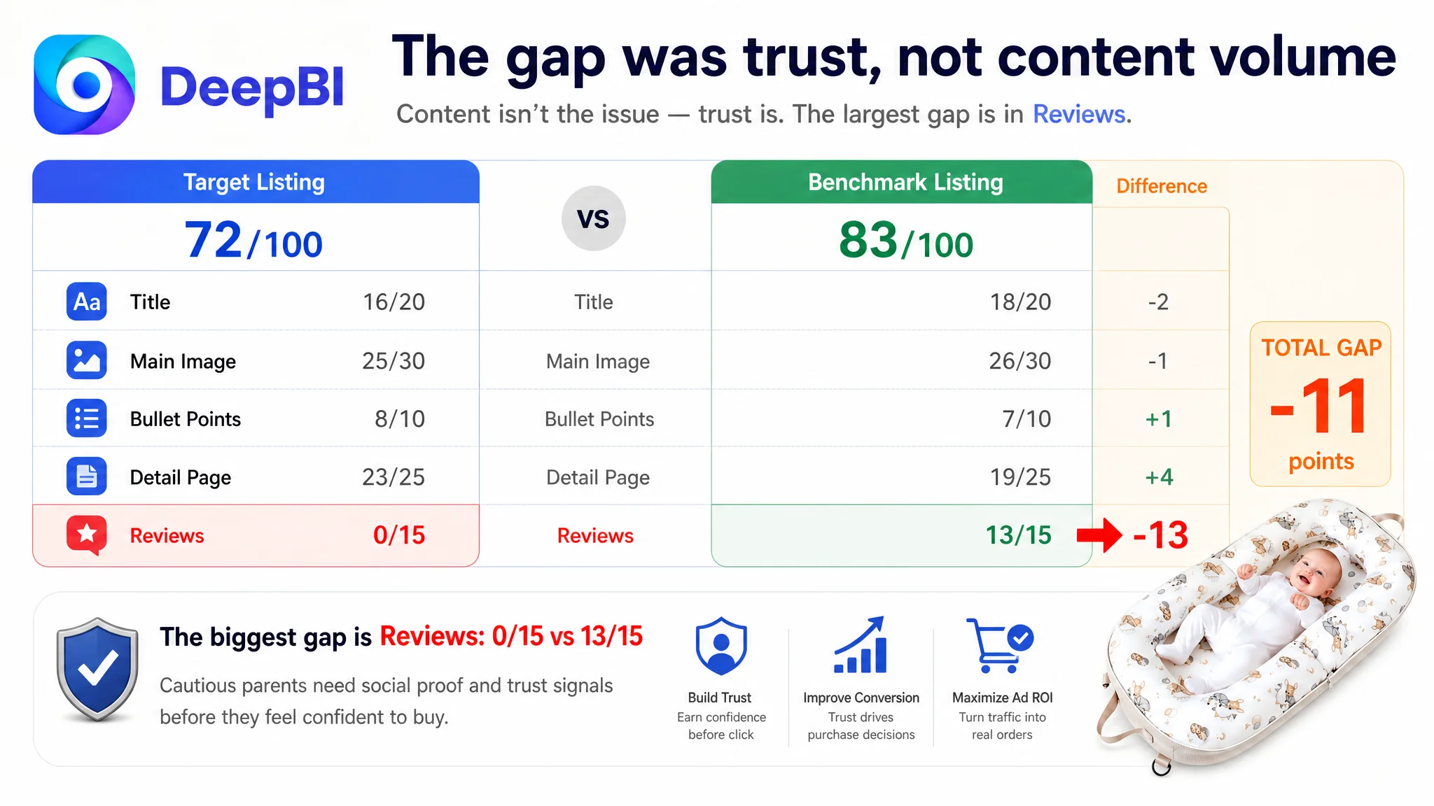
DeepBI’s comparison produced a clear gap between the target Listing and a closely matched benchmark:
- Title: Target Listing: 16/20, Benchmark Listing: 18/20, Difference: -2
- Main image: Target Listing: 25/30, Benchmark Listing: 26/30, Difference: -1
- Bullet points: Target Listing: 8/10, Benchmark Listing: 7/10, Difference: +1
- Detail page: Target Listing: 23/25, Benchmark Listing: 19/25, Difference: +4
- Reviews: Target Listing: 0/15, Benchmark Listing: 13/15, Difference: -13
- Total: Target Listing: 72/100, Benchmark Listing: 83/100, Difference: -11
The result changed the diagnosis.
The target Listing was not weaker everywhere. In fact, its bullet points and detail-page content scored higher than the benchmark in the comparison. That meant the solution was not simply to “add more content” or imitate every element of the competing page.
The largest quantified gap was the review dimension. The target Listing had no rating and no review count, while the benchmark had a 4.4-star rating, 221 reviews, and several image or video reviews visible on the first page.
That difference created a structural trust problem.
A parent visiting the page had to evaluate a baby product with no accumulated customer evidence. In that situation, the other parts of the Listing have to work harder:
- The title must establish a clear product identity.
- The main image must look immediately understandable and credible.
- Safety boundaries must be visible rather than implied.
- Material and structure claims need tangible support.
- The A+ page must answer practical concerns without forcing the shopper to search through the content.
- The product’s age range and intended use must be unmistakable.
The score did not say that every piece of content was poor. It showed that the Listing lacked enough trust reinforcement to compensate for an empty review foundation.
The real constraint was Listing conversion capacity
The central judgment was not that the product had no traffic or that the ads were poorly managed.
It was that the product page did not yet have enough conversion capacity to make additional traffic efficient.
This distinction is important for Amazon advertising. When a Listing receives paid traffic, ads create more opportunities to evaluate the product. They do not repair uncertainty on the page. If the shopper sees a crowded first image, unclear usage boundaries, scattered safety information, or no review evidence, the ad may simply deliver another visitor who leaves without ordering.
That creates a familiar operating loop:
1. Traffic is purchased through Amazon ads.
2. The product page receives visits but does not generate enough confidence.
3. CVR remains weak or unstable.
4. ACOS becomes difficult to control.
5. The team responds by adjusting bids, keywords, or campaign structure.
6. More traffic reaches the same unresolved page-level constraint.
Advertising does not only amplify a Listing’s strengths. It can also amplify the cost of its unresolved weaknesses.
In this case, the title and image improvements still mattered. But they needed to serve a broader conversion sequence rather than operate as isolated creative tasks.
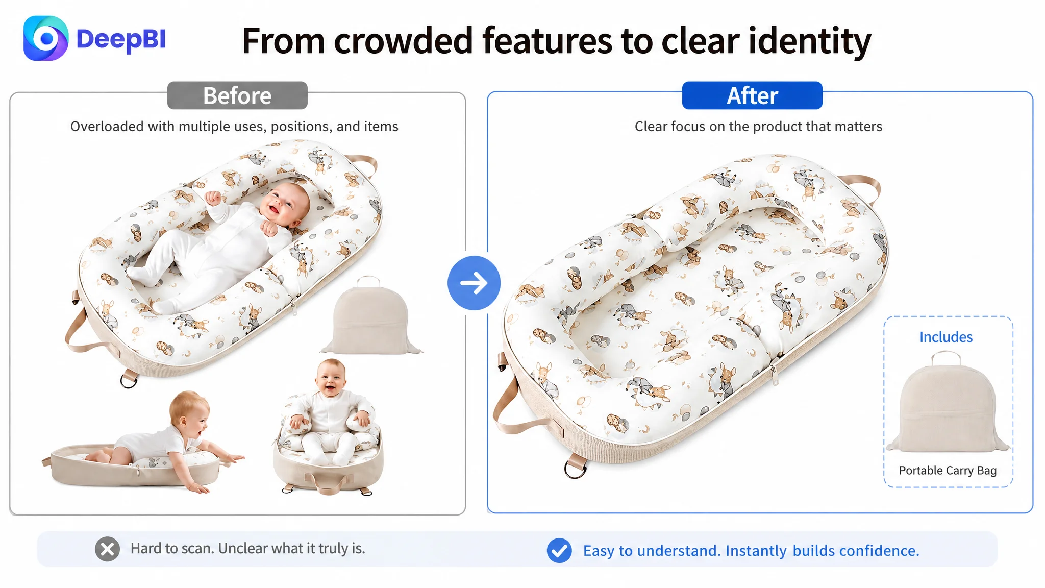
The main image was trying to explain too much at the first click
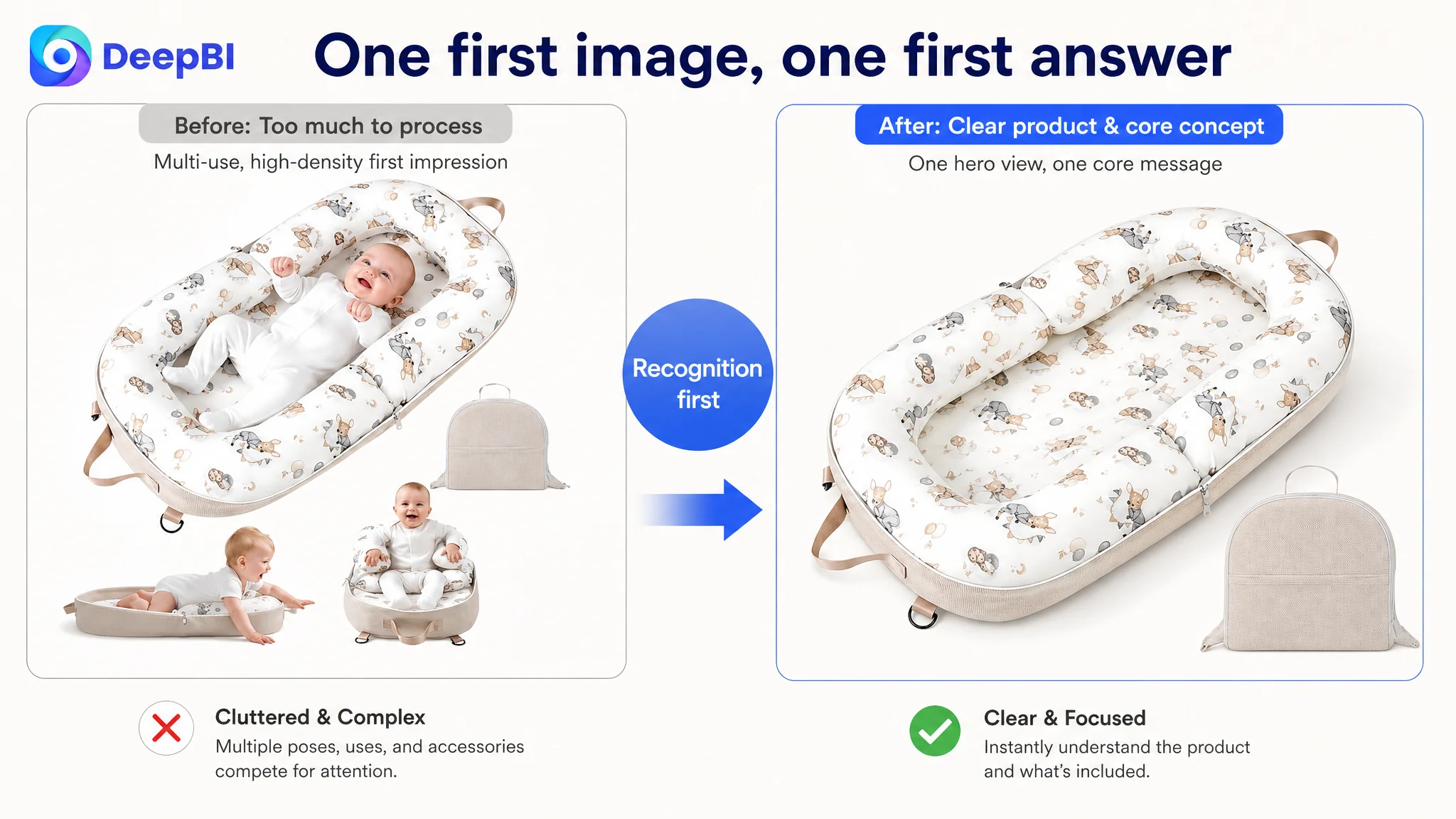
The first image combined the product, several usage positions, and the storage bag. That created a visual problem before the shopper even reached the product detail page.
The image was attempting to communicate:
- What the lounger looks like
- How the baby may use it
- That it can support different stages
- That it is portable
- That a carry bag is included
Each message was relevant. Together, they weakened the first impression.
The benchmark’s simpler presentation made the product identity easier to recognize in search results. For a mobile shopper scanning many infant-product thumbnails, that clarity matters. The first image should establish one dominant answer:
What is this product, and why should I click it?
The recommended direction was therefore not to add more visual information, but to remove competing priorities:
- Show one clean primary view of the full lounger.
- Keep the product and its core shape visually dominant.
- Present the wraparound form as the central concept.
- Show the carry bag as an included item without allowing it to compete with the product.
- Avoid leading with a later-stage sitting use case.
- Preserve the real product pattern, structure, and proportions.
The main image’s role was to win recognition and interest. It was not the right place to explain the entire product lifecycle.
The safety message needed its own decision point
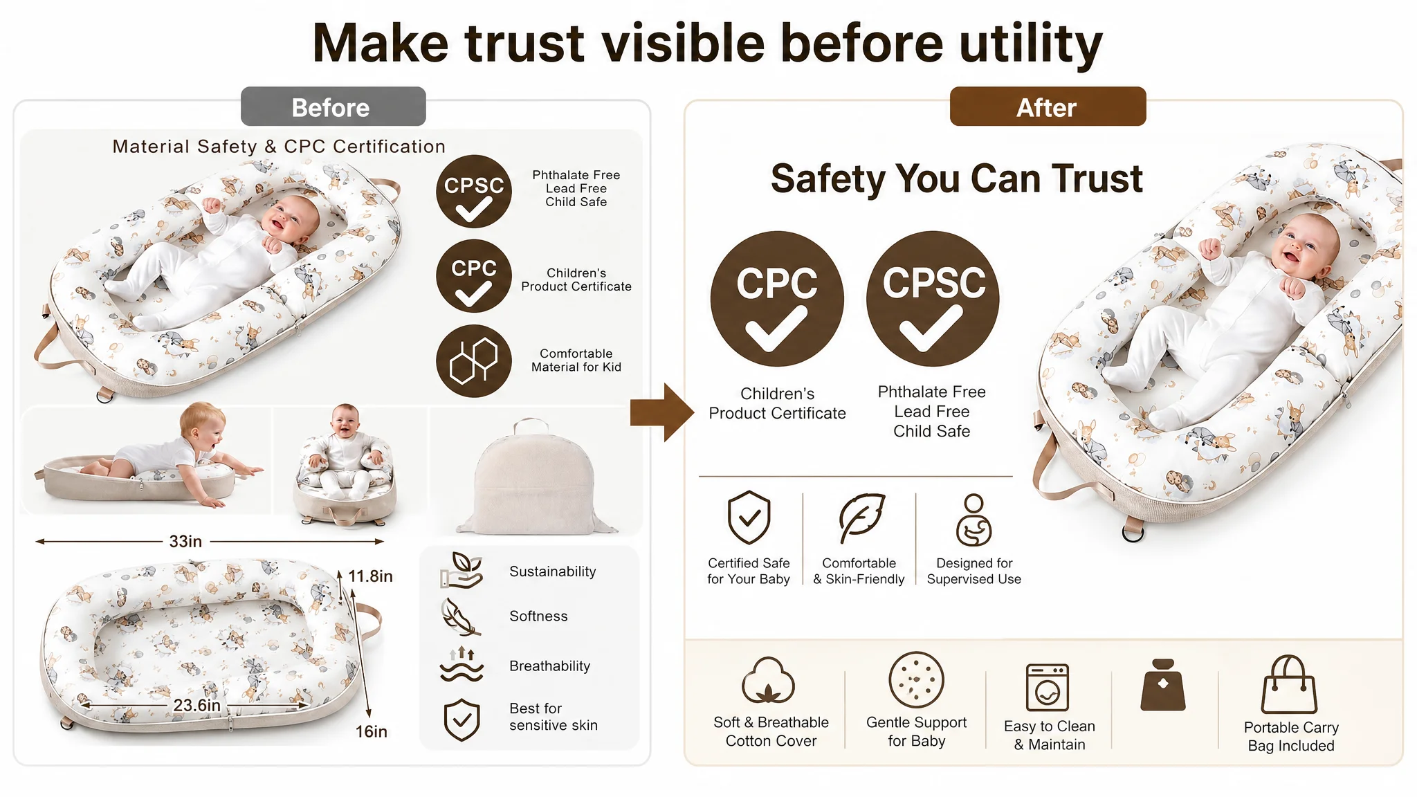
A separate image should address safety and certification rather than combine certification marks with dimensions and raw specifications.
The earlier layout made the shopper divide attention between two important questions:
- Is this product supported by the relevant certifications?
- Will it fit my baby and space?
For a baby product, safety should not be treated as one more icon among several. The recommendation was to give it a clear, authoritative position, using the supported CPC and CPSIA information together with the supervised awake-time boundary.
The wording also needed to remain responsible. The page should make clear that the product is intended for awake, supervised use on a secure surface. It should not allow a comfortable visual design to imply unsupervised sleep use.
That was more than a compliance detail. It was part of trust formation.
Claims needed visible evidence rather than repeated icons
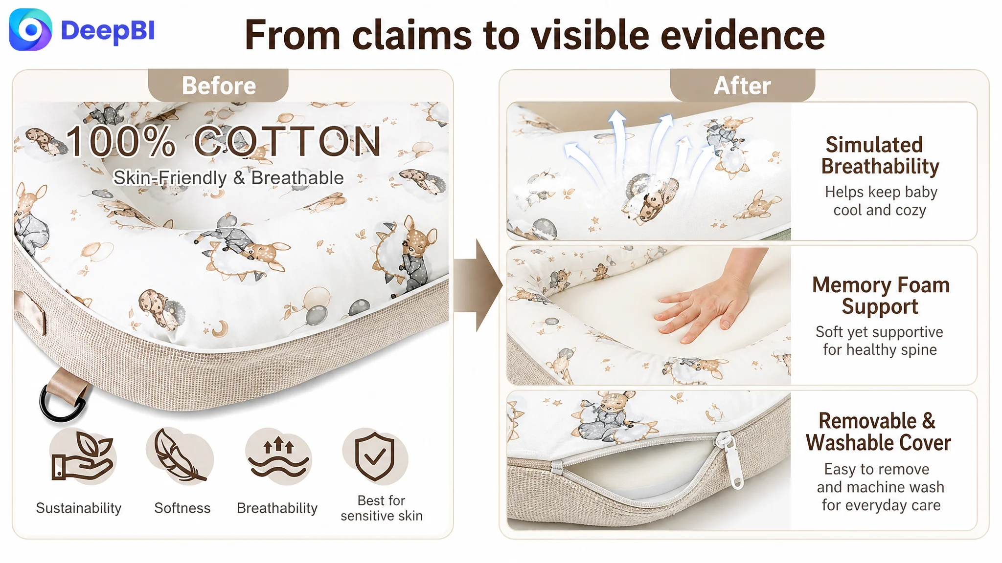
The existing material image repeated information already present in the bullets, relying heavily on static icons. This made the image feel like a summary rather than proof.
The recommended direction was to show the physical logic behind the claims:
- A close-up of the breathable cotton inner layer
- A clear view of the removable outer cover and zipper
- A visual explanation of how soft memory foam provides contouring support
- A restrained demonstration of breathability or fabric performance
- A clear connection between the material details and everyday cleaning
The goal was not to invent laboratory results or unsupported performance numbers. It was to make real product attributes easier to verify.
The title needed to improve discovery without becoming a keyword list
The title gap was smaller than the review gap, but it still affected the top of the funnel.
The original title led with “Baby Lounger–Infant Lounger,” which covered the product category but repeated similar wording. The suggested structure placed the more recognizable product and benefit terms earlier:
“Portable Baby Lounger with Pure Cotton Cover – 3 in 1 Infant Lounger for Newborn 0–24 Months, Breathable Baby Nest & Support Cushion for Home and Travel, Soft Newborn Essentials for Boys & Girls”
The important change was not simply adding more terms. It was improving the title’s sequence:
1. Product identity
2. Primary functional value
3. Age range
4. Material and comfort context
5. Usage environments
This made the page easier to understand on mobile search while retaining the product’s actual attributes.
The title also needed to avoid promising more than the product could substantiate. Search coverage only helps when the resulting click leads to a clear and credible product-page experience.
The bullet points had useful information, but the order needed to support trust
The bullet points were not the weakest dimension. They already contained several meaningful differentiators:
- The ability to separate the lounger into two U-shaped pillows
- Portable carry-bag functionality
- A storage pocket
- Removable and machine-washable cover
- Supervised awake-time guidance
- Multiple use cases over the 0–24-month range
The issue was not a lack of benefits. It was the order in which the product asked shoppers to process them.
The revised structure placed greater weight on the questions most likely to block purchase:
Safety and supervised use first
The first bullet should establish the product’s safety positioning, supported certifications, wraparound form, and supervised awake-time boundary.
Material and support next
The second bullet should connect breathable cotton and soft memory foam to comfort and contouring support without making unsupported medical promises.
Adaptability after that
The third bullet should explain the wraparound support and the ability to separate the product into two independent U-shaped pillows as the baby grows.
Cleaning as a practical barrier reducer
The fourth bullet should address the removable, machine-washable cover and shape retention in everyday use.
Portability and gifting last
The fifth bullet should explain the carry-bag transformation and storage pocket, while clarifying that displayed diapers and wipes are not included.
This sequence changed the bullets from a feature inventory into a buying argument.
The strongest differentiator was not necessarily the first thing the shopper needed to hear.
The A+ page had strong material, but weak decision sequencing
The A+ content was one of the target Listing’s stronger areas by score. It contained more detailed information than the benchmark, including:
- Five usage scenes
- Growth-stage visualization
- Functional comparisons
- Material details
- Portability
- Structural elements
- Emotional family imagery
That strength also created a risk. The page had adopted a broad, full-lifecycle narrative before resolving the buyer’s initial concerns.
The recommended restructuring was to move from reassurance to verification, then to utility.
Module 1: Establish the safety boundary
Open with CPC and CPSIA references, the secure wraparound structure, supervised awake-time use, and placement on a secure, supervised surface.
This gives the shopper a responsible frame before the page discusses comfort or lifestyle.
Module 2: Verify materials and construction
Bring together the cotton inner layer, durable outer fabric, soft memory foam, and bionic design logic. The goal is to help shoppers confirm what the product is made of and how it is constructed.
Module 3: Remove the cleaning barrier
Move the removable cover and machine-washable message earlier. Hygiene is a high-priority concern for parents, and delaying it makes the page work harder than necessary.
Module 4: Resolve portability concerns
Present the carry-bag transformation, storage pocket, and travel use in one practical section. The portability story should be specific rather than relying on a general “easy to take anywhere” claim.
Module 5: Explain how the product adapts
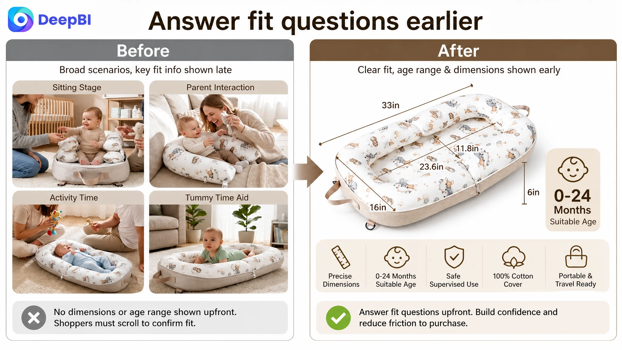
Bring the 0–24-month range and growth-stage logic forward. Show how the lounger’s three-in-one structure and separated U-shaped pillows relate to different stages without implying that every use is appropriate in every circumstance.
Module 6: Provide deeper support evidence
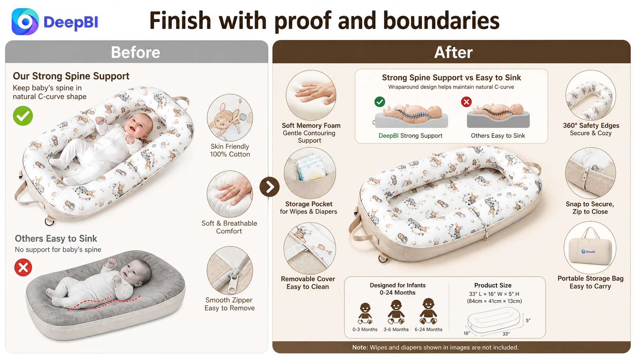
Use the memory-foam and spinal-support comparison only after the shopper understands the product’s safety boundaries, materials, and structure. A comparison such as “strong support versus easy sink” should be tied to the product’s actual construction rather than presented as a generic graphic.
Module 7: Confirm the purchase details
End with tangible confirmation: available color choices, the included storage bag, and any relevant inclusion or exclusion notes.
This sequence reduced the need for the shopper to reconstruct the product’s value alone.
Why DeepBI did not recommend tuning Amazon ads first
The decision order followed the score pattern.
The Listing had a modest title gap, a small main-image gap, a relatively strong bullet-point position, a stronger detail-page score, and a severe review deficit. That combination did not justify treating advertising as the first repair point.
Continuing to tune ads first carried three risks:
- Efficiency risk: More paid visits could continue to meet the same trust gap.
- Interpretation risk: Weak order volume might be attributed to keywords or bids when the page was the limiting factor.
- Traffic-structure risk: The Listing could become increasingly dependent on paid traffic without recovering enough organic conversion ability.
The correct next step was not to stop advertising indefinitely. It was to avoid scaling traffic before the page could receive it productively.
A more disciplined sequence was:
1. Clarify the title and product identity.
2. Simplify the first visual impression.
3. Make safety boundaries and certification information easier to verify.
4. Reorder the A+ page around buyer concerns.
5. State age suitability, dimensions, cleaning, and included items clearly.
6. Then evaluate whether ad traffic is being converted more effectively.
This is a different operating philosophy from endless bid adjustment. It treats Amazon ads as part of a larger conversion system.
The visual strategy had to remain truthful to the actual product
Because the product was a baby item, visual accuracy was especially important.
The optimization could change:
- Composition
- Visual hierarchy
- Lighting
- Background context
- Information placement
- Comparison presentation
- Scene selection
It could not change:
- The product’s physical structure
- The material into something else
- The included accessories
- The age range
- The size
- The function of the lounger
- The safety meaning of the product
For example, a visual showing diapers and wipes in the storage pocket needed to state that those items were not included. A generated image could make the carry function clearer, but it could not imply that the storage bag contained additional products.
That boundary was commercially important. A more attractive image that misrepresented the product would create a new problem through returns, negative reviews, and lost trust.
The change was from “more content” to “better conversion logic”
This case did not provide verified post-optimization CVR, ACOS, or organic-order results, so the outcome should not be presented as a quantified performance success.
The meaningful change was in the operating diagnosis and the optimization priority.
Before the diagnosis, the page could be viewed as a Listing that needed:
- More keywords
- More scenes
- More functions
- More visual content
- More persuasive language
After the diagnosis, it was understood as a Listing that needed:
- A clearer first impression
- A stronger trust sequence
- Earlier safety framing
- More tangible material verification
- More direct age and size confirmation
- Better ordering of practical concerns
- Greater support for a product with no review history
The target was not to make the page louder. It was to make the shopper’s decision easier.
The page did not need to prove that the product could do everything at once. It needed to prove, in the right order, that the product was understandable, appropriate, and trustworthy.
What this Amazon case changes about advertising judgment
The most important conclusion is not limited to infant loungers.
Amazon sellers often treat advertising and Listing content as separate workstreams:
- Advertising teams focus on impressions, clicks, bids, and search terms.
- Content teams focus on titles, images, bullets, and A+ modules.
- When orders weaken, each side may optimize its own area independently.
That separation can hide the real constraint.
If the product page cannot establish trust, advertising efficiency will remain fragile even when the campaign structure is technically sound. If the main image does not create a clear reason to click, keyword improvements may not deliver enough qualified visits. If the A+ page does not resolve practical concerns, more detail-page traffic may not lead to more orders.
For this Amazon seller, DeepBI’s value was not a longer list of edits. It was the ability to identify which gap mattered first and why.
The final business understanding was clear:
- Amazon ads cannot solve every conversion problem.
- Listing quality directly affects the value of paid traffic.
- Reviews, safety framing, product clarity, and page sequencing work together.
- A+ content should guide decisions, not merely display more scenes.
- Before scaling traffic, sellers should confirm that the page is ready to convert it.
A healthier Amazon Listing is not created by adding information indefinitely. It is created when the title, images, bullets, reviews, and A+ content work together to remove the shopper’s most important doubts in the correct order.