

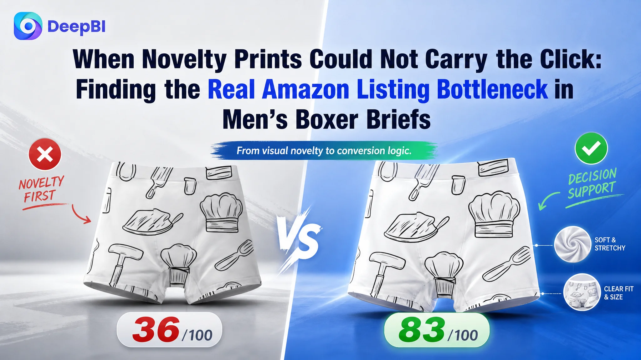
This case follows an Amazon US seller whose men’s boxer briefs Listing was visually distinctive but commercially weak. The page emphasized novelty graphics, repeated product views, and broad comfort language, while its total Listing score stood at 36/100 against 83/100 for a comparable high-performing listing.
The initial direction was easy to misread. Because the product’s printed designs were the most visible feature, the team focused on showing the patterns and maintaining visual appeal. DeepBI found that the deeper problem was not a lack of visual variety. It was a lack of decision support: the title weakened search relevance, the images did not verify functional value, the bullets listed features without resolving buyer concerns, and the A+ content provided almost no trust-building structure.
The later optimization therefore focused on rebuilding the Amazon product page as a sales argument—from keyword clarity and fit information to fabric performance, movement, sizing, usage scenarios, and personalized design value. For other Amazon sellers, the lesson is direct: before sending more traffic or adjusting campaigns again, determine whether the Listing gives that traffic enough reasons to click, trust, and buy.
The page looked distinctive. The business signal was weak.
The product was not invisible.
Its novelty prints created an immediate visual impression, and the range of designs offered a clear form of personal expression. But on Amazon, visual distinctiveness alone does not guarantee a strong click-through or conversion path.
A shopper moving through the search results still needs fast answers:
- What exactly is the product?
- What material is it made from?
- Does it stay in place?
- Is it breathable?
- Will it fit correctly?
- Is it suitable for movement or sports?
- Why should this Listing be trusted over a better-established alternative?
The Listing did not answer those questions in the order buyers needed.
Instead, the page placed too much weight on appearance while leaving core product and trust information underdeveloped. That created a critical gap between initial attention and purchase confidence.
The product had a visual hook, but the page did not turn that hook into a complete buying reason.
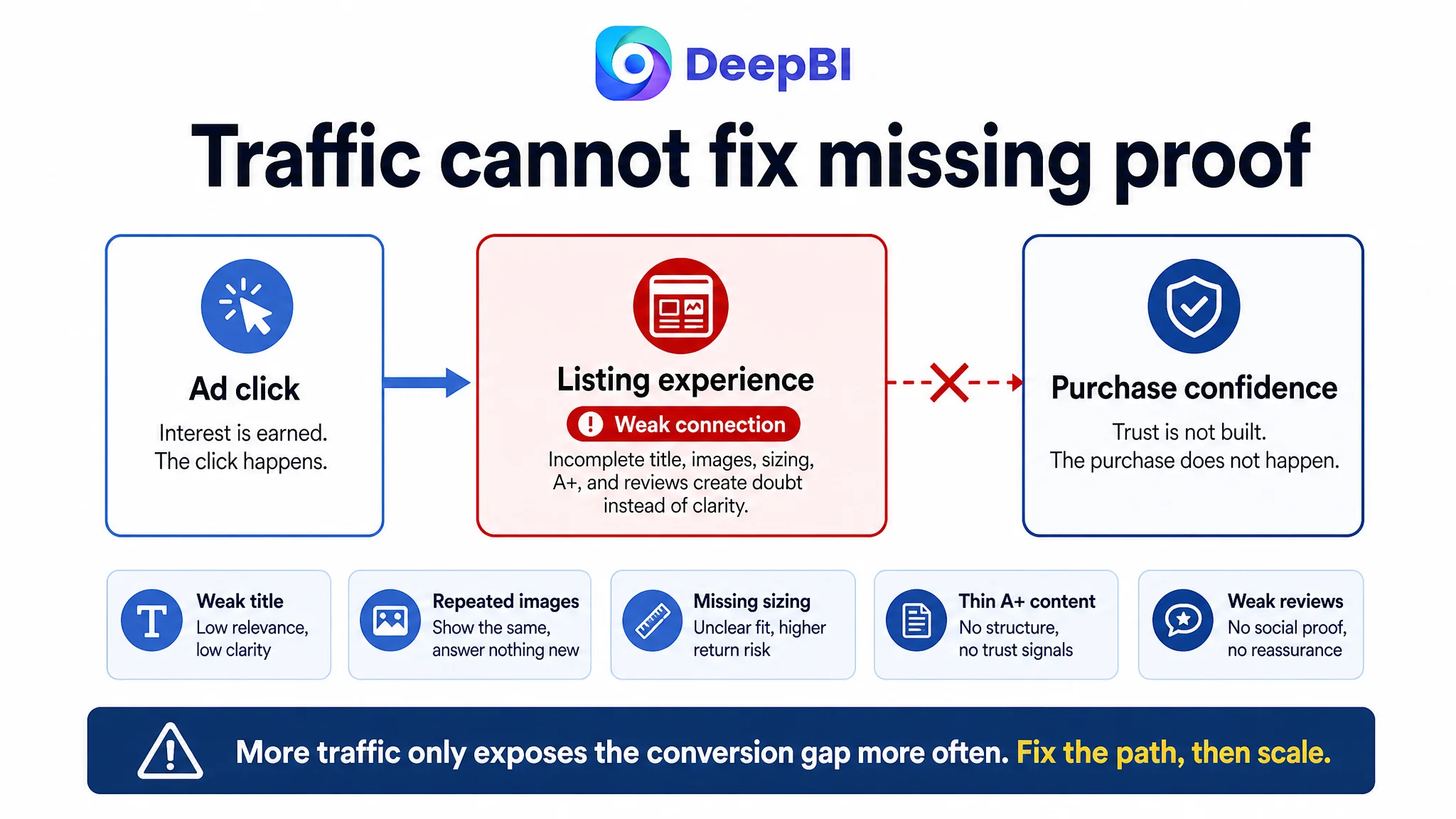
This distinction matters for both Amazon Listing optimization and Amazon ads optimization. If the page does not communicate relevance and value clearly, additional traffic may only expose the conversion weakness more often.
The first instinct was to show more of the design
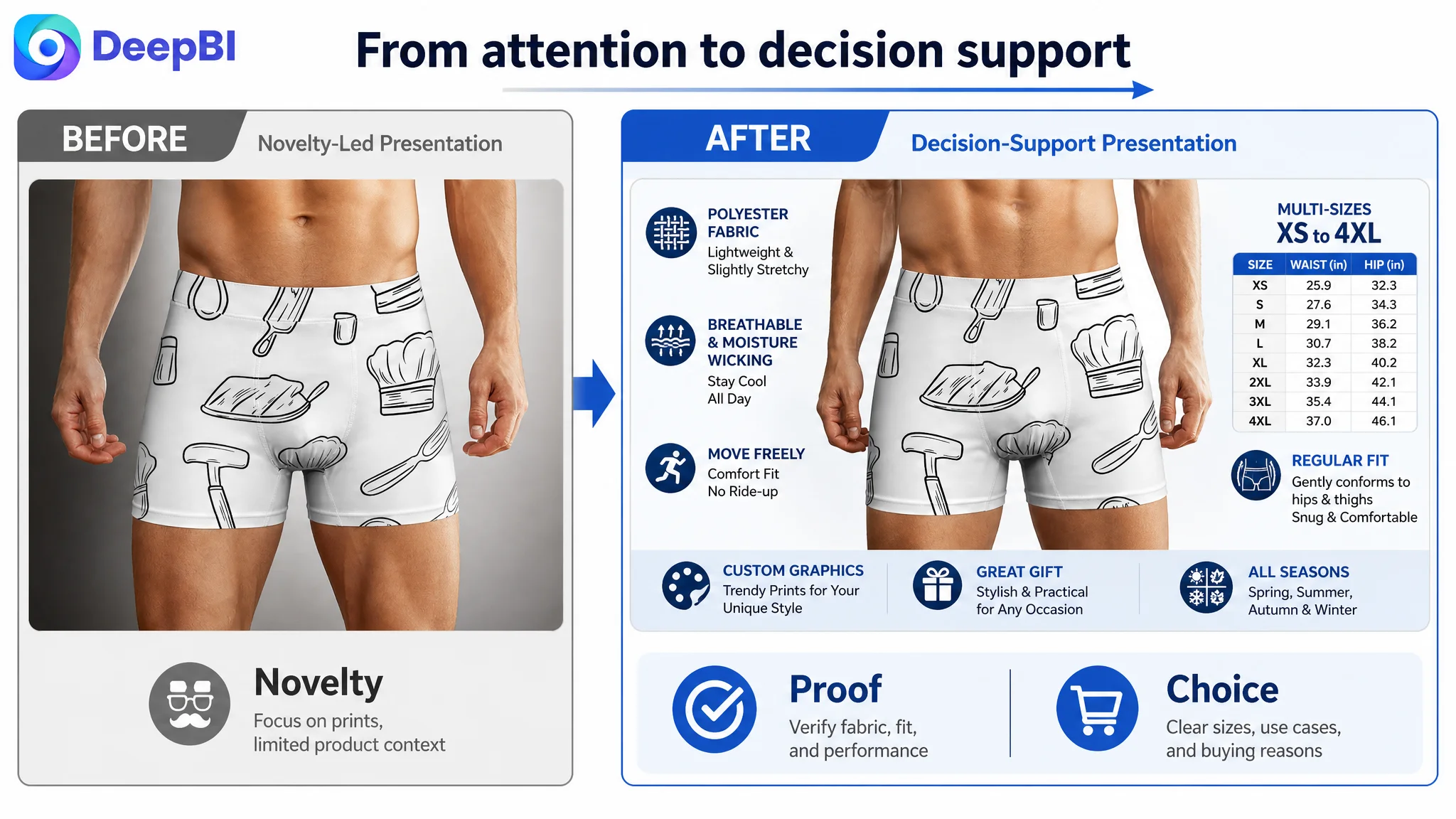
The customer’s original direction was not irrational. The patterned boxer briefs were differentiated by their graphics, so the product images naturally centered on the prints.
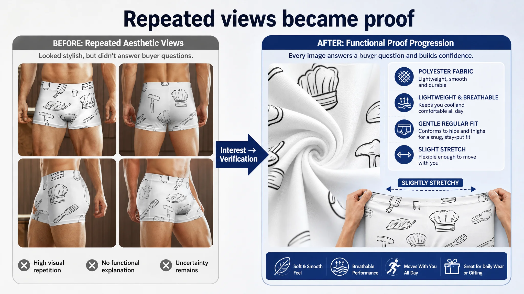
The first four images, however, remained too close in role. They continued to reinforce the same aesthetic impression without moving the buyer toward functional validation.
That created three problems.
The images repeated interest instead of advancing persuasion
The first image introduced the product’s visual character. The next images should have answered the next buyer questions.
Instead, the sequence continued to emphasize appearance without clearly explaining:
- The polyester fabric
- The lightweight and slightly stretchy feel
- The regular fit
- The available size range
- The relationship between the fit and freedom of movement
- The product’s suitability for leisure, entertainment, and sports
The result was a broken image narrative. The buyer could see the pattern, but had to work too hard to understand the product.
The product was shown, but not verified
A strong Amazon image sequence does more than display the item. It progressively reduces uncertainty.
For this Listing, the first image created novelty interest, but the later images did not provide enough technical or functional confirmation. The product page therefore asked the shopper to continue trusting a claim without showing how that claim translated into use.
This was especially important for underwear, where fit, comfort, movement, and sizing are not secondary details. They are central purchase risks.
The visual identity was not connected to a stronger value proposition
The designs could support differentiation, gifting, and self-expression. But those ideas were not integrated into a broader product story.
Without that connection, the graphics risked being perceived as decoration rather than value.
DeepBI’s diagnosis was therefore not “make the images prettier.” It was to change the role of each image:
1. Introduce the novelty design.
2. Validate fabric and construction.
3. Reduce sizing and fit uncertainty.
4. Explain movement and all-season use.
5. Confirm the fit from the back and connect it to comfort.
That is a conversion sequence, not a gallery.
The score exposed a Listing-level conversion constraint
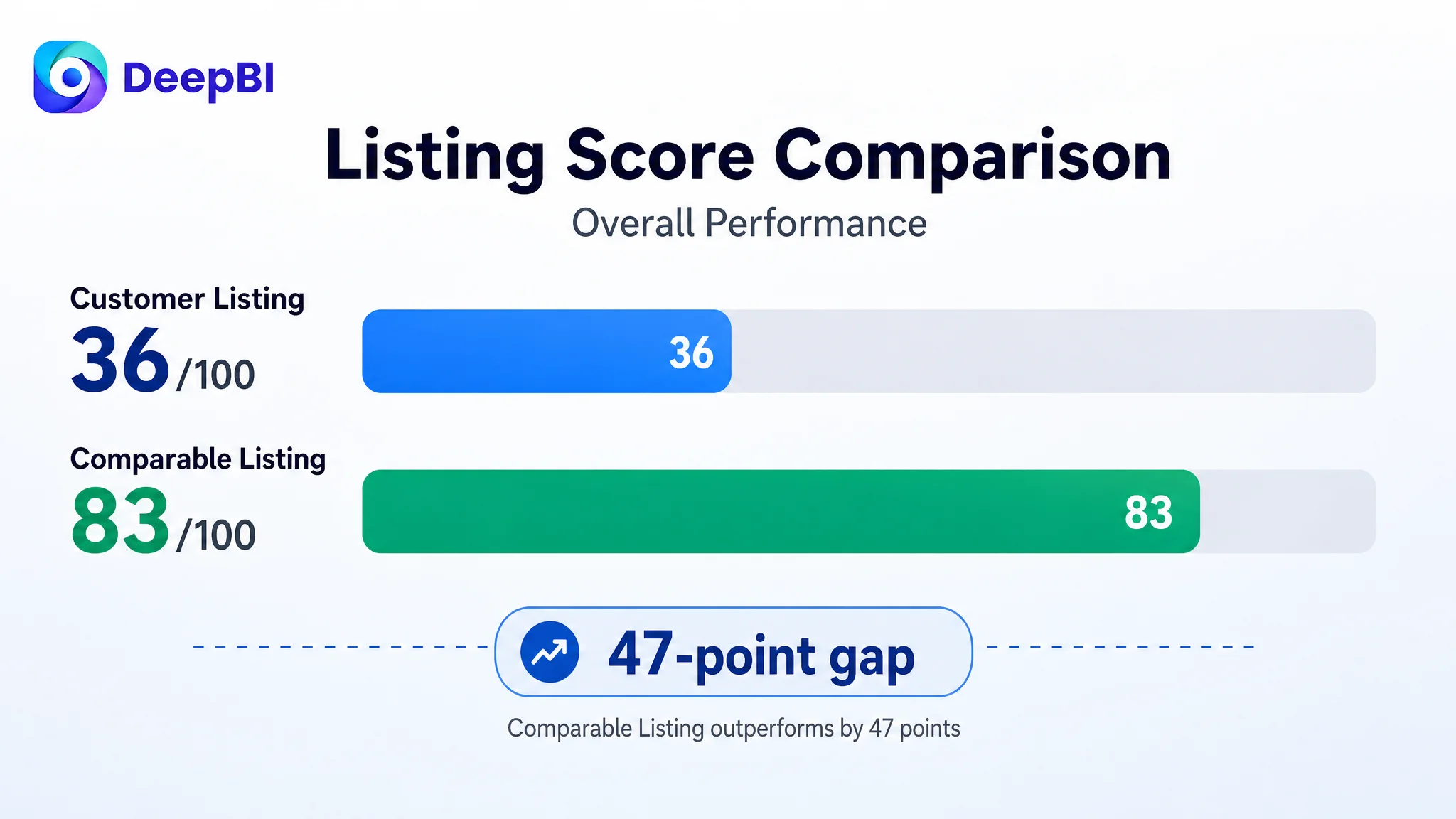
DeepBI’s comparison placed the customer’s Listing at 36/100, compared with 83/100 for a comparable high-performing Listing.
The gap was not concentrated in one cosmetic detail.
- Title: Customer Listing: 8/20, Comparable Listing: 18/20, Gap: -10
- Main image: Customer Listing: 19/30, Comparable Listing: 26/30, Gap: -7
- Bullet points: Customer Listing: 5/10, Comparable Listing: 7/10, Gap: -2
- A+ content: Customer Listing: 3/25, Comparable Listing: 18/25, Gap: -15
- Reviews: Customer Listing: 1/15, Comparable Listing: 14/15, Gap: -13
- Total: Customer Listing: 36/100, Comparable Listing: 83/100, Gap: -47
The largest gaps appeared in A+ content and reviews, followed by the title and main image.
That pattern changed the business judgment.
The problem was not simply that one image failed to attract attention. The Listing lacked enough supporting evidence after the click. A shopper could encounter the product, notice the design, and still leave without receiving a complete answer about quality, fit, comfort, or reliability.
This is where a Listing score becomes commercially useful. It does not merely rank individual assets. It shows whether the page can support the traffic it receives.
The title was weakening both relevance and credibility
The title scored only 8/20.
Its opening terms included unrelated or confusing category language such as “Chef Hat” and “Cooking Tools,” even though the product was men’s boxer briefs. That created two forms of friction at the same time.
Search relevance was diluted
The title did not lead with the clearest category phrase. Instead of immediately establishing the product as men’s boxer briefs, it introduced unrelated terms and repeated variations of the same idea.
The result was a title that was long without being informative.
It also failed to cover several useful, product-relevant terms, including:
- Men’s boxer briefs
- Polyester stretch
- Moisture-wicking
- Breathable
- No ride-up
- Comfort fit
These terms are not valuable merely because they may support search visibility. They also describe the questions buyers ask when deciding whether a fitted underwear product is right for them.
The title did not communicate a complete product promise
The comparable high-performing Listing used a clearer structure:
- Brand or product identity
- Core product type
- Pack or configuration information
- Material
- Support or fit benefit
- Performance feature
- Pain-point solution
The customer’s title did not provide the same clarity around product identity, material, or function.
DeepBI’s recommended direction was to move the core category phrase to the front and remove irrelevant wording:
Men’s Boxer Briefs Polyester Stretch Shorts, Moisture-Wicking Breathable Underwear, Comfort Fit No Ride-up Performance Boxer Briefs for Men
The important change was not the exact wording alone. It was the order of information.
The title needed to tell Amazon and the shopper what the product was before asking either one to interpret its novelty.
The main image did not fail because it was unattractive
The main image score was 19/30, only seven points behind the comparable Listing. That might suggest a relatively minor issue, but the diagnosis showed a more important distinction.
The image created aesthetic interest. It did not create enough functional confidence.
A shopper could notice the graphic print, but the image sequence did not quickly establish:
- What the fabric was like
- Why the fit would be comfortable
- How the product would stay in place
- Which sizes were available
- Whether it would support movement
- What made the product suitable beyond its appearance
This is why the main-image problem should not be reduced to “the creative was weak.”
The real issue was role allocation.
The first image had a legitimate job: create initial interest through the novelty design. But the following images continued to perform nearly the same job, wasting important decision slots that should have built trust.
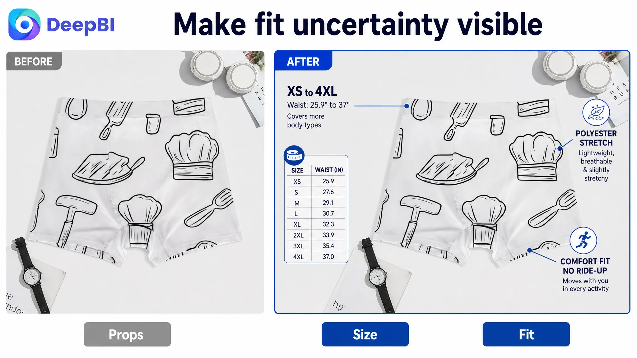
Image two needed to prove the material story
The second image should move from appearance to construction.
Using the existing product view, the page could explain that the boxer briefs are made from polyester fabric that is lightweight, slightly stretchy, and comfortable to wear. The visual should also connect the regular fit to the contours of the hips and thighs.
This would give the buyer a reason to believe the comfort claim rather than encounter another repeated product view.
Image three needed to reduce sizing uncertainty
The third image should make the size range visible, from XS to 4XL, and provide the available waist measurements.
For this product, fit is not an optional detail. It is one of the most likely sources of hesitation. A clear size-and-fit image can reduce the need for buyers to search through dense text or leave the page to compare sizing information elsewhere.
Image four needed to explain use
The ghost mannequin view could be repurposed to communicate that the product is designed for comfort and unrestricted movement across leisure, entertainment, and sports.
It could also establish the product as suitable across spring, summer, autumn, and winter—provided those claims accurately reflect the product information.
Image five needed to make the back view meaningful
A back view without explanation adds limited value.
With appropriate callouts, it could reinforce how the regular fit conforms to the hips and thighs and supports a comfortable, snug feel without restricting movement.
The change was therefore not simply “add more information to images.” It was to give each image a distinct position in the buyer’s decision process.
The page did not need five versions of the same impression. It needed five steps from interest to confidence.
The bullet points described features without solving enough problems
The bullet-point score was 5/10.
The existing structure covered fabric, fit, patterns, sizing, and use cases, but much of the language remained broad:
- Comfortable
- Does not restrict movement
- Multiple patterns
- Suitable for different occasions
These statements were not necessarily wrong. They were simply not developed into strong purchase logic.
The comparable Listing used a more persuasive pattern:
1. State the feature.
2. Explain how it works.
3. Resolve a recognizable buyer concern.
That structure was missing from the customer’s bullets.
Comfort needed a material explanation
Instead of presenting polyester as a basic material fact, the first bullet could connect the fabric to lightweight breathability, stretch, flexibility, and all-day support.
The buyer should understand not only what the product is made from, but why that material matters during wear.
Fit needed to address movement and ride-up concerns
“Regular fit” is not automatically persuasive.
The page needed to explain how the fit conforms to the hips and thighs and is designed to stay in place without riding up. This directly addresses a common concern with boxer briefs: whether the legs will shift or bunch during movement.
Graphic designs needed a clearer role
The patterns were a real point of differentiation, but the page needed to position them as more than decoration.
Animal heads, trendy themes, slogans, floral prints, camouflage, and tie-dye could support personal expression, variety, self-reward, and gifting. That creates a clearer reason to choose this product over a basic multi-pack.
Breathability needed to connect to real use
The page could connect moisture-wicking and breathable properties to leisure, everyday wear, and sports.
The goal was not to add more adjectives. It was to show how the product fits into the customer’s life.
The size range needed to become a confidence signal
The XS-to-4XL range was useful, but simply listing it did not fully solve the fit concern. The page needed to combine the range with transparent waist and hip information, so shoppers could make a more informed selection.
The largest missed opportunity was below the fold
The A+ content score was only 3/25, compared with 18/25 for the comparable Listing.
The customer’s A+ area contained no image modules and relied on repetitive basic text. This left a large portion of the product page without a structured role in conversion.
For a product where fit, fabric, movement, and personal style all matter, that absence was significant.
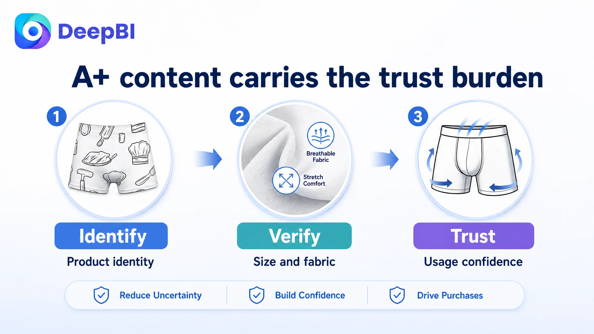
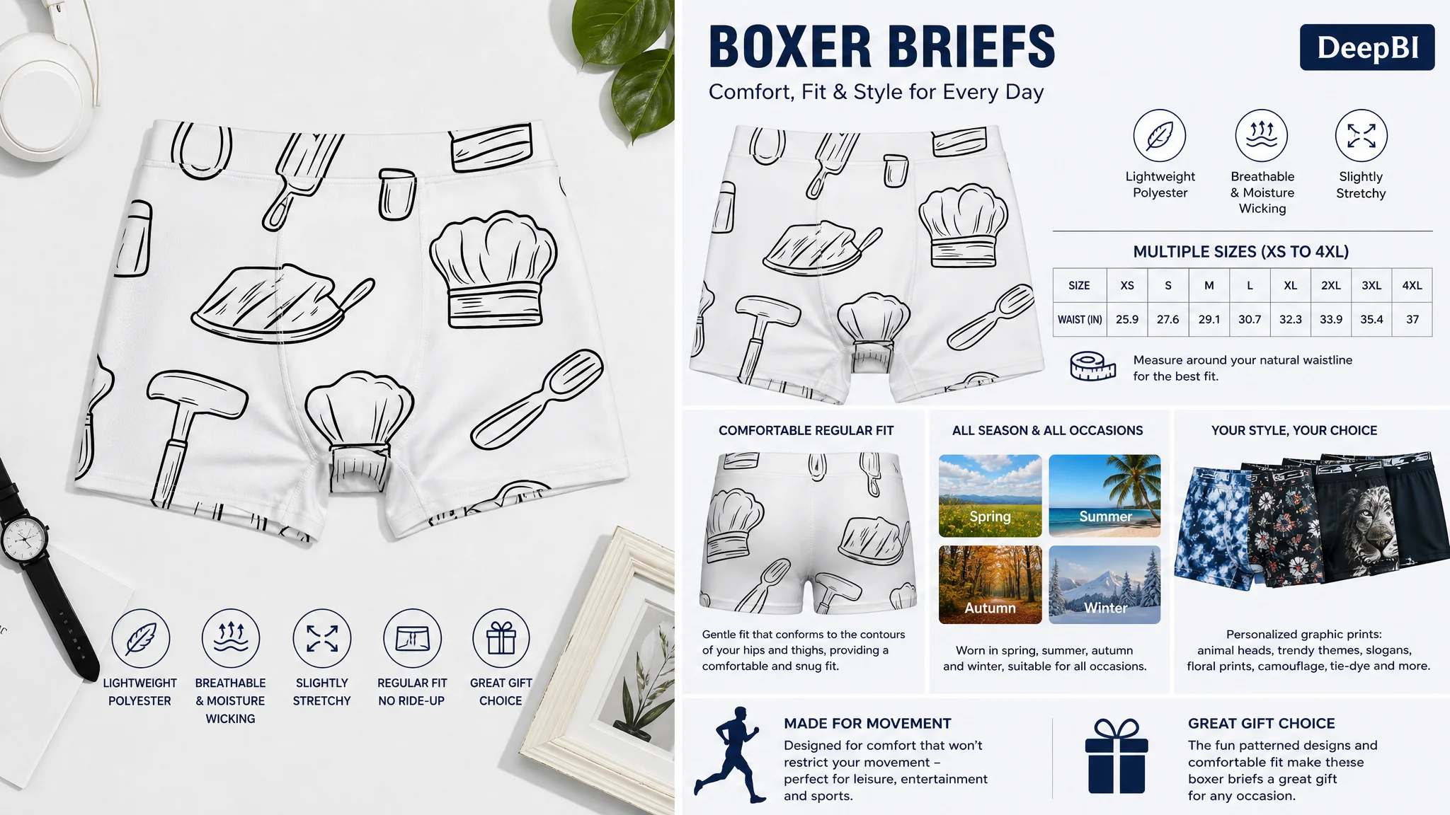
A+ module one: establish product identity
The first module should introduce the boxer briefs as a product rather than functioning as a generic brand header.
The buyer should immediately understand what is being offered and why the page deserves further attention.
A+ module two: resolve fit risk
A complete size chart should show both waist and hip measurements across XS to 4XL.
The comparable Listing itself had an incomplete sizing path, particularly around the larger size range. That created an opportunity for the customer’s page to provide more transparent fit information rather than simply imitate the competitor.
A+ module three: prove material comfort
The page should visually and verbally explain the polyester fabric, lightweight feel, slight stretch, and regular fit.
This is where a broad comfort claim can become a tangible product explanation.
A+ module four: establish usage range
The A+ story should clarify that the product is suitable for different occasions and seasons, helping the buyer understand where it fits into everyday life.
A+ module five: turn designs into differentiation
The graphic range should be presented as a deliberate choice set, not a collection of disconnected patterns.
The page can show the different design directions and connect them to personal expression, variety, and gifting.
A+ module six: address movement concerns
Fitted underwear creates a hidden question: will it restrict movement?
An A+ module should answer that directly by connecting the fit to leisure, entertainment, and sports use.
A+ module seven: close the decision
The final module should combine the two strongest reasons to buy:
- Personalized graphic designs
- A comfortable, snug fit
That creates a more natural conclusion than ending with another generic product description.
Missing A+ content did not merely reduce visual richness. It removed the part of the page responsible for explaining why the product could be trusted.
Reviews made the trust gap impossible to ignore
The review dimension scored 1/15.
The customer’s Listing had no effective rating data and no meaningful customer reviews on the first page. The comparable Listing had a 4.6-star rating, approximately 9,595 reviews, and visible written customer feedback.
This was not a gap that title editing or image redesign could erase immediately.
It was a separate trust condition that affected how every other page improvement would be received.
When a shopper sees unfamiliar underwear with no established review history, the burden on the Listing becomes much higher. The page must work harder to make sizing, fabric, fit, comfort, and use cases concrete.
That is why the review gap reinforced the need for better content rather than making content irrelevant.
A stronger A+ page could not manufacture social proof. It could, however, reduce avoidable uncertainty while the Listing built its own review history through legitimate customer experience.
The correct judgment was therefore not to copy a competitor’s review volume. It was to recognize that the customer’s page had to compensate for weaker social proof with better information architecture and clearer product evidence.
Why DeepBI did not treat this as an ads-first problem
The case does not provide post-optimization advertising data such as CTR, CVR, ACOS, or TACOS. The diagnosis therefore should not invent an advertising result.
But the business logic is clear.
If Amazon ads send shoppers to a page with:
- Confusing category language
- Weak functional explanation
- Repetitive images
- Incomplete fit guidance
- Minimal A+ content
- No meaningful review foundation
then traffic may arrive before the page is ready to convert it.
In that situation, further bid adjustments or campaign restructuring may change traffic volume without repairing the conversion constraint.
The more responsible order is:
1. Confirm whether the Listing communicates the correct product category.
2. Check whether the images progress from interest to verification.
3. Ensure the bullets resolve actual buyer concerns.
4. Build A+ content around fit, fabric, usage, and differentiation.
5. Make the review gap visible as a trust risk.
6. Only then evaluate how Amazon ads are performing against the repaired page.
This is not an argument that ads are unimportant. It is an argument that advertising efficiency depends on what happens after the click.
Advertising can bring a shopper to the product page. It cannot make an unclear title, incomplete sizing, or empty A+ content persuasive.
The optimization plan followed the buyer’s decision sequence
DeepBI’s role in this case was not to produce isolated copy edits or attractive images. It was to connect the identified gaps to a practical order of correction.
The sequence was built around the buyer’s actual questions.
First: make the product immediately identifiable
Remove irrelevant title terms and lead with the core category phrase: men’s boxer briefs.
Then add only product-relevant material and performance language that the customer can substantiate.
Second: turn visual repetition into visual progression
Keep the novelty print as the opening hook, but move the later image slots toward:
- Fabric explanation
- Fit and size verification
- Movement and seasonality
- Back-view fit confirmation
Third: rewrite bullets around pain points
Change the bullet structure from feature listing to feature-plus-outcome:
- Stretch comfort
- Stay-put fit
- Personalized style
- Breathable versatility
- Inclusive sizing
Each point should give the buyer a reason that matters in use.
Fourth: use A+ content to carry the trust burden
Build a complete page path around:
- Product identification
- Waist and hip sizing
- Fabric performance
- All-season and multi-occasion use
- Graphic variety
- Freedom of movement
- Gifting and self-reward
Fifth: treat reviews as a separate operating risk
The absence of reviews could not be solved through creative work alone. It needed to remain visible in the business diagnosis so the team would not overestimate what Listing edits could achieve in the short term.
This prioritization prevented the team from confusing content volume with conversion capability.
DeepBI’s judgment came from the pattern across dimensions
A single score could have led to a narrow conclusion:
- The title needs keywords.
- The images need improvement.
- The A+ needs more modules.
- Reviews are low.
The more useful judgment came from how those weaknesses interacted.
The title failed to establish relevance.
The images created interest but did not verify performance.
The bullets contained information but did not organize it around buyer concerns.
The A+ content did not continue the selling argument.
The review profile did not provide external reassurance.
Together, these gaps showed that the page was not suffering from one isolated creative defect. It lacked a coordinated conversion system.
DeepBI’s scoring and comparison logic made that pattern visible by assessing the Listing across title, main image, bullets, A+ content, and reviews rather than treating each asset as an independent task.
The optimization recommendations then translated the diagnosis into concrete content roles without requiring the product to claim unsupported features or alter its physical identity.
That boundary was important. The product could be presented more clearly, but it could not be redesigned through language or imagery.
What the final direction was designed to change
Because the case material does not include confirmed post-optimization results, it would be inappropriate to claim a specific CTR increase, CVR recovery, ACOS decline, or organic-order improvement.
The supported change is the operating direction.
The Listing moved from:
- Novelty-first presentation
- Repeated visual reinforcement
- Broad comfort language
- Incomplete sizing support
- Text-only A+ content
- Limited trust evidence
toward:
- Clear category relevance
- Functional image progression
- Pain-point-oriented bullet points
- Transparent waist and hip sizing
- Structured A+ storytelling
- Stronger explanations of fabric, fit, movement, and use
- Clearer positioning of graphic designs as personal expression and gifting value
That direction creates a healthier foundation for later Amazon ads evaluation.
If the page begins to communicate the product more clearly, paid traffic has a better chance of becoming useful traffic rather than simply more exposure to the same conversion leak. Organic traffic also benefits from a Listing that is easier to understand and more aligned with shopper intent.
The broader lesson for Amazon sellers
This case was not ultimately about whether novelty boxer briefs could attract attention.
They could.
The harder question was whether the Amazon product page could turn that attention into a confident purchase decision.
The 36/100 Listing score showed that the problem extended across the entire page. The largest weakness was not one unattractive image or one missing keyword. It was the absence of a connected sales logic.
For Amazon sellers, the practical lesson is to ask five questions before scaling traffic:
- Does the title establish the correct category immediately?
- Do the images move from visual interest to functional proof?
- Do the bullets resolve the buyer’s real concerns?
- Does the A+ content reduce fit and usage uncertainty?
- If reviews are weak, does the page provide enough credible information to compensate?
When the answer is no, the next optimization should not automatically be another bid change or campaign adjustment.
Sometimes the most important Amazon ads decision is to stop sending more traffic to a page that has not yet earned the opportunity to convert it.