

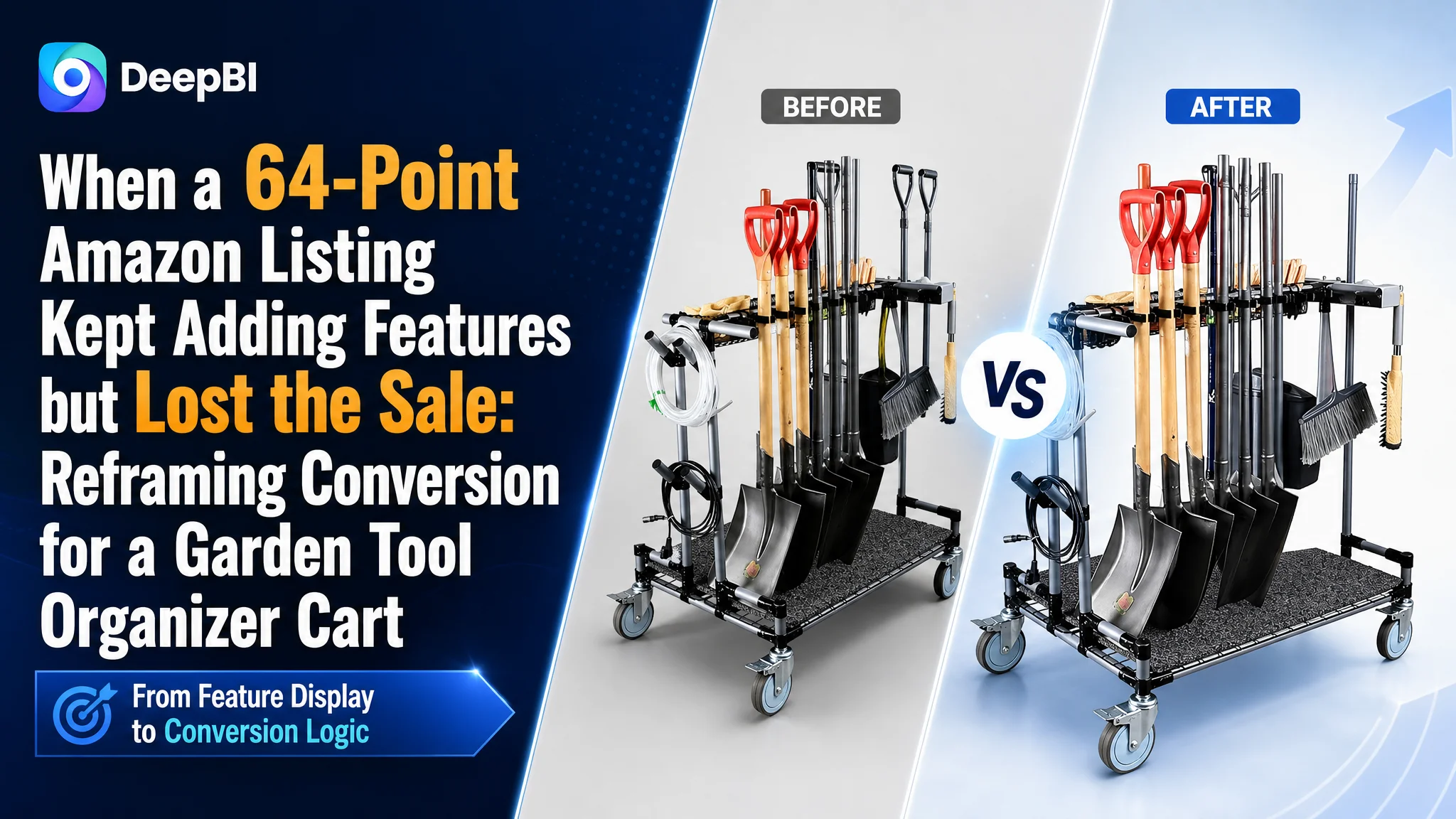
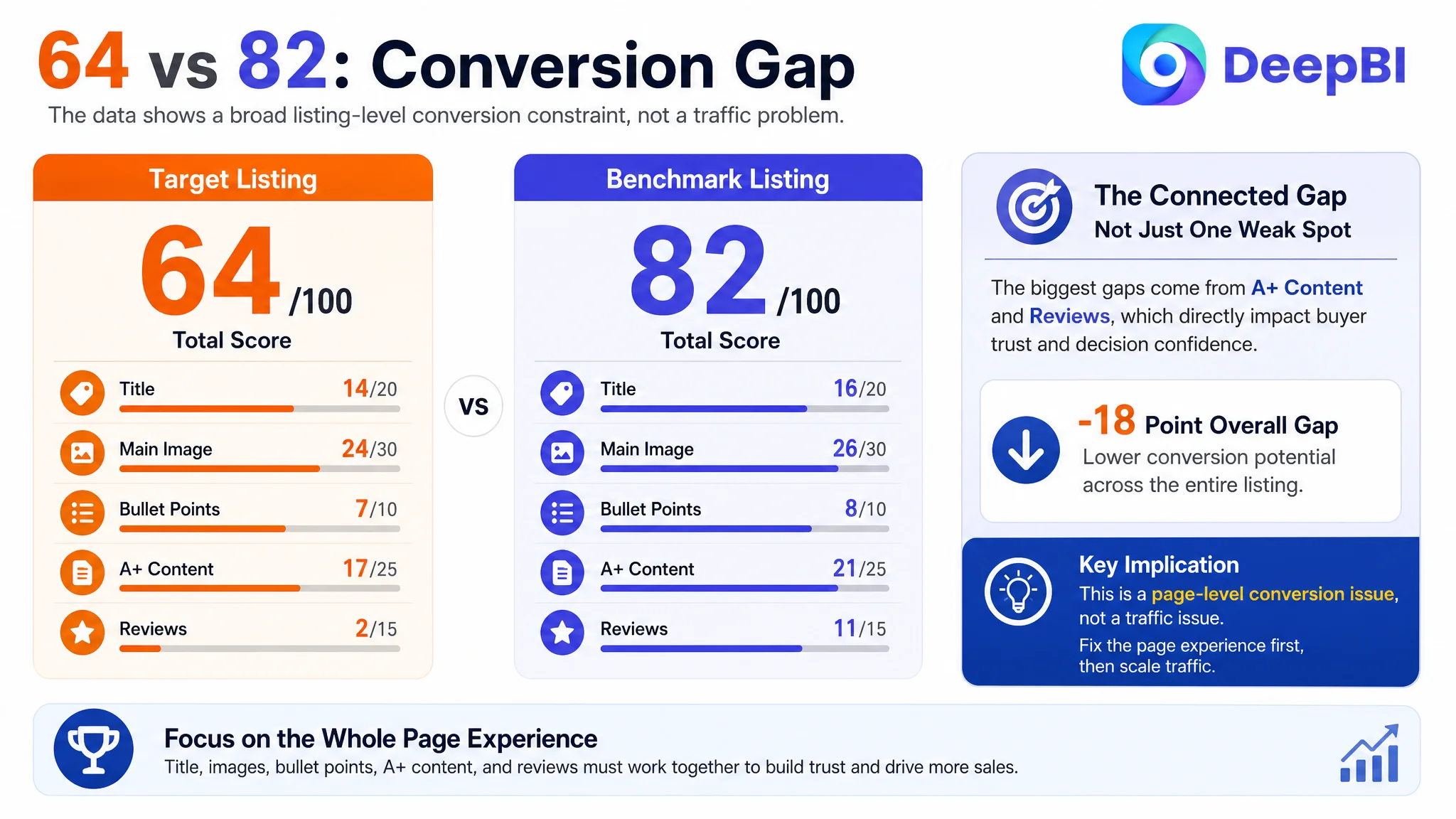
An Amazon seller in the garden storage category was not facing a simple traffic shortage. The product page had meaningful features: a three-tier storage structure, upgraded 5-inch wheels, long-handle tool holders, a metal frame, and a dirt-and-water isolation mat. Yet the Listing scored 64 out of 100 against 82 for a comparable high-performing Amazon Listing.
The initial optimization direction focused on making those features more visible—adding stronger specifications, showing more components, and presenting the product as a capable tool cart. That direction was not wrong, but it was incomplete. It treated the Amazon product page as a feature display when the larger problem was that shoppers were not being led from a familiar storage problem to a convincing solution.
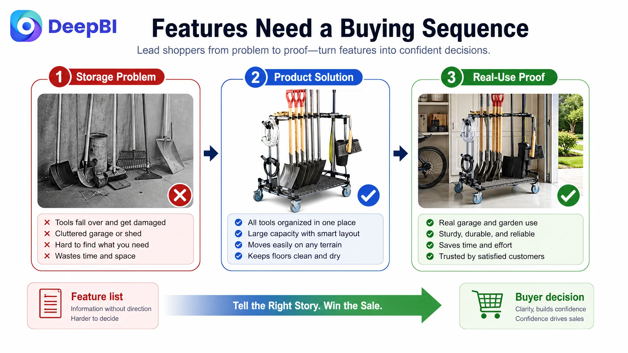
DeepBI ultimately identified a broader conversion gap across the title, main images, bullet points, A+ content, and reviews. The page needed to establish three things in sequence: why the buyer needed the organizer, how it solved garage and garden clutter, and why its mobility and capacity could be trusted in real use.
The case matters to other Amazon sellers because paid traffic cannot compensate for a product page that explains features without building confidence. Before increasing traffic or continuing to refine Amazon ads, sellers need to judge whether the Listing is ready to convert the traffic it already receives.
The Amazon Listing Had Features. It Did Not Yet Have a Sales Argument.
The product was an outdoor and indoor garden tool organizer cart designed for long-handled tools such as rakes and shovels. Its positioning was not inherently weak. The 5-inch wheels suggested mobility, the multi-tier structure suggested capacity, and the metal frame suggested durability.
The problem was how those advantages appeared across the Amazon product page.
The Listing presented the product as a collection of functions:
- A storage cart
- A wheeled organizer
- A long-handle tool holder
- A heavy-duty frame
- A base mat
- An easy-assembly structure
A comparable high-performing Listing organized the buying decision differently. It began with the shopper's frustration—tools falling over, walls becoming cluttered, and storage space being wasted. It then connected capacity, mobility, access, durability, and setup convenience to the user's daily outcome.
The page was not short of information. It was short of a persuasive order of information.
That distinction became central to the diagnosis.
The Original Direction Was to Add More Proof of Function
The customer team's working direction was understandable. If the product had useful features but was not competing effectively, the natural response was to make the product look more capable.
That meant emphasizing:
- Larger wheels
- More storage positions
- Stronger materials
- Hooks and holders
- Structural details
- Load-bearing demonstrations
- Indoor and outdoor use
The existing A+ content followed this logic. It included a brand image, lifestyle photography, close-ups of the wheels and holders, structural views, and a weight demonstration. Each module had a valid purpose in isolation.
But the sequence moved too quickly into product explanation. The content showed what the cart contained and how it was built before clearly showing the problem it was meant to solve.
The same issue appeared in the Amazon bullet points. The copy described product capabilities, but the customer benefit often remained implied. It mentioned functions without consistently answering the shopper's practical question:
What will change in my garage, shed, or garden if I buy this?
This is where traditional optimization can stall. More features may increase information density without increasing decision confidence. A stronger specification does not automatically create a stronger reason to buy.
The Scorecard Showed a Listing-Level Constraint
DeepBI's comparison produced a total score of 64 for the target Listing versus 82 for the benchmark Listing. The gap was not concentrated in one isolated creative asset.
- Title: Target Listing: 14/20, Benchmark Listing: 16/20, Gap: -2
- Main image: Target Listing: 24/30, Benchmark Listing: 26/30, Gap: -2
- Bullet points: Target Listing: 7/10, Benchmark Listing: 8/10, Gap: -1
- A+ content: Target Listing: 17/25, Benchmark Listing: 21/25, Gap: -4
- Reviews: Target Listing: 2/15, Benchmark Listing: 11/15, Gap: -9
- Total: Target Listing: 64/100, Benchmark Listing: 82/100, Gap: -18
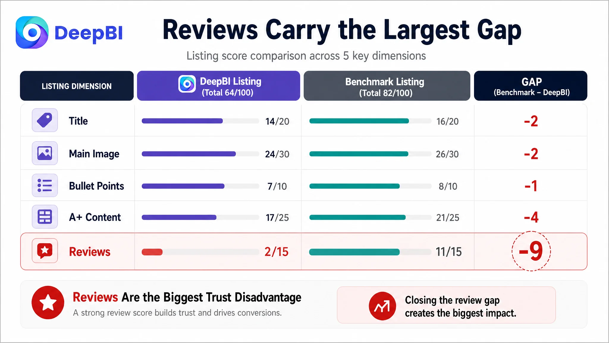
The most important judgment was not that every dimension needed equal attention. It was that the weaknesses were connected.
The title did not foreground the core category phrase strongly enough. The main image showed the cart with tools but did not create an immediate “all-in-one storage solution” impression. The bullet points leaned toward function listing rather than pain-point resolution. The A+ content lacked a strong before-and-after story. Reviews created a major trust disadvantage.
Together, these issues limited the Listing's conversion capacity.
The title lost both search clarity and category context
The core phrase “Garden Tool Organizer Cart” appeared too late in the title structure. The title also lacked several high-value category and scenario terms used by the benchmark Listing, including terms connected to rakes, shovels, stands, garages, sheds, and indoor or outdoor use.
The product had a differentiated feature in its upgraded 5-inch wheels, but the title structure placed too much emphasis on feature enumeration and not enough on the complete category promise.
The recommended direction was to lead with the product's strongest combined proposition:
Heavy Duty Garden Tool Organizer Cart with 5 Inch Wheels, Long-Handle Yard Tool Storage Rack for Rakes and Shovels, Indoor/Outdoor Utility Stand for Garage, Garden, Shed, Lawn and Sand
The purpose was not to copy the competitor's title. It was to make the Listing's own value easier to understand:
- What the product is
- What tools it stores
- Where it can be used
- Why the wheels matter
- Which search contexts it is designed for
On Amazon, title structure affects both discoverability and the shopper's first interpretation of the product. A technically accurate title can still underperform if the core category and use case arrive too late.
The main image showed a product, not the full solution
The first image created moderate confidence by showing the cart loaded with tools. However, it did not present enough variety to communicate the breadth of the storage solution immediately.
A shopper could see the product, but might not instantly understand:
- How many types of tools it can organize
- Whether it can replace several storage arrangements
- How much space it can help reclaim
- Whether it belongs in a garage, shed, or outdoor work area
The mobility image created a more serious mismatch. The title and bullets emphasized lawn, sand, gravel, and muddy terrain, while the visual showed the cart moving across a clean indoor floor.
That created a credibility gap. The image confirmed that the cart rolls, but not that the upgraded wheels solve the harder problem the Listing was promising.
A feature claim becomes more persuasive when the image proves the exact situation in which the buyer might doubt it.
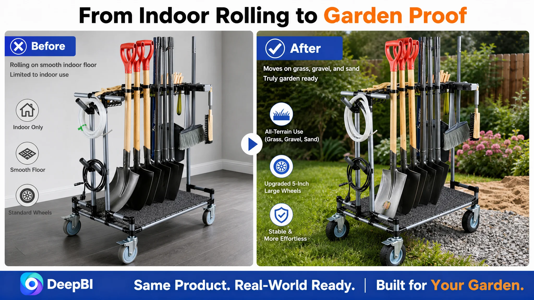
The revised visual direction therefore prioritized:
1. A high-capacity loaded-cart scene with a wider range of actual tools
2. Outdoor movement across grass, gravel, or dirt
3. A realistic garage or shed setting
4. A focused comparison around mobility, capacity, or floor protection
5. A clean dimension image that removes fit uncertainty
This sequence moved from immediate value to practical proof and then to logistical certainty.
The Bullet Points Explained the Cart Instead of the Buyer's Problem
The benchmark Listing began with clutter and falling tools. That was commercially important because the buyer is not usually searching for a “three-tier structure” as an abstract object. They are trying to regain order, save time, protect walls, or make tools easier to access.
The recommended bullet-point logic followed a more complete path.
Start with the storage problem
The first bullet reframed the cart around clutter, upright organization, and freeing wall space. The product's holders and compartments became evidence of the outcome rather than the headline.
Make capacity visible through use
The second bullet connected the multi-tier design and clip-on holders to long-handled tools and low-height sheds. This addressed a practical storage concern: whether different tools can be kept together without requiring a tall wall-mounted system.
Turn the 5-inch wheels into a meaningful difference
The third bullet focused on movement across lawns, gravel, and muddy terrain. This was more valuable than merely stating that the product had wheels. It defined where those wheels matter and why they reduce lifting effort.
Connect access to cleanliness
The fourth bullet combined all-side access with the base isolation mat. This made the feature more relevant to a garage or shed environment by addressing both convenience and dirt or water falling onto the floor.
Use the frame to answer durability doubts
The fifth bullet linked the rust-resistant, high-strength metal frame to heavy-tool storage and long-term reliability.
Remove assembly anxiety
The sixth bullet treated modular assembly and the absence of wall mounting as a decision barrier. Setup convenience was not just a secondary feature; it reduced the perceived effort required to start using the product.
This structure changed the copy from:
“Here are the functions of the cart.”
to:
“Here is the problem in your storage space, how the cart solves it, and why you can rely on the solution.”
The A+ Content Was the Largest Content Gap
The A+ score was 17 out of 25, four points below the benchmark. More importantly, the gap revealed a difference in page strategy.
The target A+ content used product-centered modules:
- Brand and product introduction
- Tool and feature close-ups
- Structural details
- Wheel detail
- Load-bearing demonstration
- Material and frame views
The benchmark Listing used a more immersive commercial narrative:
- A broader garage environment
- Mixed tool storage
- Before-and-after clutter transformation
- A professional storage-system impression
- Scenario-based proof of utility
The target page showed how the cart was built. The benchmark page more clearly showed what the buyer's space could become.
The opening module needed a transformation hook
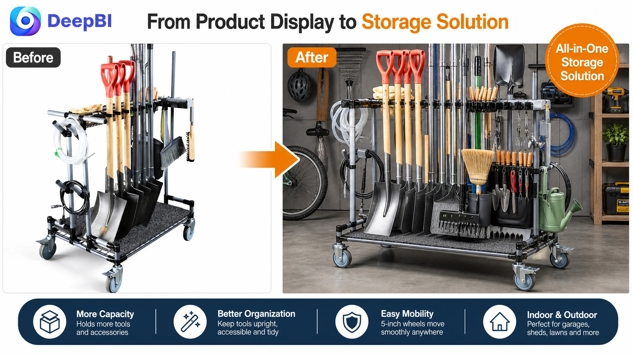
The first A+ module combined brand and cart views, but it did not create enough emotional or practical urgency. A before-and-after composition would have made the problem legible immediately:
- Before: rakes, shovels, shears, and watering cans scattered or leaning
- After: the same category of tools upright, accessible, and organized in one cart
This would let the shopper understand the product's role before encountering technical details.
Mobility needed to be shown where gardening happens
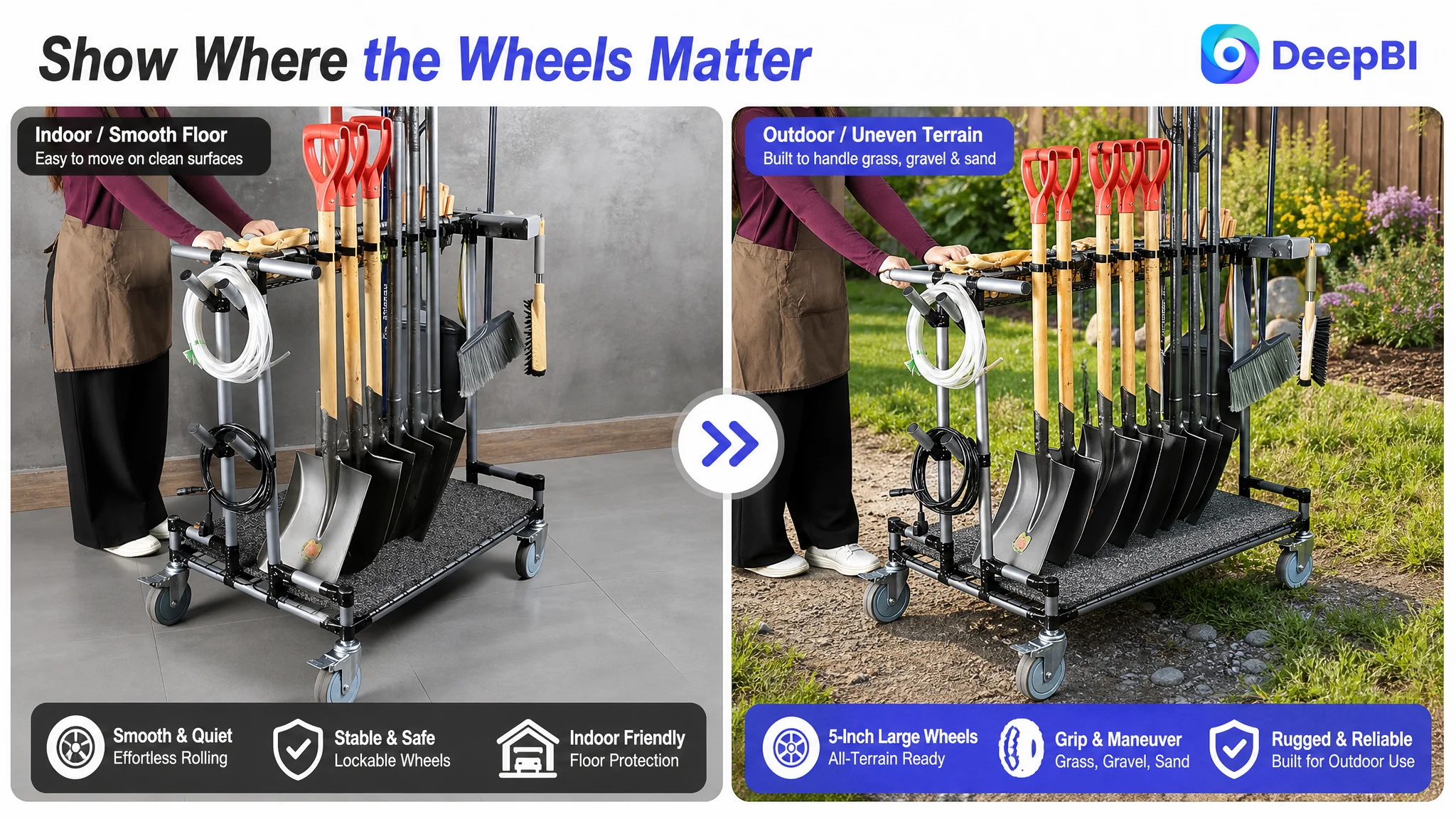
The existing indoor pushing scene proved basic movement but did not address outdoor terrain. The revised module needed to show the cart carrying tools across grass, gravel, or dirt, with the large wheels placed in context.
The goal was not to make the scene more dramatic for its own sake. It was to answer a specific objection:
Will this still be useful when the tool cart has to move through the garden rather than across a smooth floor?
Capacity needed a real environment
The A+ content also needed a fuller garage or shed scene with a broader mix of tools. A loaded cart in a realistic storage environment could communicate capacity more efficiently than several isolated close-ups.
It would also connect the product to a wider lifestyle outcome: not merely storing one set of garden tools, but helping integrate a crowded work area.
Strength proof had to remain relevant
The existing two-person weight demonstration was visually striking, but strength proof can become less persuasive when it looks disconnected from the product's actual use.
A better approach was to connect the frame's durability to the heavy tools it is intended to carry. The evidence should reinforce the “heavy-duty metal frame” claim rather than appear as an unrelated stunt.
The A+ sequence therefore needed to move from:
1. Problem and transformation
2. Capacity in a real storage environment
3. Mobility across relevant terrain
4. Tool compatibility and storage details
5. Structural durability
6. Floor protection and assembly reassurance
This order supported the buyer's decision process instead of following the order in which the product happened to be photographed.
Reviews Made Every Page-Level Weakness More Expensive
The review dimension produced the largest numerical gap.
The target Listing had:
- 3.9 stars
- 8 total reviews
- No effective review content available on the homepage for analysis
The comparable Listing had:
- 4.4 stars
- 69 total reviews
- Review language associated with easy assembly, large capacity, and sturdiness
The target Listing also showed a higher one-star review share: 19% compared with 6% for the benchmark.
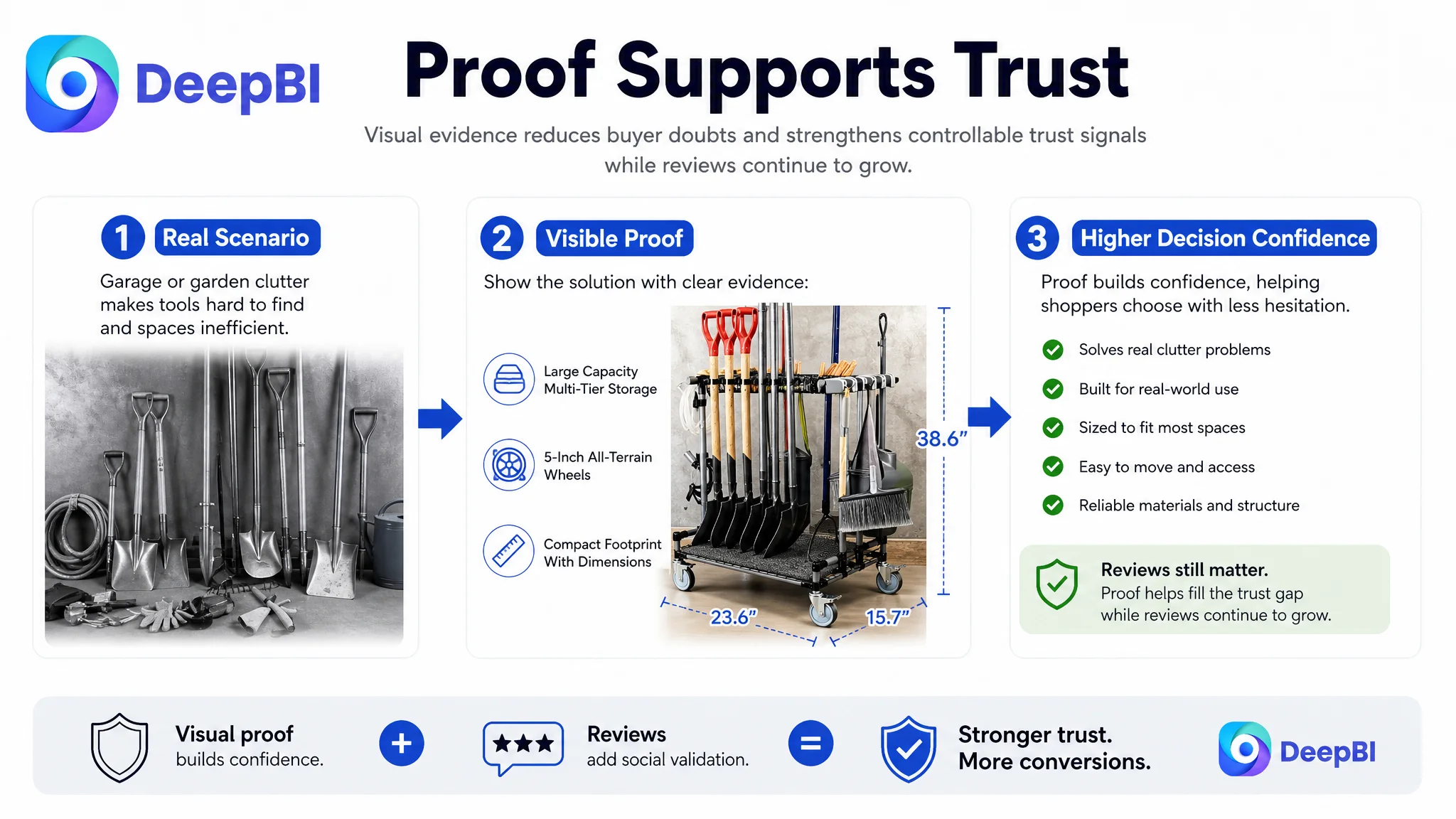
This meant the product page had to work harder than a mature competitor's page. When review volume and rating are weaker, the title, images, bullets, and A+ content must carry more of the trust burden.
That does not mean visual optimization can replace review credibility. It means the Listing cannot afford to leave other trust-building opportunities unused.
The page needed to compensate where it legitimately could:
- Demonstrate the cart in real garage and garden settings
- Show its storage capacity with actual tools
- Prove outdoor mobility visually
- Clarify dimensions
- Explain assembly without overclaiming
- Connect the metal frame to intended use
- Present the floor-protection mat as a practical benefit
The goal was not to hide the review gap. It was to prevent every other part of the page from adding to it.
When reviews are still developing, unsupported claims are especially risky. Visual evidence and clear usage logic become the safer path to trust.
Why DeepBI Did Not Recommend Tuning Amazon Ads First
The case did not call for endless bid changes or campaign restructuring as the first response. The issue was not that advertising had no role. The issue was that more traffic would be entering a page with unresolved conversion friction.
Advertising can amplify a strong Listing. It can also amplify:
- A weak first impression
- An unclear category position
- A mismatch between title and image
- Feature claims without proof
- Missing scenario context
- Low review confidence
For this Amazon seller, the immediate business risk was not simply spending more. It was paying to send additional shoppers toward a page that had not yet earned their confidence.
The correct decision order was therefore:
1. Clarify the Listing's category and use-case promise
2. Rebuild the visual sequence around problem, solution, and proof
3. Convert feature descriptions into user-benefit logic
4. Strengthen A+ content with realistic scenarios
5. Remove dimension and assembly uncertainty
6. Then evaluate how Amazon ad traffic responds
This does not imply that ads should be paused in every situation. It means the team should not treat ad optimization as the primary fix when the product page itself is the binding constraint.
The Reframed Optimization Direction
The revised direction centered on a single idea:
The garden tool organizer cart needed to be presented as a complete storage solution, not as a cart with several useful parts.
That judgment changed the role of each Listing element.
- The title became the first statement of category, use case, and mobility.
- The main image became an immediate capacity and solution signal.
- The secondary images became proof of outdoor movement, location fit, dimensions, and differentiated utility.
- The bullet points became a sequence of pain point, benefit, evidence, and reassurance.
- The A+ content became a before-and-after story supported by real storage environments.
- The reviews became a reason to strengthen every controllable trust signal rather than a reason to make unsupported claims.
- Amazon ads became a source of useful traffic only after the page was better prepared to convert it.
The recommendations stayed within the product's known boundaries. They did not require inventing new functions, changing the cart's physical design, or adding unsupported performance specifications. The proposed improvement came from changing the context, hierarchy, and proof—not from overstating the product.
What Other Amazon Sellers Can Take From This Case
This case offers a practical warning for sellers whose Amazon ads appear increasingly difficult to optimize.
A Listing can have valid keywords, real features, and a reasonable product concept while still losing conversion because the sales logic is fragmented.
Before changing bids, sellers should ask:
- Does the title state the category and main use case early enough?
- Does the main image communicate the complete solution within seconds?
- Do the images show the environment where the product will actually be used?
- Do the bullets begin with the buyer's problem or the seller's specification?
- Does the A+ content show a transformation, or only a collection of features?
- Are dimensions, setup, durability, and compatibility doubts addressed?
- Is the review gap making every other weakness more expensive?
The most important lesson is not that one image or one bullet point will solve an Amazon Listing. It is that conversion depends on coordination.
A title, main image, bullet points, A+ content, reviews, organic traffic, and paid traffic must support the same buying decision.
In this case, the next step was not to make the cart look more impressive in isolation. It was to make the shopper understand the problem, recognize the solution, and trust the product's relevance before more traffic was pushed toward the page.
That is where Amazon Listing optimization becomes a business decision rather than a sequence of cosmetic edits.