


The customer was an Amazon seller in the US fitness equipment category. The Listing had a clear product concept—a portable, ropeless battle rope and weighted skipping rope set—but its product-page conversion logic was not keeping pace with comparable listings. The team initially focused on explaining functions and showing how the equipment worked, assuming that more feature information would make the offer easier to understand.
DeepBI found a different constraint. The page was not short of product information; it was short of persuasive proof. The title did not foreground the strongest search and product-positioning terms, the main image sequence did not create enough immediate interest, the bullet points listed functions without closing the buyer's practical concerns, and the A+ content did not convincingly prove how the product supported full-body training.
That distinction matters for Amazon sellers managing paid traffic. Before increasing ad traffic or continuing to adjust campaigns, the team had to determine whether the Listing could convert that traffic. The later optimization therefore focused on rebuilding the product page around portability, quiet small-space use, adjustable resistance, muscle-group application, material trust, and the clear value of a three-in-one fitness bundle.
The case offers a practical lesson: when an Amazon Listing attracts attention but does not provide enough reasons to buy, advertising optimization alone can only amplify the page's existing weaknesses.
The Listing Looked Like a Content Problem, but the Business Risk Was Conversion
At first glance, the product page appeared to contain the expected components:
- A title describing ropeless battle ropes and fitness use
- Five bullet points covering materials, grip, rotation, and training benefits
- Product images showing components and usage
- A+ modules explaining the bundle and general benefits
- A product positioned for home, gym, outdoor, and travel workouts
The issue was not that the Listing had no content. The issue was that the content did not follow the order in which an Amazon shopper makes a decision.
A shopper typically needs to resolve several questions quickly:
- What exactly is included?
- Why is this better than a traditional battle rope?
- Can it be used in a small apartment or shared space?
- How does the resistance work?
- Which muscles or training goals does it support?
- Is the product durable enough for repeated high-intensity use?
- Can other buyers be trusted to have made the same purchase?
The customer page answered some of these questions separately, but not as a connected buying argument. It introduced features before establishing the product's practical value. It showed usage instructions where stronger decision proof was needed. It described full-body training without sufficiently demonstrating how that training worked.
The Listing did not lack information. It lacked a sequence that turned information into confidence.
That created a direct risk for Amazon advertising. If paid traffic reached the page before these doubts were resolved, more clicks would not necessarily produce more orders. The page could consume traffic without building enough conversion capacity.
The Original Assumption: Explain More Features and the Product Will Convert
The customer's initial direction was understandable. A ropeless battle rope is less familiar than a traditional rope, so the team gave attention to product structure, operation, and general functionality.
The Listing included explanations of:
- The three-in-one bundle
- The weighted components
- The handle design
- The rotation mechanism
- Anti-slip and anti-tangle features
- General use instructions
- Broad full-body fitness benefits
But the page leaned toward functional explanation rather than purchase reassurance.
The team was effectively treating the problem as one of product understanding: if shoppers could see how the equipment was assembled and used, they would be more likely to buy. DeepBI's diagnosis showed that the more important problem was whether shoppers believed the product could deliver the expected workout in their own environment.
That is a different question.
A feature such as “360-degree rotation” has limited persuasive value on its own. It becomes more commercially useful when connected to a concern such as avoiding tangles, reducing disruption in a small room, or making the workout easier to perform without a traditional rope.
Likewise, “weighted balls” is only a specification until the page explains how the weighting contributes to resistance, cardio intensity, coordination, or muscle engagement.
The customer was not necessarily optimizing the wrong assets. The problem was that the assets were being asked to perform the wrong roles.
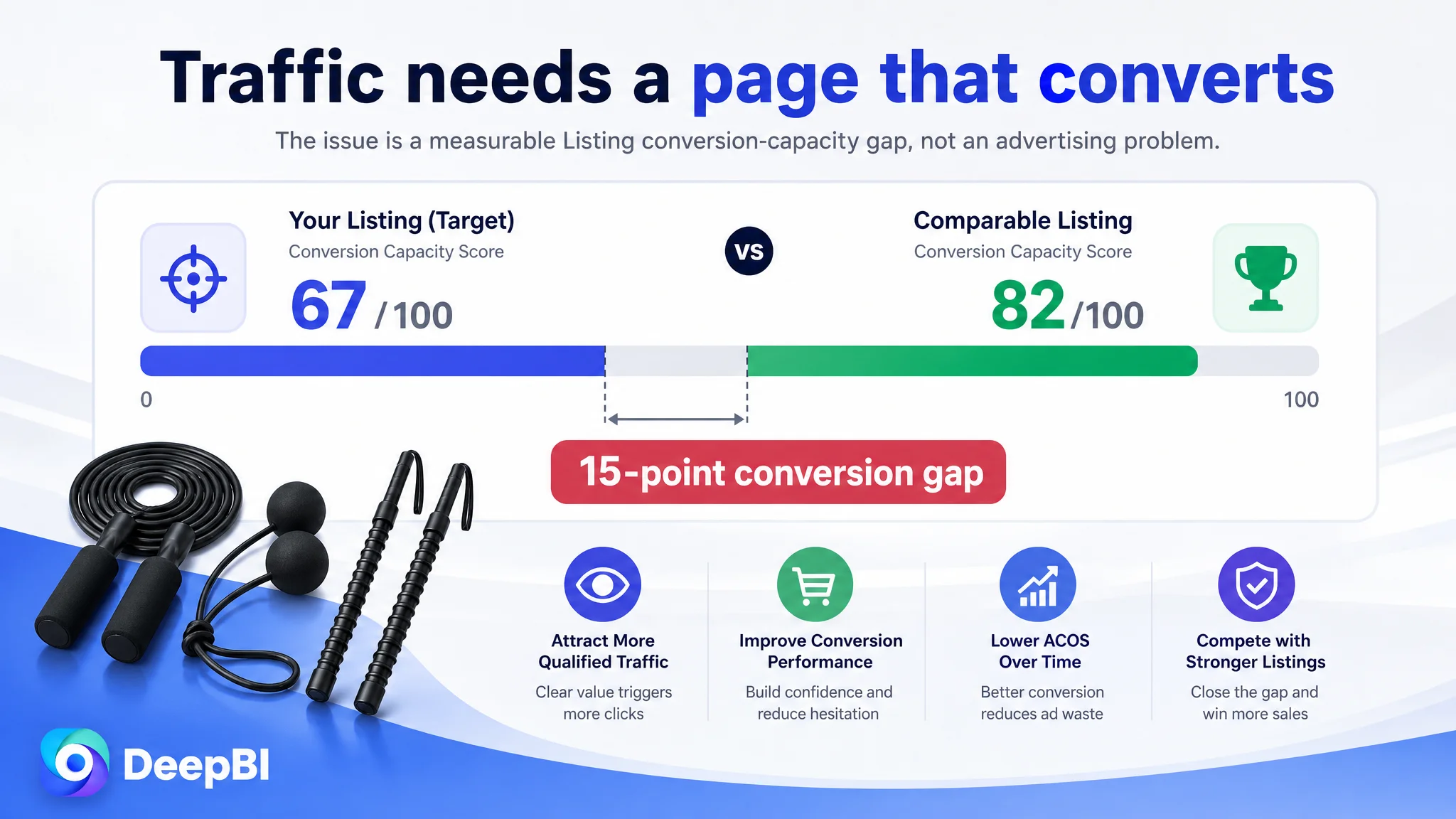
The Scorecard Exposed a Conversion Capacity Gap
DeepBI's comparison placed the target Listing at 67 out of 100, while the comparable high-performing Listing scored 82.
The 15-point difference was not evenly distributed:
- Title: Target Listing: 14/20, Comparable Listing: 17/20, Gap: -3
- Main images: Target Listing: 24/30, Comparable Listing: 27/30, Gap: -3
- Bullet points: Target Listing: 7/10, Comparable Listing: 8/10, Gap: -1
- A+ content: Target Listing: 21/25, Comparable Listing: 23/25, Gap: -2
- Reviews: Target Listing: 1/15, Comparable Listing: 7/15, Gap: -6
- Total: Target Listing: 67/100, Comparable Listing: 82/100, Gap: -15
The largest numerical weakness was the review dimension. The target Listing had no rating and no customer reviews, while the comparable Listing had a 4.2-star rating and 11 reviews.
That gap could not be solved through copywriting or image production. It represented a genuine trust disadvantage. At the same time, the other four dimensions showed that the Listing was also failing to make the most of the traffic and product interest it could generate.
This distinction was important. The absence of reviews was a structural disadvantage, but it did not mean the team should wait for reviews before improving the page. When social proof is limited, the title, images, bullet points, and A+ content have to carry more of the burden of explanation and trust-building.
The diagnosis was therefore not “change one weak image.” It was:
The Listing had limited conversion capacity, and the lack of reviews made every other communication gap more costly.
The Title Was Descriptive, but It Did Not Lead With the Strongest Buying Signal
The target title began with “Ropeless Battle Ropes,” but it did not emphasize “Portable” early enough. It also relied on broad phrases such as “Fat Burning Strength Workout Gear,” which described a general outcome without giving the shopper a sharp reason to choose this particular product.
The comparable Listing used a clearer structure:
- Core product keyword
- Portable or cordless positioning
- Adjustable resistance
- Full-body strength training
- HIIT and cardio use
- Target users
This structure served both Amazon search visibility and shopper recognition. It made the product type clear immediately and connected the product to specific use cases.
The recommended direction was not simply to add more keywords. It was to reorganize the title so that it communicated:
- The ropeless battle rope form
- The weighted skipping rope set
- Portable home-gym use
- HIIT, cardio, and full-body strength training
- Suitability for men and women
The commercial problem was not keyword absence alone. It was that the title made the shopper work too hard to understand the product's complete value proposition.
The Main Image Sequence Showed the Product, but Did Not Build a Reason to Choose It
The first image primarily confirmed the included components. That helped answer “What comes in the package?” but did not immediately establish why the bundle was valuable.
The product's strongest differentiators were not just its components. They were the combination of:
- Ropeless training
- Portability
- Three-in-one use
- Full-body workout potential
- Suitability for limited spaces
- Reduced noise and floor impact compared with traditional ropes
These benefits were not being prioritized early enough in the image sequence.
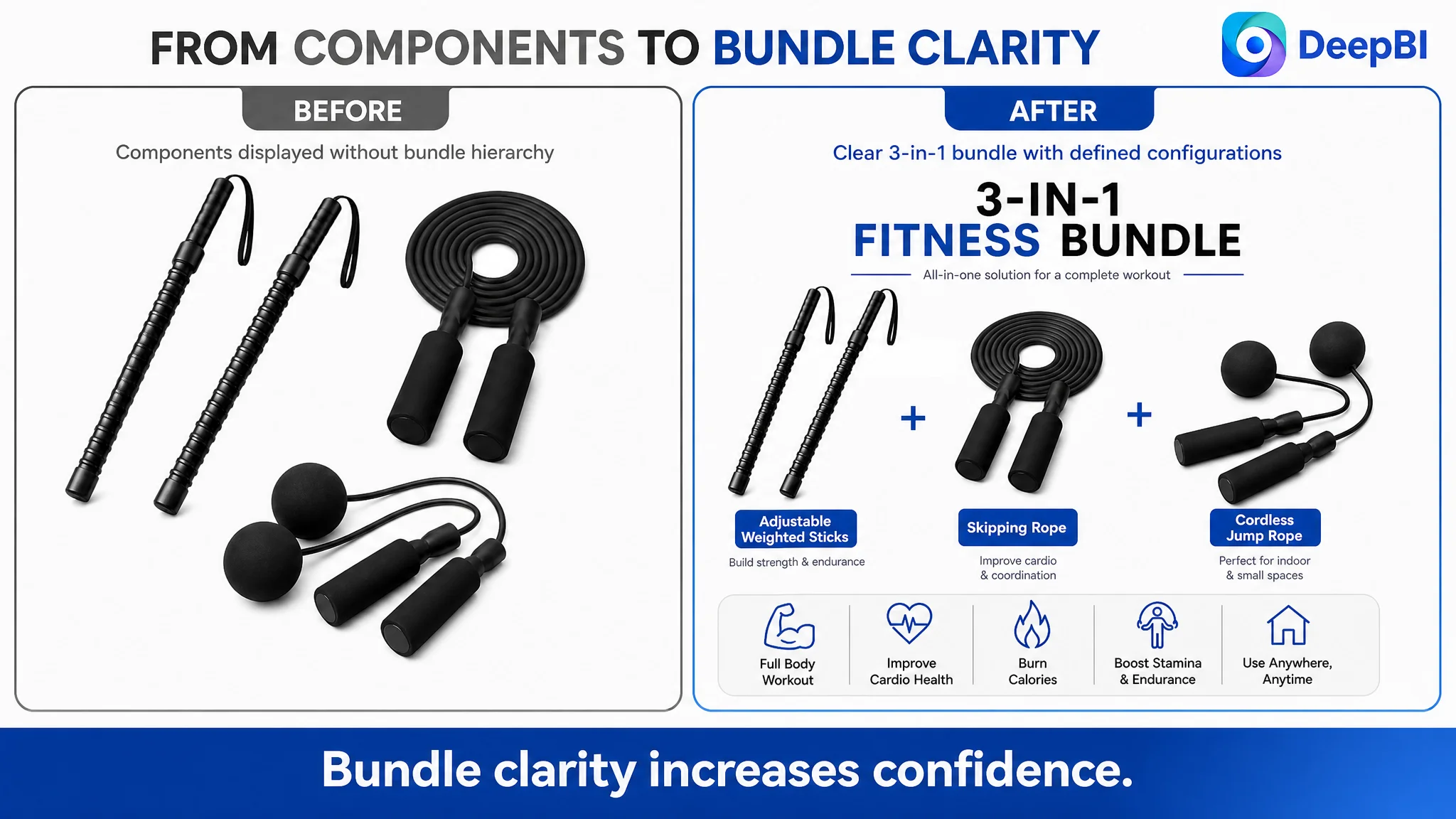
The first visual job was bundle confidence
The first image needed to make the three-in-one configuration unmistakable while staying within Amazon's main-image requirements. The shopper should not have to infer whether the displayed components formed a complete fitness system or were separate accessories.
The visual direction was to move from basic component confirmation toward immediate bundle clarity and product positioning.
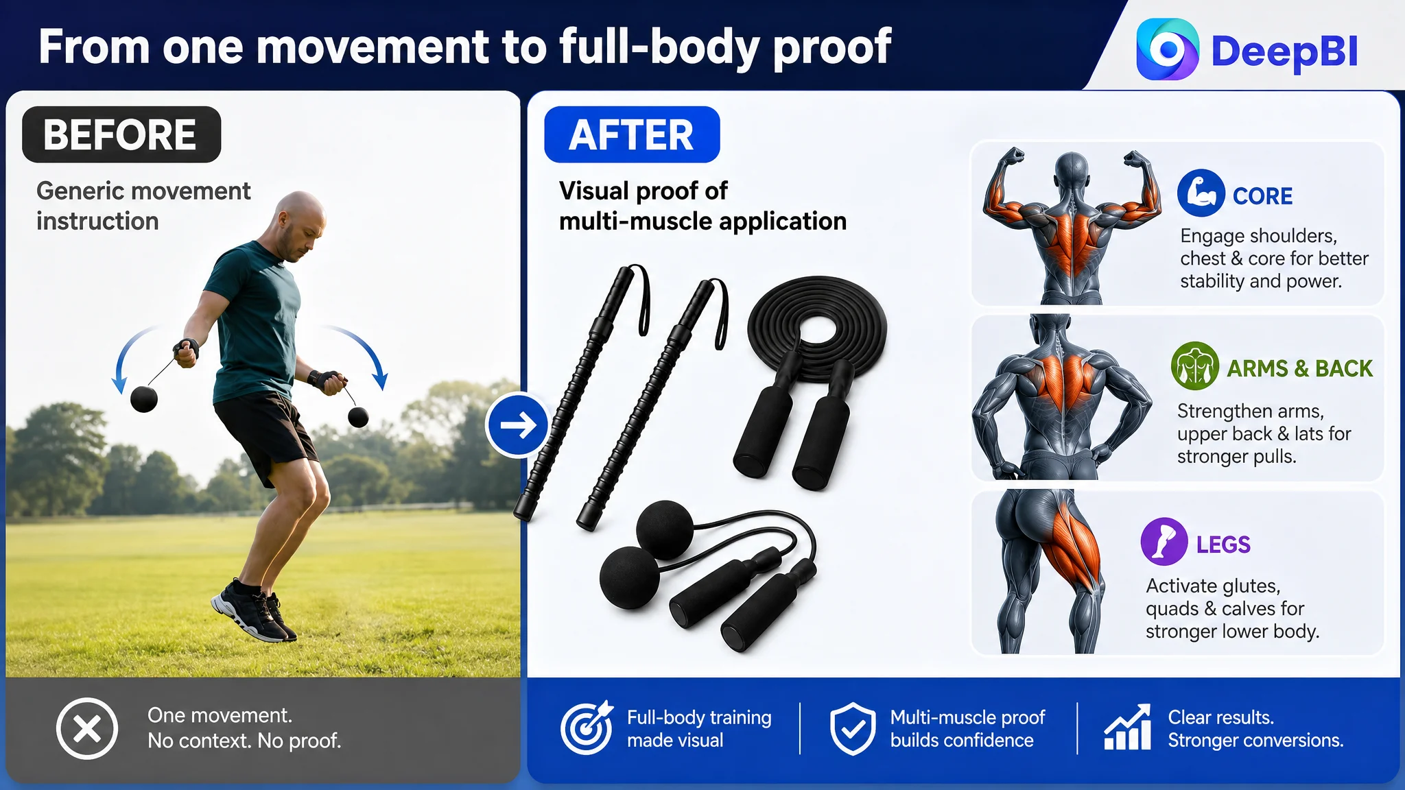
The second visual job was to show how resistance works
The existing image relied heavily on text and general claims such as building strength. It did not resolve the practical question: how can a cordless product create a meaningful workout?
The improved direction focused on the visible resistance mechanism, weighted components, and physical movement logic that the product actually supports. The purpose was not to invent technical specifications, but to make the existing function easier to understand.
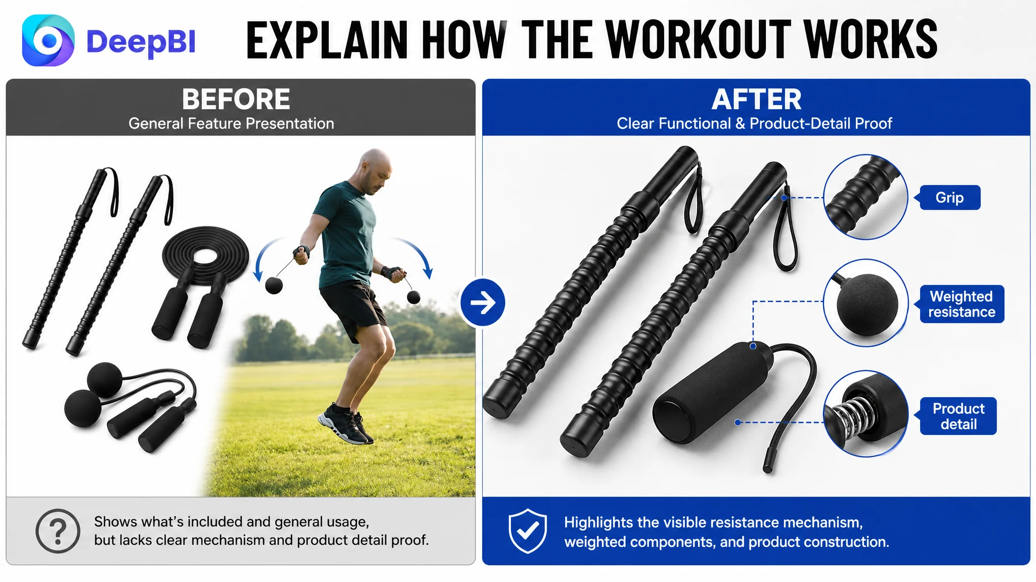
The third visual job was muscle activation proof
The image sequence showed a general swing or instructional posture, but this did not fully communicate versatility. A shopper interested in full-body training needed to see how different movements could engage the arms, shoulders, back, core, and legs.
The proposed direction used movement-based visuals and muscle-group mapping to turn “full-body workout” from a broad claim into a more concrete application story.
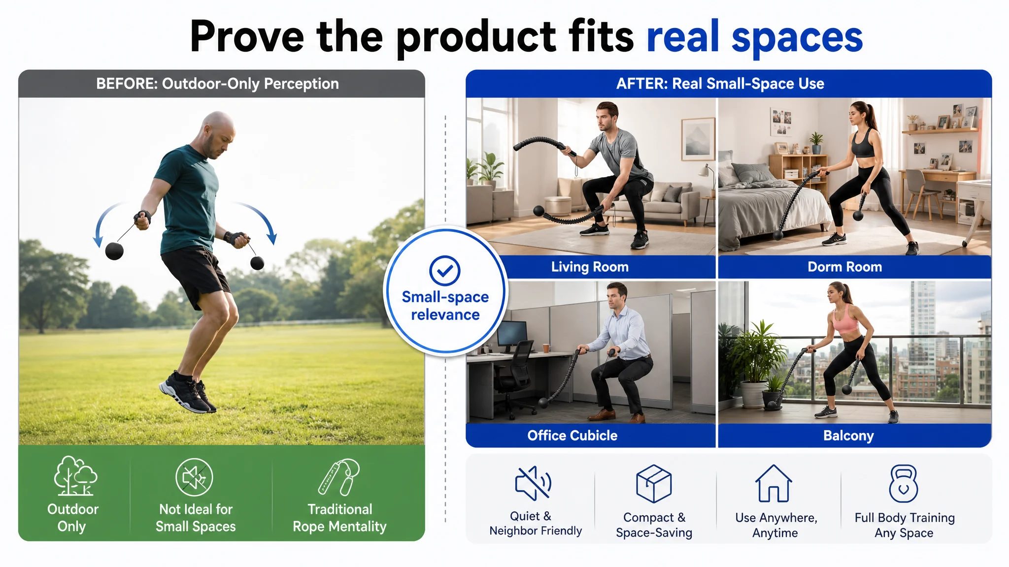
The fourth visual job was to remove the small-space objection
An outdoor scene did not answer whether the product could work in a living room, bedroom, office, dormitory, or apartment. For a ropeless battle rope, that was a central purchase concern.
The image sequence needed to demonstrate the product's relevance in compact indoor environments and shared living spaces. The point was not to make the product look more lifestyle-oriented. It was to prove that the ropeless design solved the space and noise problems associated with traditional ropes.
The fifth visual job was material trust
An instructional poster occupied a valuable visual position but did not contribute enough to purchase confidence. That kind of training guidance could be moved into A+ content.
The image slot was better used for close-up evidence of the spiral-textured handles, weighted ball materials, bearing assembly, and reinforced construction already associated with the product. These details supported the durability claim without changing the product's physical identity.
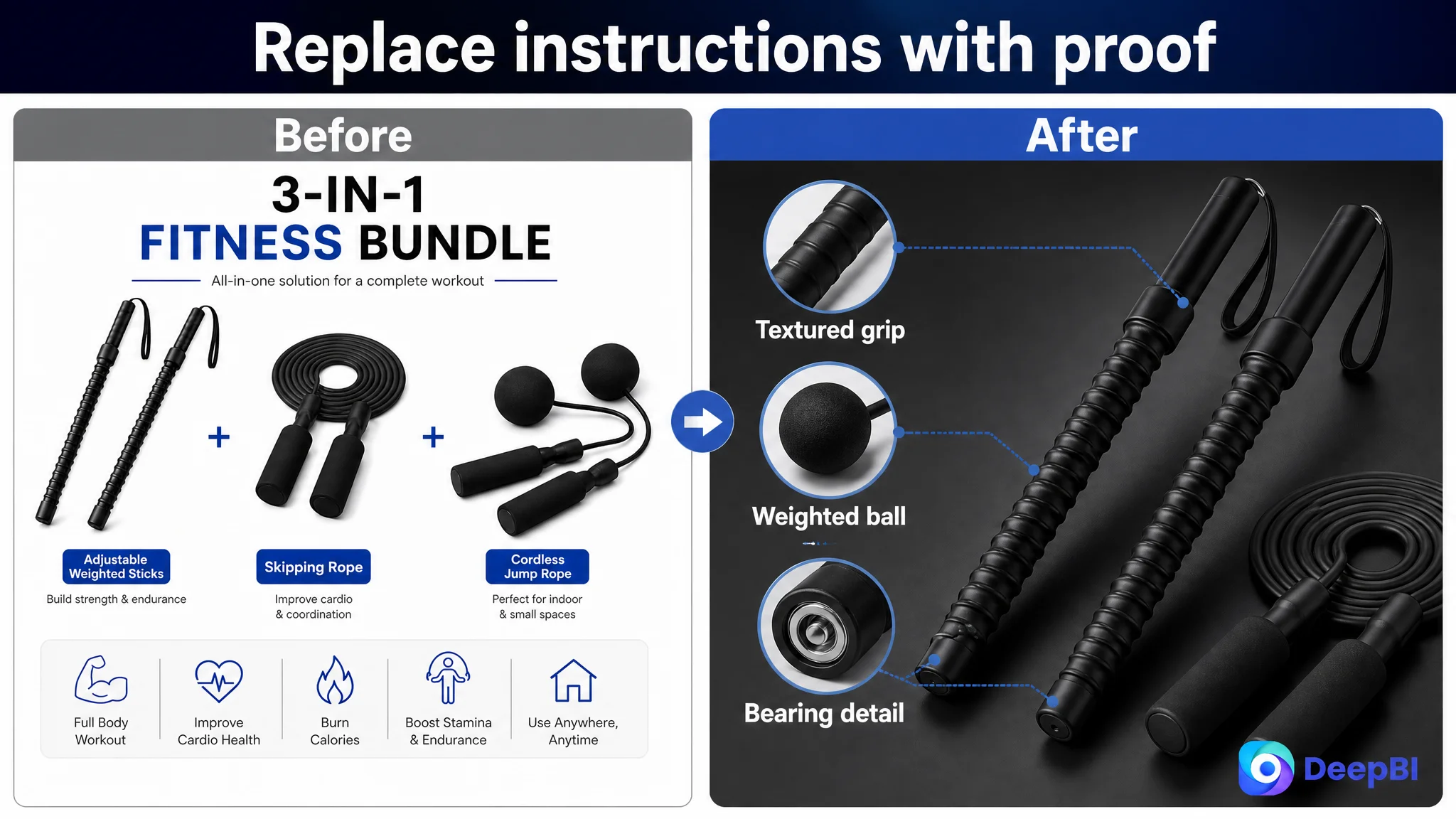
The image problem was not primarily aesthetic. Each image was being assigned the wrong commercial role.
The Bullet Points Had Features, but Not a Pain-Point-to-Solution Path
The bullet points mentioned functions such as anti-slip grip, anti-tangle design, rotation, and weighted training. However, the structure remained closer to a feature list than a decision path.
The comparable Listing performed better because it started with the problems buyers were likely trying to solve:
- Traditional ropes require more space
- Some training environments are noisy
- Resistance needs to adapt to different fitness levels
- Users want a stable grip and safer movement
- The equipment should support organized training
The recommended bullet-point direction followed the same logic while remaining grounded in the product's confirmed attributes.
From “weighted” to a training-use explanation
The product's approximate 1.5-pound weight per unit could be connected to resistance and portability. That made the specification relevant to the shopper's decision: substantial enough to create a challenge, but compact enough for travel and home use.
From “anti-slip handle” to workout security
The spiral-textured, sweat-absorbing handle should be presented as a response to grip instability during intense intervals, rather than as an isolated material detail.
From “full-body training” to specific muscle groups
The copy needed to identify the arms, shoulders, back, core, and legs as active areas, while avoiding vague claims such as “maximum results” or unsupported performance promises.
From “360-degree rotation” to apartment-friendly use
The rotation and bearing design became more persuasive when connected to smooth movement, fewer tangles, and suitability for small spaces.
From “instructions included” to safer training progression
The final bullet could support both beginners and experienced users through secure components, wrist straps, and guided training materials. This gave the product a clearer role across different fitness levels.
The core change was structural:
Every bullet had to connect a buyer concern to a product-backed answer.
The A+ Content Stopped at Feature Explanation
The existing A+ structure included:
- Three-in-one bundle overview
- Reasons to choose the product
- Key benefits
- Feature breakdown
- How it works
- Problem and solution
- Everyday progress
These modules were not useless. The problem was that they repeated high-level information without moving the shopper toward deeper confidence.
The comparable Listing used a more persuasive progression:
- Brand and product introduction
- Core features
- Multiple usage scenarios
- Detail-focused material proof
- Direct comparison with traditional ropes
- Muscle-specific training applications
DeepBI's recommendation was to change the A+ content from “what the product includes” to “why the product works for this buyer.”
Lead with the problem the ropeless design solves
The first A+ module should connect the three-in-one bundle and ropeless format to concrete problems:
- Traditional ropes take up space
- Rope impact can disturb nearby people
- Some home environments cannot accommodate large equipment
- Users want a portable way to combine cardio and strength training
This positioning established the product's reason for existing before introducing detailed features.
Move durability from a claim to visual evidence
Material and construction details such as reinforced materials, the steel cable core, foam grip, and bearing-supported rotation needed to become an early trust-building node.
A shopper does not automatically accept “built to last.” Close-up visual proof gives that claim a rational foundation.
Validate apartment and office use before giving instructions
The existing walkthrough focused on how to operate the equipment. But after seeing the product overview, the shopper still needed evidence that it could be used without taking over a room or disturbing others.
Scenario content for home, apartment, office, small spaces, gym, and outdoor use should therefore appear earlier. Generic instructions could be moved lower in the page or condensed.
Use comparison to resolve the traditional-rope objection
The existing problem-and-solution module had a sound idea but appeared too late and remained somewhat abstract.
A clearer comparison should place the compact, quiet, cordless format against the bulk, noise, and space demands of traditional ropes. The goal was not to attack an alternative product category. It was to make the switching reason visible.
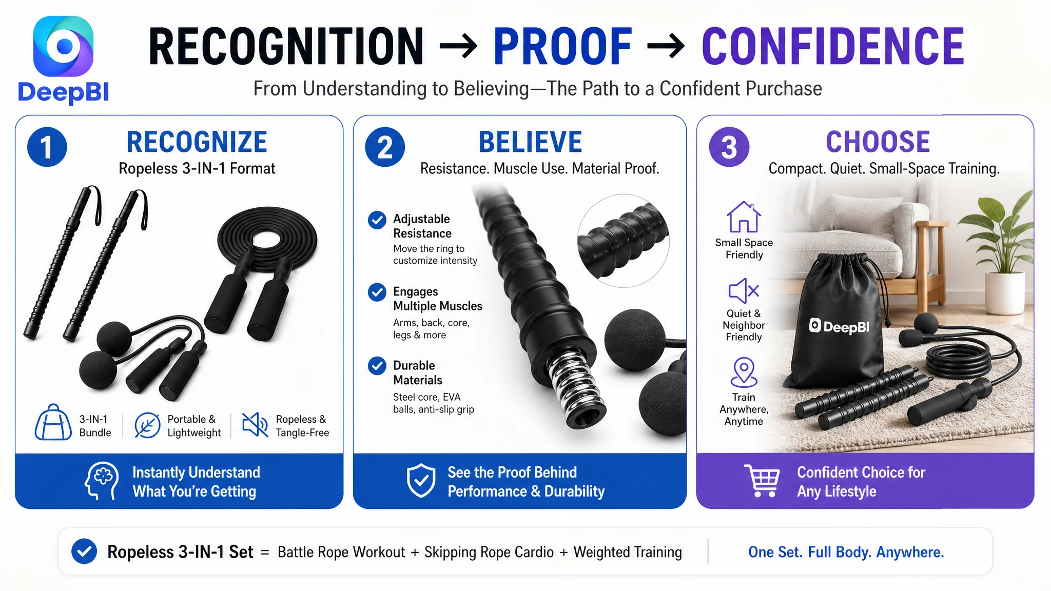
Prove muscle-group use instead of assuming it
The page stated or implied full-body utility, but it did not sufficiently demonstrate how the weighted handles could train specific areas.
The revised A+ path would add focused proof for:
- Shoulders and arms
- Back
- Core
- Legs and combined movements
This was particularly important because shoppers may understand how a traditional battle rope works but remain uncertain about whether a cordless design can provide comparable training value.
Why DeepBI Did Not Recommend Tuning Ads First
The case did not justify treating advertising as the first repair point. The more immediate issue was whether the product page could make paid traffic useful.
Continuing to adjust bids, keywords, or campaign structure before repairing the Listing would carry several risks:
- More traffic could reach a page with weak trust signals
- A low-conversion page could make ad efficiency appear worse than the traffic quality actually was
- The team could mistake page-level hesitation for a keyword or bid problem
- Additional spend could amplify the lack of reviews and weak product proof
- Repeated ad changes could create noise without resolving the underlying constraint
This did not mean advertising was unimportant. Amazon ads remained essential for generating visibility and collecting market signals. But ads could not supply the missing explanation of how the product works, why it fits an apartment, or why it deserves trust.
The correct order was to improve the page's ability to convert relevant traffic, then evaluate whether advertising signals became more useful.
Advertising can bring a shopper to the Listing. It cannot complete a product explanation the page has not built.
The Optimization Direction Became More Specific
The later plan focused on a coordinated change across the Amazon Listing rather than isolated edits.
The title would prioritize the product form, portability, weighted format, home-gym use, and relevant training scenarios.
The bullet points would move from feature accumulation toward a sequence of pain points and solutions:
- Portable resistance without bulky traditional ropes
- Ergonomic grip and adjustable intensity
- Full-body HIIT and cardio application
- Quiet, tangle-free use in small spaces
- Safety and suitability across fitness levels
The image sequence would be rebuilt around decision roles:
- Confirm the complete bundle
- Show the resistance mechanism
- Prove muscle activation and movement variety
- Demonstrate indoor and compact-space use
- Establish material and construction trust
The A+ content would then carry the deeper story:
- Why ropeless training matters
- How the product supports full-body workouts
- How the materials and components support repeated use
- How the product compares with traditional ropes
- How different movements target different muscle groups
The important point was not the number of assets changed. It was that title, images, bullets, and A+ content would finally communicate the same product logic.
What Changed in the Team's Business Understanding
The case material does not include verified post-optimization metrics, so it would be inappropriate to claim a specific CVR increase, ACOS decline, or organic-order recovery.
The more defensible change was in operating judgment.
The team could now distinguish between:
- Traffic acquisition and traffic conversion
- Product explanation and product persuasion
- Feature visibility and buyer reassurance
- A missing review base and fixable Listing weaknesses
- An ad symptom and a page-level constraint
The Listing still faced a serious social-proof disadvantage because it had no reviews. But the diagnosis showed that review scarcity was not a reason to leave the rest of the page underdeveloped. It made every improvement in title clarity, visual proof, scenario relevance, and A+ depth more important.
For Amazon sellers, this is the practical takeaway:
- A high ad cost does not automatically mean the campaign is the first problem
- A low conversion rate should be examined alongside Listing quality
- A product with an unfamiliar format needs stronger mechanism and use-case proof
- Main images should create attention and reduce doubt, not merely display components
- Bullet points should answer buyer concerns in a deliberate order
- A+ content should demonstrate value, trust, and application rather than repeat features
- Reviews are important, but they should not become an excuse to ignore controllable page weaknesses
- Before scaling Amazon ads, assess whether the product page is ready to convert the traffic
The Real Constraint Was Not More Traffic
This ropeless battle rope Listing did not need a larger volume of undirected information. It needed a clearer commercial argument.
The customer initially approached the page through functions, instructions, and general fitness claims. DeepBI reframed the problem around conversion capacity: could the Listing quickly prove what the product was, why the ropeless format mattered, how resistance and movement worked, where it could be used, and which concerns it solved?
Once the question changed, the optimization order became clearer.
The work was no longer “make the images better” or “add more features.” It was to ensure that every major Amazon Listing element performed a distinct role in helping the shopper move from recognition to confidence.
That is also why ad optimization could not come first. Until the product page could explain and substantiate the offer, more traffic would only make the underlying weakness more visible.
The page did not need to look busier. It needed to make the purchase decision easier.