

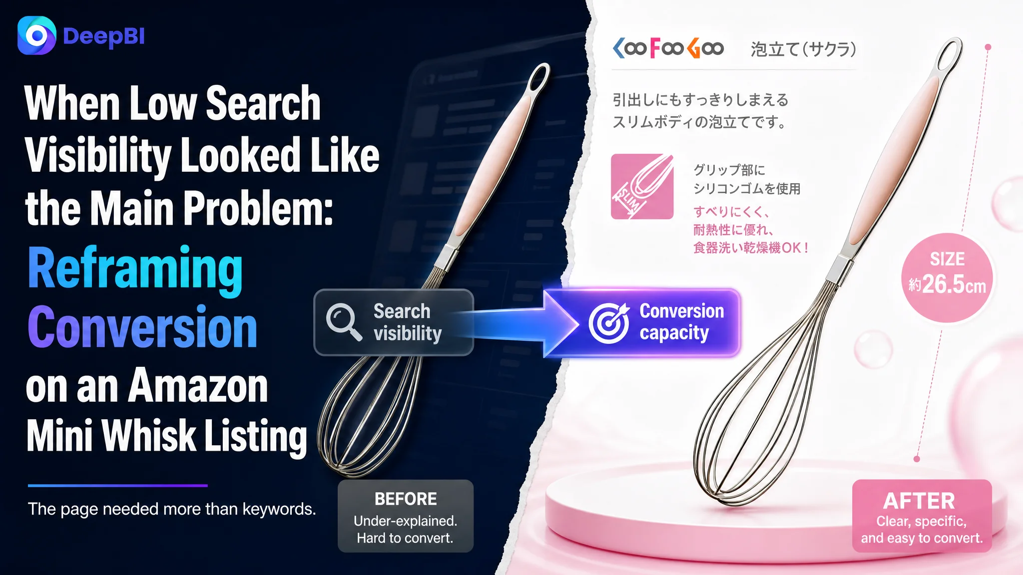
An Amazon kitchen-tool seller came to a familiar product-page problem: the Listing was barely competitive in search, and the product detail page gave shoppers very little reason to continue toward purchase. The initial optimization direction naturally leaned toward keywords, title structure, and clearer product specifications.
That diagnosis was incomplete. DeepBI’s comparison showed that the issue was not only that the Amazon title lacked search coverage. The larger constraint was that the entire product page had too little conversion capacity: the main image did not establish value quickly, the bullet points listed facts without a buying logic, the A+ section was missing, and the Listing had no meaningful review foundation.
The later optimization therefore focused on rebuilding the Amazon product page as a decision path. The title had to clarify product identity and use cases, the images had to answer practical questions at a glance, the bullet points had to connect materials and specifications to customer concerns, and the A+ content had to restore the trust layer that the page lacked.
For other Amazon sellers, the case offers a useful warning: when a Listing has weak search visibility, improving keywords may be necessary, but it does not automatically make the resulting traffic valuable. Before increasing exposure or relying more heavily on Amazon ads, sellers need to determine whether the product page can convert the attention it receives.
The Listing Was Not Losing on One Field
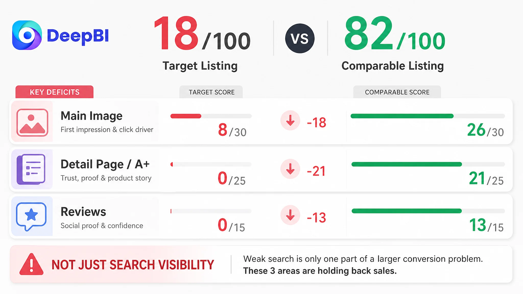
The customer’s Amazon Listing received an overall score of 18 out of 100, compared with 82 out of 100 for a comparable high-performing mini whisk Listing.
The gap was not concentrated in a single text field.
- Title: Target Listing: 8/20, Comparable Listing: 15/20, Gap: -7
- Main image: Target Listing: 8/30, Comparable Listing: 26/30, Gap: -18
- Bullet points: Target Listing: 2/10, Comparable Listing: 7/10, Gap: -5
- Detail page and A+: Target Listing: 0/25, Comparable Listing: 21/25, Gap: -21
- Reviews: Target Listing: 0/15, Comparable Listing: 13/15, Gap: -13
- Total: Target Listing: 18/100, Comparable Listing: 82/100, Gap: -64
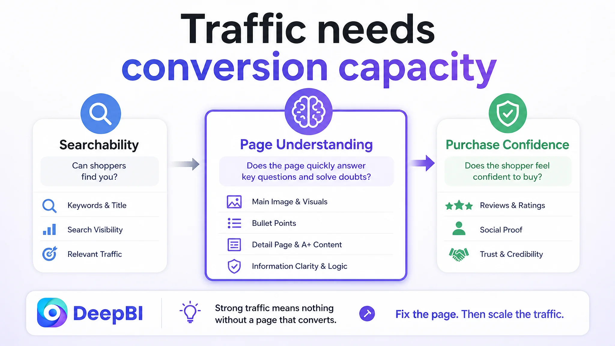
The numbers pointed to a broader business problem.
The title had limited search coverage, but the main image and detail-page gaps were even larger. The bullet points contained basic specifications, but they did not explain why those specifications mattered. The Listing had no A+ content, no meaningful visual sequence after the main image, and no effective review support.
The page did not merely need more information. It needed a more complete reason for a shopper to buy.
This distinction mattered because each weak element affected a different stage of the Amazon conversion path:
- The title influenced whether shoppers could find and understand the product.
- The main image influenced whether the product earned attention on the search page.
- The bullet points shaped product understanding and objection handling.
- A+ content helped build confidence after the click.
- Reviews provided social proof when shoppers compared alternatives.
Treating these as unrelated editing tasks would have left the central problem unresolved.
The Initial Diagnosis Stopped at Searchability
The original product title began with a brand and model reference. It did not lead with the core category term or clearly communicate the product’s use cases, material, size, or functional value.
That made a keyword-focused diagnosis understandable. Search terms such as whisk, mini whisk, wire whisk, and stainless steel whisk were either missing or insufficiently prioritized. A title revision was clearly needed.
But search coverage was only the first layer of the problem.
A buyer who reached the page still had to answer several basic questions:
- What exactly is this product?
- How large is it?
- What is it made from?
- Is it durable enough for repeated use?
- Can it be used with hot ingredients?
- Will the handle feel secure?
- What kinds of kitchen tasks is it designed for?
- Why should it be chosen instead of another small whisk?
The existing Listing did not answer those questions in a connected way.
The initial direction therefore risked turning the page into a more searchable version of the same weak sales argument. More relevant keywords could improve discoverability, but they would not by themselves solve the lack of visual proof, functional context, or trust.
“A stronger search term can bring a shopper to the page. It cannot, by itself, give that shopper a reason to stay.”
The Main Image Was a Conversion Bottleneck, Not Just a Design Issue
The main image scored 8 out of 30, a much wider gap than the title.
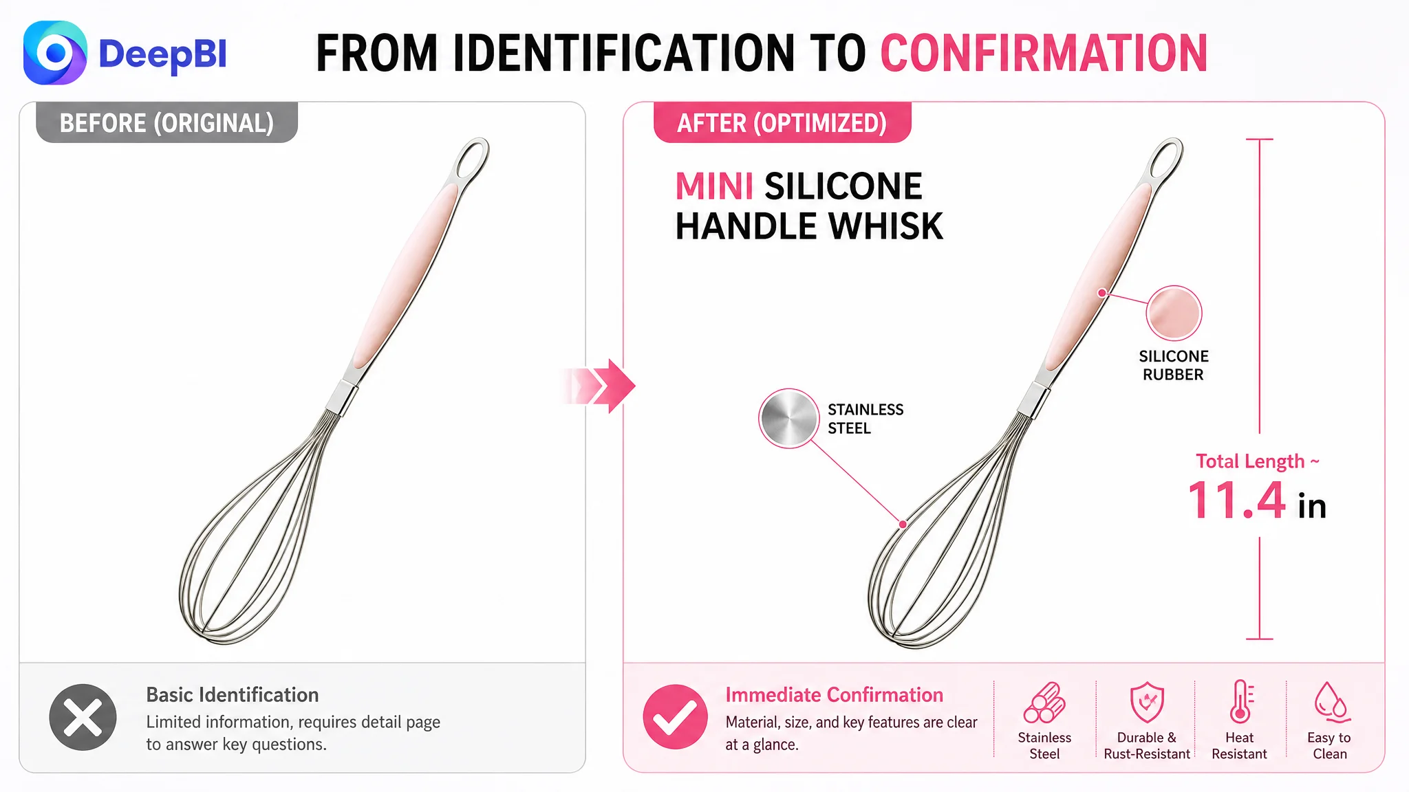
That score reflected more than an aesthetic difference. The existing visual treatment behaved mainly as basic product identification. It did not provide enough decision-making information for a shopper scanning an Amazon search page.
The comparable Listing used its visual assets to establish several points quickly:
- The product category and mini format
- The quantity and size options
- The stainless-steel material
- A more professional sense of product quality
- Practical benefits such as heat resistance and cleaning convenience
- A clearer distinction from weaker alternatives
The target Listing left much of this to the text, and some of it was not communicated at all.
This created two separate risks.
The click was not strongly earned
On Amazon, the main image is often the first meaningful contact between the shopper and the product. A plain product presentation can make the item difficult to distinguish from similar kitchen tools, especially when the category contains many visually interchangeable products.
The issue was not that the image needed to become decorative. It needed to become more informative within Amazon’s image requirements and product-identity context.
The optimization direction was to make the product’s size, material, handle construction, and intended use easier to understand through clearer composition and supporting image sequencing.
The click was not adequately supported afterward
Even if a shopper opened the Listing, the page still lacked visual confirmation of the product’s value. There were no scenario images showing small-batch mixing or frothing tasks, no clear structure-focused detail images, and no visual sequence that moved from product identity to practical reassurance.
That meant the page asked shoppers to trust unproven claims.
The real weakness was not “the image looks ordinary.” It was that the image system failed to reduce uncertainty.
The Bullet Points Had Facts, but Not a Buying Logic
The bullet-point score was 2 out of 10.
The existing bullets focused on dimensions, weight, and material. Those details were not useless, but they were presented in a specification-first format that left the customer to interpret the benefits.
The comparable Listing followed a more persuasive sequence:
1. Address the concern about flimsy or rust-prone whisks.
2. Connect material choice with durability and performance.
3. Explain the product’s use across sauces, eggs, hot chocolate, and other tasks.
4. Show the convenience of cleaning and storage.
5. Reinforce overall product quality and customer reassurance.
This structure transformed product attributes into answers to common buying concerns.
For the target Listing, the same principle meant reframing verifiable product information around the product’s actual characteristics:
Stainless steel should explain reliability
The metal construction could support a durability and rust-resistance message. The point was not to use stronger language for its own sake, but to explain why the material mattered during repeated mixing.
The silicone rubber component should explain handling
The silicone rubber portion offered a meaningful product distinction. It could be connected to grip comfort and protection for non-stick pans or bowls, provided the final claims remained within the product’s confirmed properties.
The dimensions should explain use
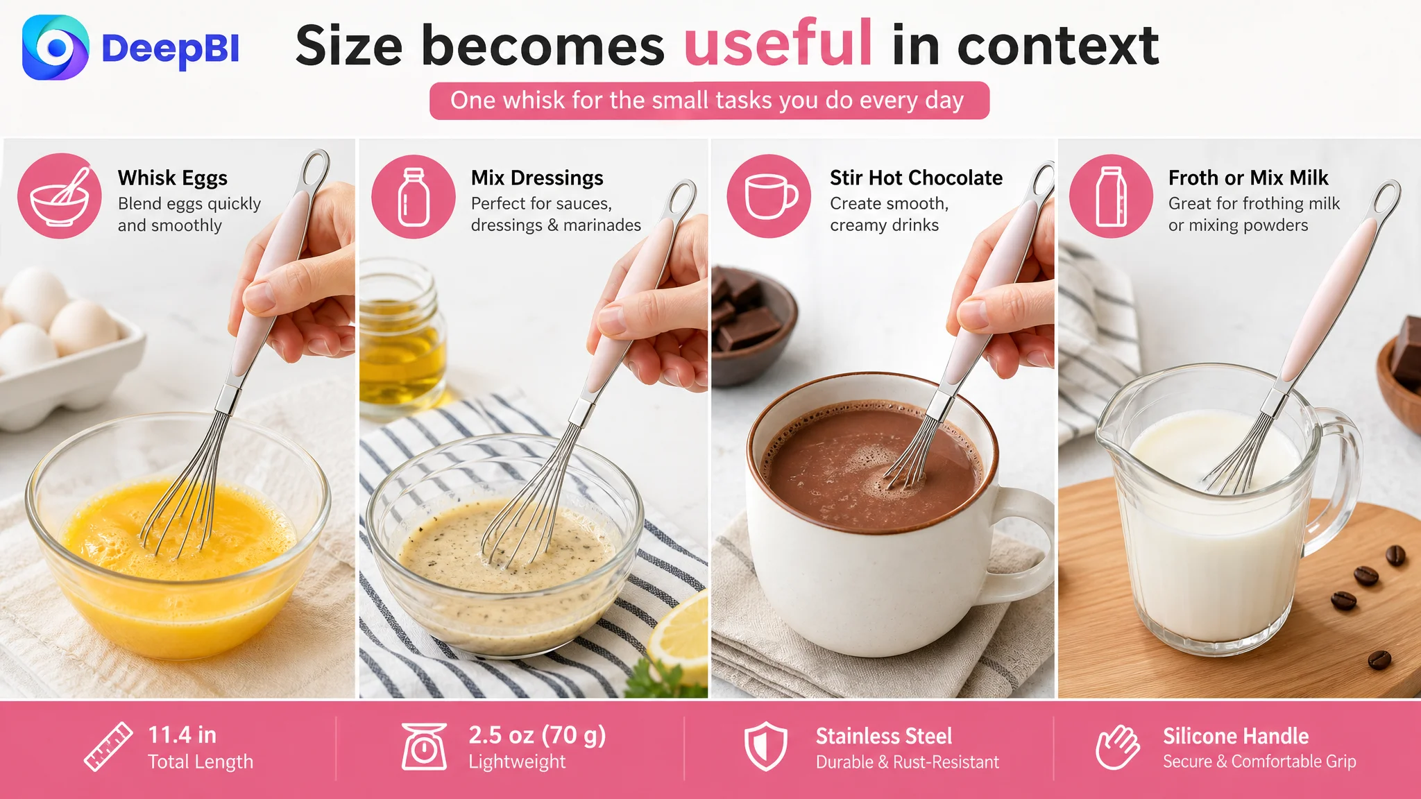
The approximate size of 11.4 by 2.2 inches could be connected to everyday tasks such as mixing sauces, whisking eggs, blending ingredients, or preparing hot chocolate. Specifications became more useful when tied to situations the buyer could recognize.
The weight should explain ease of use
At approximately 2.5 ounces, or 70 grams, the product could be positioned as lightweight for repeated handling. Again, the value came from translating the number into a user experience rather than leaving it as an isolated measurement.
Cleaning claims required evidence
The original recommendations included dishwasher-safe and easy-clean language in some areas. DeepBI’s deeper analysis also identified an important boundary: the available material confirmed stainless steel and silicone rubber, but did not provide sufficient proof for every cleaning or heat-resistance claim.
That distinction mattered.
A strong Amazon Listing cannot repair trust by replacing one vague claim with another unsupported claim. If a benefit is not confirmed by the source material or visual evidence, it should not be presented as an established product fact.
Missing A+ Content Removed the Trust Layer
The detail-page score was 0 out of 25 because the Listing had no image-rich detail sequence and no A+ content.
This was the largest structural weakness alongside the main-image gap.
The comparable Listing used a fuller content system to guide shoppers through several questions:
- What the product is
- What materials are used
- Whether the whisk head appears securely constructed
- How the product fits into small kitchen tasks
- How the size relates to usage
- What design details support handling and maintenance
The target Listing provided none of that visual progression.
For a small and relatively simple kitchen tool, that absence can be easy to underestimate. Sellers may assume that a whisk requires little explanation because its basic function is obvious. But a familiar product category can also be highly substitutable. When several products appear to perform the same task, buyers compare confidence, durability, comfort, and perceived value.
A+ content was therefore not being treated as decoration. It was needed to supply the missing logic between product recognition and purchase confidence.
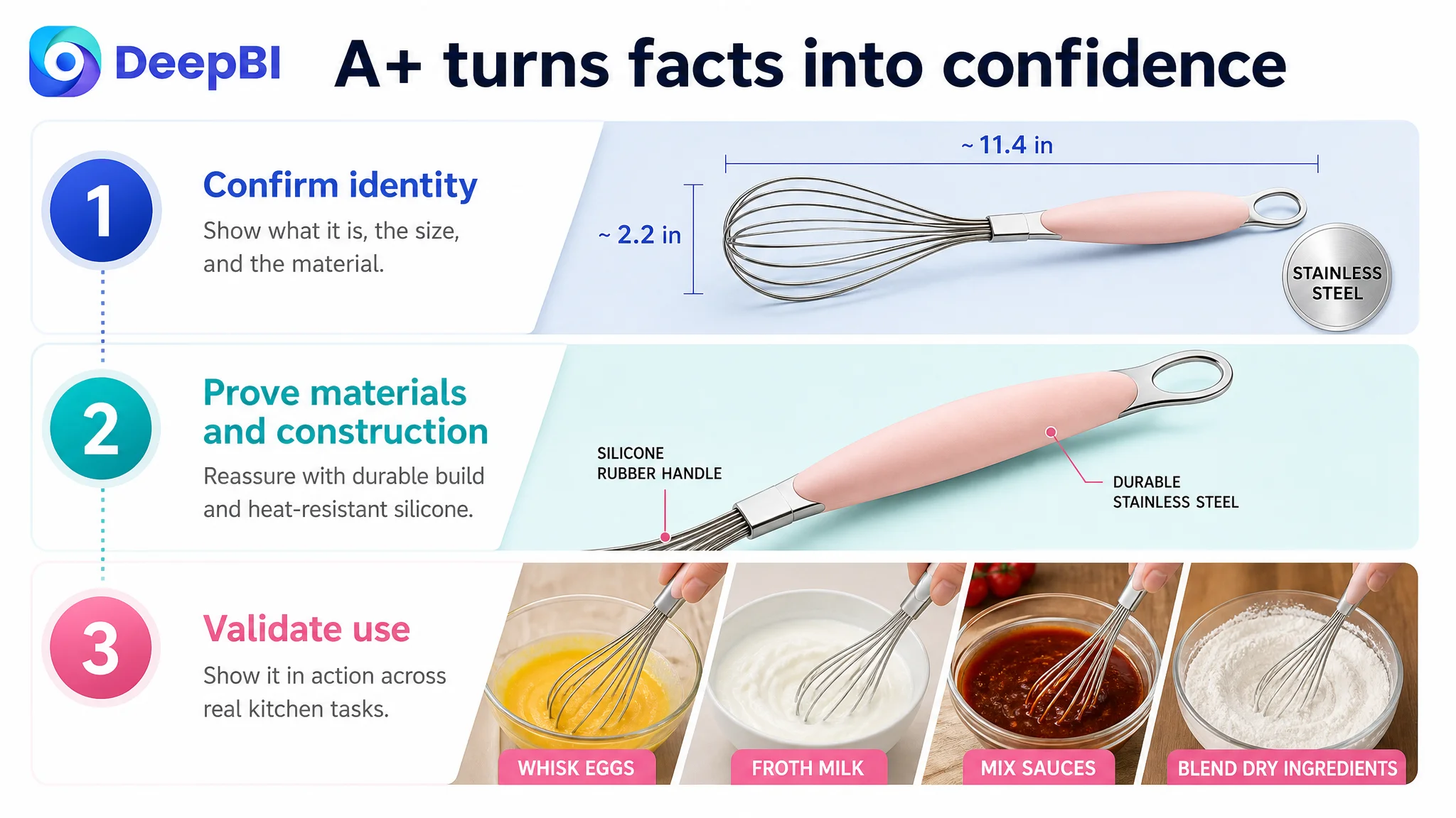
The first module should confirm identity
The opening content should establish the product category, approximate dimensions, and confirmed materials. It should remove ambiguity rather than repeat a broad brand or model reference.
The next modules should prove construction
Mini tools can trigger concerns about weak wires, loose attachments, or uncomfortable handles. Close-up imagery should show the actual whisk-head structure and the connection between the metal and handle components without inventing internal features.
Material should be connected to experience
The silicone rubber component should be presented as a functional part of the design, not merely as a material label. The benefit may relate to grip and surface protection, while the product’s actual boundaries remain clear.
Use cases should validate the mini positioning
The page should demonstrate where the product is useful: small-batch mixing, sauces, eggs, hot chocolate, or similar tasks supported by the available product information.
The goal is not to imply that a mini whisk replaces every full-size kitchen tool. The goal is to make its intended role clear.
The final module should confirm the facts
The page should close with a concise summary of the verified size, weight, and material information. That final confirmation can reduce hesitation without relying on inflated promises.
DeepBI’s role in this process was not to recommend more content indiscriminately. It was to identify the specific trust questions that each module needed to answer.
Reviews Were a Separate Trust Constraint
The Listing had no usable review foundation:
- Rating data: 0
- Total reviews: 0
- Homepage review count: 0
The comparable Listing had 4.6 stars and 2,294 reviews, with visible customer feedback and image-based experiences.
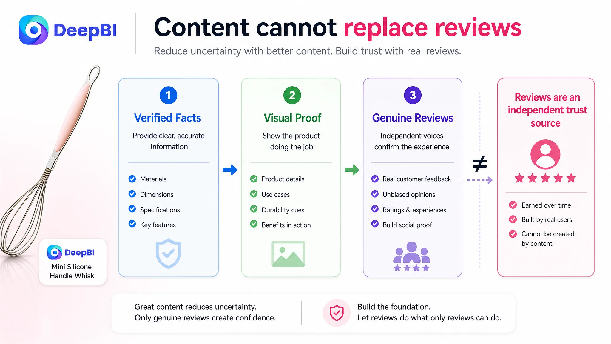
This gap could not be solved through title editing, image generation, or A+ design. Reviews are a separate commercial constraint, and the article should not imply that content optimization can replace genuine customer feedback.
But the review gap changed how the rest of the Listing needed to work.
When a product has limited social proof, the page must be especially clear about what can be verified directly:
- Material
- Dimensions
- Weight
- Construction
- Intended use
- Handling characteristics
- Product limitations
The visual and text content cannot create the same trust as authentic reviews. It can, however, prevent avoidable uncertainty from making the gap even more damaging.
A Listing with no review support has less room for vague copy, incomplete images, or unsupported claims.
Why the Team Should Not Keep Tuning Ads First
The case material does not provide post-optimization advertising results or a before-and-after ACOS, CTR, or CVR timeline. It therefore would be inaccurate to claim that ad campaigns had already been tuned repeatedly or that a specific ad adjustment caused a measurable result.
The decision logic is still clear.
If Amazon ads are used to send more shoppers to a page with an 18/100 Listing score, the traffic may expose the page’s weaknesses faster:
- Weak search-page presentation can limit clicks.
- Limited information can increase hesitation after the click.
- Missing A+ content leaves objections unresolved.
- No meaningful review foundation reduces confidence.
- Fact-only bullets make the customer do the persuasion work.
In that condition, ad optimization becomes difficult to evaluate. A campaign may appear inefficient when the deeper issue is that the page is not ready to receive more traffic.
“Advertising does not only amplify a product’s strengths. It can also amplify the outcome of an underprepared product page.”
That is why the priority was not to keep adjusting bids or campaign structure in isolation. The page first needed enough clarity and evidence to make incoming traffic commercially useful.
This did not mean advertising was irrelevant. It meant advertising had to be placed in the correct sequence:
1. Clarify what the product is and who it serves.
2. Improve the Listing’s ability to earn attention.
3. Build a connected path from product features to customer concerns.
4. Add visual proof and A+ structure where the page is currently empty.
5. Then evaluate whether paid traffic is being converted more effectively.
The fundamental judgment was about conversion capacity before traffic expansion.
The Optimization Direction Became More Precise
Once the problem was reframed, the optimization was no longer a list of isolated improvements.
It became a coordinated rebuild.
The title would open the correct search path
The recommended title direction introduced stronger category and use-case language, including terms related to stainless steel, milk frothing, coffee, mixing, blending, and the silicone rubber handle.
The purpose was not to copy a competitor’s wording. It was to replace a low-value model-led opening with product language that shoppers could search for and understand.
The image sequence would answer questions in order
The proposed image logic followed a decision sequence:
- Immediate product and material confirmation
- Focused quality and construction proof
- Real use-case validation
- Safety or capability communication only where supported
- Ergonomic and niche-use reassurance
This sequence gave each image a job. It also reduced the risk of asking one crowded image to communicate every benefit at once.
The bullets would move from specifications to outcomes
The five bullets would connect confirmed attributes to practical concerns:
- Stainless steel to durability
- Silicone rubber to handling and surface protection
- Dimensions to small-batch kitchen tasks
- Lightweight construction to reduced hand fatigue
- Overall design to quality reassurance
The writing could become more persuasive without becoming less factual.
A+ content would complete the story
The proposed A+ structure would fill the current zero-content gap with a seven-module sequence covering identity, construction, material, maintenance-related reassurance, use cases, distinct features, and final specification confirmation.
The key change was not the number of modules. It was the order of persuasion.
What Changed in the Business Understanding
Because the source material does not include post-optimization performance data, the case cannot claim a confirmed CVR increase, ACOS decline, recovery of organic orders, or improvement in keyword rankings.
The documented change is a change in operating judgment.
Before the diagnosis, the Listing could be approached as a searchability problem with several missing details. After the diagnosis, it was understood as a page-level conversion problem with search, visual, content, and trust failures working together.
That reframing changes how the Amazon seller should manage the product:
- The title is not only a keyword container; it is the first product-positioning signal.
- The main image is not only a product photo; it is an attention and confirmation point.
- Bullet points are not only specifications; they are a sequence for handling objections.
- A+ content is not optional decoration when the page has no other trust-building structure.
- Reviews cannot be replaced, but unclear content makes a review gap more damaging.
- Amazon ads should not be expected to compensate for a Listing that cannot yet convert traffic reliably.
The most important conclusion is straightforward:
“Before asking Amazon to send more traffic, the seller had to make the product page more capable of converting the traffic already available.”
For this mini whisk Listing, DeepBI’s value came from locating that constraint through a structured comparison rather than treating every weak field as an equal editing task. The work began with scores, but the useful outcome was the decision about what had to be fixed first.
That is the difference between making an Amazon Listing look more complete and making its sales logic more complete.