

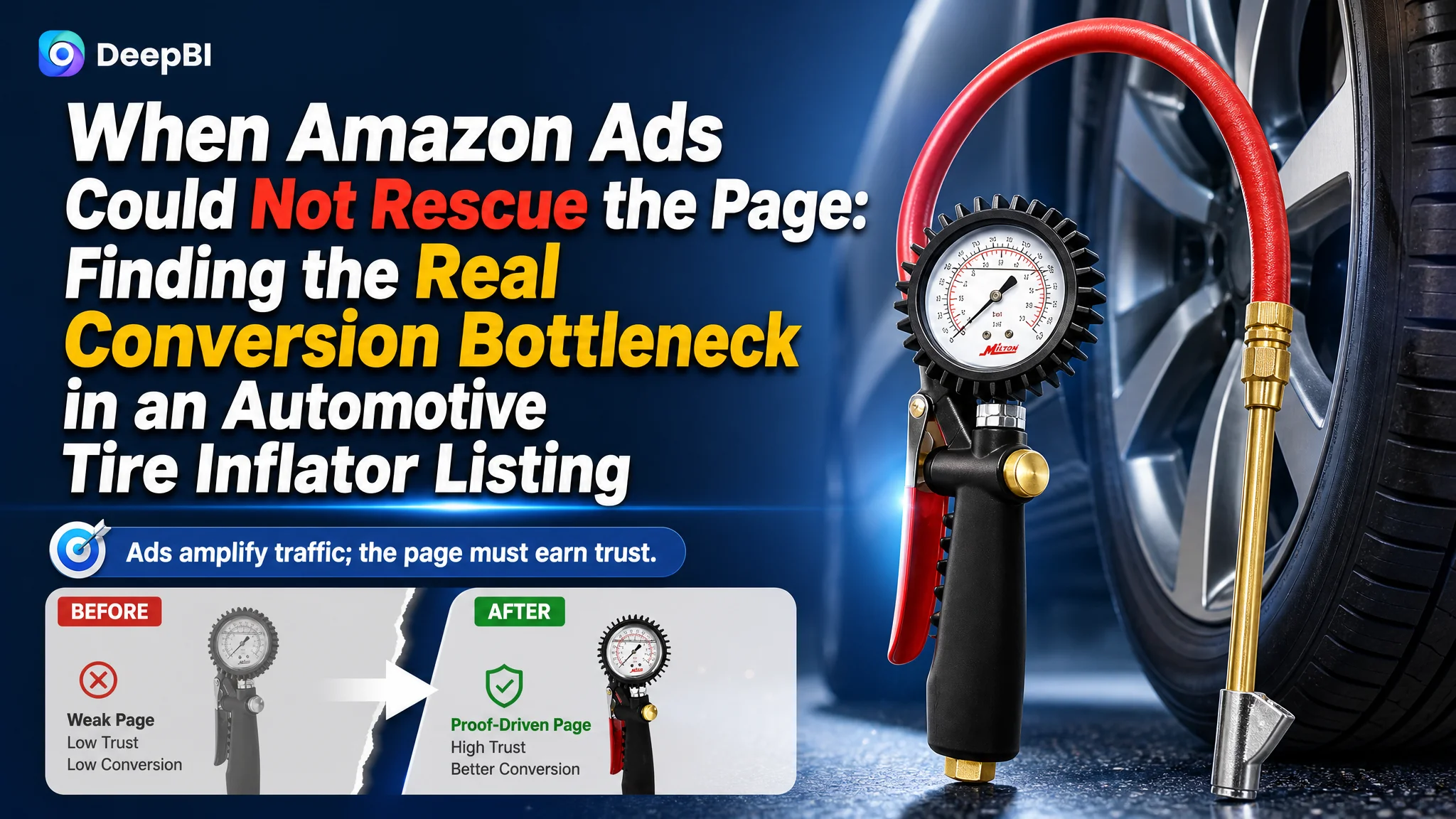
This case involved an Amazon US seller of a professional tire inflator with a pressure gauge. The customer was operating in a competitive automotive accessories category where search visibility alone was not enough: shoppers had to trust the tool’s accuracy, durability, connection security, and suitability for high-pressure work before placing an order.
The initial working assumption was that the Listing needed stronger keyword coverage and more specification-focused messaging. The title was reviewed, technical details were present, and the five bullet points already explained several product benefits. But DeepBI’s comparison showed that the central problem was not a lack of information. It was the product page’s inability to turn that information into confidence.
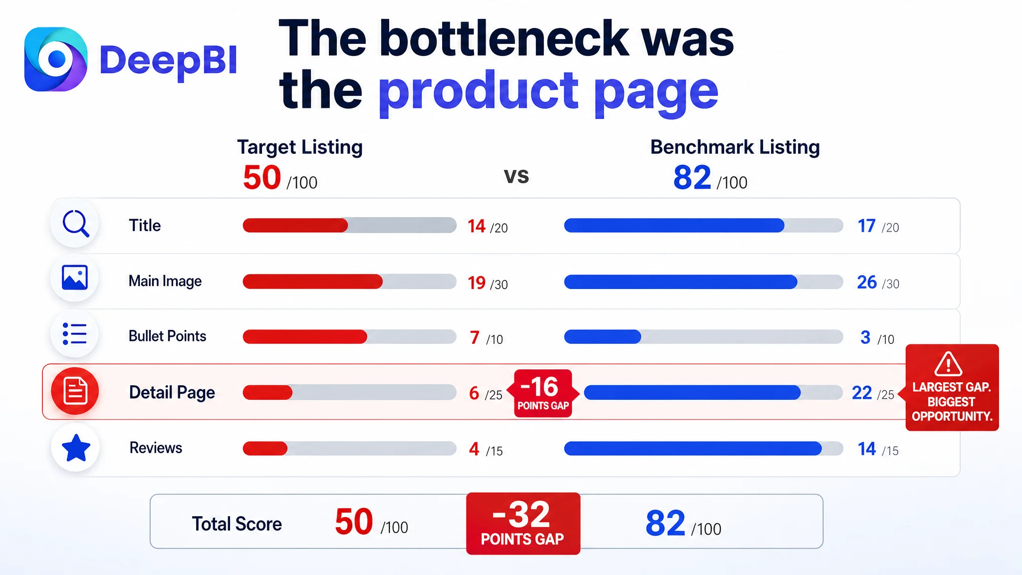
The target Amazon Listing scored 50 out of 100, compared with 82 for a closely matched benchmark listing. The largest gap was in the detail page: 6 points versus 22. The later optimization therefore focused on rebuilding the page’s sales logic through a stronger title structure, clearer visual proof, a more useful image sequence, and a seven-module A+ story. For other Amazon sellers, the lesson is direct: before increasing ad pressure, determine whether the product page is ready to convert the traffic it receives.
The Listing Did Not Lack Specifications. It Lacked Persuasion
At first glance, the product page appeared to contain many of the elements expected from a professional tire inflator.
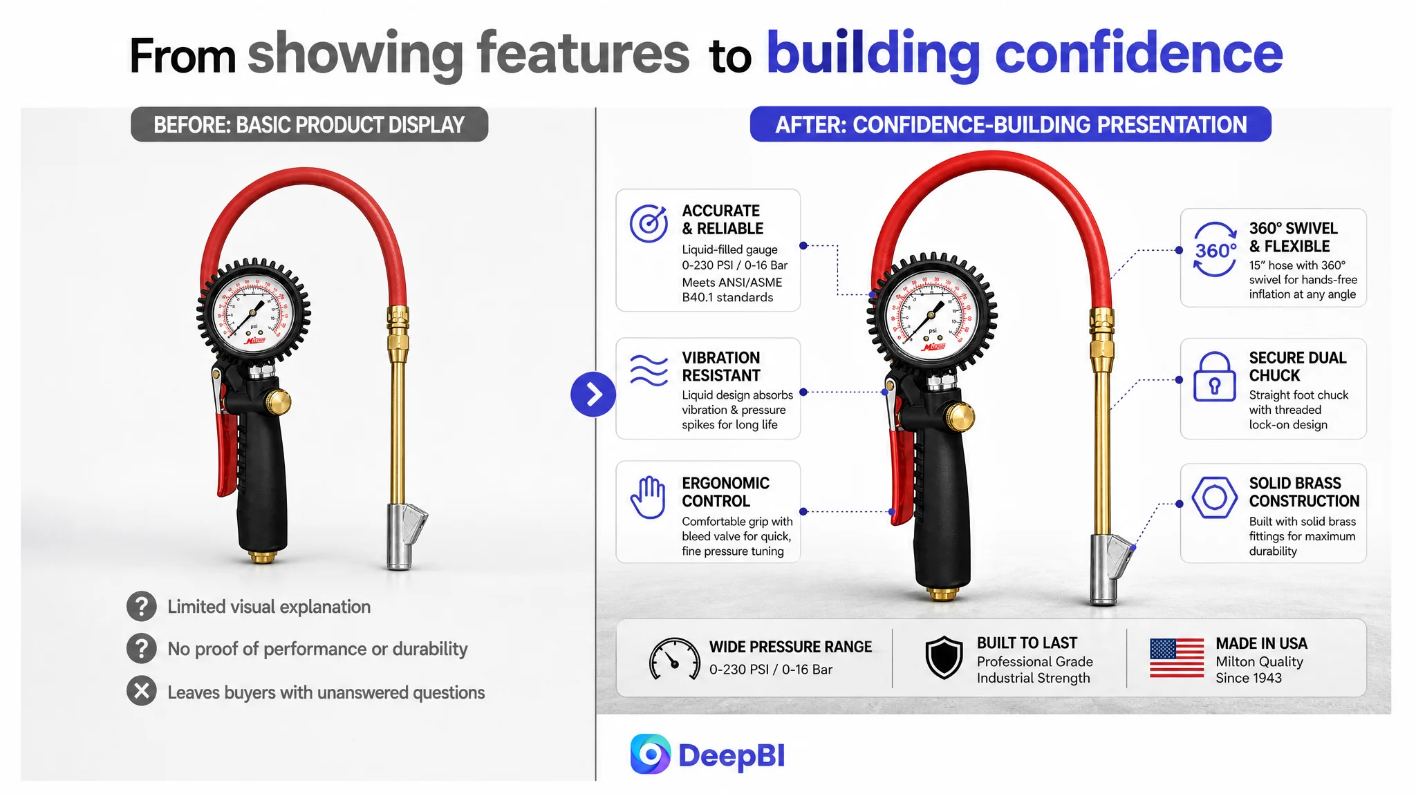
The title included product type, pressure range, hose length, chuck configuration, brand and model information. The bullet points discussed accuracy, vibration, ease of use, durability, fittings, and compatibility. The product itself had meaningful technical advantages, including:
- A liquid-filled pressure gauge
- A 0–230 PSI measurement range
- A 0–16 Bar range
- A straight dual chuck
- A 15-inch hose
- A 360-degree swivel function
- Solid brass fittings
- An ergonomic pistol grip
The issue was that these advantages were not arranged into a convincing Amazon product-page experience.
The page largely communicated, “Here are the specifications.” The benchmark listing communicated, “Here is why this tool is dependable in real use.”
The conversion problem was not an empty page. It was a page that made shoppers do too much of the selling work themselves.
That distinction mattered because automotive tools are often purchased under a practical risk calculation. Buyers want to know whether the gauge can be read accurately, whether the chuck will stay sealed, whether the hose allows comfortable handling, and whether the product will hold up under vibration and repeated use.
Those questions were not fully answered by a text-heavy Listing.
The Original Optimization Direction Stopped at Keywords and Features
The title gap was real, but it was not the whole problem.
The target title placed the core search term related to an analog tire inflator and pressure gauge too far behind the brand and model information. Functional terms such as “pistol grip” and the product type were also pushed later in the title. This weakened both search relevance and early shopper recognition.
The working response was therefore to improve keyword order and make the product attributes easier to identify. That was necessary, but it could not by itself solve the deeper issue.
A better title structure brought the product type and high-value attributes closer to the front:
- Analog tire inflator
- Pressure gauge
- Pistol grip
- Straight dual chuck
- 15-inch hose
- 160 PSI or related pressure specification
It also removed redundant brand wording, corrected punctuation, and replaced inconsistent measurement formatting.
This improved the Listing’s entry point. But a stronger title could only earn attention. It could not prove durability, explain the liquid-filled gauge, or reduce concern about air leakage and connection stability.
That is where the original optimization direction was incomplete. The team was improving the information that helped shoppers find the product, while the larger conversion constraint was the information that helped shoppers trust it.
The Score Gap Pointed to the Product Page, Not the Bullet Points
The dimension scores made the priority clearer:
- Title: Target Listing: 14, Benchmark Listing: 17, Gap: -3
- Main image: Target Listing: 19, Benchmark Listing: 26, Gap: -7
- Bullet points: Target Listing: 7, Benchmark Listing: 3, Gap: +4
- Detail page: Target Listing: 6, Benchmark Listing: 22, Gap: -16
- Reviews: Target Listing: 4, Benchmark Listing: 14, Gap: -10
- Total: Target Listing: 50, Benchmark Listing: 82, Gap: -32
The most important finding was that the target Listing’s bullet points were not the weakest area. In fact, they scored higher than the benchmark.
The bullet points used readable headline structures such as “ACCURATE” and “WHY LIQUID?” They explained user concerns including vibration, ease of handling, durability, measurement range, and recommended accessories. They also included concrete figures and technical specifications.
That did not mean the bullets required no improvement. They could still be refined around professional precision, ergonomic control, 360-degree swivel handling, and solid brass construction. But they were not the first constraint to address.
The detail page was.
The 16-point gap in the detail dimension represented a much larger commercial weakness than the three-point title gap. The product page had no meaningful image-led A+ structure. It relied primarily on repeated text and technical explanations, while the benchmark listing used a sequence of visual proof:
1. Brand and product identity
2. Full product overview
3. Feature-specific close-ups
4. Pressure and gauge readability
5. Real-use handling
6. Structural and connection details
7. Brand trust and performance confirmation
The target Listing had the product facts. It did not have the visual path that allowed shoppers to verify those facts quickly.
The Main Image Showed the Product, but Did Not Establish Its Quality
The first image created a minimal product impression. It showed the overall form, but it did not make the tool’s most important physical signals immediately clear.
The solid brass fittings were not visually prominent. The straight dual chuck was not presented as a meaningful usability or durability feature. The overall composition did not strongly communicate that this was a heavy-duty tool rather than a generic inflator accessory.
This matters in Amazon search results, where the main image has only a short window to establish product category, quality level, and relevance.
For this Listing, the main-image direction was not to make the product look artificially different. It was to make existing physical attributes easier to recognize:
- Show the full brass connection structure clearly
- Give the straight dual chuck enough visual emphasis
- Improve the product angle and scale
- Preserve the actual product geometry and materials
- Make the visual language consistent with professional automotive use
The goal was not decoration. It was initial risk reduction.
A shopper comparing several tire inflators should not have to open the detail page and inspect every image before understanding that one product is built around solid fittings, a professional gauge, and a secure chuck connection.
The Gauge Image Created Confusion Instead of Technical Trust
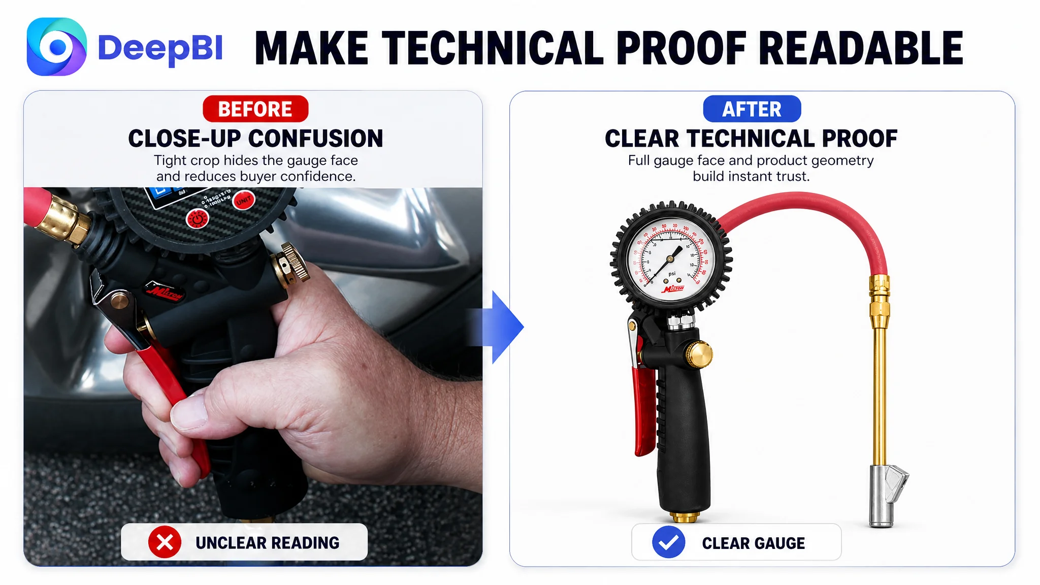
The second image focused tightly on the grip and part of the gauge. The close-up was not sufficiently informative, and some visible markings could create confusion about whether the product was digital or analog.
More importantly, the image did not explain why the liquid-filled gauge mattered.
For a professional tool, “accurate” is not enough as a claim. The page needs to connect accuracy with a recognizable design advantage. The liquid-filled construction could be positioned around its ability to absorb vibration and pressure spikes, reduce internal wear, and maintain more stable readings in demanding environments.
That logic became a visual communication task:
- Show the gauge face clearly
- Make the PSI and Bar ranges easy to confirm
- Present the liquid-filled design as a functional benefit
- Connect the gauge to vibration resistance and reading stability
- Support the accuracy message with the stated ANSI/ASME B40.1 standard
This is the difference between displaying a specification and explaining its commercial meaning.
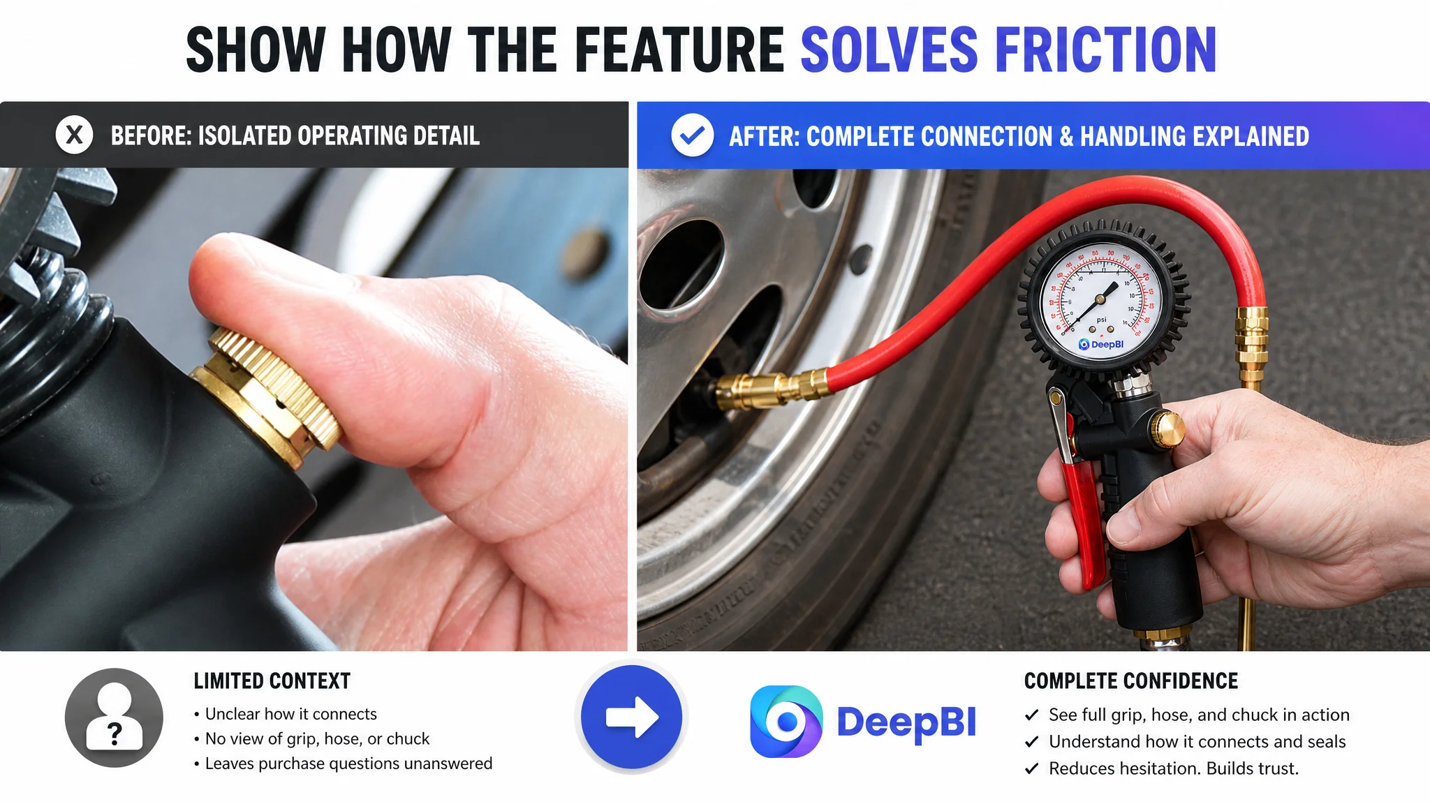
The Product Had Usability Advantages, but the Images Did Not Demonstrate Them
The third image showed a small operating detail without enough context. A close-up of a hand or dial did not answer the buyer’s more practical questions:
- How is the tool held during use?
- Can the user make fine pressure adjustments?
- Does the chuck stay connected?
- Can the hose move without forcing the valve?
- Is the tool comfortable during higher-pressure inflation?
The Listing already had useful answers in its product design and bullet points. The 360-degree swivel, 15-inch flexible hose, threaded lock-on design, and ergonomic grip could all reduce handling friction. But those benefits remained abstract when shown only as isolated details.
The revised visual logic treated this image as a usability and connection-confirmation stage. It needed to show the product in a believable operating context while highlighting:
- The pistol-grip handling position
- The straight dual chuck connected to a tire valve
- The 360-degree swivel
- The flexible hose length
- The lock-on connection
- Hands-free inflation and reduced side-loading
A feature becomes persuasive only when the shopper can see how it removes a practical concern.
Why DeepBI Did Not Recommend More Ad Tuning First
When a Listing has weak conversion capacity, additional traffic can intensify the problem rather than solve it.
More impressions may expose a weak main image. More clicks may send shoppers to a page that has not established enough trust. More paid visits may increase the cost of discovering that the product page still cannot answer basic purchase questions.
That was the decision logic behind prioritizing the Listing before pushing further into ad adjustments.
The score pattern showed three important facts:
1. The title had a moderate structural weakness, but not the largest gap.
2. The bullet points already contained several strong selling arguments.
3. The detail page and review profile created the largest trust deficit.
This did not mean advertising was irrelevant. Amazon ads remain a source of valuable traffic and search data. But ads should not be treated as the first lever when the page is failing to convert the traffic already reaching it.
Advertising can amplify demand, but it can also amplify a product page’s existing weaknesses.
The biggest risk at this stage was not simply high ad spend. It was allowing paid traffic to keep feeding a page that lacked visual proof, brand reassurance, and a coherent decision path.
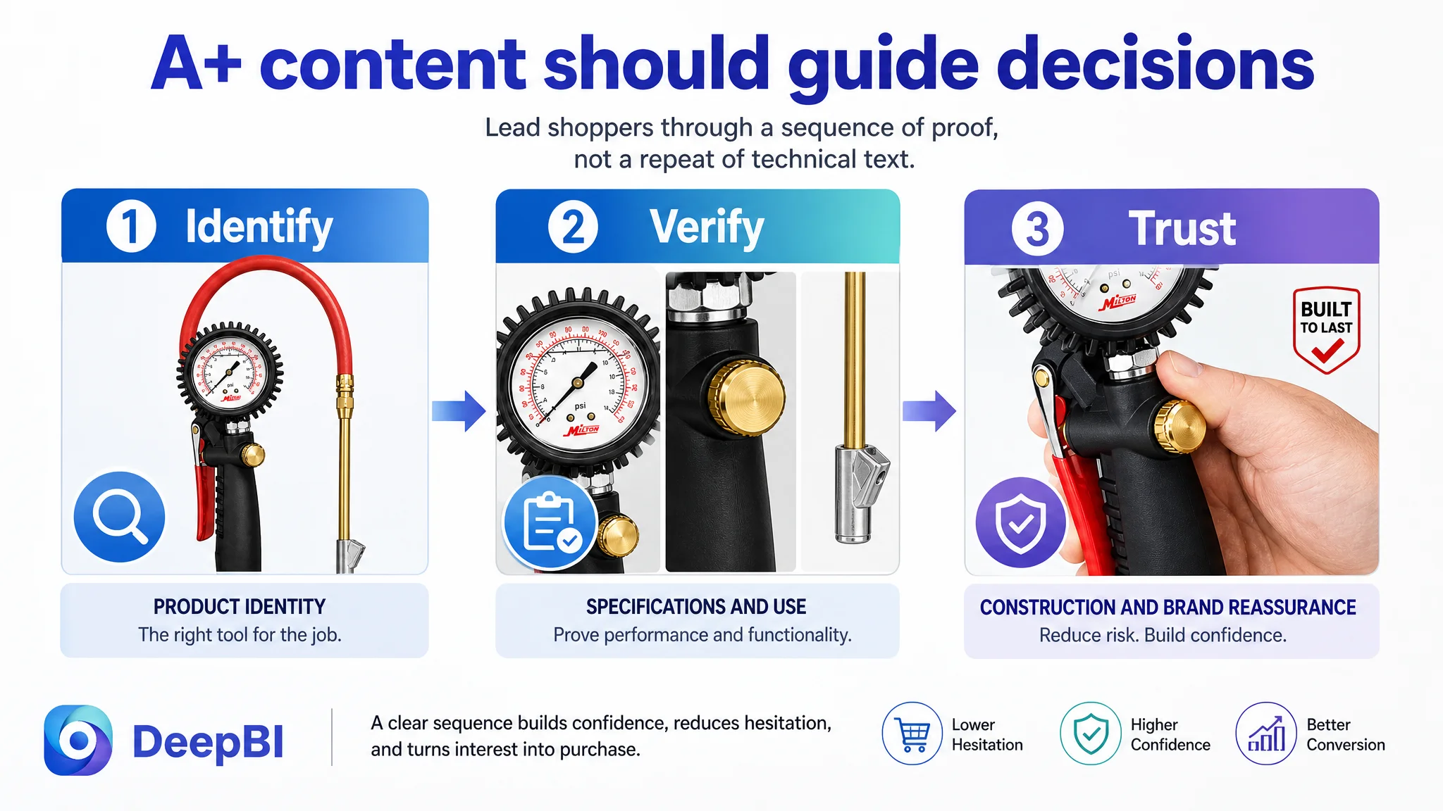
The A+ Page Needed a Sales Sequence, Not More Technical Text
The target Listing’s detail section depended on text. The benchmark listing used a visual funnel.
That funnel moved through the buyer’s decision process in a deliberate order:
1. Establish what the product is
The first module needed to identify the analog pistol-grip inflator gauge, straight dual chuck, and 15-inch hose immediately.
2. Confirm what the purchase includes
A complete visual overview should show the inflator body, hose, and chuck together. This reduces uncertainty about components and helps the buyer understand the product as a working kit.
3. Provide fast technical verification
A dedicated specification module should present:
- 0–230 PSI
- 0–16 Bar
- 15-inch hose
- Straight foot chuck
- Ergonomic grip
- Fine pressure adjustment or deflation control
This allows technical buyers to confirm suitability without searching through paragraphs.
4. Explain the gauge technology
A close-up of the liquid-filled gauge should answer why it is useful under vibration, pressure changes, and demanding working conditions.
5. Solve handling concerns
The swivel connection and flexible hose should be shown as practical solutions for positioning, reduced side-loading, and hands-free inflation.
6. Prove connection durability
The page should visualize the solid brass fittings, 1/4-inch NPT air inlet, and threaded lock-on chuck design as structural reasons to expect a stable connection.
7. Confirm performance range and trust
The final module should reinforce the product’s ability to handle applications up to 230 PSI, while using appropriate brand-quality and professional-use messaging supported by the available product information.
This seven-module structure gave each section one job. Instead of repeating specifications, the page could answer the questions that typically delay purchase decisions.
Reviews Were a Major Trust Constraint, but Not a Page Copy Problem
The review comparison added another layer of risk:
- Target Listing: 3.7 stars, 13 total reviews
- Benchmark Listing: 4.6 stars, 231 total reviews
- Target Listing homepage: 4 reviews visible
- Benchmark listing homepage: 14 reviews visible
The target Listing also had a higher concentration of negative feedback. Reported concerns included missing parts, air leakage, and restricted airflow. The benchmark listing’s reviews more often reinforced durability, precision, and brand reliability.
This gap could not be solved through a new image alone. Reviews are accumulated market evidence, and a page redesign does not erase an existing rating profile.
But the review weakness made visual trust even more important.
When a Listing has limited review volume and a lower average rating, shoppers need stronger clarity elsewhere. The page must avoid vague claims and make the product’s actual design, specifications, connection method, and intended use easier to verify.
That is why the optimization did not treat reviews as an isolated reputation issue. It treated them as part of the page’s total trust environment.
At the same time, the page needed to remain fact-based. It could not use visual storytelling to imply performance beyond the confirmed specifications or conceal known product concerns. The correct approach was to make the real product easier to understand and reduce preventable uncertainty.
The Optimization Direction Shifted From “More Information” to “Better Decision Logic”
The revised Listing strategy aligned each content element with a stage of the Amazon buying journey.
The title handled recognition and search relevance.
The bullet points handled structured explanation. Their existing strengths were retained, then sharpened around professional precision, liquid-filled gauge benefits, ergonomic control, swivel handling, and industrial-grade fittings.
The main images handled first impression, usability, technical confirmation, and trust.
The A+ content handled deeper persuasion by connecting product design to real operating concerns.
This was not a matter of making every section longer. It was a matter of ensuring that title, images, bullets, and A+ content did not work as separate pieces.
For example, the title could introduce the pressure gauge and pistol grip. The image sequence could then show the gauge face, grip, hose, and chuck. The bullet points could explain why the liquid-filled design and swivel connection matter. The A+ modules could provide the full technical and usage context.
That alignment is what turns Listing content into a sales system.
What the Amazon Seller Could Learn From the Diagnosis
The case did not provide a verified post-optimization data set, so it would be inappropriate to claim a specific CVR increase, ACOS reduction, or organic-ranking recovery.
The more important change was the operating judgment.
The customer could now distinguish between several issues that had previously been blended together:
- A title can have keyword-order problems without being the main conversion bottleneck.
- Strong bullet-point logic does not compensate for a weak visual page.
- A technically capable product can still look unproven.
- A low review base increases the importance of clear, credible product evidence.
- A+ content should not repeat specifications; it should resolve purchase hesitation.
- Advertising should not be scaled mechanically before the Listing can convert the resulting traffic.
The target Listing’s biggest problem was not that the product had no advantages. It was that those advantages were not being presented in the order Amazon shoppers needed.
Before asking Amazon ads to produce more traffic, the seller had to make the product page worthy of that traffic.
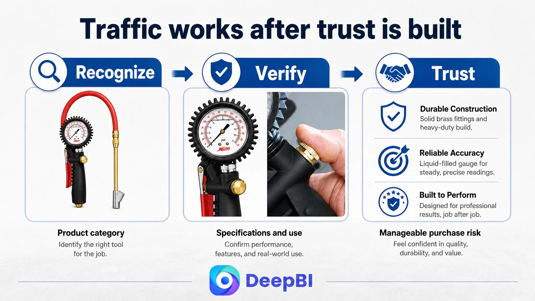
That is the central lesson for sellers in automotive tools and other specification-heavy categories. Conversion does not come from a keyword-rich title, a long list of features, or attractive images in isolation. It comes from a consistent chain of proof: the shopper recognizes the product, understands its use, sees its construction, verifies its specifications, and feels that the purchase risk is manageable.
DeepBI’s role in this case was not to produce a longer checklist of Listing edits. It was to identify where the commercial constraint was concentrated, show why the existing optimization direction was incomplete, and establish the order in which the page should be repaired.
For this Amazon tire inflator Listing, the priority was clear: rebuild product-page conversion capacity first, then allow advertising to work against a stronger page rather than using ads to compensate for a weak one.