

The customer was an Amazon seller in the US humidifier category. The product page had a credible set of functional advantages: a 2L top-fill tank, 5μm ultrafine mist, operation below 25dB, up to 50 hours of runtime, and a design suited to bedrooms, nurseries, offices, pets, and plants. Yet the Listing was not communicating those advantages in the order shoppers needed to understand them.
The initial working assumption was that the page mainly needed more complete feature coverage: more specifications, more usage information, and stronger descriptions of the product's functions. That direction produced an information-rich Listing, but it did not close the larger conversion gap.
DeepBI ultimately identified the real constraint as Listing conversion capacity. The page had useful information, but its main image, A+ content, trust signals, and review foundation were not working together to move a shopper from recognizing the product to believing it would improve daily comfort.
The later optimization therefore focused less on adding more content and more on rebuilding the sales logic of the Amazon product page: create desire around dryness and sleep, resolve concerns about noise and refilling, visualize the product's strongest proof points, and make every module contribute to the same buying decision. For other Amazon sellers, the lesson is direct: before increasing paid traffic, determine whether the product page is ready to convert it.
The Listing Was Not Empty. It Was Underperforming as a Decision Path.
At first glance, this humidifier Listing did not look neglected.
The title included important search terms such as “Humidifier for Bedroom,” “2L Top Fill Tank,” “24H Runtime,” and “NightLight.” The bullet points included concrete specifications covering room size, mist particle size, runtime, and noise. The A+ page also contained several modules, including room scenarios, health-related benefits, operating steps, aromatherapy, and mood lighting.
The problem was not a lack of information.
The problem was that the information was not arranged around the shopper's decision sequence.
A shopper considering a bedroom humidifier is rarely asking only:
- How many operating modes does it have?
- What is the tank capacity?
- Does it include a night light?
- Can it be used in an office?
The deeper questions are usually closer to:
- Will it actually make the room more comfortable?
- Will it make the surface wet?
- Will it disturb sleep?
- Is it safe to leave running at night?
- Is refilling messy?
- Will cleaning become another household chore?
- Is this product trustworthy enough to buy?
The Listing answered many of these questions somewhere on the page. But the page did not consistently answer them at the moment they mattered.
The customer did not primarily need more product information. The Listing needed a clearer reason for the shopper to continue toward purchase.
A 14-Point Gap Exposed the Real Pressure
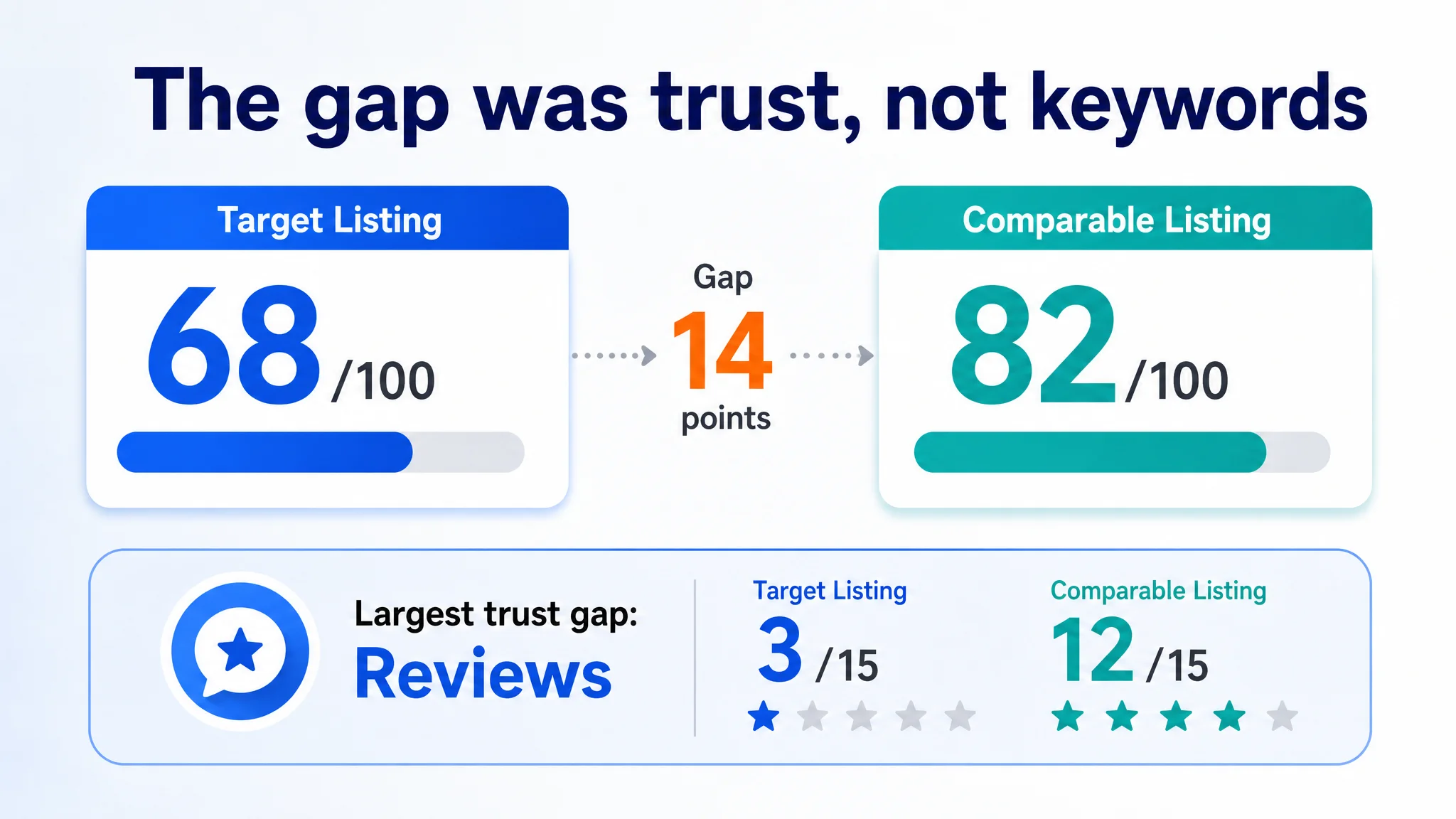
DeepBI's comparison placed the target Listing at 68 out of 100, while a comparable high-performing Amazon humidifier Listing scored 82.
The overall difference was important, but the distribution of the gap was more revealing:
- Title: Target Listing: 14/20, Comparable Listing: 15/20, Difference: -1
- Main image: Target Listing: 24/30, Comparable Listing: 26/30, Difference: -2
- Bullet points: Target Listing: 8/10, Comparable Listing: 6/10, Difference: +2
- Detail page: Target Listing: 19/25, Comparable Listing: 23/25, Difference: -4
- Reviews: Target Listing: 3/15, Comparable Listing: 12/15, Difference: -9
- Total: Target Listing: 68/100, Comparable Listing: 82/100, Difference: -14
This distribution changed the optimization priority.
The title was not the main problem. Its keyword structure was relatively strong, even though it contained some redundancy and too many scattered use cases. The bullet points were also not the weakest area. In fact, they handled user pain points more effectively than the comparison Listing in several places.
The largest controllable page-level gaps were in the main image sequence and A+ content. The largest overall trust gap was in reviews.
The target Listing had a 4.0-star rating with only one review and no effective review presence on the first page. The comparable Listing had a 4.2-star rating, approximately 9,924 reviews, and 45 reviews visible on its first page.
That difference could not be solved through copy editing alone.
It meant the target Listing had to make a stronger case through the assets it could control immediately: the title, images, bullet points, and A+ page. When a product has almost no review history, the page must work harder to provide clarity, evidence, and reassurance without making claims the product cannot support.
The Original Direction Favored Feature Coverage Over Buyer Confidence
The original Listing followed a familiar Amazon operating pattern: include as many relevant product facts as possible, then use different modules to explain where and how the product can be used.
That approach is understandable. Humidifiers have several measurable attributes, and the product itself had genuine specifications worth communicating:
- Coverage for approximately 440–645 square feet
- 5μm ultrafine mist
- A 2L tank
- Up to 50 hours of runtime
- Noise below 25dB
- 12-hour automatic shut-off
- Top-fill design
- Aromatherapy and mood-light functions
But factual completeness does not automatically create conversion.
The Listing introduced technical details and general scenarios before establishing why the shopper should care. In the A+ page, for example, the opening modules leaned toward specifications and broad room placement. The more emotionally relevant concerns—dry skin, irritated sinuses, dry throat, poor sleep, and the desire for a more comfortable bedroom—appeared too late or too weakly.
The page was effectively asking the shopper to process the product before making the problem feel urgent.
That reversed the natural buying logic.
A better sequence would be:
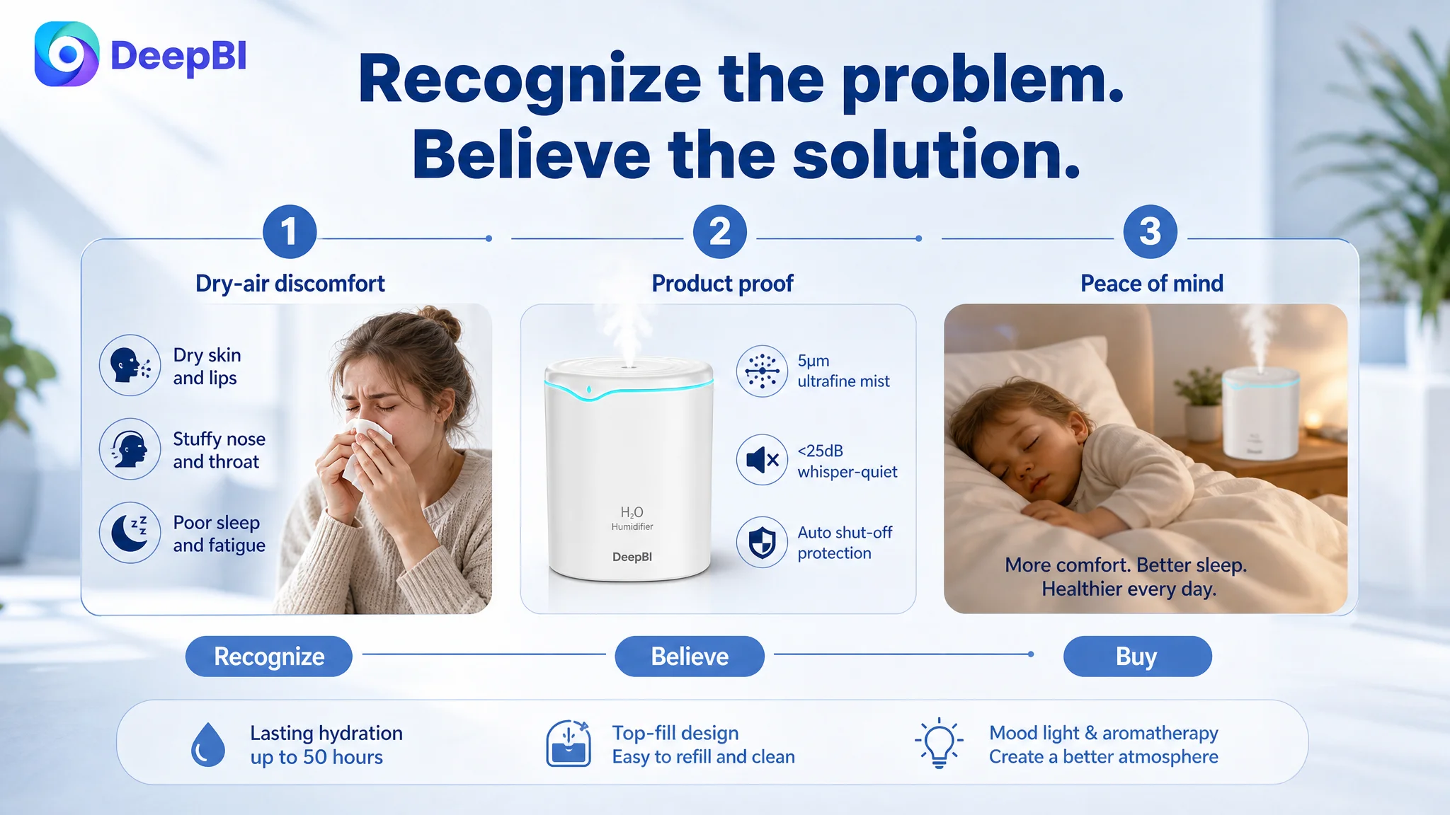
1. Recognize the discomfort caused by dry air.
2. See how the humidifier is intended to address that discomfort.
3. Understand why the mist is suitable for bedrooms and living spaces.
4. Receive proof around noise, safety, and surface wetness.
5. See that refilling and cleaning are manageable.
6. Confirm that the product fits the bedroom, nursery, or home environment.
7. Consider secondary benefits such as aromatherapy and mood lighting.
The issue was not that the original content was false or irrelevant. It was that the page gave secondary information too much responsibility and gave primary buying concerns too little emphasis.
The Main Image Was Carrying Too Many Jobs
The first image and supporting image sequence did not establish a clean visual hierarchy.
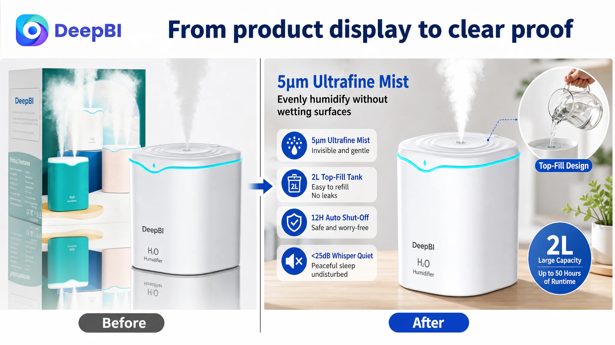
The current presentation included packaging and background elements that introduced visual clutter. The product itself was a standard humidifier form, so the first glance needed to make its meaningful difference immediately understandable. Instead, the opening visual did not strongly separate the product from other humidifiers competing on the Amazon search page.
For a product like this, the main image sequence needed to perform different jobs in a deliberate order.
First, make the product unmistakable
The opening image should focus on the humidifier itself, with a clearer product-centered composition and less visual interference. The objective is not decorative polish. It is fast recognition and a stronger reason to click.
The distinctive technical point available to the Listing was the 5μm ultrafine mist. That advantage needed to become visually understandable rather than remaining buried in text.
Then, connect the product to the problem
The second image should move earlier into bedroom and nursery scenarios, showing the intended comfort logic: consistent mist distribution without wetting nearby surfaces, and relevance to dry skin, dry throat, irritated sinuses, and poor sleep.
This matters because a shopper does not buy “5μm” as an isolated number. The number becomes persuasive only when it is connected to a result the shopper wants.
Next, remove the strongest objections
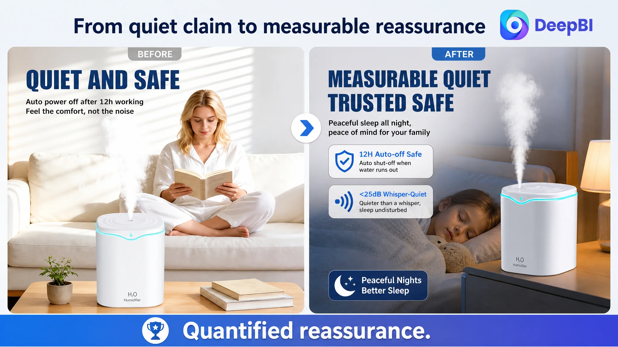
Noise and nighttime safety were important for this category. The Listing already had two concrete points to use:
- Noise below 25dB
- 12-hour automatic shut-off
Those claims should appear earlier and with stronger visual proof. A bedroom humidifier must not merely say it is quiet. It must help the shopper understand what that quietness means in a bedtime or nursery setting.
The main image problem was not simply that the creative was less attractive. It did not assign each image a clear role in the purchase decision.
Capacity, runtime, top-fill convenience, and easy maintenance could follow after the primary comfort and trust concerns had been established. Presenting these benefits later would not make them less important. It would give them the right position in the decision sequence.
The Bullet Points Had a Better Logic Than the A+ Page
One of the more important findings was that the target Listing's bullet points actually had a structural advantage.
They often followed a useful pattern:
Pain point → product solution → user result
For example, top filling was not described only as a physical design choice. It could be connected to avoiding the need to flip the tank and reducing spills. The large tank could be connected to less frequent refilling. The fine mist could be connected to more even distribution without wetting surfaces.
This was stronger than simply listing features.
The recommended bullet structure preserved that strength while improving clarity and trust:
- Efficient humidification and safety: connect room coverage and 5μm mist with automatic shut-off and stated certifications.
- Long-lasting comfort: connect the 2L tank and up to 50-hour runtime with consistent day-and-night use.
- Whisper-quiet operation: connect below-25dB performance to sleep, focused work, and nursery use.
- Three-in-one convenience: connect humidification, aromatherapy, mood light, top filling, and cleaning access.
- Reliable quality and support: provide a clearer reassurance layer without overclaiming.
The key decision was not to rewrite the bullets into more technical language. It was to keep the customer-benefit structure and ensure the title, images, bullets, and A+ content repeated the same core logic from different angles.
The A+ Page Explained the Product but Did Not Build Enough Desire
The A+ content contained several useful modules:
- Core specifications
- Office, living room, and bedroom scenes
- Health-related benefits
- A four-step operating guide
- Aromatherapy and mood lighting
The issue was the order and role of those modules.
The opening A+ module used a general feature-list approach. That created information density but not enough emotional entry. A shopper experiencing dry air or poor sleep needed to recognize the discomfort before being asked to evaluate mist output and operating modes.
The A+ page also spent too much space on ordinary usage steps. “How to start” is useful, but it is not necessarily the strongest conversion argument. The top-fill structure had greater commercial value when positioned as an answer to a specific concern: Will this be messy or inconvenient to refill?
The revised logic therefore placed the modules into clearer decision roles.
Start with the discomfort, not the specification
The first module should create a direct contrast between dry, uncomfortable conditions and a more comfortable bedroom or living environment. This is not a promise of a medical outcome. It is a way to establish the everyday problem the product is designed to address.
Use room scenarios to reinforce relevance
Office and living-room scenes should not appear as generic placement images. They should show the comfort benefit in a context where dry air affects concentration, rest, or daily routines.
Bedroom and nursery scenarios deserve stronger emphasis because quiet operation, automatic shut-off, and a peaceful atmosphere are particularly relevant there.
Make top filling a doubt resolver
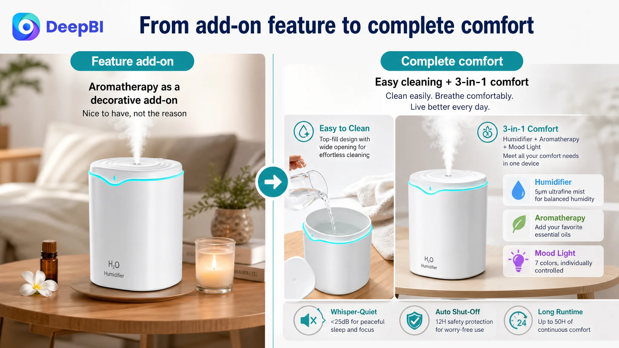
The top-fill feature should be shown as a reduction in household friction:
- Remove the cover.
- Add water from above.
- Avoid flipping the tank.
- Reduce the risk of spills.
- Clean through the wider opening.
This is more persuasive than presenting the same feature as one step in a generic operating tutorial.
Bring safety and noise proof together
The below-25dB claim and 12-hour automatic shut-off should form a rational reassurance module. The shopper should not have to connect these facts across separate sections while imagining nighttime use.
Move aromatherapy and mood lighting into a larger comfort story
These are secondary benefits, but they can still contribute to the final impression when connected to bedtime routines, relaxation, and atmosphere. They should support the main purchase logic rather than appear as unrelated add-ons.
Why DeepBI Did Not Prioritize Ads First
There was a clear reason not to begin with more aggressive Amazon ads tuning.
The available case material does not provide a verified before-and-after record for CTR, CVR, ACOS, TACOS, or organic-order share. It would therefore be incorrect to claim that advertising performance had already improved or that a specific campaign structure caused the Listing problem.
But the Listing evidence was sufficient to establish a strategic risk:
Sending more traffic to a page with weak trust construction could amplify the page's existing conversion limitations.
The review gap was severe. The main image did not communicate the product's strongest differentiator quickly enough. The A+ page introduced functions before building a strong comfort narrative. The page had genuine product advantages, but shoppers had to work too hard to assemble the reason to buy.
Under those conditions, more clicks would not automatically create more orders.
This is why the correct operating sequence was:
1. Repair the product page's decision logic.
2. Improve the visual hierarchy of the image sequence.
3. Reframe A+ content around desire, objections, and reassurance.
4. Keep the bullet points focused on pain point, solution, and result.
5. Then evaluate how paid traffic responds to the revised Listing.
This order protects the advertising budget from becoming a testing mechanism for defects that should have been addressed on the page first.
Advertising can bring a shopper to the Listing. It cannot decide whether the Listing deserves the shopper's confidence.
The Real Root Cause Was a Trust Gap Across Modules
The 14-point score difference was not caused by one isolated mistake.
It reflected a coordination problem across the page:
- The title had relevant keywords but too much information density and scattered scenarios.
- The main image sequence did not establish a strong first-glance differentiator.
- The bullet points had useful logic but needed tighter alignment with the visual story.
- The A+ page contained many modules but placed pain-point persuasion too late.
- The review foundation was too limited to carry trust on its own.
DeepBI's judgment was therefore not “replace the images because they look outdated.”
It was more specific:
The Amazon Listing had product value, but the page did not convert that value into a sufficiently clear and credible buying argument.
That distinction determines what should be changed and what should not.
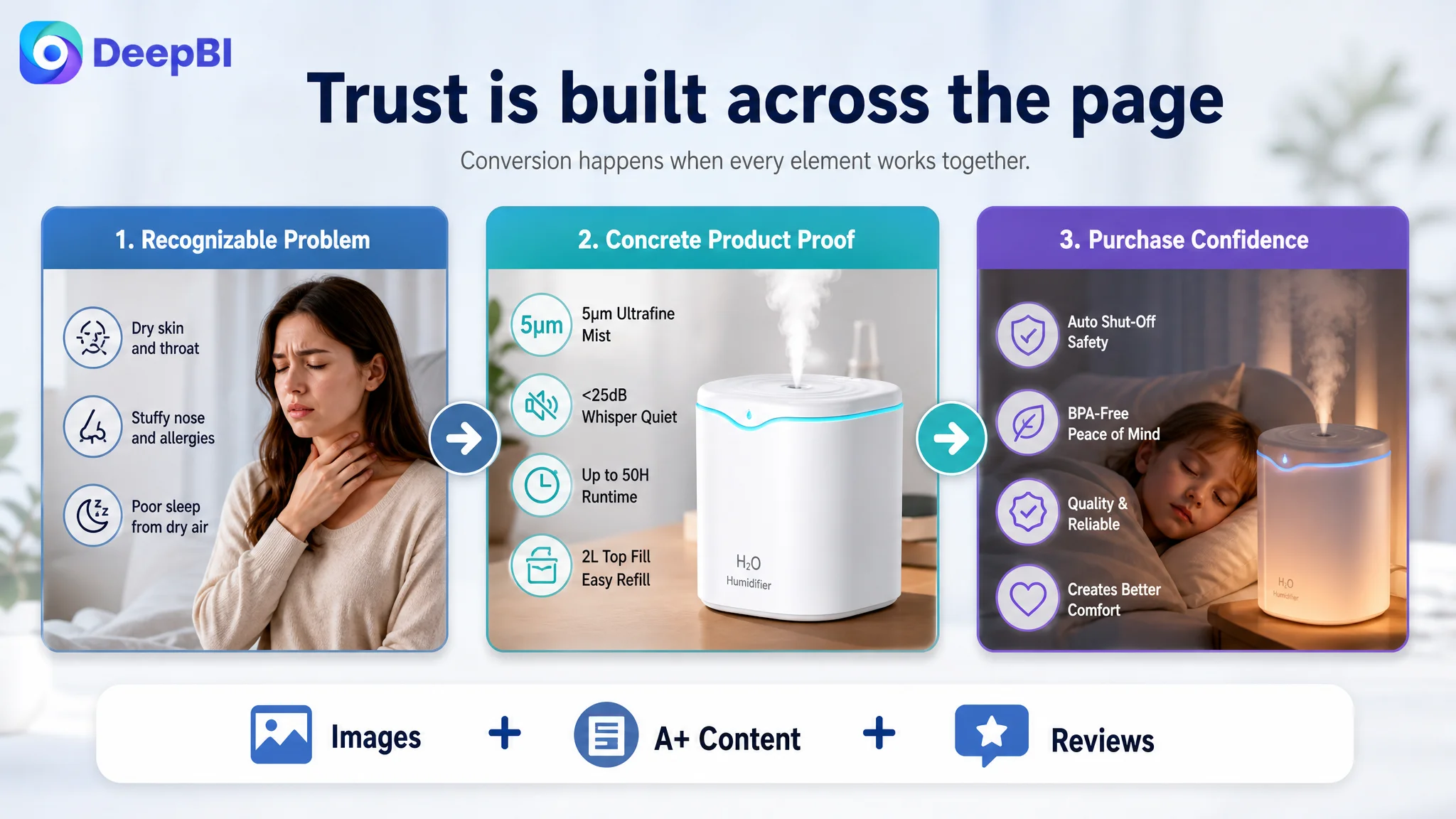
The solution was not to imitate the comparable Listing's brand identity or copy its creative assets. It was to understand the competitive logic behind its stronger presentation: lead with a recognizable problem, show the relief path, resolve practical objections, provide concrete proof, and confirm the product's fit across relevant scenarios.
What Recovery Would Mean for the Store
The supplied case material does not include verified post-optimization performance data, so no numerical improvement in CVR, ACOS, CTR, or organic orders should be claimed.
The intended business change was more fundamental than a single metric movement.
The page was being repositioned to:
- Convert product specifications into shopper-relevant outcomes.
- Make the 5μm mist, below-25dB operation, and automatic shut-off easier to understand.
- Use the main image sequence to establish value before introducing secondary functions.
- Turn top filling and easy cleaning into direct answers to household objections.
- Use A+ content as a persuasion path rather than a feature catalog.
- Reduce the extent to which the Listing depends on reviews it does not yet have.
- Create a stronger foundation for evaluating future Amazon ad traffic.
If later advertising data shows CVR recovery, lower ACOS, or a healthier balance between paid and organic orders, those changes can be evaluated against the Listing revision. Without that measurement, the responsible conclusion is that the store has moved toward a more controllable operating state, not that a guaranteed performance result has already been achieved.
The Seller's Understanding Had to Change
The most important outcome of this diagnosis was a change in operating judgment.
The customer could no longer treat Amazon Listing optimization as a collection of isolated tasks:
- Add another keyword to the title.
- Mention another product specification.
- Add another room scene.
- Explain another operating step.
- Increase ad traffic and wait for the page to convert.
The stronger conclusion was that every element had to support the same commercial story.
For this humidifier, that story was not simply “a 2L ultrasonic device with several functions.” It was closer to:
A quieter, safer, easier-to-maintain way to create more comfortable air in the spaces where people sleep, work, and care for their families.
That story still required accurate specifications. It still needed compliant Amazon content. It still needed real review development over time. But it gave the specifications a reason to matter.
The lesson for Amazon sellers
A high ACOS problem may begin with advertising, but it may also be a product-page conversion problem in disguise.
A low-converting Amazon Listing may contain all the right facts and still fail because:
- The main image does not create a reason to click.
- The title is crowded instead of focused.
- The bullet points describe functions without showing outcomes.
- The A+ page starts with features instead of the shopper's problem.
- Trust signals are too weak to support the purchase decision.
- Paid traffic is being sent to a page that has not earned more traffic yet.
DeepBI's value in this case was not the volume of changes proposed. It was the ability to separate the visible symptoms from the actual constraint, then decide what had to be fixed first.
Before asking Amazon ads to scale a product page, the seller must first determine whether the page can turn attention into confidence—and confidence into an order.