


An Amazon seller in the pet travel category was not facing a simple traffic shortage. The product page had relevant functionality, detailed A+ content, and several useful selling points, yet its Listing still lacked the clarity and trust needed to turn shopper interest into a purchase. The natural reaction was to look toward advertising efficiency, stronger lifestyle presentation, or more product education.
That diagnosis was incomplete. DeepBI’s comparison found a 68/100 Listing competing against a comparable 82/100 page. The most serious gap was not a lack of content, but a lack of decision-ready proof: the product had no reviews, the title did not lead with the strongest search term, the bullet points did not begin with the driving-safety problem, and the image sequence left key fit and stability questions unresolved.
The later optimization therefore focused on repairing the Amazon product page before asking traffic to do more work. The goal was to make the barrier’s purpose immediately clear, prove whether it would fit a shopper’s vehicle, show why it would remain stable, and replace misplaced behavioral-training content with evidence that supported the purchase decision. For other Amazon sellers, the lesson is direct: when paid or organic traffic fails to produce orders, the first question should be whether the Listing is ready to convert that traffic.
The Listing Had Useful Content, but the Buying Decision Was Still Unclear
The customer’s Amazon Listing was not empty or careless. It already included:
- A product-focused main image sequence
- Lifestyle scenes with dogs and drivers
- A+ modules covering product features and installation
- A four-step training path from home preparation to longer trips
- Explanations of mesh construction, storage, airflow, and portability
On the surface, this appeared to be a relatively complete product page.
The problem was that completeness did not equal conversion capacity.
A shopper considering a dog car barrier usually needs several questions answered quickly:
- Will it stop my dog from climbing into the front cabin?
- Will it fit my SUV, truck, or sedan?
- Can I install it without tools?
- Will the mesh sag or shift during a drive?
- Is the material durable enough for an active dog?
- Is there enough evidence to trust the product?
The page addressed some of these questions, but not in the order or visual format that supported a fast buying decision. Important proof appeared too late, while content with greater post-purchase value occupied space that should have reduced pre-purchase doubt.
The issue was not that the Listing lacked information. It was that the information did not arrive in the order shoppers needed to make a confident decision.
The Original Diagnosis Stayed Too Close to Presentation
The initial optimization direction leaned toward making the product story more appealing and complete. The A+ content’s behavioral-training sequence was a good example. It positioned the barrier as part of a gradual pet travel routine:
Home → Parked Car → Short Ride → Daily Trips
That was a thoughtful approach to helping a dog adapt to car travel. It added emotional depth and suggested long-term product value.
But it answered a question that generally comes after purchase:
How can I help my dog become comfortable with this setup?
The more urgent question before purchase was different:
Will this barrier fit my vehicle and reliably solve the problem of my dog moving into the front seat?
This distinction changed the diagnosis. The page did not primarily need more emotional education. It needed more rational reassurance at the exact points where a shopper could hesitate or leave.
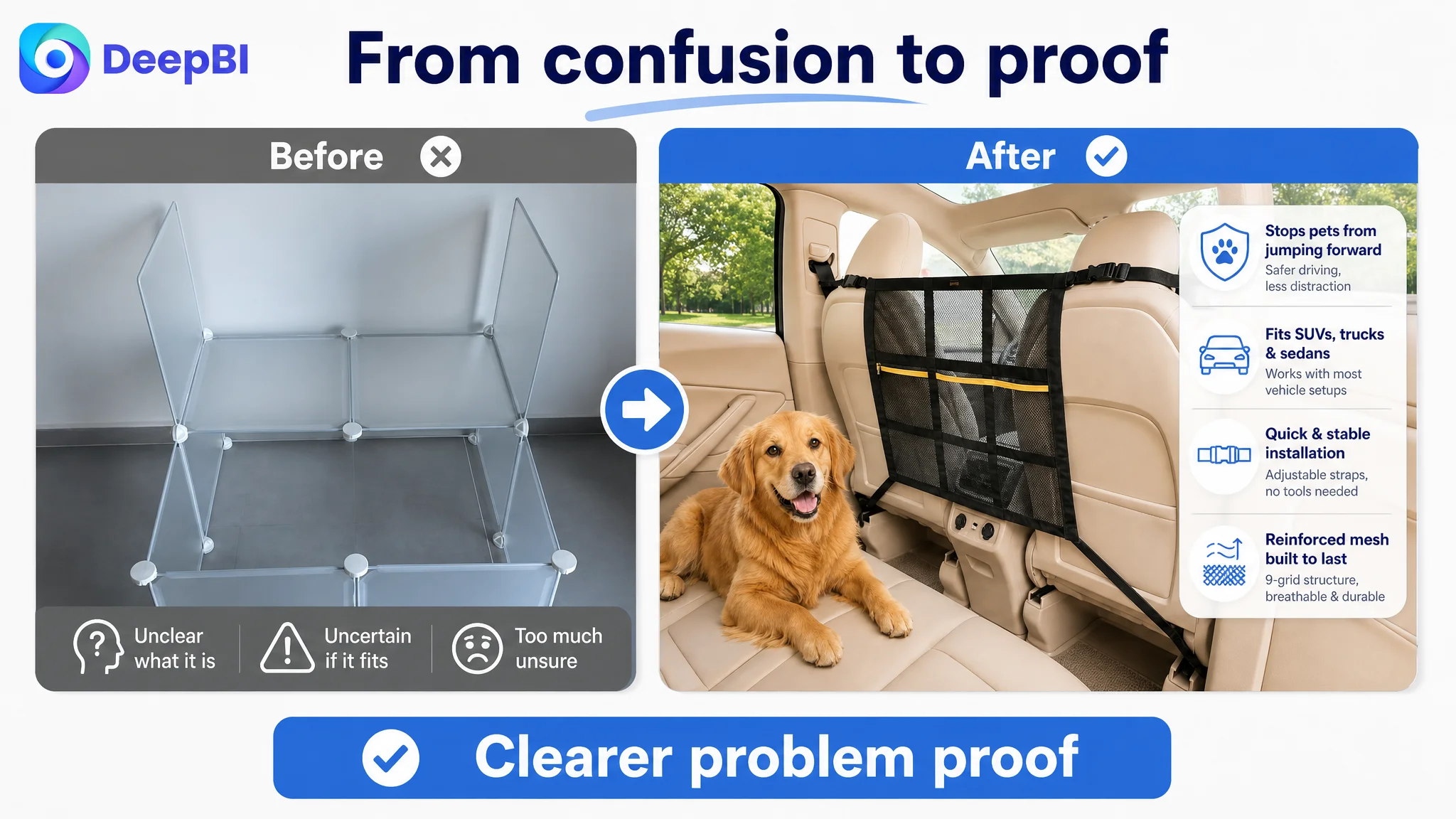
The same issue appeared in the image sequence. One image showed a product unrelated to the barrier, creating immediate confusion about what was being sold. Another combined installation and vehicle compatibility into one overloaded visual. A text-heavy image listed information without showing the fit conditions clearly enough.
These were not isolated design preferences. They created friction in the purchase path.
DeepBI’s Score Comparison Exposed the Real Constraint
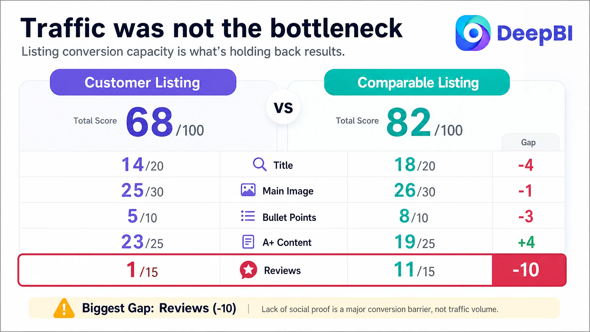
The Listing comparison produced a total score of 68/100, compared with 82/100 for a comparable product page.
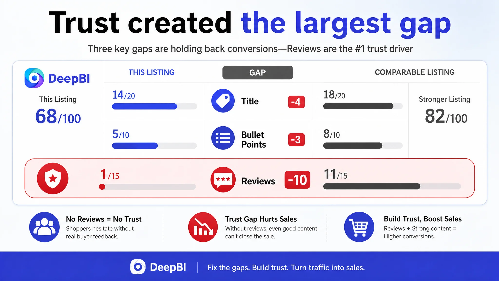
- Title: Customer Listing: 14/20, Comparable Listing: 18/20, Gap: -4
- Main image: Customer Listing: 25/30, Comparable Listing: 26/30, Gap: -1
- Bullet points: Customer Listing: 5/10, Comparable Listing: 8/10, Gap: -3
- A+ content: Customer Listing: 23/25, Comparable Listing: 19/25, Gap: +4
- Reviews: Customer Listing: 1/15, Comparable Listing: 11/15, Gap: -10
The score did not suggest that every part of the Listing was weak. In fact, the A+ content scored higher than the comparable page. That was an important finding: the problem was not simply “the A+ page needs to be better.”
The more precise conclusion was that the page’s strongest content was not being used to resolve the most important objections.
The largest numerical gap was reviews. The customer Listing had no ratings or customer comments, while the comparable page had 24 reviews, an average rating of 4.2 stars, and several detailed or image-based reviews.
That gap could not be solved through copywriting alone. It represented a trust disadvantage at the moment of purchase.
However, the absence of reviews was not the only issue. The remaining score differences showed why the page was especially vulnerable without social proof:
- The title did not place the core search phrase, “Dog Car Barrier,” at the front.
- The title used broad phrases such as “Safe Driving” and “Breathable & Easy to Install” without enough concrete detail.
- Vehicle coverage was not stated clearly enough.
- The bullet points began with product positioning instead of the central driving-distraction problem.
- The image order did not quickly prove fit, stability, or functional difference.
- The A+ page delayed material and construction evidence while emphasizing training content.
DeepBI’s value in this diagnosis was not the score itself. It was the connection between the score gaps and the shopper’s decision sequence.
The Core Bottleneck Was Listing Conversion Capacity
The real problem was a weak Amazon product-page conversion system: the Listing could describe the product, but it did not establish enough trust and clarity before the shopper reached the purchase decision.
Three conversion leaks were especially important.
The title did not claim the search intent clearly enough
The comparable title led with “Dog Car Barrier”, followed by concrete details such as double-layer mesh, adjustable top and bottom straps, storage pockets, and vehicle types.
The customer title began with “Double-Layer Car Divider for Dogs.” That phrase was relevant, but it was less direct as a primary search and shopping signal.
The recommended direction moved the core product phrase to the front:
Double Layer Mesh Car Divider for Dogs, Dog Car Barrier for SUV, Trucks and Sedans, Reinforced Safety Net with Storage Organizer Pockets, Adjustable Straps, Breathable & Easy to Install
The purpose was not to copy a competitor’s wording. It was to establish a clearer structure:
Core product term → vehicle fit → construction and safety → practical benefit
The title also replaced vague value claims with observable product details, including reinforced mesh, adjustable straps, storage pockets, SUVs, trucks, and sedans.
The bullet points described features without leading the buyer
The original bullet structure began with product positioning and material qualities. It explained what the product was, but it did not immediately frame the problem it solved.
For this category, the first bullet needed to address driving distraction and front-seat movement:
Effectively Prevents Driving Distractions: This dog barrier creates a secure divider between the front and back seats, helping keep pets in the rear cabin and reducing sudden movement while driving.
That opening gives the shopper a direct reason to care. The following bullets could then support the decision with:
- Vehicle fit conditions
- Tool-free installation
- Adjustable top and bottom straps
- Reinforced nine-grid, double-layer mesh
- Storage pockets
- Airflow and visibility
- Foldability and portability
The change was from feature inventory to pain point, proof, and practical outcome.
The image sequence did not answer the highest-risk questions
The main image set had strong visual potential, but its logic was not sufficiently disciplined.
One irrelevant image needed to be removed immediately because it interrupted product recognition and weakened trust. A shopper should not have to determine whether the page is showing a dog barrier, a playpen panel, or another accessory.
The remaining images needed a clearer progression:
1. What problem the barrier solves
2. Which vehicles and seat layouts it can fit
3. How the installation works
4. Why the structure is durable and stable
5. What additional convenience the product provides
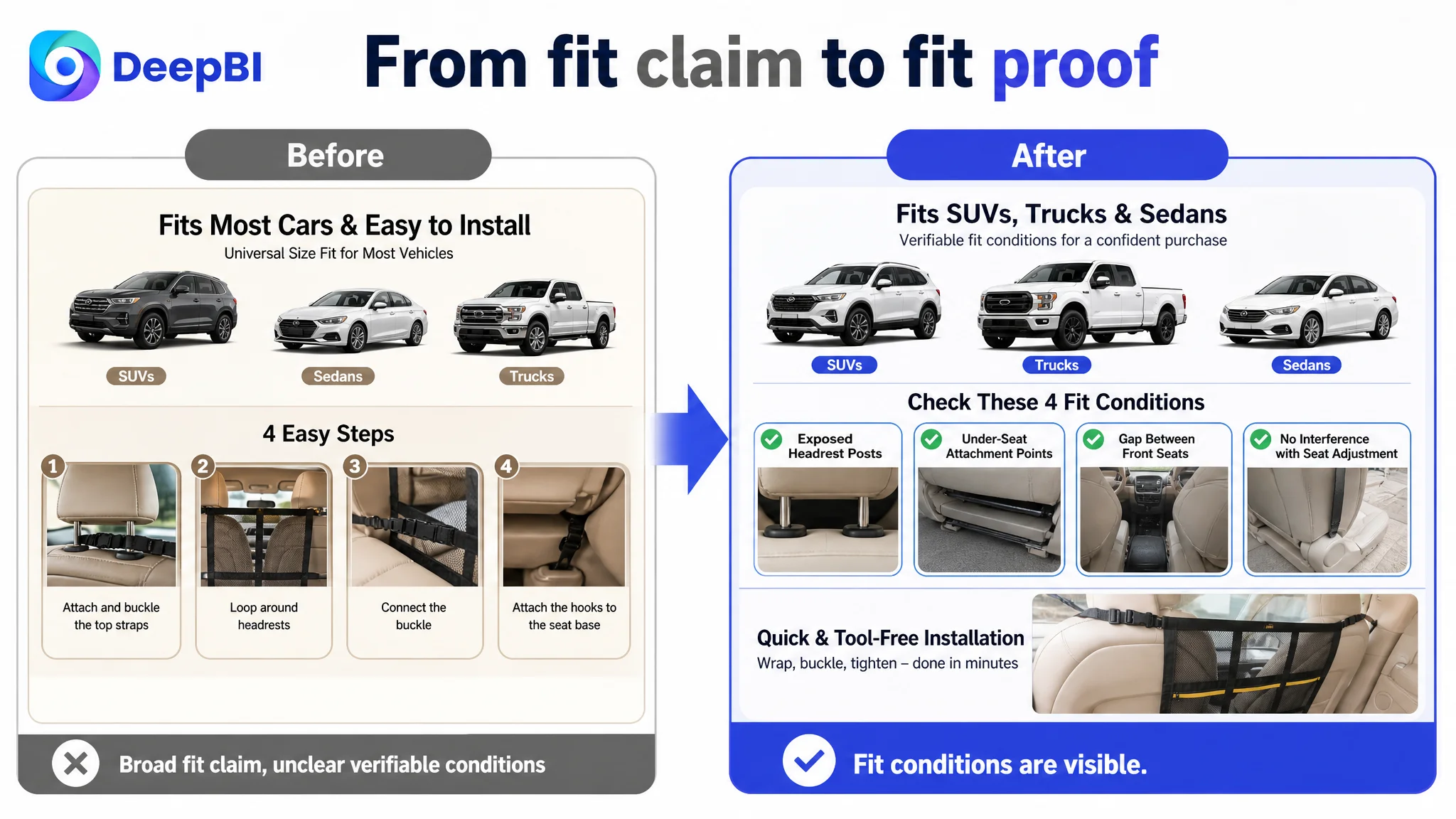
The installation image should focus only on installation. Compatibility should not be buried in the same frame. The vehicle-fit explanation should instead use checkable conditions such as exposed headrest posts, accessible under-seat attachment points, and a gap between the front seats.
This is a significant difference in Amazon Listing logic. “Universal fit” is a claim. A fitment checklist is evidence.
Why DeepBI Did Not Recommend Tuning Ads First
When an Amazon seller is concerned about efficiency, it is tempting to adjust bids, search terms, match types, or campaign structure immediately.
Those actions can be necessary, but they cannot repair a page that does not convert the traffic it receives.
For this Listing, additional traffic would have exposed the same unresolved questions to more shoppers:
- Does this product fit my car?
- Will the mesh stay firm?
- Does it actually prevent the dog from reaching the front?
- Is the product durable?
- Can I trust it despite the lack of reviews?
In that situation, advertising does not only amplify potential. It can also amplify uncertainty.
Before scaling traffic, the team had to determine whether the product page had earned the right to receive more of it.
This was why Listing conversion had to be addressed first. The highest-priority work was not a broad redesign or a complete rewrite of every module. It was to repair the decision bottlenecks most likely to prevent an order.
The A+ Content Was Strong, but Its Priority Was Wrong
The A+ score was one of the few areas where the customer Listing exceeded the comparable page: 23/25 versus 19/25.
That made the diagnosis more nuanced. DeepBI did not treat the existing A+ content as low quality. The problem was that its strongest ideas were not positioned around the most important pre-purchase concerns.
The recommended sequence began with a stronger problem-solution scene:
Distracted driving danger → safer, more focused journey with the barrier installed
The next module then needed to establish construction credibility through close-ups of:
- The reinforced nine-grid structure
- Double-layer mesh
- Resistance to tears and scratches
- Storage pockets
- The physical points that contribute to stability
Material and structure proof had to move earlier, rather than waiting until after a general feature summary.
The vehicle-fit module also needed to become a technical verification checklist. Instead of relying on generic vehicle illustrations or broad “fits most cars” language, it should show the actual installation requirements.
The behavioral-training modules were not useless. They simply belonged after the shopper had already decided that the product fit the vehicle, solved the driving problem, and offered adequate stability. In the earlier position, they consumed attention without removing the main purchase risk.
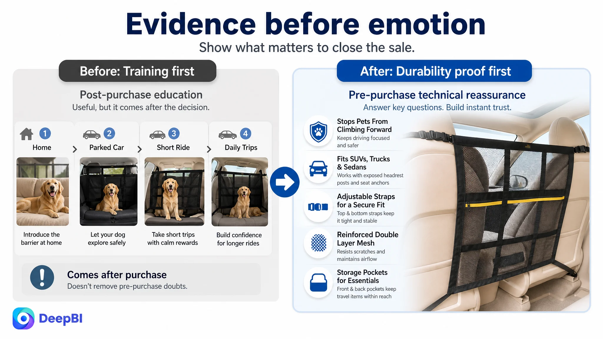
The Optimization Direction Was Evidence Before Emotion
The final direction was not to discard lifestyle content. The customer already had high-quality scenes featuring dogs and drivers, with bright lighting and natural human-pet interaction.
The change was to assign each visual a clearer job.
The main image should create immediate recognition
The page needed to remove the unrelated product image and make the barrier’s installation and purpose clear at a glance.
The compatibility image should reduce return risk
Vehicle types such as SUVs, trucks, and sedans should be supported by visible fit conditions rather than broad claims alone.
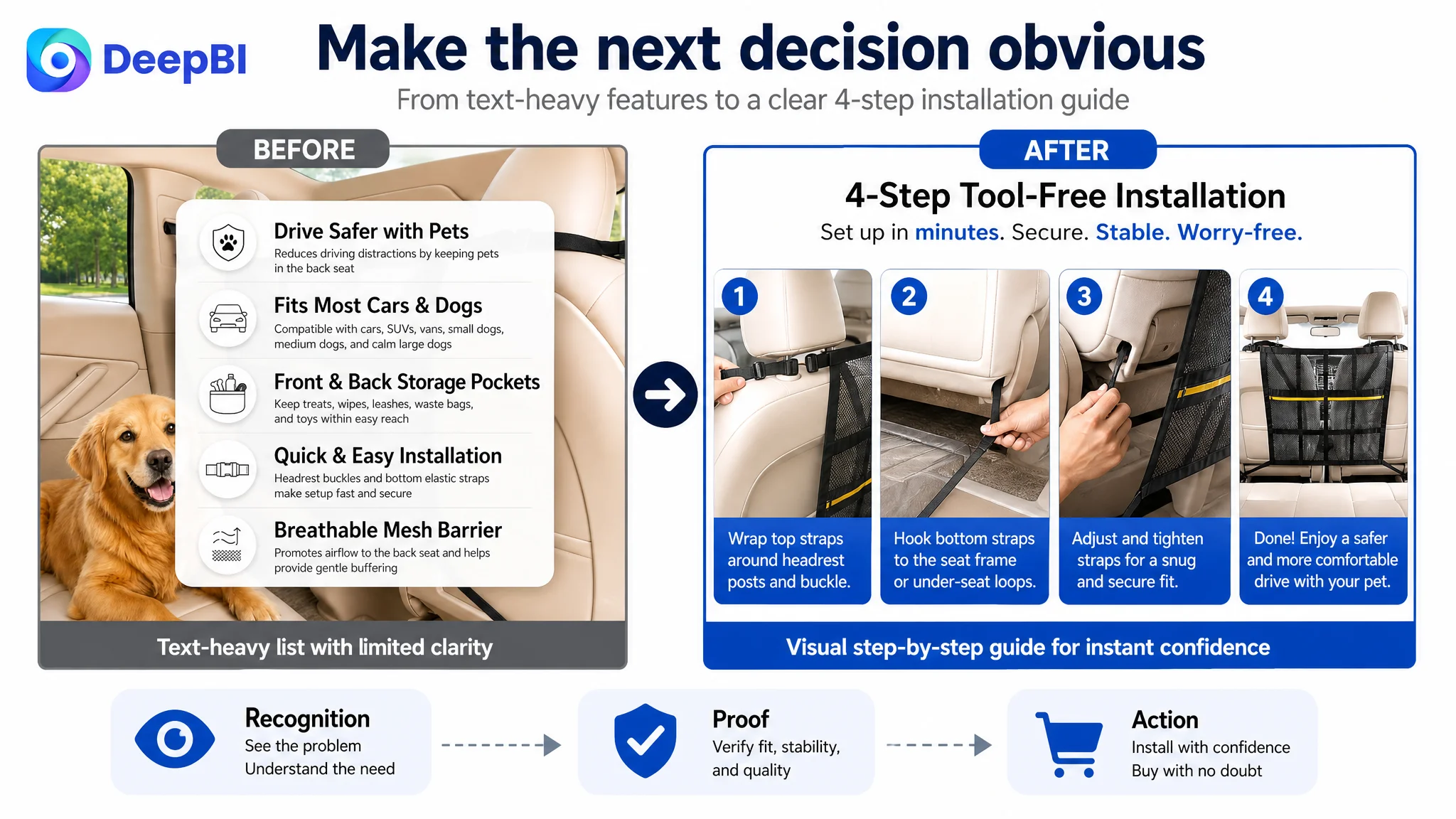
The installation image should remove complexity
The setup should be shown as a simple sequence:
- Wrap the strap around the headrest post
- Attach the elastic hooks
- Adjust the strap length
- Secure the barrier
The structure image should prove durability and stability
The nine-grid and double-layer construction should be shown as physical evidence, not merely listed as adjectives.
The final image should provide rational reassurance
A comparison of construction or material quality could serve as the closing proof point after the shopper understood fit and use.
The same principle applied to copy. The optimized bullets connected product attributes with shopper outcomes rather than presenting isolated specifications.
The Business Change Was a Change in Operating Judgment
The available case material does not provide post-optimization CVR, ACOS, or organic-order figures, so no numerical performance claim can be made.
The more important change was the operating decision itself.
The customer team could now distinguish between:
- A traffic problem and a page-conversion problem
- More content and more useful proof
- A visually attractive A+ page and a decision-effective A+ sequence
- A broad fit claim and a verifiable fit condition
- Product education and purchase reassurance
- A creative adjustment and a conversion diagnosis
That distinction matters because an Amazon Listing with zero reviews has less room for ambiguity. When social proof is absent, the rest of the page must compensate with unusually clear product recognition, specific fitment guidance, credible construction evidence, and a tightly ordered buying story.
The Listing did not need to say more everywhere. It needed to make the right evidence visible sooner.
What Other Amazon Sellers Can Take From This Case
A low-converting Amazon product page is often diagnosed at the wrong level.
The visible symptom may be weak ad efficiency, low order volume, or expensive traffic. But the constraint may sit inside the Listing:
- The title does not match the shopper’s search intent clearly enough.
- The main image does not create immediate recognition.
- The bullet points begin with product description instead of the customer’s core concern.
- The images combine too many decision questions in one frame.
- The A+ page explains use after purchase but does not remove doubt before purchase.
- The product has no reviews, making every unclear claim more damaging.
DeepBI’s diagnosis of this dog car barrier Listing was therefore not “add more images” or “rewrite the copy.” It was a decision about sequence and priority:
First make the product recognizable. Then make it verifiable. Then make it trustworthy. Only after that should more traffic be treated as the primary growth lever.
For Amazon sellers, that is the broader lesson. Advertising can bring shoppers to a product page, but the Listing determines whether those shoppers have enough clarity and confidence to become customers.