

An Amazon seller in the garden-tool category was not facing a simple traffic problem. The Listing had a relevant product, a clear use case, and several practical selling points, but its product page was not giving shoppers enough confidence to move from interest to purchase. The initial response leaned toward stronger keyword coverage, more prominent specifications, and clearer feature communication.
That direction was not entirely wrong, but it was incomplete. The deeper issue was that the Amazon product page was presenting information without building a convincing decision path. The largest gaps were not limited to the title or main image. They were concentrated in trust: weak review proof, an underdeveloped A+ story, and insufficient visual confirmation that the tool could deliver the promised result.
DeepBI reframed the case around Listing conversion capacity rather than continued traffic or copy adjustment. The later optimization focused on making the page communicate three things in the correct order: why the tool matters, how it works, and what successful weed removal looks like. Other Amazon sellers can learn from the case that ads may bring a shopper to the page, but the Listing must still earn the order.
The Amazon Listing Had a Product Story, but Not Yet a Buying Story
The customer’s Listing scored 69 out of 100, compared with 82 out of 100 for a closely matched high-performing competitor in the US marketplace.
At first glance, the result did not point to one obvious failure.
- Title: Customer Listing: 15/20, Comparable Listing: 17/20, Gap: -2
- Main image: Customer Listing: 25/30, Comparable Listing: 23/30, Gap: +2
- Bullet points: Customer Listing: 8/10, Comparable Listing: 6/10, Gap: +2
- Detail page: Customer Listing: 19/25, Comparable Listing: 23/25, Gap: -4
- Reviews: Customer Listing: 2/15, Comparable Listing: 13/15, Gap: -11
- Total: Customer Listing: 69/100, Comparable Listing: 82/100, Gap: -13
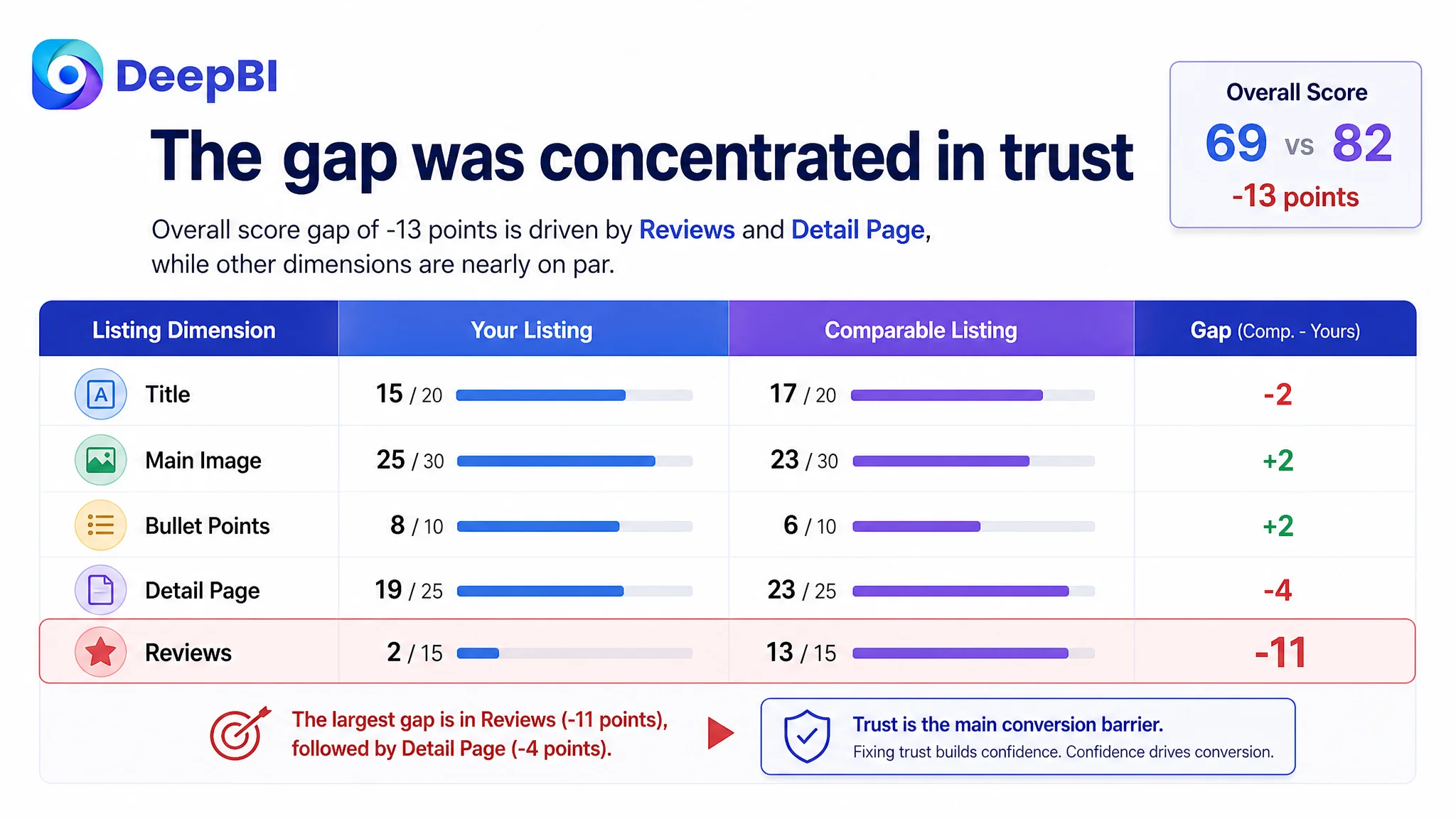
The customer’s main image and bullet points were not weaker than the comparison Listing in the scoring results. In fact, they performed better in those dimensions.
That mattered.
It meant the central problem was not simply that the product page looked worse everywhere. The Listing already had usable strengths:
- A 41-inch long handle
- A four-claw steel head
- A foot-pedal leverage design
- A stand-up weeding use case
- Pain-point language around bending and kneeling
- Application references including dandelions, thistles, and foxtails
The real question was more difficult:
Why did a Listing with several relevant features still lack enough commercial strength to compete with a more trusted alternative?
The Initial Diagnosis Focused on Discoverability and Features
The customer’s first optimization direction was understandable.
The title placed the core keyword “Stand Up Weed Puller Tool” near the front. The bullet points described back and knee strain, the four-claw structure, foot-pedal leverage, material construction, assembly, and maintenance. The page also included component details such as the adjustable handle, T-handle, claws, and foot pedal.
From a conventional Amazon operation perspective, this looked like a Listing that needed refinement:
- Improve keyword structure
- Reduce repeated wording
- Add stronger commercial terms
- Highlight the 41-inch length
- Emphasize the four-claw advantage
- Expand weed-type coverage
- Make the product benefits more visible
These changes could improve clarity and potentially strengthen CTR. But they did not address the full conversion problem.
The page was already saying what the product was. It was less effective at proving why a shopper should trust it to work.
That distinction is easy to miss when the team is looking at isolated assets. A title can contain the right keywords. Bullet points can contain strong claims. Product images can be technically clear. Yet the page may still fail to answer the buyer’s most important questions:
- Will this actually remove deep-rooted weeds?
- Can I use it without excessive force?
- Is the tool suitable for my garden and common weeds?
- What does successful use look like?
- Can I trust this product despite its limited track record?
The customer was not lacking information. The customer was lacking a sufficiently persuasive sequence.
The Largest Gap Was Not the Title. It Was Trust
The review dimension exposed the most serious commercial weakness.
The customer Listing had:
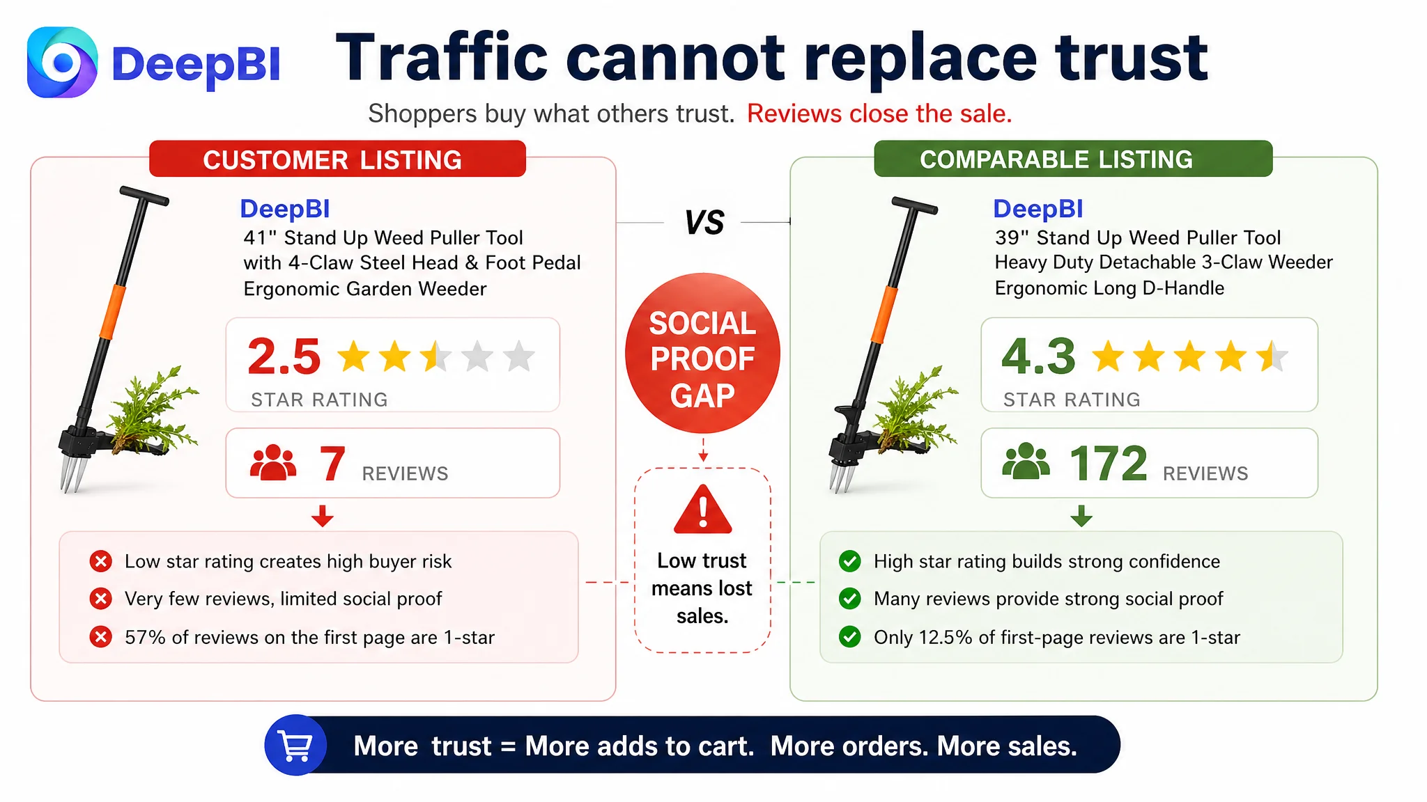
- A 2.5-star rating
- Seven total reviews
- Four one-star reviews among the seven visible reviews
- Limited detailed usage feedback
- Little image or video-based social proof
The comparable Listing had:
- A 4.3-star rating
- 172 total reviews
- A much stronger balance of positive feedback
- More established evidence of real-world use
The difference was 11 points out of 15 in the review dimension, far larger than the title gap and larger than the main-image difference.
This did not mean that content optimization was useless. It meant that the page had to compensate for a major trust deficit through clearer demonstration and more disciplined decision logic.
A shopper seeing a new or weakly reviewed garden tool is likely to scrutinize the page more closely. Claims such as “deep root removal,” “effortless operation,” and “no bending or kneeling” cannot remain at the level of advertising language. They need visible support.
The page did not only need to describe the product better. It needed to reduce the buyer’s perceived risk.
A Stronger Title Could Improve the Click, but Not Complete the Sale
The title gap was real, but limited.
The customer’s title led with the main search term, which was a sound starting point. The main weaknesses were structural:
- It was slightly too long
- Some phrases repeated the same meaning
- The core benefits were not prioritized clearly enough
- It mentioned fewer relevant weed types
- It did not use the strongest differentiators early enough
- It relied more on specification listing than commercial positioning
The proposed direction was to retain the high-value keyword while making the product’s difference easier to understand:
- 41-inch length
- Four-claw steel head
- Heavy-duty construction
- Foot-pedal leverage
- Ergonomic, stand-up use
- Dandelion and thistle applications
- No bending or kneeling
This is not merely a keyword insertion exercise. On Amazon, the title has to perform two jobs at once: support search relevance and create a reason to continue evaluating the product.
The customer’s title was closer to a catalog description. The stronger version needed to function as a compact promise:
This is a stand-up tool designed to remove stubborn weeds with less physical strain.
That could improve the quality of the click. But it still would not solve the deeper trust issue if the product page failed to show the result.
The Main Image Was Clear, but It Did Not Establish the Use Case Fast Enough
The main-image score was actually higher than the comparison Listing’s score: 25 versus 23.
That ruled out a simplistic conclusion that the customer had an “ugly image” problem.
The issue was more specific. The primary visual showed the product clearly, but it did not immediately connect the tool with the two benefits that mattered most:
- Standing instead of bending
- Pulling out a deep-rooted weed
In Amazon search results, a product can be visually clean and still be commercially ambiguous. A shopper may see a long-handled tool but not immediately understand whether it is a specialized weed remover, a general garden accessory, or simply another manual implement.
The supporting images also had sequencing problems:
- The 41-inch adjustable-height benefit appeared too late
- The four-claw structure was not given enough visual confirmation
- The operating motion was not explained with enough clarity
- Some images carried dense information without a strong reading order
- The human-use visuals were not fully consistent, weakening the “labor-saving” message
The correction was not to add more graphics indiscriminately. It was to assign each image a clearer role.
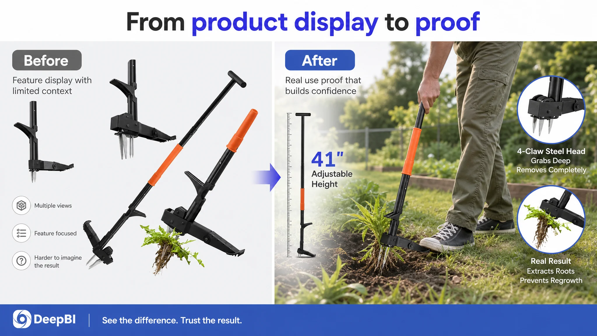
The first image had to establish the outcome
The opening visual needed to move beyond a neutral product display and connect the tool to root removal and stand-up use. Any revised presentation would still need to remain consistent with Amazon image requirements, but the commercial objective was clear: the shopper should understand the product’s purpose immediately.
The second image had to confirm the primary benefit
The stand-up use case and the 41-inch total length belonged closer to the beginning of the image sequence. This was more important than presenting adjustable-height details as a secondary specification.
Later images had to prove operation and construction
The four claws, foot pedal, T-handle leverage, pull-back motion, and steel construction should appear as evidence supporting the initial promise—not as disconnected feature panels.
The image problem was therefore one of decision timing, not simply visual quality.
The A+ Content Was Missing the Final Layer of Persuasion
The detail-page score was 19 out of 25, four points below the comparison Listing.
The customer’s A+ content included useful material:
- Pain-point contrast
- Component close-ups
- Foot pedal and claw details
- T-handle and height-adjustment information
- Weed-type coverage
- Assembly guidance
- General use scenarios
But the modules were arranged more like a feature inventory than a sales argument.
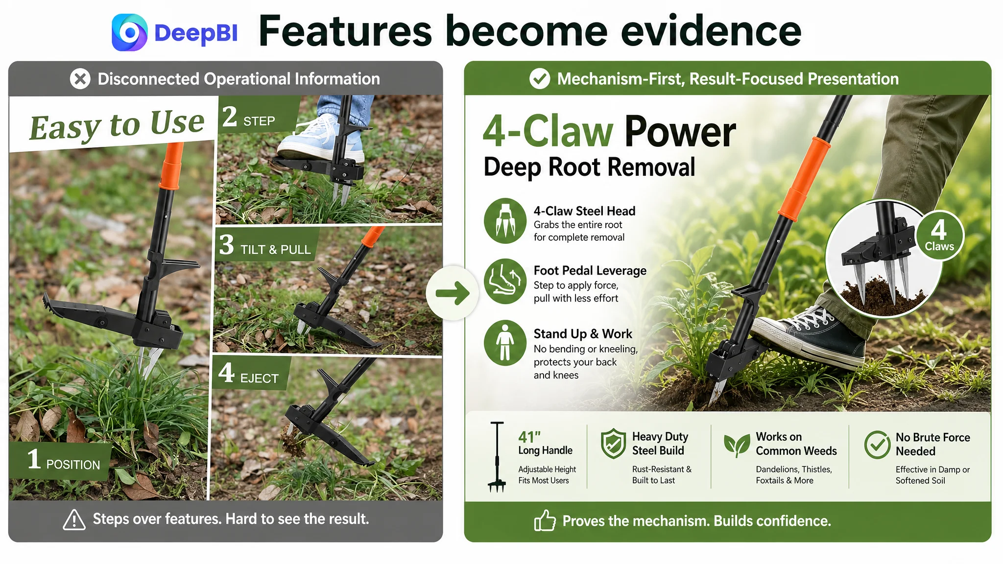
The comparison Listing used a stronger sequence:
1. Establish the problem
2. Show the correct solution
3. Explain how the product works
4. Warn against incorrect use
5. Demonstrate the result
6. Expand the possible use cases
That structure gave the shopper a clearer path from concern to confidence.
The customer’s page spent too much attention on assembly and disconnected component details before fully resolving the central question: Does this tool make weed removal easier and more effective?
The page needed a visible problem-to-result chain
The most important missing connection was between the product’s design and the buyer’s expected outcome.
For example:
- The foot pedal should explain how foot pressure supports pulling force
- The four-claw head should explain how it grips deep roots
- The stand-up design should connect directly to reduced bending and kneeling
- The operating sequence should show how the tool is used, not only how it is assembled
- The weed-type section should confirm practical relevance
- The result section should help shoppers visualize a fully removed weed
The existing content contained many of these ingredients, but they were not working together as one argument.
A product page can contain every important feature and still fail if the buyer has to assemble the logic alone.
Why DeepBI Did Not Recommend More Ad Tuning First
The case did not provide a post-optimization advertising dataset, so it would be inappropriate to claim a specific ACOS reduction, CVR increase, or organic-order recovery.
The decision logic, however, was clear.
When a Listing has a substantial trust gap and an incomplete product-page narrative, additional traffic can increase exposure without improving the underlying conversion capacity. Ads may bring more shoppers to the page, but they cannot create review credibility, demonstrate successful use, or repair a weak A+ sequence by themselves.
Ads may bring more shoppers to the page, but they cannot create review credibility, demonstrate successful use, or repair a weak A+ sequence by themselves.
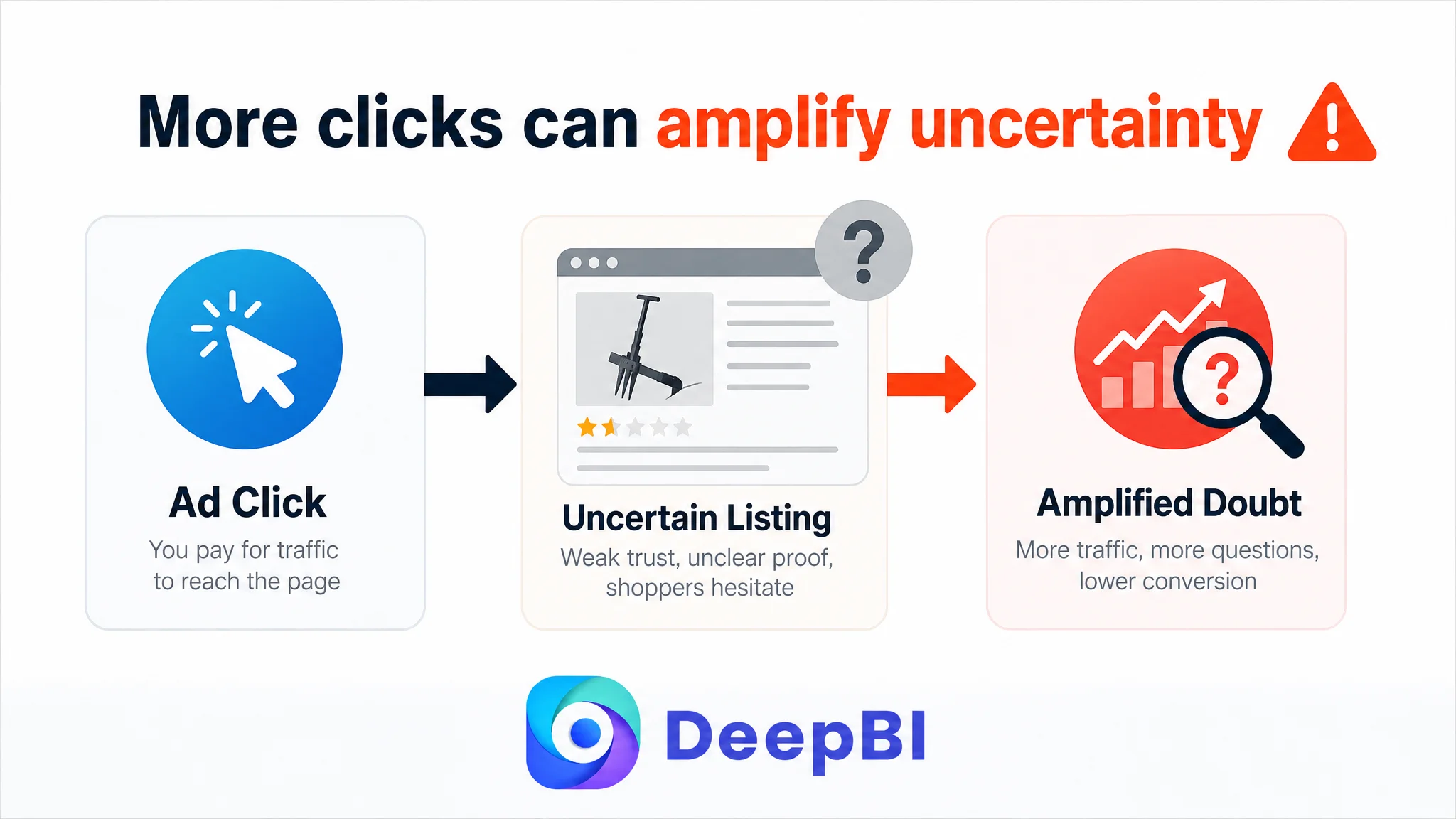
This was the risk of continuing to treat the problem as an advertising or keyword issue:
- More clicks could arrive at the same uncertain page
- Budget could be spent amplifying unresolved objections
- Low conversion could be misread as a bidding or targeting problem
- The team could keep changing campaigns without clarifying the product-page constraint
The correct priority was not to stop advertising. It was to stop asking advertising to compensate for a page-level trust problem.
DeepBI’s diagnosis came from comparing the Listing across multiple connected dimensions rather than judging one image or one sentence in isolation. The score gap showed that:
- Search-entry elements were improvable but not catastrophic
- Bullet-point logic was already a relative strength
- Main-image clarity was not the primary competitive weakness
- A+ content and reviews created the largest conversion risk
- The page needed stronger proof and sequencing before traffic expansion could become more productive
This is the difference between adjusting inputs and identifying the current business constraint.
The Later Optimization Focused on Rebuilding the Page’s Sales Logic
The proposed direction was not a wholesale redesign based on subjective taste. It was a reordering of evidence.
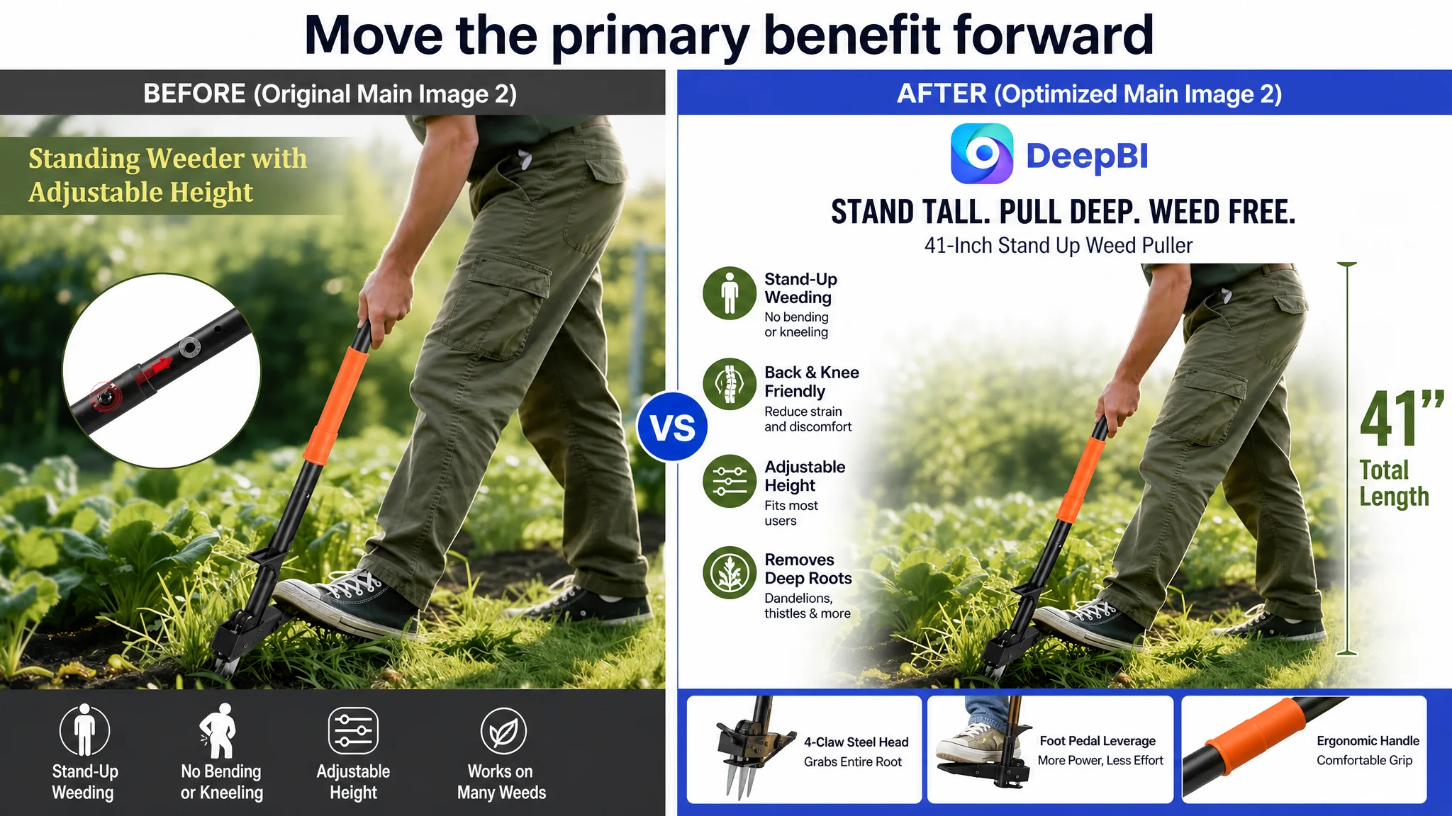
First: make the core pain point unmistakable
The page should establish the contrast between bending or kneeling and working while standing. This is the emotional entry point for the product, especially for seniors and shoppers looking for a lower-impact gardening method.
Second: show how the design supports the promise
The four-claw steel head and integrated foot pedal should not appear as isolated specifications. They should explain the mechanism:
- The claws grip the weed
- The foot pedal supports deeper penetration
- The T-handle provides leverage
- The user pulls back rather than relying on brute force
Only claims supported by the product material should be used. The page should avoid inventing unsupported operating conditions, accessories, or limitations.
Third: move proof ahead of secondary details
Height adjustment is useful, but it should not appear before the buyer understands whether the tool works. Assembly information is also relevant, but it belongs later, after the core use case and outcome have been addressed.
Fourth: visualize successful removal
The current content lacked a strong result-verification link. A before-and-after presentation based on the product’s supported root-removal claim could help shoppers picture the outcome more clearly.
This is especially important for a product with limited reviews. When social proof is weak, the page has to make the product’s use and result easier to evaluate without overstating performance.
Fifth: add rational trust without inventing limitations
The comparison Listing used warning and limitation content to appear more professional and reduce misuse risk. The customer Listing could learn from that structure, but only within the evidence available.
It should not invent claims about rocks, tree roots, soil conditions, or prohibited use unless those limitations are confirmed. A safer trust-building direction is to clarify:
- How the product is assembled
- What is included
- How to check assembly stability
- How the tool should be operated according to the supported instructions
- What types of weeds and settings are actually represented in the materials
Trust is not created by adding more warnings. It is created by being precise about what the product does and how it should be used.
The Advertising Problem Was Really a Conversion-Readiness Problem
The customer’s original direction focused on making the Listing more searchable and feature-rich. DeepBI’s reframing focused on whether the page was ready to receive more qualified traffic.
That distinction changed the order of decisions:
- Add or rearrange keywords: Reframed priority: Clarify the product’s core buying promise
- Highlight specifications: Reframed priority: Show how the design produces the intended benefit
- Present more components: Reframed priority: Build a problem-to-solution-to-result sequence
- Explain assembly early: Reframed priority: Prove use and outcome before secondary details
- Rely on page content to carry claims: Reframed priority: Use visual evidence to reduce uncertainty
- Keep optimizing traffic inputs: Reframed priority: Repair Listing conversion capacity first
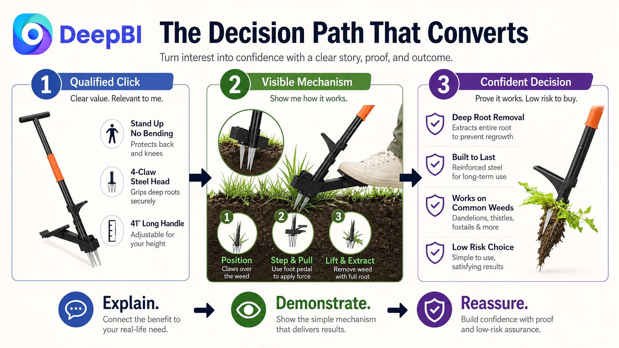
This does not mean title optimization, image work, or advertising analysis should be separated. They need to be connected.
A stronger title can improve the quality of traffic. A clearer main image can improve the first impression. Better bullets can reinforce relevance. A stronger A+ page can address objections. Reviews can provide social proof. Ads can then scale a page that is better prepared to convert.
The commercial logic is cumulative.
What This Amazon Seller Could Learn From the Diagnosis
The case does not establish a final numerical performance result, but it does show a meaningful change in operating judgment.
The customer moved from asking:
“How can we make this Listing more competitive in search?”
to asking:
“Can this product page convert the shopper once the click happens?”
That change reduced the risk of making isolated adjustments without resolving the main constraint.
The resulting operating priorities became clearer:
- Treat Listing conversion as a business capacity, not a copywriting detail
- Use competitor comparison to locate the largest commercial gap
- Do not assume a low-performing Listing is weak in every dimension
- Distinguish a visual-quality issue from a visual-sequencing issue
- Treat reviews and A+ content as part of conversion infrastructure
- Prove the product’s mechanism and outcome before adding secondary details
- Avoid asking Amazon ads to compensate for weak trust
- Keep optimization recommendations within verified product facts
- Judge whether a page deserves more traffic before increasing traffic pressure
Advertising can amplify a strong Listing. It can also amplify uncertainty when the page has not earned the buyer’s confidence.
For this stand-up weed puller Listing, the central challenge was not a lack of features. It was the distance between those features and a confident purchase decision.
DeepBI’s role was to identify that distance, quantify where it was largest, and put the optimization work in the correct order: first restore the page’s ability to explain, demonstrate, and reassure; then let Amazon ads bring traffic to a Listing that is better prepared to convert it.