

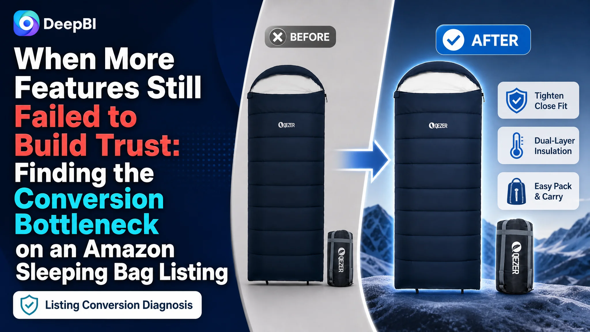
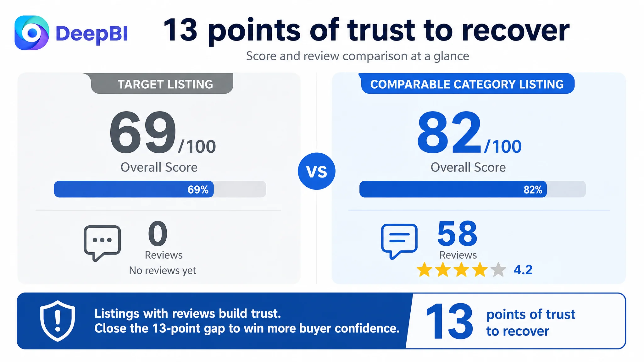
This case involved an Amazon US seller whose adult sleeping bag Listing had plenty of information, but not enough persuasive force. The page covered seasonality, dimensions, materials, storage, washing, and multiple usage scenarios. Yet when compared with a stronger category Listing, it scored 69 out of 100 versus 82.
The initial direction appeared to focus on adding or explaining more product details: more specifications, more usage modes, more storage guidance, and more functional callouts. But DeepBI found that the central issue was not a lack of information. It was the order and quality of the buying logic. The Listing asked shoppers to interpret technical details before answering their most urgent questions: Will this keep me warm? Will it fit? Can I trust it outdoors?
The later optimization therefore focused on Amazon product-page conversion: making temperature performance, fit, weather resistance, comfort, and portability easier to verify through the title, image sequence, bullet points, and A+ content. The broader lesson for Amazon sellers is straightforward but easy to miss: a page can contain many correct facts and still fail to convert if those facts do not form a credible decision path.
The Amazon Listing Was Complete on Paper, but Weak at the Moment of Decision
The sleeping bag Listing was not empty or obviously neglected.
It already included:
- A lifestyle hero image
- Core feature icons
- Three-season usage information
- Structural detail panels
- Multi-mode usage illustrations
- Packing instructions
- Combination and pairing visuals
- Multiple outdoor scenarios
That level of coverage can create a false sense of progress. From an internal perspective, the team may feel that all major selling points are present. From a shopper’s perspective, however, the question is not whether the page contains information. The question is whether the page resolves uncertainty quickly enough.
The competitive comparison showed that it did not.
- Overall score: Target Listing: 69/100, Comparable category Listing: 82/100
- Title: Target Listing: 15/20, Comparable category Listing: 17/20
- Main image and image sequence: Target Listing: 25/30, Comparable category Listing: 26/30
- Bullet points: Target Listing: 7/10, Comparable category Listing: 9/10
- A+ content: Target Listing: 21/25, Comparable category Listing: 23/25
- Reviews: Target Listing: 1/15, Comparable category Listing: 7/15
The largest gap was in reviews. The target Listing had no rating data and no customer reviews, while the comparable Listing had a 4.2-star rating and 58 reviews.
But the review gap was not the only concern. The Listing also lagged in the areas that shape the first impression and the conversion decision: title structure, bullet-point logic, evidence in the image sequence, and the order of A+ content.
The page did not lack product facts. It lacked a clear reason for shoppers to believe those facts mattered to their trip, their weather conditions, and their comfort.
The Original Optimization Direction Focused on Coverage, Not Conversion
The existing Listing seemed to follow a familiar operating logic: include as many relevant features as possible and let shoppers evaluate them.
The title mentioned functions such as machine washability and hollow fiber fill. The image sequence explained dimensions, packing, and product structure. The A+ content covered several usage modes and scenarios. These were not irrelevant details. The problem was that they appeared before the page had established the product’s most important value.
For an outdoor sleeping bag, shoppers usually need to make several judgments in a short sequence:
1. Is the bag warm enough for the conditions I expect?
2. Will it fit my body comfortably?
3. Can I rely on the shell and construction outdoors?
4. Will it be practical to carry?
5. Is it easy to manage after use?
The target Listing often approached these questions in a different order. It presented general information and technical descriptions first, while the comparable category Listing led with stronger decision triggers:
- Expedition and backpacking context
- A clear temperature rating
- Tall-camper compatibility
- Water resistance
- Compression and portability
- Construction details tied to warmth and weather protection
This created the central misdiagnosis.
The page was being treated as though it needed more explanation. DeepBI’s analysis showed that it needed stronger prioritization and proof.
The Real Constraint Was Listing Conversion Capacity
DeepBI’s 69-point score was not important simply because it was lower than 82. The value was in identifying where the difference came from.
The target Listing was only two points behind in the title, one point behind in the image dimension, and two points behind in both bullet points and A+ content. Those gaps were individually modest. Together, they revealed a consistent pattern: every major content layer was slightly less decisive than the comparable Listing.
The review gap intensified the problem, but it did not explain everything.
A Listing with no reviews has to compensate through exceptionally clear product communication and visible evidence. Instead, this page also made shoppers work harder to interpret its performance. That combination weakened trust at several stages of the Amazon conversion path.
The title described the product, but did not frame the use case
The target title began with a broad phrase equivalent to “Sleeping Bags for Adults.” The comparable Listing began with an expedition-oriented phrase and then quickly established temperature, height compatibility, water resistance, and backpacking relevance.
The difference was not merely keyword placement.
The competing structure connected the product to a specific outdoor situation. It gave high-intent shoppers a reason to identify with the product before they processed the full specification set.
The target title had broad keyword coverage, including machine washability and hollow fiber fill, but its structure leaned toward feature listing. Important differentiators such as backpacking, water resistance, compression, and fit were not given enough early emphasis.
The recommended direction retained the product’s genuine specifications while restructuring their order around search relevance and buyer confidence:
- Adult sleeping bag
- Camping and hiking
- Three-season temperature information
- Lightweight backpacking use
- Hollow fiber fill
- Water-resistant shell
- Machine washable construction
- Compression sack
- Specific dimensions
The goal was not to imitate the competitor’s wording. It was to make the target product’s actual strengths easier to recognize.
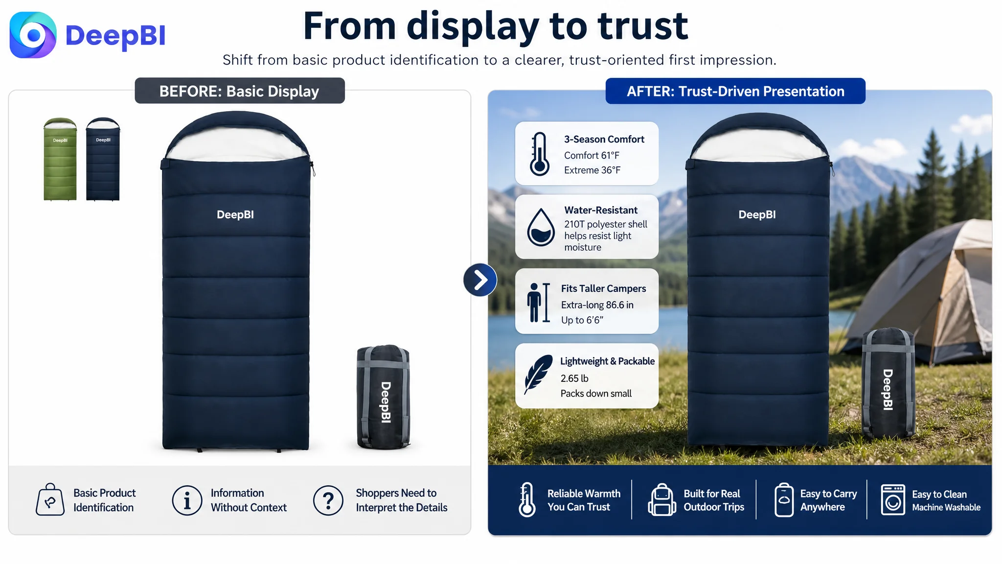
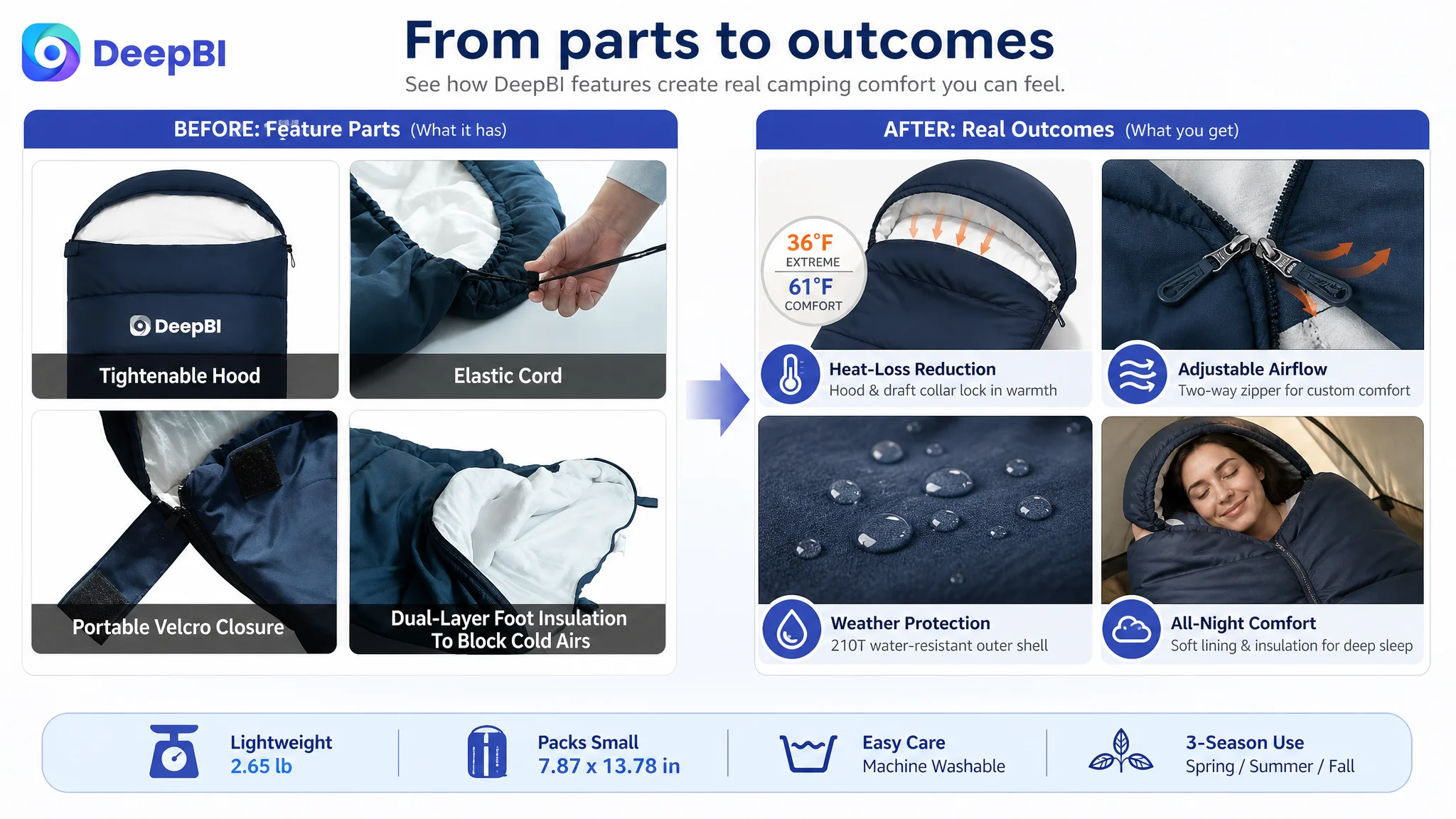
The first images answered “what is it?” before “will it work?”
The image sequence performed a competent product-identification role. It showed the bag, dimensions, components, materials, and packing process.
But the early sequence did not answer the most important performance question directly enough:
Will I be warm and comfortable in the conditions I expect?
The target images relied heavily on static diagrams and general material presentation. The comparable Listing used more direct trust signals, including:
- Temperature information placed earlier
- A stronger outdoor context
- Water-beading evidence
- Close-ups of the hood and zipper construction
- A visible pocket in use
- Practical demonstrations of compression and handling
This does not mean every image should become more dramatic. It means each image should have a specific role in reducing purchase uncertainty.
The recommended sequence therefore moved toward:
- Three-season comfort and outdoor sleep context
- Clear temperature ratings
- Dimensions and adult fit
- Hood, zipper, and draft-control details
- Water-resistant shell evidence
- Soft lining and insulation presentation
- Compact storage and portability
The key change was from feature display to proof sequence.
The Bullet Points Had Information, but Not a Complete Buying Logic
The bullet points showed a similar issue.
The target copy described seasonality, dimensions, insulation, closures, weather resistance, washing, and portability. However, several bullets began with factual parameters rather than the shopper’s concern.
The comparable Listing used a more persuasive structure:
- “Fits Tall” connected length to a clear audience
- “Real 3-Season Warmth” connected temperature to outdoor use
- Compression details connected construction to reduced packing bulk
- Hood and baffle details connected structure to reduced heat loss
- Lightweight materials connected directly to trail use
DeepBI reframed the target bullets around the same decision logic while preserving its actual specifications.
Fit and portability should be judged together
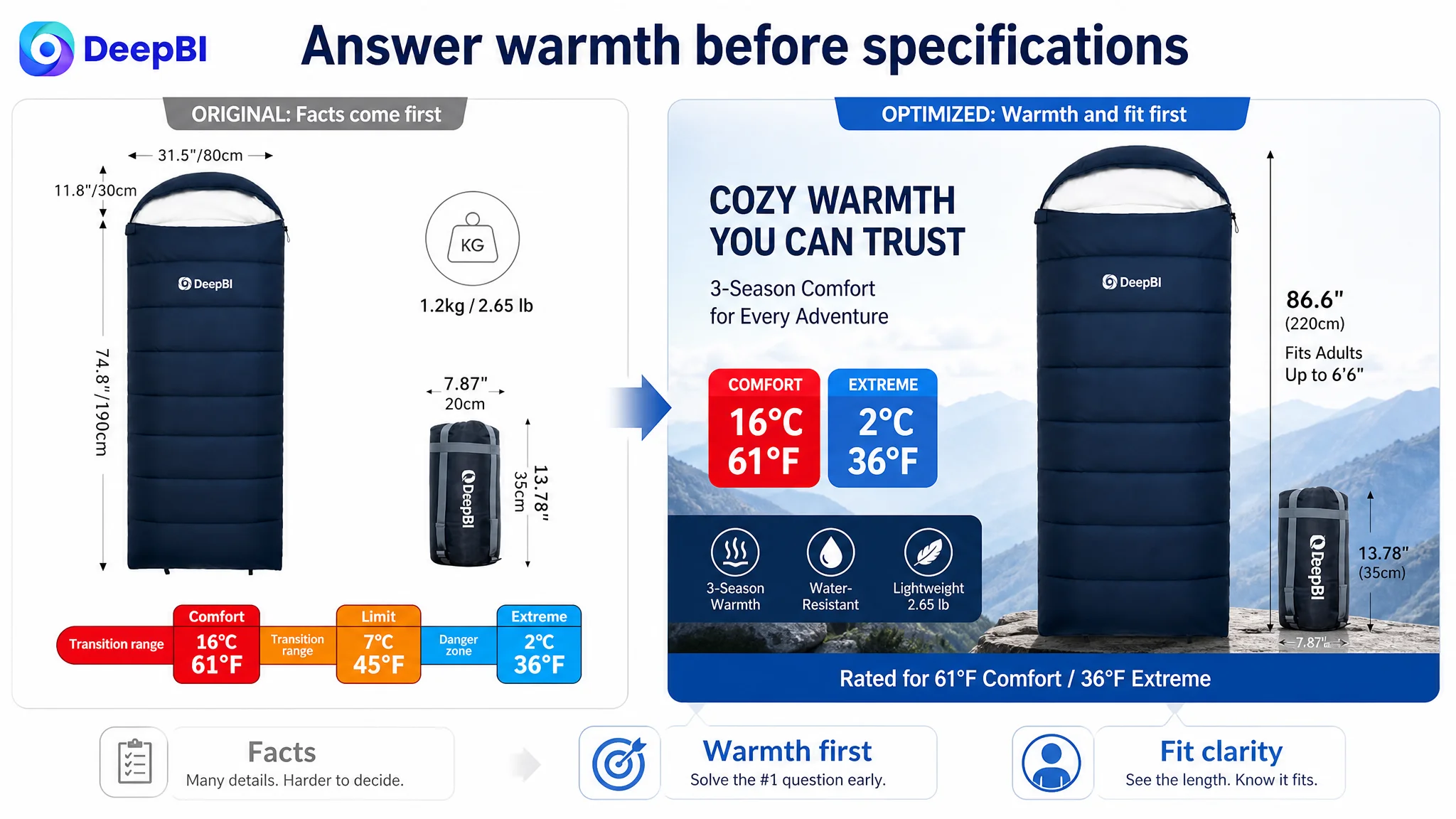
The target bag’s approximately 86.6-inch length was a meaningful advantage over the comparable 82-inch length. But that advantage was not being used strongly enough at the beginning of the first bullet.
The revised direction positioned the product as both longer and compact:
- Approximately 86.6 inches long
- Suitable for taller adult campers
- About 2.65 pounds
- Compresses to approximately 7.87 by 13.78 inches
- Includes an Oxford compression sack
This gives the shopper a clear outcome: more room when open, less bulk when packed.
Temperature information needed comfort context
The target product had real temperature information:
- Comfort: about 61°F / 16°C
- Limit: about 45°F / 7°C
- Extreme: about 36°F / 2°C
Those numbers were useful, but numbers alone do not automatically create confidence. The bullet structure needed to connect them to three-season use, a soft washed-cotton-feel lining, hollow fiber fill, and specific outdoor situations such as hiking, road trips, and camping.
This is the difference between stating a rating and helping a shopper understand how the product fits a planned use.
Features needed to explain what they prevent
The drawstring hood, zipper closure, hook-and-loop fastener, and two-way zipper were already part of the product story. What was missing was the consequence of those features.
The revised logic connected them to:
- Reducing heat loss around the head and neck
- Limiting drafts and cold spots
- Improving closure security during sleep
- Adjusting airflow from the top or bottom
- Managing comfort in changing conditions
The page did not need more hardware terminology. It needed a clearer link between each feature and the discomfort or uncertainty it addressed.
The A+ Content Was Rich, but Its Persuasion Chain Was Not Tight Enough
The A+ page contained more modules than the comparable Listing, but greater volume did not create greater trust.
Its structure included lifestyle scenes, icons, three-season diagrams, construction panels, multi-use visuals, storage instructions, pairing information, and multiple scenarios. The content was broad, but some modules repeated earlier messages or introduced details before core performance had been established.
The comparable Listing followed a tighter progression:
Brand promise → performance proof → practical detail → usage confidence
That sequence made the page feel more deliberate, even with fewer visible content types.
DeepBI’s recommendation was not to remove information indiscriminately. It was to assign every module a single decision-making role.
Put technical validation at the beginning
The first A+ module should quickly establish:
- Temperature ratings
- Adult fit
- Approximate dimensions
- Soft lining and hollow fiber fill
- Lightweight design
This gives outdoor shoppers the technical information they expect before they move into broader lifestyle messaging.
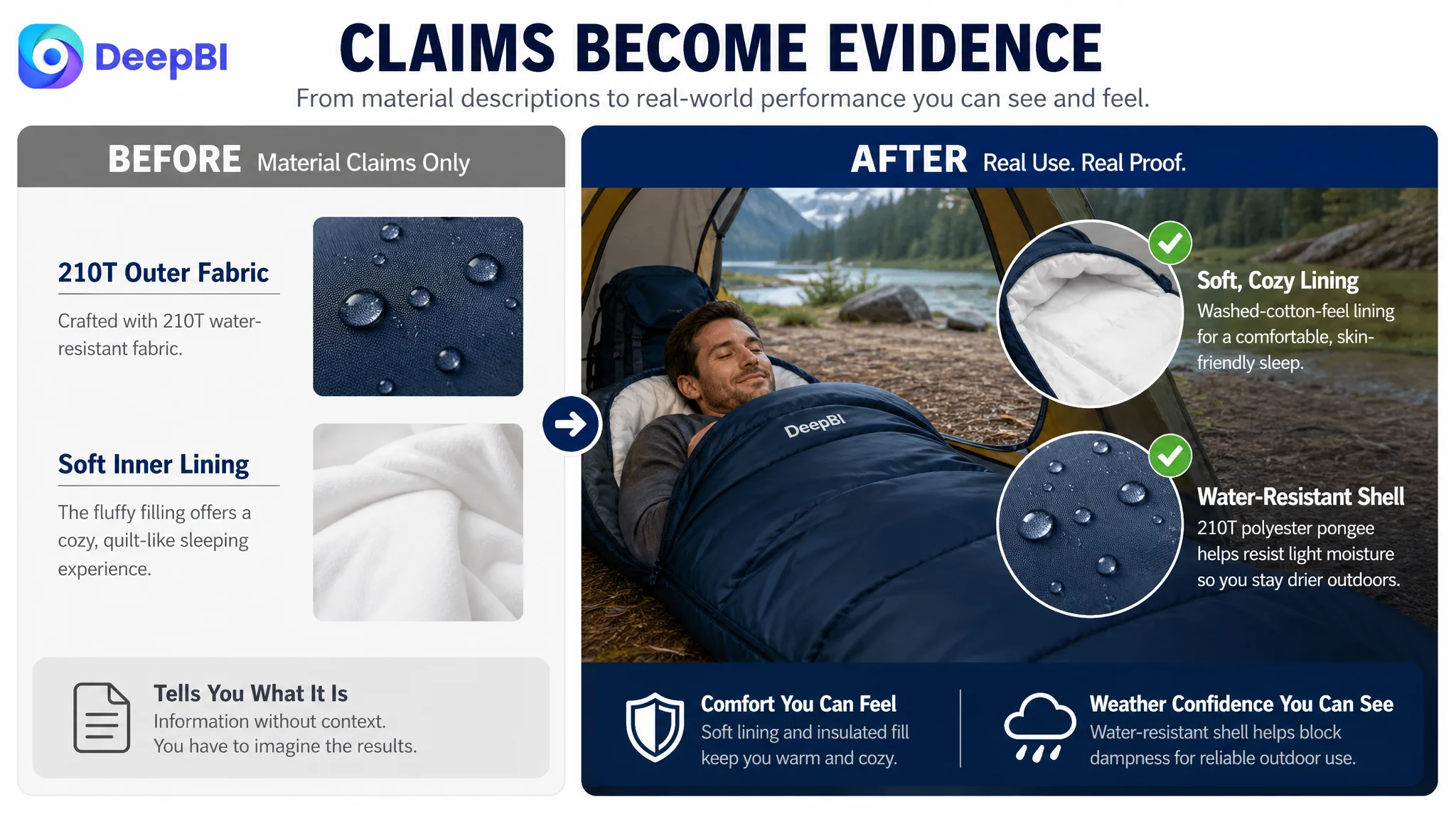
Prove weather resistance physically
The target page described the shell, but its visual presentation did not provide enough direct evidence of water resistance.
A close-up showing water beading on the 210T polyester pongee shell would be more persuasive than a generic material image because it connects the material to a visible performance outcome.
The distinction matters:
- “Water-resistant shell” is a claim.
- Water visibly beading on the shell is evidence supporting the claim.
Use interaction details to make construction credible
The existing content showed product parts, but not always the action those parts perform.
The revised direction prioritized close-ups and demonstrations of:
- The drawstring hood tightening around the head
- The zipper and hook-and-loop fastener securing the opening
- The two-way zipper adjusting ventilation
- The compression sack reducing packed bulk
These visuals make the product easier to imagine in actual use. They also help prevent the page from becoming a collection of disconnected icons.
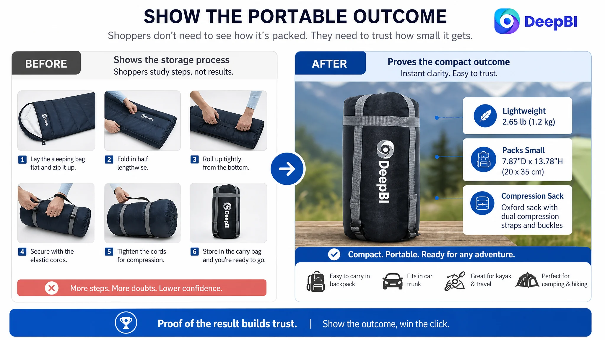
Move storage guidance behind performance proof
Packing instructions are useful, but they are rarely the strongest early conversion argument. The existing page gave storage process a prominent role, while the more important questions of warmth, weather protection, and fit remained less directly proven.
The revised structure treated storage as compact-mobility proof:
- Approximately 2.65 pounds
- Approximately 7.87 by 13.78 inches when packed
- Included compression sack
- Easier transport in a backpack, trunk, or gear bag
This communicates the outcome without forcing shoppers to study a step-by-step rolling process before they trust the product.
Why DeepBI Did Not Recommend More Advertising First
The case material did not point to a keyword shortage or a campaign-structure problem as the primary constraint. The stronger evidence was on the product page itself.
The Listing was already positioned around relevant Amazon search contexts such as camping, hiking, backpacking, adult fit, temperature range, and portability. But when shoppers reached the page, the content did not build confidence as efficiently as the comparable Listing.
That changes the decision order.
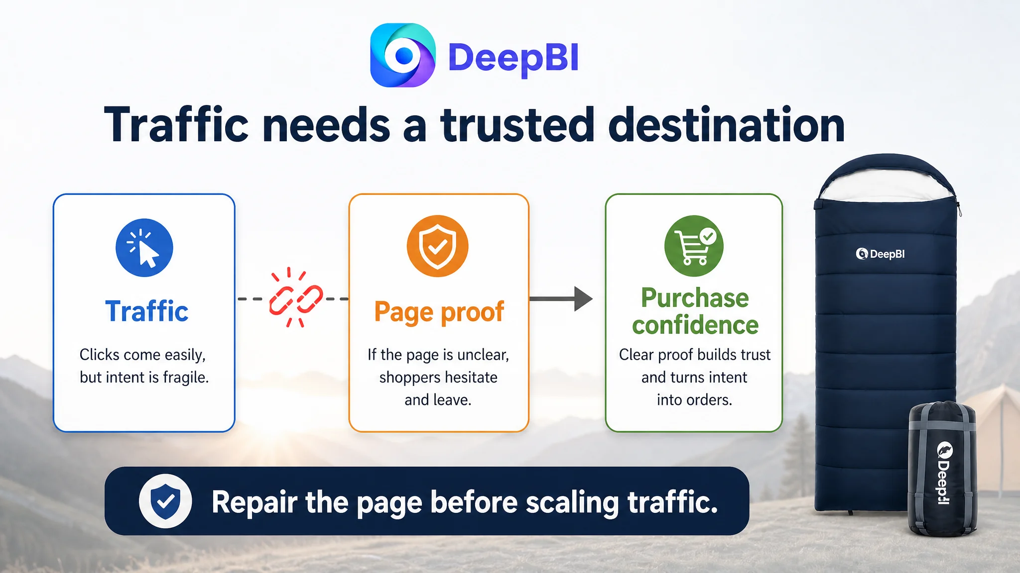
If the product page remains weak at converting traffic, sending more traffic through Amazon ads can increase exposure without resolving the underlying commercial problem. It may even make the inefficiency more visible: more clicks arrive, but the page still asks shoppers to interpret too much and trust too little.
Advertising can amplify a strong Listing. It can also amplify the defects of a low-conversion page.
DeepBI therefore treated Listing repair as the first priority, not because advertising was irrelevant, but because ad efficiency depends on what happens after the click.
The immediate business risk was not simply wasted spend. It was the possibility of judging the product, the keywords, or the market incorrectly when the real constraint was the page’s ability to convert interest into confidence.
The Review Gap Made Page Clarity Even More Important
The target Listing had no effective review base, while the comparable Listing had 58 reviews and a 4.2-star rating.
That created a fundamental trust disadvantage.
A shopper evaluating an unfamiliar sleeping bag often looks for reassurance about warmth, fit, comfort, durability, and real outdoor use. Reviews normally provide part of that reassurance. Without them, the Listing has to carry more of the burden through:
- Clear temperature communication
- Specific fit information
- Realistic performance evidence
- Visible material and construction details
- A coherent explanation of how the product is used
Review accumulation remained an important business requirement, but it could not substitute for page clarity. Nor could stronger images fully replace the absence of customer feedback.
The correct diagnosis was therefore layered but still centered on one bottleneck: the Listing did not yet have enough conversion capacity to compensate for its weak trust foundation.
The Change Was From More Content to Better Commercial Sequence
The most important change was not a single title rewrite or image replacement.
It was a shift in how the team evaluated the page.
Before the diagnosis, the Listing could be viewed as a collection of product facts and visual modules. After the diagnosis, each asset had to answer a business question:
- Does the title attract the right outdoor search intent?
- Does the early image sequence establish warmth and fit?
- Does each bullet connect a feature to a concrete user concern?
- Does A+ content provide evidence before asking the shopper to imagine an outcome?
- Does the page reduce uncertainty despite having no review history?
- Does every module move the shopper closer to a purchase decision?
That is the judgment DeepBI contributed. It did not treat the competitor as a template to copy. It used the competitor as a market reference to identify the missing logic in the target Listing.
The target product already had defensible strengths:
- Longer overall length
- Three-season positioning
- Machine washability
- Lightweight construction
- Compression storage
- Two-way zipper
- Water-resistant outer shell
- Soft washed-cotton-feel lining
The issue was that those strengths were not prioritized according to the shopper’s decision path.
What the Seller Could Learn From the Diagnosis
This case did not provide a verified post-optimization performance report, so it would be inappropriate to claim a specific CVR increase, ACOS reduction, or organic-order recovery.
The measurable outcome in this stage was a clearer operating direction:
- Fix the Listing conversion logic before scaling traffic
- Lead with warmth, fit, and outdoor reliability
- Use real performance evidence instead of generic material presentation
- Turn bullet points from feature lists into problem-solution arguments
- Give every A+ module one specific persuasion role
- Treat reviews as a separate trust gap that requires legitimate accumulation
- Preserve real product specifications without inventing unsupported performance claims
The broader Amazon lesson is not that every sleeping bag Listing should use the same layout.
It is that a page should be judged by the quality of the decision it enables, not by the number of features it displays.
For this adult sleeping bag Listing, the central issue was never a shortage of content. It was the distance between what the product could offer and what the page allowed shoppers to believe quickly.
Before Amazon ads can become more productive, the product page must first make the traffic useful.