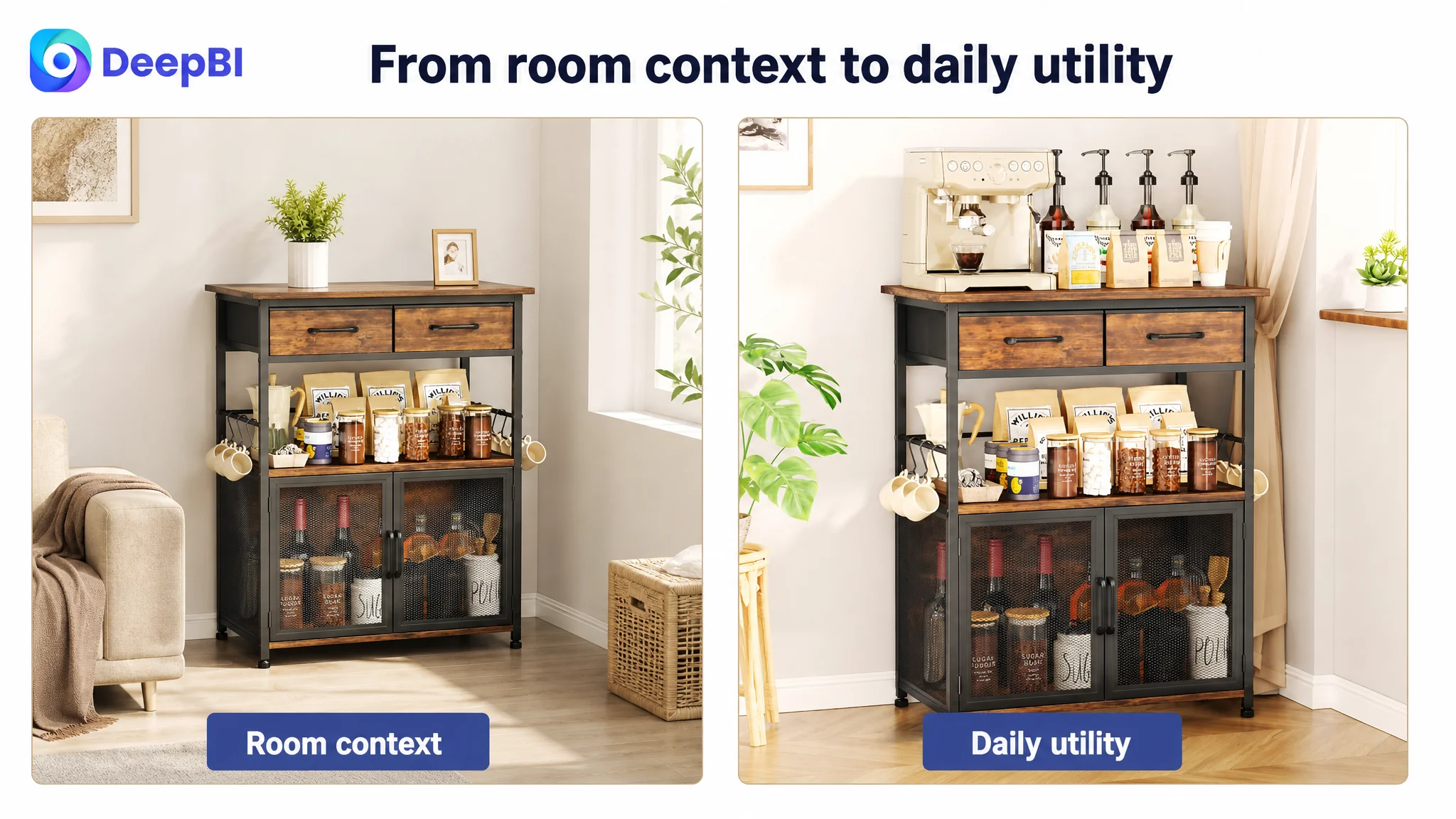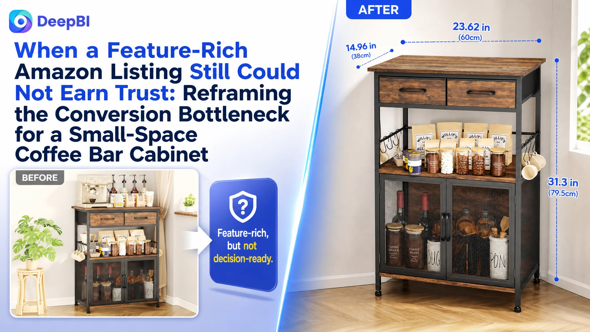
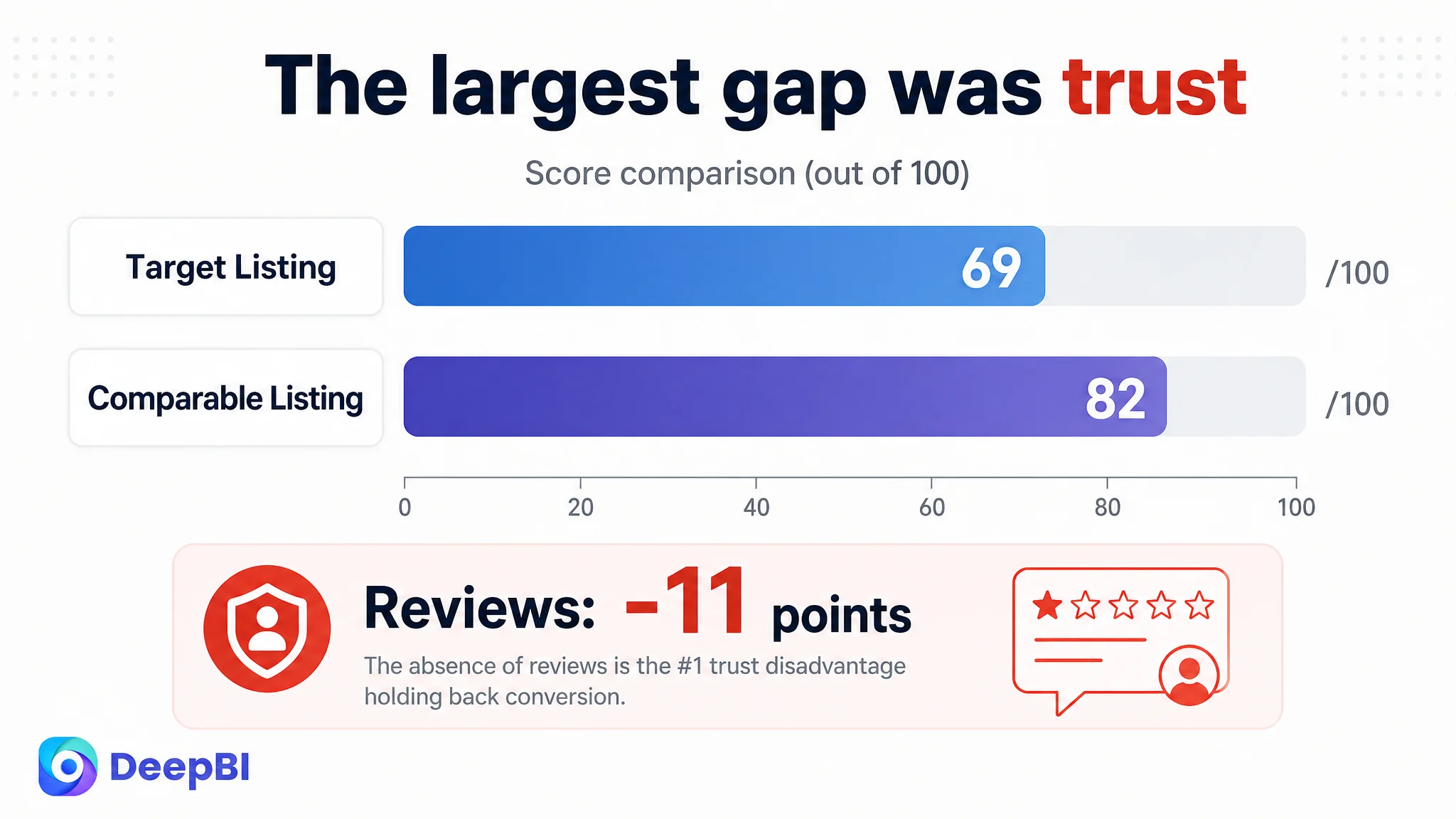
An Amazon seller selling a coffee bar cabinet in the US marketplace did not have an empty product page. The Listing included lifestyle images, functional close-ups, dimensions, multiple size comparisons, and A+ content showing coffee machines, storage, and home-use scenarios. Yet its competitive score was 69 out of 100, compared with 82 for a comparable high-performing Listing.
The initial optimization direction could easily have remained focused on adding more keywords, refining the title, repeating the coffee-bar scene, or making the images look more attractive. DeepBI’s diagnosis pointed to a broader product-page conversion problem: the Listing was describing usefulness, but it was not resolving the buyer’s most important doubts quickly enough—whether the cabinet would fit a small space, hold the right appliances, remain stable, and match the buyer’s expectations after purchase.
The later direction therefore focused on decision proof rather than decoration. The title needed clearer search and use-case logic, the image sequence needed to prioritize space and appliance fit, the A+ content needed more realistic demonstrations, and the page needed stronger trust-building around stability and actual daily use. For other Amazon sellers, the case shows why paid traffic and organic traffic can both lose value when the product page does not answer the buyer’s final questions.
The Amazon Listing Looked Complete. Its Sales Logic Was Not
At first glance, the Listing appeared to cover the standard requirements for a furniture product:
- A main product scene
- Several functional images
- Dimensions and load-bearing information
- Storage and usage scenarios
- A+ modules
- Five bullet points describing capacity, materials, assembly, and versatility
The page also communicated several legitimate strengths. The cabinet had two drawers, six hooks, a 14.96-inch-deep countertop, mesh doors, a metal frame, anti-slip feet, and a compact form intended for kitchens and other small spaces.
The problem was not a lack of product information.
The problem was the order and quality of the proof.
A buyer searching for a coffee station or microwave stand is rarely making a purely aesthetic decision. The buyer is trying to determine whether the unit will fit a particular corner, support a particular appliance, provide enough storage, and avoid becoming another unstable or disappointing piece of furniture.
The Listing addressed these questions, but not always at the moment when the buyer needed the answer.
A product page can contain many facts and still leave the buyer uncertain.
The First Misread: More Description, More Features, More Scene
The existing content leaned heavily on general usefulness and lifestyle presentation. The page positioned the cabinet as a coffee bar, storage unit, and multipurpose home furnishing. Phrases such as “warm and welcoming,” “charm,” and “minimalist flair” helped establish a style, but they competed with more practical purchase questions.
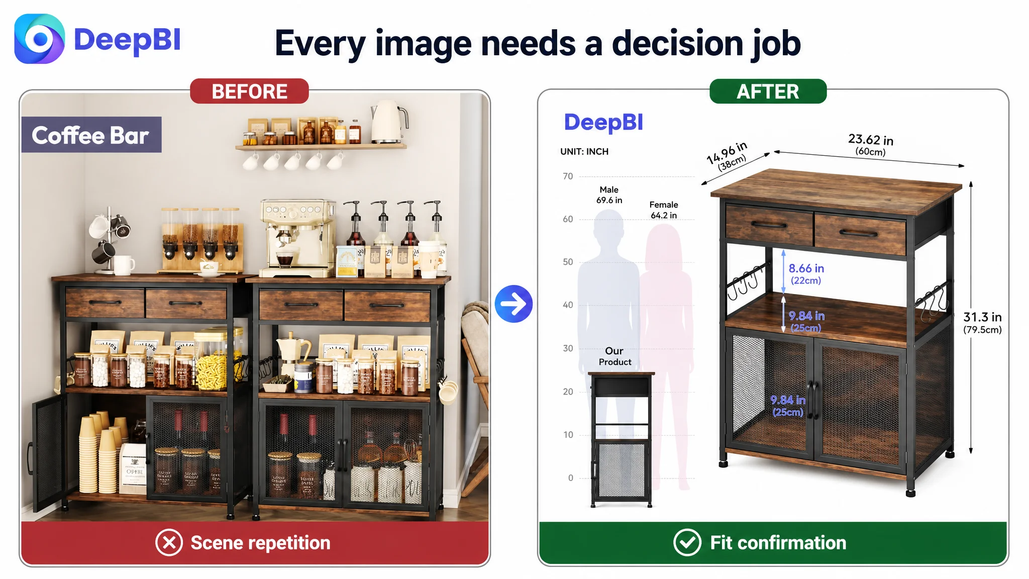
The existing image sequence had a similar issue. Several images showed the cabinet in broadly similar coffee-station or home-corner settings. These scenes were not irrelevant, but they repeated a message the buyer had already received.
Meanwhile, more important doubts remained less visible:
- Will it fit into a narrow kitchen corner?
- Can the shelf spacing accommodate a microwave or bread machine?
- Is the countertop deep enough for a real espresso machine?
- Does the frame look stable under daily appliance use?
- What can the fabric drawers realistically hold?
- Is this primarily a coffee station, or can it function as a microwave stand and kitchen rack?
This created a natural but incomplete optimization direction: improve the title, add more visual appeal, and keep presenting the cabinet’s versatility.
DeepBI reframed the question.
Instead of asking, “What other features can the Listing mention?” the more useful question became:
Which doubts are still preventing a buyer from accepting the product as a safe, suitable choice?
The Score Difference Showed Where the Conversion Risk Was Concentrated
The comparison with a relevant high-performing Listing created a more precise picture.
- Title: Target Listing: 15/20, Comparable Listing: 17/20, Difference: -2
- Main images: Target Listing: 24/30, Comparable Listing: 25/30, Difference: -1
- Bullet points: Target Listing: 7/10, Comparable Listing: 7/10, Difference: 0
- Detail and A+ content: Target Listing: 21/25, Comparable Listing: 20/25, Difference: +1
- Reviews: Target Listing: 2/15, Comparable Listing: 13/15, Difference: -11
- Total: Target Listing: 69/100, Comparable Listing: 82/100, Difference: -13
The result was important for two reasons.
First, the page was not losing everywhere. Its detail-page score was slightly higher than the comparison Listing, and its bullet-point score was equal. This ruled out the idea that the entire Listing needed to be rebuilt from scratch.
Second, the largest numerical gap was in reviews. The target Listing had no rating or customer reviews, while the comparable Listing had a 4.5-star rating and 953 reviews, including customer images and videos.
That gap could not be solved by rewriting one bullet point.
It represented a major trust disadvantage. A new Listing without review evidence asks the product page to do more work through clarity, visual proof, realistic use cases, and expectation management. The content has to reduce uncertainty wherever social proof is absent.
This was the central diagnosis: the Listing’s conversion capacity was weaker than its feature coverage suggested.
The Real Constraint Was Not Product Variety. It Was Buyer Certainty.
The Listing already presented several possible uses. But versatility only helps conversion when the buyer can recognize a concrete use case quickly.
“Multipurpose” is an abstract claim.
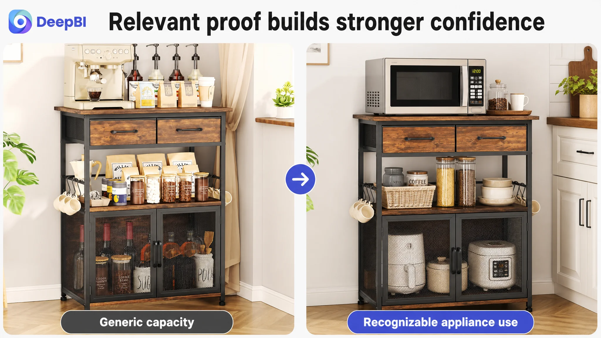
A microwave visibly placed on the cabinet is evidence.
An espresso machine shown operating on the countertop is evidence.
A shelf labeled with the appliances it can accommodate is evidence.
A close-up showing anti-slip feet and a reinforced frame in a real kitchen setting is more relevant than a generic statement that the product is sturdy.
DeepBI’s diagnosis moved the Listing from general description toward concrete validation.
The title needed a clearer entry point
The comparison Listing placed “5 Tier Coffee Bar Station” at the front and combined the product type with specific use cases such as small spaces, corner placement, kitchen storage, and living-room use.
The target title began with the brand name and then accumulated features in a denser structure. It included useful terms, but the hierarchy was less direct and the main customer scenario was harder to recognize on a mobile screen.
The recommended direction was to place the core product and function earlier, then connect it to high-intent use cases:
- Coffee bar cabinet
- Drawer and hooks
- Small-space use
- Microwave stand
- Bakers rack
- Storage
- Clear, compact dimensions
This was not keyword stuffing. It was a reordering of the Listing’s promise.
The title needed to tell both Amazon search and the shopper what the product was, where it belonged, and what problem it solved.
The main image sequence needed to answer “Will it fit?”
The current primary visual direction was relatively general. It showed the product in a home scene, but it did not make small-space efficiency the dominant message.
For this category, the first visual question is often spatial:
Can this cabinet work in my kitchen, corner, hallway, apartment, or dorm?
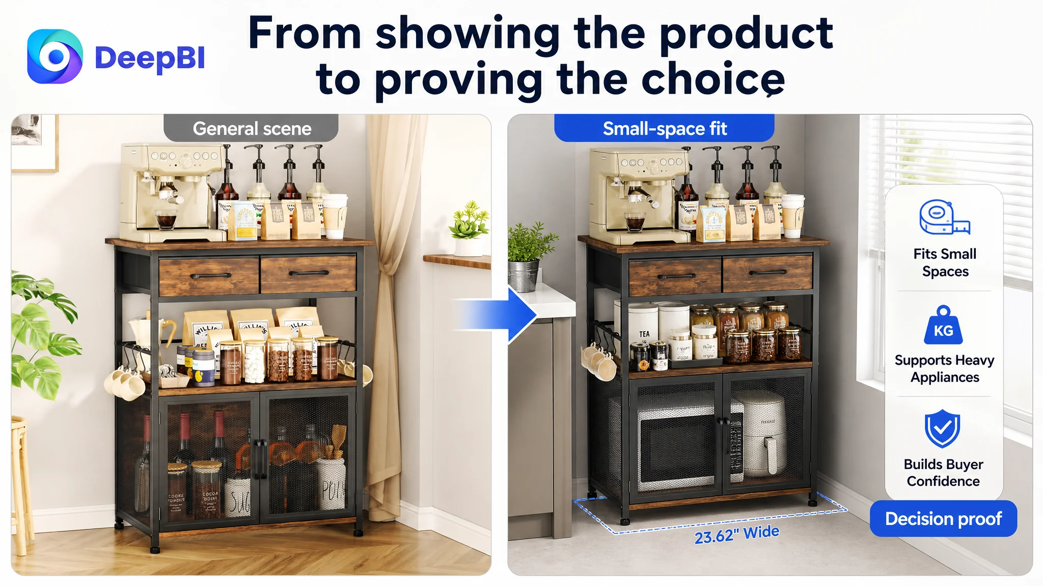
The revised sequence should therefore begin with a realistic narrow-space setting, with the cabinet visibly holding recognizable kitchen appliances and storage items. The purpose is not to make the scene busier. It is to remove a purchase objection at the first glance.
The dimension image also needed to go beyond the overall height, width, and depth. Shelf spacing is often more useful than external measurements when the buyer is trying to place a microwave, bread machine, or other large appliance.
A buyer may understand that the cabinet is 23.62 by 14.96 by 31.3 inches and still not know whether the appliance will fit between the shelves.
External dimensions establish scale. Internal spacing supports the purchase decision.
Repeated scenes were using valuable image space
Several images communicated a similar coffee-station scenario. Once that point had been established, another scene with the same general message added limited decision value.
DeepBI identified the wasted information space and redirected it toward distinct stages of buyer reasoning:
1. Space fit and compact placement
2. Appliance compatibility
3. Storage capacity
4. Structural stability
5. Countertop usability
6. Expectation setting for the drawers and components
7. Final confirmation of the cabinet’s primary use
This is a different way to plan an image sequence. Each image should have a job in the buyer’s decision path.
Why the Existing A+ Content Was Not Enough
The A+ content had several strengths. It used full-width scenes, showed the cabinet in a home environment, compared different sizes, and presented dimensions and load-bearing figures. In some respects, it communicated information more effectively than the comparable Listing.
But information density does not automatically create trust.
The A+ sequence still needed to connect product claims with situations buyers could immediately understand.
Start with the actual space problem
The opening A+ module should show the cabinet in a compact kitchen alcove, corner, or similarly constrained space. A coffee machine or another recognizable appliance should be visibly placed on the unit, with callouts that confirm the fit.
This creates a direct connection between the product’s compact footprint and the buyer’s likely reason for searching.
Show capacity with real kitchen objects
The storage module should use objects such as:
- A microwave
- A bread machine
- Spice bottles
- Tableware
- Coffee supplies
These objects are more persuasive than a generic list of possible uses because they allow the buyer to mentally test the cabinet against an existing kitchen setup.
The claim becomes concrete: not just “ample storage,” but storage that appears relevant to the buyer’s routine.
Replace abstract durability proof with relevant proof
The existing durability presentation used dumbbells to demonstrate weight-bearing ability. That may communicate load, but it is not the most natural proof for a kitchen cabinet.
A better direction is to show relevant appliances such as an espresso machine, air fryer, microwave, or bread machine placed on the unit. This links stability to the environment in which the product will actually be used.
The point is not to make a stronger claim than the product supports. It is to make the evidence more recognizable.
The same principle applies to anti-slip feet and the metal frame. These should be shown as part of a stability story rather than mentioned as isolated specifications.
Manage expectations around the fabric drawers
The drawers are a potential source of post-purchase misunderstanding. If the page presents them only as attractive storage features, a buyer may assume they are rigid or suitable for heavy items.
The A+ content should show the drawers holding appropriate light items such as K-cups, napkins, or small utensils. The fabric construction should be stated clearly.
Expectation management is part of conversion quality.
A page that creates a realistic expectation is more commercially durable than one that wins a click through ambiguity.
End with confirmation, not more choice friction
The final module currently emphasizes different size models. That can introduce a new decision at the end of the page, when the buyer should be receiving confirmation.
A stronger closing image would reinforce the standard model’s primary value: a compact, multipurpose coffee and kitchen station that can accommodate a recognizable appliance and organize a small space.
The last impression should answer:
What will this product do for my home?
It should not leave the buyer comparing variations without a clear reason to choose one.
The Bullet Points Needed a More Practical Buying Logic
The bullet-point score was equal to the comparable Listing, so this was not the primary weakness. Still, the analysis showed an opportunity to make the text more conversion-oriented.
The existing bullets often combined emotional language with functional claims. The revised direction shifted toward measurable utility and specific use cases.
A stronger sequence would look like this:
Lead with storage that can be visualized
The first bullet should combine the two drawers, six hooks, mesh doors, and the 14.96-inch-deep countertop. These details immediately communicate how the cabinet organizes a small area.
Connect design to multiple practical uses
The industrial metal frame and rustic wood-grain appearance can support the style story, but the bullet should also clarify that the unit can function as a coffee station, bakers rack, microwave cart, or office coffee station.
Use stability details buyers can trust
The reinforced frame, quality boards, anti-slip feet, and suitability for appliances should be presented as a coherent stability message. “Sturdy” alone is weaker than a description connected to daily use.
Combine compactness with assembly clarity
The small-space benefit and labeled components can sit together. Buyers want to know not only whether the cabinet fits the room, but whether they can assemble it without unnecessary frustration.
Close with service and realistic functionality
The final bullet can reinforce the product’s intended use and service response without relying on inflated promises. It should leave the buyer with a clear understanding of what the cabinet is designed to hold and how support is handled.
The goal is not to make every bullet more promotional. It is to ensure that each one moves the shopper from a concern to a reason for confidence.
Why DeepBI Did Not Keep Tuning the Ads First
The case material does not provide post-optimization advertising results, so it would be misleading to claim that ACOS declined, CVR increased, or organic orders recovered.
What the diagnosis does make clear is the decision order.
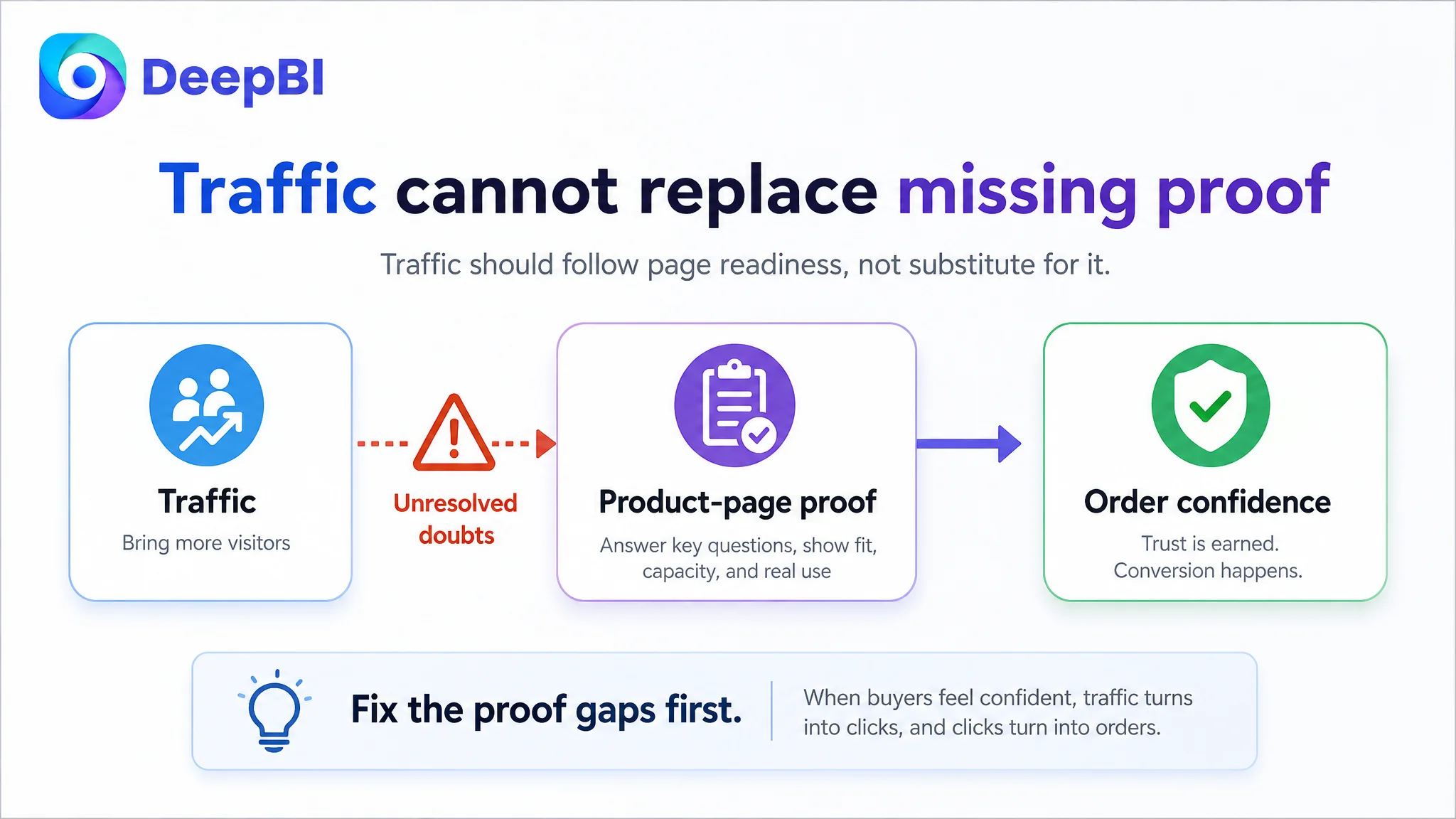
If the page has no review foundation and leaves questions about fit, appliance compatibility, and stability unresolved, sending more traffic to it can increase exposure without fixing the conversion constraint.
Advertising may generate the click. The product page still has to earn the order.
Advertising does not only amplify strengths. It can also amplify the defects that already exist on the page.
This is why continued bid or keyword adjustment would not be the first priority in this situation. More precise targeting cannot fully compensate for a product page that does not establish enough certainty after the click.
The practical sequence becomes:
1. Clarify the product’s strongest search and use-case entry points.
2. Reorder the images around space fit, appliance compatibility, and stability.
3. Replace repeated scenes with distinct proof.
4. Use A+ content to demonstrate realistic capacity and daily use.
5. Set accurate expectations for components such as fabric drawers.
6. Then evaluate how paid traffic responds to the revised conversion path.
This does not mean advertising is unimportant. It means advertising should not be asked to solve a Listing problem.
The Business Risk Was Larger Than a Low Score
The 69-point score was useful because it showed the page’s relative position. But the more important issue was operational risk.
With no customer reviews, the Listing lacked the social proof that a comparable product used to reassure shoppers. That made every unclear image, generic phrase, or repeated scene more costly.
The business risks included:
- Paid traffic arriving on a page with limited trust support
- Buyers hesitating over appliance fit
- Buyers misunderstanding internal shelf capacity
- Buyers questioning stability in daily kitchen use
- Buyers forming unrealistic expectations about fabric drawers
- Organic conversion remaining difficult to sustain
- Operators continuing to adjust traffic before repairing the page
The correct response was not to hide the weakness with more visual decoration. It was to make the page more explicit, more relevant, and more credible within the product’s real capabilities.
What Changed in the Seller’s Understanding
This case did not end with a reported performance uplift, so the conclusion should not be framed as a numerical success story.
Its value is in the change in operating judgment.
The seller could now distinguish between:
- A Listing that contains many features and one that communicates a clear buying decision
- A scene that looks attractive and one that resolves a purchase concern
- A dimension graphic that reports size and one that proves appliance compatibility
- A durability claim and evidence that feels relevant to kitchen use
- A complete A+ layout and a persuasive A+ sequence
- An advertising problem and a product-page conversion problem
The review gap remained a serious structural disadvantage. No title rewrite or image replacement could make the Listing equivalent to a product with hundreds of customer reviews. But the page could become better at doing the work available to it: clarifying use, demonstrating fit, building confidence, and preventing avoidable regret.
That distinction matters for Amazon sellers operating newer or under-reviewed products.
The Lesson for Amazon Sellers
A coffee bar cabinet does not win simply because it has storage, hooks, drawers, or a stylish frame. It wins when the buyer can quickly imagine it fitting into a real space and serving a real routine.
For this Amazon Listing, the most important optimization was not adding more content. It was assigning each content element a clearer role:
- The title should capture the product type, core function, and high-intent use cases.
- The main image should make small-space fit visible.
- The secondary images should answer appliance and shelf-spacing questions.
- The bullet points should connect features to practical problems.
- The A+ content should demonstrate capacity, stability, and daily use.
- The drawer presentation should set accurate expectations.
- The overall page should compensate, as far as possible, for the absence of review-based trust.
Before increasing Amazon ad traffic, sellers need to ask whether the product page is ready to receive it.
If the answer is no, the next optimization is not necessarily another bid adjustment. It may be the title, the image sequence, the proof of fit, the structure of the bullet points, or the missing trust logic across the Amazon product page.
In this case, DeepBI’s value was not in producing more changes. It was in identifying which change had to come first.