

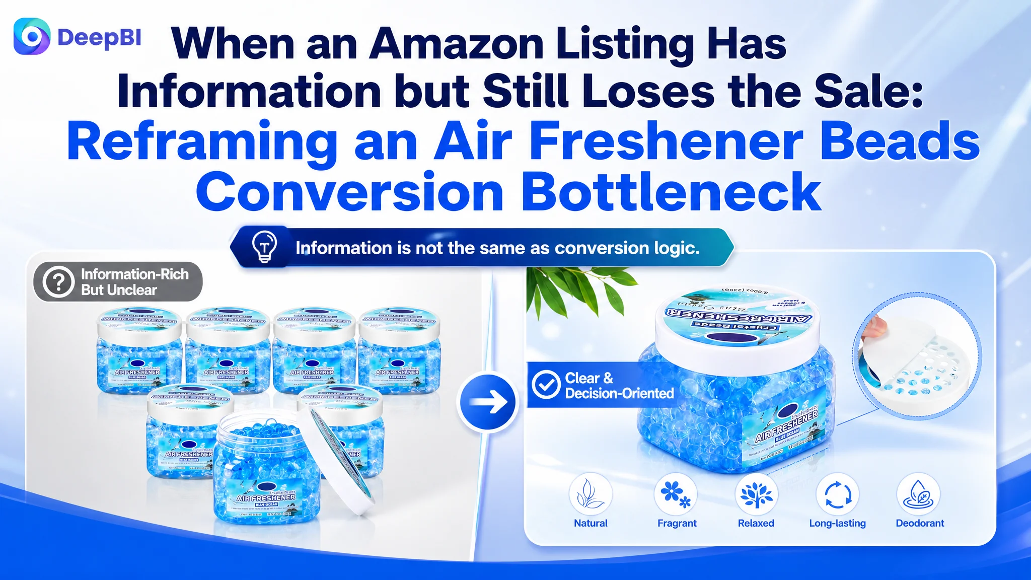
An Amazon seller in the home air-care category was not facing a simple content shortage. The product page already showed the six-pack quantity, product specifications, usage scenes, and fragrance options. Yet compared with a stronger category listing, the page was not communicating value, trust, or ease of use in the order shoppers needed.
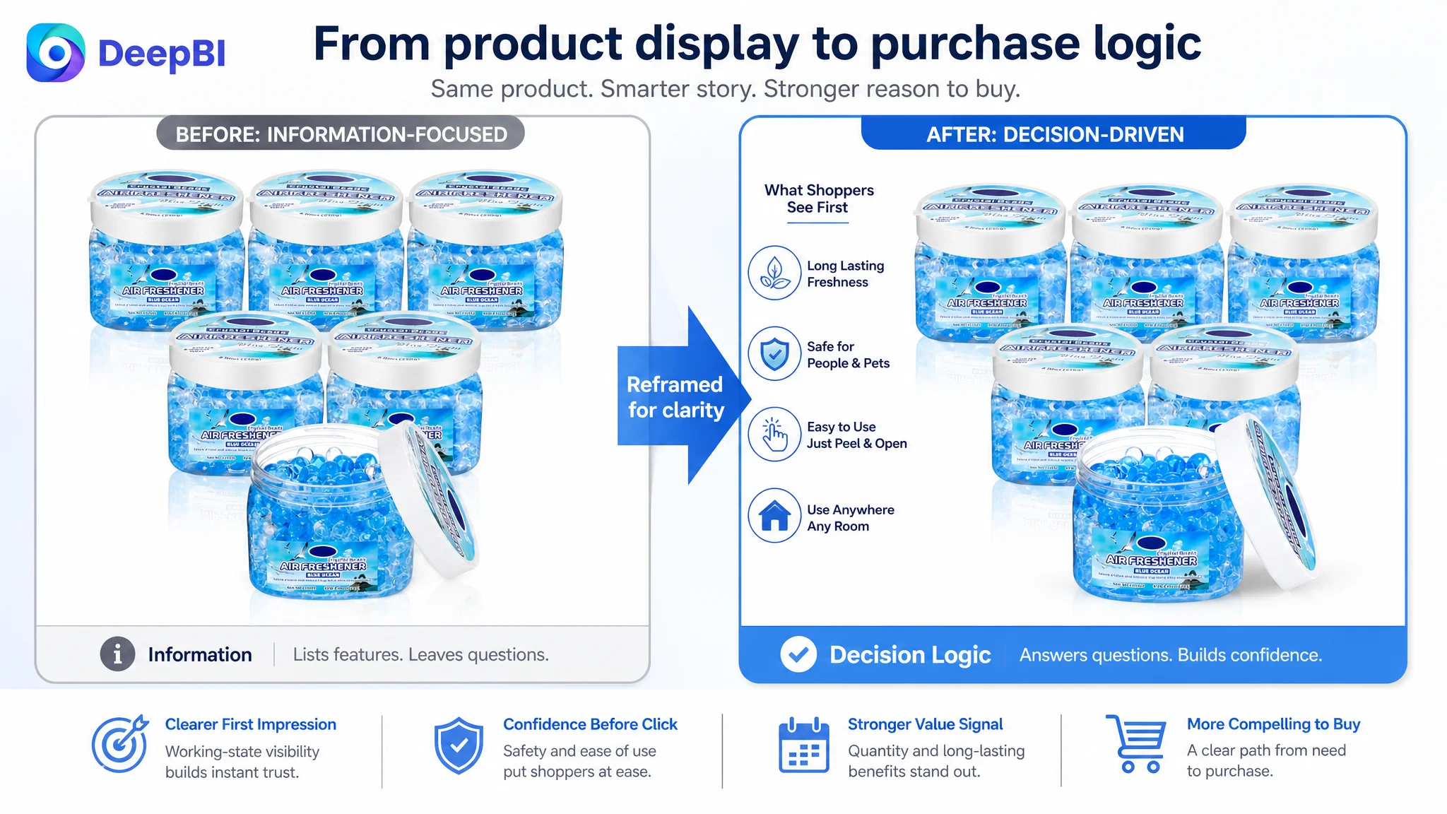
The initial direction was to add more product information and improve individual images. DeepBI’s diagnosis pointed to a deeper issue: the Amazon Listing was presenting features separately, but it was not guiding the shopper from the problem of recurring odors to confidence in the product’s safety, effectiveness, and everyday use.
The later optimization therefore focused on rebuilding the product-page decision path. The title needed stronger search and value signals, the main images needed to make the product’s function visible faster, the bullet points needed to connect features with buyer concerns, and the A+ content needed to establish safety and efficacy before introducing secondary details. Other Amazon sellers can take away one important lesson: a page can contain all the expected modules and still lack the sales logic required to convert paid and organic traffic.
The Page Was Complete in Form, but Weak in Decision Logic
At first glance, the Listing appeared to cover the basics:
- A six-pack of odor eliminator gel beads
- Blue Ocean fragrance positioning
- Home, bathroom, car, office, pet-area, and other use cases
- Product dimensions and weight
- Usage instructions
- Safety-related messaging
- Multiple lifestyle and product images
The problem was not that shoppers had no information.
The problem was that the information did not arrive as a convincing sequence.
A shopper looking for an odor solution is usually making several judgments in a short period:
1. Does this product address the odor problem I have?
2. Is it safe to use around people, children, and pets?
3. Will it work for a meaningful length of time?
4. Is it easy to activate and place?
5. Does the quantity justify the purchase?
6. Does the page look trustworthy enough to support the claims?
The customer’s page addressed these topics, but often as separate facts. The stronger comparable Listing connected them into a more deliberate path: quantity and long-term value, safety and ingredients, usage mechanism, duration, and multi-space deployment.
The real gap was not a missing feature. It was the absence of a clear reason for the shopper to believe, choose, and buy.
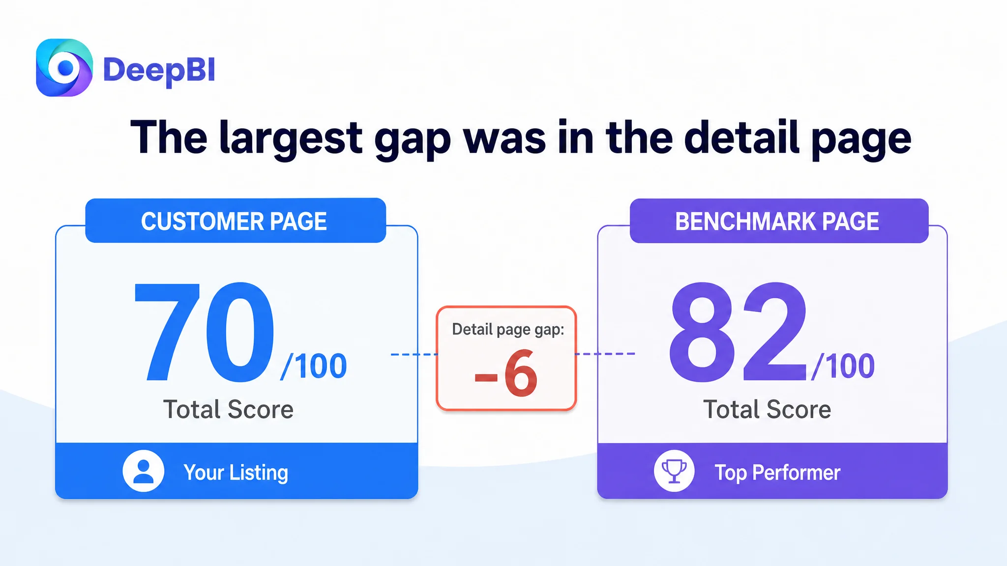
DeepBI’s Listing assessment made that difference visible. The customer’s page scored 70 out of 100, compared with 82 for the benchmark listing.
The most important gap was not in reviews or the main image alone. It was in the detail-page experience, where the customer scored 17 out of 25 against the benchmark’s 23. That six-point difference was larger than the gaps in the title, main image, bullet points, or reviews.
This changed the order of priorities.
Instead of treating every module as an independent improvement task, the diagnosis focused on the page’s overall conversion capacity.
The Original Assumption: Add More Information and Improve Individual Images
The existing content leaned toward functional coverage.
The title mentioned the product type, odor-removing function, size, pack quantity, fragrance, and application scenarios. The bullet points described quantity, material, dimensions, usage duration, safety, and different locations where the product could be placed. The images covered product presentation, odor-related scenes, fragrance, instructions, and multiple use environments.
That structure created a familiar operational trap: the team could see many areas to edit, but not necessarily which weakness was limiting the purchase decision.
The page looked as if it needed more detail, more scenarios, or more polished visuals. But adding another specification or another general lifestyle image would not necessarily resolve the underlying hesitation.
The customer’s content was also weighted toward product description:
- The pack quantity was stated, but the value of covering multiple spaces was not strongly developed.
- The material was described in broad terms rather than through a clearly supported trust narrative.
- The usage duration appeared as a specification instead of a confident performance story.
- Safety and ease of use were combined with other claims, reducing their impact.
- The five bullets listed functions and steps but did not consistently follow a problem-to-solution structure.
- Several A+ modules repeated quantity, fragrance, or general freshness information.
This is where the initial diagnosis was incomplete. The page was being treated as a collection of assets to improve. DeepBI reframed it as a sequence of buyer decisions that needed to work together.
The Score Gap Showed Where the Page Was Losing Confidence
The dimension comparison was useful because it prevented the team from overreacting to the most visible issue.
- Title: Customer page: 14/20, Benchmark page: 17/20, Gap: -3
- Main image: Customer page: 24/30, Benchmark page: 25/30, Gap: -1
- Bullet points: Customer page: 6/10, Benchmark page: 7/10, Gap: -1
- Detail page: Customer page: 17/25, Benchmark page: 23/25, Gap: -6
- Reviews: Customer page: 9/15, Benchmark page: 10/15, Gap: -1
- Total: Customer page: 70/100, Benchmark page: 82/100, Gap: -12
The score did not suggest that the main image was irrelevant. It showed that the image was only one part of the problem.
The customer’s main image set had several specific weaknesses:
- The product’s working state was not immediately clear.
- The loose lid in several images created ambiguity about how the vented cap functioned.
- One image attempted to communicate dimensions, icons, usage, and generic benefits at the same time.
- Another image repeated the six-pack and product type without introducing a new buying reason.
- The safety message was mixed with multiple scenarios instead of receiving a dedicated trust-focused treatment.
- The bathroom use case, one of the strongest practical needs, was not expressed directly enough.
These were not merely aesthetic differences. They affected how quickly a shopper could understand the product and whether the page looked deliberate and credible.
The title had keywords, but not enough value structure
The benchmark title led with a stronger quantity signal and placed the core odor-eliminator phrase earlier. It also made specifications and longevity more visible.
The customer’s title began with a smaller six-pack quantity, placed the central product phrase later, and used overlapping odor-related wording that consumed space without adding much meaning.
The issue was not simply keyword placement.
It was that the title did not immediately combine:
- Product type
- Core odor-removal purpose
- Pack quantity
- Longevity
- Key use environments
- Product size
The proposed title direction therefore prioritized a clearer search-and-value structure while removing repetition. It was intended to make the product easier to identify and easier to evaluate at the search-result stage.
The bullets described the product, but did not consistently sell the solution
The customer’s bullet points moved through quantity, material, dimensions, safety, usage, and multiple scenes. That covered the expected information, but the sequence felt closer to a specification sheet than a buying argument.
The benchmark listing was more persuasive because each point connected a product attribute with a reason the shopper should care:
- More units supported a longer-term, multi-space solution.
- Ingredient language created a stronger basis for trust.
- Capacity and duration made the performance claim easier to evaluate.
- Safety was addressed with more specific household context.
- Use cases were framed around recurring odor problems rather than a generic list of rooms.
The customer’s bullet points did not need more claims for the sake of volume. They needed clearer prioritization.
The bullet points had information, but not enough decision momentum.
The A+ Gap Was the Main Conversion Constraint
The largest score difference appeared in the detail-page content.
The customer’s A+ structure included product presentation, odor-problem scenes, long-lasting fragrance, usage instructions, multiple applications, and separate fragrance-related modules. The benchmark listing used a more unified visual language and a more deliberate persuasion sequence.
Its content connected:
- Household trust
- Ingredient and fragrance explanation
- Product-use mechanism
- Duration expectations
- Everyday lifestyle context
- Emotional reassurance for families and pets
The customer’s page was more fragmented.
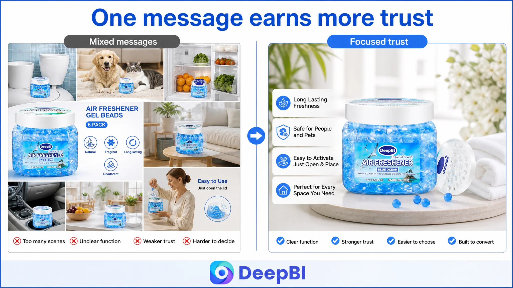
Safety arrived too late and without enough depth
For an odor-control product used in homes, pet areas, bathrooms, and other enclosed environments, safety is not a minor supporting detail. It can determine whether a shopper continues evaluating the product.
The customer’s safety message appeared alongside ease of use and compact design. That combination caused the page to address too many concerns at once without fully resolving any of them.
DeepBI’s recommended order moved safety much earlier, immediately after the value and quantity confirmation. The intent was not to exaggerate the claim, but to give it enough space to work as a trust-building node.
Any wording such as “plant-based,” “botanical,” “essential oil,” “pet-friendly,” or “contains no harmful substances” must remain limited to claims the seller can substantiate. The benchmark’s language could indicate a stronger communication strategy, but it could not serve as permission to add unverified ingredients or safety assurances.
That distinction is commercially important. A conversion improvement that depends on unsupported claims can create a later review, compliance, or refund problem.
Product efficacy needed to be shown, not only stated
The customer’s page identified garbage cans, pet areas, food odors, smoke, bathrooms, and other recurring odor sources. However, the visual logic focused more on showing where odors exist than on showing how the product addresses them.
DeepBI’s diagnosis shifted the emphasis from “these places can smell” to “this product is designed for recurring odor problems in these places.”
That meant giving greater weight to:
- Targeted odor-removal scenarios
- The product’s placement in high-frequency problem areas
- A clear activation sequence
- A readable explanation of how freshness is released
- A duration message presented with appropriate evidence and qualification
The available material included a proposed “up to 90 days” communication direction. Because the case does not establish that this was a verified measured result, the safer business approach is to validate the duration before making it a central promise. The visual and copy structure can still communicate long-lasting use, but the final claim must match the product’s confirmed performance.
Repetition reduced the value of the A+ space
Several modules repeated the same basic messages:
- Six-pack quantity
- Gel beads
- Multiple fragrances
- General freshness
- Multi-scene use
Repetition can be useful when reinforcing a key benefit, but here it replaced opportunities to answer more important questions.
The recommended A+ path consolidated the fragmented fragrance modules into one clearer ingredient-and-scent section, moved safety earlier, combined usage instructions with the duration explanation, and repositioned multi-room deployment as a practical installation story.
This was not a request to make the A+ page longer.
It was a request to make each module perform a different job.
Why DeepBI Did Not Keep Treating the Problem as an Image Refresh
The customer’s images did need improvement, but a visual refresh alone would not repair the page’s logic.
A more polished living-room scene could improve perceived quality, but it would not necessarily resolve uncertainty about safety. A new product close-up could make the jars look clearer, but it would not explain why six units represent a practical multi-space solution. A stronger fragrance image could create appeal, but it would not establish how the product is activated or what duration to expect.
DeepBI’s role in the diagnosis was to connect the visible gap to the business consequence.
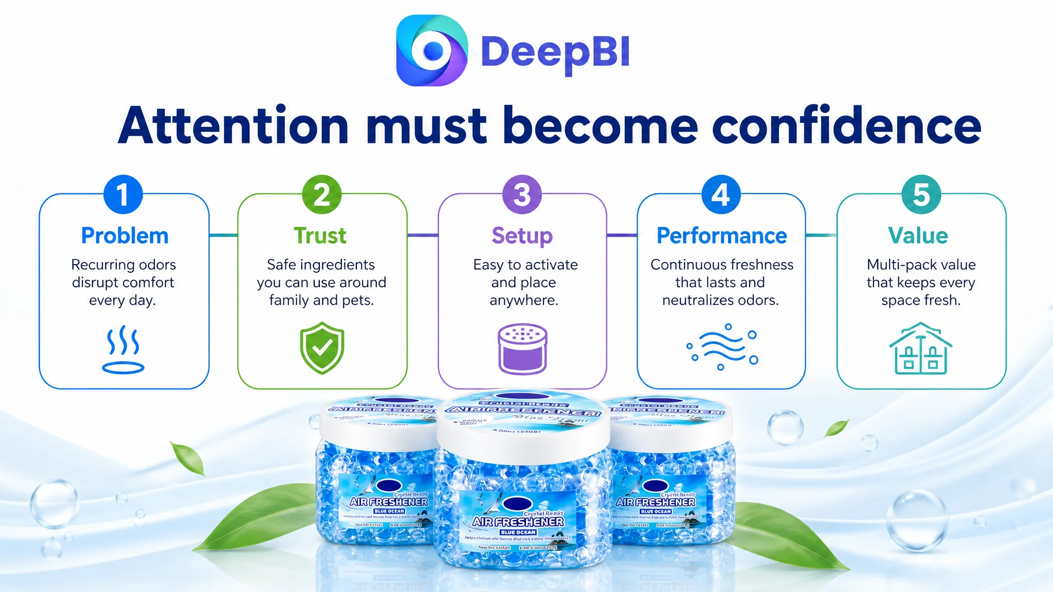
The page needed to answer the shopper’s questions in sequence:
1. What is this, and what problem does it solve?
2. Why should I trust it in my home?
3. How does it work and how easy is it to use?
4. How long can I expect it to remain useful?
5. Where can I place it?
6. Why is this pack a sensible purchase?
That decision order explained why the A+ content had to be addressed alongside the title, images, and bullets. A stronger main image could improve attention, but the rest of the Listing still had to convert that attention into confidence.
Advertising or visibility can bring a shopper to the page. The Listing must still give that shopper a reason to continue.
The Main Image Needed to Show Readiness, Not Just Quantity
The first image’s job was to establish product type and quantity. The customer’s image did confirm the six-pack and Blue Ocean scent, but it did not make the product’s working state obvious enough.
The proposed direction retained the quantity message while making the open jar and vented cap unmistakably functional. This mattered because the product is not just a container of scented beads. Its value depends on how it is activated and placed.
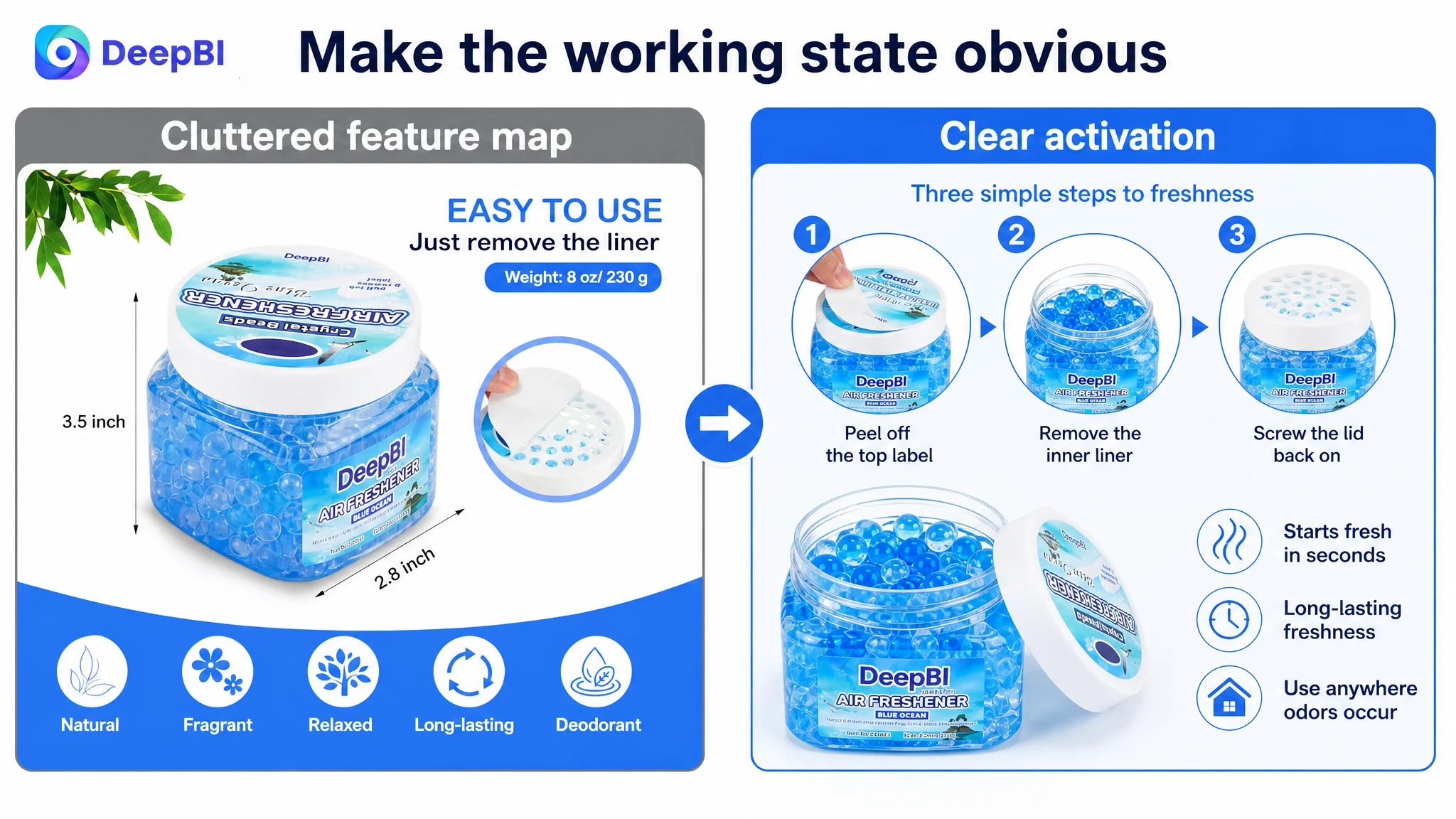
The remaining images were then assigned more focused roles:
Make setup visually effortless
The existing feature image attempted to function as a user manual, a dimension chart, and a benefits summary. That created clutter.
A more effective image would isolate the activation sequence:
- Peel off the top label
- Remove the inner liner
- Replace the lid
The purpose was not to add decorative explanation. It was to remove the fear that setup might be complicated or easy to get wrong.
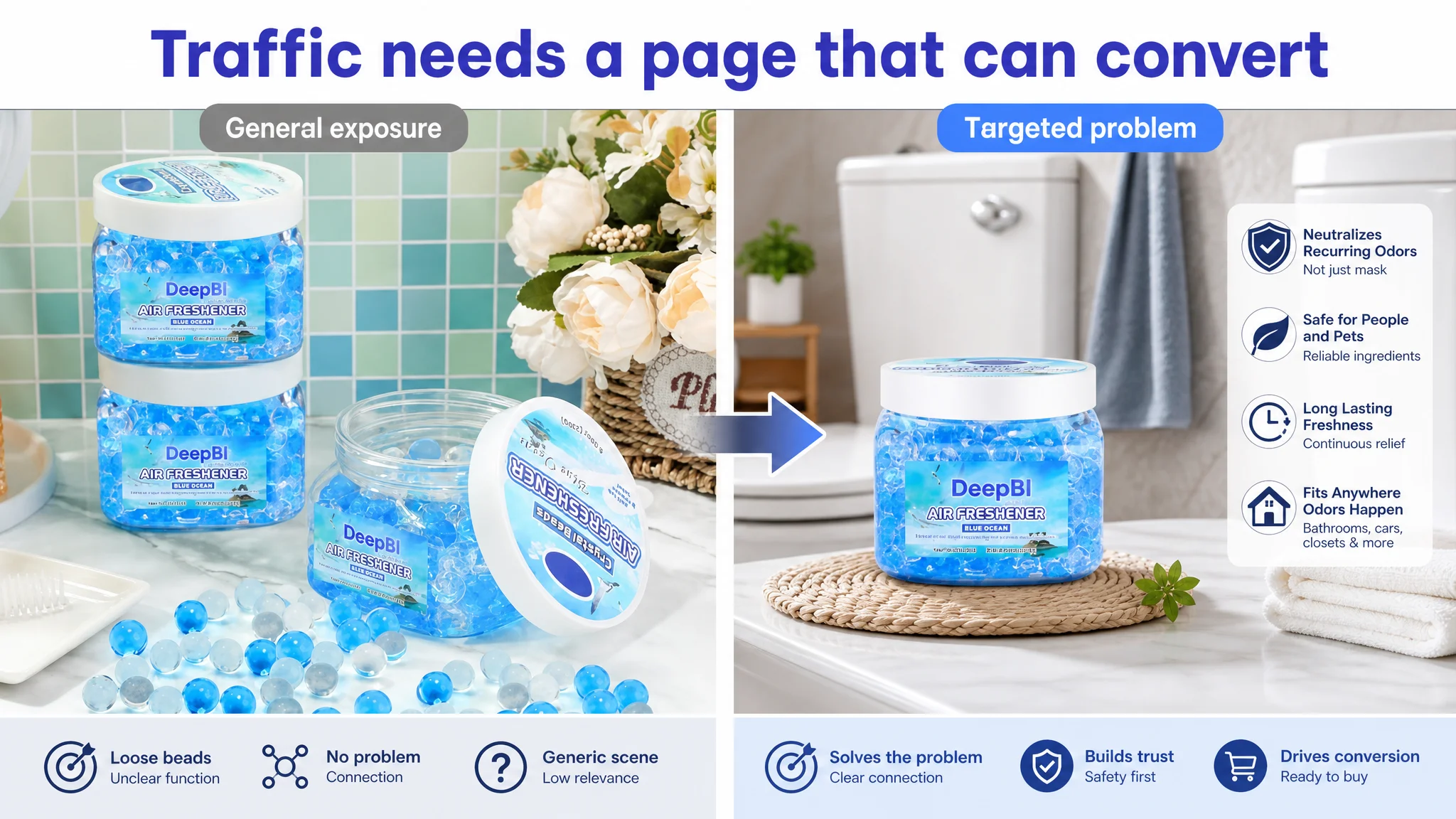
Replace repetition with a targeted problem scene
The repeated six-pack image did not add enough new information. It could be replaced by a focused visual showing the product placed in a high-frequency odor area such as a bathroom, garbage-can area, or pet zone.
The specific scene should match confirmed product use claims. The image should make the placement and intended problem immediately understandable.
Separate duration from general lifestyle atmosphere
The living-room image created a pleasant mood but did not provide a strong reason to choose the product. The revised direction connected the lifestyle scene to a verified duration or long-lasting-use message, so the visual would support value rather than merely repeat “fresh and fragrant.”
Give safety its own visual moment
The previous safety image mixed people, pets, and multiple use scenes. As a result, no single message dominated.
The revised direction treated safety as a standalone trust story. It could show people and pets coexisting with the product in a natural home environment, while keeping the actual copy within substantiated product claims.
This separation made the page easier to scan and reduced the chance that safety would disappear inside a crowded composition.
The Product Page Needed a New Information Order
The recommended A+ sequence was not based on adding every possible benefit. It was based on reducing uncertainty at the right time.
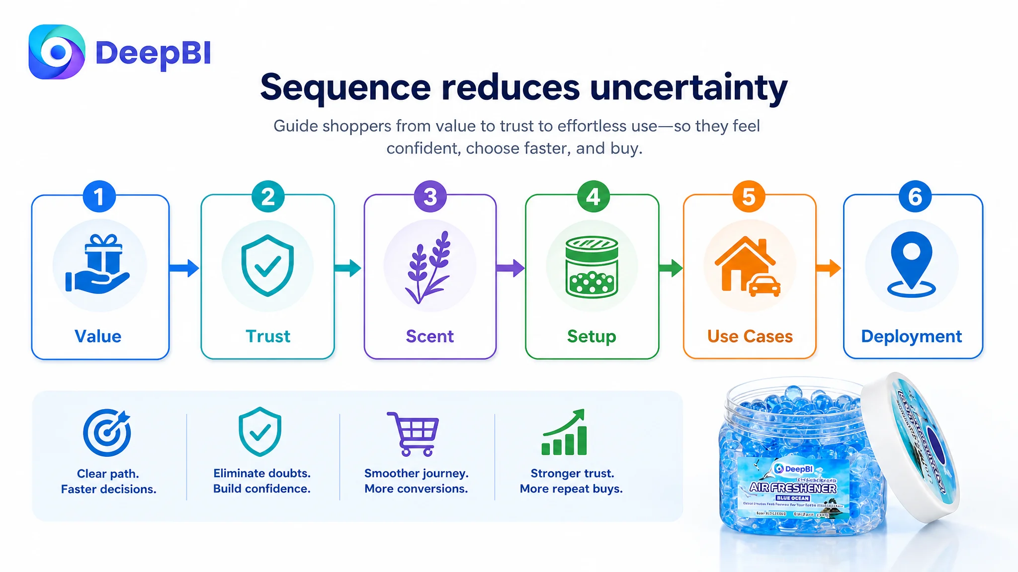
First: confirm the value and practical fit
The six-box quantity, compact dimensions, and approximate weight establish what the shopper receives and where it can realistically be placed.
Second: address household trust
Safety-related information should follow early, before detailed performance claims. The shopper needs a reason to feel comfortable considering the product in a home, pet area, or other daily environment.
Third: consolidate fragrance and material information
Instead of spreading fragrance options across several late modules, the page should present them in one coherent menu. Ingredient descriptions should only be used when factually confirmed.
Fourth: explain activation and expected duration
The peel-and-open process should appear with the performance explanation. This allows the shopper to understand both what to do and what outcome the product is intended to provide.
Fifth: show the problem-solving use cases
The page can then move into recurring odors, including bathrooms, garbage areas, food odors, smoke, pet zones, closets, vehicles, RVs, and boats where supported by the Listing claims.
Sixth: demonstrate multi-space deployment
The six-pack becomes more meaningful when the shopper can see how the compact jars may be distributed across different spaces rather than treated only as a quantity statement.
This order transformed the A+ content from a sequence of image modules into a conversion path.
The Review Profile Was Not the Main Bottleneck, but It Still Mattered
The customer’s Listing had a 3.8-star rating from 92 reviews, while the benchmark had 3.7 stars from 141 reviews.
The customer therefore held a slight advantage in average rating but a disadvantage in review volume. The review score was close enough that it did not explain the full 12-point Listing gap.
However, the review content identified specific trust risks:
- Complaints about product scent
- Dissatisfaction with packaging
- A lower overall review volume than the benchmark
- A somewhat higher negative-review share than the benchmark
This supported a cautious conclusion: the page did not need to solve everything through more review accumulation. It needed to reduce the mismatch between what the Listing promised and what customers experienced.
If the page emphasizes freshness, safety, duration, or ease of use, those claims must be expressed with enough precision to set realistic expectations. Better content is not only about persuading the next shopper. It is also about preventing avoidable disappointment after purchase.
The Decision Was to Repair Conversion Capacity Before Scaling the Message
The central business judgment was straightforward:
The Listing should first become more capable of converting attention before the seller relies on broader traffic or more aggressive promotion to solve the problem.
This did not mean that advertising was irrelevant. It meant that traffic and page quality had to be viewed together.
When the title, main image, bullet points, and A+ content communicate different priorities, more traffic can expose the inconsistency rather than solve it. Shoppers may click because the product looks relevant, then hesitate because safety is unclear, the duration claim feels unsupported, or the product’s use mechanism is difficult to understand.
For this product page, the most important risks were:
- A low-value perception created by the six-pack presentation
- Weak immediate understanding of how the jar works
- Insufficient safety reassurance
- A+ repetition that consumed persuasive space
- Bullet points that described features without enough buyer logic
- A mismatch between the desired performance story and the evidence available to support it
DeepBI’s value was not in recommending that every element be changed at once. It was in identifying which changes belonged earlier in the sequence and which should wait.
The page needed a stronger foundation before additional traffic could be judged fairly.
What the Seller Could Learn from the Case
The case did not establish a verified post-optimization CVR, ACOS, CTR, or organic-order increase, so no numerical performance outcome should be claimed.
What did change was the operating understanding of the Listing.
The seller could now distinguish between several issues that had previously appeared to be one general content problem:
- The title was a search and value-positioning issue.
- The main image set was a function-visibility and focus issue.
- The bullets were a problem-to-solution structure issue.
- The A+ content was a trust, sequencing, and repetition issue.
- The review profile was a credibility and expectation-management issue.
That distinction creates a more controllable optimization process.
It also clarifies the relationship between Amazon ads and product-page conversion:
- Ads can create exposure and bring relevant shoppers to the Listing.
- The title and main image influence whether the shopper engages.
- The bullets and A+ content determine whether uncertainty is resolved.
- Reviews influence whether the product feels credible enough to choose.
- The combined page experience affects whether traffic becomes an order.
A Listing should not be judged only by whether it contains the required modules. It should be judged by whether those modules help the shopper make the next decision.
For this air freshener beads seller, the next optimization direction was therefore not “add more content.” It was to rebuild the page around a clearer commercial sequence:
problem recognition, household trust, easy activation, credible performance, and practical multi-space value.
That is the difference between an Amazon Listing that merely describes a product and one that is prepared to convert the traffic it receives.