

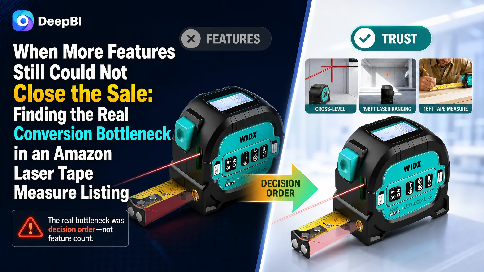
This case follows an Amazon seller whose 3-in-1 laser tape measure Listing was not losing because the product lacked functions. It combined a 196-foot laser rangefinder, a 16-foot magnetic auto-lock tape measure, and a cross-line laser. Yet the product page was not communicating that value with enough clarity or credibility.
The initial optimization direction treated the problem mainly as an information and presentation gap: add more feature explanations, show more measurement modes, and describe the hardware in greater detail. DeepBI found a more fundamental issue. The Listing was asking shoppers to process too much disconnected information before it had answered the basic questions of suitability, accuracy, usability, and trust.
The later optimization therefore focused on restoring the page's decision logic: remove misleading elements from the main image, place range and performance proof earlier, reorganize the title and bullet points around user outcomes, and rebuild the A+ content as a progression from product structure to technical evidence to real-world use.
For other Amazon sellers, the lesson is direct: when paid or organic traffic fails to produce enough orders, the first question should not always be which keyword or bid to adjust. It should be whether the Amazon product page gives that traffic a clear reason to believe, understand, and buy.
The Listing Had a Capable Product, but a Weak Sales Argument
The product belonged to a practical, specification-driven category. Buyers were not only looking for a measuring tool. They were evaluating whether one device could reliably replace several separate tools without creating new problems on the job.
The product offered a meaningful combination:
- A 196-foot digital laser measurement range
- A 16-foot magnetic auto-lock tape measure
- A cross-line laser function
- Distance, area, and volume measurement modes
- Unit switching between feet, inches, and meters
- A rechargeable battery
- A self-locking mechanism, magnetic hook, and belt clip
On paper, this created a strong 3-in-1 value proposition.
On the Amazon product page, however, the value was distributed across separate icons, feature grids, technical notes, and scenario panels. The Listing showed that the product could do many things, but it did not establish which benefit mattered first or why the buyer should trust the result.
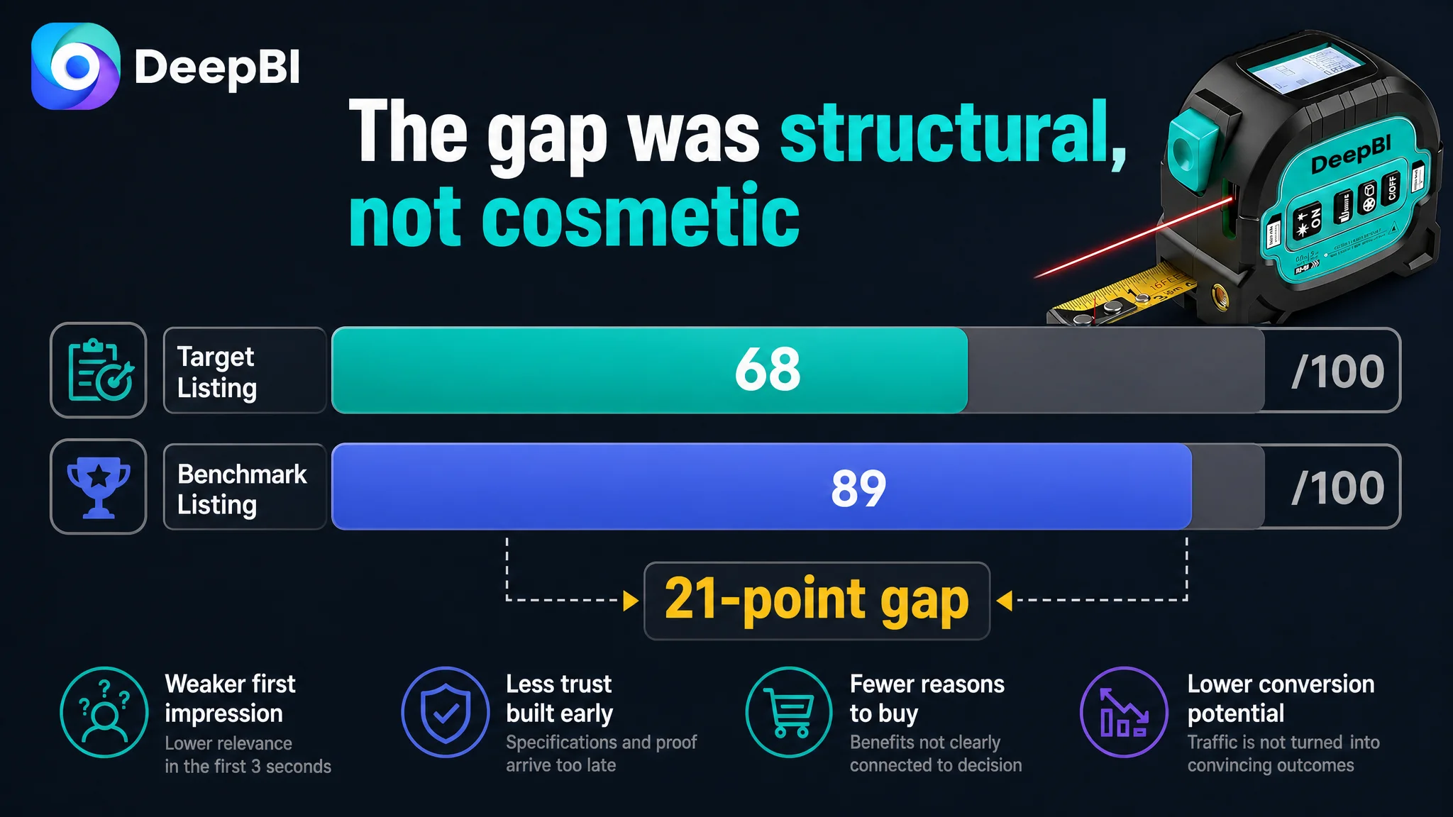
That distinction explains why the overall Listing score reached only 68 out of 100, compared with 89 out of 100 for a comparable high-performing Listing.
The gap was not concentrated in a single cosmetic detail:
- Title: Target Listing: 15/20, Benchmark Listing: 18/20, Gap: -3
- Main image: Target Listing: 25/30, Benchmark Listing: 26/30, Gap: -1
- Bullet points: Target Listing: 6/10, Benchmark Listing: 9/10, Gap: -3
- Detail page and A+ content: Target Listing: 17/25, Benchmark Listing: 24/25, Gap: -7
- Reviews: Target Listing: 5/15, Benchmark Listing: 12/15, Gap: -7
- Total: Target Listing: 68/100, Benchmark Listing: 89/100, Gap: -21
The most important signal was not that the Listing needed more content. It was that the page was weak at converting complexity into confidence.
The product had a broad feature set. The Listing did not yet have a clear order for selling that feature set.
The Original Diagnosis Focused on Feature Coverage
The page's structure revealed the initial assumption.
Its content repeatedly introduced functions:
- A multi-function overview
- A six-icon feature panel
- A four-panel usage grid
- A button and operation explanation table
- Separate references to units, battery, storage, magnetic mounting, and belt-clip convenience
This approach is understandable. A 3-in-1 measuring tool has more functions than a standard tape measure, so the natural response is to explain everything.
But the page was solving the wrong communication problem.
It behaved as though buyers were mainly asking:
“How many functions does this tool have?”
In reality, buyers were more likely to be asking:
- Can this tool measure the distance I need?
- Can I read the result clearly?
- Is the measurement accurate enough for my project?
- Will the device be reliable in practical use?
- Does the 3-in-1 design make work easier, or does it make operation more complicated?
- Can I understand the product quickly from the first few images?
The Listing answered those questions too late, too indirectly, or not with enough proof.
The original direction therefore leaned toward more information. DeepBI reframed the problem as better decision sequencing.
That was the central judgment.
Amazon Ads Could Not Repair a Page-Level Trust Gap
There was no evidence in the case material of a post-optimization ACOS, CTR, or CVR result, so the case does not support claiming a specific advertising improvement. But the Listing diagnosis makes the business risk clear.
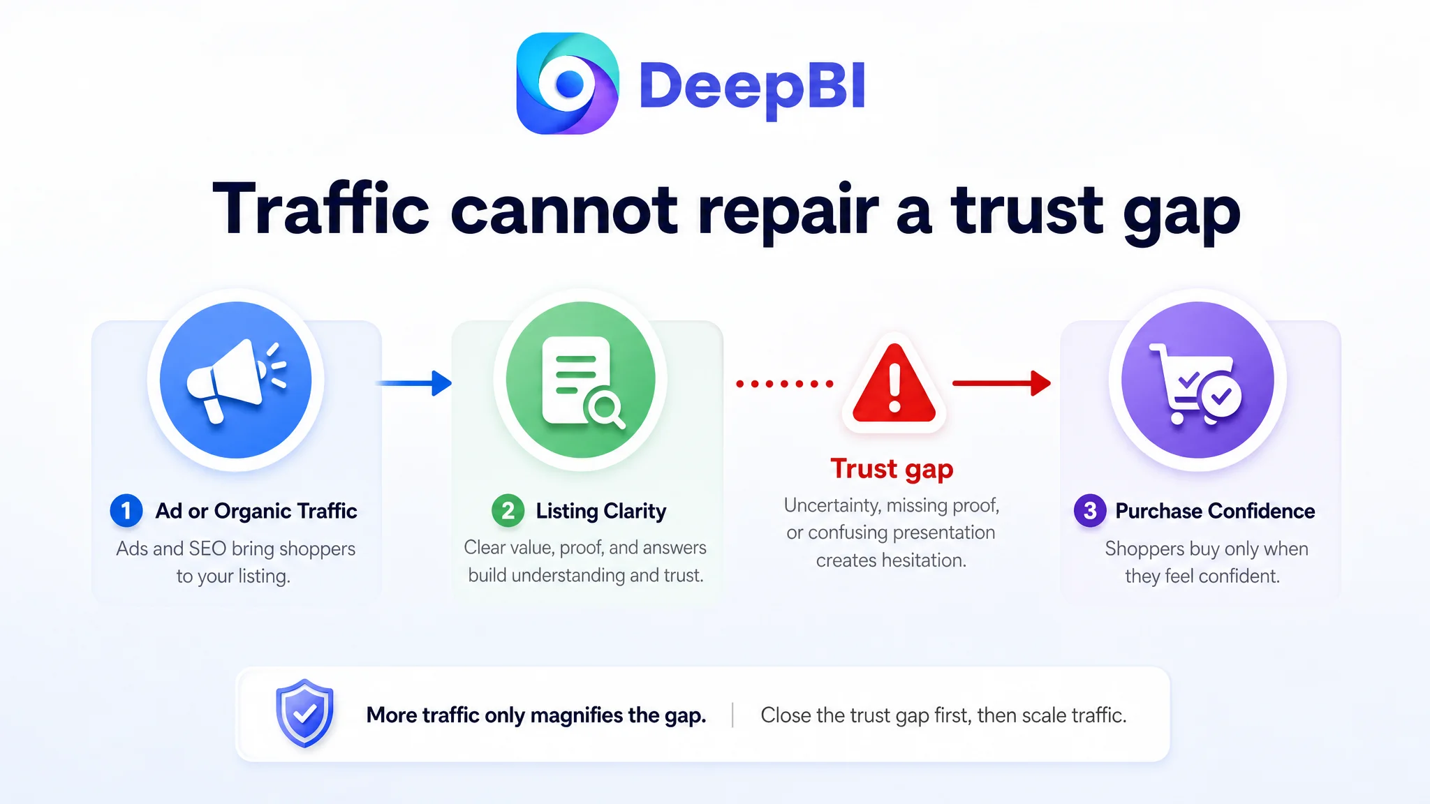
If Amazon ads send shoppers to a page that is difficult to understand, advertising simply increases the number of people exposed to that weakness.
For this product, the page-level risks included:
- A main image that showed an accessory not included with the product
- Repetitive information in the early image sequence
- Weak prioritization of the 196-foot range and 16-foot tape length
- Limited visual proof of digital display usability
- Insufficient accuracy and technical specification emphasis
- Feature grids that described modes without demonstrating their practical value
- A+ content that listed capabilities without building a strong problem-to-solution narrative
- Low review volume and a weak rating that reduced trust at the final decision stage
Advertising can bring a shopper to the Listing. It cannot decide whether the Listing deserves that shopper's confidence.
This is why continued traffic optimization would have been premature. Before increasing exposure, the team needed to determine whether the product page could convert that exposure into a credible buying decision.
The First Risk Was Not Aesthetic. It Was Transactional
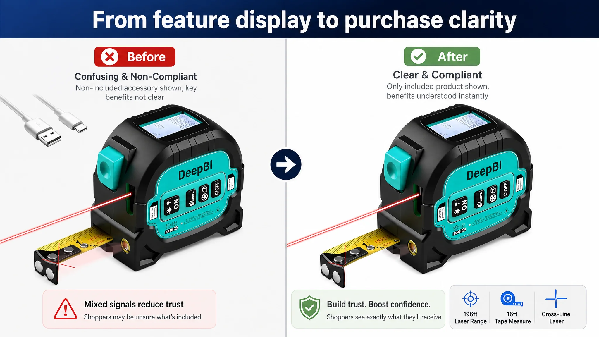
The main image appeared to create interest through the product's multi-tool concept, but it also displayed a charging accessory that was not included with the product.
That created a problem more serious than a weak visual style.
A shopper could reasonably interpret the image as showing the complete package. If the delivered product did not contain that accessory, the image would create a mismatch between expectation and purchase experience. That mismatch could later appear as confusion, dissatisfaction, or a negative review.
The first correction was therefore not to make the image more dramatic.
It was to make the image more trustworthy.
The main product view needed to show only what the buyer would actually receive, with unauthorized or non-included accessories removed. This was a foundational requirement because no amount of high-quality visual design can compensate for a misleading product impression.
The revised role of the first image became simple:
Identify the product clearly, establish the 3-in-1 form, and reduce purchase risk.
Only after that foundation was secure should the image sequence begin proving performance.
The Image Sequence Was Asking Buyers to Work Too Hard
The next issue was ordering.
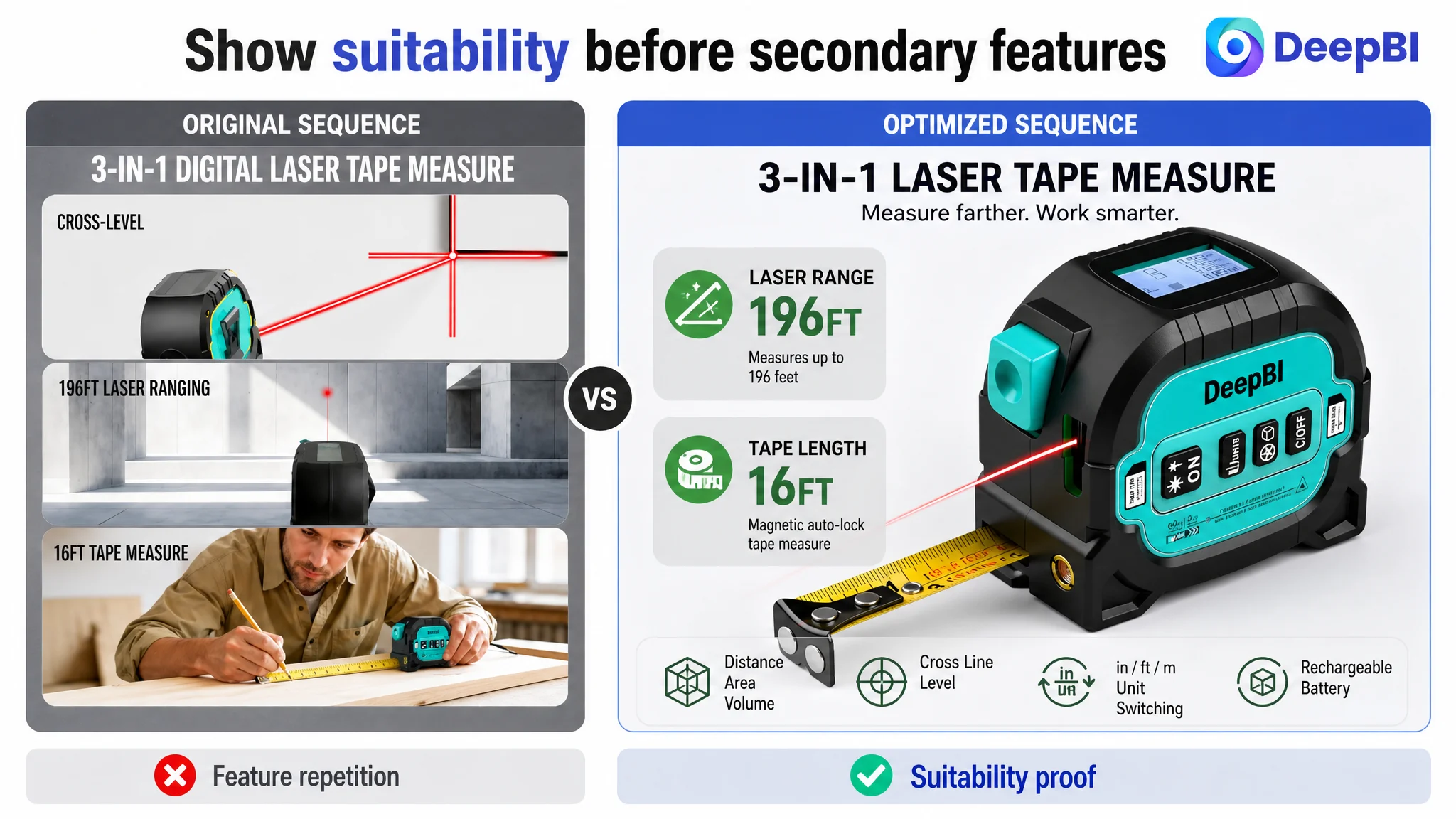
The early images repeated the product's functions but did not move the shopper efficiently from recognition to suitability confirmation. The range capability, one of the most decisive specifications for a measuring tool, was not given enough priority immediately after the product introduction.
The recommended sequence was based on the questions a buyer naturally asks:
First: What is the product?
Show the actual 3-in-1 tool without misleading accessories.
Second: Is the range suitable?
Present the 196-foot laser range and 16-foot tape measure as clear, immediate performance specifications.
Third: Can I read and use it easily?
Show the digital display, real measurement output, and a practical calculation scenario such as area measurement for flooring.
Fourth: Can I trust the technical design?
Use a structural or technical illustration to clarify reference points, unit switching, and the relationship between the tool's physical components and functions.
Fifth: How does it help in real work?
Show an active project context, such as measuring ceiling height from a corner, rather than ending with a passive belt-clip diagram.
This was not a request for more images for their own sake. It was a reallocation of each image's job in the conversion path.
The main image should earn the click. The next image should confirm suitability. The following images should remove doubt.
The Title Had Keywords, but Not Enough Buying Clarity
The title score was 15 out of 20, three points below the benchmark.
The issue was not simply keyword quantity. The title was structured more like a list of functions, which made its core value harder to recognize quickly.
The recommended direction moved the most important product identity and use case forward:
3-in-1 Laser Tape Measure with Cross Line Rangefinder, 196ft Digital Laser Measure & 16ft Magnetic Auto-Lock Tape Measure, Measuring Tool for Distance, Area, Volume, Units in/Ft/M/Ft+in
This structure did several things at once:
- Put the core product phrase near the beginning
- Established the 3-in-1 concept immediately
- Highlighted the 196-foot range
- Highlighted the 16-foot magnetic auto-lock tape
- Clarified the main measurement applications
- Presented unit support in a more readable form
The purpose was not to copy the benchmark Listing. It was to learn from the benchmark's information hierarchy while preserving the target product's actual specifications.
The longer 196-foot range and 16-foot tape were meaningful differentiators. They needed to be treated as buying reasons rather than left among secondary details.
The Bullet Points Listed Functions Instead of Resolving Concerns
The bullet-point score was 6 out of 10.
The target Listing's bullets contained useful information, but the sequence was scattered. The first point began with a safety warning, while later points moved between modes, battery design, physical features, and application scenarios without a clear priority.
The benchmark Listing used a more persuasive order:
1. Core product value
2. User pain point
3. Technical proof
4. Practical flexibility
5. Convenience and durability
The revised direction for the five bullets followed that logic.
The first bullet should establish the 3-in-1 value
The digital laser measure, retractable tape, and cross-line level should be presented together as one compact professional tool. Any safety information, such as the stated Class II laser classification and power output, should remain accurate and compliant without taking over the opening sales message.
The second bullet should connect modes to project needs
Distance, area, volume, and Pythagorean modes should not appear as a detached list. They should explain how the tool supports more complex measuring tasks and reduces manual calculation.
The third bullet should prove display usability
The digital screen should be shown as a practical answer to a recognizable problem: difficulty reading manual scales or small results in demanding work conditions.
The fourth bullet should make charging and durability meaningful
The 300mAh rechargeable battery and charging-port protection should be connected to reduced battery replacement and more dependable use, without making unsupported claims about operating life.
The fifth bullet should translate physical features into workflow value
The self-locking mechanism, magnetic hook, and belt clip should be tied to one-handed operation, stable positioning, and portability in construction or home renovation settings.
The key change was from feature naming to pain point, proof, and outcome.
The Detail Page Had the Largest Structural Gap
The detail-page score was 17 out of 25, a seven-point gap from the benchmark. This was the largest content and persuasion gap outside reviews.
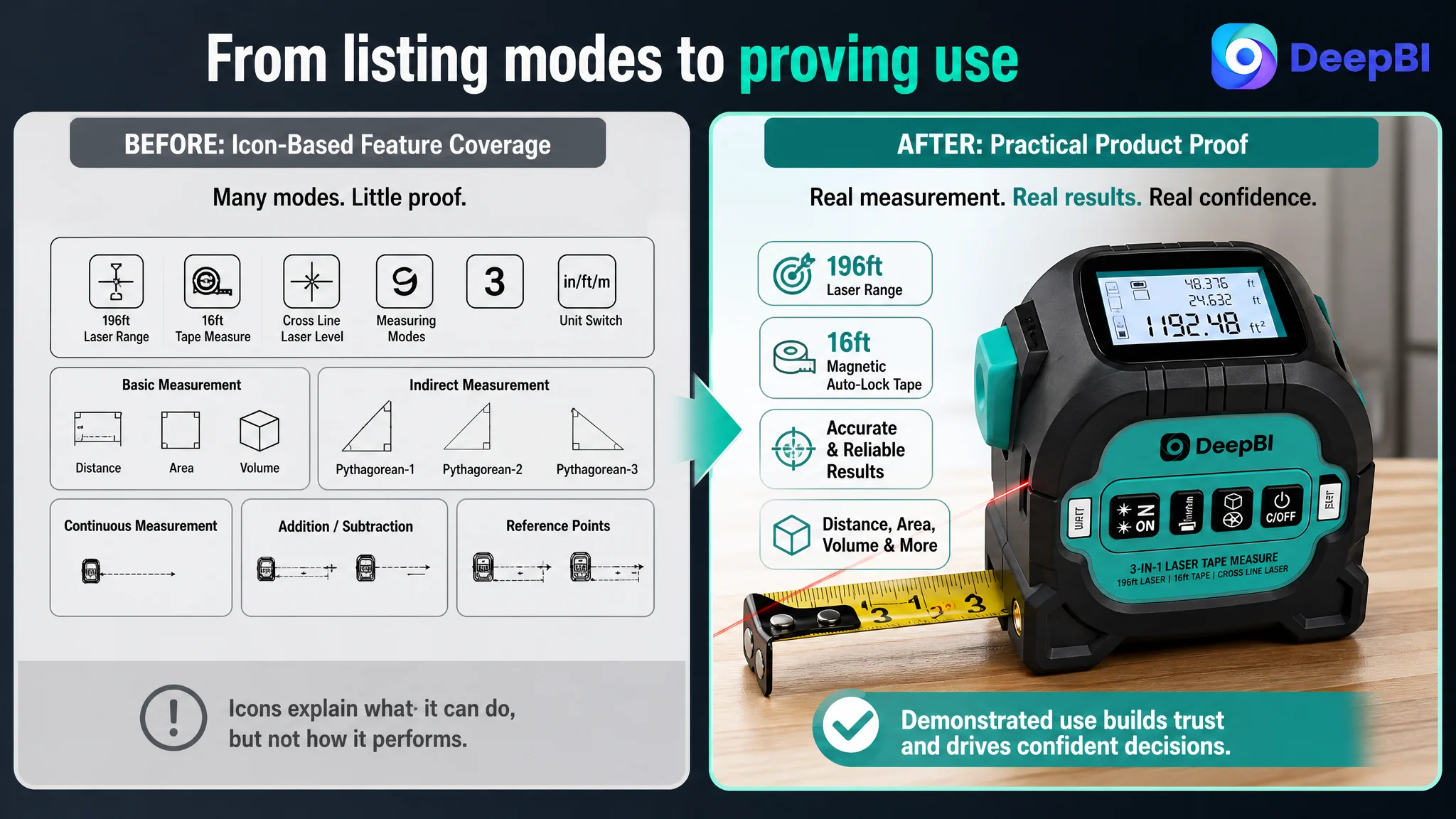
The target A+ content relied heavily on conceptual grids and icon-based explanations. Those modules could show breadth, but they did not provide enough proof of how the product worked in a real project.
The high-performing benchmark Listing used a fuller progression:
- Product structure
- 3-in-1 function demonstration
- Display close-up
- Accuracy specifications
- Measurement modes
- Battery and physical construction
- Data storage and reference points
- Large-number display comparison
- Real usage scenarios
DeepBI's recommendation was not to reproduce every one of those elements. It was to rebuild the target page around a more useful sequence.
Start with the physical product
The first detail module should explain the hardware structure and the location of key interfaces. This directly addresses a concern created by the 3-in-1 format: does the device look reliable and understandable, or does it appear overly complicated?
Demonstrate the three core functions
The retractable tape, laser distance measurement, and cross-line laser should be shown in realistic contexts rather than represented only by icons.
The buyer should be able to see what each function does and how the functions work together.
Bring accuracy proof forward
The Listing needed to give greater prominence to specific, verified precision information. If accurate measurement specifications are available, they should be presented clearly. If they are not confirmed, the page should not invent them.
This distinction matters because technical buyers are not persuaded by the word “precise” alone. They need a measurable basis for trust.
Show the digital workflow
The page should demonstrate how the user switches between distance, area, and volume modes, how the screen displays results, and how automated calculations reduce the need for manual arithmetic.
The purpose is to make the product appear easier to operate, not merely more capable.
Move advanced functions after the core story
Unit switching, reference points, stored data, Pythagorean mode, and addition/subtraction functions are useful. But they should come after the page has established the product's main promise.
Advanced features support the purchase decision. They should not be responsible for creating it.
Reviews Confirmed That Trust Was a Business Constraint
The review dimension also scored 5 out of 15, seven points below the benchmark.
The target Listing had:
- 3.6 stars
- 11 total reviews
- 8 reviews visible on the first page
The benchmark had:
- 4.5 stars
- 128 total reviews
- 8 reviews visible on the first page
The review gap was therefore both quantitative and qualitative.
The target Listing had only a small fraction of the benchmark's review volume, and its visible reviews included one one-star review and two three-star reviews. The negative feedback concentrated on unclear instructions and measurement accuracy.
That feedback was especially important because it aligned with the page diagnosis.
The Listing was not only failing to describe the product persuasively. It was also failing to reassure buyers about the exact areas where users had already expressed concern.
A stronger A+ page could improve explanation, but it could not erase review history. The business response had to address both sides:
- Improve the product-page explanation of operation and measurement logic
- Ensure that future customer expectations match the actual product and package contents
- Avoid visual claims or accessories that could create delivery misunderstandings
- Use verified specifications and clearer instructions to reduce preventable confusion
Reviews were not a separate reputation issue. They were evidence about where the product page had failed to build understanding and confidence.
Why DeepBI Prioritized the Listing Before Advertising
The diagnosis brought together five dimensions rather than treating each asset separately.
The title limited search and click clarity.
The main image created a compliance and expectation risk.
The bullets contained functions but lacked persuasive order.
The A+ content showed breadth without enough proof and scenario logic.
The reviews weakened trust at the point of decision.
Together, these findings indicated one core constraint:
The Amazon Listing did not have enough conversion capacity to make additional traffic efficient.
That judgment changed the order of operations.
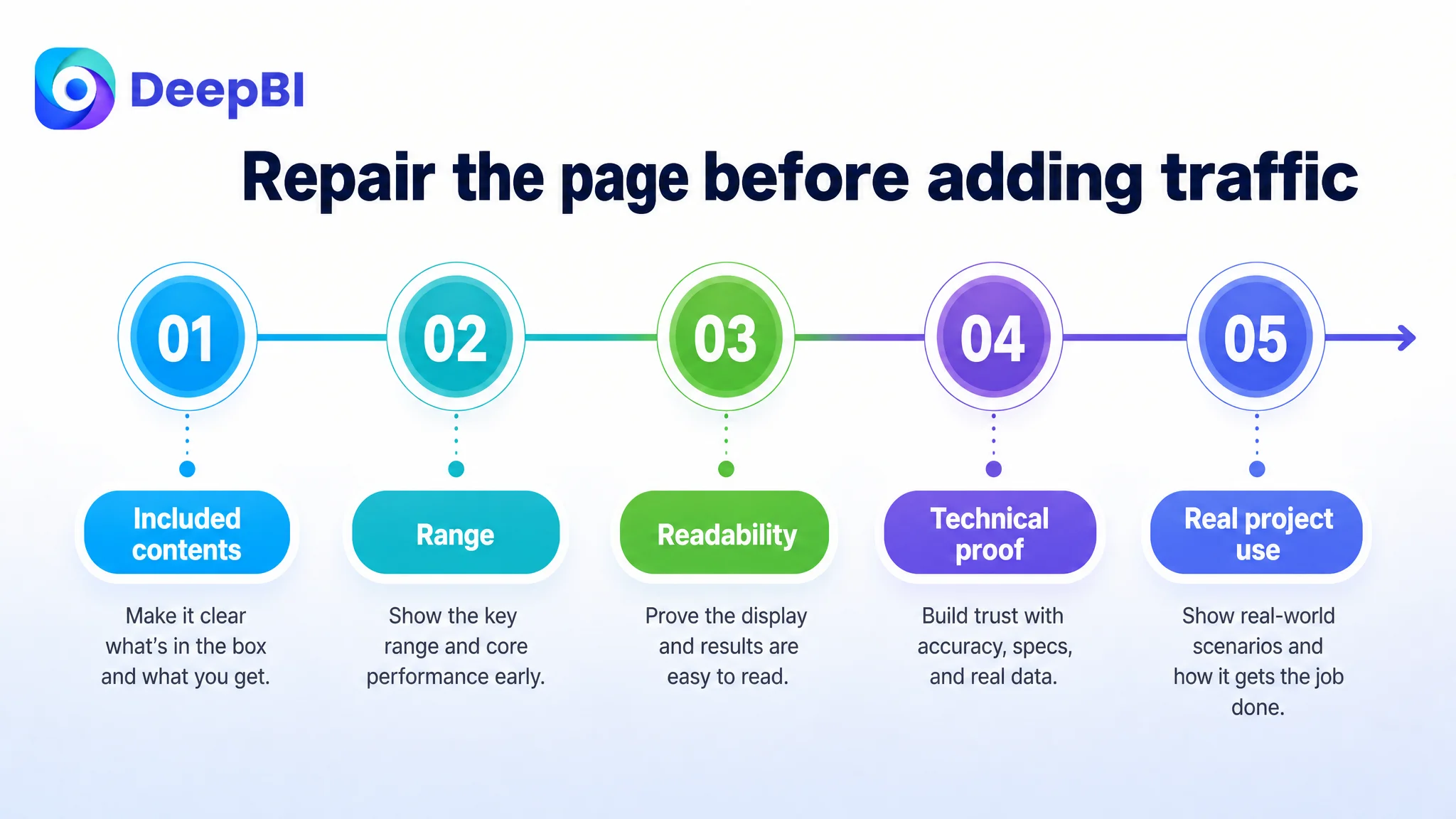
Instead of immediately adding more traffic or repeatedly adjusting campaign inputs, the team needed to repair the page's ability to handle traffic:
1. Remove misleading or non-included visual elements.
2. Clarify the product identity and key performance specifications.
3. Reorder the title and bullets around the buyer's decision process.
4. Replace repeated icon grids with functional demonstrations.
5. Bring accuracy, display usability, and structural proof forward.
6. Use real project scenarios to connect functions with outcomes.
7. Treat review feedback as evidence for improving expectation and instruction clarity.
This sequence reduced the risk of paying to amplify an unclear product page.
The Optimization Was About Decision Order, Not More Decoration
The recommended changes did include better imagery and stronger visual presentation. But visual quality was not the core judgment.
The real question was:
What should a shopper understand first, and what proof should appear before the shopper is asked to buy?
For this Listing, the answer was:
- First, establish what is included.
- Then, confirm range and core capability.
- Next, show the display and calculation experience.
- Then, prove technical flexibility and physical construction.
- Finally, demonstrate how the tool fits a real measuring task.
This also explains why unsupported awards, certifications, or technical numbers could not simply be added to make the page appear more professional. Any third-party certification or award would need to be real and verifiable. Any accuracy figure would need to match the product's confirmed specifications.
A stronger Listing is not one that makes the largest promise. It is one that makes the clearest defensible promise.
What Changed in the Business Understanding
The case material does not include confirmed post-optimization CTR, CVR, ACOS, TACOS, or organic-order data. It would therefore be inaccurate to claim a measured increase in conversion or a reduction in advertising cost.
What can be stated clearly is the change in operating direction.
The team moved from:
- Adding more feature information
- Repeating mode icons
- Treating the page as a catalog of functions
- Allowing secondary features to appear too early
- Relying on visual presentation without enough proof
Toward:
- Reducing purchase and expectation risk
- Making the main image compliant and unambiguous
- Turning range and product specifications into early decision points
- Rewriting bullets around user problems and verified evidence
- Demonstrating the 3-in-1 system in realistic use
- Using A+ content to build trust progressively
- Letting the page establish conversion readiness before additional traffic is pursued
That is the more durable lesson for Amazon sellers.
A product page does not become stronger because it contains more information. It becomes stronger when every piece of information appears at the moment it resolves a buyer's next concern.
The Broader Amazon Lesson
For tools and other technical products, Listing conversion often fails quietly.
The product may have a competitive specification. The title may contain relevant keywords. The page may include many images. Yet the shopper can still leave because the information is not organized around a credible decision.
This laser tape measure case shows why Amazon Listing optimization must be connected to business diagnosis.
A seller should not ask only:
- Are the keywords present?
- Are there enough images?
- Have all features been mentioned?
- Can the ad campaign generate more clicks?
The more important questions are:
- Does the first image accurately establish the purchase?
- Does the title communicate the main value quickly?
- Do the bullets answer the buyer's practical concerns?
- Does the A+ page prove the product's reliability and usability?
- Do the reviews reinforce or contradict the page's claims?
- Is the Listing ready to convert the paid and organic traffic it receives?
DeepBI's role in this case was not to produce a longer feature list. It was to identify the constraint behind the weak commercial outcome and place the optimization work in the correct order.
Before asking Amazon ads to do more, the Listing had to become capable of doing its part.