

This case involved an Amazon US seller whose automotive replacement wiper blade Listing was competing in a category where shoppers make fast decisions based on compatibility, size, installation confidence, and expected durability. The customer initially approached the problem as a keyword and feature-description issue: clarify the title, list the available sizes, and describe the product functions more completely.
DeepBI found a larger problem. The Listing was not merely missing keywords or polished copy. It was failing to answer the questions that determine whether Amazon shoppers are willing to buy: What exactly is included? Will it fit my vehicle? How difficult is installation? Will it remain reliable across different weather conditions? Why should I trust this product over a better-established alternative?
The later optimization therefore focused on rebuilding the Amazon product page as a decision path. The title and main image were used to remove purchase ambiguity, while the bullet points and A+ content were reorganized around compatibility, installation, durability, visibility, and all-season reliability. For other Amazon sellers, the case is a reminder that advertising and traffic cannot compensate for a product page that leaves core buying questions unresolved.
The Listing Looked Like a Content Problem. The Score Revealed a Conversion Problem.
At first glance, the Listing appeared to need ordinary content optimization. Its title contained multiple size references and compatibility terms. Its bullets described quiet wiping, all-season use, rubber material, installation, and a boneless design. The product itself had several usable selling points.
But the structure did not help shoppers make a decision.
DeepBI’s comparison produced a total Listing score of 29 out of 100, against 89 out of 100 for a comparable high-performing Listing in the same automotive replacement category.
The gap was not concentrated in one cosmetic detail:
- Title: Target Listing: 8/20, Comparable Listing: 17/20, Gap: -9
- Main image: Target Listing: 14/30, Comparable Listing: 26/30, Gap: -12
- Bullet points: Target Listing: 5/10, Comparable Listing: 8/10, Gap: -3
- Detail page: Target Listing: 2/25, Comparable Listing: 23/25, Gap: -21
- Reviews: Target Listing: 0/15, Comparable Listing: 15/15, Gap: -15
- Total: Target Listing: 29/100, Comparable Listing: 89/100, Gap: -60
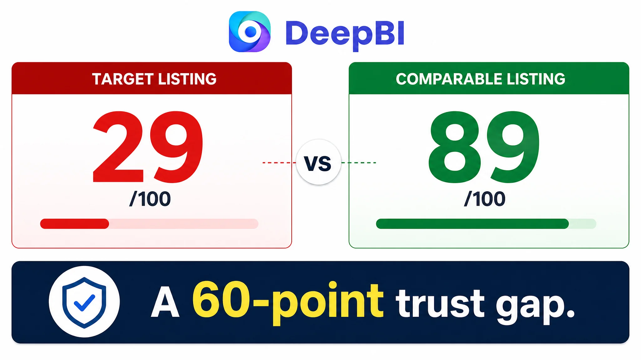
The most important signal was not simply the low total score. It was the distribution of the losses.
The page was weak in the exact areas responsible for converting traffic into confidence:
- The title created ambiguity around the product and size.
- The main image did not clearly communicate quantity or fit.
- The bullet points described features without building a persuasive sequence.
- The detail page had no A+ content and almost no visual explanation.
- The Listing had no review history to compensate for weak on-page trust.
The page did not lack product information. It lacked a clear order in which shoppers could believe that information.
The Initial Diagnosis Put Too Much Weight on Keywords and Feature Coverage
The original title opened with terms such as “Universal General J/U Hook” and included a broad list of sizes. It also repeated wording related to windshield rubber and blade dimensions.
That approach seemed logical from a search perspective. More compatibility terms and more size information appeared to offer broader coverage.
In practice, the title created three problems.
It made the product difficult to identify
The shopper had to work through a crowded opening before understanding the core product: an automotive replacement windshield wiper blade.
It created uncertainty around the actual purchase
The title referenced a range from 16 to 26 inches even though the evaluated SKU was 14 inches. A buyer looking at the page could reasonably hesitate over which size would arrive.
It used features without a strong buying reason
The title listed dimensions and material-related wording, but did not communicate a clear outcome such as all-season reliability, clean visibility, easy replacement, or dependable fit.
The initial direction therefore treated the Listing as if it needed more complete keyword coverage. DeepBI reframed it as a purchase-confirmation problem.
The key question was no longer:
“How can the title contain more relevant terms?”
It became:
“Can a shopper understand the product, confirm the fit, and see a reason to trust it within the first few seconds?”
That change in question altered the entire optimization order.
Amazon Ads Could Not Fix What the Product Page Failed to Confirm
For Amazon sellers, this type of Listing often creates an operational trap. If paid traffic reaches the page but shoppers remain uncertain, the natural response is to look first at campaigns, bids, search terms, or budget allocation.
Those adjustments may change the amount or type of traffic. They do not solve a page that fails to answer basic purchase questions.
For this wiper blade Listing, the main conversion risks were visible before any advertising adjustment:
- The product quantity was not immediately clear.
- The relevant size was not presented cleanly.
- Compatibility was mentioned but not visually confirmed.
- Installation claims were not supported by an explanation of the connector or hook type.
- Durability claims were not developed into a credible all-season story.
- The A+ section was absent.
- The Listing had no review-based social proof.
In other words, additional traffic would not automatically create stronger demand. It could simply expose more shoppers to the same uncertainty.
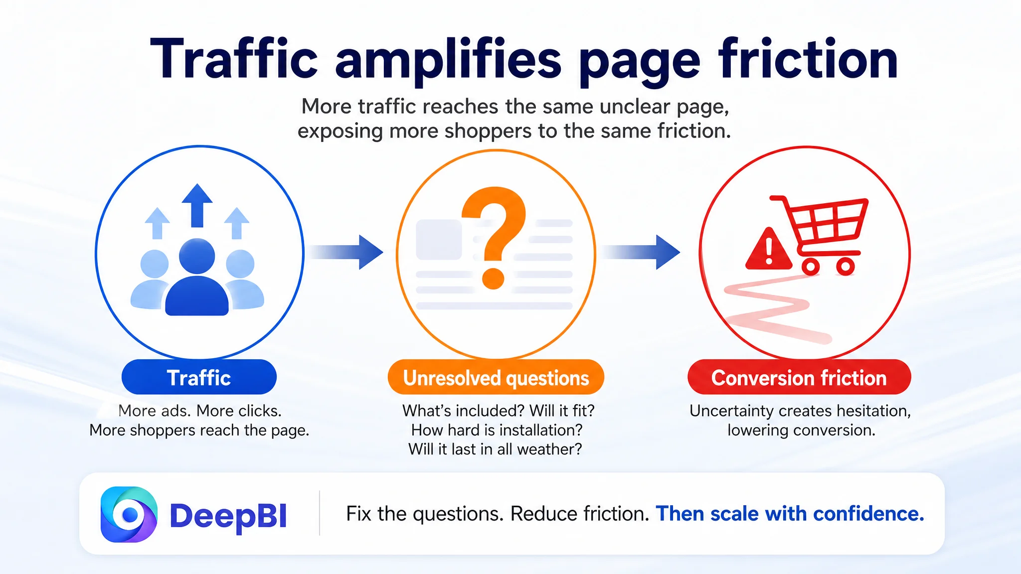
Advertising does not only amplify a product’s strengths. It can also amplify the conversion defects already present on the Amazon product page.
This is why DeepBI did not treat ad optimization as the first move in the case. The page needed to become more capable of converting both paid and organic traffic before traffic expansion could be judged fairly.
The Largest Gap Was Not the Title. It Was the Missing Sales Logic
The title and main image were weak, but the largest individual scoring gap appeared in the detail page:
- Target Listing: 2/25
- Comparable Listing: 23/25
The reason was structural. The target Listing had no A+ content and relied largely on basic title text. The comparable page used a complete sequence of visual and informational modules:
- Brand and product presentation
- Packaging and product close-ups
- Installation guidance
- Real-world usage context
- Product comparison
- Technical specifications
- Visualized selling points
This difference mattered because a wiper blade is not purchased only on the basis of appearance. The shopper must also believe that it will fit, install correctly, perform quietly, withstand weather exposure, and improve visibility.
The comparable page addressed these concerns in sequence. The target Listing left them scattered across short descriptions, or did not address them at all.
The page needed to answer compatibility before making broader promises
“Universal J/U Hook” appeared as a phrase, but the page did not provide enough visual or structural confirmation. A shopper could still wonder whether the connector matched the vehicle.
The optimization therefore moved compatibility and installation information toward the front of the detail-page story. The goal was not to add technical language for its own sake. It was to remove the most immediate reason for hesitation.
The page needed to make durability tangible
The Listing mentioned high-quality rubber and all-season performance, but these ideas were not developed into a strong visual or textual proof structure.
The revised direction emphasized:
- Resistance to cracking and tearing across hot and cold conditions
- Wear resistance of the rubber strip
- Stable contact with the windshield
- Reliability in rain, snow, sun exposure, and changing temperatures
These claims were tied to product attributes already present in the case material rather than expanded into unsupported specifications.
The page needed to connect the boneless structure with the promised result
“Boneless” was treated as a feature. It needed to be connected to the shopper’s actual concern: clean, quiet, even wiping.
The revised logic linked the curved boneless structure to more uniform pressure distribution, a closer fit to the windshield, reduced edge curling, and clearer visibility. That gave the feature a reason to matter.
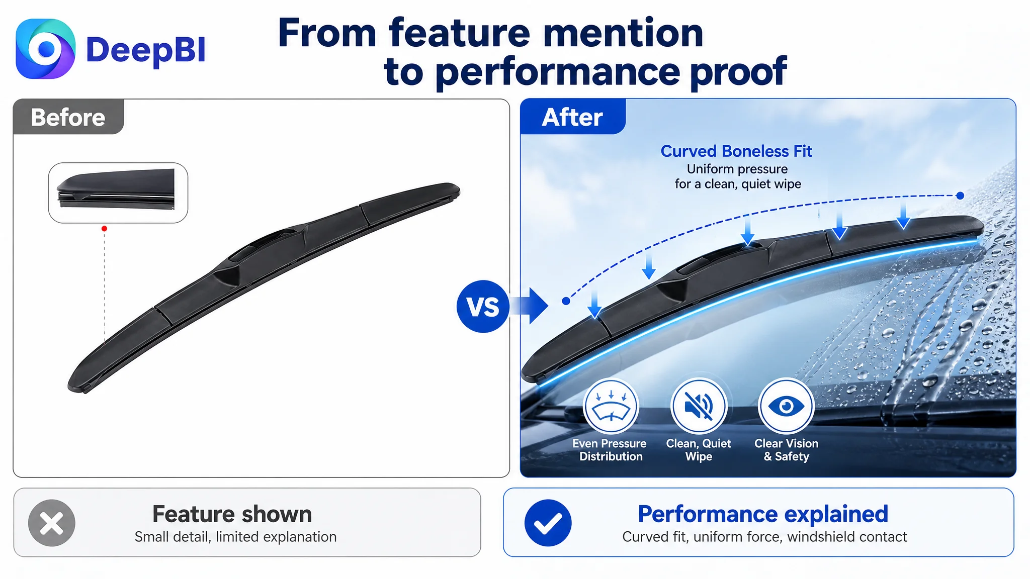
The Main Image Was Not a Cosmetic Weakness
The main image score was 14 out of 30, compared with 26 out of 30 for the comparable Listing.
The problem was not that the product was invisible. The problem was that the image did not settle the buyer’s first questions.
The existing image treatment mainly provided basic product recognition. It did not make quantity and size sufficiently clear, and it did not create a strong visual reason to stop on the Amazon search results page.
DeepBI’s diagnosis separated the image sequence into different jobs instead of treating every image as another product angle.
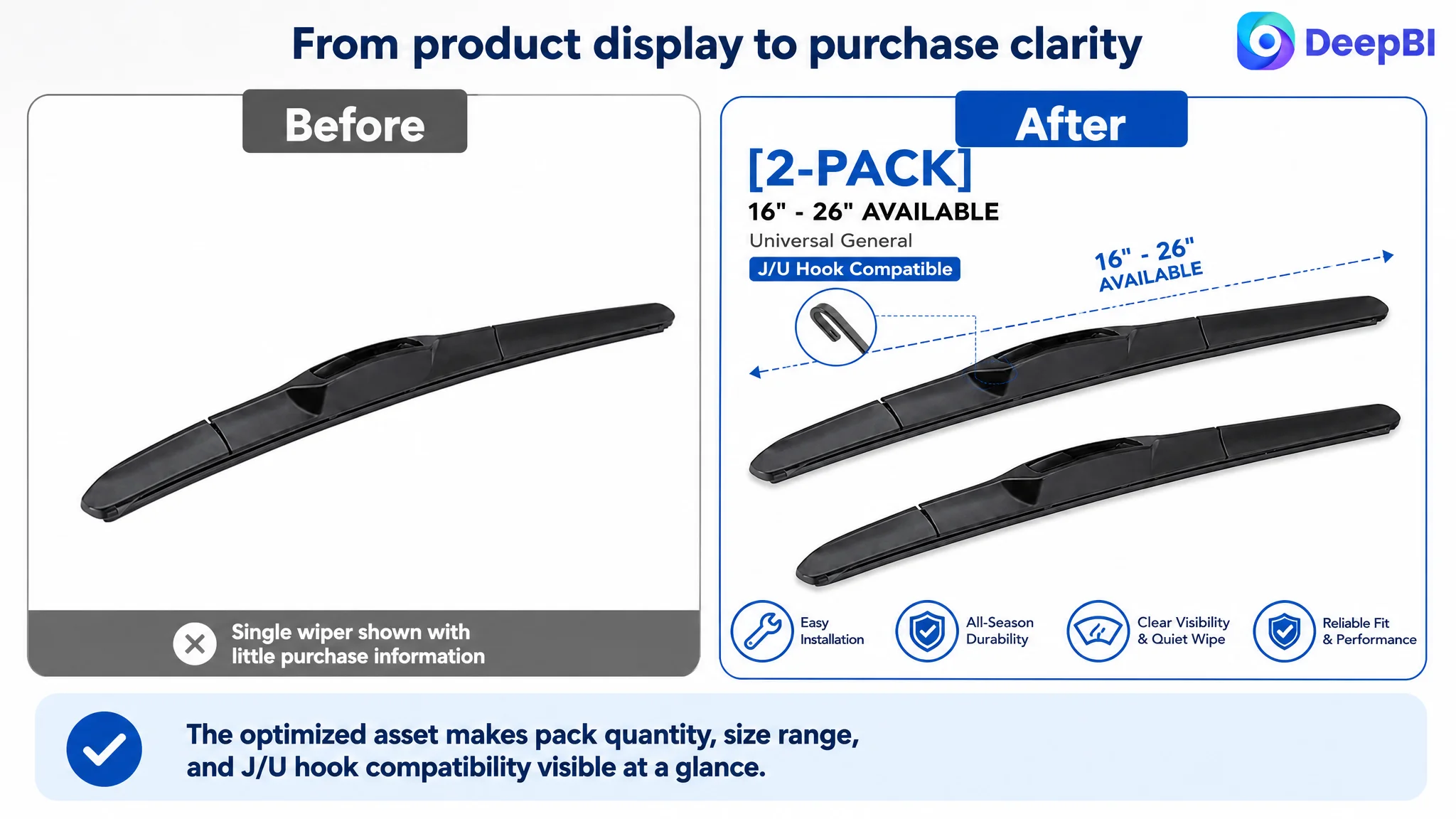
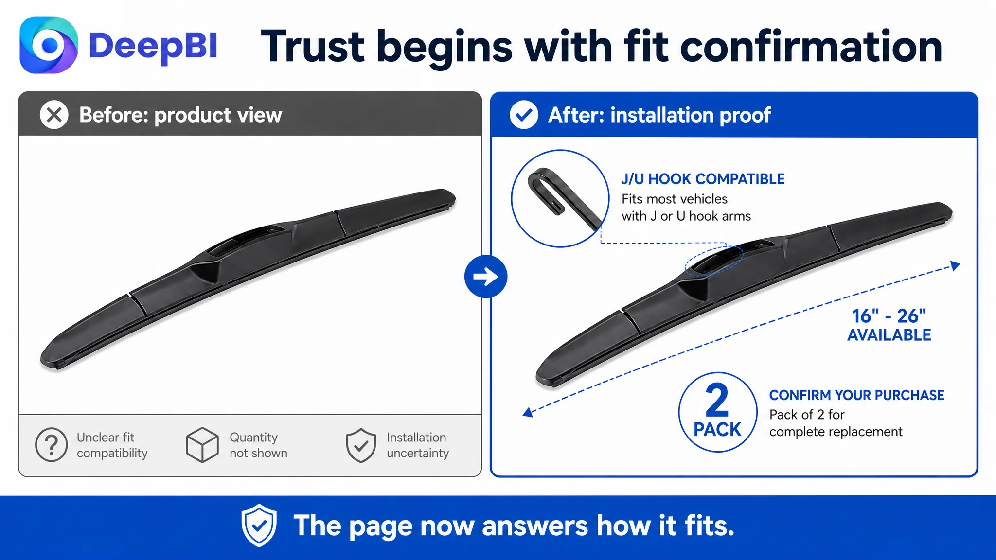
Image 1: Confirm the purchase
The first image needed to show the product in a way that made the quantity and relevant size unmistakable. For this SKU, that meant avoiding a broad size-range presentation that could confuse shoppers.
The main image should answer:
- What product is this?
- How many pieces are included?
- What size is being purchased?
Image 2: Explain the fit
The second image should not repeat another nearly identical whole-product view. It should show the curved boneless structure and how it supports close, even contact with the windshield.
Image 3: Resolve installation anxiety
The next image should show the connector and snap-on installation logic, making the J/U hook compatibility easier to understand.
Image 4: Build durability confidence
A dedicated image should reinforce the all-season and wear-resistance story through a clear visual treatment of the rubber strip and weather suitability.
Image 5: Close the visibility and safety loop
The final image should consolidate the core benefit: clean, quiet wiping and improved visibility in rainy or windy driving conditions.
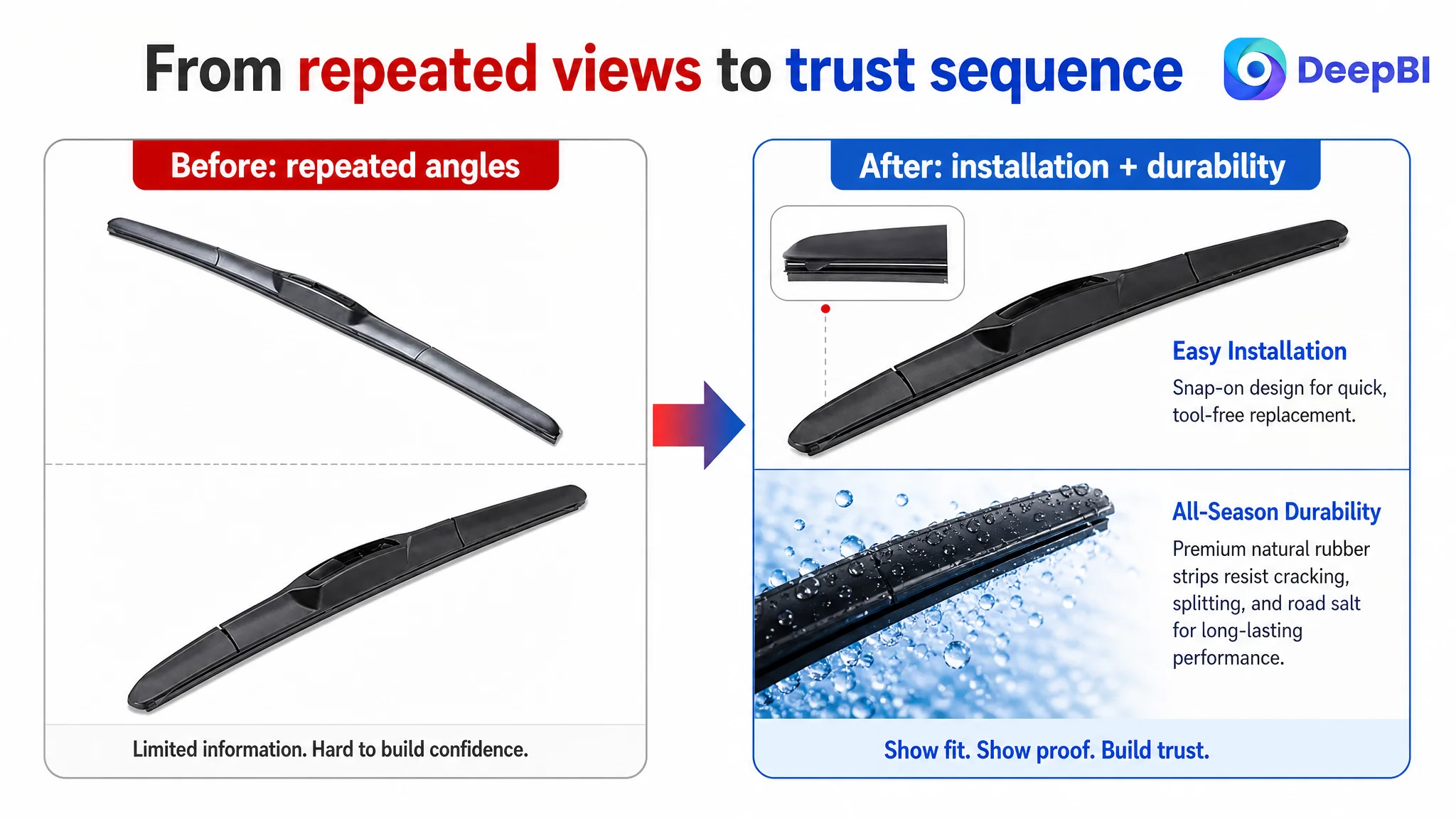
The image sequence had to move from recognition to confirmation, then from confirmation to trust.
That is a different task from making the product look more attractive.
The Title Needed Less Coverage and More Control
The proposed title direction was:
Universal J/U Hook Windshield Wiper Blade, 14 Inch (350mm) Automotive Replacement Windshield Wipers, All-Season Natural Rubber Windscreen Blade
Its value was not simply the inclusion of additional keywords. It corrected the title’s decision structure.
The revised approach:
- Removed the confusing broad size list.
- Put the specific SKU size in a clear position.
- Retained “Universal J/U Hook” compatibility.
- Added “Automotive Replacement” to clarify product purpose.
- Added “All-Season” to communicate a meaningful use benefit.
- Brought “Natural Rubber” forward as a material cue.
- Made the mobile search result easier to scan.
The title did not need to imitate the competitor’s brand language. It needed to adopt a clearer category structure while staying within the product’s actual attributes.
This distinction is important. Competitive analysis should reveal how a high-performing Listing organizes information. It should not encourage a seller to borrow claims or identity that do not belong to the product.
The Bullet Points Had Features, but No Persuasive Progression
The target Listing’s bullet points covered relevant topics, but their order and expression were too loose. They mainly described product properties:
- Quiet wiping
- All-season use
- Rubber quality
- Easy installation
- Boneless fit
The comparable Listing presented its points as a progression:
1. Trust and quality standard
2. Installation and compatibility
3. Material durability
4. Structural strength
5. Visibility and safety
That sequence follows the buyer’s decision process more closely.
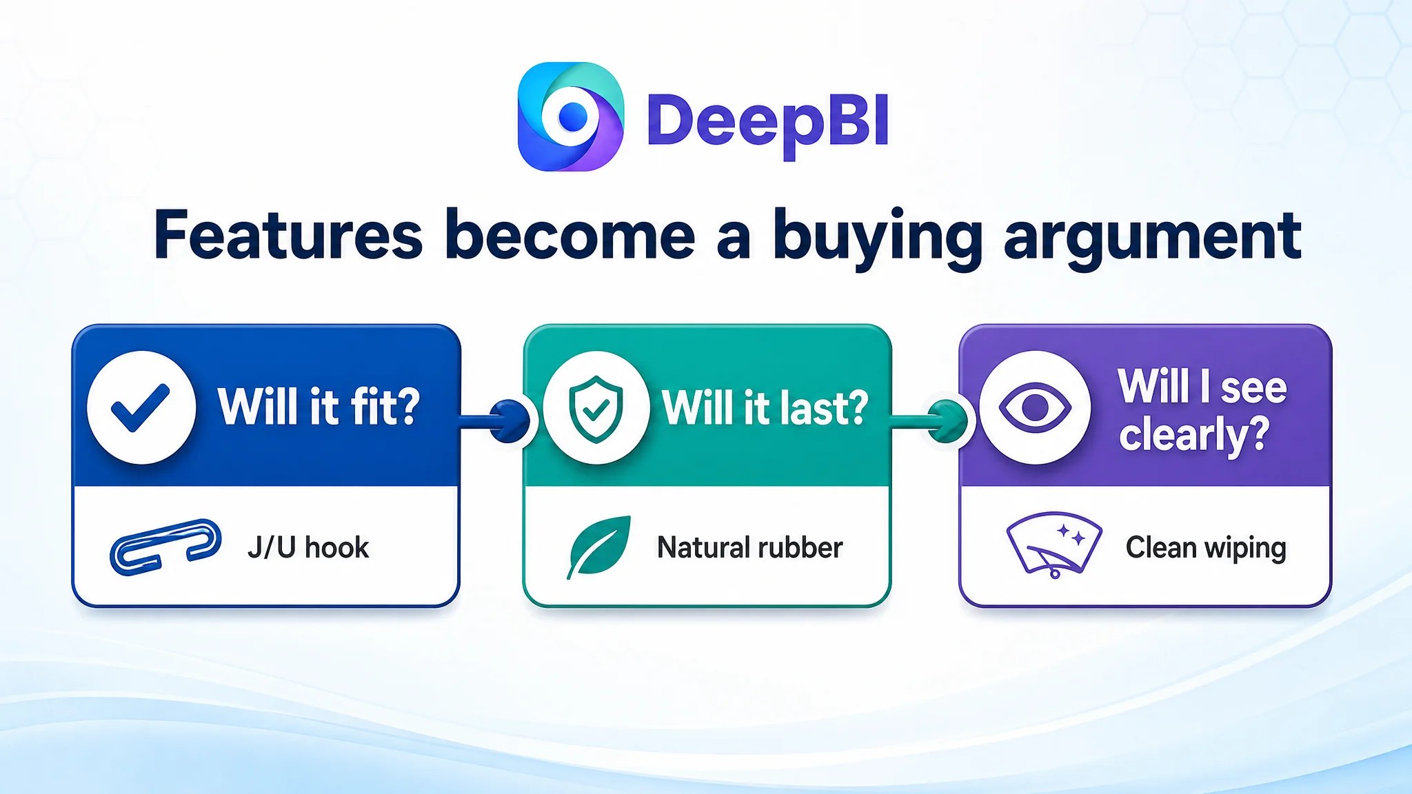
The recommended bullet-point direction rebuilt the story around five questions.
Can I trust the product?
The first point reframed quiet, clear wiping around professional quality and a precise fit, rather than presenting silence as an isolated feature.
Will it fit and install easily?
The second point brought the pre-installed multi-adapter, J/U hook compatibility, and snap-on replacement logic forward.
Will the material withstand real use?
The third point connected natural rubber with resistance to cracking and tearing caused by temperature changes, windshield fluid, and road salt.
Why should the structure perform better?
The fourth point explained how the curved boneless design supports more even pressure across the blade and helps maintain contact at higher speeds.
What does the customer ultimately gain?
The fifth point moved from product mechanics to the outcome: clearer visibility and safer driving across changing weather conditions.
This is the difference between a feature list and a sales argument. Each point should make the next question easier to answer.
Why A+ Content Had to Be Addressed Before More Traffic
The absence of A+ content was not a secondary design issue. It removed the section of the Amazon product page responsible for deeper explanation and trust-building.
For this category, A+ content could carry several important jobs:
- Show the installation process.
- Confirm the covered hook type.
- Explain the relationship between structure and wiping performance.
- Present the rubber material and wear-resistance story.
- Show the product in a realistic use context.
- Consolidate the core benefits before the buyer returns to the purchase decision.
The recommended module order was deliberately staged.
First: Establish all-season reliability
The opening module should move beyond a narrow “silent wiping” promise and position the product as a dependable replacement for year-round use.
Second: Make installation visible
A visual explanation of the connector and snap-on process should appear early, because compatibility concerns can stop a purchase before performance claims matter.
Third: Confirm the J/U hook interface
A technical diagram should show the relevant hook connection clearly. This addresses the difference between saying “compatible” and proving what compatibility means.
Fourth: Reinforce material durability
The rubber strip and its wear-resistance benefits should appear soon after compatibility, creating a coherent “it fits, and it can last” sequence.
Fifth: Make the product feel real
A human-use image or physical product presentation can make the offer more tangible and help confirm quantity and handling.
Sixth: Explain quiet wiping through structure
The page should show why the boneless fit can support even contact and reduce the risk of chattering or abnormal noise.
Seventh: Summarize the decision
The final module should bring together compatibility, durability, quiet wiping, visibility, and all-season use so the shopper does not have to reconstruct the argument independently.
DeepBI’s Judgment Was About Order, Not More Work
The case did not call for every possible optimization at once.
A seller could spend time rewriting every bullet, generating multiple lifestyle images, adjusting ad bids, adding search terms, and investigating reviews. But the most urgent business question was simpler:
Can the page convert a shopper who has already arrived?
DeepBI’s score comparison made the priority visible:
- The Listing had a severe information gap.
- The main image left purchase details unclear.
- The title created size and structure confusion.
- The detail page had no A+ narrative.
- The review gap removed an important external trust layer.
That meant the first priority was to improve the page’s own ability to establish clarity and trust. Continued ad tuning before that point risked making the traffic problem look worse, because the page was not yet ready to receive more demand efficiently.
This is the operating judgment that matters for Amazon sellers: traffic quality should not be evaluated separately from the page’s ability to convert it.
The Business Understanding Changed
The case did not provide verified post-optimization metrics such as CVR, ACOS, TACOS, or organic-order growth. Therefore, the result should not be described as a quantified performance improvement.
The meaningful change was in the operating logic and risk profile.
Before the diagnosis, the Listing could be treated as a product with scattered features and broad keyword coverage. After the diagnosis, it could be managed as a conversion system with a clear sequence:
1. Identify the product and purchase quantity.
2. Confirm the relevant size.
3. Resolve J/U hook compatibility.
4. Make installation understandable.
5. Establish material and all-season durability.
6. Explain how the structure supports clean, quiet wiping.
7. Connect performance to visibility and driving safety.
That sequence reduced the chance that paid or organic traffic would arrive at a page still asking shoppers to perform the explanation themselves.
The core lesson was not “add more images” or “rewrite the title.” It was “repair the page’s decision logic before asking advertising to scale it.”
For this Amazon automotive accessories Listing, the conversion bottleneck was ultimately not a lack of product claims. It was the absence of a trustworthy path from search result to purchase decision.
Once that distinction is clear, title optimization, main-image redesign, bullet-point writing, A+ content, and advertising analysis stop being separate tasks. They become coordinated parts of the same Amazon business question:
Does the product page deserve more traffic, and is it prepared to convert it?