

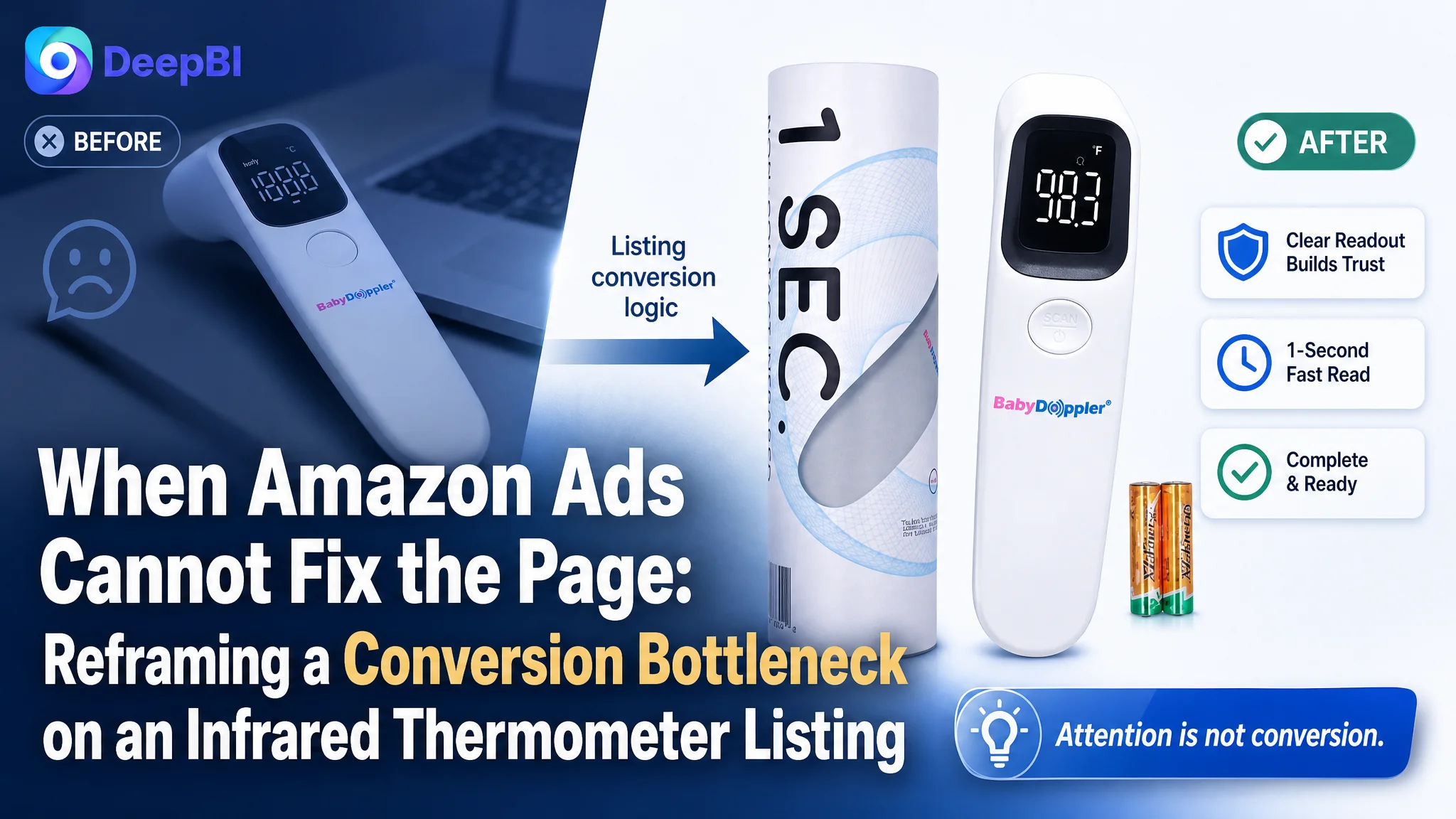
This case follows an Amazon seller in the US marketplace whose infrared forehead thermometer Listing was competing for attention but was not communicating enough value or trust at the product-page level. The initial optimization instinct centered on search coverage, repeated product views, and basic feature presentation—reasonable actions, but not enough to close the conversion gap.
DeepBI’s comparison showed a more fundamental issue. The Listing scored 57 out of 100 against 89 for a comparable high-performing thermometer Listing, with the largest losses in the main images, bullet points, A+ content, and customer reviews. The product page was not merely missing better creative; it lacked a clear decision path for parents and families evaluating speed, accuracy, hygiene, quiet operation, and ease of use.
The later direction therefore focused on rebuilding the Amazon product page around trust: a stronger title, complete benefit-led bullet points, scenario-based images, visible proof of measurement logic, and a more progressive A+ narrative. For other Amazon sellers, the lesson is straightforward but easy to overlook: before pushing more paid traffic, determine whether the Listing can explain, reassure, and convert the traffic it already receives.
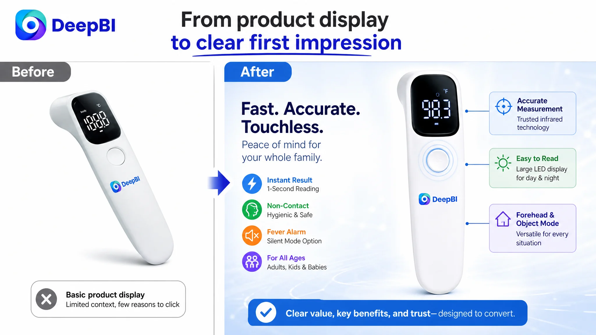
The page looked functional. The market expected reassurance.
The Listing was for a non-contact infrared forehead thermometer designed for adults, children, and babies.
At first glance, it had the basic ingredients of a viable Amazon product page:
- A relevant core keyword near the front of the title
- Product images showing the thermometer from several angles
- Family and mother-and-child usage references
- Claims around non-contact measurement and instant results
- A product positioned for household use
But the competitive gap was not located in one isolated element.
The comparable Listing scored 89 out of 100, while the target Listing scored 57. That 32-point difference represented a broader problem: the page communicated what the product was, but not strongly enough why a shopper should trust it, click it, or choose it over a more complete alternative.
The Listing was presenting a thermometer. The stronger Listing was presenting confidence in a family health decision.
That distinction matters on Amazon. A shopper looking for a thermometer is not evaluating the device only as a physical object. They are asking whether it will be fast enough, accurate enough, quiet enough, easy enough to read, and suitable for the people who may need it at night.
The page needed to answer those questions in sequence.
The initial diagnosis stopped at keywords and product display
The title’s core keyword, “Infrared Forehead Thermometer,” was placed prominently, which supported search coverage. The problem was that the rest of the title behaved more like a list of repeated product descriptors than a reason to choose the product.
Terms such as “Touch-Free” and “Touchless” repeated the same basic idea. At the same time, the title did not foreground concrete decision triggers such as:
- Fast measurement
- Accurate results
- Fever alert
- Quiet operation
- Use across adults, children, and babies
- A clear household or baby-care context
This created an important misdiagnosis.
The Listing was treated as though it mainly needed more keyword visibility and more product information. In reality, it needed a better balance between search relevance and conversion persuasion.
The same pattern appeared in the image sequence. Three of the five images were largely repetitive product views. They confirmed the shape of the thermometer, but they did not progressively remove buying concerns.
The page did not clearly show:
- Why non-contact measurement should be trusted
- How the device supports nighttime use
- What the temperature numbers mean
- How the product fits into whole-family use
- Which features matter in an actual household situation
More images would not automatically solve that problem. The image sequence needed a different role.
The score gap showed where the conversion logic was breaking
DeepBI’s assessment did not treat the total score as the conclusion. The useful signal came from the distribution of the losses.
- Title: Target Listing: 14/20, Comparable Listing: 17/20, Gap: -3
- Main images: Target Listing: 19/30, Comparable Listing: 27/30, Gap: -8
- Bullet points: Target Listing: 0/10, Comparable Listing: 8/10, Gap: -8
- A+ and detail content: Target Listing: 16/25, Comparable Listing: 23/25, Gap: -7
- Reviews: Target Listing: 8/15, Comparable Listing: 14/15, Gap: -6
- Total: Target Listing: 57/100, Comparable Listing: 89/100, Gap: -32
The pattern was clear.
The title had a meaningful but manageable weakness. The main images, bullet points, A+ content, and reviews created a much larger trust and persuasion deficit.
That changed the order of operations.
If advertising or organic traffic brings a shopper to the page, the first job of the Listing is not to repeat the product name. It is to help the shopper make a confident decision. The target Listing was losing points precisely in the parts of the page responsible for that work.
The five bullet points were not underperforming. They were absent.
The most serious structural issue was the bullet-point section, which received 0 out of 10 in the comparison.
This was not a matter of refining wording or moving one feature higher. The Listing lacked the basic text layer that should connect product capabilities with household concerns.
The comparable Listing used a clear progression:
1. Accuracy, speed, and hygienic non-contact use
2. Color-coded temperature guidance and audible feedback
3. Large display and easy reading
4. Multiple functions and memory support
5. Lightweight, ergonomic, travel-friendly design
That structure worked because each point answered a different question.
The target Listing had no equivalent decision path. As a result, even if a shopper understood the product from the images, the page did not provide enough organized reassurance in text.
The first point needed to establish professional trust
The first bullet should lead with the core concern: whether the thermometer can provide fast, reliable, hygienic readings for the whole family.
The proposed direction was to connect non-contact infrared measurement with speed and household suitability, rather than opening with a generic feature description.
Any numerical claim, such as one-second measurement or a specific accuracy level, should be used only after confirming that it is supported by the product’s actual specifications.
The second point needed to reduce interpretation effort
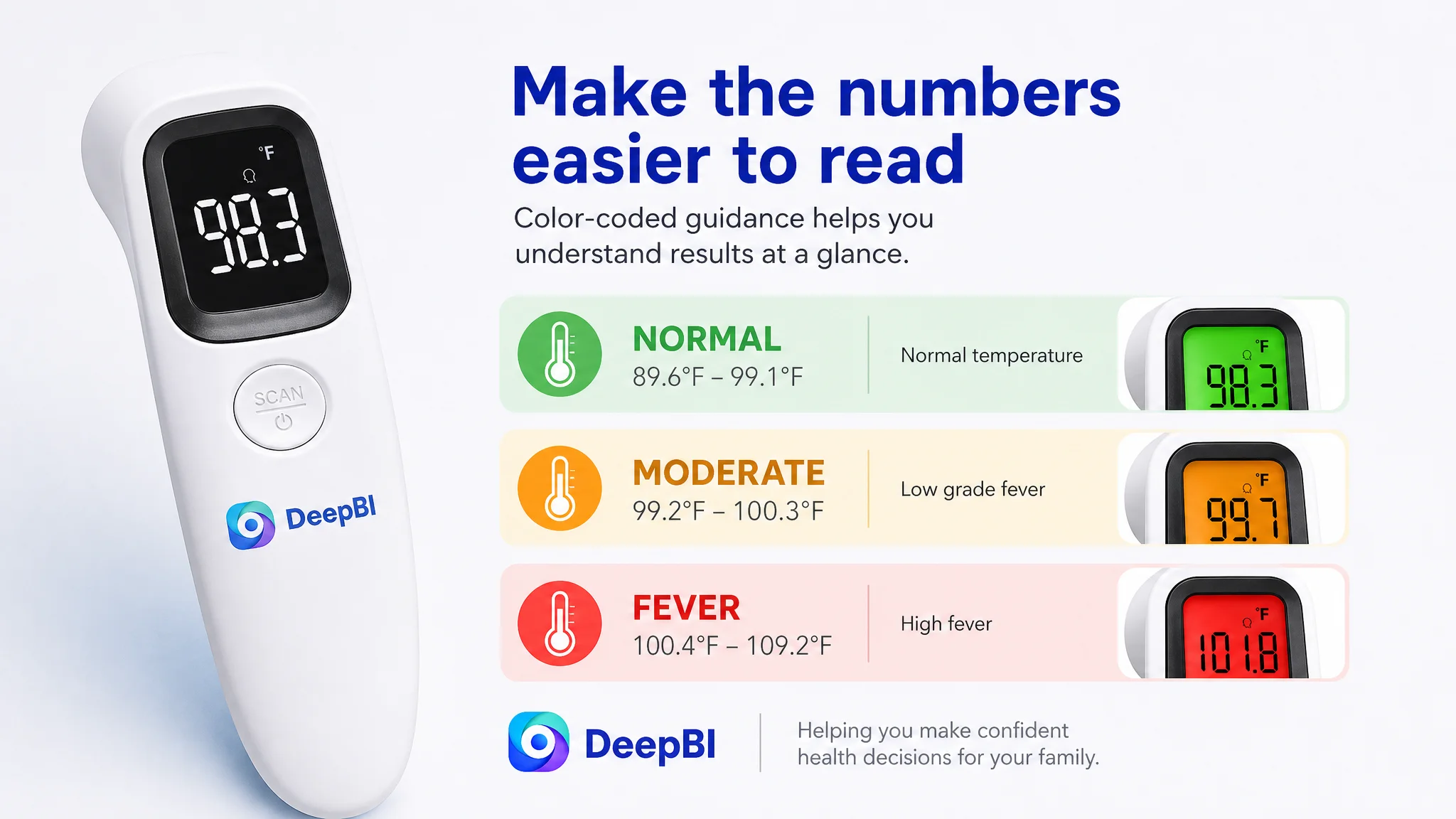
Color-coded temperature guidance and soft audio feedback were identified as strong communication opportunities.
A shopper should not have to interpret a number without context. Visual signals can help users quickly distinguish normal, elevated, or fever-related readings—provided the product genuinely supports those functions and the presentation complies with Amazon requirements.
This is not only a feature benefit. It reduces cognitive effort at a stressful moment.
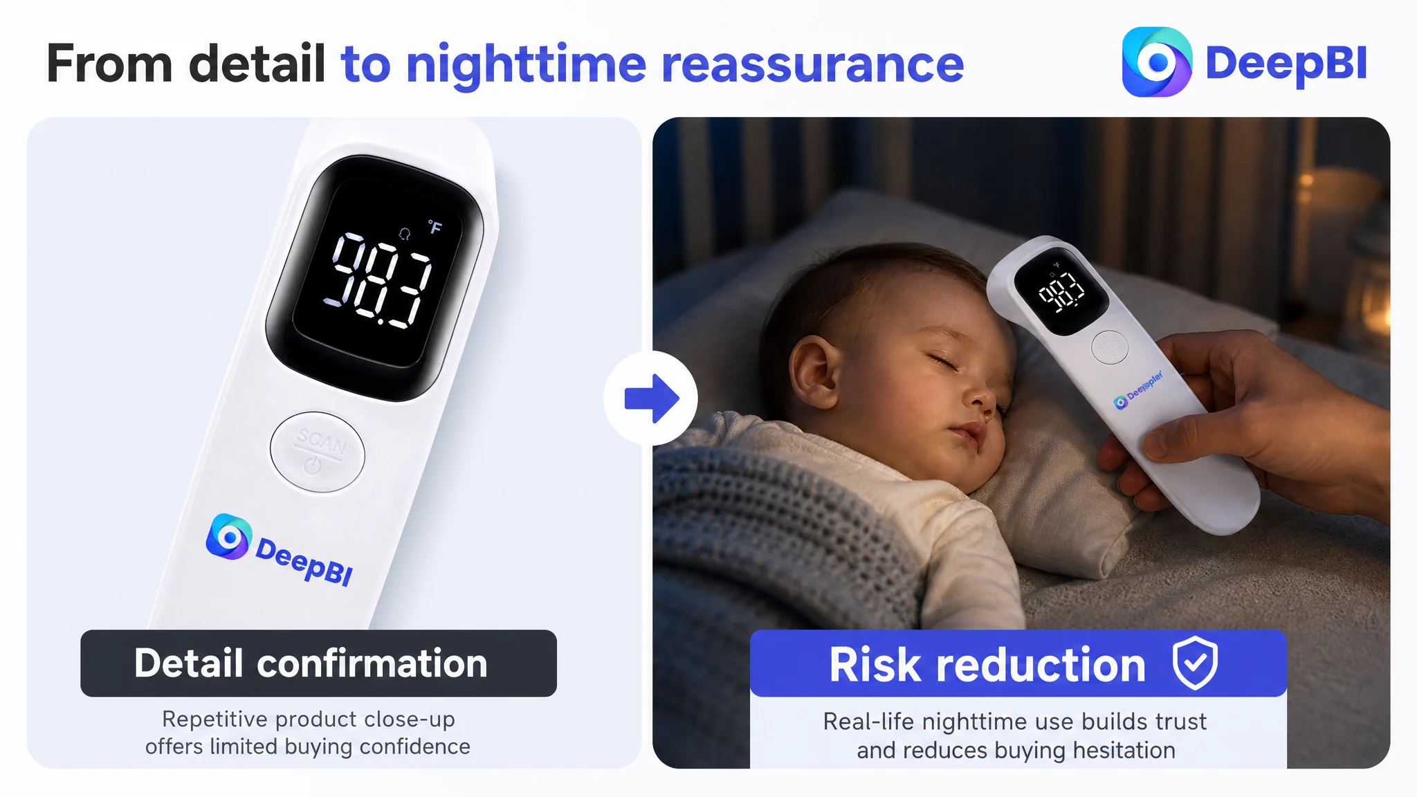
The third point needed to address nighttime use
For baby and family thermometers, nighttime use is a meaningful decision context.
A large display, simple one-touch operation, and mute capability can matter more than another generic product statement. The page needed to show how a parent could check a sleeping child without turning the experience into a disruptive procedure.
The recommended direction was therefore not simply “large LED display.” It was a combined use case: readable results, quiet operation, and less disturbance.
The fourth point needed to make versatility concrete
The available material indicated support for forehead and object or room-temperature modes. That creates an opportunity to position the product as useful beyond a single forehead measurement.
However, the page should prove the mode visually and describe only the functions confirmed for the product. It should not add unsupported applications or specifications merely because a competitor uses them.
The fifth point needed to complete the household-use story
Portability and ergonomic handling provide a practical closing point. The thermometer could be positioned for use at home, during travel, or in a diaper bag, but only if the product’s actual size and handling characteristics support those claims.
The important change was structural: every bullet needed to connect a product attribute to a real decision concern.
The main image problem was not visual quality alone
The target Listing’s main image set was not necessarily unusable. Its weakness was that the images were assigned the wrong jobs.
The first image used a flat product presentation. It showed the thermometer, but did not create a strong first impression of modern simplicity or easy operation. The comparable Listing used a more dynamic angle and a visually emphasized activation area, making the product feel easier to understand at a glance.
That difference affects the first click.
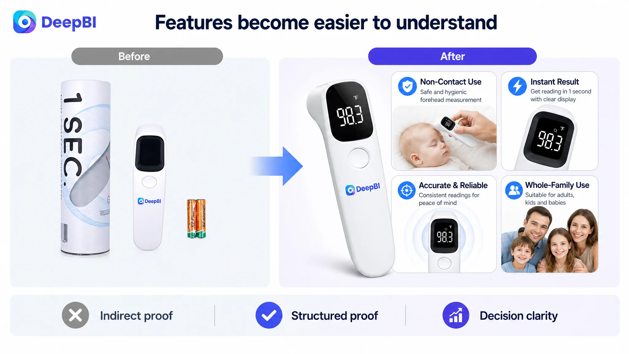
The second image relied partly on packaging to communicate speed and features. This used valuable image space to confirm information indirectly. Professional icons or a structured feature visual would have made the message more immediate.
The third image repeated product detail and display information without resolving a specific concern.
The fourth image focused on battery and certification information. These may be necessary, but they are not necessarily the strongest early-stage persuasion elements.
The fifth image added another physical angle without advancing the decision logic.
DeepBI’s diagnosis was to reorganize the image sequence around risk reduction:
- First: Show a clean, modern product presentation that communicates simple operation.
- Second: Explain how non-contact measurement delivers speed and convenience.
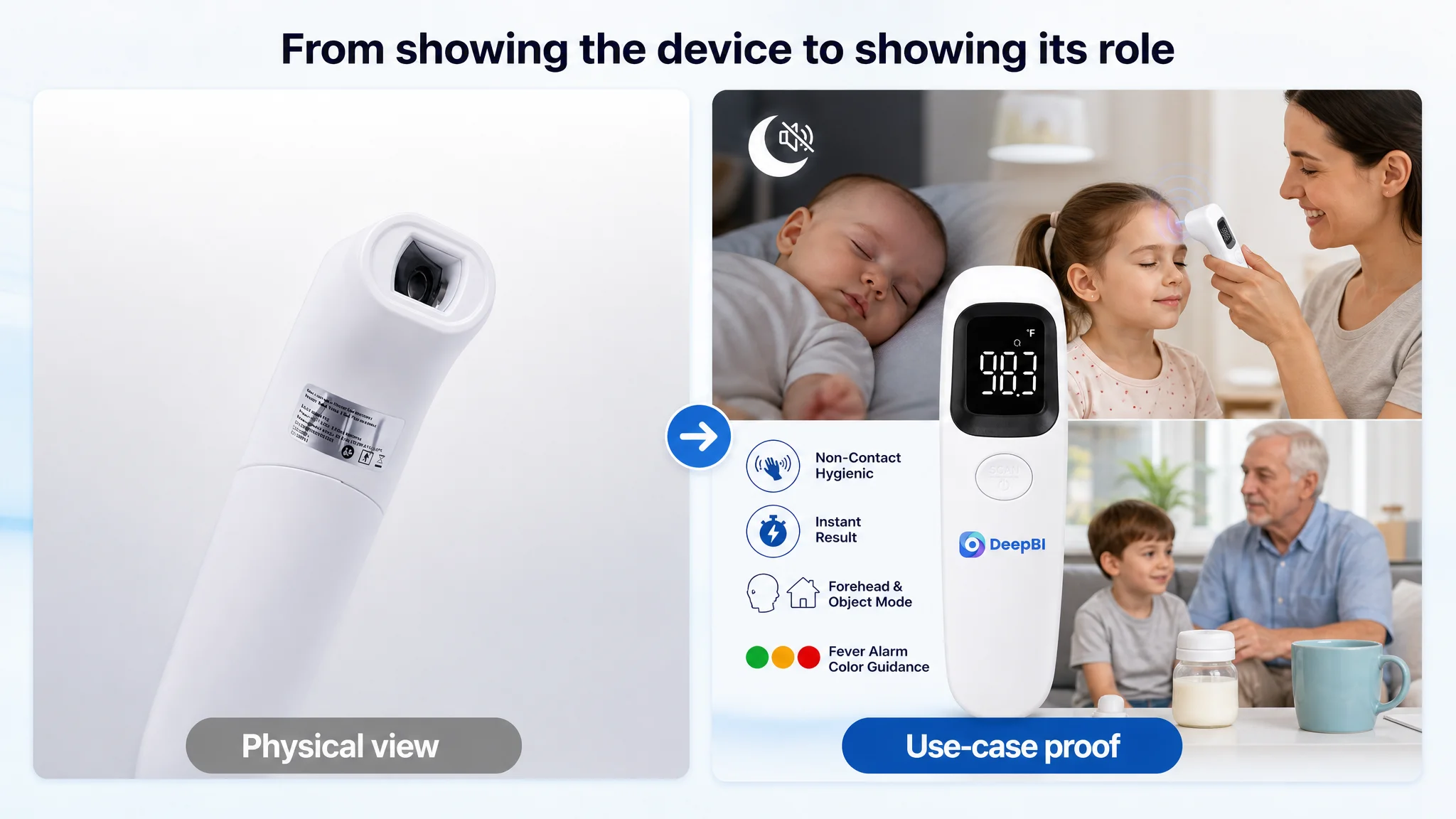
- Third: Place the thermometer in a quiet nighttime scenario with a sleeping baby.
- Fourth: Visualize how temperature readings should be interpreted.
- Fifth: Show broader family use, including the supported forehead and object or room modes.
A product image should not only answer “What does it look like?” It should answer “Why should I feel confident using it?”
This is where the distinction between image quantity and image function becomes commercially important.
The A+ content repeated the product instead of progressing the argument
The A+ and detail content scored 16 out of 25, seven points below the comparable Listing.
The target page relied heavily on static product displays, close-ups, and repeated screen views. The comparable Listing built a more complete progression:
- Lifestyle introduction
- Functional breakdown
- Technical explanation
- Feature verification
- Family use cases
- Quiet nighttime use
- Structured comparisons and visual proof
The problem was not a lack of images in the broadest sense. It was a lack of narrative movement.
The opening needed to create a gentle use context
The first A+ module should have introduced the product in a calm household setting rather than repeating a standard product shot. For a family thermometer, a gentle scene involving a child can establish relevance before the page moves into technical detail.
The next module needed to translate features into practical value
A concise feature overview could connect non-contact use, instant results, memory support, unit switching, and forehead or object modes—subject to confirmation of the product’s actual capabilities.
This would give shoppers a fast rational explanation before they encounter more detailed proof.
Accuracy needed to become visible
The page used broad language around accuracy, but did not make the measurement logic concrete enough.
Where supported by the product data, specific values such as a measurement resolution or accuracy standard can make a general claim more credible. The page could also explain the measurement process and provide appropriate distance or usage guidance if that information is available.
The objective is not to add technical language for its own sake. It is to reduce the shopper’s concern that non-contact measurement may be too uncertain.
The object mode needed visual verification
If the product supports object or room-temperature measurement, the A+ content should show the mode through visible display changes or a clear comparison between use cases.
The source material did not support visualizing every possible object, such as food or milk. A more credible direction would focus on room temperature or other inanimate household objects that can be accurately represented.
Repetition needed to give way to evidence
Repeated product close-ups consumed space without adding new proof. The later modules should instead confirm:
- Readability in different conditions
- Celsius and Fahrenheit switching
- Memory functionality, if verified
- Simple operation
- Whole-family use
- Indoor and outdoor practicality, where supported
Each module should move the shopper one step closer to confidence.
Reviews made the trust gap impossible to ignore
The review profile added another layer of risk.
The target Listing had:
- 3.8 stars
- 95 total reviews
- 8 reviews visible on the first page
- A first-page one-star share of approximately 25%
The comparable Listing had:
- 4.6 stars
- 8,988 total reviews
- 12 reviews visible on the first page
- A first-page one-star share of approximately 8.3%
The review-count gap was especially significant. The target Listing had roughly one percent of the comparable Listing’s review volume, making it much harder for the page to compensate for weak content through social proof.
The review content also differed in usefulness. The stronger Listing’s reviews emphasized speed, accuracy, quiet mode, and color-coded guidance, and included image or video elements. The target Listing’s comments were shorter and less effective at demonstrating the product’s strongest use cases.
This did not mean the seller could solve the problem through reviews alone. Review acquisition is a longer-term business process, and the existing rating could not be edited away through copy changes.
It meant the page had to work harder in the areas the seller could control:
- More precise claims
- Better visual proof
- Stronger use scenarios
- Clearer feature hierarchy
- A more credible A+ explanation
Why DeepBI did not recommend tuning the page one element at a time
The score comparison showed that the Listing’s weaknesses were connected.
A better title without supporting bullets would create an expectation the page could not fully explain. New lifestyle images without technical proof would create attention but leave accuracy concerns unresolved. More detailed A+ content without a stronger opening would make the page denser without making it easier to trust.
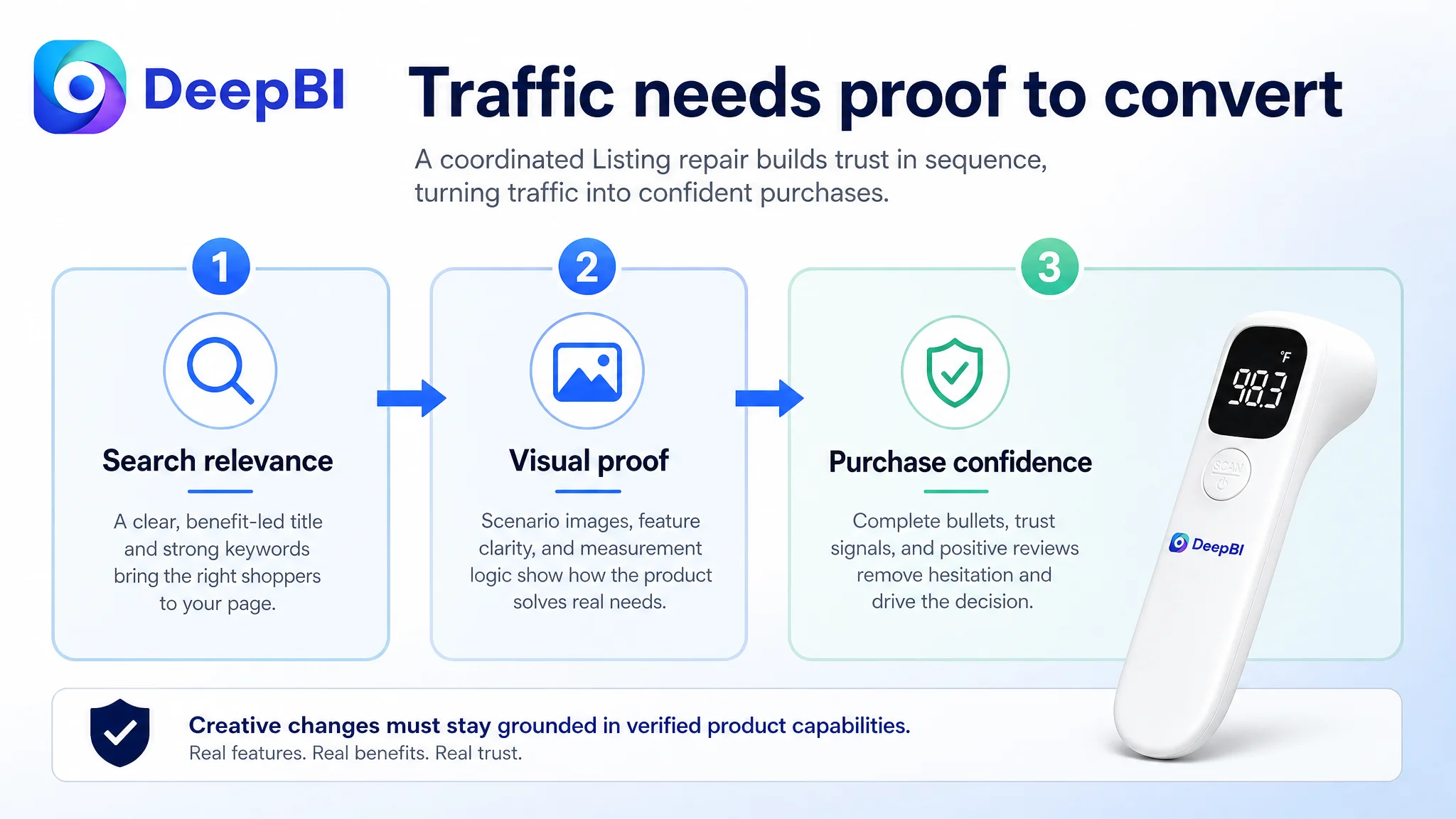
DeepBI therefore reframed the task as a coordinated Listing repair rather than a collection of isolated edits.
The decision order was:
1. Clarify the central household value proposition.
2. Rebuild the title around search relevance and concrete decision triggers.
3. Add bullet points that connect concerns, features, and outcomes.
4. Reassign each image a distinct role in the conversion sequence.
5. Use A+ content to provide scenario context and technical verification.
6. Treat reviews as an existing trust constraint rather than something content alone could immediately remove.
7. Only then evaluate whether additional advertising traffic can be converted efficiently.
This order protects the seller from amplifying an incomplete page.
Advertising can bring more shoppers into the funnel, but it cannot create missing proof. If the product page does not communicate speed, accuracy, quiet use, and practical relevance, additional traffic may simply expose more shoppers to the same uncertainty.
The revised Listing direction was about decision logic, not decoration
The proposed title direction retained the core keyword while removing repetitive wording and introducing more conversion-oriented language:
Infrared Forehead Thermometer Non-Contact for Adults, Kids and Babies, Fast Accurate Touchless Thermometer with Fever Alarm & Instant Result, Baby Essentials for Indoor and Outdoor
The value of this direction was not the exact wording alone. It reflected a more mature hierarchy:
- Core search term first
- Audience clarified
- Speed and accuracy made visible
- A concrete alert function introduced where supported
- Household and baby-care relevance established
- Redundant synonyms reduced
The same principle applied to images and A+ content. The goal was not to imitate the comparable Listing’s design. It was to understand the role its content played and build an original version within the target product’s real physical and functional boundaries.
DeepBI’s reasoning also required caution. It could recommend changing composition, lighting, scene, information hierarchy, and visual explanation. It should not change the thermometer’s physical design, invent unsupported functions, or add numerical claims that had not been verified.
That boundary is essential for Amazon Listing optimization. A visually persuasive image that shows a function the product does not have may improve attention temporarily, but it creates a more serious downstream problem through customer disappointment, returns, and negative reviews.
What changed in the business understanding
The available case material does not include confirmed post-optimization CTR, CVR, ACOS, TACOS, or organic-order results. Those outcomes should therefore not be invented.
What the diagnosis did establish was a clearer operating state.
The seller could now distinguish between:
- Search coverage and click motivation
- Product visibility and product-page persuasion
- Feature presence and feature explanation
- More traffic and more useful traffic
- A visually attractive image and an image with a defined conversion role
- A review deficit and a content problem that could be addressed immediately
The main business risk was no longer described vaguely as “the Listing needed improvement.”
It was more precise:
The page was asking paid or organic traffic to make a purchase decision without giving shoppers enough structured evidence to do so.
That reframing changes how the team evaluates future Amazon ads performance. If CTR is weak, the main image and title deserve attention. If clicks arrive but CVR remains weak, the bullets, A+ content, reviews, and trust sequence deserve deeper examination. The metrics should not be interpreted separately from the page elements responsible for each stage.
The lesson for Amazon sellers
This thermometer case did not show that advertising is unimportant. It showed that advertising cannot substitute for Listing conversion capacity.
A seller may have a relevant keyword, a functional product, and several product images, yet still lose the purchase decision because the page does not build confidence in the order shoppers need.
For this Amazon Listing, the missing order was:
- Make the product easy to understand at the first glance.
- State the core value without repetitive wording.
- Explain benefits through complete bullet points.
- Show how the thermometer works in real family situations.
- Make accuracy and reading logic more concrete.
- Use A+ content to progress from reassurance to proof.
- Treat reviews as a trust constraint that must be managed alongside content.
- Judge whether the page is ready before scaling traffic.
The deeper conclusion is simple:
Amazon ads can deliver attention, but Listing quality determines whether that attention becomes a useful business outcome.
For the target thermometer Listing, the next optimization step was not to add more noise or keep repeating the product from different angles. It was to rebuild the page as a coherent decision system—one that helps shoppers understand the product, trust the measurement, and see why it belongs in their household.