

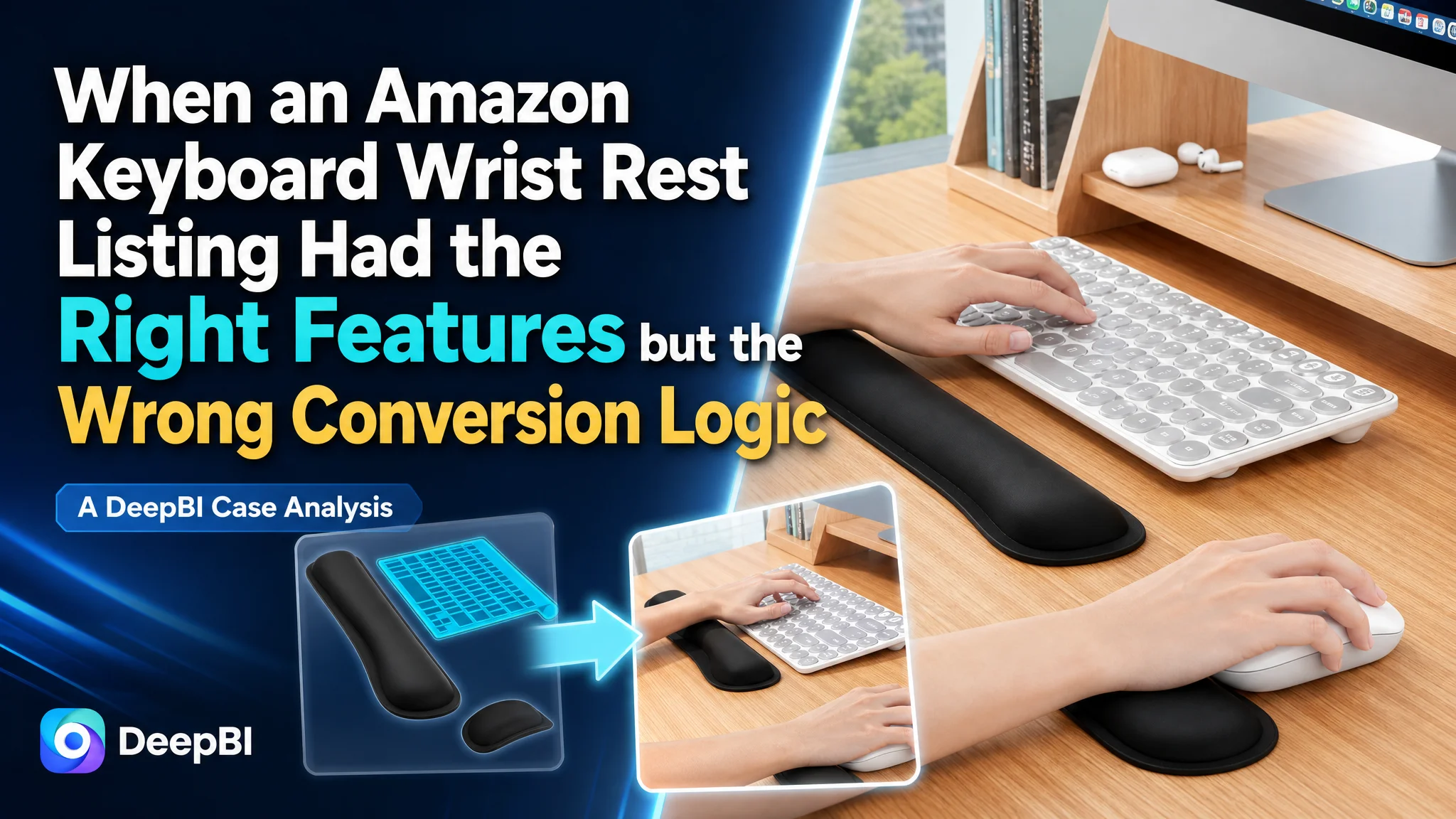
This case follows an Amazon seller of a keyboard and mouse wrist rest set whose product page was not converting its value clearly enough. The customer initially treated the issue as a collection of smaller Listing problems: adjust the wording, improve a few images, clarify the dimensions, and make the product look more polished.
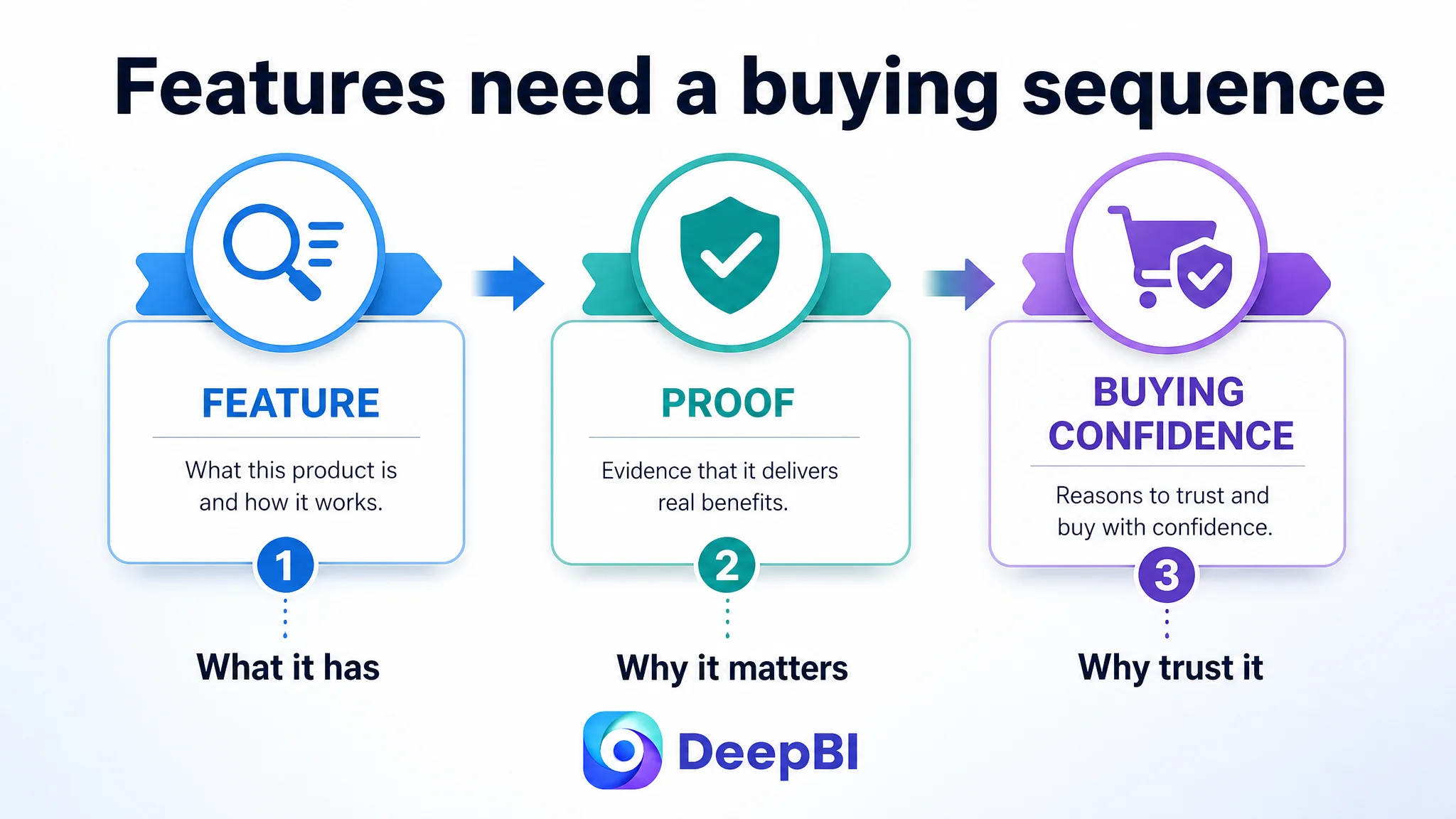
DeepBI found a more fundamental constraint. The Amazon Listing was presenting features, but it was not leading shoppers through a convincing buying decision. The title lacked outcome-oriented language, the main images did not establish an immediate reason to click, the bullet points did not quantify the product's advantages, and the A+ content did not explain the problem-solution relationship with enough force. Most importantly, the page had no usable review proof to reduce first-purchase hesitation.
The later optimization therefore focused on rebuilding the Listing's sales logic rather than making isolated cosmetic changes. The title, main images, bullet points, product-page modules, and trust signals had to work as one conversion path before Amazon ads or additional traffic could become more productive.
For other Amazon sellers, the lesson is direct: when a Listing contains the right product features but still underperforms, the issue may not be a lack of information. It may be that the page has not organized that information into a reason to click, a reason to trust, and a reason to buy.
The Listing Was Not Empty. It Was Underperforming at the Decision Stage.
The product was a keyboard and mouse wrist rest set for computer, laptop, office, and home use. On the surface, the Listing had many of the expected ingredients:
- Memory foam
- Ergonomic wrist support
- A non-slip base
- A keyboard wrist rest and mouse wrist rest
- Size and compatibility information
- Lifestyle and material images
- A+ content modules
- Customer support language
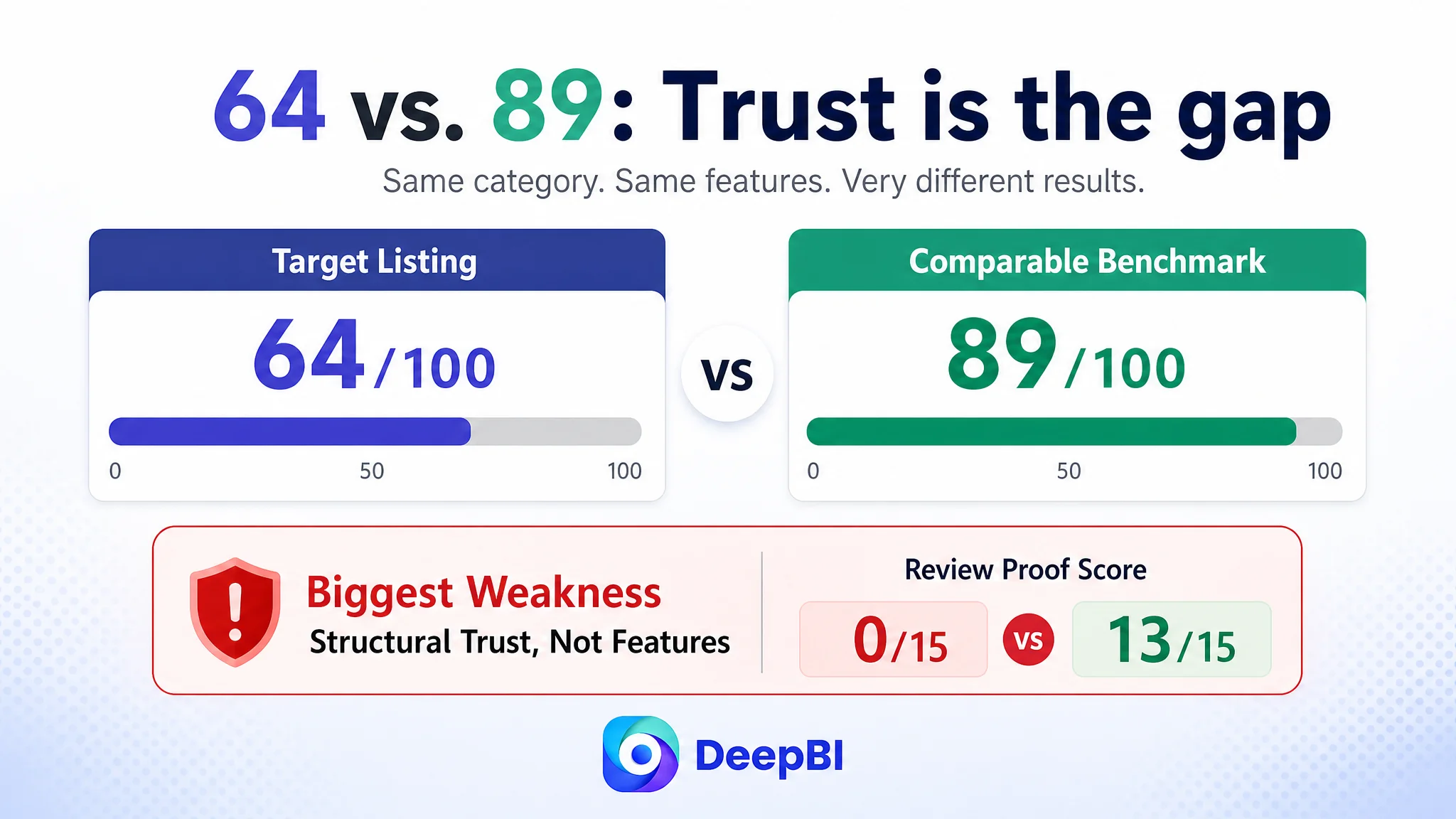
Yet the Listing received a total score of 64 out of 100, compared with 89 out of 100 for a comparable high-performing listing in the same product space.
- Title: Target Listing: 14/20, Comparable benchmark: 18/20, Gap: -4
- Main images: Target Listing: 24/30, Comparable benchmark: 26/30, Gap: -2
- Bullet points: Target Listing: 7/10, Comparable benchmark: 9/10, Gap: -2
- Product-page content: Target Listing: 19/25, Comparable benchmark: 23/25, Gap: -4
- Review proof: Target Listing: 0/15, Comparable benchmark: 13/15, Gap: -13
- Total: Target Listing: 64/100, Comparable benchmark: 89/100, Gap: -25
The largest gap was not a missing minor feature. It was the absence of a complete trust and conversion structure.
The Listing had product information. What it lacked was a persuasive order for that information.
The Original Direction Was Too Fragmented
The customer was not ignoring the Listing. The problem was that the page was being viewed as a series of independent assets.
The title was considered a keyword and wording issue. The main images were considered a visual presentation issue. The bullet points were considered a copywriting issue. The A+ page was considered a content-volume issue.
That perspective encouraged local improvements:
- Add or rearrange keywords
- Clarify the product size
- Explain the memory foam
- Show the non-slip base
- Add more lifestyle context
- Refine the visual style
Each action appeared reasonable by itself. But the Listing still lacked a clear answer to the shopper's actual questions:
1. What problem does this product solve?
2. Why is this wrist rest more convincing than another one?
3. Will it remain stable during daily use?
4. Will it fit my keyboard and desk?
5. What evidence reduces the risk of trying it for the first time?
The initial direction focused on whether the page contained information. DeepBI reframed the issue around whether the page moved the shopper from recognition to confidence.
That distinction mattered because conversion is not created by the number of features displayed. It is created by the logic connecting the features to the buyer's concern.
The Title Described the Product, but Not the Buying Reason
The title had a relevant product category and described functions such as memory foam and ergonomic design. However, it placed the brand name before the strongest category language, did not include meaningful size information, and did not communicate an outcome such as pain relief or reduced wrist pressure clearly enough.
The benchmark title led with the core search phrase for a computer keyboard wrist rest. It then added:
- Thickness
- Product dimensions
- Memory foam
- Pain relief
- Palm support
- Anti-slip performance
- Color
This structure served both sides of Amazon search behavior.
It gave the algorithm a clearer cluster of relevant terms, while also helping shoppers identify the product quickly and evaluate whether it matched their needs.
The target Listing's title was more function-oriented than decision-oriented. It said, in effect, “this is an ergonomic memory foam product.” It did not communicate as directly:
- How thick the support is
- What kind of pressure it is intended to relieve
- How the set fits into a keyboard-and-mouse setup
- Why the product is relevant to long work or gaming sessions
The proposed direction therefore moved the core product phrase forward and added a clearer benefit structure:
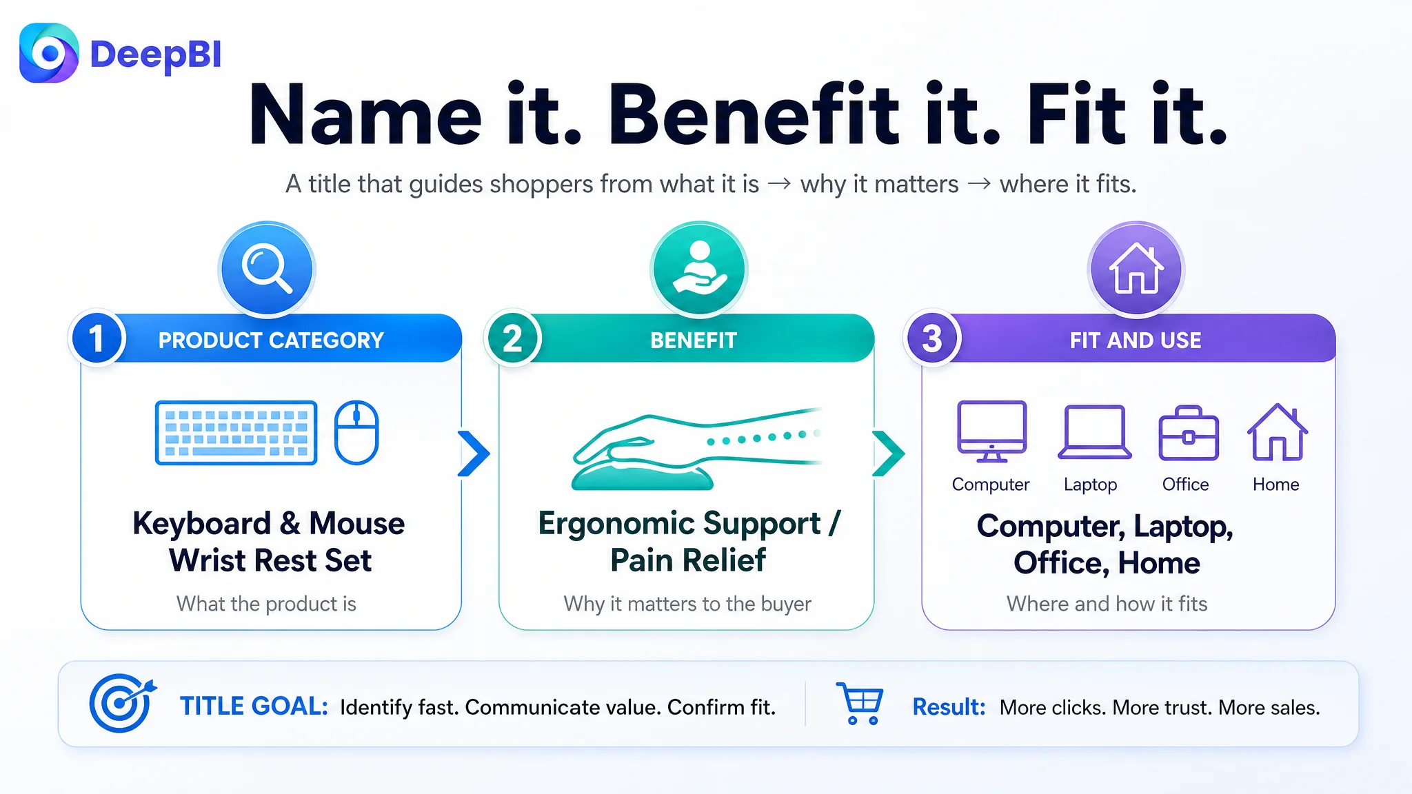
Memory Foam Keyboard and Mouse Wrist Rest Set → Ergonomic Wrist Support → Pain Relief → Non-Slip Base → Computer, Laptop, Office, and Home Use
This was not keyword stuffing. It was a reordering of the Listing's entry point.
The shopper should first understand what the product is, then why it matters, then whether it fits the intended use.
The Main Image Showed the Set, but Did Not Create Urgency
The main image score was 24 out of 30, only two points below the benchmark. That relatively small gap could easily be dismissed as a design difference.
DeepBI did not treat it that way.
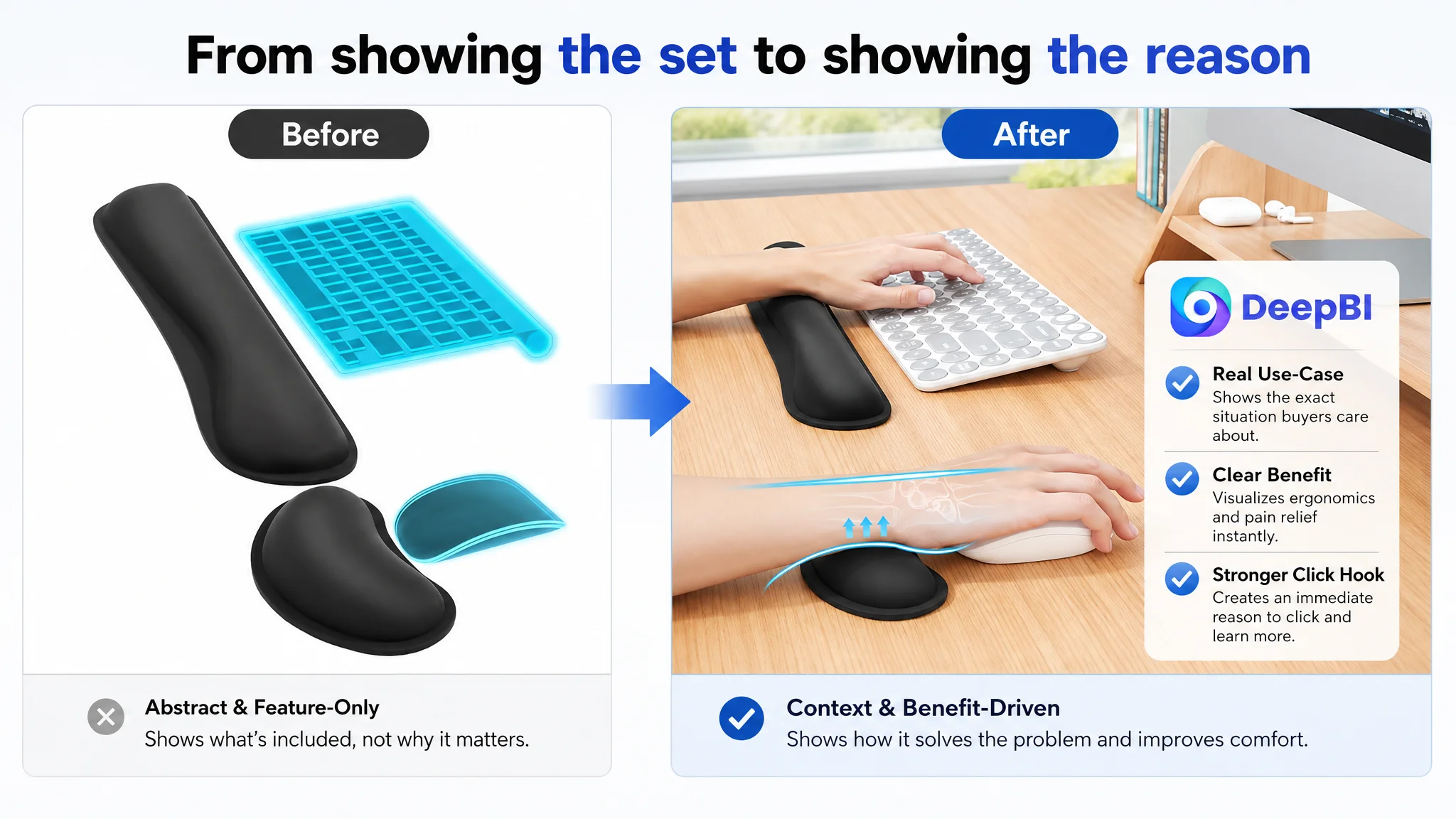
The target Listing's first image showed the two-item set through an abstract presentation. It communicated what was included, but not the real-world problem the product was designed to address. The visual did not establish scale clearly, and it did not create an immediate connection with the discomfort of unsupported wrists during long periods of typing or mouse use.
The image was technically informative, but commercially passive.
The proposed visual sequence was built around the buyer's decision path:
The first image should establish the use case
Rather than presenting the set as an abstract object, the visual direction was to show the keyboard wrist rest and mouse wrist rest in a realistic close-up context. The goal was to make the benefit understandable before the shopper reached the bullets.
The second image should make the ergonomic difference visible
The existing visual showed the wrist being supported, but did not create a strong comparison. A clearer before-and-after structure would show:
- An unsupported wrist position
- A supported, more neutral position
- The relationship between the wrist rest and the keyboard or mouse
This changes the image from “product anatomy” to “problem resolution.”
The third image should validate memory foam comfort
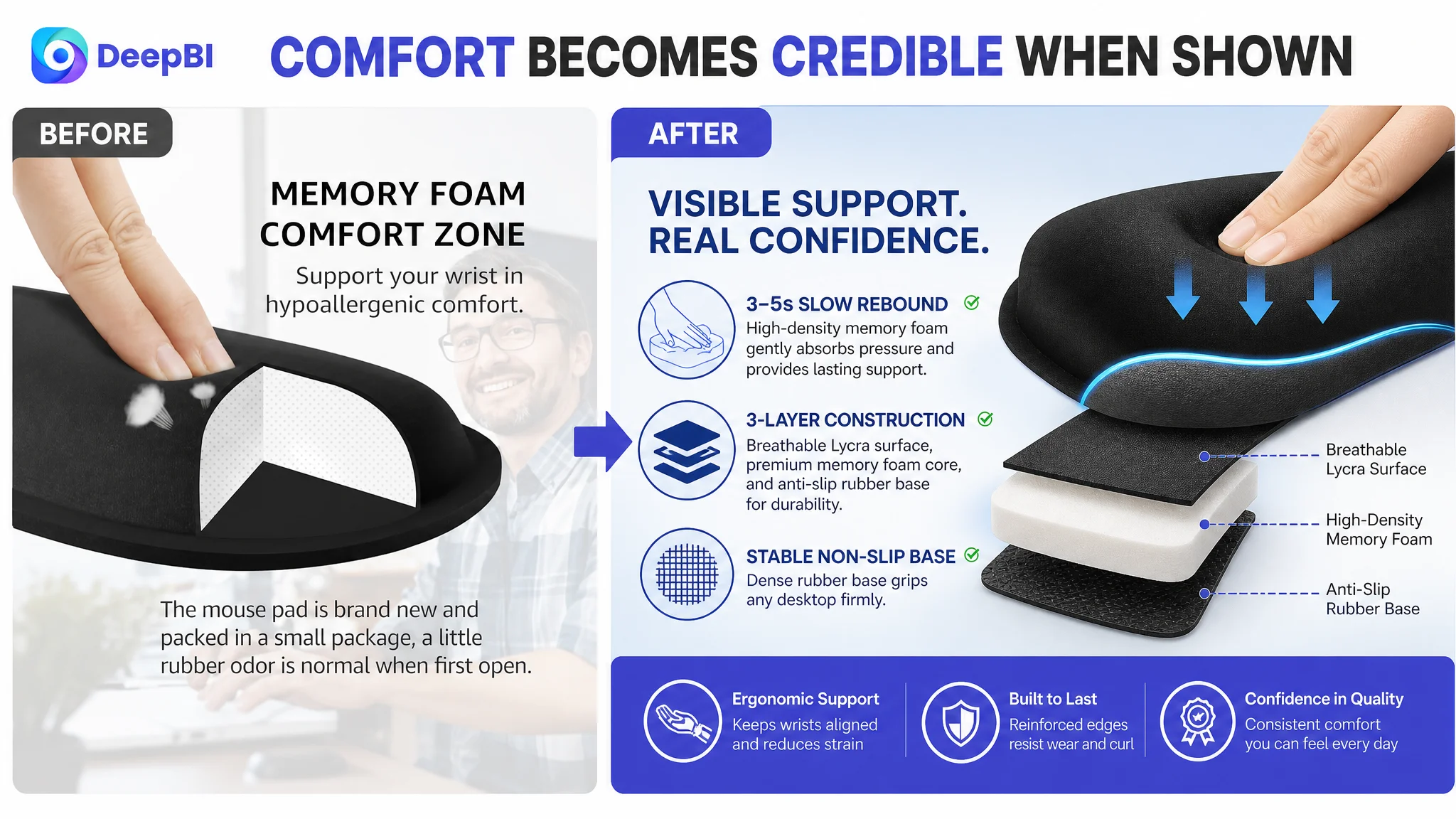
The existing image diluted the positive material message by placing attention on a slight rubber odor disclaimer. Even when the disclosure is accurate and necessary, combining it with a trust-building image can introduce doubt at the exact moment the shopper is evaluating material quality.
The stronger direction was to focus the image on:
- High-density memory foam
- Slow rebound
- Soft, breathable fabric
- Pressure distribution
- Consistent daily support
The fourth image should show stability as a solved problem
A non-slip base is not valuable merely because it exists. It matters because the wrist rest should not shift during typing, gaming, or mouse movement.
The visual therefore needed to emphasize the consequence:
The product stays in place, so the user does not have to keep correcting its position.
The fifth image should separate fit verification from other features
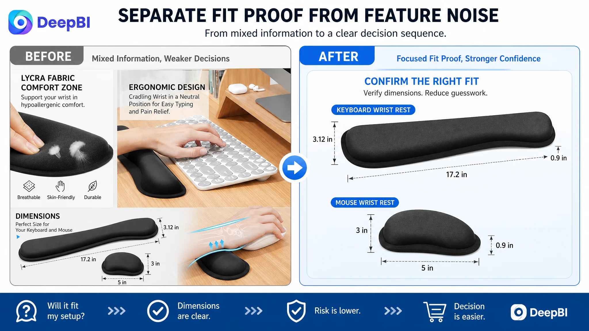
The original image combined fabric information and dimensions, which weakened both messages. Dimensions answer a specific purchase-risk question and should be presented independently:
- Keyboard wrist rest: 17.2 × 3.12 × 0.9 inches
- Mouse wrist rest: 3 × 5 × 0.9 inches
- Compatibility with standard, laptop, and gaming keyboards
This is a small structural change, but it reduces the effort required for mobile shoppers to verify fit.
The Bullet Points Had Features, but Not Enough Proof
The bullet-point score was 7 out of 10. The issue was not that the bullets were incomplete. They covered the main product functions.
The problem was that they were less specific and less sequential than the benchmark.
The benchmark moved from core benefit to supporting evidence:
1. Thick memory foam and slow rebound
2. Ergonomic wrist alignment
3. Anti-slip performance
4. Multi-layer construction and durability
5. Water resistance and easy cleaning
6. Use cases and support
The target Listing's bullets were more likely to read as a feature inventory. That forced the shopper to make the connection between the feature and the expected benefit.
DeepBI's proposed structure followed a clearer feature → evidence → buyer outcome pattern.
Memory foam should be expressed as support, not just softness
“Memory foam” and “comfortable” are common category language. They do not fully explain why the material is relevant.
The revised direction used the available product information more precisely:
- High-density memory foam
- Three-to-five-second slow rebound
- Pressure absorption
- Even distribution of hand weight
- Support during long typing sessions
This gives the material a functional role instead of presenting it as a generic comfort claim.
Ergonomic design should explain the user's physical experience
The curved shape needed to be connected to the wrist's natural position and the reduction of hand suspension fatigue.
The bullet should help the shopper picture the experience:
- The wrist is supported rather than left suspended
- The support follows the natural curve of the wrist
- The hand can remain in a more neutral position during work or gaming
The anti-slip base should be tied to control
Listing a rubber base is not enough. Shoppers want to know whether the wrist rest will move on their desk.
The revised logic specified common surfaces such as:
- Glass
- Wood
- Metal
It then linked the material to the use outcome: stable support and less unwanted movement during active use.
Structure and durability should answer future-use concerns
The target Listing described construction in broad terms. The recommended direction made the layers more tangible:
- Non-slip rubber base
- Memory foam core
- Breathable Lycra surface
- Heat-pressed edge reinforcement
This structure addresses concerns such as curling, fraying, glue failure, and loss of shape after repeated daily use, provided those claims remain consistent with the actual product.
Cleaning and maintenance should be presented as practical value
The benchmark separated the water-resistant surface into its own buying reason. For a product used beside coffee, tea, keyboards, and mice, easy maintenance is not an ornamental detail.
A spill-resistant or wipe-clean surface gives the shopper one more reason to believe the product will remain useful beyond the first few days.
The A+ Page Needed a Sales Sequence, Not More Decoration
The product-page score was 19 out of 25, four points behind the benchmark.
The target Listing used six primary content modules covering:
- Lifestyle context
- Dimensions
- Material detail
- Functional demonstration
- User context
The benchmark used a fuller nine-module structure, including:
- Pain and relief comparison
- Material and structure breakdown
- Water-resistance demonstration
- Multiple work and travel scenes
- Layered construction explanation
The difference was not simply that the benchmark had more images. It was that the benchmark used each module to answer a different concern.
The target A+ content repeated context and static product presentation. It did not build enough momentum from need to confidence.
DeepBI's diagnosis prioritized the following sequence.
First, establish the problem
The opening A+ module should reinforce the primary reason to consider the product: reducing wrist pressure and fatigue during extended computer use.
A generic lifestyle image spends valuable space showing that someone uses a computer. The shopper already knows that. The stronger module shows why the wrist rest belongs in that environment.
Then, demonstrate the ergonomic logic
A dimension label such as 0.9 inches may be accurate, but it does not explain why the product is ergonomic.
The page needed a rational visual demonstration of:
- Wrist alignment
- Stable support
- The relationship between the keyboard, mouse, and wrist rest
This converts an abstract design claim into something easier to evaluate.
Move fit information after desire and quality
Dimensions are important, but they mainly reduce fit risk. They do not create product desire.
The recommended order placed size information after the page had already established:
- The problem
- The support mechanism
- The material quality
- The product's stability
Only then would the shopper be asked to verify compatibility.
Give memory foam a visible quality story
A close-up of the surface validates texture, but not support performance. A slow rebound or compression visual creates a more meaningful connection between the material and the user's hand.
The shopper should not have to infer why the foam matters.
Turn the non-slip base into a reliability signal
The page should show that the base prevents unwanted movement during typing, gaming, or office work. This is more persuasive than simply displaying the rubber texture.
Replace repetitive lifestyle content with risk reduction
The final module repeated a general typing scene without introducing a new reason to trust the purchase.
The stronger use of that space was to reinforce purchase confidence through:
- A clear explanation of the set
- Compatibility
- Product support
- The available 18-month customer support commitment
The role of the final module is not to make the page feel fuller. It is to reduce the hesitation that remains after the shopper has understood the product.
The Largest Conversion Risk Was the Missing Trust Layer
The review dimension scored 0 out of 15 for the target Listing, compared with 13 out of 15 for the benchmark.
The benchmark had:
- A 4.4-star rating
- 297 total reviews
- Eight visible review entries on the first page
- Customer images and videos
- A relatively mature review profile
The target Listing had no usable rating or review evidence available on the page. The homepage review area contained no effective social proof and could not reduce the concern of a first-time buyer.
This gap changed the meaning of every other improvement.
A stronger title may win attention. A clearer image may improve understanding. More specific bullets may create interest. But when the shopper reaches the final trust question, the page still offers little evidence that other buyers have purchased and used the product successfully.
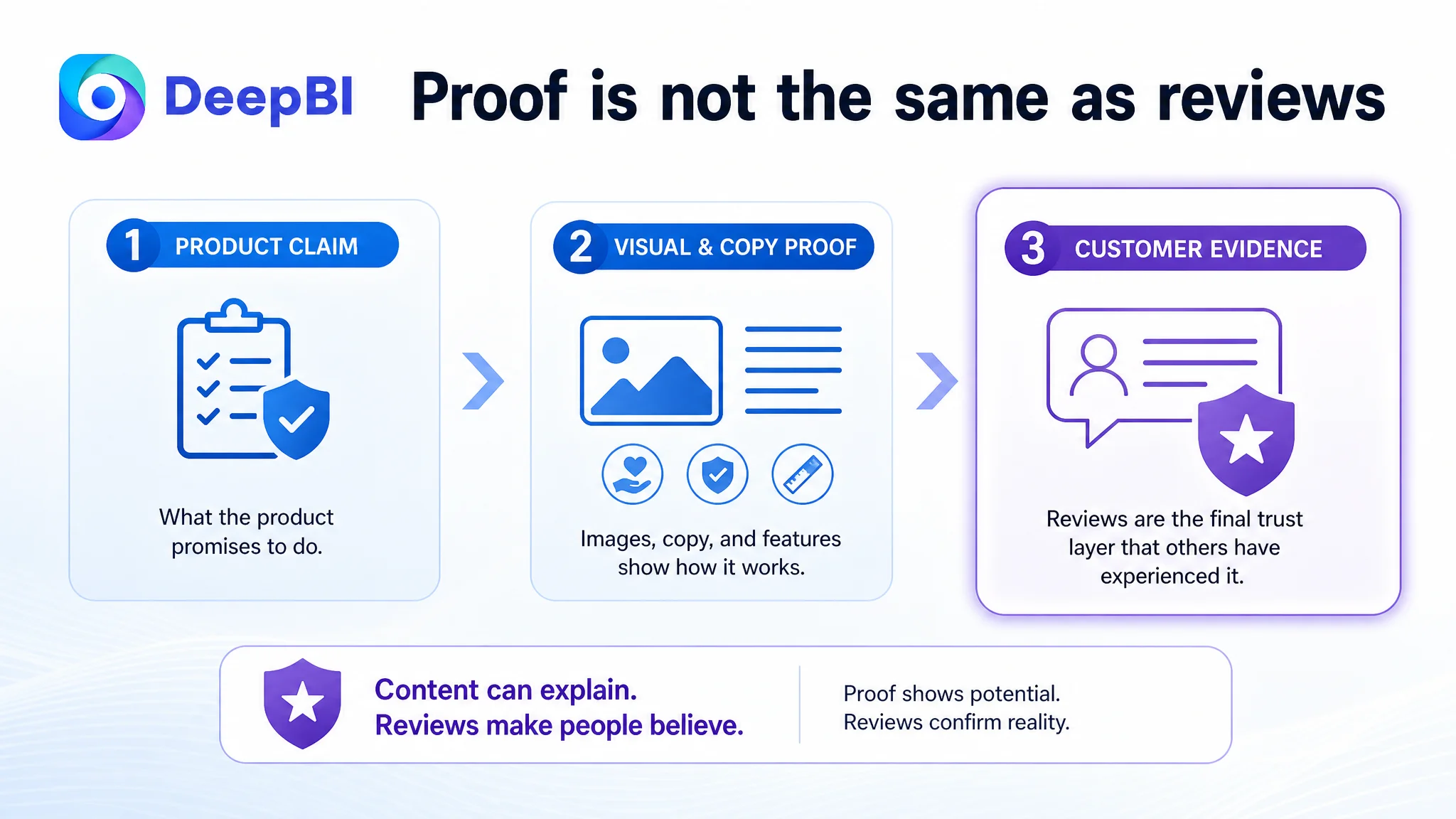
Content can explain what the product claims to do. Reviews help buyers believe that the claim has been experienced by someone else.
DeepBI therefore treated the review gap as a structural business risk, not as a minor Listing score issue.
At the same time, the available case material does not provide post-optimization review growth or conversion results. The correct conclusion is not that the review gap was already solved. The correct conclusion is that the page's content had to become stronger and more explicit while the seller continued addressing the separate trust challenge represented by the absence of usable review proof.
Why DeepBI Did Not Recommend Chasing Ads First
The case material does not provide a before-and-after ACOS, CTR, CVR, or TACOS series. It would therefore be inaccurate to claim that advertising costs fell or that orders increased after the changes.
The decision logic is still clear.
If paid traffic is sent to a page that does not communicate its value quickly, does not quantify its advantages, and does not reduce purchase risk, additional traffic can expose the weakness rather than solve it.
For this Listing, the page-level gaps were visible across several connected dimensions:
- The title was less precise and less outcome-oriented
- The main image did not create a strong use-case hook
- The bullets did not provide enough quantified proof
- The A+ modules did not build a complete problem-solution story
- The Listing lacked usable review evidence
That made continued ad tuning a lower-priority decision than repairing conversion capacity.
The key risk was not merely wasted spend. It was allowing paid traffic to amplify a page that had not yet earned the opportunity to scale.
This does not mean Amazon ads are unimportant. It means their role must be judged in sequence:
1. Confirm that the page clearly communicates the product's value.
2. Confirm that the images and copy support the same buying logic.
3. Reduce avoidable trust and fit concerns.
4. Then evaluate whether additional paid traffic can be converted efficiently.
The page had to become more capable of converting both paid and organic traffic before advertising could be judged fairly.
The Optimization Was a Rebuild of Decision Logic
The recommended changes were not a collection of disconnected edits.
They followed one commercial narrative:
At the search-result stage
The title should identify the product quickly and connect the product form to the buyer's intended outcome.
At the thumbnail stage
The main image sequence should make the support benefit, set composition, stability, and fit easier to understand.
At the bullet stage
Each point should move from a core concern to specific evidence and then to a practical use outcome.
At the A+ stage
The page should demonstrate why the product works, how it is constructed, where it can be used, and why the purchase carries less risk.
At the trust stage
The Listing should acknowledge that content cannot replace review proof. The seller must continue building credible customer evidence while ensuring that the page is ready to convert that trust when it arrives.
This was why DeepBI's diagnosis led to prioritization rather than indiscriminate optimization. The goal was not to make every element equally elaborate. The goal was to repair the parts of the page that most directly affected the shopper's decision.
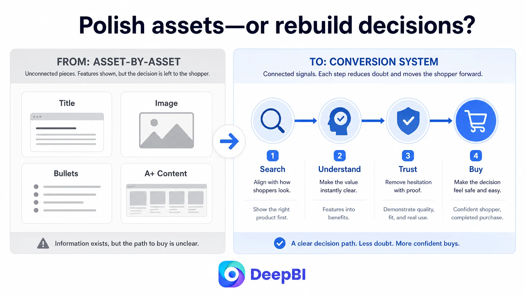
What Changed in the Operating Understanding
No verified post-optimization business metrics are included in the case material. The final change should therefore be understood in terms of operating logic and risk, not as an unsupported numerical success claim.
The customer moved from viewing the Listing as a set of assets to viewing it as a connected conversion system.
That shift produced several clearer operating conclusions:
- A relevant keyword is not enough if the title does not communicate the buying reason.
- A product image can be visually clean and still fail to create a reason to click.
- A feature such as memory foam becomes more persuasive when supported by measurable or visible evidence.
- A non-slip base matters more when the page shows the movement problem it prevents.
- Dimensions reduce fit risk, but they should not interrupt the early persuasion sequence.
- A+ content must explain the product's logic rather than repeat the main image.
- Review proof is not a cosmetic Listing element. It is a major trust input.
- Amazon ads cannot compensate for a product page that has weak conversion capacity.
The practical result of this reframing is a more controllable optimization path. Instead of repeatedly changing individual images or phrases, the team can evaluate whether each Listing element performs its role in the larger sequence.
The Broader Lesson for Amazon Sellers
A Listing can have the correct category, a real product advantage, and a complete set of basic modules, yet still lose at the point where the shopper decides whether to trust the purchase.
That was the central issue in this keyboard and mouse wrist rest case.
The customer did not need more random content. The page needed a stronger relationship between:
- Search language
- Visual attention
- Functional proof
- Use-case relevance
- Fit verification
- Purchase confidence
DeepBI located that issue by comparing the Listing across five dimensions instead of judging one asset in isolation. The 64-to-89 score gap was useful not because the number itself guaranteed an outcome, but because it showed where the page was losing competitive strength: especially in the title, A+ logic, and review proof.
Before scaling Amazon traffic, sellers should ask whether the product page is ready to convert the traffic it receives.
For this Amazon seller, the next optimization direction was therefore not “make the ads work harder.” It was to make the Listing communicate more clearly, prove more specifically, and reduce more of the buyer's uncertainty.
That is the difference between polishing a page and diagnosing the business problem inside it.