

An Amazon seller in the outdoor category was not short of product information. The Listing described a high-back folding camping chair with a pillow, height adjustment, portability, and multiple outdoor uses. Yet its overall Listing score reached only 66 out of 100, compared with 89 for a comparable high-performing listing.
The initial direction was easy to understand: add more specifications, improve the title, explain the structure, and make the product’s functions more visible. But the deeper issue was not a lack of information. It was that the Amazon product page did not organize its information around the buyer’s real decision sequence—whether the chair would be comfortable, stable, easy to carry, and trustworthy in actual outdoor conditions.
DeepBI reframed the problem as a Listing conversion-capacity issue. The later optimization focused on making the chair’s strongest difference—the 2-in-1 height adjustment—visible earlier, replacing narrow product presentation with broader outdoor scenarios, simplifying setup communication, and building stronger proof around stability, durability, comfort, and packed size. Other Amazon sellers can learn from the case that traffic and features are not enough; the product page must help shoppers resolve their most important doubts in the right order.
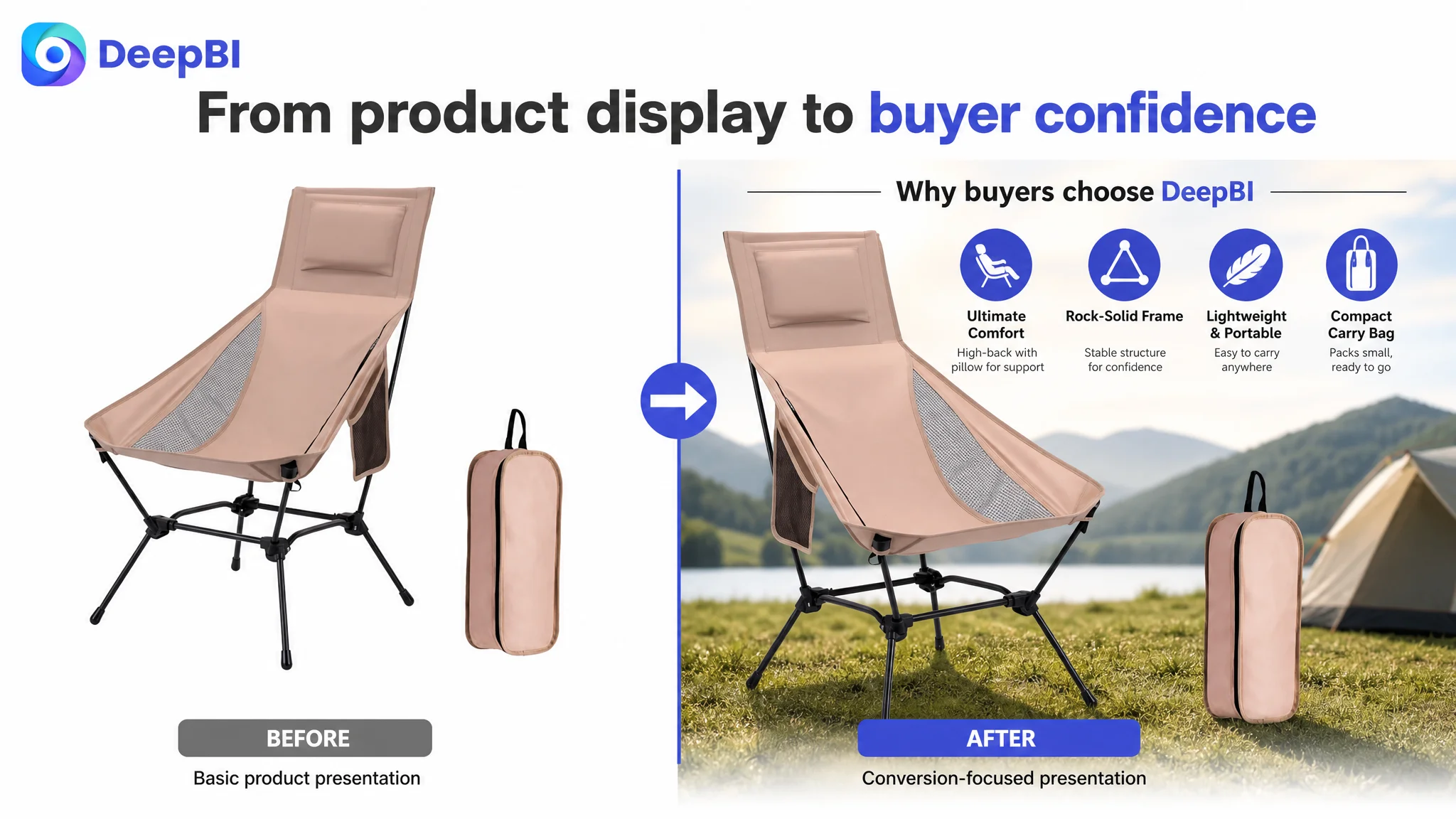
The Amazon Listing Had a Product. It Did Not Yet Have a Persuasive Buying Path.
The customer’s product had several meaningful selling points:
- High-back structure
- Detachable memory foam pillow
- 2-in-1 height adjustment
- Lightweight folding design
- Side storage pocket
- Outdoor use across camping, hiking, fishing, beach trips, and RV travel
On paper, this was a reasonably differentiated camping chair.
The difficulty was that the Listing presented these points as a collection of functions rather than as a clear reason to choose this product over another portable chair.
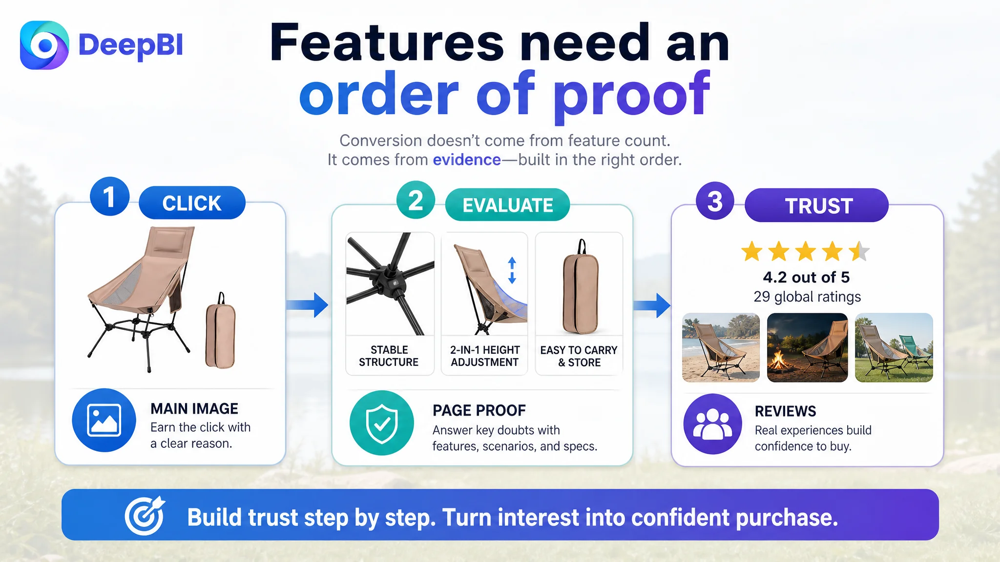
That distinction mattered because Amazon shoppers do not evaluate every specification with equal attention. They typically move through a compressed sequence:
1. The main image earns the click.
2. The title confirms relevance and highlights the primary value.
3. The bullet points answer the first practical concerns.
4. The image stack and A+ content reduce uncertainty.
5. Reviews validate whether the product performs as promised.
The customer’s Listing was weaker across each part of that sequence, but the most serious gap appeared in the page depth and review environment.
The Listing did not simply need more content. It needed a clearer order of persuasion.
A 23-Point Gap Changed the Diagnosis
DeepBI’s comparison produced a total score of 66 for the customer’s Listing and 89 for the comparable benchmark Listing.
The gap was not evenly distributed:
- Title: Customer Listing: 16/20, Benchmark Listing: 18/20, Gap: -2
- Main image: Customer Listing: 24/30, Benchmark Listing: 27/30, Gap: -3
- Bullet points: Customer Listing: 7/10, Benchmark Listing: 8/10, Gap: -1
- Detail page: Customer Listing: 16/25, Benchmark Listing: 24/25, Gap: -8
- Reviews: Customer Listing: 3/15, Benchmark Listing: 12/15, Gap: -9
The first interpretation might have been that the title and images needed the most attention because they are visible at the top of the Amazon search and product-page funnel.
But the score distribution suggested something more important: the Listing was losing its ability to convert after the initial product interest had already been created.
The detail-page gap was eight points. The review gap was nine.
That meant the main business risk was not only a weak first impression. It was the absence of sufficient evidence after the shopper began evaluating the chair seriously.
The Original Direction Focused on Features, Not Decision Risk
The customer’s existing content covered many functions. It described comfort, height adjustment, lightweight construction, setup, storage, and use across different settings.
The problem was not that these functions were irrelevant. The problem was that they were not arranged according to the concerns most likely to block purchase.
For a portable outdoor chair, a shopper may be asking:
- Will it support me securely?
- Will it sink or wobble on grass, sand, or uneven ground?
- Will the back and pillow remain comfortable during extended use?
- Can I set it up without frustration?
- Will it fit in my vehicle, backpack, or motorcycle luggage?
- Does the product look durable enough for repeated outdoor use?
The existing Listing often answered these questions indirectly through technical descriptions. The benchmark Listing answered them more directly through measurable claims, scenario proof, and visual demonstrations.
This is where the original optimization direction became incomplete. Adding more features or making specifications more prominent could improve information coverage, but it would not automatically create trust.
The customer had information. The shopper still lacked confidence.
The Main Image Was Not Just a Visual Weakness
The customer’s image set showed the chair and communicated its general structure. However, the first impression did not establish a strong enough reason to prefer this chair in a crowded Amazon search result.
Several problems were connected:
- The high-back profile and memory foam pillow were not strongly visualized.
- The compact carry format did not create an immediate portability impression.
- The structure looked functional but did not communicate stability with enough force.
- The product’s most distinctive feature, 2-in-1 height adjustment, appeared too late.
- The technical visuals created an information burden without enough visual hierarchy.
A comparable high-performing Listing used a stronger combination of product, person, and outdoor setting. Its scenes helped shoppers imagine the chair in use rather than merely inspect the object.
That difference is commercially important. A product-only image can show what the item is. A well-sequenced image set must also show why the item belongs in the shopper’s life.
The strongest differentiator was placed too late
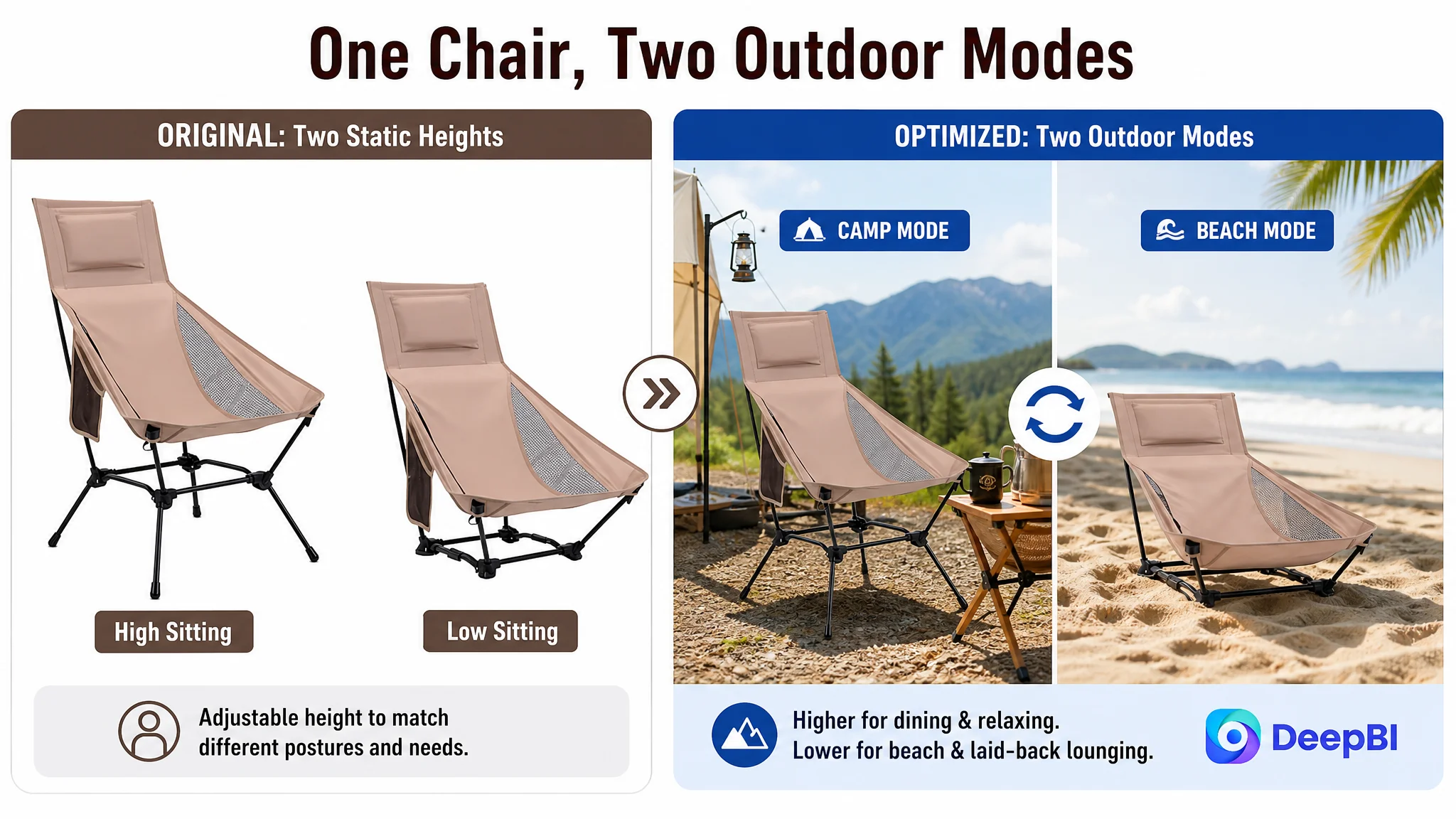
The 2-in-1 height adjustment was the customer’s clearest opportunity to stand apart.
It could position the product as both:
- A standard-height camp chair for campfires and general outdoor seating
- A lower beach lounger for relaxing near the water or on soft ground
But the feature was expressed too late and too statically. It appeared as a function rather than as a visible change in use.
DeepBI’s recommendation was to move this content to the third image and present the transition dynamically. The objective was not to add another specification. It was to give shoppers an immediate answer to a practical question:
Why choose this chair instead of a single-height alternative?
The page did not resolve the stability concern early enough
The benchmark Listing proactively addressed sinking and uneven terrain through its foot design and visual proof.
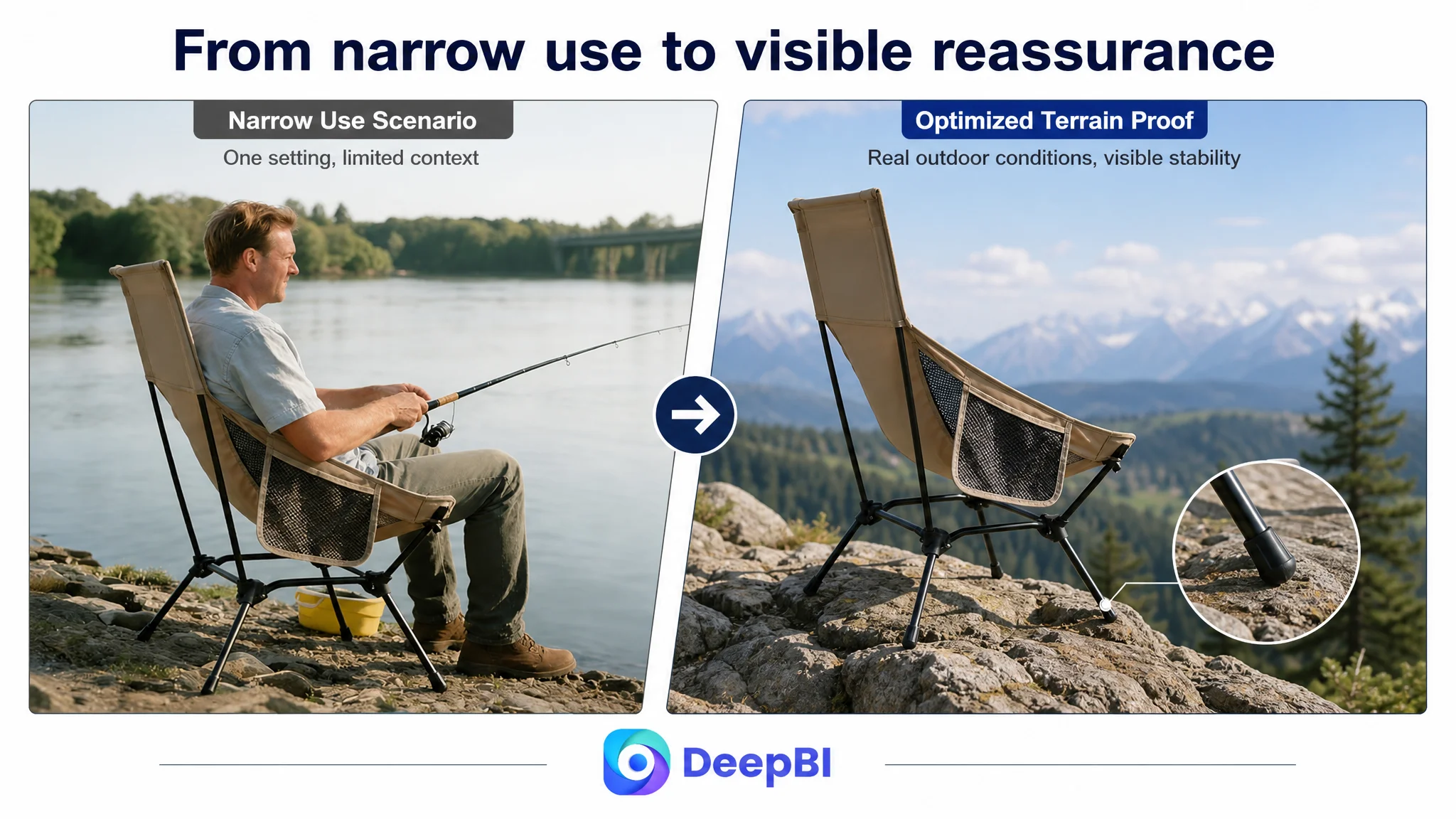
The customer’s Listing did not make stability equally easy to understand. Its product presentation did not sufficiently validate use on mixed or irregular outdoor surfaces, even though this is a natural concern for camping, fishing, beach, and hiking buyers.
The recommended direction was to show:
- The chair in more varied outdoor conditions
- The relationship between the frame and the ground
- The adjustable legs in practical use
- Quick setup without creating a complicated visual explanation
The goal was to replace technical reassurance with visible reassurance.
The Title Needed Better Prioritization, Not More Keywords
The customer’s title included several outdoor scenarios, including camping, motorcycle travel, RV use, backpacking, and hiking. However, the structure felt crowded, while the central product value was not immediately clear.
The benchmark title used a more mature sequence:
- Brand recognition
- Product form
- Quantified performance
- Comfort feature
- Differentiated function
- Use scenarios
The recommended title direction therefore placed the core search phrase and product identity earlier:
High Back Folding Camping Chair with Pillow, Lightweight Heavy Duty Portable Chair, 2-in-1 Height Adjustment & Deep Recline, Side Pocket for Camping, RV, Backpacking, Hiking, Picnic
The strategic change was not simply to increase keyword coverage. It was to balance several signals that could otherwise conflict:
- “Lightweight” communicates portability.
- “Heavy Duty” protects against the impression that lightweight means fragile.
- “High Back” and “Pillow” communicate comfort.
- “2-in-1 Height Adjustment” provides differentiation.
- Outdoor use cases expand relevance without letting the title lose its main structure.
The title still needed to remain grounded in the product’s confirmed specifications. DeepBI’s role in this type of diagnosis is to make the hierarchy visible: which information should lead, which should support, and which should be removed or deprioritized.
The Bullet Points Had Coverage, But Not Enough Buying Logic
The customer’s bullet points covered the product broadly, but several points remained feature-led.
A stronger Amazon bullet point usually connects three elements:
Buyer concern → product evidence → practical outcome
For this chair, that meant moving from general descriptions toward more concrete decision support.
Comfort had to become more specific
Instead of describing comfort in general terms, the revised direction emphasized:
- High-back support for taller adults
- Detachable memory foam pillow
- Neck and lumbar support
- A deeper, more enveloping seating position
- Reduced fatigue during longer outdoor stays
This made the comfort claim easier to imagine and evaluate.
Stability had to be connected to construction
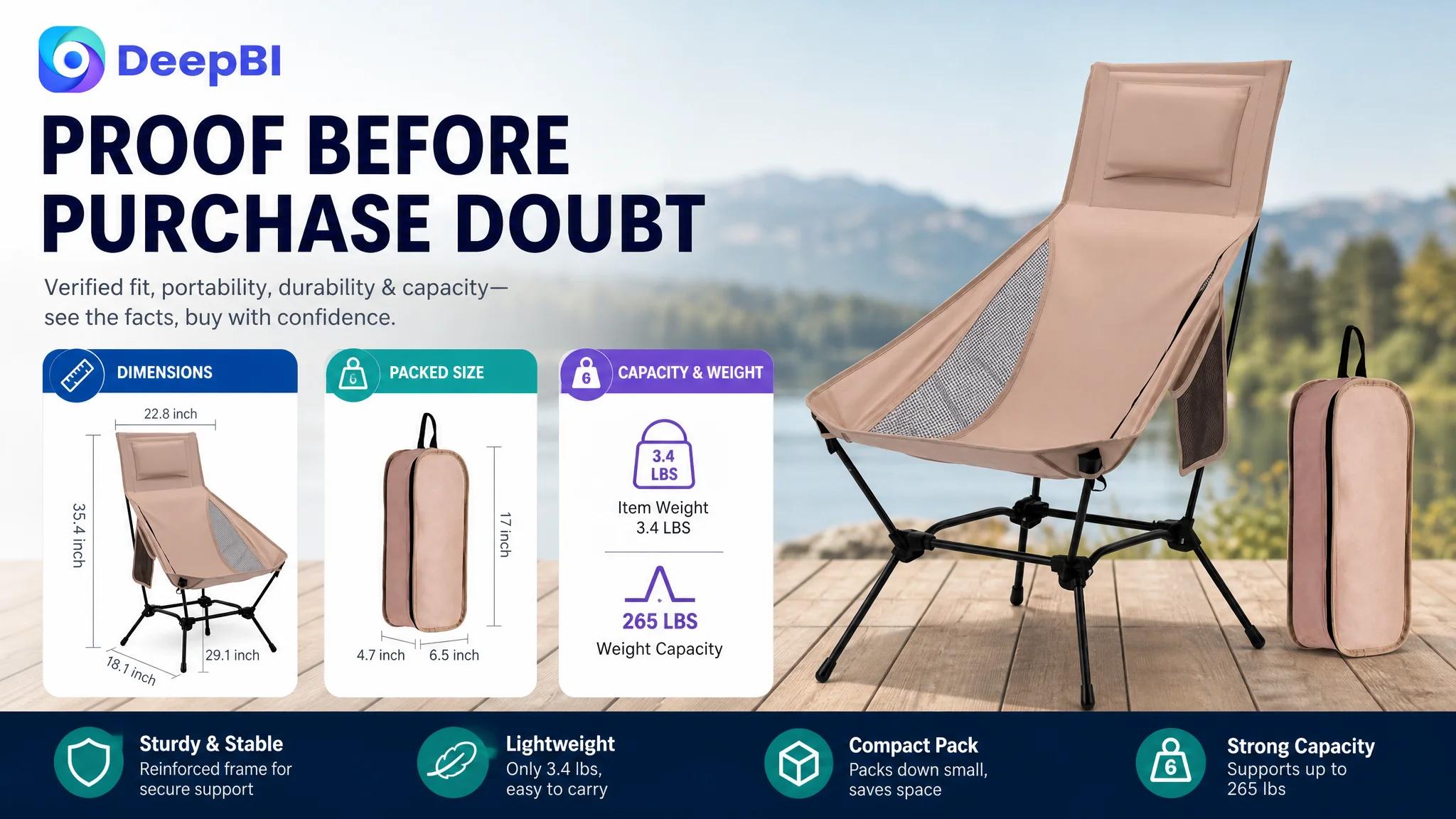
The customer’s product information included a 265-pound static load capacity, anti-rust coated iron framing, 600D PU-coated ripstop Oxford fabric, and reinforced stitching.
Those details were more persuasive when connected to the shopper’s concern about wobbling, wear, and reliability in demanding environments.
The point was not to imitate the benchmark’s 400-pound claim. It was to explain the customer product’s own verified construction more effectively.
Height adjustment had to solve a real use problem
“2-in-1 height adjustment” is a product feature. It becomes a buying reason when connected to context:
- Higher seating around a campfire
- Lower seating for beach use
- More flexibility on uneven ground
- Different postures for different outdoor activities
This was one of the most commercially valuable reframes in the case: the product’s difference was not only what it could do, but when that difference would matter.
Portability needed a measurable final check
The Listing could communicate:
- 5.5-pound weight
- 17.7-inch packed length
- Compact folded dimensions
- Pre-connected internal bungee system
- Setup in under 60 seconds
- Compatibility with backpacks and motorcycle travel
These details reduce practical hesitation, especially for buyers who are comparing a chair not only by comfort but also by how much effort it creates before and after use.
The A+ Content Was Carrying Too Little of the Trust Burden
The customer’s A+ content relied mainly on a primary outdoor scene, setup steps, a structural diagram, and detail close-ups.
That was not empty content. It was simply too limited for the number of questions the product needed to answer.
The benchmark Listing used a much broader sequence:
- Brand-led visual introduction
- Folding demonstration
- Multiple lifestyle scenes
- Ergonomic explanation
- Material and construction details
- Capacity and size information
- Storage and carrying presentation
- Final specification summary
The difference was not just the number of modules. It was the way each module handled a different stage of decision-making.
The opening needed broader outdoor relevance
A fishing scene made the customer’s product look suitable for fishing. It did not immediately establish broad relevance for camping, motorcycle trips, beach days, music festivals, or backyard use.
The recommended opening shifted toward a more inviting outdoor camping atmosphere. This was intended to widen the product’s appeal without changing its identity.
Setup should reduce perceived effort
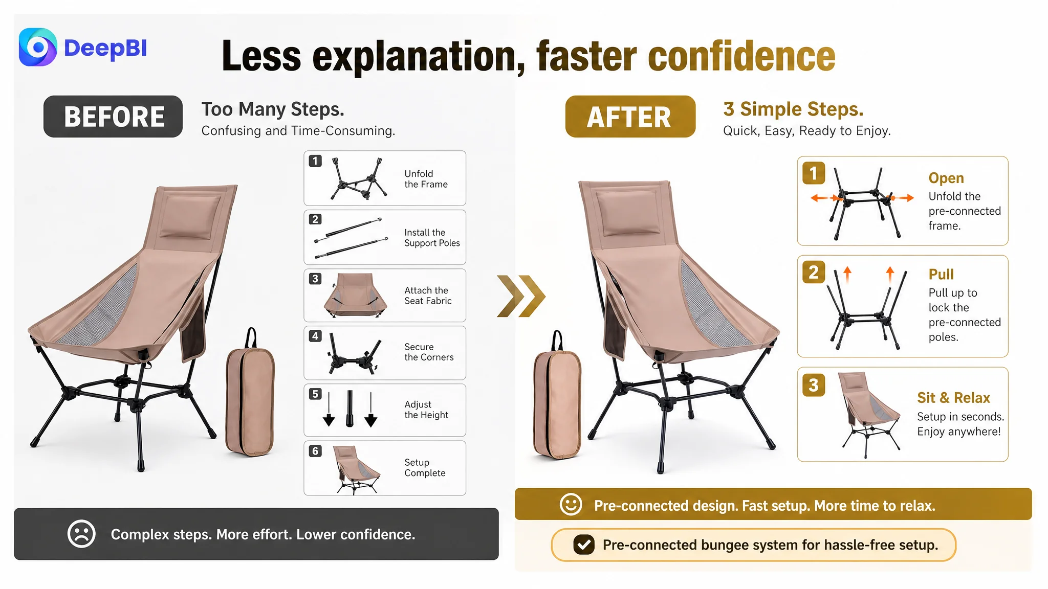
The existing assembly guide explained the process in detail. But a detailed guide can sometimes make a product feel more complicated before the shopper has decided to buy it.
A shorter visual sequence—such as three clear steps—could communicate:
- The frame is pre-connected.
- The chair opens quickly.
- No complicated assembly is required.
The detailed instruction could remain later for users who need it. The first objective was to remove the fear of hassle.
Technical proof needed to arrive before doubt hardened
The customer’s page did not provide enough component-level evidence to support its capacity and durability claims.
A stronger A+ sequence would bring forward:
- Anti-rust coated iron frame
- Reinforced structural joints
- 600D PU-coated ripstop Oxford fabric
- Support for up to 265 pounds
- Reinforced stitching at high-tension points
- Swivel or terrain-adaptive feet where applicable
The final specification summary could then consolidate these details near the end, helping shoppers perform a last rational check before purchase.
Comfort needed its own proof
The detachable and adjustable memory foam pillow was a useful differentiator, but it lacked a dedicated visual explanation.
A separate module showing the pillow’s position, removal, and adjustment would address a simple but important uncertainty:
Will the chair fit different heights and sitting preferences, or is the support fixed in one position?
That question belongs on the page because it affects whether the product feels personally suitable.
Reviews Added a Structural Conversion Risk
The review gap was the most severe numerical weakness.
The customer’s Listing had:
- 3.5-star rating
- 11 total reviews
- No effective review content visible on the first page
- A high proportion of one- and two-star reviews
The comparable Listing had:
- 4.2-star rating
- 29 total reviews
- Eight visible first-page reviews
- Detailed customer images and videos
- No low-star reviews in the comparison
This difference affected more than credibility. It changed how every other claim was interpreted.
A statement such as “stable,” “comfortable,” or “durable” carries less weight when the review environment does not reinforce it. Conversely, customer images and videos can validate the product’s actual size, use context, and construction in a way that polished brand content cannot fully replace.
The case material does not establish a post-optimization review outcome, so no improvement in rating or review volume should be claimed. The correct business judgment is narrower:
The page could not rely on visual and textual optimization alone to eliminate a serious review-based trust gap.
This was a risk to be managed alongside the content changes, not hidden beneath them.
Why DeepBI Did Not Recommend Continuing to Tune the Page in Isolation
The central decision was not “change every weak element at once.”
It was to prioritize the page’s ability to convert before treating additional traffic or advertising pressure as the main answer.
Advertising can bring shoppers to an Amazon product page. It cannot, by itself, prove that the chair is stable on uneven ground, comfortable for taller adults, easy to carry, or worth trusting despite a low review base.
In fact, more traffic can make a weak page’s limitations more visible. If shoppers click but do not find the evidence they need, the seller may end up paying to amplify the same conversion leak.
Advertising does not only amplify strengths. It can also amplify an Amazon Listing’s unresolved defects.
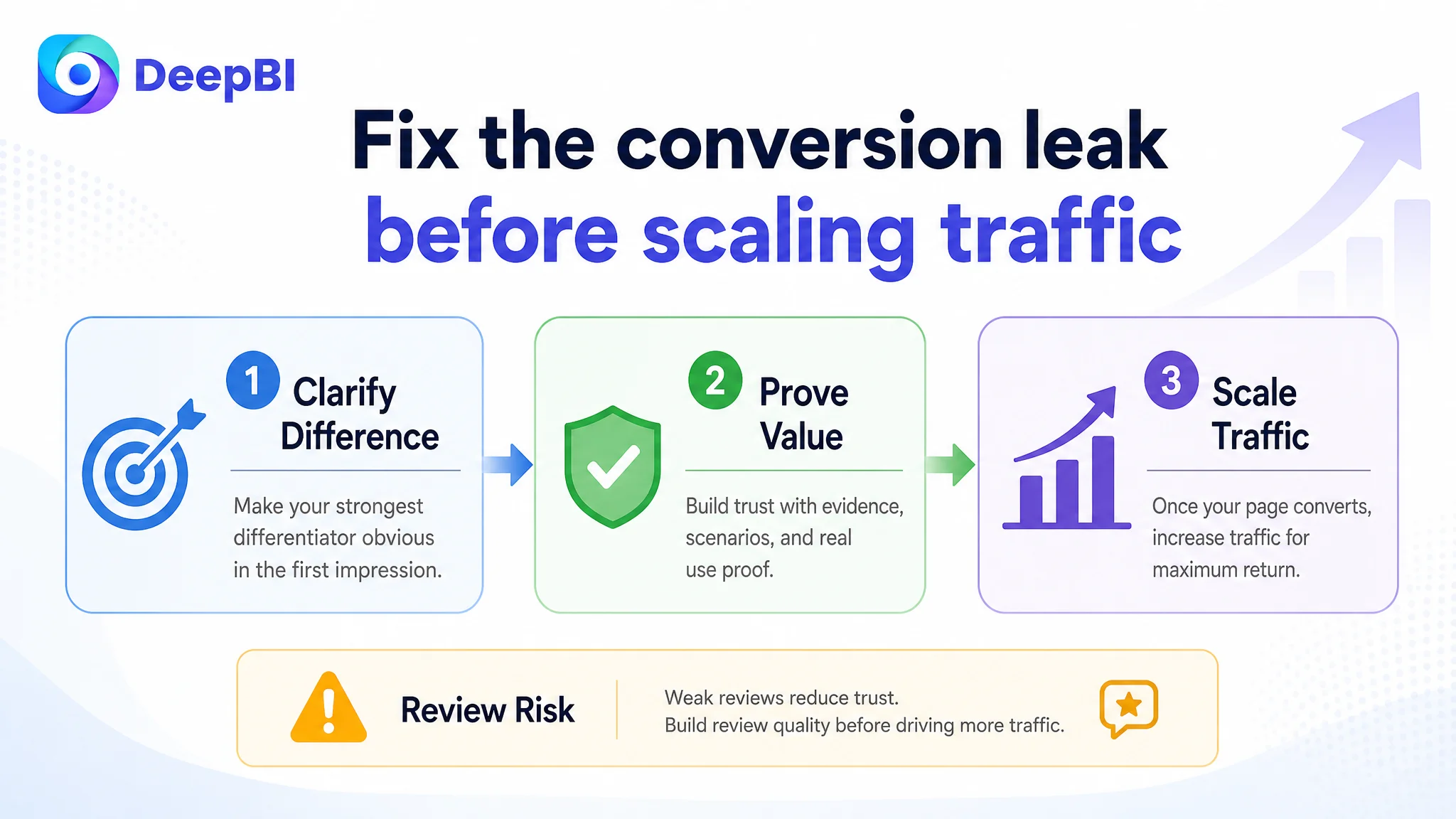
For this product, the decision order was therefore:
1. Clarify the product’s strongest difference.
2. Improve the first-impression and image sequence.
3. Make the title and bullet points follow a clear buyer logic.
4. Expand A+ content around comfort, stability, setup, durability, and portability.
5. Treat the review environment as a separate trust risk.
6. Only then judge whether additional traffic is being converted efficiently.
This order prevented the team from mistaking content volume for conversion capacity.
The Optimization Direction Became More Commercially Precise
The later plan was not a general redesign. It focused on specific conversion questions:
- Can the shopper understand the 2-in-1 height adjustment by the third image?
- Can the main image communicate comfort, portability, and structural confidence immediately?
- Can the page show the chair in more than one narrow outdoor scenario?
- Can the bullet points connect specifications to actual problems?
- Can A+ content prove support, materials, setup speed, and packed dimensions?
- Can the customer make a final size and weight judgment without searching through the page?
These questions created a more disciplined relationship between content and business outcome.
The image strategy was not “make the chair look more premium.” It was to use scenes, diagrams, and product demonstrations to remove specific doubts.
The copy strategy was not “add more keywords.” It was to place relevant search language inside a clearer value hierarchy.
The A+ strategy was not “add more modules.” It was to give each module a defined role in the buyer’s decision path.
The Business Lesson Was About Conversion Capacity
The case did not provide verified post-optimization metrics such as CVR, ACOS, organic-order share, or keyword recovery. Those outcomes should not be invented.
What the diagnosis did establish was a change in operating understanding.
The customer’s Amazon Listing was not being evaluated only as a collection of content assets. It was being evaluated as a system that either could or could not convert paid and organic traffic.
That changed the question from:
“Which feature should we describe next?”
to:
“What prevents a shopper from believing this product is the right choice?”
For this camping chair, the answer involved several connected gaps, with the largest constraint concentrated in page depth and trust:
- The strongest differentiator appeared too late.
- The main image did not create enough preference.
- The scenes were too narrow to support the full use case.
- The bullet points described features without enough problem-solution progression.
- A+ content did not carry enough technical and emotional proof.
- The review environment created a significant credibility risk.
DeepBI’s value in the case was not the number of suggestions produced. It was the ability to identify which gap mattered most, why it mattered before further traffic expansion, and how the product page should be rebuilt around the shopper’s decision sequence.
Before an Amazon Listing can benefit from more traffic, it must first give that traffic a credible reason to convert.