

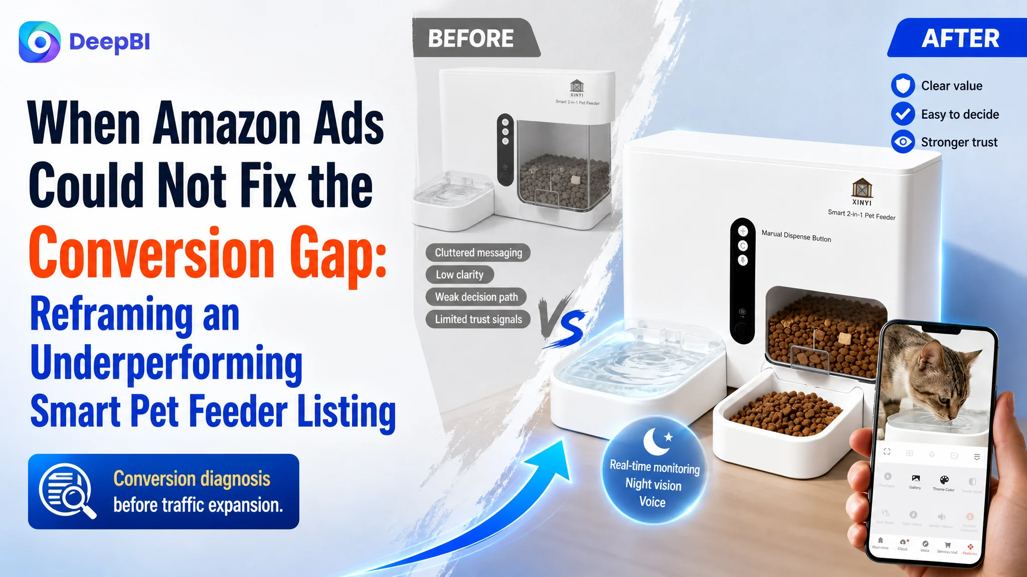
This case involved an Amazon seller in the smart pet feeder category whose product page was struggling to create enough purchase confidence. The customer’s Listing combined automatic feeding, water dispensing, camera monitoring, and app control, but its presentation remained heavily focused on feature descriptions and repeated technical explanations.
The initial optimization direction treated the problem as one of messaging depth: add more app claims, explain the anti-clogging design, and show more product functions. DeepBI’s diagnosis pointed to a broader issue. The Amazon Listing was not failing because it lacked features. It was failing because the page did not arrange those features into a convincing buying path—and its weak review foundation amplified the problem.
The later optimization therefore focused on Listing conversion capacity before expanding the page’s functional claims further. The title had to clarify the product’s core value earlier, the main images had to create a stronger reason to click, and the A+ content had to turn technical capabilities into visible proof, reassurance, and emotional connection. For other Amazon sellers, the case is a reminder that more traffic or more feature information cannot compensate for a product page that does not build trust in the order shoppers need it.
The Listing Had Features. The Market Still Saw Risk.
At first glance, this Amazon product page did not look incomplete.
The product offered a combined automatic feeder and water dispenser, remote app control, a camera, night vision, voice interaction, low-food alerts, and an anti-clogging outlet. The page also included lifestyle imagery, product diagrams, and explanations of the operating system.
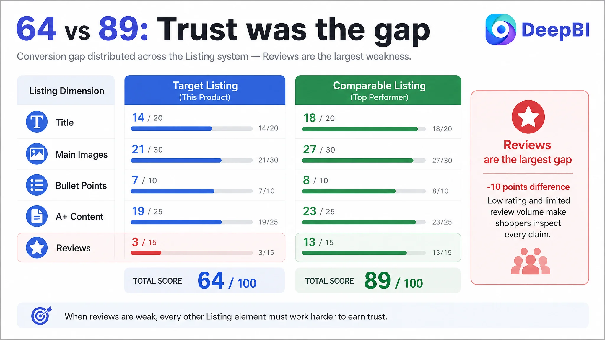
Yet the Listing received an overall score of 64 out of 100, compared with 89 out of 100 for a comparable high-performing listing in the same category.
That 25-point gap was not concentrated in one small copy issue. It appeared across the entire conversion chain:
- Title: Target Listing: 14/20, Comparable listing: 18/20
- Main images: Target Listing: 21/30, Comparable listing: 27/30
- Bullet points: Target Listing: 7/10, Comparable listing: 8/10
- A+ content: Target Listing: 19/25, Comparable listing: 23/25
- Reviews: Target Listing: 3/15, Comparable listing: 13/15
- Total: Target Listing: 64/100, Comparable listing: 89/100
The most important signal was not simply that the competitor looked more polished. It was that the target Listing made shoppers work harder to answer basic purchase questions:
- What is the main benefit of this product?
- Can I monitor my pet clearly at night?
- Will the feeder dispense food reliably?
- Can I control feeding precisely?
- Is the camera intrusive inside my home?
- What happens if the product jams or loses power?
- Can I trust this product enough to buy it despite limited review evidence?
The page contained answers, but they were not presented as a connected decision path.
The central problem was not a lack of product functions. It was a lack of conversion logic connecting those functions to buyer concerns.
The Original Optimization Direction Stayed Too Close to the Product
The existing page leaned toward functional explanation.
One image explained the anti-clogging design. Another repeated app-related claims. Other modules showed feeding, water dispensing, voice reminders, filters, power supply, and general product scenarios.
This created an understandable operating assumption: if the Listing was not converting, the page might need more technical information or more complete feature coverage.
That direction was not unreasonable. The product had several capabilities that deserved explanation. The problem was the order and purpose of the explanation.
The page was describing what the product could do, while the stronger competitor was showing why a shopper would feel safer buying it.
The distinction is subtle but commercially important:
- A feature list tells shoppers what exists.
- A buying logic explains what problem is reduced.
- Visual proof tells shoppers why the claim should be trusted.
- Review strength determines whether shoppers are willing to accept the remaining uncertainty.
The target Listing was still operating mainly at the first level.
This also explains why repeated image and copy adjustments would have limited effect. Adding another app screenshot or another anti-clogging statement could increase information volume without improving confidence. The page needed to remove hesitation, not merely add content.
The Review Gap Made Every Page Weakness More Expensive
The most severe difference appeared in the review dimension.
The target Listing showed:
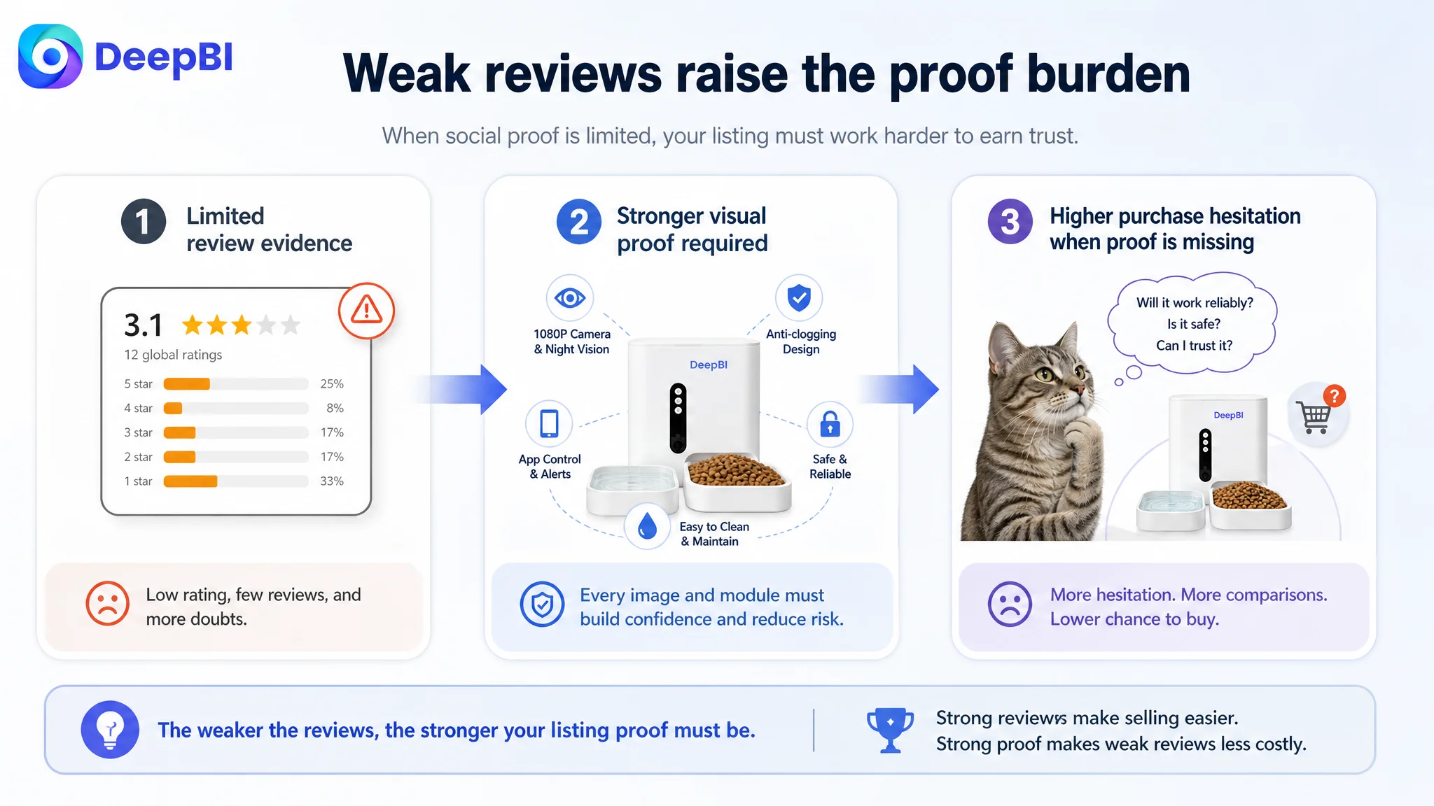
- A 3.1-star rating
- 12 total reviews
- A high share of negative feedback among the visible reviews
The comparable listing showed:
- A 4.7-star rating
- 214 total reviews
- A much lower proportion of negative reviews
The review score difference was 10 points out of 15, larger than the gap in any other individual dimension.
This did not mean that Listing content was irrelevant. It meant that the content had to work harder.
A shopper looking at a product with a mature 4.7-star review base may accept a relatively direct product presentation. A shopper looking at a 3.1-star product with limited review volume is more likely to inspect every claim:
- Does the camera actually provide useful visibility?
- Is the feeder reliable over time?
- Will food get stuck?
- Is cleaning practical?
- Will the app be easy to operate?
- Can the product protect a pet’s feeding routine during an absence?
When social proof is weak, the page must compensate through stronger evidence and clearer risk reduction. In this case, the Listing did not yet provide enough of either.
That is why the review problem could not be isolated from the image and A+ problems. A weak review foundation increased the importance of every other conversion element.
The Main Image Was Showing a Product, Not a Reason to Click
The first image used a relatively plain product presentation and included technical information that competed for attention.
The stronger category listing used a more immediate visual hook: a large capacity cue, a pet-oriented context, and a visible connection between the feeder and mobile monitoring. It communicated the product’s role before the shopper had to read deeply.
The target Listing’s first image did not establish its strongest differentiation clearly enough:
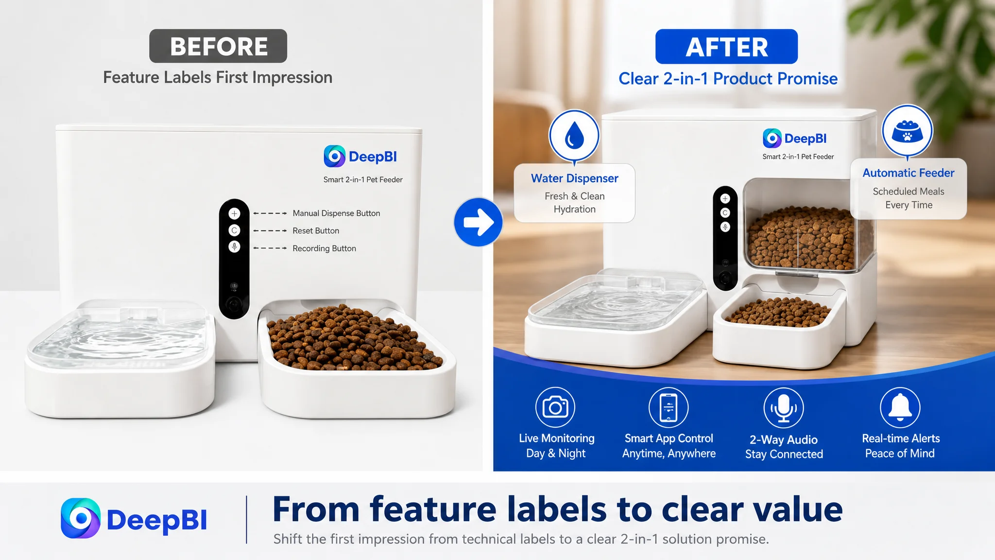
It offered a 2-in-1 feeder and water dispenser, but the first visual impression did not make that combined value unmistakable.
The main image sequence also had a progression problem.
Several images repeated app or anti-clogging explanations rather than assigning each position a distinct role. As a result, the gallery did not move the shopper through a natural sequence such as:
1. Understand the product’s primary value
2. See that remote monitoring works
3. Confirm night visibility and feeding status
4. Understand the interaction experience
5. Resolve reliability and safety concerns
The recommendation was therefore not to make every image more elaborate. It was to give each image one persuasion task.
The first image needed a clearer product promise
The visual focus should have shifted toward the complete automatic pet feeder and water dispenser 2-in-1 proposition, with less distracting technical labeling.
The early gallery needed proof of monitoring
The 1080P camera and night vision capability addressed a major buyer concern, but the page relied too heavily on text and icons. A clearer day-and-night comparison could make the claim more tangible.
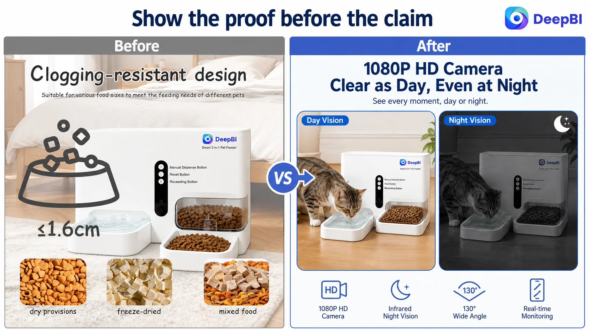
The middle images needed to show interaction
A clean phone view showing feeding confirmation, motion detection, or remote communication would be more persuasive than a collage of multiple interfaces and icons.
The final images needed to reduce practical risk
The wide outflow, anti-clogging design, and chew-resistant power cord were valuable, but they belonged later in the decision path—after the shopper understood the main benefit and had seen evidence of performance.
This is the difference between displaying features and sequencing proof.
The Title Was Broad, but Not Specific Enough Where It Mattered
The title also lost conversion potential before the shopper reached the image gallery.
The comparable listing placed the core product phrase early and combined it with specific, concrete signals such as:
- Camera capability
- WiFi connectivity
- Capacity
- Feeding range
- Portion control
- Night vision
- Two-way audio
- Anti-clogging performance
The target title placed the central product concept less prominently and used broader phrases such as “Easy APP Operation” without making the technical value equally concrete.
The revised direction moved the primary phrase closer to the beginning:
WiFi Automatic Pet Feeder and Water Dispenser 2-in-1 with Camera
It also brought forward the capabilities most connected to purchase intent:
- Proximity sensor
- Night vision
- Real-time video monitoring
- Two-way audio
- App control
- Timed feeding
- Use for cats and dogs
This was not a matter of filling the title with more keywords. It was a matter of ensuring that search relevance and shopper understanding began with the same sentence.
A title can contain relevant terms and still underperform if the product’s core identity is unclear. In this case, the Listing needed to establish both what the product was and why its smart features mattered.
The Bullet Points Described Functions Without Building Reassurance
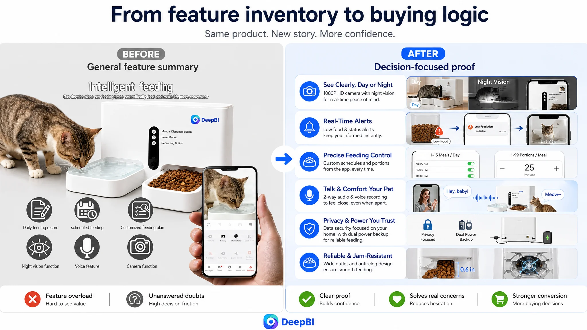
The original bullet structure covered a wide range of capabilities, including fresh water delivery, low-food alerts, remote interaction, anti-clogging design, and power-cord safety.
The weakness was not a total lack of information. It was that the information was arranged primarily as a function inventory.
The stronger structure led with user concerns:
- Can I see and check on my pet while away?
- Can I control meals precisely?
- Will I receive alerts when something goes wrong?
- Does the camera respect home privacy?
- Will feeding continue during a power interruption?
- Can the product handle different dry-food sizes?
- Can I use my voice to comfort my pet?
That structure converts specifications into consequences.
For example, “night vision” becomes more meaningful when connected to observing eating behavior in low light. “Low-food alert” becomes more persuasive when combined with feeding-success and jam notifications. A camera becomes less intrusive when the page clearly explains that it focuses on the feeding area rather than the surrounding home.
The recommended content direction therefore emphasized:
- 24/7 monitoring and night vision
- Personalized feeding schedules and portion control
- Real-time status alerts
- Privacy-focused camera framing
- Anti-clogging support for appropriately sized food
- Two-way audio and voice interaction
- Fresh water delivery through motion sensing
- Visual food-level management and maintenance
The key change was not simply adding bullets. It was making each bullet close a specific trust gap.
A+ Content Was the Missing Proof Layer
The largest content-level weakness appeared in the A+ page.
The target A+ content presented core functions, app integration, anti-clogging information, voice reminders, filters, power supply, and lifestyle scenes. But the modules did not sufficiently demonstrate how the product worked in real use.
The comparable listing created a more complete proof system:
- App interface flow
- Motion detection and event history
- Privacy protection
- Two-way audio
- Night vision
- Anti-clogging structure
- Bowl material and cleaning
- Backup power
- Capacity translated into usage time
- Multi-pet suitability
- Product breakdowns and emotional scenarios
The difference was not merely the number of modules. It was the presence of a clear sequence from concern to evidence.
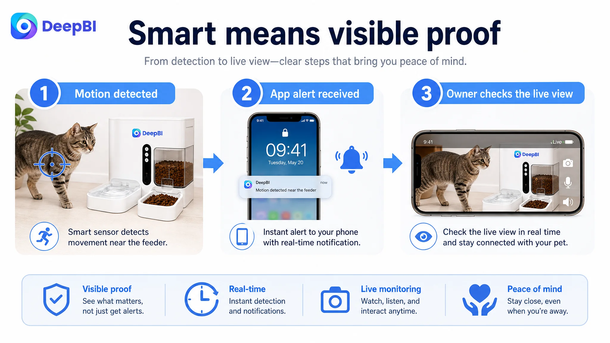
The app needed to feel operational, not decorative
Static app graphics could show that an app existed. They did not fully show what a user could do with it.
A stronger module would demonstrate feeding schedules, portion adjustments, manual dispensing, feeding logs, and notifications in a recognizable workflow.
Monitoring needed a visible event chain
Instead of placing several callouts around one lifestyle image, the page needed to show a sequence:
Motion detected → event recorded → notification received → owner checks the live view.
This would make the “smart” experience easier to believe.
Reliability needed engineering evidence
The anti-clogging claim required more than a label. The page needed to show the relevant outlet design and explain the operating logic using the confirmed product specifications.
Cleaning and maintenance were underdeveloped
The existing content mentioned filters and desiccant, but it did not answer deeper hygiene concerns such as disassembly, washing, and long-term maintenance.
Capacity needed a practical translation
A raw capacity number is less persuasive than an explanation of what that capacity means for feeding routines. Any duration claim, however, must be tied to verified usage conditions rather than presented as an unsupported promise.
Emotional value needed to connect to a real scenario
The product’s “warm caretaker” positioning had potential, but the page did not consistently connect recording a voice message or talking to a pet with a specific moment of separation, anxiety, or routine disruption.
A+ content should not repeat the title and bullets at a larger size. It should provide the evidence that the upper page could only promise.
Why DeepBI Did Not Recommend Tuning the Page in Isolation
The diagnosis came from comparing the target Listing and a closely matched category benchmark across five dimensions rather than judging the page by visual taste alone.
That comparison revealed a pattern:
- The title was less specific at the search and click stage.
- The main images lacked a strong visual hook and repeated similar ideas.
- The bullets emphasized functions more than reassurance.
- The A+ page lacked process-based proof and several high-concern modules.
- The review profile created a much higher trust burden.
This mattered because the weaknesses were connected.
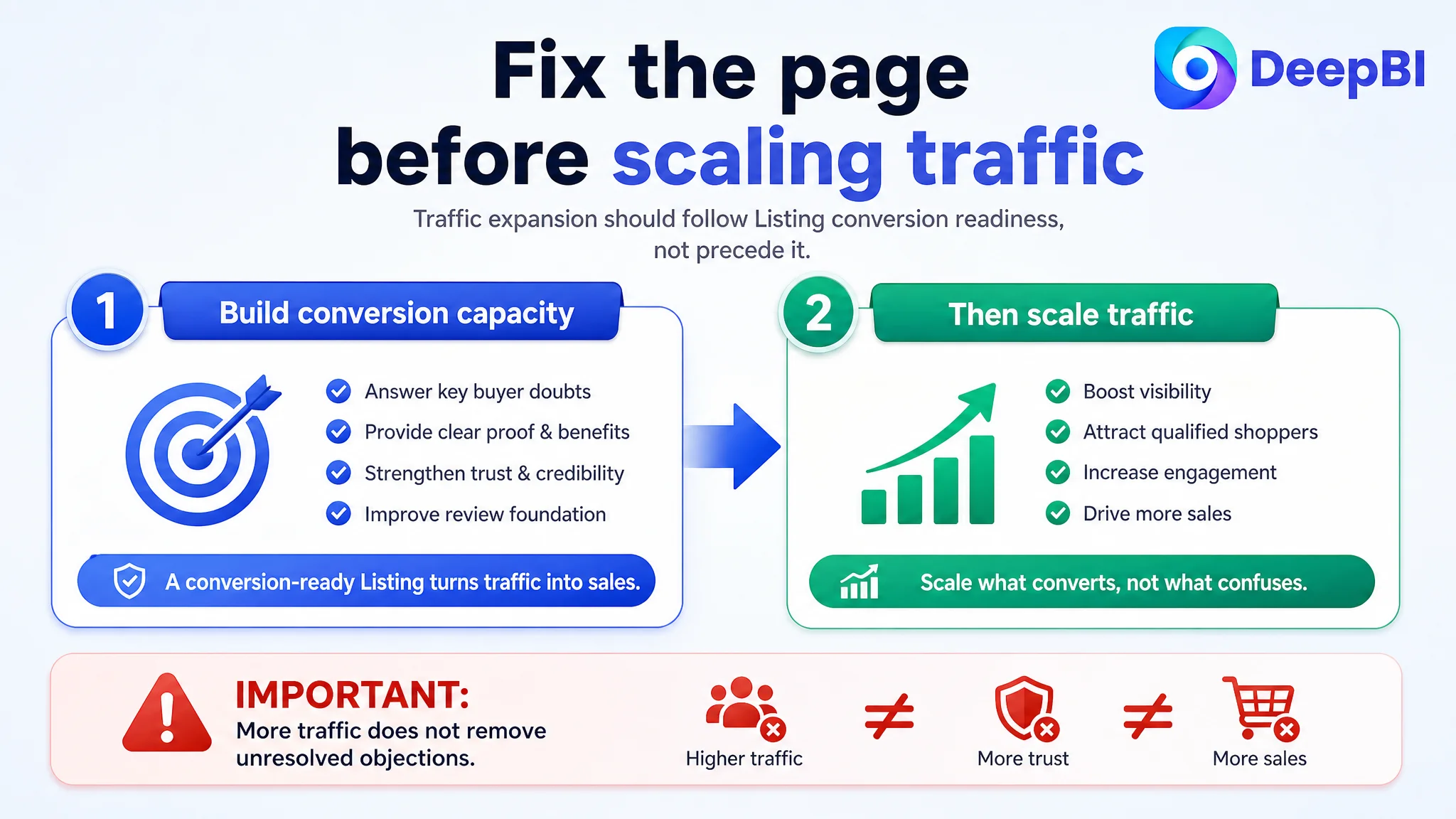
A stronger title might improve relevance, but it would not solve a low-confidence product page. A new main image might attract more clicks, but more clicks would not help if shoppers still questioned reliability, privacy, cleaning, or product quality. More ad traffic could expose the page to more shoppers while leaving the same conversion objections unresolved.
The correct decision order was therefore:
1. Clarify the product’s central value in the title and first image.
2. Rebuild the gallery around distinct decision questions.
3. Use bullet points to translate functions into reassurance.
4. Strengthen A+ content with process, engineering, maintenance, and scenario proof.
5. Treat review weakness as a trust constraint rather than attempting to hide it with more promotional language.
6. Only then evaluate whether additional Amazon ad traffic can be converted efficiently.
This was the important reframing: the Listing had to become more capable of converting before traffic expansion could become a reliable growth lever.
What Changed in the Operating Logic
The case material does not include confirmed post-optimization results for CVR, ACOS, TACOS, organic orders, or keyword rank. Those outcomes should not be assumed.
What did change was the business understanding of the Listing.
The optimization moved away from:
- Repeating app features
- Showing technical claims without enough proof
- Treating every image as a general product summary
- Describing functions without connecting them to buyer anxiety
- Assuming more information would automatically create more trust
It moved toward:
- A clear 2-in-1 product identity
- Earlier visibility for camera and night vision benefits
- Distinct image roles across the gallery
- A visible monitoring and alert sequence
- More precise app and feeding logic
- Privacy and power-reliability reassurance
- Stronger anti-clogging and maintenance evidence
- Voice interaction tied to a real separation scenario
- Capacity translated into practical use
- A+ modules that complete the proof chain
The result sought was not a prettier page for its own sake. It was a page with a more stable commercial role: attract the right shopper, answer the most important doubts, and make paid or organic traffic more likely to produce a decision.
The Lesson for Amazon Sellers
This Amazon smart pet feeder case shows why Listing diagnosis must happen before aggressive traffic optimization.
A product page can have a camera, night vision, app control, voice interaction, alerts, water dispensing, and anti-clogging technology—and still fail to convert if shoppers cannot quickly understand the value or trust the evidence.
The review profile can make that weakness more severe. When social proof is limited or negative, the Listing must work harder through clarity, proof, and risk reduction. When the main image is weak, advertising may increase exposure without creating enough qualified interest. When A+ content repeats features instead of demonstrating outcomes, the page leaves the final decision to uncertainty.
The more useful question is not:
“Which feature should we add next?”
It is:
“At what point in the Amazon buying decision is the shopper still unconvinced, and which page element should resolve that doubt?”
That shift—from feature accumulation to conversion diagnosis—was the real change in this case. It gave the Amazon seller a more defensible path for deciding what to optimize first, why repeated ad or content adjustments had not solved the problem, and how the product page needed to earn the traffic it received.