

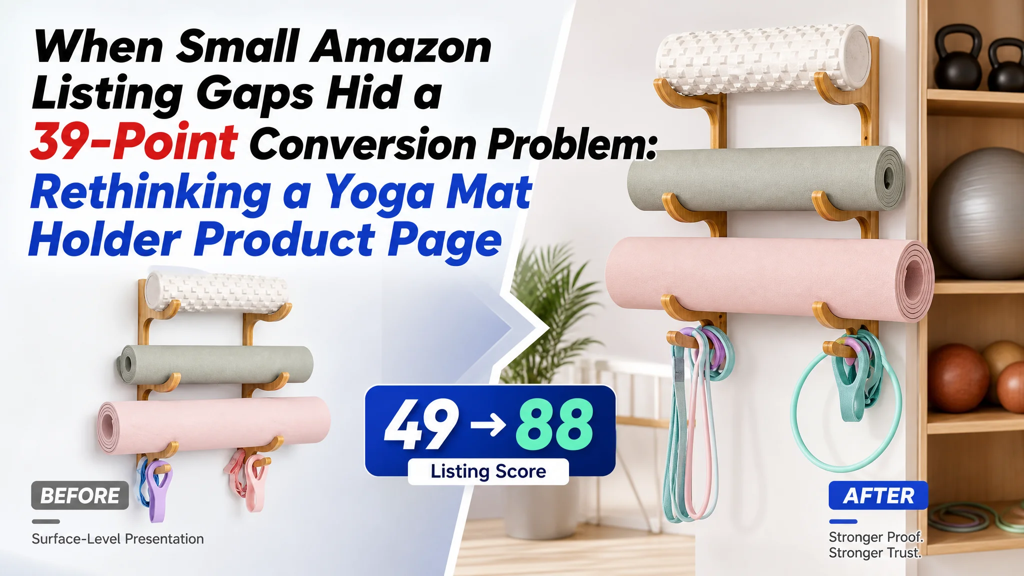
An Amazon seller came to the case with what looked like a familiar Listing optimization task: improve the title, sharpen the images, and make the product’s storage functions easier to understand. The product was a three-tier wooden yoga mat holder for home gyms, with shelves and hooks for fitness accessories.
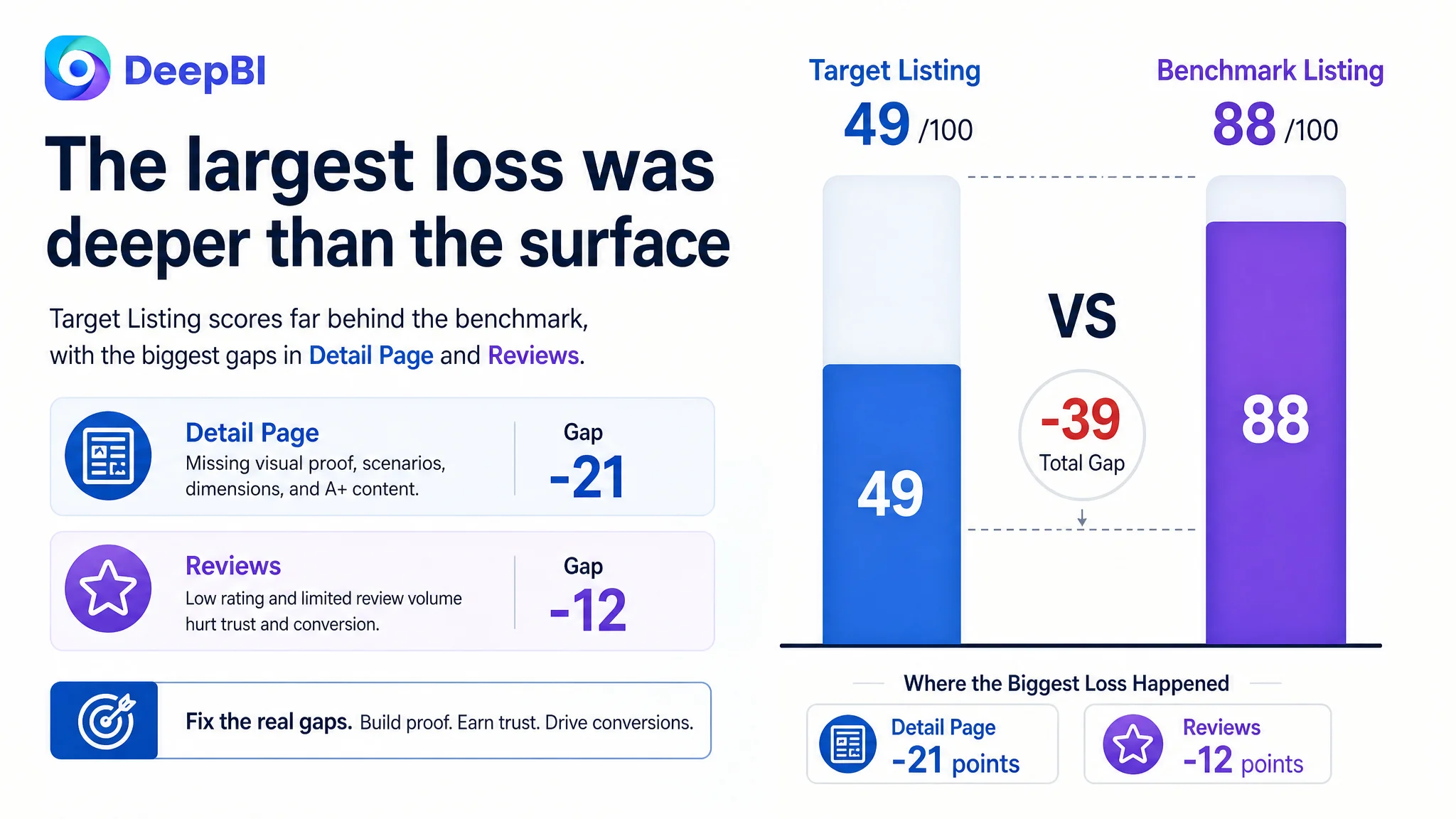
The initial direction treated the weakness as a collection of relatively small content issues. The title could be more concise, the main image could show more capacity, and the bullet points could describe the product more persuasively. But DeepBI’s comparison with a category-leading Amazon Listing showed that these were not isolated copy or design defects. The target Listing scored 49 out of 100, compared with 88 for the benchmark, with the largest gaps concentrated in the detail page and customer trust.
The later optimization therefore focused on restoring the page’s sales logic: create a stronger storage scenario, make the structure and use cases easier to verify, add A+ content, clarify dimensions and compatibility, and use the title, images, bullets, and reviews as one connected decision path. For other Amazon sellers, the lesson is direct: before asking Amazon ads to bring more traffic, first determine whether the product page has enough evidence and clarity to convert that traffic.
The Amazon Listing Was Not Missing Information. It Was Missing a Persuasive Order.
At first glance, the product page contained the basic information buyers would expect.
It identified the product as a wall-mounted yoga mat holder. It described the three-tier structure, wooden construction, four hooks, and intended storage use. Dimensions and color were also present.
But Amazon shoppers do not evaluate a product page by checking whether every feature appears somewhere in the copy. They decide whether the product is worth considering, whether it fits their space, whether it feels reliable, and whether the purchase risk is acceptable.
That requires a sequence.
A product page can contain the right facts and still fail to give buyers a reason to believe the product is right for them.
The benchmark Listing built that sequence more effectively:
- It opened with a clear value proposition around capacity and floor-space savings.
- It showed the product in a realistic home environment.
- It explained how the shelves and hooks worked together.
- It made durability and installation feel more concrete.
- It used A+ content to connect the problem, solution, proof, and lifestyle context.
- It benefited from a much stronger review foundation.
The target Listing was not simply “less attractive.” Its information was arranged more like a specification sheet than a buying argument.
The Score Revealed Where the Conversion Capacity Was Being Lost
The overall comparison made the problem difficult to dismiss as a matter of personal taste.
- Title: Target Listing: 14/20, Benchmark Listing: 16/20, Gap: -2
- Main image: Target Listing: 24/30, Benchmark Listing: 26/30, Gap: -2
- Bullet points: Target Listing: 6/10, Benchmark Listing: 8/10, Gap: -2
- Detail page: Target Listing: 3/25, Benchmark Listing: 24/25, Gap: -21
- Reviews: Target Listing: 2/15, Benchmark Listing: 14/15, Gap: -12
- Total: Target Listing: 49/100, Benchmark Listing: 88/100, Gap: -39
The most important finding was not that every dimension was behind.
It was that the title, main image, and bullet-point gaps were relatively limited. The detail page was 21 points behind the benchmark, and the review dimension was 12 points behind.
That changed the order of operations.
A team focused only on title wording or image polish could spend considerable effort improving the visible surface while leaving the largest conversion constraints untouched. DeepBI’s diagnosis pointed instead to a broader Listing conversion problem: the page did not provide enough visual proof, structured explanation, or trust reinforcement for the traffic it might receive.
The Original Direction Focused on Local Improvements
The working assumption was that the page needed better presentation at the front of the funnel.
The title could lead with stronger category terms. The main image could communicate higher capacity. The bullets could move beyond basic function descriptions.
Those changes were valid, but incomplete.
They addressed how the product might be discovered and understood in the first few seconds. They did not fully address what happens after a shopper becomes interested and starts asking:
- How much equipment can this actually organize?
- Will it fit the available wall space?
- Can it hold the intended items securely?
- Does it look appropriate in a home rather than only in a gym?
- What does the material and construction look like up close?
- Is the product worth choosing despite limited review evidence?
- What happens to a cluttered workout area after installation?
The page had answers to some of these questions in scattered text and images. It did not turn them into a clear decision path.
This is where the misdiagnosis mattered. The issue was not that the Listing had no content. The issue was that the content was not doing the work required at each stage of an Amazon buyer’s decision.
The Detail Page Was the Largest Structural Leak
The target Listing used a largely text-based detail presentation without image-rich A+ modules.
The benchmark used a fuller structure:
- Brand-led visual introduction
- Functional breakdowns
- Multiple usage scenarios
- Dimension diagrams
- Before-and-after comparison
- User-generated visual feedback
- Color presentation
- Compatibility and multi-use icons
This created a 3/25 versus 24/25 gap in the detail-page dimension.
That difference was not cosmetic. A wall-mounted storage product requires visual confirmation. Buyers need to picture the rack on their own wall, understand its storage zones, estimate its footprint, and judge whether it can support their intended use.
Repeated text cannot fully replace that evidence.
The page did not show the transformation clearly
The product’s commercial promise is not only “a wooden rack with three tiers.”
It is a more organized workout space with less equipment on the floor and easier access to commonly used items.
The target page described organization, but did not make the transformation visually immediate. A strong A+ sequence should show the contrast between a cluttered corner and a streamlined wall-mounted arrangement.
That contrast gives the product a role in the buyer’s life, not just a list of specifications.
The page did not make structure easy to verify
The three-tier format and four hooks were important selling points, but they were not developed into a complete visual explanation.
A buyer should be able to see:
- Which items belong on the vertical shelves
- Which items can hang from the hooks
- How the upper shelf can be used
- How the storage zones work together
- How the dimensions relate to a real wall
The benchmark’s structure made those answers easier to process. The target page left more of the interpretation to the shopper.
The page did not provide enough material proof
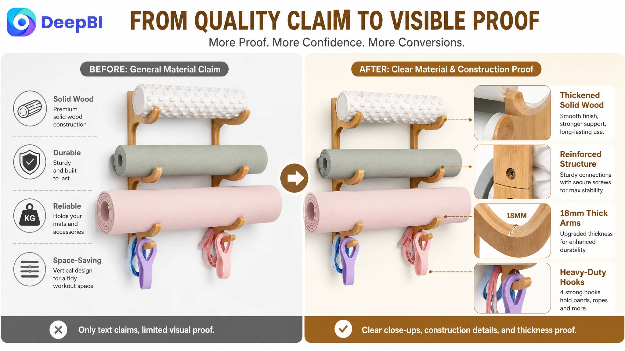
The target Listing relied mainly on a general “premium solid wood” claim.
The benchmark used more concrete demonstrations of construction and durability, including close-up views and specific explanations of stability and finish.
For a wall-mounted product, perceived material quality is closely tied to perceived safety and regret risk. Buyers are not only asking whether the product looks good. They are asking whether it will remain useful and secure after installation.
DeepBI therefore treated material and construction communication as a trust problem, not merely a design detail.
The Main Image Needed a Stronger Reason to Click
The main-image gap was smaller than the detail-page gap: 24/30 compared with 26/30.
That did not make it unimportant.
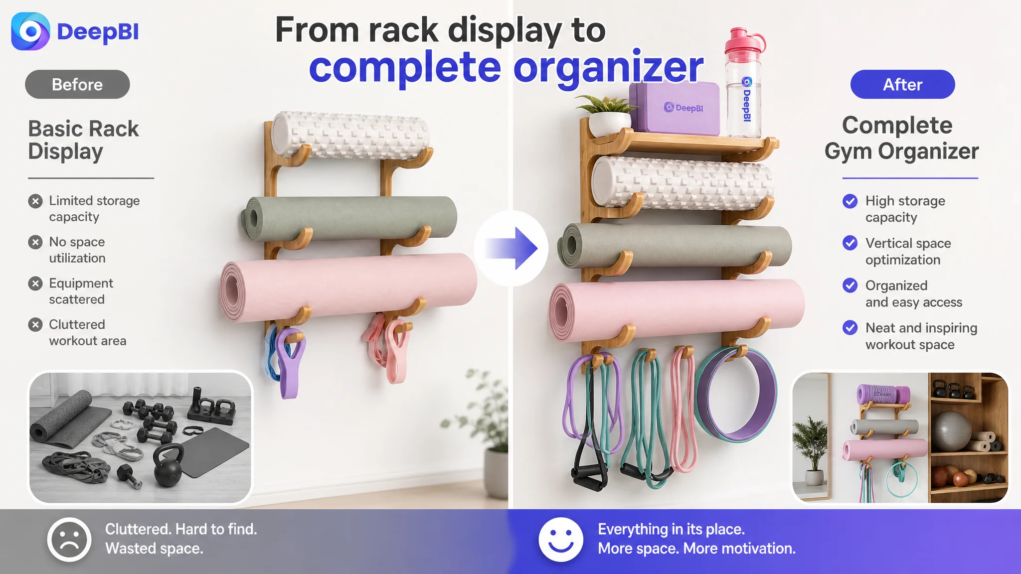
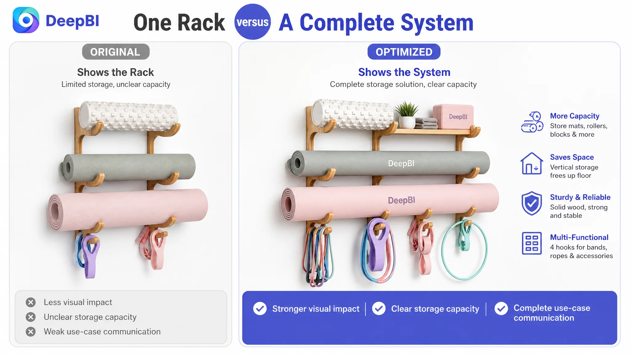
The target main visual showed the product as a three-tier wall rack, but the equipment density and variety were limited. The benchmark created a stronger impression of a complete home-gym organization system by showing a fuller range of relevant, confirmed equipment.
The distinction was significant.
One image presented a rack. The other presented an organizing solution.
The recommended direction was to increase the visual density of the allowed and confirmed items the product is designed to store, such as yoga mats, foam rollers, yoga blocks, resistance bands, or other suitable accessories. The purpose was not to add fictional capacity or unsupported items. It was to make the existing storage value legible at a glance.
The image sequence also interrupted the decision flow
The target Listing included useful information such as dimensions, a home-gym scene, storage-zone logic, and material details. The problem was the order.
The suggested sequence was:
1. Create a stronger first impression of capacity and organization
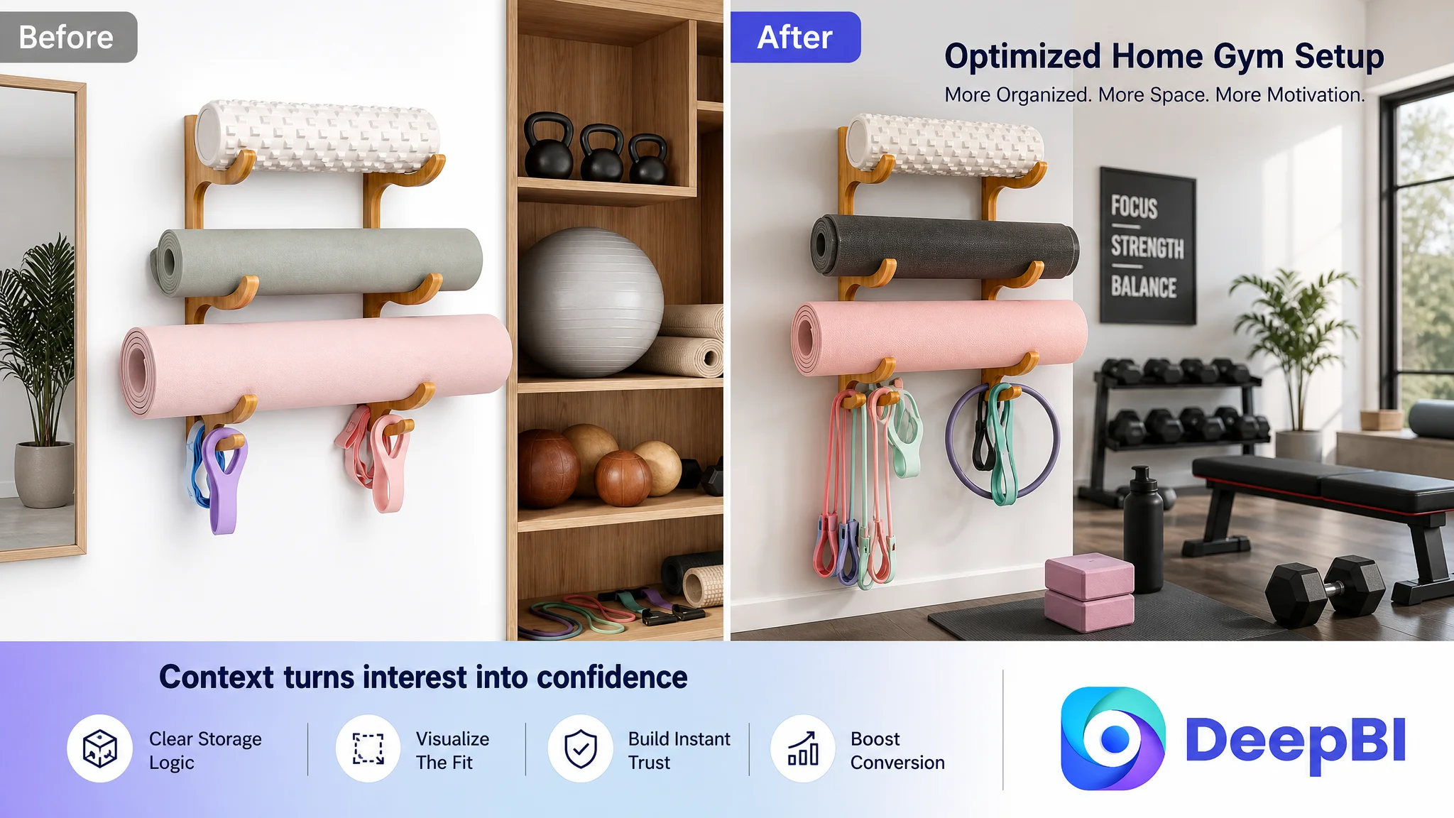
2. Move the realistic home scenario earlier
3. Explain the storage zones and hooks
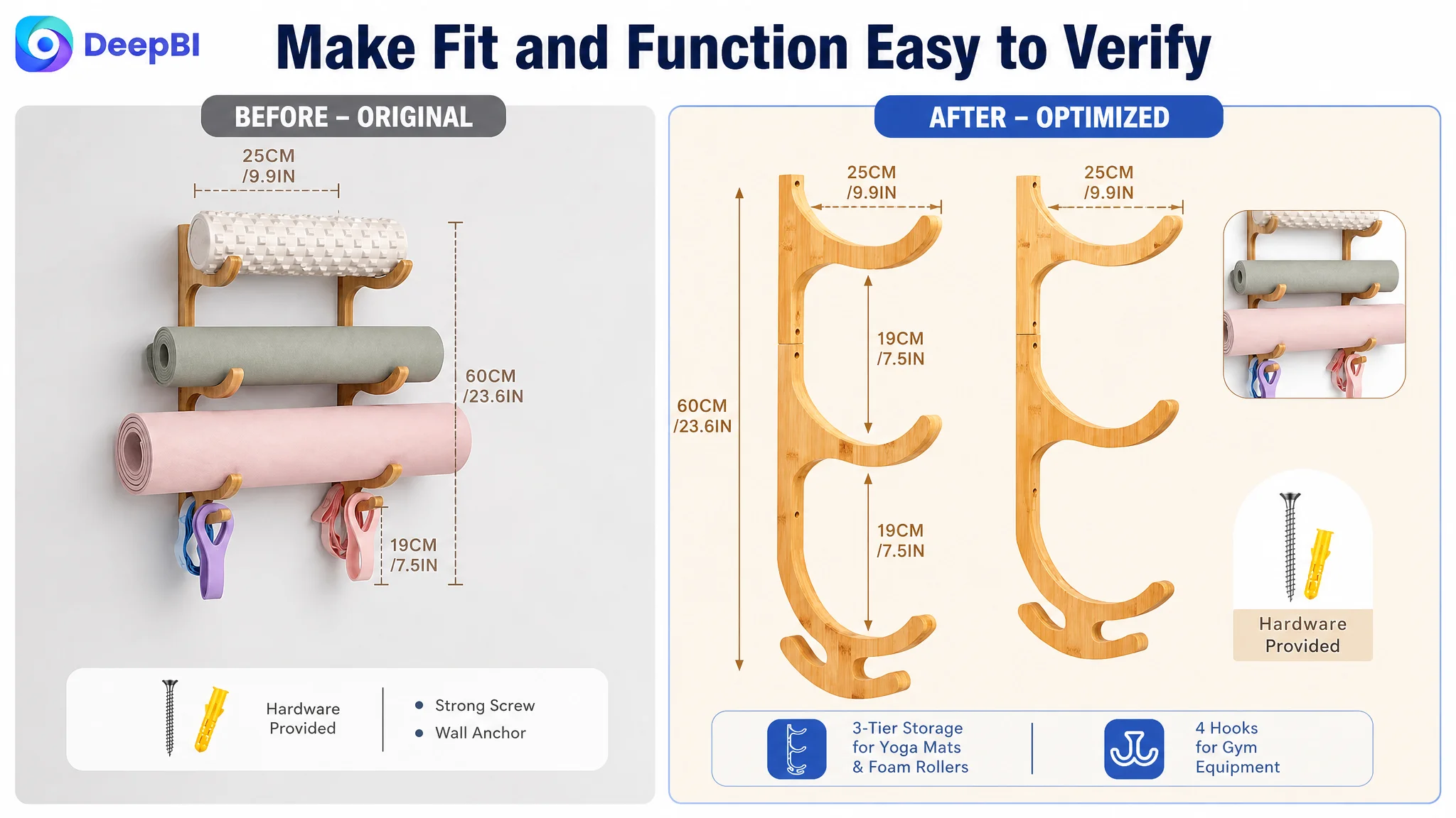
4. Show dimensions and wall-space requirements
5. Close with material and construction details
This follows a natural Amazon product-page progression:
Attraction first, context second, explanation third, verification last.
The dimension image was useful, but placing it too early could interrupt the shopper’s emotional and visual understanding of the product. The realistic home scene was more effective as an early follow-up because it helped shoppers imagine ownership before moving into rational confirmation.
The Title Was Functional, but It Did Not Lead With the Buying Context
The title scored 14/20 against the benchmark’s 16/20. This was not the main bottleneck, but it showed how the Listing could become more precise.
The target title began with a brand term and used a longer construction around “Yoga Mat Holder” and “Storage Holder.” The benchmark led with “2 PACK” and presented the product form and home-gym context more immediately.
The proposed title direction placed the core category and structure earlier:
Wooden Wall Mount Yoga Mat Holder 3 Tier, Yoga Mat Storage Rack with 4 Hooks for Foam Rollers and Resistance Bands, Home Gym Equipment Organizer, Brown
The purpose was not to copy the benchmark’s wording. It was to improve the order of information:
- Core product category first
- Wall-mounted and three-tier structure next
- Relevant storage accessories after that
- Home-gym use case clearly stated
- Color retained as a purchase-detail cue
The title also became more readable by replacing redundant phrasing with clearer category language such as “storage rack” and “organizer.”
This matters on Amazon because the title serves two jobs at once. It supports search relevance, but it also gives shoppers an immediate answer to what the product is, where it belongs, and what problem it addresses.
The Bullet Points Listed Functions Instead of Building a Buying Logic
The five-point section scored 6/10, only two points behind the benchmark. Again, the issue was not total absence of information.
The issue was sequencing.
The target bullets leaned toward:
- Function and dimensions
- General compatibility
- Accessory storage
- Material and durability
- Organization benefits
The benchmark led with the shopper’s underlying concerns:
- Saving floor space
- Keeping equipment secure
- Proving durability and finish
- Showing broader household uses
- Making installation and gifting easier to understand
DeepBI’s recommended structure shifted the bullets from “what the product has” to “why the buyer needs it.”
The first bullet had to establish the result
The opening bullet should position the product as a space-saving and visually clean solution for a home gym or yoga studio.
The 23.6 x 9.84-inch footprint and vertical storage format are useful because they support that result. The dimension should reinforce the value proposition rather than appear as an isolated specification.
The second bullet had to reduce stability concerns
A wall-mounted rack creates an immediate safety question.
The page needed to communicate the confirmed construction and mounting characteristics without making unsupported load claims. Solid wood, robust construction, resistance to bending or warping, and a secure mounting system can be presented as evidence of intended stability, provided the claims match the actual product.
The third bullet had to make compatibility concrete
“Multi-functional storage” is too abstract on its own.
A stronger bullet connects the three tiers and four hooks to actual use cases: yoga mats, foam rollers, resistance bands, jump ropes, light gym bags, yoga blocks, picture frames, or water cups where appropriate to the product’s confirmed use.
The point is to help shoppers quickly check whether their own equipment belongs in the system.
The fourth bullet had to protect perceived product value
A smooth finish and carefully treated wood can support the product’s appearance and reduce concern about snagging or premature wear.
This is more persuasive than repeating a general quality adjective. The buyer needs to see what the finish does for the equipment and the room.
The fifth bullet had to complete the purchase case
Installation information and included hardware reduce logistical hesitation. Gift positioning adds another reason to buy, particularly for fitness enthusiasts, but it should remain secondary to the product’s core utility.
Together, the bullets should move from:
Space problem → stability concern → storage fit → product quality → purchase completion
That is a more effective Amazon conversion path than a neutral feature list.
The Review Gap Made Every Content Weakness More Expensive
The review dimension was 2/15 for the target Listing and 14/15 for the benchmark.
The target product had:
- 1.0-star average rating
- 1 total review
- 1 review visible on the first page
The benchmark had:
- 4.6-star average rating
- 1,440 total reviews
- 13 reviews visible on the first page
The single review on the target Listing was a one-star complaint about inaccurate image dimensions and unusable hooks. That feedback was especially damaging because it challenged two of the product page’s core promises: fit and function.
This gap could not be solved through copy alone.
A stronger title, better images, and A+ content can clarify the product and reduce misunderstanding, but they cannot manufacture review history or erase an existing negative experience. The review issue therefore had to be treated as a separate trust constraint within the larger conversion problem.
That distinction is important for Amazon sellers. A low-review Listing may need better content precisely because it lacks social proof, but better content must also be accurate enough to prevent further expectation gaps.
When review evidence is weak, the product page has to work harder as a source of proof—but it cannot pretend to be a substitute for customer experience.
The immediate Listing priority was therefore to improve clarity and reduce preventable uncertainty: show exact dimensions, demonstrate the hook and shelf functions, clarify compatible items, and present the product in realistic settings.
Why DeepBI Did Not Keep Adjusting the Surface First
The scoring pattern provided a clear decision order.
If the title, main image, and bullets had been the only weak areas, a front-end rewrite might have been the appropriate first move. But the 21-point detail-page gap showed that the page’s deeper trust and explanation system was underdeveloped.
Continuing to tune isolated wording while leaving the detail experience nearly empty would create an imbalance:
- More shoppers might understand the category
- More shoppers might notice the product
- But many would still lack enough evidence to complete the decision
For an Amazon seller, this creates a practical risk. Any additional traffic—organic or paid—can expose the same unresolved page weakness at greater volume.
The better sequence was:
1. Repair the page’s ability to explain the product visually.
2. Make the storage system and space-saving outcome easy to verify.
3. Clarify dimensions, materials, compatible equipment, and installation.
4. Improve the title and bullets so the text follows the same logic.
5. Address the review-related expectation risks through more accurate presentation.
6. Only then evaluate whether additional traffic and Amazon ads can be scaled efficiently.
This does not mean ads are irrelevant. It means advertising should not be used as a substitute for product-page readiness.
The A+ Story Had to Move From Description to Proof
The recommended A+ direction was not to add decorative banners for their own sake.
It was to build a seven-part visual story around the shopper’s decision:
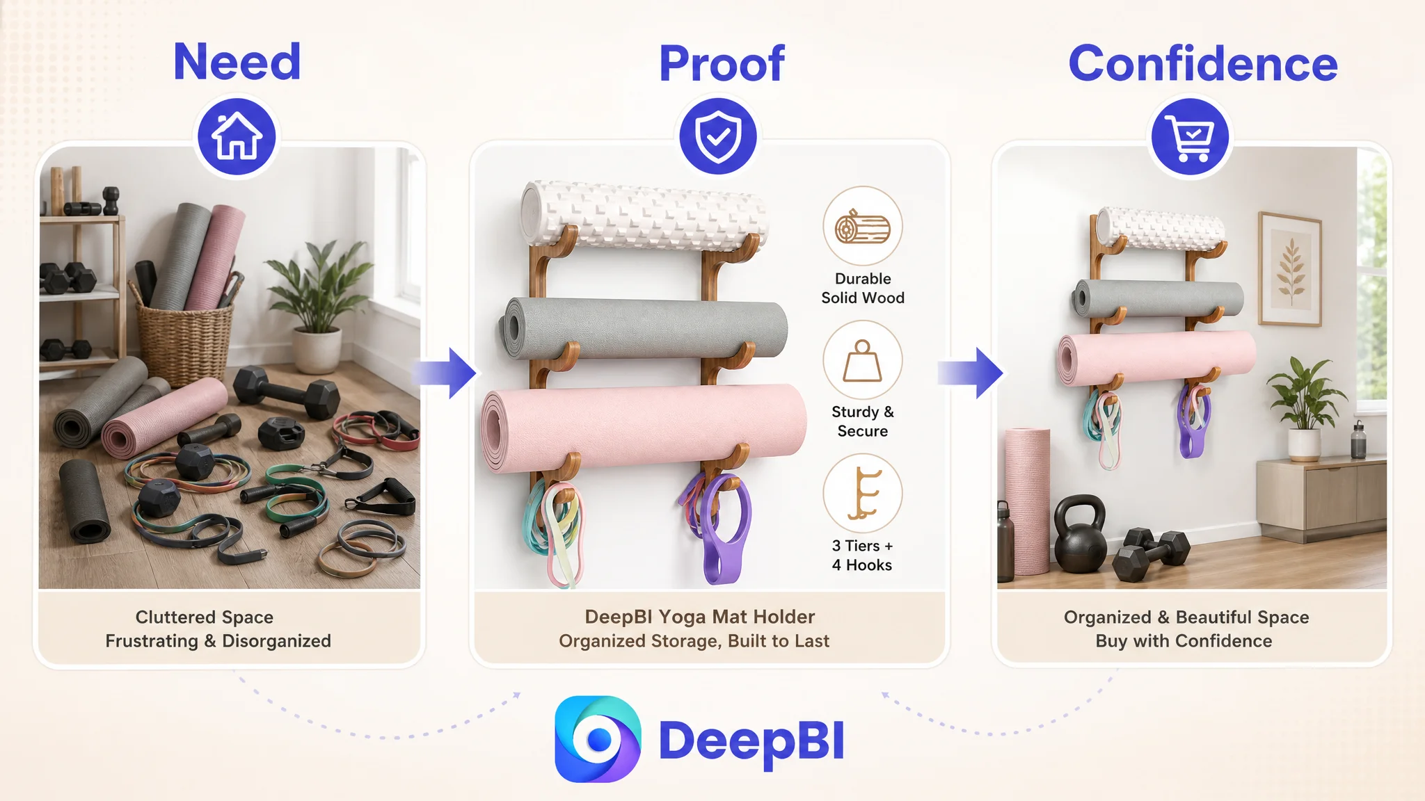
1. Begin with the organized-space outcome
Show a complete, professional, uncluttered home-gym arrangement. The opening should communicate the emotional benefit of reclaiming floor space and making equipment easier to access.
2. Prove material and construction quality
Use close-up views of the confirmed wood material, finish, thickness, and structural details. The objective is to make durability more tangible without inventing technical specifications.
3. Clarify what fits
Use a clear compatibility list or icon-based layout for the intended equipment types. This reduces the risk that shoppers interpret “multi-functional” too broadly.
4. Show the dimensions in context
Present the 23.6 x 9.84-inch dimensions in an easy-to-read diagram. Buyers need to understand not only the numbers, but also how the rack occupies wall space.
5. Visualize the before-and-after change
Contrast scattered equipment and tangled gear with a clean wall-mounted setup. This turns “space saving” from a claim into an observable result.
6. Integrate the product into different home settings
Show how the rack can work in a home gym, yoga studio, or other suitable interior context. This reduces the risk that shoppers see it as a niche commercial-gym product.
7. Close with color and choice confirmation
Present the brown finish clearly so the buyer can assess how the product will fit the intended room.
The progression is deliberate:
Need recognition → functional proof → compatibility → space planning → transformation → lifestyle fit → final choice
That is the type of structure the original Listing lacked.
The Real Business Decision Was to Restore Conversion Capacity First
This case did not justify a promise of immediate CVR improvement or lower ACOS. No post-optimization performance data was provided.
What it did provide was a clear operating diagnosis.
The target Listing had a 49/100 competitive score and a 39-point gap against a strong category benchmark. The largest weakness was not a minor title issue. It was the page’s inability to present a complete, credible buying argument.
DeepBI’s role was to make that conclusion visible and defensible:
- The title needed stronger search and category framing.
- The main image needed to communicate the product as a complete organizer, not merely a rack.
- The bullets needed to lead with space, safety, fit, and use cases.
- The A+ page needed to replace text repetition with visual proof.
- The review gap needed to be acknowledged as a major trust constraint.
- The image and copy system needed to remain accurate to the actual product.
The key change was therefore not a single rewritten title or a new image concept.
It was the decision to stop treating the Listing as a collection of isolated assets and start treating it as one conversion system.
What the Amazon Seller Could Take Forward
The case changed the interpretation of the problem in several ways.
First, the seller could no longer assume that improving a few visible elements would resolve the Listing’s weakness. The score distribution showed that the deepest loss was in the detail and trust layers.
Second, the seller could distinguish between traffic creation and traffic conversion. A stronger main image may help win attention, and a better title may help discovery, but the A+ page, bullets, dimensions, and proof determine whether interest becomes confidence.
Third, the seller could use competitor comparison more precisely. The useful question was not “Why does the competing Listing look better?” It was:
Which part of the buyer’s decision does the competing Listing support that ours leaves uncertain?
For this yoga mat holder, the answer included capacity, spatial fit, stability, material quality, use-case breadth, and lifestyle integration.
Finally, the seller had a clearer basis for deciding what not to do first. More traffic should not be the automatic response to weak sales. If the Amazon product page is still failing to show the problem, solution, evidence, and outcome in the right order, additional traffic may only expose the conversion gap more quickly.
The Broader Amazon Listing Lesson
A Listing score is useful only when it changes the operating decision.
In this case, the most important conclusion was not that the target product needed more content. It was that the page needed a more complete reason for purchase.
The product already had a credible foundation:
- Three-tier vertical storage
- Four hooks
- A wall-mounted format
- Solid wood construction
- A compact footprint
- Use in home-gym and yoga settings
The problem was that these elements were not connected into a strong visual and textual narrative.
Once the optimization direction shifted toward scenario, proof, compatibility, dimensions, transformation, and trust, the purpose of each asset became clearer. The title could support discovery. The main image could create attention. The bullets could answer practical objections. The A+ content could establish confidence. The review experience could be protected by more accurate expectations.
That is the judgment Amazon sellers should carry into their own Listings:
Ads can bring a shopper to the product page, but the page still has to earn the order.
And before increasing traffic, the more important question is whether the Amazon Listing has enough clarity, proof, and trust to deserve it.