

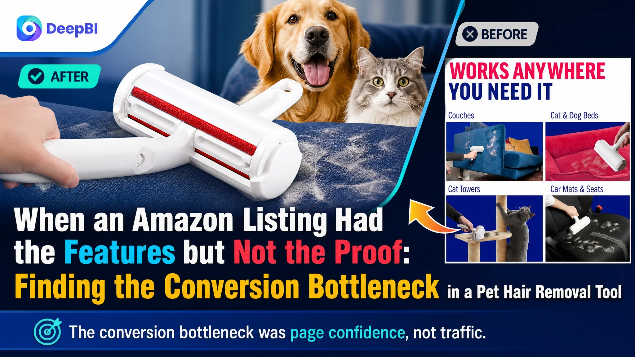
An Amazon seller in the pet-care accessories category was not facing a simple visibility problem. The product page described a reusable pet hair remover, showed several use cases, and included the core functional claims. Yet the Listing was not giving shoppers enough reason to trust the product or believe that using it would be easy.
The initial optimization direction leaned toward improving keywords, adding more product information, and showing more cleaning scenarios. Those changes addressed individual content elements, but they did not resolve the deeper issue: the page had features without a convincing purchase sequence.
DeepBI’s diagnosis reframed the problem around Amazon Listing conversion capacity. The product page was missing the visual proof, practical details, and emotional reassurance needed to turn interest into confidence. The later optimization therefore focused on rebuilding the title, image sequence, bullet-point logic, and A+ content as one connected sales argument.
For other Amazon sellers, the lesson is direct: when a product page receives attention but struggles to convert, the problem may not be a lack of keywords or traffic. The page may simply be asking shoppers to make too many judgments on their own.
The Listing Was Not Empty. It Was Incomplete
At first glance, the customer’s Amazon Listing contained the expected elements:
- A product title
- Five bullet points
- Multiple product images
- Functional descriptions
- Claims around reusability and self-cleaning
- Use cases involving furniture, carpets, clothing, and car seats
But the Listing’s competitive position showed that having all the standard components was not the same as using them effectively.
The customer’s Listing scored 50 out of 100, while a comparable high-performing listing in the same pet hair removal category scored 88.
The overall gap was not evenly distributed:
- Title: Customer Listing: 14/20, Comparable Listing: 17/20, Gap: -3
- Main image: Customer Listing: 24/30, Comparable Listing: 26/30, Gap: -2
- Bullet points: Customer Listing: 6/10, Comparable Listing: 8/10, Gap: -2
- A+ content: Customer Listing: 3/25, Comparable Listing: 23/25, Gap: -20
- Reviews: Customer Listing: 3/15, Comparable Listing: 14/15, Gap: -11
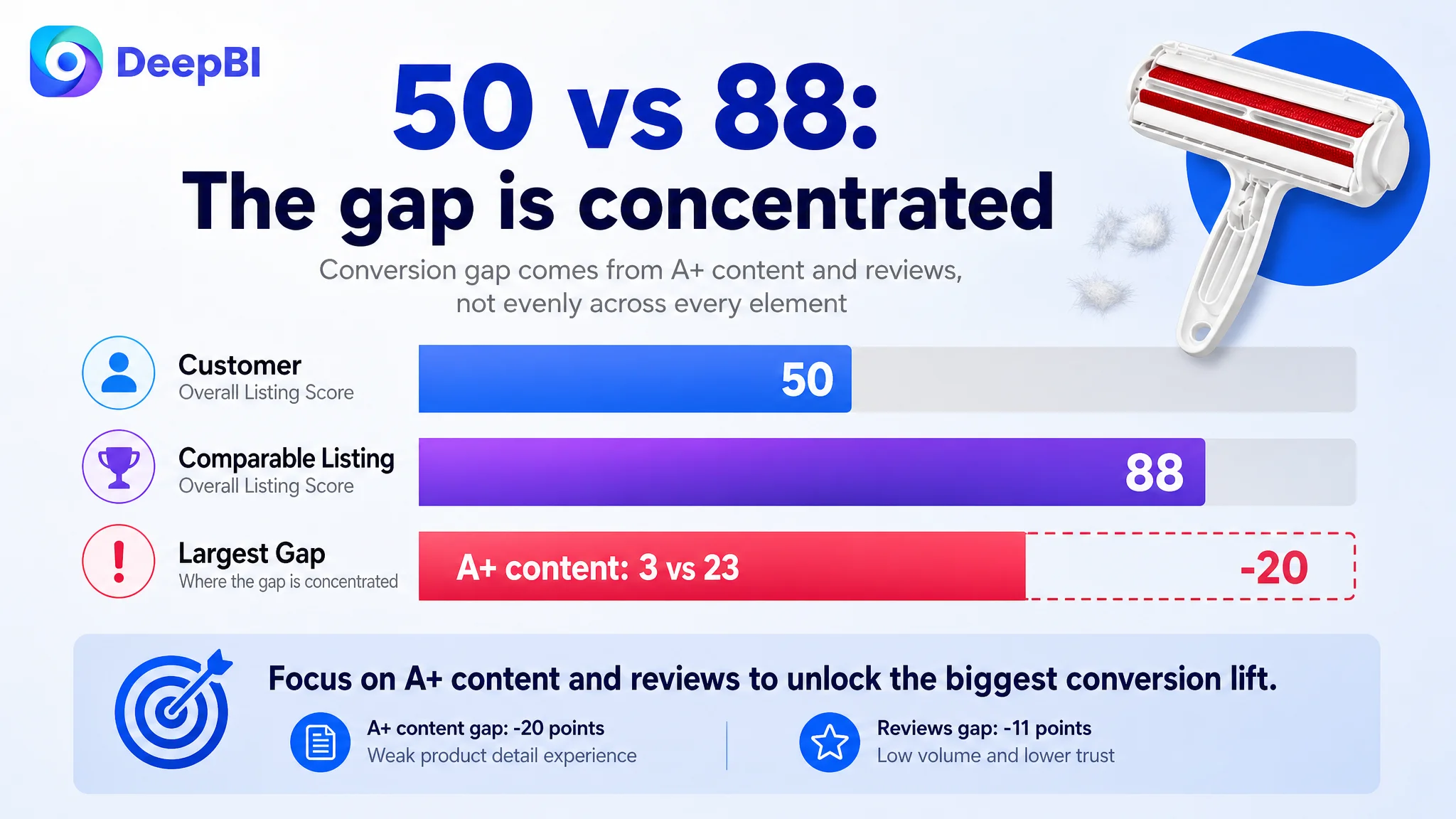
The pattern mattered more than the total score.
The title, main image, and bullet points were behind, but not disastrously so. The largest weakness was the product-detail experience, followed by reviews. That indicated that the Listing’s central problem was not a single missing keyword or isolated design flaw.
The page was losing the customer after initial interest, at the point where trust and product understanding needed to take over.
The Original Diagnosis Focused on Information, Not Decision Friction
The customer’s existing content was primarily functional.
The title opened with “Reusable Pet Hair Remover Roller,” then continued with product forms, cleaning functions, and application surfaces. The bullets described the tool’s capabilities, environmental value, ease of use, and target users. The images presented different scenarios and operating steps.
These were not irrelevant messages. The problem was their order and role in the buying process.
The Listing treated shoppers as if they were already convinced and only needed more specifications. But pet owners considering a hair-removal tool are usually making several practical judgments at once:
- Will it work on the surfaces in my home?
- Will it remove embedded fur rather than move it around?
- Is it genuinely reusable?
- Will emptying the collected hair be unpleasant or difficult?
- Will it damage upholstery or clothing?
- Is it more convenient than disposable sticky rollers or a vacuum?
- Is this product reliable enough to justify a purchase?
The existing page answered some of these questions indirectly. It did not answer them in a sequence that reduced hesitation.
The working assumption was therefore incomplete: more feature coverage and more scenarios would make the Listing more persuasive.
DeepBI’s comparison showed that the missing element was not more information. It was a clearer connection between shopper concern, product proof, and expected outcome.
“The Listing did not lack features. It lacked a reason for the shopper to believe those features would make daily cleaning easier.”
The First Major Gap Was Not the Title
The title was weaker than the benchmark, but the difference was relatively limited.
The comparable listing placed the high-value category phrase “Pet Hair Removal Tool” near the beginning. It also used concrete differentiators such as a fur-trapping compartment, detachable handle, and smaller storage size. These details served two purposes at once: they supported search relevance and created a stronger click reason.
The customer’s title relied more heavily on functional naming and repeated removal-related terms. It did not make the product’s practical distinction clear enough at the beginning.
The proposed direction was to reorganize the title around the product’s strongest verified value:
- Reusable pet hair removal
- Self-cleaning operation
- Dog and cat hair use cases
- Furniture, couch, carpet, and car-seat applications
- Portable and lint-removal positioning
This was not keyword expansion for its own sake. The purpose was to make the search result communicate a clear answer to the shopper’s first question:
What makes this tool worth clicking instead of another roller?
The title could improve the entry point, but it could not solve the full conversion problem alone.
The Main Image Was Busy, but Not Persuasive Enough
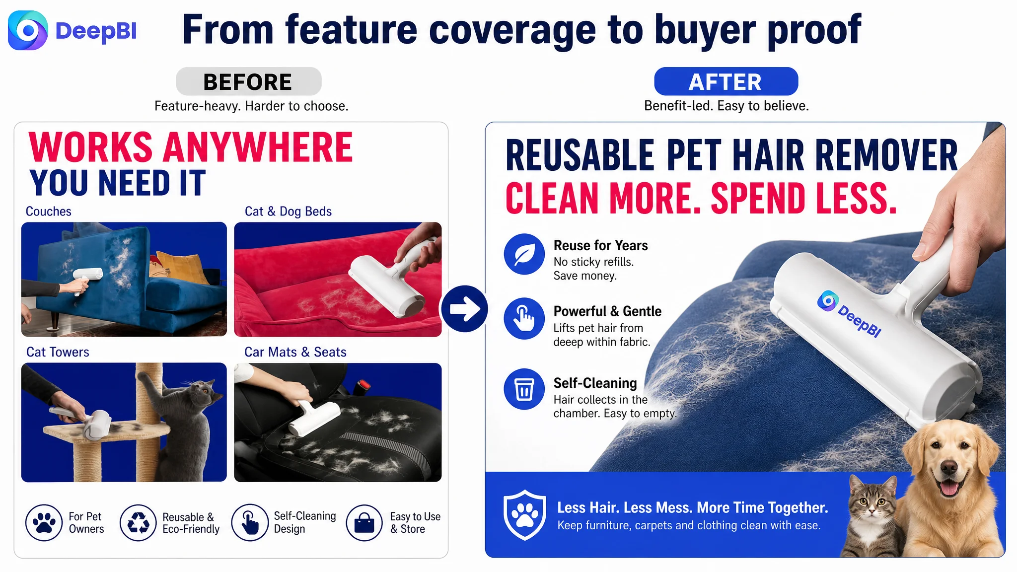
The main-image set contained several valid selling points, including use scenarios, dimensions, operating steps, and reusability. The issue was that the visual sequence did not always give each image a distinct job.
The first image presented too many scenarios at once, including couches, bedding, carpets, and car seats. That increased information density before the shopper had formed a clear understanding of the primary benefit.
The second image communicated product features and dimensions, but the cost-saving message was not prominent enough. For a reusable pet hair remover, “no sticky refills,” “no batteries,” and “no waste” are not secondary details. They directly address the recurring-cost concern that separates this product from disposable rollers and powered cleaning tools.
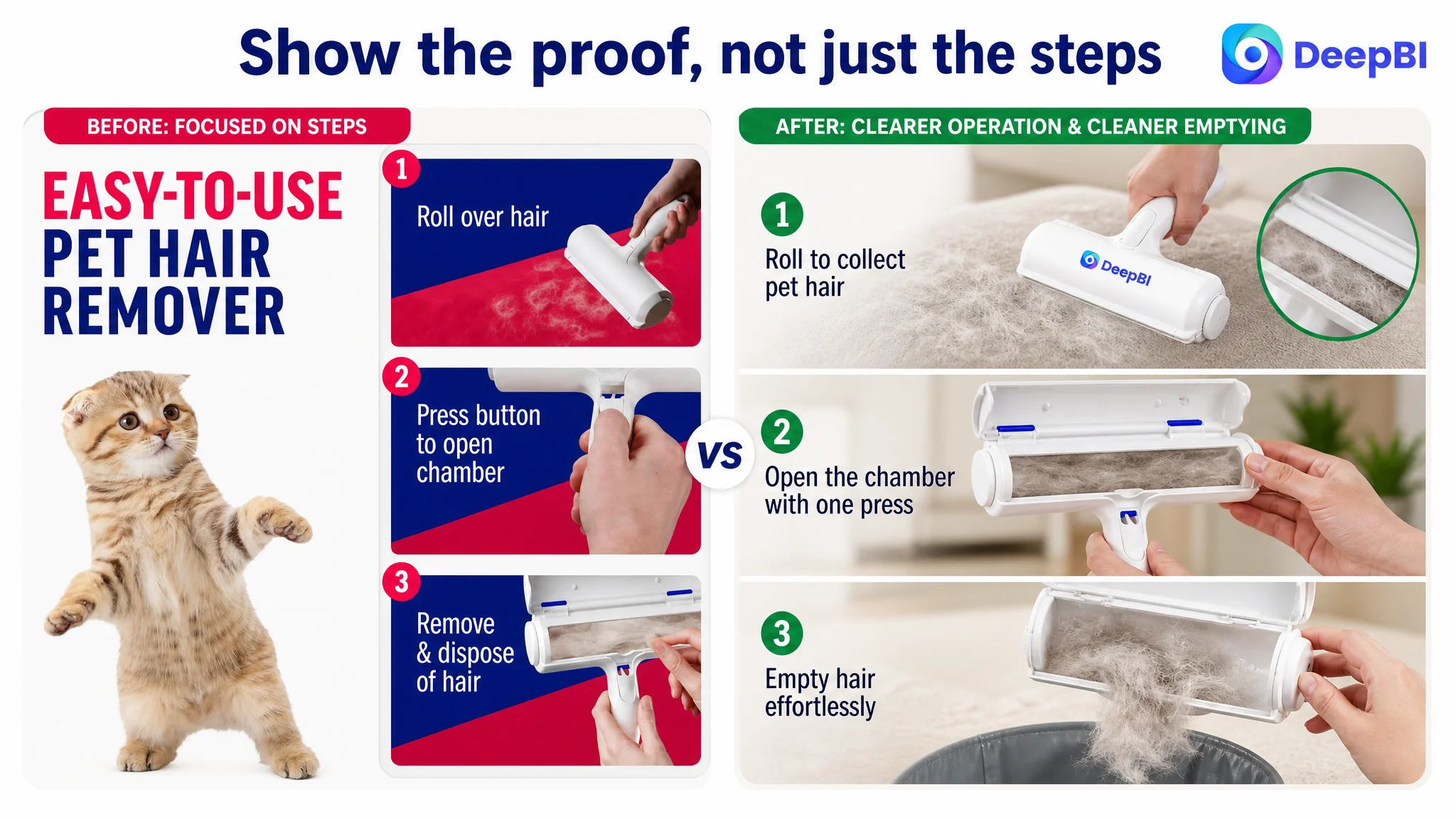
The third image showed how to operate the tool, but did not sufficiently resolve the unpleasant question of what happens after hair is collected. The built-in chamber and emptying process needed to be shown as a clean, simple part of the experience.
The later images also repeated some messages instead of progressing toward a final purchase decision.
DeepBI’s recommended image logic was more sequential:
First: establish the category and primary benefit
Show the tool as an effective pet hair remover, with a simpler visual composition and a direct benefit-led message.
Next: make reusability economically meaningful
Present the reusable design as a practical alternative to sticky-tape refills and batteries. The available dimensional information could remain, but it should support the value proposition rather than compete with it.
Then: remove doubt about operation and cleanup
Show the back-and-forth rolling motion, the built-in collection chamber, and the process of emptying it. The point was not merely to explain how the tool works. It was to reassure shoppers that cleanup would not create another mess.
After that: prove surface versatility
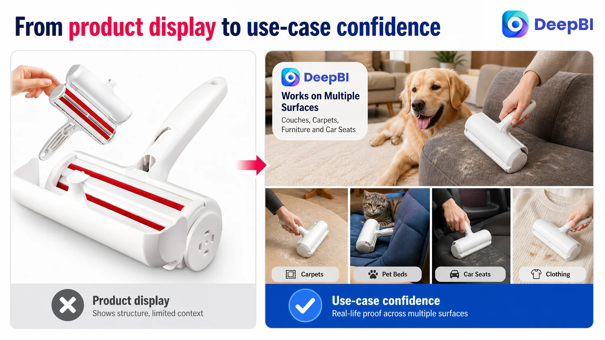
Demonstrate use on couches, carpets, furniture, bedding, clothing, and car seats. These scenes should broaden the product’s relevance without overwhelming the first impression.
Finally: close with the life improvement
The last visual should connect the functional benefits to a cleaner, more comfortable home for pet owners.
The image set needed to move from recognition to proof, then from proof to reassurance.
The Bullet Points Described Functions but Did Not Build a Buying Logic
The five bullet points were also directionally correct but structurally weak.
They emphasized product functions and general convenience. The comparable listing began from the shopper’s daily problems: limited storage, travel, multiple surfaces, cleanup effort, and long-term cost. That difference gave each bullet a stronger conversion role.
The revised structure placed the product’s value in a more practical order.
The tool should work across real pet-owner surfaces
The first bullet could begin with furniture, carpets, bedding, and car upholstery rather than with a general product description. This makes the tool relevant to the shopper’s actual cleaning routine.
The claim should remain within the product’s confirmed use cases and avoid unsupported promises. The purpose is to show where the tool fits, not to overstate its performance.
Reusability should be framed as a cost and waste benefit
The product’s reusable design becomes more meaningful when connected to the alternatives shoppers already know:
- Sticky-tape refills
- Disposable lint rollers
- Battery-powered tools
- Repeated vacuum use
This turns “reusable” from a material description into a reason to choose the product.
The self-cleaning chamber should answer the most uncomfortable question
The page needed to make the collection and emptying process visible and concrete:
1. Roll the brush back and forth.
2. Let the built-in chamber collect the hair.
3. Open the chamber and empty it.
4. Repeat the process without manually picking up loose fur.
The important message was not just that the product collects hair. It was that the user can dispose of the collected hair without creating a second cleaning task.
Lightweight design should support frequent use
A compact, durable, ergonomic design is more persuasive when connected to daily behavior. The customer’s product could be positioned as something that stays within reach in a laundry room, closet, or storage area and can be used for quick touch-ups as well as deeper cleaning.
The final bullet should connect the product to the pet-owner lifestyle
A pet hair remover is not only a cleaning accessory. It helps maintain furniture, clothing, and shared living spaces in a home with shedding cats or dogs.
That emotional connection should come after the practical evidence, not before it.
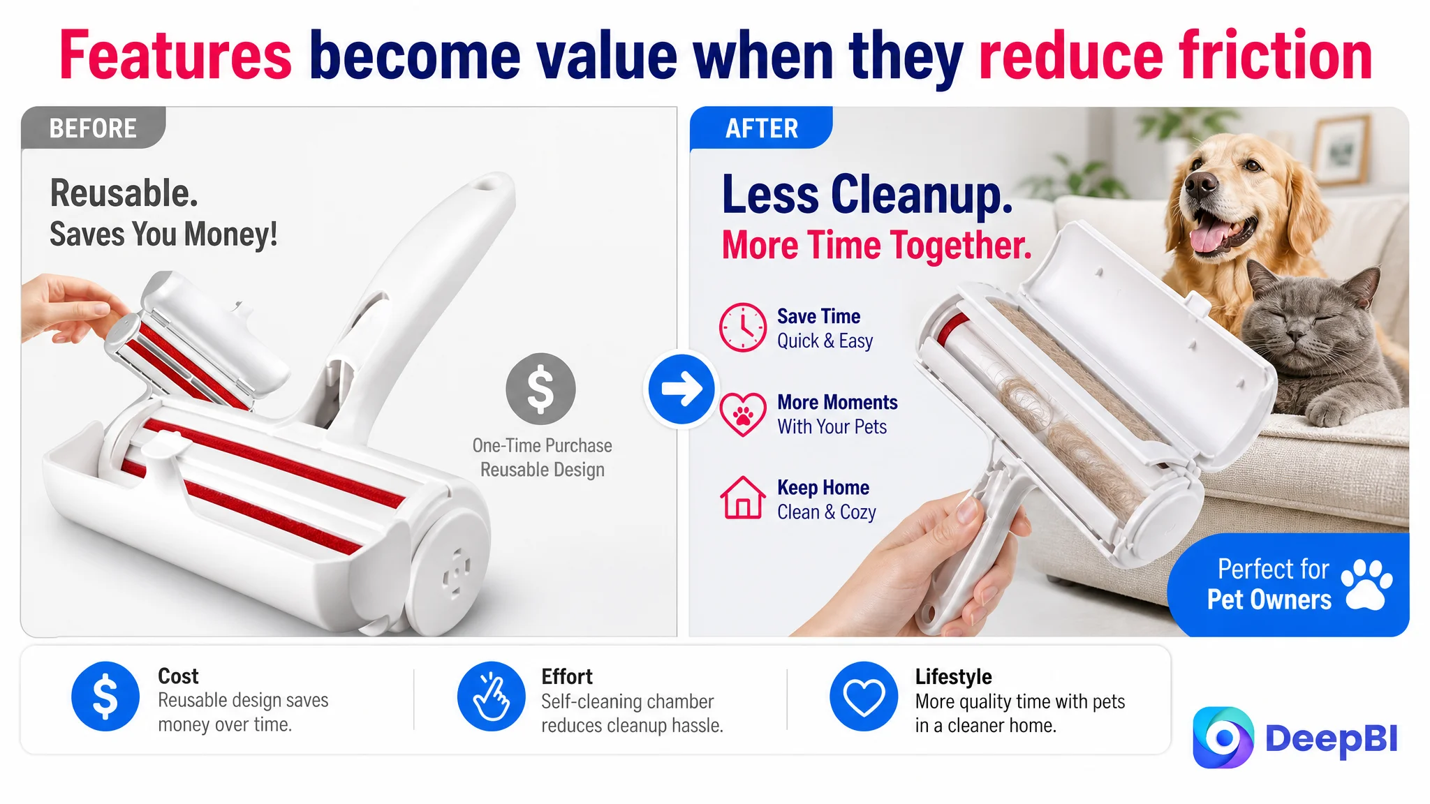
The Largest Conversion Leak Was the Missing A+ Story
The most important finding was in the A+ content.
The customer’s product page had no image-based A+ modules. It relied on repeated text descriptions. The comparable listing used a complete visual sequence covering:
- Brand-level introduction
- Core benefit icons
- Product mechanism
- Multiple use scenarios
- Structural details
- Emotional lifestyle value
This created a 20-point gap, far larger than any other Listing dimension.
That gap changed the priority of the entire optimization.
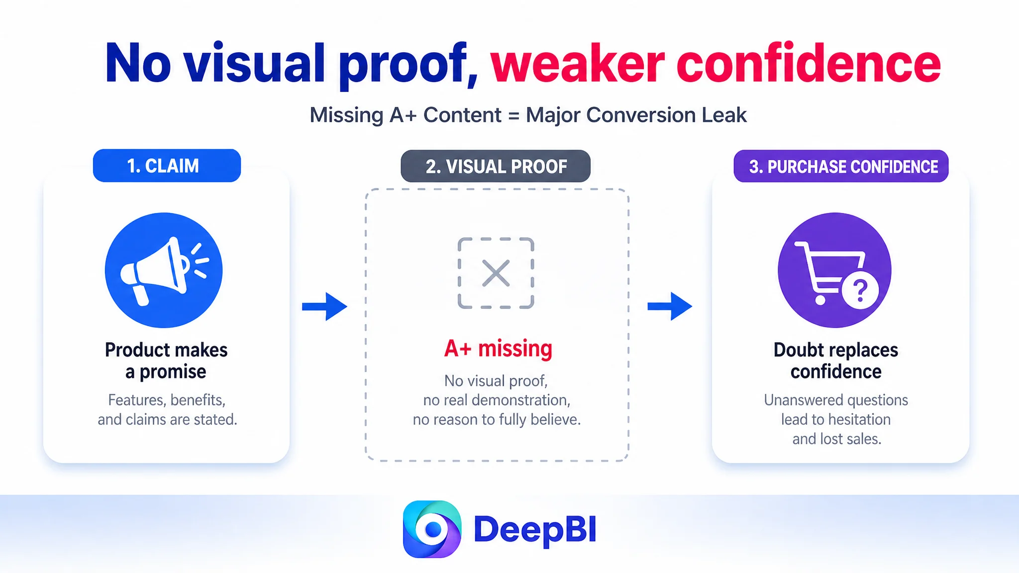
Without A+ content, the shopper had to understand the product through a small set of listing images and text blocks. The page did not provide enough visual proof for the product’s most important claims:
- How the tool captures pet hair
- How the built-in compartment works
- How the chamber is emptied
- Why the tool is more convenient than a sticky roller
- Where it can be used safely
- Why reusability matters over time
The result was a page that explained the product but did not demonstrate it.
“The missing A+ content was not a cosmetic weakness. It removed the part of the page responsible for turning product claims into believable evidence.”
Why DeepBI Prioritized the Page Before Further Traffic Expansion
In an Amazon store, paid traffic can expose a Listing’s weaknesses faster than organic traffic does.
If the page does not establish trust, additional traffic does not necessarily create additional orders. It can increase the number of shoppers who leave after encountering unclear value, weak proof, or insufficient confidence.
For this Listing, the priority was therefore not to keep adding traffic before repairing the conversion path.
The decision logic was:
1. The title and image set needed refinement, but their score gaps were manageable.
2. The bullet points needed a stronger pain-point structure, especially around portability, cost, operation, and use cases.
3. The A+ section was effectively absent, leaving the page without a visual explanation layer.
4. The review profile created an additional trust barrier, making strong product-page proof even more important.
5. Improving traffic without improving page confidence would risk amplifying a low-conversion experience.
This did not mean advertising was irrelevant. It meant advertising should not be treated as the first or only lever.
Before scaling Amazon ads or judging campaign efficiency too aggressively, the team needed to determine whether the product page was ready to convert the traffic it received.
Reviews Added a Second Trust Constraint
The review data reinforced the same conclusion.
The customer’s Listing had:
- A 3.0-star rating
- Only 3 total reviews
- Two reviews visible on the first page
- A high proportion of negative feedback, including one-star reviews
The comparable listing had:
- A 4.2-star rating
- 2,541 total reviews
- Fourteen reviews visible on the first page
- More detailed customer content, including image and video reviews
This was not a gap that Listing copy alone could erase. Review volume and rating are accumulated trust signals. They form part of the environment in which every title, image, bullet point, and A+ module is judged.
But the weakness made better page communication more urgent.
When a product has limited review support, the page must work harder to provide:
- Clear product expectations
- Visible operating proof
- Specific use cases
- Transparent cleanup steps
- A credible explanation of long-term value
The optimization could not promise to remove the review disadvantage. It could, however, prevent the page from adding further uncertainty.
The A+ Content Needed to Follow a Proof-First Sequence
The recommended A+ structure was not a collection of decorative banners. It was a deliberate persuasion path.
Module 1: establish the primary promise
Open with fast pet-hair removal across relevant surfaces, while reinforcing that the tool is intended for pet owners and everyday home use.
Module 2: explain the long-term value
Show the reusable design through clear statements such as no batteries, no sticky tape, and no refills, provided these claims accurately reflect the product.
This module should make the economic and environmental benefit understandable rather than leaving “eco-friendly” as an abstract label.
Module 3: demonstrate the self-cleaning chamber
This was the key differentiator to visualize. The product collects hair inside a built-in compartment, which can then be opened and emptied.
Showing the mechanism directly would address the shopper’s likely hesitation better than repeating “easy to clean” in text.
Module 4: rationalize the cleaning process
Explain how rolling the brush back and forth captures hair efficiently. The purpose is to make the product’s operation feel credible and predictable.
Module 5: prove surface compatibility
Show the product in the specific environments named in the Listing: couches, carpets, bedding, clothing, furniture, and car interiors.
This reduces the gap between a general claim and the shopper’s own home.
Module 6: connect reuse with reduced waste
Bring together reusability, no disposable refills, and reduced waste as a practical long-term choice for pet owners.
Module 7: close with a better daily routine
End with the outcome: less time spent cleaning, cleaner shared spaces, and more comfortable time with pets.
The emotional message was most effective at the end because it summarized the practical evidence already established.
What Changed in the Business Understanding
The case did not end with a reported post-optimization metric, so it would be inaccurate to claim a specific CVR increase, ACOS decline, or organic-order recovery.
The more important change was the operating diagnosis.
The customer’s Listing was no longer viewed as a page that merely needed more keywords, more descriptions, or more images. It was understood as a page whose sales logic had broken between product interest and purchase confidence.
That changed the order of decisions:
- Title work would clarify the search and click entry point.
- Main-image work would reduce visual confusion and surface the strongest benefits earlier.
- Bullet-point work would connect features to daily pet-owner problems.
- A+ work would provide the missing proof and explanation layer.
- Review limitations would be treated as a risk factor rather than ignored.
- Amazon ads would be evaluated only after the product page had a stronger ability to receive and convert traffic.
This is the distinction between editing a Listing and diagnosing a Listing.
The Broader Lesson for Amazon Sellers
For pet-care accessories and many other Amazon categories, conversion problems are often distributed across several page elements. A title may be adequate, the main image may be attractive, and the bullets may be technically accurate. Yet the Listing can still underperform if those elements do not work together.
A shopper does not experience the page as five separate optimization categories. They experience one decision:
Do I understand this product, do I trust it, and will it solve my problem with less effort than the alternatives?
That is why the 50-to-88 competitive gap mattered. It revealed not only that the Listing was behind, but where the business case was weakest: the page had not built a sufficiently complete argument for purchase.
“Amazon ads can bring a shopper to the product page. They cannot replace the proof, clarity, and trust that the page itself must provide.”
The practical conclusion is not to stop optimizing ads. It is to stop assuming that every weak result is an advertising problem.
Before increasing traffic, Amazon sellers should ask whether the Listing has:
- A title that communicates the product’s strongest distinction
- A main image sequence with one clear job per image
- Bullet points organized around shopper concerns
- A+ content that demonstrates rather than repeats
- Product proof that addresses operating and cleanup doubts
- Enough trust support to compensate for review limitations
When those pieces begin working as one system, paid traffic has a better chance of becoming useful traffic. Organic traffic also has a stronger foundation for conversion. And the seller’s operating decisions become less dependent on guessing which isolated element to change next.